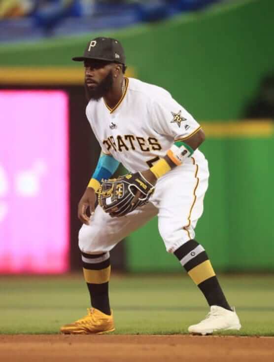
All-Star Games are usually footwear free-for-alls, but last night’s Midsummer Classic was surprisingly light on shoe shenanigans — no neon, not many custom-painted jobs. One prominent exception, however, was Josh Harrison (shown above), who wore one gold shoe and one white. That’s absurd, of course, but I kinda liked it! Both shoes went well with his throwback socks. It was almost like he was saying, “Hmmm, should I go with the gold shoes or the white shoes tonight? Eh, I’ll just wear both.” Looks like he may also have been wearing a wristband with a portrait of himself and an Irish flag motif. Anyone know more about that? (Update: Twitterer Timmy Westside has plausibly suggested that the wristband may actually be for the Ivory Coast, not Ireland. … Additional update: He was apparently wearing one of these.)
In other news from last night’s game:
• As usual, there were no alternate jerseys — all home whites and road greys. Given new commish Rob Manfred’s evident willingness to tinker with the sport’s look, I’m surprised they’ve stuck to the white/grey protocol. And if solid-colored alts have to exist, this is where they should be worn — an exhibition game where anything goes. Look at the team photos from the ’70s — that seems to capture the spirit of All-Star fun a lot better than whites vs. greys, no? It’s like they have it backwards: Allow the alts in the ASG (hell, let them wear throwbacks if they want) and save the whites/greys for the World Series.
• As has become standard practice in recent years, memorial sleeve patches were moved to the chest to make room for the various All-Star sleeve patches.
• I’m fine with the left-sleeve patch showing the player’s number of All-Star appearances. In the case of the Phillies, that patch forced them to remove the TV number that’s usually on that sleeve.
• Interestingly, the umps wore their usual sleeve numbers on the right side and the ASG patch on the left side. Might’ve been nice if they’d gotten to wear the “how many times an All-Star” indicator, showing how many ASGs they’d worked.
• For the second consecutive year, the All-Star caps had gold, star-shaped grommets, and I still don’t like them. They make the players look like they have rivets in their heads. Toss in the gold squatchees and it made everyone look like they’re cyborgs or something. (Of course, the bigger issue is that there’s no need for a special ASG caps to begin with — just let the players wear their regular team caps. But I particularly dislike the gold grommets.)
• Another thing about the caps: The All-Star logo patch on the side often reflected rather oddly. On numerous occasions I thought it looked more like a sweat stain or a foreign substance. I think this is one of the downsides of the Chromaflex patch style: The patch has deeper ridges and almost seems to cast its own shadows.
• The mismatched All-Star socks looked ridiculous. Just like last year, some players just wore their regular team socks and Bryce Harper wore Trusox (along with, as you can see in that shot, a tribute to fallen Marlins pitcher José Fernandez).
• For reasons I can’t even begin to fathom, starting National League catcher Buster Posey wore grey catcher’s gear — a brutal look, especially against the Giants’ cream uniform.
• Posey’s American League counterpart, Salvador Perez, went with gold gear. Interestingly, he wore a different set of gold-trimmed gear in last year’s All-Star Game. (Perez was later outdone by Posey’s replacement, Yadier Molina, who went full gold.)
• Speaking of gold: Last year the Royals’ players wore their Friday-night batting helmets with the gold logo. No photo, but this year they just wore their regular white-logo helmets.
• American League skipper Brad Mills — subbing for Terry Francona, who had to miss the game due to medical concerns — got victimized by the old bubblegum prank. Amazingly enough, the gum wasn’t gold! Someone’s gonna lose their job over that, right?
• Some idiot in the front row was wearing a Native American headdress.
• Watching the parade of batting helmets from various teams, I was struck by how much I now prefer matte helmets over glossies. Best trend of recent years.
And that’s a wrap. Come back next year for the final MLB All-Star Game of the pre-Under Armour era.
(My thanks to everyone who contributed pics and observations.)
Election hacking apparently not limited to Russia: If you follow the site on weekends, you know that Phil has been conducting a series of very cool fauxback design contests. They’re fun, and many of the designs have been excellent.
It has come to our attention that the voting in the current contest may have been compromised by the use of bots, which are apparently being used to pad the vote totals for certain designs. Do we have proof that bots are being used? No. But there’s some pretty strong circumstantial evidence.
It is beyond pathetic that anyone would cheat on a fucking internet design contest, and I find it personally embarrassing that someone in the Uni Watch community may have done so. I can’t believe I even have to waste my time on this nonsense, so I’m only going to say this once:
If you’ve been using a bot to rig the design contest vote, stop. Stop now. Or we’ll shut down this contest and we won’t run any more of them.
These contests should be fun — fun for the designers, fun for the readers, and fun for Phil (who puts a lot of work into these things). If it stops being fun, it’s not worth it. So if we continue to see evidence of bots, we’ll just scrap it and move on to something else.
And that’s it. I’ve already devoted more time and brain cells to this issue than I care to, so I don’t want to see anything about it in today’s comments, I don’t want to get any more emails about it, I don’t want to hear about more secure polling software we could use, or anything else. If we can’t run a simple contest on the honor system, that’s a really sad commentary on the current state of things.
Now let’s move on. Thanks.
The Ticker
By Paul

’Skins Watch (a few days early this week): I grew up on Long Island in the 1970s but have no memory of the Long Island Tomahawks, a box lacrosse team that played at the Nassau Coliseum in 1975. Pretty dreadful logo (from Kevin Brown).

Baseball News: What’s even stupider than the embarrassing term used by the NFL for its Thursday-night uniforms? That same embarrassing term being used by MiLB teams. Sigh (blame Connor Jones). … Look at all the great players — and uniforms! — that showed up for the Padres’ 1978 old-timers’ day (from the great @BSmile). … The Nippon Ham Fighters’ farm team in Kamagaya gave away a jersey-shaped coupon to celebrate the team’s 500th home win. … Looks like the Brooklyn Cyclones were wearing throwbacks or retro uniforms with a heathered faux-flannel fabric (from Robert Hayes). … Also from Robert: Cleveland P Danny Salazar, on a rehab assignment at Mahoning Valley Scrappers, wore a jersey and pants with mismatched shades of white.
College Football News: I feel like we may have seen this before, but just in case: The footballs used by Wisconsin this year will have a Camp Randall centennial pattern (from Nate Neumann).

Hockey News: The Red Wings’ new arena has a big, honking pizza ad on the roof. Gross. … New uniforms for the Birmingham Bulls. … Here’s a good look at the Oilers’ new dark-blue helmet, pants, and gloves. … The Markham Thunder have a new logo but are letting fans decide the color treatment (from Moe Khan). … The composer of the Hartford Whalers’ popular “Brass Bonanza” fight song has passed away at the age of 94 (from Ted Arnold).

Basketball News: The Infor ad patch on the Nets’ jerseys, which was originally red, has apparently been changed to black and white (from Robert Hayes). … The Kings are using their new team wordmark with their old number style on their Summer League jerseys. I wonder if it’s because Adidas has a lot of extra numbers in stock that needed to be used, instead of cutting them out on demand with the available technology,” speculates Dustin Pomprowitz. But hey, on the plus side: vertically arched NOBs! … James A. Garfield High School in Ohio has a new court design that’s mostly charcoal and black. … Celtics rookie Jayson Tatum’s mom has been wearing a Celtics jersey with the GE ad patch for the past week or so. Here’s the best look at it so far. Gross (from Neal Hanson). … Repeated from the hockey section: Detroit’s new arena, where the Pistons and Red Wings will play, has a big, honking pizza ad on the roof.

Soccer News: New home shirt for Napoli (from Ed Å»elaski”). … “The English championship team Sheffield Wednesday has not announced its new kit supplier yet,” says Stefan Schubert. “However, a picture surfaced on Tuesday showing a player wearing gear from Lacatoni, a Spanish supplier owned in part by Wednesday manager Carlos Carvalhal. I cannot think of a soccer coach who owned (part) of the outfitter in recent years.” … Puma will be releasing new kits for 23 teams today. Many of the designs will be black. Here’s a teaser (from Josh Hinton).

Grab Bag: SI has launched a new site devoted to the intersection of sports and food. … Logo tweak for Famous Dave’s (from Pete Woychick). … The Ford Mustang’s “corralled pony” logo is returning to the 2018 edition of the car. … A Chinese airline has debuted a set of haute couture flight attendant uniforms (thanks, Brinke). … Conor McGregor, promoting his upcoming fight with Floyd Mayweather Jr., wore a suit with “Fuck You” pinstripes. Classy (from Andrew Cosentino).
The link for the ” f u pinstripes” goes to a Kris Bryant at bat picture but as always great analysis of the asg thanks
Fixed.
Yeah the special all star caps are silly. Taking that gold motif and forcing it into the player’s standard uniform is just not a good look. The gold logos on the hats are weird. And the stars on the sleeves should have just been rendered in the team’s actual colors.
The socks were awful too.
Unrelated to uniforms, I’m shocked by how much I miss the game having no stakes. I’m usually a traditionalist and having the game count for home field advantage is pretty much prima facie ridiculous, but dang if I don’t miss having a reason to care who won being just rooting for my team’s league.
So, I guess that means you’re happy that the game last night doesn’t count for anything then, right?
I haven’t followed MLB ever since it cancelled the World Series. But at least there are bragging rights. On behalf of the Milwaukee Brewers, “Hah! In your face, National League! Our American League is still the best!!!!!”
At least the National League featured all of those young Astros stars.
Proofreading:
The coupon was actually from the “Nippon Ham Fighters farm team in Kamagaya”, according to Jeremy’s tweet.
Fixed.
In the obit for the composer of Brass Bonanza is a link to this story about the song’s history and its ties to the Whalers:
link
What’s the story with the white front panel on the Angels hat (back row) in the Old-timers Game photo?
Re: Harrison, there are other flags with green, white and orange including Cote d’Ivoire, Niger, Bhutan and India. Wonder if it’s one of those.
This. My guess is it is the Ivory Coast.
So you–and everybody else–still call it Ivory Coast.
(geek)I love the Ivory Coast flag because it’s the only tricolor with the warm color closer to the hoist.(/geek)
Instead of “Côte d’Ivoire”? Nah. I don’t call the city “Pa-ree” either.
And yeah, that’s a nice little quirk for the Ivorian tricolor.
I think in 1992 or thereabouts, the country requested that they be called “Côte d’Ivoire” (or the phonetic equivalent) in all languages. If that’s what they want, it’s simple courtesy to comply with their wishes.
Here is non green/orange band for sale.
link
Bhutan actually has yellow and orange. Also, both Cote d’Ivoire and Niger go by the order of orange-white-green (the former placing the orange on the hoist side of the flag, the latter on top).
I decided to just go for it and tweet to him asking about the significance of the choice of colors last night. We’ll see if he responds to it later.
Bhutan’s flag is orange and red. No green.
Little Caesar’s Arena will be home of the Pistons as well, perhaps cross-list that in the Basketball section Paul?
Good point. Will do.
The Phillies actually wear the Dallas Green memorial patch on the right sleeve, with their jersey number on the left sleeve. The all star game patch replaced the DG memorial patch on the right sleeve (moving that patch to the front of the jersey), and the all star number patch replaced the left sleeve jersey number, which removed it completely from the uni (unless I am missing something).
link
Disregard!! I see now that I read the paragraph wrong!!
Josh Harrison was apparently “mic’d up” as well.
(I didn’t watch the game, so if that is a known fact, sorry for the interruption)
The site is still being plagued by those annoying, inescapable pop-up ads. One is especially vulnerable viewing it on a smart phone.
Screen shot, pretty-please.
They’re not “inescapable” if you use an ad blocking plug in for your browser.
You’re not supporting the site if you use an ad blocking plug in for your browser.
Isn’t it possible that the guy in the front row wearing the Native American headdress is in fact Native American?
Possible. Not probable.
He’s not at a tribal ceremony, nor participating in a war.
I didn’t see that guy, but there was an older gentleman in the outfield seats wearing a Cleveland cap that got dirty looks and callouts from some officials from the Miccosukee tribe(who are sponsors of the Marlins/Marlins Park).
Wahoo cap or “C” cap?
My thought was that the only way the headdress is acceptable if if the wearer is representing his actual group; not very likely if he’s sitting front row at the All-Star game.
It looked like Fox, to theit credit, tried to avoid having him in the shot. I think with all the in-game interviews they did, they could’ve sent someone over to find our what his deal was. If he was legit, then cool; otherwise, they missed an opportunity to educate people about cultural appropriation.
I got a schooling when I investigated how a person who wants a headdress might get their hands on one. At first, I believed descendants of American Indians might have inherited or made them, and decided to part with them for any number of reasons, which logically would have taken the curse off. What I learned instead is about the thriving industry of knockoff Indian apparel being made in Asia and South America. The stuff sells, like counterfeit sporting apparel, so somebody has to cash in.
Yeah, but like counterfeit sporting apparel, we shouldn’t be supporting the industry.
“Corralled” Pony? OK. I guess I get it.
Here’s an evolution gallery of Mustang pony logos
link
A muscle car that has an “eco-boost” package, omg!!
I don’t see the problem. The car has had non-V8 engines as base since the beginning and @ over 300hp, its more powerful than nearly every V8 Ford put in the Mustang all the way from the 1960s to the 2010s
Yea its a thing, but this isn’t going all ’18 Mustangs
Ever notice vintage Mustangs used in commercials have the grille badge taken off? This phenomenon is not unknown with other cars; I suppose if there’s money to be made on a product unrelated to the automobile, Ford would like a piece of it.
I hated the ASG caps when I first saw them, so I was really surprised that I liked them when I saw them on the field. They didn’t clash horribly with the unis like some of the ones from recent years have. I thought the red caps looked particularly snazzy with the gold treatment. I’ll go on record as saying that I dig the star eyelets and shiny happy scratched.
My two gripes are that there was, again, no difference between AL and NL caps. Maybe give the road team a silver treatment or something. Also, if New Era HAS TO put their dumb logo on the side, the least they could do is make it in the same schmancy gold thread used on the rest of the cap.
Squatchee, not scratched. Stupid autocorrect.
I liked when they did the All Star caps with the teams’ regular cap and the ASG logo with the players’ signature and number. The current practice is just ugly and a money grab, as are all of the ‘special weekend’ uniforms.
Speaking of the Long Island Tomahawks, old National Lacrosse League also featured the Quebec Caribous:
link
The Caribous had a cool logo. A look like this deserves a rebirth. Seems that Quebec City cannot get an NHL team to fill dates in their new arena anytime soon. Would it not be great to see a rebirth of the brown-and-orange clad Quebec Caribous in the present NLL to fill some arena dates?
I could like the Tomahawks a lot more had they gotten the guy who designed the Caribous insignia to make theirs.
I went to see a game at the old Montreal Forum, The Caribous vs. Montreal, I really liked Montreal uni, Quebec I remember as unusual – but as it was 40+ years ago, couldn’t remember exactly what it looked like, thanks for posting.
Thanks for exposing me to a great logo I hadn’t seen before (Quebec Caribous).
Apparently in 2015, on the 40th anniversary of the Caribous championship, a lacrosse team wore Caribous jerseys and a banner was raised in the Quebec Coliseum for the 1975 team.
(ran through Google translate)
link
Here’s the banner:
link
well that didn’t work for the banner.
here’s a site that includes a pic at the top.
link
The 1977 ASG NL team photo is great, and I miss the days of the different A’s players wearing different-colored jerseys in the ASG every year.
What’s really interesting about the ’77 NL photo is that Dave Parker is shown wearing a yellow jersey and yellow pants, but in the game, he wore a black jersey and black pants, as did Goose Gossage. Goose is wearing a black cap in the photo but he wore the yellow cap in the game.
Parker: link
Parker: link
Gossage: link
And, what the hell were they looking at?? So awesome that that was the best photo and was published
I love wearing Stance socks. They’re comfortable like I can’t describe.
I hate looking at Stance socks on the baseball field. They’re going to be this generation’s sansabelt pants/two-in-ones. Mismatched makes it look even worse.
How did we move so far in the wrong direction in two years?
How did we move so far in the wrong direction in two years?
New commissioner?
Very possible. But as a league of players, how did we go from what I consider the best evolution of game fashion in the adoption of classic patterns of stirrups, socks, and (non-pajama) pants to this current mishmash of closeout/thrift store hirajuku-wannabe crap?
Color Rush
I would have thought the NFL or Nike would have owned a trademark on the term. It’s possible the MiLB/teams could have licensed it, but maybe not or maybe its not trademarked…
Also I don’t really mind the phrase. It’s not Voldemort, one can say the term when its warranted. Although it bothers me when it features a colorless white uniform
White is a color.
Not according to my middle school art teacher. And still subject to debate:
link
In a technical sense, white may be a color. In a colloquial sense it is not. An event advertised as “color rush” should not include white uni’s.
In a sports uniforms/logos sense, white is most certainly a ‘color’ (and so is black).
As far as color Rash uniforms, if the helmet is white, I wouldn’t have a problem with the jersey and pants being white too. I suppose.
I hate Color Rash generally though.
Lee
Maybe Color Matters?
link
I don’t mind the term or concept (though I agree that white defeats the purpose), and I’m looking forward to attending that Wings-Pigs game Friday night (weather permitting?). My only regret is that Bartolo Colon debuted last night for the Wings. Big Sexy in head-to-toe red would rival Andy Reid as the big tomato!
Is it just me, or is that Birmingham Bulls logo really unbalanced? The upper 1/3 just seems pointless and distracting, like a balloon squishing the bull’s face. Makes me think of The Kid’s In The Hall: “I’m crushing your head!”
It seems to me to be a simplification of the Sabres’ red-silver-black jersey design, which the ECHL version of the Bulls once used. The logo of the SPHL team is the same as the ECHL one.
Also, nice reference to Mr. Tyzik the Head-Crusher! Though you did commit an apostrophe catastrophe there.
What is that thing? It’s bull-esque, but it looks like a Japanese demon painted on a goalie mask, or perhaps a Mexican wrestling mask.
The only thing I know about it is that it dates back to the previous ECHL incarnation of the team from 1992-2001. The owner of the new SPHL team is also the same owner who bought and moved the original ECHL Cincinnati Cyclones to Birmingham in 1992, when the Cyclones’ owner was granted an IHL franchise.
It’s too bad they can’t just use the WHA Bulls logo, though I’m sure there are legal reasons as to why not.
no mention of Mills bringing in a cardboard cutout of Terry Francona ala Major league, since Tito couldn’t make the game due to his recent heart surgery
link
I thought it looked like Ender Inciarte of the Braves was wearing Atlanta’s all-navy road cap with his home uni during last night’s ASG. It’s briefly visible at the 0:10 mark of the video embedded on the Braves’ official website: link
At the risk of stating the obvious, all *normal* sleeve patches took a vacation at the ASG to defer to the logo on the right and the star indicator on the left. Not just the Phillies’ numbers. I think all the memorials got moved…Dallas Green, Yordano Ventura, Jose Fernandez, Mike Illitch…
Looks like the Brooklyn Cyclones were wearing throwbacks or retro uniforms with a link
They’ve been wearing that for link now. And yeah, it looks great. I wonder if that’s why they’ve stopped their rotating road uniform carousel and settled on this look.
Long time reader, first time commenter:
The Cyclones jersey featured in The Ticker is actually their normal away jersey (which they started using in 2015, I recall). There was a whole uproar among a subset of fans over using the “BKLYN” abbreviation (as the previous two away shirts featured the full name of the Borough), but I still kinda dig it.
That is the Brooklyn Cyclones road uniforms.They been wearing them for a couple of yeas now
Dang, they are sweet-lookin’. I’d wear that.
-Jet
I vaguely recall the LI Tomahawks. Had no interest in seeing a lacrosse game though.
Thanks for posting that 70’s All Star game squad picture. Though I never really cared about the outcome of the game, those team pics of all the different uniforms together was mind-blowing for a kid. Considering that in a regular season game you only saw 2 team uniforms at a time, being able to see the entire freakin’ league all together just seemed to make each uniform all the more… I don’t know the word… special?
-Jet
Question about the 1977 NL All Star Game photo? It appears that the Houston Astros trainer and Jouquin Andujar were wearing white. Were the Astros road grays just a very pale shade? I looked at a 1979 NL All Star picture, and Andujar is also wearing what appears to be white. I can’t find any pictures online of the Astros road uniforms during this period. Thanks.
As described in Paul’s recent ESPN article, the Astros had only that one uniform for all 162 games from 1975 through 1983(?)
Thanks. I’m surprised that MLB didn’t (or doesn’t) have rules against this. Are there any MLB rules for uniforms? Could a team decide to wear white all the time, or white pants on the road when wearing colored jerseys?
Oh, I’ll bet they have rules *now*. But the 1970’s were more free-wheeling. The Astros, Pirates, Indians and Athletics, at least, made no distinction between home and road uniforms for at least part of that decade. But Pittsburgh, Cleveland and Oakland had multiple combinations. Houston banked on not being able to be mistaken for whoever was on the field in any city, and MLB went along. Mind you, they might have had multiple copies to prevent them from wearing out prematurely.
Proofreading:
“showing many ASGs they’d worked”
– how many
Fixed.
RIP Jacques Asaye, Brass Bonanza is almost the official fight song for the State of Connecticut :)
Brass Bonanza is played when the Hartford Yard Goats hit a home run.
I miss the Whalers….
Speaking of padding votes (bots), when I went to the Markham Thunder website and cast my vote for the team colors, a message appeared saying, “THANKS, VOTE AGAIN TOMORROW”… huh?
-Jet
The “one vote per day” mechanism is not unheard of. I can’t name any specific examples off the top of my head, I just recall seeing it in the past. (Possibly for NHL All-Star online voting?)
So, the actual English name for “Ivory Coast” is “Republic of Côte d’Ivoire”, and along with East Timor/ “Democratic Republic of Timor-Leste” are the only two countries that have their English names as theire native language’s name.
That’s certainly the Ivory Coast’s prerogative (as it is East Timor’s). Luckily, though, no English-speaker is actually bound by their prescriptions on the matter.
Is it just me or does the color in the GE logo on the Celtics jersey look blue rather than the green that was originally shown?
Is it possible that someone just slapped an existing GE logo on an existing Celtics jersey?
It’s green – just looks that way because of my crappy screenshot
Putting the Mustang in a corral kinda defeats the purpose, no? A mustang, by definition (or at least by the origin of the term), is a feral/wild horse.
I assumed the idea was that Ford “corralled” all those ponies under the hood for your use.
But that’s just a guess at 1960’s ad-man thinking.
Proofreading: (from Nate Neumann0.
Fixed.
Liked Catchers gear last night. Didn’t like MasterCard logo on Nat Anthem kids sleeve. Wish Unis would be mixed up with Alts or throwbacks! Or both teams wear white
Also change up ASG caps, make em unique to city or team like in 2014 with the Twins
The issue with Danny Salazar’s mismatched whites unfortunately isn’t isolated just to him. We go to a lot of Scrappers games and it always frustrates me when I see it. It seems to happen more with the coaches than the players, and the pants are always whiter than the tops. Seems like it should be an easy thing to avoid, even for a Single A team.
Admittedly a completely different direction with the “I’m callling it” t-shirts, but for the TD Centre in Boston, can there be a t-shirt that says “I’m calling it the Toronto Dominion Centre”, which is the origin of the initials “TD”. Certain irony in a Boston arena where the Bruins play, having this connection.
Amusing, but not really in the spirit of Naming Wrongs. Besides, I don’t think the American bank (TD Bank, N.A.) has ever used the full name of its Canadian parent.
Agree overall, the one connection (albeit it’s a stretch) to the actual spirit of “I’m call it”, as a child I knew the TD Bank as the Toronto Dominion Bank, one could argue they’re nostalgic for the old name of the bank. Maybe it’s a geeky number thing, but I certainly remember the day I opened my first bank account. FYI – The RBC Centre would be the Royal Bank Cente. And off course a Montrealer would point out that Toronto’s football and soccer teams play at Bank of Montreal Field
I grew up in Queens, not far from the Nassau County border. There were a couple of kids in my Junior High School and HS that wore Tomahawk jackets. I wasn’t really friends with them, and the only real memory I have of this is what darn sport are they playing? I had never even HEARD of lacrosse and I thought it was a football team, not associated with the school. My school (Martin Van Buren HS) didn’t have a football team.
I’ll put out a message on my school facebook page for more info and I’ll ask for pics.
Hope to get some new stuff here.
“Watching the parade of batting helmets from various teams, I was struck by how much I now prefer matte helmets over glossies. Best trend of recent years.”
100% agreed! Starting to feel the same way about non-3D helmet logos, too. I particularly think a flat, glossy logo decal looks terrible on a matte helmet. The clear negative space in the decal tends to shine while the rest of the helmet is matte.
Agreed. When the matte helmets first came out, I thought they could be OK for certain teams. Now, I find that I generally prefer them. The Dodgers are the team that clinched it for me. If ever there was a team whose colors and identity ought to make them glossy-helmet-friendly in my book, it’s the Dodgers. And yet I find that I much prefer the Dodgers in the matte helmets than in gloss.
I’ll put in a vote for Flocked over Matte.
Totally disagree. The mattes are dull and boring. Standardize the glossies for all teams. And no pajama pants.
Who are the guys in the ’78 Old Timers pic? I can identify Bob Feller (top row Indians), Sandy Koufax (duh), Al Kaline (middle row Tigers), Ernie Banks (middle row Cubs).
Robin Roberts in the Philadelphia uniform.
I look at the Birmingham Bulls logo and I see a toilet seat…
-Jet
I think Chromaflex patches look chintzy. They remind me of iron-on patches that are used because it’s cheaper than embroidery. and the more fancy and detailed they are, the chintzier they look.
Received an email discount code to a major online sports retailer, and spent some time over lunch looking at their Cooperstown Collection merch for Brewers hats. As usual, literally every regular home and road cap ever work by a Milwaukee MLB team is available except my personal favorite*, the 1997-99 Germanic M caps. I prefer the link, but I’d happily settle for the link. In searching for those images, I found several message-board conversations dating back to the aughts filled with Brewers fans complaining that they can’t find those ’97-99 caps.
For all that we complain about “cash grabs” by the big sports leagues and uni suppliers, I’ve got forty bucks that New Era could have for the grabbing if they’d just make the one darn Brewers cap.
*Technically, my all-time favorite Brewers cap is a special-event cap, not a regular-uniform cap: Their link. The link is close, but the color block square behind the mascot head makes all the difference.
Infographic from Cut4 about All-Star starting lineups using logos. Unfortunately, the whole thing is current logos and not period logos, meaning, for instance, Milwaukee Braves starters are listed with an Atlanta ‘A’. + for effort, – for execution.
link
It’s a tough call. If they made all the logos period-appropriate, you’d lose some of the cumulative oomph of some of the consecutive logo repetition.
But I see Expos logos, too. Seems inconsistent.
Regarding the Little Caesars Arena roof, there’s been a bit of blowback over the logo, but it seems it’s mainly because we’re not getting the fancy LED display on the roof that was part of the early concepts for the new arena. While it was announced that they wouldn’t be installing such a display like that as it wasn’t cost-effective (even before the advertising rights were sold), that aspect wasn’t well-publicized beyond a mere blurb in the papers, so a lot of folks weren’t aware of that change.
Still, while it’s disappointing to see another giant corporate advertising logo on top of another sports venue, at least it’s the character based upon the very man who pushed for the building. Though it doesn’t change anything ultimately – it’s not Mike Ilitch Arena, it’s Little Caesars Arena.
Of course, some still would prefer to have had it named Gordie Howe Arena. But, at least Mr. Hockey’s getting a new bridge named after him… when it’s eventually built.