For all photos, click to enlarge
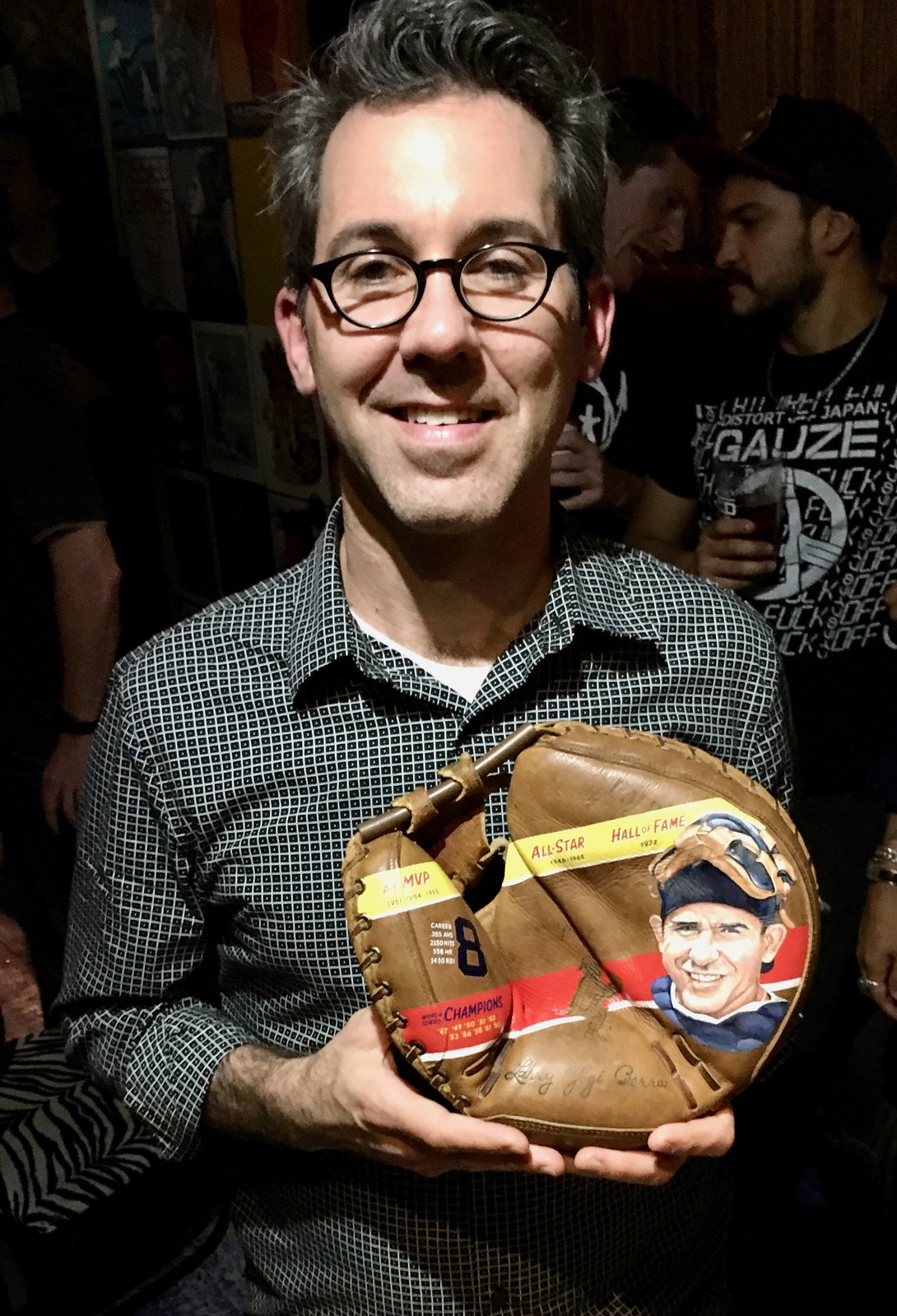
The annual SABR convention is currently underway, and this year it’s in New York. I’m not attending, but lots of Uni Watch readers are (hi, Elena!), including the great Sean Kane. In case you don’t recognize Sean’s name, he’s the guy who does awesome paintings on vintage baseball gloves. He joined me last night at Susquehanna Industrial Tool and Die Co.’s monthly show and brought along a swell Yogi Berra glove for show and tell. Here’s a closer look at the glove:
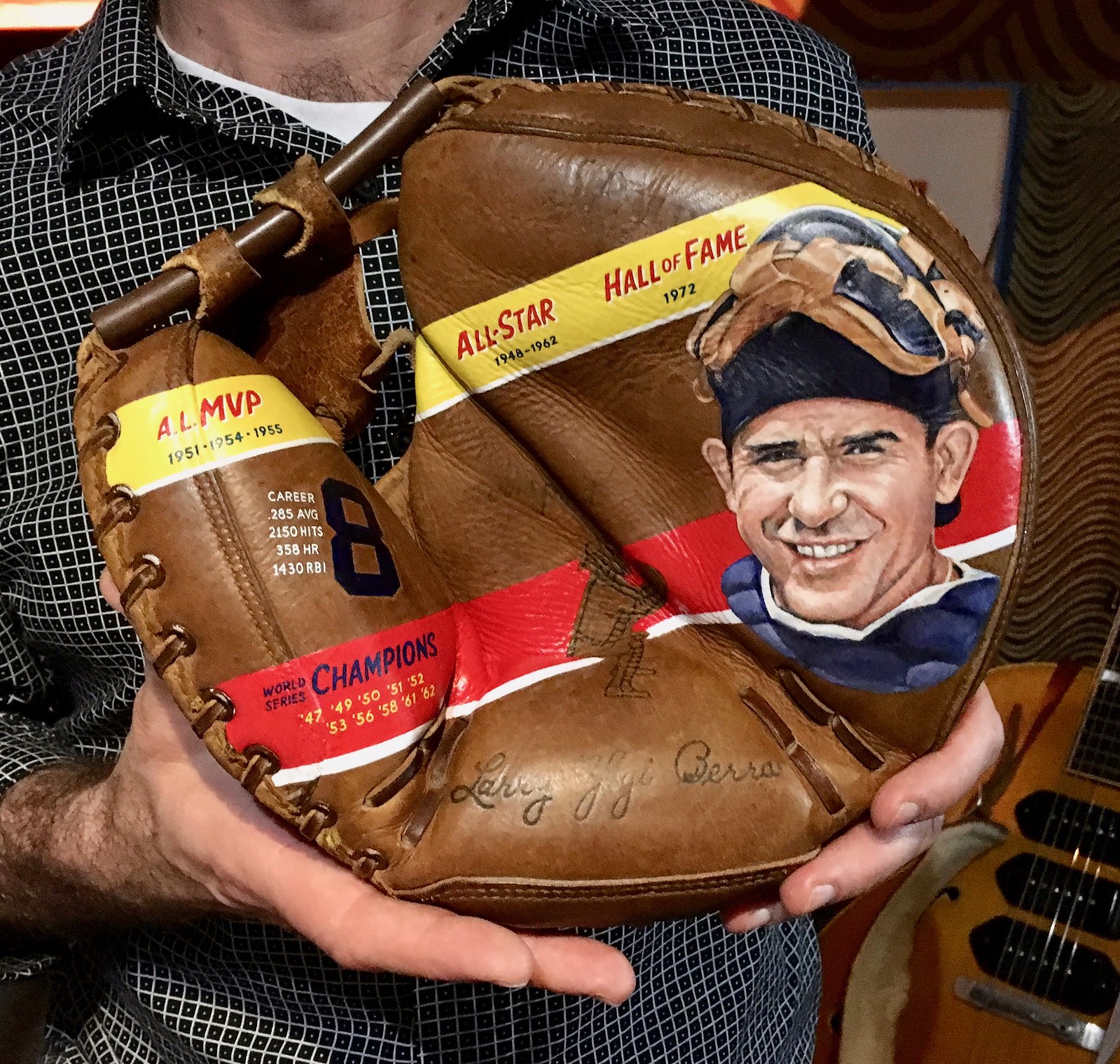
How great is that? I particularly like how Sean interrupted the stripe across the center so the little illustration of the catcher was left untouched, and I continue to be amazed by his lettering, which is of near-typographic quality. Tremendous stuff.
Hanging out with Sean was the highlight of my night. But a close second was an appearance by her royal majesty Daisy the Chicken Queen (don’t ask), who hopped up onstage between songs to present a birthday cake to one of the audience members:

At first I thought Daisy’s jacket was just, you know, colorful. But upon closer inspection, I discovered that it was actually covered in Kwik Loks (or as they’re more commonly known, bread tags):
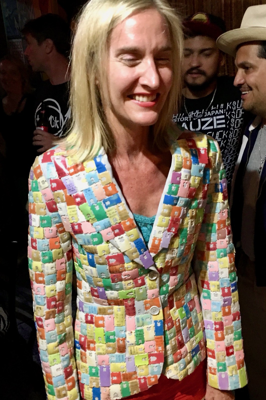
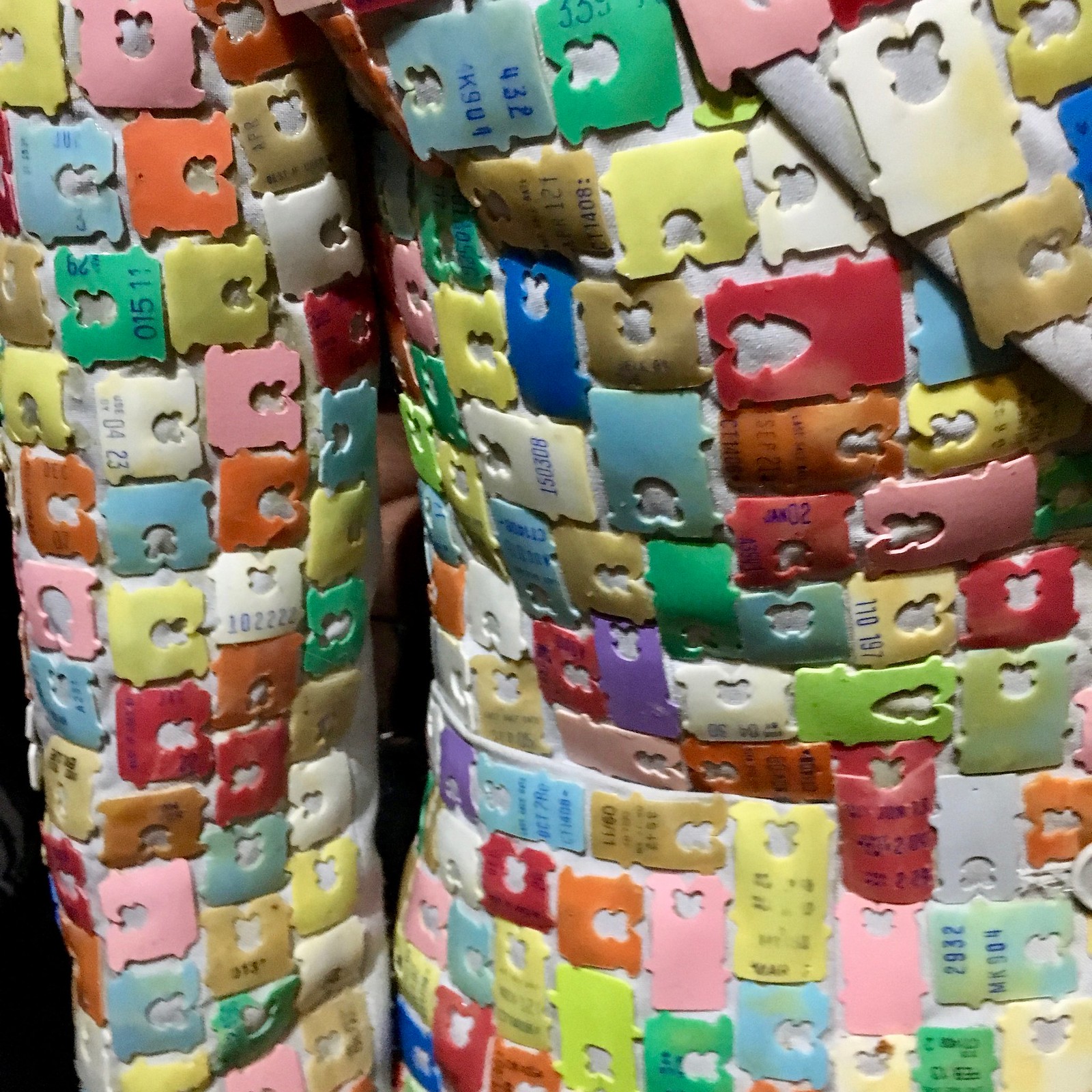
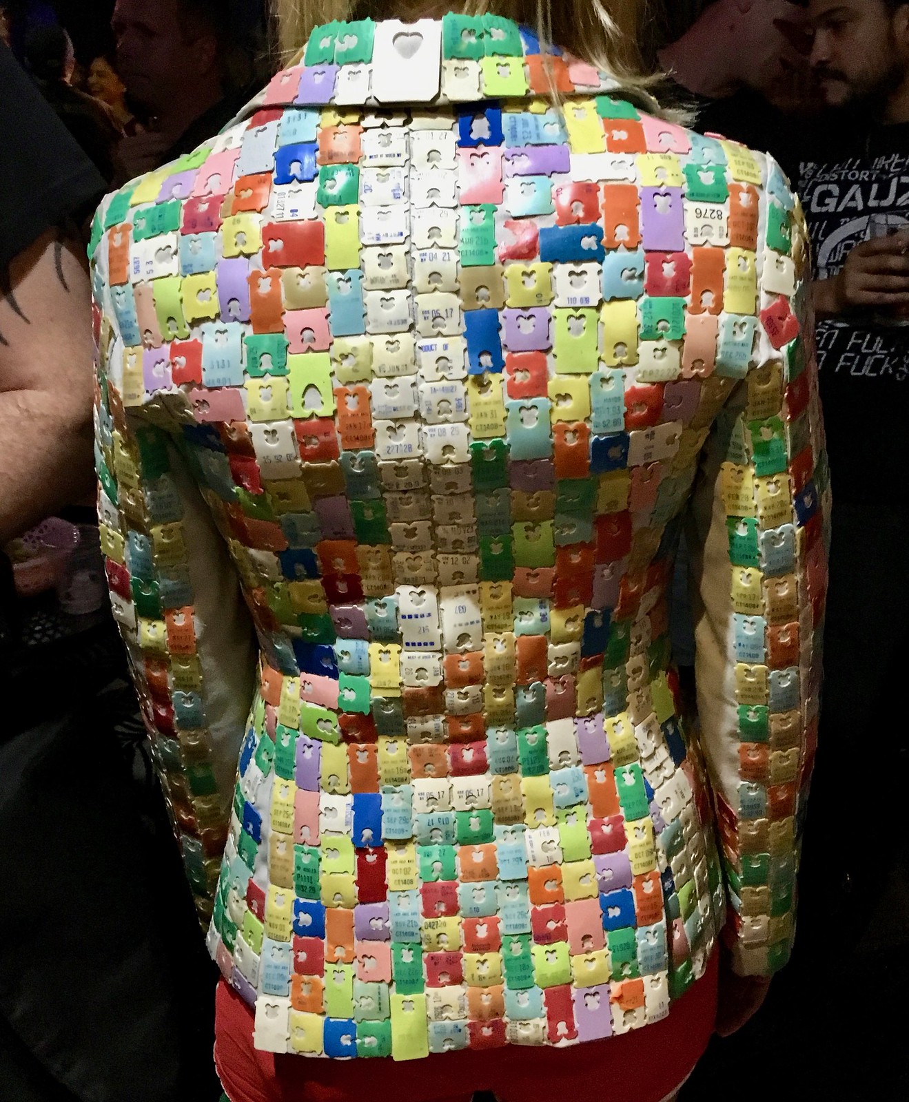
Longtime readers may recall that I wrote a story about the eternal tug of war between Kwik Loks and twist-ties for BusinessWeek back in 2013, so I was particularly enthralled by Daisy’s jacket, which she made herself. So cool!
ESPN reminder: In case you missed it yesterday, my latest ESPN piece features 10 things you might not know about the Astros’ classic rainbow uniforms. Check it out here.
Naming Wrongs reminder: We’ve made adjustments to the wording of the Murph and Ted shirts, and have also added several new Rose Garden shirts (in addition to the ones we already had). Get the full scoop here, or just go straight to the Naming Wrongs shop.
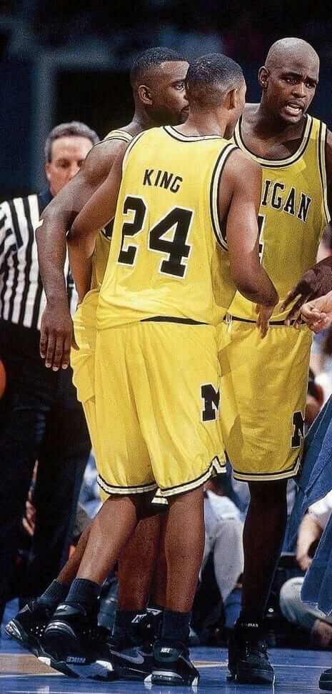
Research query: I’m trying to compile a list of players or groups of players who were uniform renegades or just eccentrics. The Fab Five and their black socks (shown at right) would be a good example. Others would include Joe Namath’s white shoes, LC Greenwood’s yellow shoes, Brooks Robinson’s truncated helmet brim, Frank Robinson’s stirrup extensions, Pedro Martinez’s slit sleeves, David Price’s squatchee-free cap, Manny Ramirez’s baggy pants, George Hendrick’s low-cuffed pants, Hunter Pence’s high-cuffed pants, Ezekiel Elliott’s crop-top jersey, and a lot more.
As you can see, some of these involve making modifications to the uniform, while others involve adding accessories. Some were influential and others were just limited to the one player. Some involve players that are currently active and some are from decades past. I’m interested in as many of these as we can come up with. Feel free to post them in today’s comments. Thanks.
The Ticker
By Paul

’Skins Watch: Back in 1963-64, there was a minor league hockey team whose logo showed a savage Indian marauder. The ironic thing is that the team was called the Denver Invaders (good one from CityBuffPete). … As had been expected last week’s Supreme Court decision allowing trademarks to be granted to potentially offensive terms means the ’Skins will retain their trademark rights.

Baseball News: The Yankees’ roster currently includes four players named Tyler. That prompted a really fun piece by longtime Uni Watch pal Tyler Kepner. … Unusual to see a tequila sunrise motif on a road grey uni (from Stan Capp). … This is pretty awesome: The Potomac Nationals are giving away a Tommy John surgery statue thingie (from @VictoryCB). … Lederhosen-style jerseys next weekend for the Bismarck Larks (from Jordan Oster). … D-backs SS Ketel Marte came to bat yesterday with the size sticker still on his throwback batting helmet.

NFL News: Here’s a really good investigative piece about that ongoing scandal involving game-used Giants gear and Eli Manning. It’s long but really well-written, and it provides a good look at all the corruption in the modern memorabilia scene. Highly recommended reading (from Tommy Turner). … Check out this shot from a 1959 Cardinals/Rams preseason game. Looks like Ram No. 58 has a white outline on his numbers while his teammates do not. According to the mighty Gridiron Uniform Database, the Rams used the outlined numbers in 1957 and the 1958 preseason, but not at all in 1959. So assuming the date of the photo is accurate (always a bit of a leap with Getty photos), No. 58 was probably wearing an old jersey carried over from 1957 (good spot by Eric Bangeman).
College Football News: New uniforms for Lamar. … New uniforms for Monmouth (from Mark Mohrman). … The tequila sunrise look even extended to the Georgia Tech cheerleaders back in 1979. … In case you couldn’t figure out UNLV’s new logo, they’ve diagrammed it for you.

Hockey News: The official puck of the IIHF Inline Hockey World Championship is pretty weird-looking (from John Muir). … Speaking of the inline tourney, Slovenia appears to be wearing something akin to Cooperalls (from Bob Addison). … Whoa, check out the amazing jersey worn by the Minnesota State Mavericks in the early 1980s! (Big thanks to Paul Allan.) … New uniforms for the Knoxville Ice Bears (from Mike Campos). … Players at the Penguins’ prospect camp were wearing Reebok practice jerseys yesterday. … Here’s a good look at the Vegas home and road uniforms together (from Patrick Thomas).

Basketball News: The Mavericks will have a darker shade of blue this fall. … The Knicks misspelled Frank Ntilikina’s NOB on his first practice jersey with the team — possibly because they reused an old Jeremy Lin jersey. … New floor in the works for the University of Jamestown (from Greg Enkers).

Grab Bag: Beginning tomorrow, hunters in Virginia will be permitted to wear blaze pink vests (from Gregory Koch). … The Team Sky cycling team is using NOBs, which is atypical for cycling (from Ted Taylor). … You can now own a mock turtleneck similar to the ones Steve Jobs wore for a mere $270 (blame Brinke). … The PGA website has a version of apparel tracking called “The Style Insider” (from Rex Henry). … I still call it the Tappan Zee.
The Independence Day weekend unofficially begins this afternoon for many people. If you’re traveling, travel safe. And for our Canadian readers, happy Canada Day! Phil will be here tomorrow and Sunday, as usual, and I’ll be back on Monday. See you then.
Hockey Uni-Eccentricity: Wayne Gretzky tucking half his jersey into his hockey pants.
That is the one I immediately thought of as well. Current NHLer, Sidney Crosby having his Reebok sweater tailored to make the back hem straight instead of curved.
Evgeni Malkin has the same tailoring, and it’s straight on the front as well for both players.
For Gretzky, his quirk actually had an effect on another trend: maker’s marks. Since they were just starting to appear in the early 1980s, and their position was normally on the right side of the jersey’s tail, the mark would get obscured when Wayne tucked his jersey in. So Nike, who made the Oilers’ jerseys from 1982-1989, switched their logo’s position from the right side to the left in 1983. It remained that way even after Wayne was traded to the Kings, although when CCM took over in 1989, their logo went back to the right side.
CCM duplicated their logo on the left side for Gretzky’s Kings and Blues jerseys, and Starter did the same when he was with the Rangers.
Hockey eccentricity:
Remember Butch Goring wearing that same odd helmet as a pro that he wore as a youngster?
link
link
Wearing the same helmet at age 31 that you wore at age 12? That just doesn’t seem right at all.
Speaking of helmets, I actually liked the Jofa 366! And here’s another quirk: Mario Lemieux switched from the Cooper SK2000 to the 366 for the 1991-92 season, sticking with it until his first retirement in 1997. In that time, he scratched the 3 off of the model number on the front bumper, so it just read “66”. So he had his jersey number on the front long before the NHL made it a requirement!
Mark Messier wore the same “Tron” helmet throughout his career. I once saw a story that when Cooper quit making that model he arranged to acquire the remaining stock for his personal use.
I think that Chris Osgood may have been the last NHL player to wear the SK2000.
That reminds me of John Wetteland, who wore the same ratty old cap for years, even having it dyed when he changed teams (as well as having various patches and such added at times.
Also, there was a time when Jim McMahon had a battle with the league over writing messages (including one supporting the Juvenile Diabetes Foundation) on his headband.
How about Ovechkin wearing shorter sleeves and having his elbow pads printed with the jersey pattern
Oops, should read all the comments. This was mentioned by Adam w
RE: Research Query. Didn’t Deion Sanders tailor the sleeves of his Reds jersey to the point where patches had to be moved to the deltoids?
link
And who can’t forget Ted Kluszewski!
link
Deion Sanders did that to his road jersey in 1997 to commemorate the 50th Anniversary of Jackie Robinson breaking Baseball’s color barrier. The sleeves on Robinson’s uniforms were similarly short.
He also wore high-cuffed pants and low stirrups to complete the Robinson-tribute look. Deion couldn’t alter the Reds’ home jersey because they were wearing vests at the time. The rest of the team liked the look and appreciated the tribute, so all of the road jerseys were altered.
The rest of the team liked the look and appreciated the tribute, so all of the road jerseys were altered.
It’s a little more complicated than that. The National League office (which still existed at the time) ruled that Sanders couldn’t alter his sleeves because that made his jersey different from everyone else’s. The rest of the team decided to alter theirs in solidarity.
Uniform Eccentrics/Renegades
Gretzky – tucking his jersey in on one side
Cruyff – Adidas shirt with only 2 stipes
MLB Uni-Eccentricity: I don’t remember who started it (or if it still happens), but the Brewers untucking their jerseys as soon as the game is over representing something like completing a hard day’s work.
Mike Cameron started that.
1959 Rams: The player behind No. 58 is also wearing the out-dated jersey (no. 40?). That makes two…
Some members of the Philadelphia Eagles wore black shoes ‘commissioner’s will be dammed’ during the Buddy Ryan days as quoted in this article about the 1989 Bounty Bowl vs the Cowboys.
link
Uni-eccentricity; Ovi’s custom elbow pads / sleeve roll ups
Proofreading: “Back in 1964-64”
Fixed.
Don’t forget Andre Ethier who is breathing a little eathier!
Eccentricities: Brad Marchand’s super short sleeves, and holey glove palms.
This used to be illegal – may still be. I used to do it to be able to grab hold of my opponent’s jersey. The refs would check, so we started just filing down the leather with an emory board until it was thin but still there…that way we didn’t get an “equipment modification” minor penalty for 2 minutes. Same as the stick curve…
Jayson Werth’s sleeves always appeared to be custom/extra long to me
link
link
Just look how much space is in between the shoulder and the sleeve patch!
Re: Research query
Alex Ovechkens sleeves
Yellow laces too
The Fab Five made other uni waves as well. To protest how Michigan and others were making money off their likeness, they wore their shooting shirts inside out, so they appeared just as plain solid blue shirts without the word “Michigan” on them. This would portend the trend of using warmup gear to make political statements (e.g. “I can’t breathe”), which is so common now it’s become completely ineffectual.
Uni eccentric Phil Esposito and turtleneck under jersey
A few goalies don’t wear socks under their pads. On a personal note, my daughter who is a hockey goalie some times wears 2 different color socks under her pads.
I’m not sure if this is “eccentric” or just fashion-forward, but Willie Mays and Tito Fuentes started the skin-tight uniform trend by taking their baggy flannels to a tailor and having them altered to be more form-fitting. Derek Bell did just the opposite, bringing back the baggy look in the early 2000’s by wearing jerseys and pants that appeared to be about three sizes too big.
Carl Yastrzemski did something similar to Brooks Robinson’s helmet alteration. When he started wearing a helmet with an ear flap, it looks like he took a hacksaw to cut the front part of the flap off – I assume it was bothering his ability to see a pitch.
Yaz also modified the earflap on his helmet by making the ear hole larger. I forget the reason why though.
I thought Brooks had only modified the bill of his batting helmet.
Jim Burt from the NY Giants modifying his jersey to make it extra tight.
Ted Kluszewski going sleeveless
Renaming bridges strikes me as a particularly futile exercise as you are flying in the face of commuters’ habits and the routines of people who might be responding to emergencies. I wonder how many folks get lost by their GPS instructing them to take the “RFK Bridge” while they drive in circles around the Triborough.
I suppose that depends on the original name versus the new one. The Triborough bridge was perfectly named to begin with, and at least someone will still call it that as long as I’m on this earth. However, renaming the Sixth Street Bridge the Roberto Clemente Bridge is a huge improvement, and seems to have stuck.
I would suggest “Pistol” Pete Maravich. His socks always drooped down around his ankles.
Mark Brunnell’s “Redskin” jersey. Sean Taylor’s and Devin Hester’s socks.
Ted Kluszewski, MLB, w/ no shirt under his vest/altered shirt sleeves.
Fun article about the rainbow uniforms. But that first paragraph is a sweeping blanket statement. I may dislike the those uniforms more than any of the Padres brown ones. And that’s saying a lot!
I found that a rash declaration, my own self. That uniform has always had millions of detractors!
I agree, but I think in Paul’s defense when someone uses a term like “everybody” like this, it’s understood not to mean literally every person in the world.
It does seem true that back in the 80’s, the majority of fans thought they were ugly and tacky. I remember a friend whose little league team adopted the look complaining about having to wear them.
Now, it does seem that most fans like the look. Funny how time changes tastes.
You’ve got the Pedro sliced sleeves, but who could forget the Pedro Portal?
From the NBA, Michael Cooper’s socks, which were even high for the era.
Porthole, not portal!
d’oh
Oh goodness, this could be fun.
Rajon Rondo’s upside down headband
Gary Sheffield wore size large batting gloves but insisted on special XL labels
Marc-Andre Fleury’s yellow pads from Cape Breton…kept them even though the Penguins were in Vegas gold by then
Martin Gerber got hot after getting traded so he kept his plain black mask and never wore his new paint job he would have been waiting on…so he became Darth Vader
Patrick Lalime always had eyes on his mask…actually started as young Penguin chick eyes not all the way out of the shell, but then it took off as Marvin the Martian
I’m so geeking on Daisy the Chicken Queen’s jacket! Nothing less than heroic.
Regarding the inline(roller) hockey puck and pants, that is the standard uniform. There’s nothing at all unusual about the puck, other than the logo.
Some NBA player tied his wedding ring to his shoes…that became a problem when he gave away his shoes to a kid fan one time.
Marc Jackson perhaps?
That highly annoying, unavoidable popup ad is still plaguing the site when I visit on my iPhone. It’s perhaps the most effective way to drive traffic away from here.
Screen shot?
Notice in the picture of Jimmy King and Chris Webber that each has the M on their shorts in a different spot compared to the other. King’s M is midway between the waistband and hem. Webber’s M is just above the hem. This inconsistency is visible throughout the Fab Five era and was spread throughout the team.
John Stockton’s short shorts immediately come to mind. He might’ve been the last player to wear shorts above the knee.
Also… Ed McCaffrey’s shoulder pads (or lack there of), Joe Namath’s sideline fur coat, Tom Dempsey’s square cleat, and Gerry Cheevers’ goalie mask (he marked it with stitches every time he got hit, he basically started goalie mask designs).
Do barefooted kickers in football fall under your purview?
John Stockton stuck with shorter shorts longer than any other NBA player, but Isiah Thomas (the original Pistons’ version) wore shorter & tighter shorts than anyone else in my memory
Re McCaffrey: I also remember an interview with him in which he said he removed a layer of fabric from his pants to make them lighter. I’m assuming the pants were somehow “two-ply” and he had the inner ply removed. If you look at some photos of him, the pants do look thinner, almost like second skin. he thought the lighter pants would make him faster and more agile.
McCaffrey took the inner lining from his football pants that would’ve held in the thigh and knee pads.
Was it George Hendrick that made the pajama pant look popular? Curse him. And Frank Robinson popularized the high, cut stirrup look.
In the early 70’s Falcons QB Bob Berry wore a comically large double bar facemask.
Bob Griese wore eyeglasses, but weren’t there one or two glasses wearers that pre-dated him?
Mark Kelso and Steve Wallace wore those helmet caps (extra outside padding)
link
One uniform quirk I like personally is Bobby Orr removing the laces from the neckline of his Bruins jerseys in the early 1970s.
That reminds me, Tuukka Rask similarly went without the jersey laces for a bit. He wears them now…wonder if that was a mandate from the league.
Also, Ryan Miller had a very special way of doing his jersey laces. Instead of tying the bow, he fed the slack back through the other side a second time…I’ll see if I can google that, but google helpers should zero in on his Buffalo time after dropping the slug.
Johnny Unitas’ high tops
Re: Kwik-Lok vs Twist Ties – that reminded me of my dear, departed grandma. She lived in a mobile home the entire time I knew her and she had a stash of several years worth of Kwik-lok thingies and Twist Ties stored in separate bread bags. She even had a bread bag stuffed with bread bags.
Good stuff!
R/
SWells
The Vegas sweater logo would look better if the Knight’s helmet was surrounded by red, since it would unify the accompanying red stripes instead of making them look as if they were tojssed into the mix on a whim.
Sean Kane’s work is ninety percent awesome. The other half is stupendous.
I’m not sure about adding it to the logo, but the waistline stripes could certainly use a touch of red.
The red stripe ties in with the shoulder patch that isn’t often visible on many photos. It’s subtle, but does help the red stripe not look so out of place.
Yoenis Cespedes’ neon compression sleeve
Hockey eccentricities:
Puttin’ on the foil!
(link)
Al Arbour wearing glasses on the ice in the pre-helmet days.
link
Football Uni-Eccentricity: Former Steeler DE Brett Keisel liked Nike football pants (I assume they supplied BYU uniforms while he was there) so the Steelers equipment staff would sew a Reebok logo over the Nike swoosh to meet NFL uniform regulations
Scott Erickson wore solid black socks while with the Twins, when everyone else was still wearing stirrups. Obviously the solid socks look caught on (unfortunately).
Actually, Erickson wrote stirrups. He just pulled them way down. link
The U.S. Justice Departmet officially dropped the trademark case against the Washington Redskins. It seems obvious now that there will be no name change.
I recall Paul saying that he felt that within five years the Redskins would have a new name. As it appears Paul was incorrect, will he comment on his prediction?
I’m fairly certain I never predicted outright that the name would change within five years of a certain date. I think what I probably said was something along the lines of “It’s not going to change this year or next year, but it’s entirely possible that it will change within five years.” (If you can find whatever it is that you think I said, please share it with us.)
In any case, I do agree that the momentum for the name change has stalled somewhat, and that the time frame is probably going to be longer. But I do not agree that it is “obvious now that there will be no name change.” For one thing, the trademark case was always a side issue, never the main issue. (That’s not to say it doesn’t matter — of course it does, and of course it’s a win for the ’Skins, although not a determinative one in my view.) More importantly, things change. One change, for example, is that it appears increasingly likely that Chief Wahoo is going to be mothballed next year or the year after, which will put renewed pressure on the NFL and the ’Skins.
If you’d like to believe that the name will never change, that’s certainly your prerogative.
The name will change when Dan Snyder becomes convinced that it is financially beneficial to do so (or, alternatively, financially detrimental not to). At the end of the day, pro sports franchises are businesses.
Now, how well aligned Dan Snyder’s view of the financial impact of the ‘Skins name matches those of other experts (or reality, which is unknowable, at least with certainty) is another matter altogether.
Ezekiel Elliott’s crop-top? How quickly we forget. The original abs-bearing jersey wearer was definitely an Ohio State Buckeye. But it was Eddie George more than twenty years ago.
Sorry, but Eddie George wasn’t anywhere near the “original” crop-top jersey wearing player. Doug Flutie was wearing one during the “Hail Mary” and The U made it big in the 80’s and it was even worn before them by Herschel Walker in 1982 and some people in the 1970’s.
It’s been around for a long time, but it’s still recency bias to think that Elliot either “started” it or that it’s his “signature style.”
John Garrett’s extra long jersey to cover the 5-hole is my fave Uni eccentricity. Bonus points that it happened on the Canucks V jersey.
Love the bread clip jacket, wonder how they were attached? Hot glue gun?
I know it was for health/safety reasons rather than whim or preference, but does John Olerud’s helmet-worn-while-fielding qualify?
Buffalo Bills player Darryl Talley wore spiderman tights on his arms every game
link
link
Someone mentioned Carl Yastrzemski. When I was young I remember a television commentator referencing the extra large hole on the right ear flap that Yaz preferred so he could hear better. I’ve always remembered that and you can see some pictures on the internet.
I found a link that verified that Yaz had it custom made so he could better hear the strike count more clearly but still be protected from close pitches.
link
Love the Chicken Queen’s jacket. Need to know how she made it,or if she would make one for me to give to my wife
Uni-eccentricities:
Patrick Ewing’s t-shirt under his jersey while at Georgetown.
and Allen Iverson with the t-shirt with cut-off sleeves
Ken Stabler with the rip under his sleeves.
And Darryl Strawberry with wristbands of himself in the cover of SI.
Wilt Chamberlain wore a very unique headband. Only the front of the headband was terry cloth. The rest was a thin piece of elastic.
Don’t have a picture but I recall Wilt also wearing some sort of padded shin guards.
looks like he is wearing knee pads over his shins in this photo – link
John Corker wore yellow elbow pads while playing for the USFL Michigan Panthers, whose colors were champagne silver, burgundy and light blue.
link
I don’t know if he continued to wear them in the NFL or in the Arena League.
Uni quirks – someone else is more likely to remember just who it is, but there’s a current MLB player who removes the squatchee from his hat.
Paul mentioned David Price’s squatchee free cap in the paragraph.
Pitcher David Price does that. Says the squatchee hurts his head so he takes it off.
I know he’s not current, but Cliff Lee used to remove the squatchee from his cap.
Research query: Uniform Eccentrics/Renegades
Bret Favre’s jersey pocket for warming his hands.
link
LeBron James cut the inside seems of his sleeved jersey.
link
Dale Earnhardt Jr. has often worn a matte-black helmet and skeleton gloves, while most drivers wear helmets and gloves that match their suit.
link
Former Formula 1 driver Alex Wurz wore mismatched shoes.
link
Uni-eccentricities:
Mario Cipollini was a pro cyclist from the 90’s who popularized the trend of matching shorts and bike to the leader’s jersey in Grand Tours, which is fairly common these days. Also used to wear some outrageous cycling skinsuits during time trials that did not match his teammates skinsuits. That one didn’t catch on. Both examples can be found here (NSFW warning, you’re going to see a lot of man thigh and side-butt if you click this link):
link
Eccentrics/Renegades
I am sure you have this one if not you do now. Handford Dixon and Frank Minnifield spray painting their shoes Orange for the Browns and tagging the Defense as the Dawgs. link. link
What about Morten Andersen wearing that 70s style face mask in the 2000’s?
Toni Fritsch and Scott Player with drooping facemasks:
link
link
And Player was the last of the single bar wearers.
Eccentric/Renegade: Earl Weaver’s cigarette pocket.
Sorry if already mentioned: Benito Santiago’s 09?
Designated hitter Willie Hoton kept the same batting helmet and painted it each time he was traded.
Fred Biletnikoff tapping both arms from his wrist to his elbow so he could cover himself with stick’em (before they changed the rules on that).
Willie Horton’s henley collar on an otherwise V-necked Mariners’ team.
Here’s an interesting uniform renegade for ya,which has always bothered/intrigued me a bit:
The Boston Bruins behemoth (6’9″) defenseman, Zdeno Chara. Chara has in recent years favoured black tape for his socks (while most playes stick with clear, or at least match white tape with white socks, or black with black). However since the Bruins wear yellow socks with their home uniforms his black tape in essence adds another black stripe on the yellow socks, giving him one more sock stripe than the rest of his teammates! But with his height it is almost excusable, and in some ways adds a bit of balance to his overall on-ice look. link
Interestingly he does match white tape to white socks with his away uniform.
link
Next season, with the B’s switch to black socks with their home uniform, this will be a moot point, but to me at least is an interesting footnote in hockey fashion.
link
“Back in 1963-64, there was a minor league hockey team whose logo showed a savage Indian marauder. The ironic thing is that the team was called the Denver Invaders (good one from CityBuffPete).”
Ah, yes! The Denver Invaders! One of my all-time favorite examples of really bad team branding that would never pass muster today. I actually link on Uni Watch a few years ago. This is just one in a series of inappropriate mascots in Colorado, some of which still exist link. Let’s just say it’s been a link in the state.
link
Ray Lewis wore cropped jerseys way before Elliot!
I love a good Seinfeld reference!
“You’ve experienced a lifetime of smoking in 72 hours.”
Tebows bible verses on his eye black
Joey Galloway wore a crop top for the Buckeyes long before Zeke.
David Wells wearing Babe Ruth’s hat for an inning in 1997: link
Dusty Baker this year, no New Era logo on cap: link
2001 – Mark Stepnoski in his second Cowboys stint, wearing his jersey from his first Cowboys stint: link and link (note the thicker TV number font and overall wear and tear)
Ken Singleton with a special polyester Expos jersey because he was allergic to wool!
Here’s one “expert” prediction that Georgia Tech will go with Nike once their Russell contract expires.
link
What really got me was this quote:
“Nike does those things not as a money maker, but to deepen relationships,” Jensen said.
I weep for anyone who actually believes that to be true…
Michael Cooper with his strings out of his shorts.
David Beckham and Peter Crouch (two English footballers, I mean soccer players) almost exclusively wear long sleeved versions of the shirts. I heard once that Becks likes to keep his tattoos off of the pitch for a cleaner look if he can, so as not to offend anybody. As for Crouch, not sure. And I say almost exclusively because you might find an odd exception.
Uniform eccentricities …..A few Redskins (maybe Shawn Taylor) would put yellow tape on his facemask to make it appear to be burgundy,yellow, burgundy, yellow….and Josh Cribbs used to take socks cut off the foot part and wear as like extra striping on his wrists.
Research Query: maybe not a popular one but a guy who always stood out to me for wearing his uniform a certain way was Khalil Greene. The former Major League shortstop would always have big sleeves and flowing hair. I emulated him in college and emulated his look as a result. You cant forget the white cleats with white pants he wore (soo well) at Clemson too.
Ken Griffey Jr. – his backwards baseball cap was a big deal at the time. Not on-field but was newsworthy and controversial to some who felt it was a sign he didn’t take the game seriously.
Current person would possibly be the Seahawks Michael Bennet’s tiny shoulder pads.
The A’s of the late 80’s (Bash Brother era) had stirrup stripes just stitched into their socks and they cut off at the shoe.
Dan Uggla with his ridiculously short cropped sleeves.
Dan Uggla had ridiculously short arms.
Earl Weaver’s cigarette pack pocket sewn on the inside of his jersey.
It looks like Gronk has upset Nike with his logo: link
I’d say it looks like a pretty similar logo, especially if you take the mirror image of Gronk’s logo.
I know golf is an individual sport, but when I think of a sports aesthetics eccentric, Payne Stewart always comes to mind.
And not sure if this counts, since it’s more of an equipment choice, but Petr Cech of Arsenal is the only keeper I’m aware of who wears a protective padded cap.
Shouldn’t the ode to Tommy John statue be left handed?
A couple off the top of my head:
– Allen Iverson wearing that sleeve on his right arm
– Joe Theismann wearing the single-bar facemask as a QB long after most non-kickers had ditched it.
I remember Steeler great Mike Webster being the first lineman I can remember wearing tight, shorted sleeves to show off the guns.
Here are a few more iconic sports figures for the “uniform renegades or just eccentrics”.
Pete Maravich with his floppy gray socks.
Michael Jordan baggy shorts. Before the fab 5, since they wouldn’t have worn those if not for MJ.
Payne Stewart knickers and cap.
+1 for Jordan’s shorts. Amazed it took this long to be mentioned.
Surely we should consider the untucked Marquette basketball jerseys.
No tape on Bobby Orr’s stick.
link
Greg Pruitt’s tearaway jersey.
link
Fred Biletnikoff and his sliced up sleeves
link
Jackie Slater’s crazy facemask
link
Dave Parker’s various face masks
link
Henry Boucha. First NHL player to wear a headband.
link
link
link
I guess it’s not terribly eccentric now, but add Cameron Maybin to the list of well-above-the-knee pants wearers: link
Better link here: link
Is that University of Jamestown in North Dakota? I know it’s their colors, my mom lives there, but I can’t quite tell. But I’m like 95% sure.
Wide receiver Henry Ellard’s long baggy sleeves while playing for the LA Rams in the 1980s.
link:
I’d buy an “I Still Call It The Tappan Zee” Naming Wrongs shirt. Or an “I Still Call It The Triborough” shirt.
Kurt Rambis in glasses, Horace Grant in goggles, & Eric Dickerson with a headband and rec specs.
Kareem Abdul Jabbar had goggles long before Horace Grant.
Uniform eccentricity in the CFL:
Flamboyant DE Nick Hebeler used to wear his unique solid orange shoes during his time with the BC Lions:
link
Then when he joined the Saskatchewan Roughriders, he wore solid green shoes:
link
Would adding decals of shoe logo over tape from ’80s NFL (Payton with ‘Roos, etc) count?
Let’s not forget the 80’s Chicago Bears. They were pioneers at the now “lineman cut” jerseys. They actually used tape, and rolled up their sleeves under their armpits.
link
In 1974, Johan Cruyff was sponsored by Puma which led him to wear a Dutch Adidas uniform with only two stripes. link
Also in soccer, Eric Cantona typically wore a Manchester United jersey with the collar popped.
link
Kareem’s goggles!
Two old skool ice hockey eccentricities:
1. Bill Durnan of the Montreal Canadiens wore two catching gloves (no blocker) and was ambidextrous. He would switch his stick back and forth, and even wore the C for the Habs.
link
2. Jacques Plante wearing a mask as a goalie–considered eccentric as hell back then.