As you may have noticed in the left sidebar, our friends at Grey Flannel Auctions are running another catalog auction. Here are my picks for some of the most interesting items being offered:
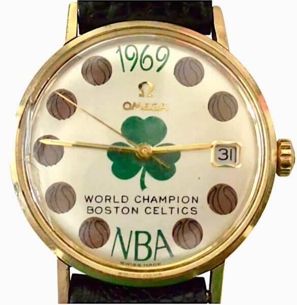
• This 1969 Celtics championship watch (shown at right; click to enlarge) is a real beauty, eh?
• Speaking of the Celtics, I love the gold yellow-outlined lettering on the front of this beautiful Celtics warm-up top.
• Here’s another Celtics item — a 1983 Kevin McHale jersey. The interesting thing here is that they created the lowercase “c” for his McNOB by cutting an uppercase “C” and removing part of the vertical stroke.
• Sorry to be so Celtics-centric, but just one more Boston item: this 2008 jersey, back in the days when they were using the snowflake motif on the NBA logo for games on Christmas Day.
• This 1975-76 Nuggets jersey has something unusual: The NOB was applied on a nameplate, rather than via direct-sewn lettering — uncommon for a pro basketball jersey.
• Whenever I see a red Sonics alternate jersey, it just doesn’t compute. I’ll never think of that as a Sonics color.
• Oh baby, check out the gorgeous crest detailing on this 1955 Maple Leafs jersey.
• Really like the lettering on these New York Giants trophy footballs. The visual style feels more like something from the 1950s or ’60s, not the late 2000s.
• Here’s something interesting: a Saints tearaway jersey. According to the listing, “This is a lightweight cotton tear-away jersey which may have been worn in the preseason necessitated by the excessive heat in New Orleans.” Hmmm. It also describes the numbers and NOB lettering as being “painted on.” Note also that the NOB has a gap running through it. Weird.
• Love love love the chest patch on this old Chicago Cardinals jacket.
• Speaking of NFL jackets, check out this gorgeous Pat Patriot varsity jacket. Tasty!
• Here’s something you don’t often see: a 1970s California Sun uniform from the old WFL.
• You may have seen Ken Griffey Jr. uniforms before, but you probably haven’t seen this one, which he wore for Father-Son Day in Cincinnati when he was about five years old!
• This old Steve Carlton Phillies jersey is Exhibit A for why teams with pinstripes should never use nameplates for their NOBs. I hate how the plate disrupts the pins — grrrrr.
• We all know that Orioles skipper Earl Weaver famously had a little cigarette pocket sewn into the inside of his jerseys. But according to this listing, Frank Robinson also had the inner cig pouch when he coached for the O’s in 1979. I’d never heard that before. Sure enough, you can see the outline of the pouch on his front jersey number.
• Oooh, look at this magnificent California Angels jacket. Love that giant state-halo logo on the back. Really miss that logo.
Want to see more? You can browse through the entire auction here.
Click to enlarge
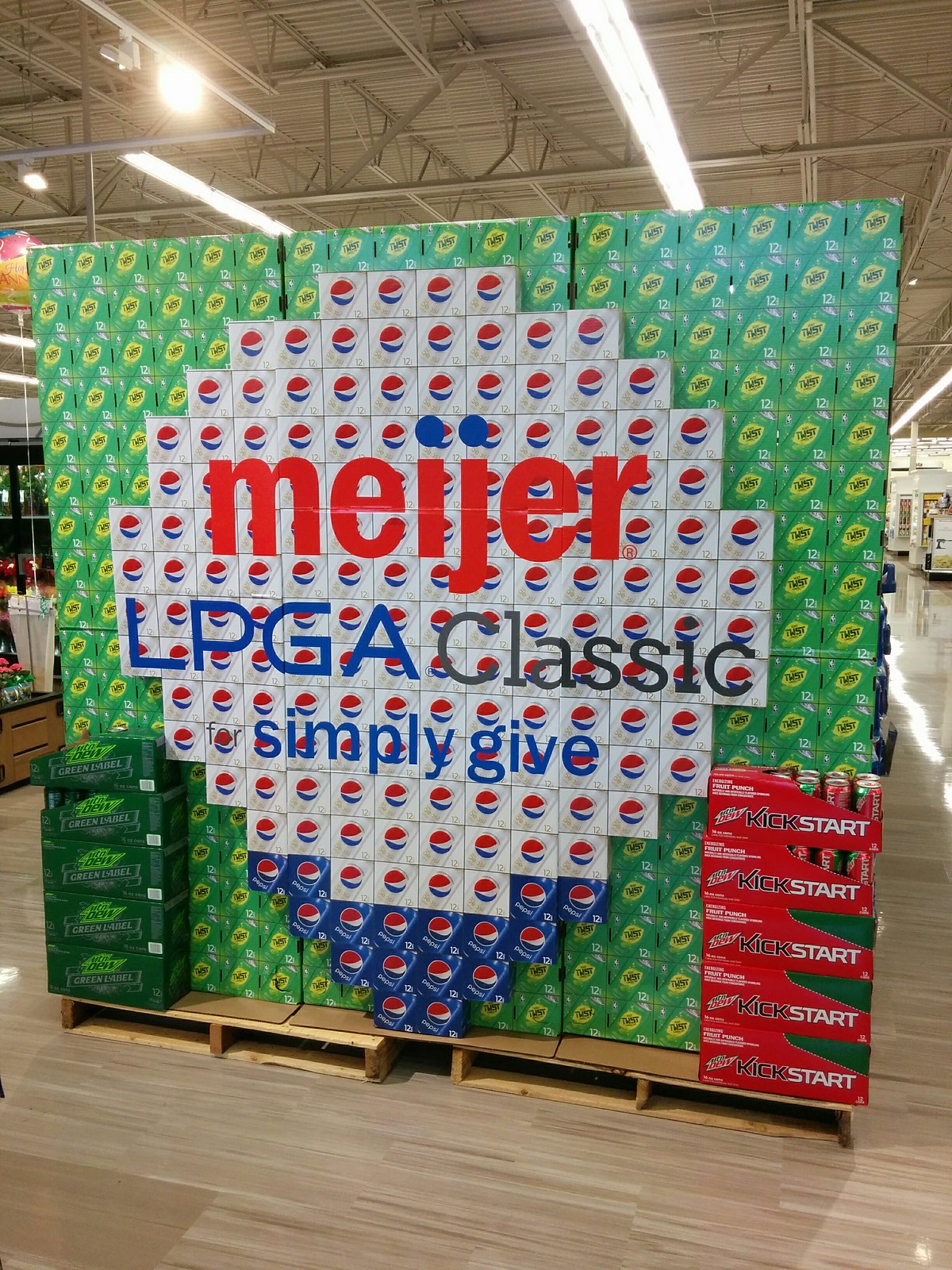
Is nothing sacred? Reader John Chapman recently spotted this soda box design at a Michigan supermarket. Or at least it appears to be a soda box design. If you look closer, it turns out to be cardboard facing meant to simulate a soda box design:
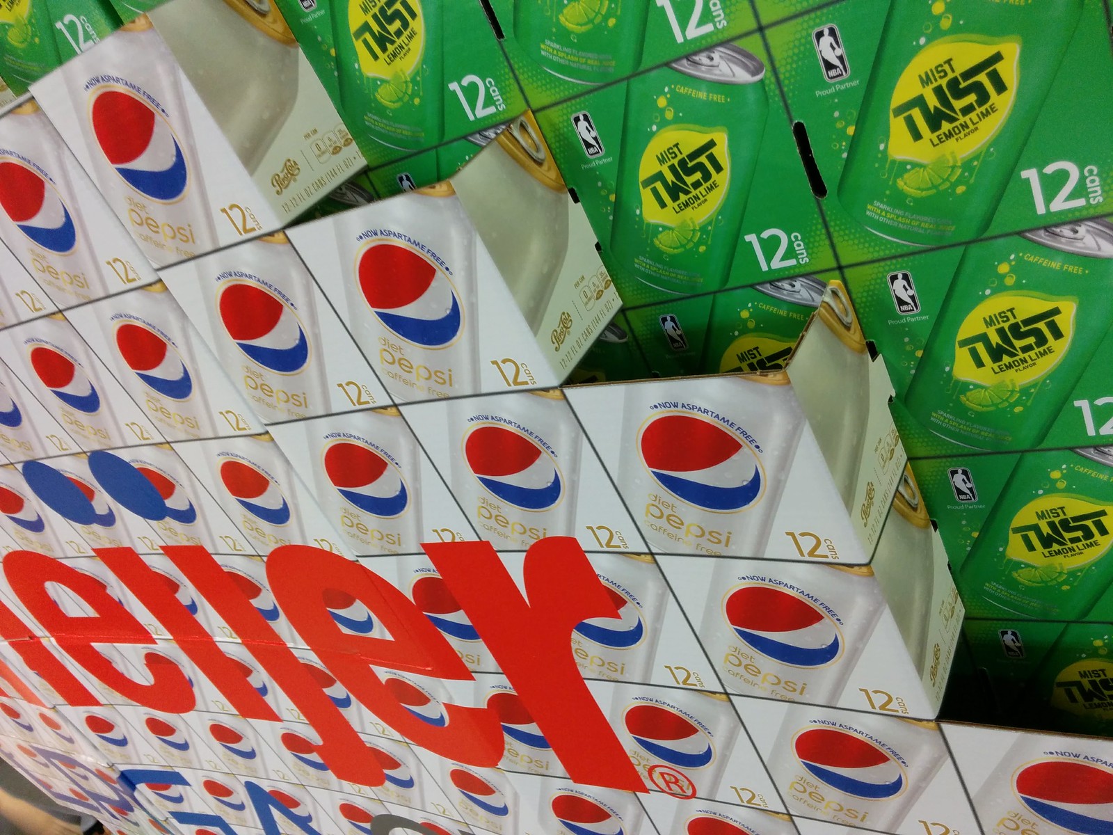
There’s something seriously weird about that. Like, if you’re going to make a promotional sign, why not make a fancy, pro-looking sign instead of a sign that mimics a soda display? It’s also pretty disappointing: Supermarket workers turned commerce into art, and now Pepsi has co-opted that art form and turned it back into commerce. Sigh.
Naming Wrongs reminder: In case you missed it earlier this week, the new incarnation of Naming Wrongs — the T-shirt project that pushes back against corporate-named stadiums and arenas — is now up and running. Full details here, or you can skip the explainer and go straight to our new Naming Wrongs online shop. (Note that it runs for three pages. Some people have told me that they didn’t initially notice the little “2” and “3” indicators at the bottom of the first page.)
Question Time reminder: I’m currently accepting submissions for a new round of Question Time. Details here.
The Ticker
By Paul

’Skins Watch: A new bill being considered in the Massachusetts state legislature would ban Native American mascots from being used by public schools (from Paul Friedmann). … The Canadian legal case seeking to prevent the Indians from using their team name and Wahoo logo in Canada, which was initially derailed last fall, is now moving forward (from Matt Bryce).

Baseball News: Faaaascinating article on how MLBers will sometimes drop their bat in a specific spot in order to interfere with possible plays at the plate (thanks, Mike). … The jersey that Giants P Hunter Strickland was wearing when he recently plunked Nats OF Bryce Harper, setting off a big brawl, was up for auction on MLB’s website. Then they pulled it from the site, and now it’s back but without any mention of the brawl. Weird (thanks, Brinke). … A restaurant at the Minneapolis airport features an MLB logo made from 3,000 bats (from Benji King). … Teenage Mutant Etc. jerseys this weekend for the Indianapolis Indians. … Yankees P Dellin Betances wore a Jumpman undershirt beneath his jersey last night. … Check out these old photos of A’s 1B/DH Deron Johnson, submitted by Tristan Ridgeway. In the shots where he’s wearing a green jersey, his NOB is arched while everyone else’s is straight. And in in the white jersey photo at bottom center, his 7 has serifs while Mike Andrews’s 7, at far-left of the same photo, does not. Did Johnson have his own stitcher? Also: In that same photo with the white jerseys, you can see Billy Conigliaro’s “Billy C” nickNOB. Here’s a better view of that. His brother Tony wore a similar nickNOB during his time with the Angels.

Pro and College Football News: The Edmonton Eskimos will retire No. 13 for one game Sunday, in honor of the late Larry Highbaugh. QB Mike Reilly, who normally wears No. 13, will wear No. 0 instead (from Moe Khan). … Was Bengals RB Archie Griffin wearing mesh pants? Sure looks that way! Brinke, who found that photo, got in touch with former Bengals LB Reggie Williams, who confirmed that the pants were indeed mesh. “They were comfortable to wear but could rip,” Reggie told Brinke. I remember one game, Don Bass had his torn so bad, his butt was exposed, showing only a jock strap.” … New cleats for Texas.

Hockey News: A bill is moving through the Connecticut state legislature to allow for Hartford Whalers license plates (thanks, Mike). … Love this old Bauer skates box festooned with NHL team logos. … Coolest jersey ever? Definitely in the running (from Mike Stevens). … New jerseys for the Kootenay Ice.

NBA News: The Bucks’ new D-League G-League team in Oshkosh, Wis., will be called the Wisconsin Herd (from Brian Kerhin). … The Pistons are selling some merchandise with secondary logos that I don’t think I’ve seen before (from Mike Cole). … The Pacers’ and Spurs’ caps for the upcoming NBA draft both provide confirmation of long-rumored secondary logos. … Faaaascinating story about NBA nets, including how they’re made, how often they have to be changed, and more. Great stuff (thanks, Brinke).

Soccer News: New home kit for Everton (from Jordan Baker). … Arsenal is looking for a new shirt sponsor advertiser (from Chris Bisbee).

Grab Bag: Pro golfer Cameron Tringale will be wearing camouflage for the FedEx St. Jude Classic (from Drew Stiling). … New graphics for the pit lanes at 24 Hours of Le Mans (from @dmoon). … Sen. James Risch’s shirt collar was askew while he was questioning former FBI director James Comey yesterday morning. … Meanwhile, Sen. Dianne Feinstein used the hearings to usher in the return of Seersucker Thursday. … The logo for Microsoft’s new Xbox Scorpio may have leaked. … The Summit League — that’s a D1 NCAA conference — is running a contest/poll to choose the league’s best uniform across all sports. … A graduating high school senior in Indiana who’s also a member of the Marines was not allowed to wear his Marines uniform at his graduation ceremony. The school requires graduates to wear the traditional caps and gowns. … I’ve always been fascinated by the different state highway sign designs. I’ve often seen them shown in a list format, but I think this is the first time I’ve seen them shown on a map (big thanks to Jay Mantis). … Justin Bieber says he’ll wear pretty much any team’s jersey (Brinke again). … Ever wonder why shorts cost almost the same as pants? Here’s why. Also, that article quotes the head of a fashion brand called Unis. Who knew? Not me (from Tommy Turner). … Here’s more info on Cal’s new deal with Under Armour (thanks, Phil). … Just do it: Last month it was reported that a Nike-funded project involving elite runners was shaping up as a doping scandal. Now the other shoe has dropped.
I worked at a grocery store for about three years, and it was actually the distributor that made the designs. He had a paper with instructions on how many of each type to put where. It was always fascinating to watch.
Right, that had become the norm in recent years. But the original soda art displays just happened on their own — organic creativity.
Dellin Betances, not Pineda
Fixed.
Unrelated note but … On a new clip of nba live 18 the pacers home uniforms have seitched the colors on the sides and reversed the yellow and blue. You can find the clip on operationsports.com
I’ve been told that that is not what their new uniforms will look like.
The Laval minor hockey jersey is actually the logo off their city flag. Pretty sweet word mark too. Best city flag I’ve seen.
The Laval Voisons were a major junior hockey team. Part of the QMJHL. They changed names, then relocated and are not the Acadie-Bathurst Titan. Here is a photo with Mario Lemieux wearing the jersey:
link
* correction – Voisins.
link
Proofreading:
“This 1969 Celtics championship watch (show at right; click to enlarge)”
– “shown” at right
“Sorry to be so Celtics-centric, but just more Boston item”
– “one” more
“Love love love the chest patch this old Chicago Cardinals jacket”
– “on” this old
“Faaaascinating story about NBA nets, incuding”
– “including”
Fixed.
Could the differences in the A’s Deron Johnson uni be that he was traded to Oakland after first few weeks of the ’73 season?
Amazing how the Whalers have endured all this time, there is an entire generation now that has never seen them play. I wonder what the leading factor in that is? The excellent logo? Local passion for the team? The lack of another major league team in that market?
I’ve actually been giving this a lot of thought lately. In some ways, I think, it’s actually more acceptable to celebrate the Whalers now than it was when the Whalers were a thing. My rationale is that since Hartford is smack dab between New York and Boston, most fans are and were primarily fans of those more established teams. I’ll bet there are fans who will buy and wear Whalers gear that wouldn’t have been caught dead wearing stuff from a regional rival back in, as I like to say, The Day. I was never a Whalers fan, but I’d wear a t-shirt now. It’s a great logo, especially in the original colors.
Just to clarify: Jon, you live fairly close to Hartford, right?
Bridgeport. More or less right between Hartford and NYC.
Thanks for the insight. I’ve always loved the logo. I can definitely see what you are saying. Lots of Rangers / Bruins fan in Connecticut. You don’t wear another teams colors, but now that they are gone its just a cool design regional pride kind of thing.
“…MLBers will sometimes drop their bat in a specific spot in order to interfere with possible plays at the plate.”
That’s called, “knowing the situation”. I
It’s not just for fielders anymore!
Proofreading:
“on this New York Giants trophy footballs”
“not the last 2000s”
Fixed.
Highway markers – several states have moved away from circles or squares to custom designs in the last 20 years.
The markers om the map are surely from James Lin’s routemarkers.com, one of the first road geek sites dating back to the mid 1990s.
I think it has come up before but “people who get it” being road geeks too is not surprising.
Lastly, I think Pennsylvania has the best marker, simple, distinctive and reflective of it’s state.
New Hampshire has a good argument too, but PA scales better to 3 digits.
IMO New Mexico has the best highway marker and it isn’t very close. Old Wyo ain’t bad either.
I’ve always liked Nebraska. No connection to the Cornhusker state other than having driven through a couple of times.
I love Utah’s signs. The Beehive State!
That map is outdated. North Dakota replaced the Indian head shield with a state outline last year.
Plus, the US shield is actually the older 1961 version and not the current version adopted in 1970.
After looking at the U.S. state highway markers, Looked up some information on Ontario’s highway signs.
“The King’s Highway” is well on its way to being phased out.
link
Wow, The Ball fam has nothing on the UNIS e-com shop. From what I can divine from perusing the images – Gold foil stamping is the reason for the top shelf prices?
Anything wth the wordmark UNI or WATCH is gold I’m telling ya!
The US played Trinidad and Tobago last night not Venezuela.
Correct. Neither the U.S. nor T&T wore the rainbow-colored numbers last night. Nor did Venezuela wear them in the linked photo. A completely erroneous item.
Sigh. Then what is shown in the photo?
I’m not saying you’re wrong. I’m just saying I passed along what was given to me.
The photo is showing the US vs Venezuela from June 3.
Videos of the US vs T&T game last night can be seen here: link
Oh — so the original identification of USA/Venezuela was correct. But it *date* was wrong.
Now deleted from Ticker because it’s nearly a week old.
US men did not wear rainbow numbers, per FIFA regs. The women wore them for yesterday’s friendly in Sweden, though.
Do you know why Pride numbers and some coaches looking like NASCAR drivers with the amount of ads on their shirts are allowed during friendlies?
Probably because Friendlies are controlled by the individual countries’ soccer associations, not FIFA. From FIFA Regs:
54.1 For all Matches, all forms of advertising for sponsors, Manufacturers (exceeding the extent of Manufacturer’s Identification permitted under Chapter VI above) or any third parties, of political, religious or personal statements and/or other announcements, are strictly prohibited on all Playing Equipment items used on, or brought into (permanently or temporarily), the Controlled Stadium Area. For the purpose of the FIFA Club World Cup, the participating Clubs may engage in sponsor advertising in accordance with the regulations or guidelines issued by FIFA for the respective edition of the FIFA Club World Cup
Tim, why do you think teams don’t wear advertising during friendlies?
Looking at that WFL Sun uniform had me all confused…. I was thinking, those pants just don’t look right…. turns out it’s because they never wore white pants. They wore orange both home and away. These must have been a mock up or prototype, because that certainly is orange and magenta striping :)
Hey, the numbers and striping are wrong on the jersey too… reversed of what they really were… hmmmm.
I would think they would mention Dave Roller (who wore #74 in 1974 and 75) if it were a true game/team uniform.
My guess it is a promo rig, Get it? #74 for the year 1974?
Mmm, yeah, thst makes sense… not so Dumb Guy after all :)
The WFL promo jerseys had #32 on them, not #74. I have New York Stars and Detroit Wheels jerseys with #32. Similarly all the XFL promos had #1 and the team name on back. I bought the whole set like a moron and resold it for 1/10 of its value.
link
Perhaps this is the Archie Manning jersey listed in the auction. This particular clip in the highlight package is from a 1977 Packers-Saints game in the Superdome.
Advertising is about pushing your product. The Pepsi thing is disappointing. But that is marketing- push your product out there for the consumers to see.
In the end it is no different than those whores at ESPN shilling anything and everything tied to their brand, other shows and their parent Disney at the cost of watching the event you -the viewer- tuned into see.
You are essentially using the “It’s just business” defense — which is no defense at all. Here, read this: link
This is another case where I 50/50 agree/disagree with Paul.
I think he’s right that “it’s just business” is used way too often to defend unethical, immoral, or sometimes downright illegal behavior.
On the other hand, making money is the point of business, in fact, corporations are legally obligated to make all decisions with the goal of making money for the shareholders. So sometimes it is a fair defense, if the decision being defended is within the bounds of legal and ethical behavior.
I think he’s right that “it’s just business” is used way too often to defend unethical, immoral, or sometimes downright illegal behavior.
Actually, Dan, if you bothered to read the link I provided, you’d find that my argument has nothing to do with illegal behavior.
My point is that some behavior can be unethical and immoral EVEN IF IT’S LEGAL. That includes corporations’ shareholder obligations. You always focus on an EXPLANATION for certain behavior but never address the idea of JUSTIFYING that behavior — there’s a difference. Please try to address that in the future instead of just falling back on the same tired “The point is to make money” clichés (which my link already addressed). That line of argument is, and has always been, a non-starter on this website.
First off Paul- don’t assume I’m defending Pepsi. YOUR error. I was attacking them AND ESPN in my opinion.
Second I can make any point I want. Just because you disagree with what you ASSUME I’m saying is your take.
Third- your board we get it- laud it over all of us.
But next time- assume noble intent.
Actually, I never said you were defending Pepsi. How would I (or anyone) ever say that, when you explicitly stated that you found Pepsi’s move “disappointing”?
I was responding to your next sentence after that: “But that is marketing- push your product out there for the consumers to see.” That is just another way of saying, “Hey, it’s just business. Whaddaya gonna do.” That is not an assumption on my part; that is the position you chose to take.
And then I provided a link that provides my response to that point of view.
What part of the phrase- “those whores at ESPN” makes it sound like I was defending? Again- your leap to defend YOUR point.
This is why you don get it.
RE: State highway signs.
I’ve lived in GA for the past few years and their state highway signs have always bothered me. They use the outline of their state but bloat it out to fit a triple digit highway marker. This bloating just looks so wrong to me!
The Tugboat Captain and I discussed that very thing during our recent Deep South road trip. We thought the triple-digit signs made Georgia look, shall we say, unflatteringly robust. The same is true of several other states that use the state-outline design motif for their highway signs.
Oklahoma, Florida, and Idaho all have good solutions to that problem.
The shape of Louisiana fits great in their design and works well with 3 digit numbers.
Paul, I’m curious what you think of the North Dakota highway sign. It features the number inside the silhouette of an Indian/Native American headdress – not exactly a naming wrong, but does it violate your concept of not appropriating an image without the group’s permission?
The Indian head sign is being phased out in favor of a standard state-outline sign. That happened about the same time U. of North Dakota changed its team names.
State of Washington State Highway signs are numbers inside the silhouette head of George Washington. Also disconcerting.
I don’t like using a line drawing of a state map on the sign. I would support a sign actually shaped like the state outline in certain cases. Could be nifty for Texas or Nevada. Of course that wouldn’t work so well for Alaska, Maryland or Michigan.
What’s the big deal with the XBox logo? I recognize the small x in a circle that I’ve seen for years, but am I missing something?
If you like state highway signs –
link
Gotta believe the 75/76 Nuggets jersey name plate is a way to save a jersey should the player get cut or traded. It was the dying days of the ABA and they probably only had 12 jerseys in total. Look at old pictures of the ABA’s Baltimore Claws playing exhibition games and you’ll see “Claws” stitched over old Memphis Sounds jerseys.
The local minor league pro hockey team uses nameplates for sewn-on names. The reason was that it was a lot easier to sew on letters on a 4×12″ nameplate than on a XXXXXL goalie jersey.
What a shame…3000 bats died to make that MLB logo.
or 300 short stumps of leftover wood were rounded over and died.
Anyone remember in Little League where the handle/knob of old bats were sawn off to use for “coathooks” inside the dugouts?
RE: Milwaukee Bucks/Wisconsin Herd
Per the sub-title, to order season tix for their G-League teams, you go to a site that uses “dleague”
All that money, yet too lazy to change or fix?
updating their twitter handle to @nbagleague would be a slight improvement from the current @nbadleague
The domain names gleague.com and g-league.com are being domain-squatted (by the Japanese “Grapplers League” and the Korean “Global League” respectively). The @nbagleague handle is taken by a “hidden” identity. The Twitter handle @GLeague is also taken as is @G_League. I’d think that until they secured those identities they’d want to keep the “D-League” name around in some form.
The Blackhawks’ logo on the Bauer box is about 15 years out of date.
Re: Massachusetts high schools using native mascots, I live in a quite affluent town in MA which uses such a mascot (a stylized head of a native chief). We had our 6 year old do a town day fun race and they gave t-shirts to the kids, and of course it had the high school mascot on it, ugh. so now I have to think of a way to make the shirt disappear
“Jersyes” in the Billy C item.
Fixed.
Also, re highway markers, I get Pennsylvania, but what is Wisconsin going for?
A sign that is legible. Road signs shouldn’t be pieces of art. They should be easy to identify and then read as you are driving and need to be able to get back to the task of driving. A task that seemingly more and more people are losing sight of how much concentration it actually takes.
I notice that US Highway signs are moving toward being just squares with the shield printed (vinyl cut out) on them, rather than the actual metal being cut into a shield shape.
I know, I know. It’s cheaper. But I don’t like it.
No sir, I don’t like it.
California’s the only state still using cutout US shields. The remaining 47 states with US highways have had the square signs for decades.
Virginia still uses cutout US shields.
Confused why the Pepsi display isn’t still art — just a different kind of art.
You are also seeing only part of the display. It’s huge.
The photo doesn’t show it, but there’s a “sculpture” of a golfer just beyond the “can wall” that also is supposed to look like it was made from soda cartons.
I was marveling at how they did it until I got up close and saw that it was specially cut and folded pieces. I confess that when I saw it, I didn’t think it was a sacred violation. I thought it was pretty neat. To each his own.
The event its promoting is an LGPA tournament that is actually a short walk from my house. It’s an LPGA event, but also a philanthropic effort — hence the “simply give.” title.
Meijer — the supermarket — is a family owned, Michigan-based company that famously gives back to the community, donating 6 percent of its net profit to charity.
“Simply Give” is the name of the company’s effort to help stock food banks, donating more than $26 million in the last decade.
Meijer – the supermarket – is a family owned, Michigan-based company that famously gives back to the community, donating 6 percent of its net profit to charity.
“Simply Give” is the name of the company’s effort to help stock food banks, donating more than $26 million in the last decade.
That’s all very nice, but I don’t see what it has to do with the issue at hand, which is the simulation of something real with something fake by Pepsi. That’s all.
Doesn’t really have to do with the issue at hand. I just thought it was interesting.
If you’ve got a minute, check out the Saints tear-away jersey item from Paul’s list of auction items.
Note that there is a black line through the MANNING name on the back of Archie’s jersey, basically splitting the letters in half.
Has this been noted before on Saints jerseys of that era? Any idea what’s going on here?
Given that the jersey’s likely over 40 years old, it could just be the effect of it being folded up in a drawer somewhere and the screen paint cracked.
Yeah, that’s probably it. Looking at it again, the line appears to be where the seam goes, so that’s probably caused the letters to crack over time.
And of course Paul did note this before, proving that I need to pay more attention. :-)
It looks like the name was screened on top of the seam line.
Praise to the Edmonton Eskimos for honouring Larry Highbaugh, who recently passed away. The Eskimos are 1 of the 2 CFL teams that do not formally retire numbers. However, Mr. Highbaugh is a member of the team’s Wall of Honour.
Larry has a couple of interesting team records that were set in the mid-1970s, that could not actually be matched in American football.
He has the team record for longest kickoff return – 118 yards.
Also has the team record for longest punt return – 116 yards.