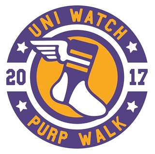
Hello there! Welcome to the 2017 edition of Uni Watch’s Purple Amnesty Day — or as I now like to call it, the Purp Walk. Today is the 11th anniversary of the first entry ever posted on this site, which by longstanding tradition is the one day of the year when I grudgingly acknowledge the world’s most accursed color.
People sometimes say I have “purplephobia.” But as I always explain, that’s not the case, because “phobia” means fear. I don’t fear purple; I loathe purple. If anything, purple should fear me.
What makes me hate purple so much? Short answer: a near-bottomless reservoir of good taste. Longer answer: I actually think purple in nature is quite nice ”” violets, plums, eggplants. But purple as a human-imposed design element has always struck me as tasteless and tacky. It’s the diva of colors, the Celine Dion of colors ”” loud, grandiose, never content to do just enough when it can do way too much.
And I’m not alone. As a culture, or even as a species, we seem to understand purple’s tackiness. Not a single U.S. state uses purple as one of its official colors, and neither does any sovereign country (at least according to this listing). It’s no accident that we rarely see a purple house or a purple car. Now if we could just eradicate purple clothing, accessories, and yoga mats too.
But do I think teams like the Vikings, Rockies, and LSU should stop wearing purple? Honestly, no. They chose their colors and now they’re stuck with them that’s part of who they are. Today — and only today — I salute those teams and their fans.
Purple Amnesty Day has three components:
1. Obviously, the site looks a bit different today, and so does my Twitter page and the Uni Watch Facebook page. I find all of this more than a little distressing (imagine your eyeballs being gouged with salt-encrusted razor blades), but I’m trying to tell myself that it’s therapeutic or something like that. Assuming I don’t slit my wrists in desperation at some point today, everything will revert back to normal at midnight. And not a moment too soon.
2. As always, this is the one day of the year when I’ll accept Uni Watch membership card orders with purple-inclusive designs. So if you’ve been waiting for the opportunity to order a card with a Ravens, Northwestern, or Lakers motif, now’s your chance. At midnight Eastern time tonight, the door will slam shut and you’ll have to wait until next year’s Purp Walk.
3. For the third consecutive year, we’re doing a one-day T-shirt offering. This one, like the last two, was designed by the great Bryan Molloy. Check it out (for all of these photos, you can click to enlarge):
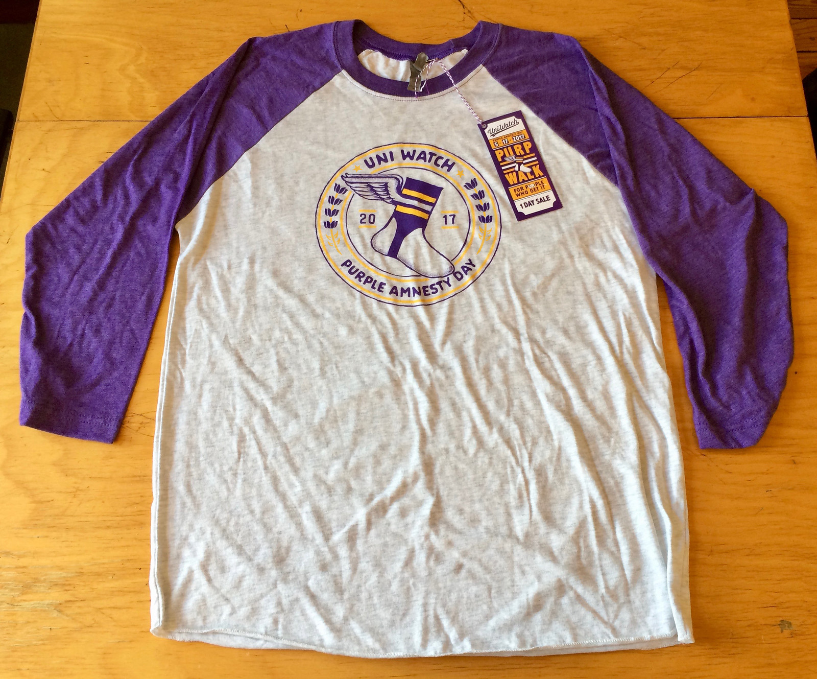
Nice, right? There are a lot of elements to this one, people, so bear with me here. One thing at a time:
• The shirt, as you can see, is a raglan-sleeved baseball shirt. The torso color is a light heather grey, not white.
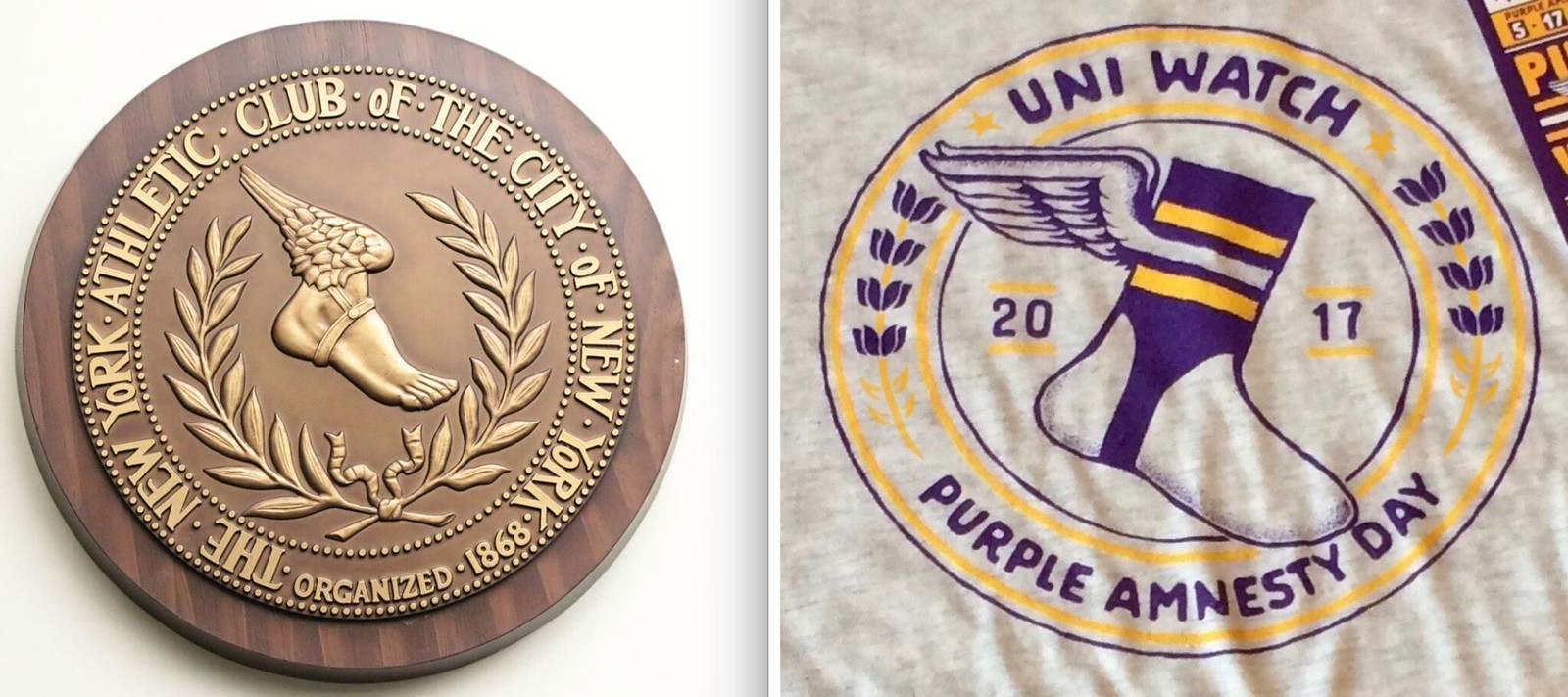
• The logo on the shirt was inspired by the New York Athletic Club logo, but with purple lilacs instead of laurel wreath:
• The shirt itself is super-duper-soft. Seriously, it’s about the softest cotton shirt I’ve ever felt. I’d love to wear it 24/7 except for, well, you know.
• Unlike our other shirts, this one is not being sold via Teespring. Bryan is selling it on his own website. That’s because…
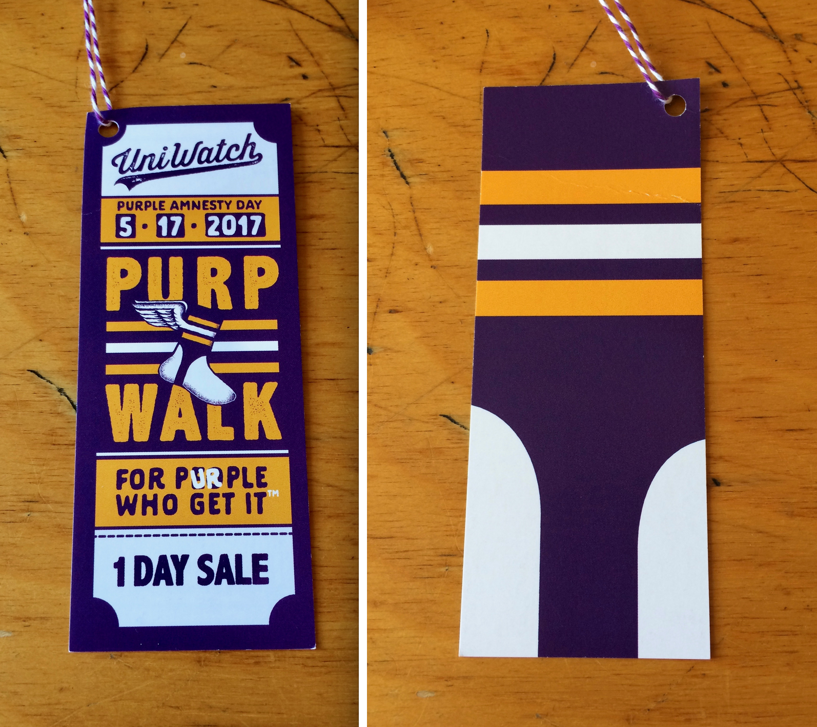
• Each shirt includes a hang tag, which will be attached to the shirt with a loop of purple-striped baker’s twine. Bryan designed the hang tag and will be personally hole-punching all of them, threading the string through the holes, and attaching the strings to the shirts with little safety pins. Here’s a closer look at the front and back:
• Each order will also come with a Purp Walk sticker (quarter shown for scale):
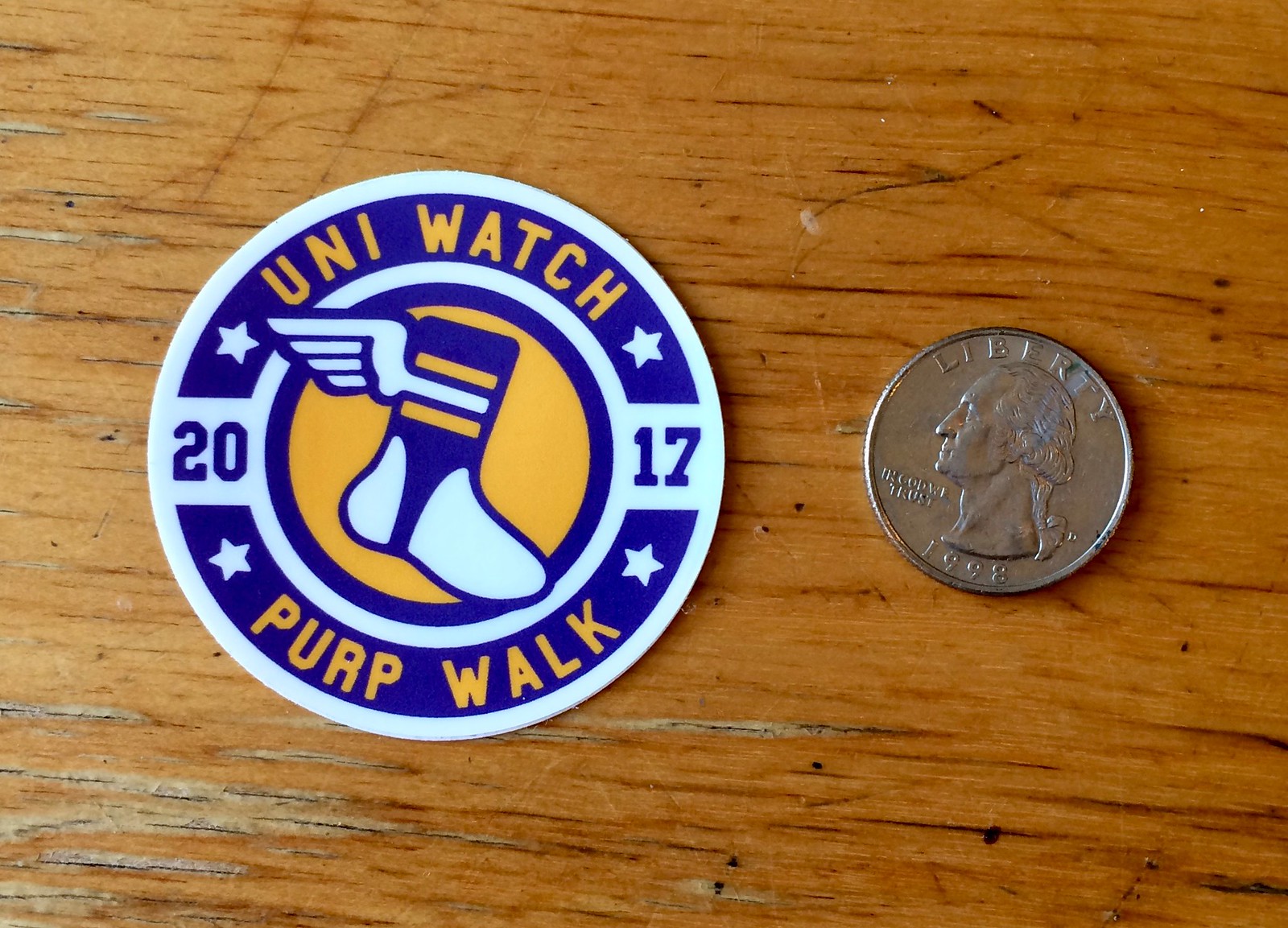
Unfortunately, we cannot send more than one sticker per shirt, nor can we sell the stickers separately. The only way to get the sticker is to buy the shirt.
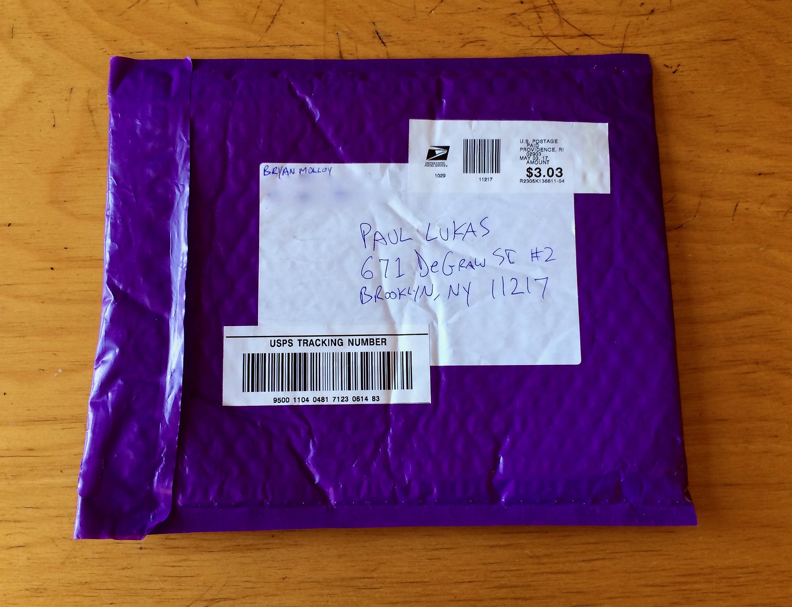
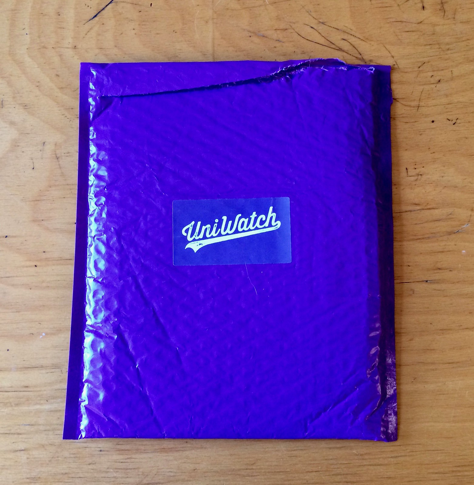
• Bryan will be personally packing each shirt in a purple bubble mailer with a purple Uni Watch sticker on the outside:
• Because of all the extra bells and whistles, the price point is a bit higher than on most of our other shirts: $29.99 (plus an extra $2 for 2XL and 3XL — sorry, but it was unavoidable for this project). I realize that probably seems like a lot, but it actually leaves less of a profit than we make on most of our other merchandise. Basically, we really wanted to create a fun project (ideally one that’s fun for you, not just for us), and extra fun sometimes costs a bit more.
• Speaking of the price: Because this shirt is not being sold on Teespring, it does not qualify for the 15% discount that card-carrying Uni Watch members can get on our Teespring product. HOWEVER, we are offering a 10% membership discount on this shirt, but only for people who have purple membership cards. That applies to anyone who’s ordered a purple card on any past Purple Amnesty Day, and it’ll also be good for anyone who orders a purple card today. (In other words, you can order your purple card, then I’ll send you the discount code, and then you can use the code to order your shirt.)
If you already have a purple card and want to order this shirt, send me a note (if you can include a photo of your purple card so I don’t have to look up your original membership order from years ago, even better) and I’ll send you the discount code.
• Important: This shirt is limited to 48 orders. Once we go through that many sales, that’s it. As it happens, that’s about how many shirts we sold for the 2015 and ’16 Purp Walks. But get your orders in early, just in case. Update: Whoa — sales have turned out to be a lot brisker than we anticipated. We had two dozen orders in the first hour. As of 7:30am, we’ve almost sold through the 48 shirts we had allotted. (Additional update: 48th shirt just sold at 7:47am.)
After consulting with Bryan, we’ve decided to lift the 48-order cap. There is now no limit — we’ll let it ride. If you ordered by about 7:47am, your shirt will mail out soon, probably next week. If you order later in the day, your shirt will take a bit longer to mail out (probably an extra week to 10 days), because Bryan will have to order more hang tags and stickers.
We didn’t see this coming, because the 2015 and ’16 Purp Walk shirts both had about 45 orders, so we figured things would be similar this time around. Thanks for proving us wrong — it’s exciting to see the response, and it’s a great validation of all the bonus elements that Bryan put into this year’s shirt.
• As usual, the shirt will only be available for 24 hours, ending at midnight Eastern tonight. No exceptions!
One more time, the shirt is available here.
And hey, look — even the Empire State Building was getting in the spirit of Purple Amnesty Day last night:
One final note: I’ll be off the grid for much of the late afternoon because I’m getting my head scanned for a custom-fitted football helmet (more on that later), so there will be a gap when I won’t be able to acknowledge new membership orders or send out discount codes for the shirt. I’ll do my best to catch up as soon as I’m able.
(Big thanks to Bryan for doing such a great job with this year’s shirt. Thanks also to membership card designer Scott M.X. Turner, who came up with the term “Purp Walk” back in 2015, and to reader Tim Cox, who came up with the whole idea of Purple Amnesty Day back in 2010. Thanks also to Brinke Guthrie purple-izing our Facebook page.)
And speaking of discounts: In case you missed it last week, all Uni Watch membership cardholders are now entitled to a 15% discount on any of the merchandise listed in our Teespring store.
The discount code will be provided to new enrollees when they place their card orders. Existing enrollees can obtain the discount code by contacting me. Once I confirm that you are indeed a card-carrying Uni Watch member, I’ll email the discount code to you. (If you want to include a photo or screen shot of your card, that would be helpful, but it’s not required. I can look you up in my records.)
As always, you can sign up for your own custom-designed membership card (purple or otherwise) here, you can see all the designs we’ve done so far here, and you can see how we produce the cards here.
New Pistons logo: As had long been expected, the Pistons finally made it official yesterday by unveiling their new logo (shown at right), which is an updated version of their 1979-96 logo. Evidence of this move has been floating around for at least a year now (designer/sleuth Conrad Burry has been particularly good at documenting all the clues), so it’s not exactly earthshaking news, but at least now we can stop wondering when they’ll finally go public with it.
As per the NBA’s standard procedure, there’s a very nice interactive page breaking down every aspect of the makeover. I’m on record as loving these NBA pages (here’s hoping all teams/leagues start doing something similar), but it’s worth noting that this Pistons page includes a serious eye-roller: a diagram boasting that the new logo includes “anatomically-correct basketball groove lines.” Thank the lordy for modern sports marketing, or else we never would have known that a basketball had its own anatomy.
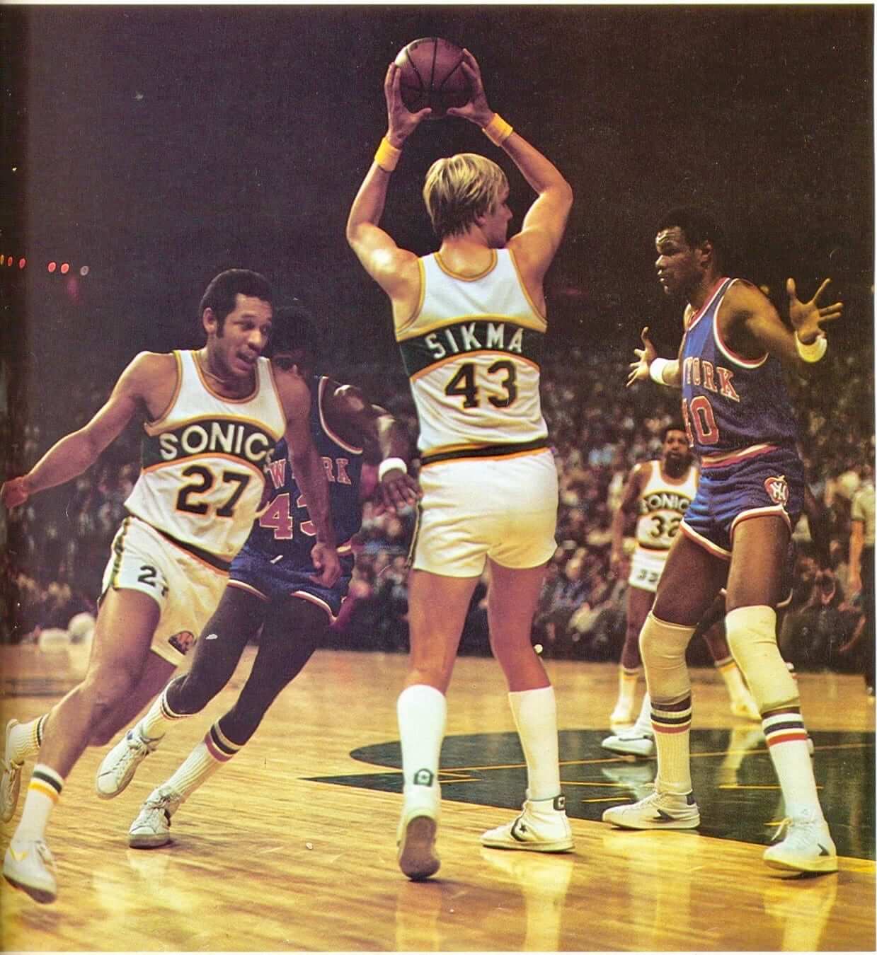
ESPN reminder: In case you missed it on Tuesday afternoon, ESPN is doing a bunch of NBA top-10 lists. My contribution is, of course, a list of the top 10 uniforms in NBA history (one of which is shown above). Check it out here.
(Footnote: The Hornets weren’t happy about not being included. Can’t please everyone!)
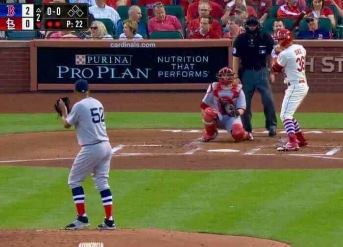
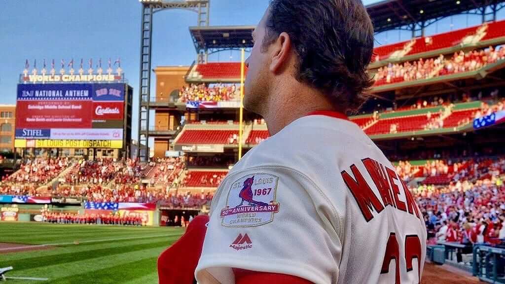
1967 revisited: The Cardinals celebrated the 50th anniversary of their 1967 championship season last night by wearing ’67 throwbacks, and the visiting Red Sox — who lost to the Cards in the ’67 World Series — wore throwbacks as well.
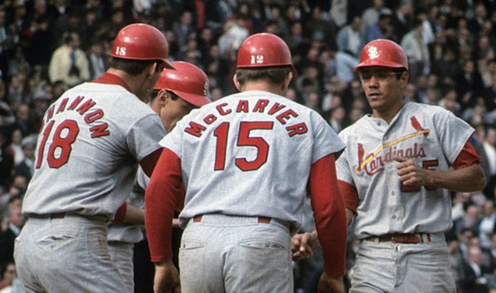
There was one very nice detail about the Cardinals’ jerseys. Back in ’67, the Cards had really short sleeves (click to enlarge):
I also like the stencil font for their helmet numbers! But I digress. Last night the Cards mimicked those old short sleeves. The fabrics are different than the ones from 50 years ago, so the sleeves didn’t drape the same way, but I do appreciate the effort (click to enlarge):
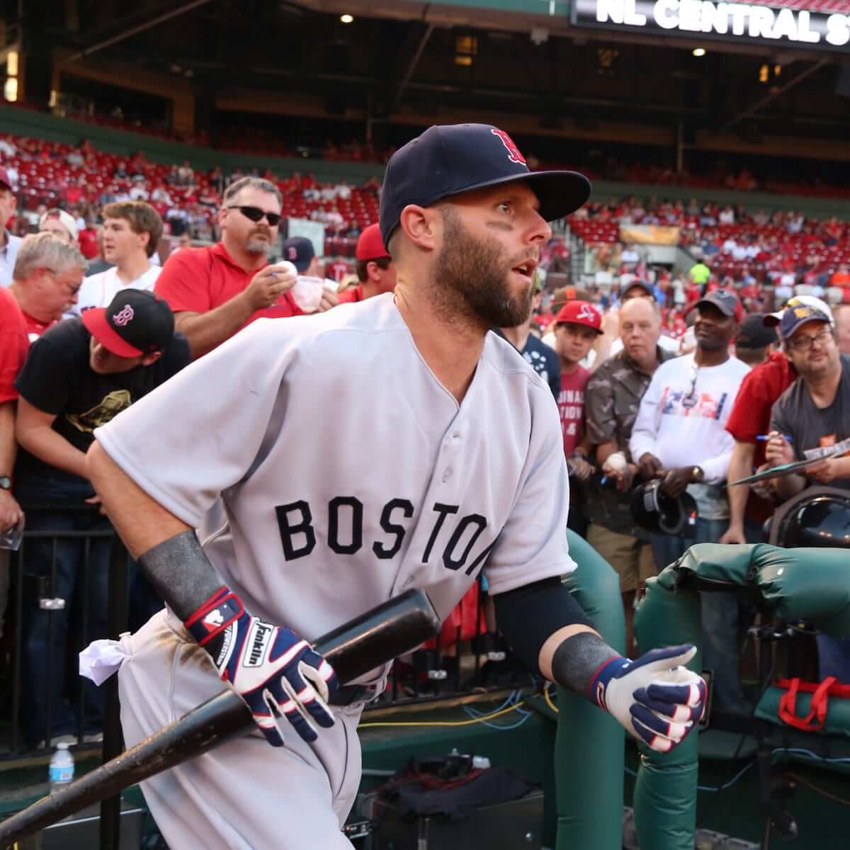
And here’s how the Red Sox looked (click to enlarge):
The Ticker
By Alex Hider

Baseball News: The Orioles will wear Maryland flag-themed jerseys and caps on Saturday for “Celebrate Maryland Day” (from Mike Anderson). … The Indians and Rays went navy-on-navy yesterday in Cleveland (from Trent Parker). … What’s more Seattle than a flannel shirt giveaway? That’s what the Mariners did last night. … The Kannapolis Intimidators, a Class-A affiliate of the White Sox, have camo and stars-and-stripes uniforms (from Mike Anderson). … Indiana wore throwbacks last night ”” and the umpires played along! … LSU gave away these pins of their throwback jerseys at their game last night (from Ernie Ballard). … Chris was watching the B1G Network and reports that half the Rutgers players he spotted wearing stirrups were wearing them backwards. … Crawfordsville High School in Indiana has some nice tequila sunrise jerseys and stirrups (from Derek Linn). … Astros INF Jose Altuve had problems with his pink shoes, which were making his feet fall asleep. He’s in better shape now that he’s back to wearing shoes that fit (from Jerry Wolper).

NFL News: The Falcons will use Nike’s new jersey template next season. They had been using the old Reebok template, even after Nike took over the league’s uniform contract in 2012. … This photo seems to indicate that the Panthers will not be adopting Nike’s new template next season (from Broc). … Does anyone know the story behind what appears to be Trent Dilfer wearing an old Dungard two-bar facemask for the Bucs? (From Spence).
College Football News: Utah’s new jerseys are pretty slick, but the pants have some weird striping (from Brandon Gutierrez). … The Utes dropping their mountain-pattern sleeves is a perfect example of how college football uniforms appear to be regressing back to the mean of “normalcy.” … New uniforms for Southern Mississippi (from Mike Anderson).

Soccer News: Stoke City has sold its first-ever sleeve-based advertising patch (from Ed Zelaski). … New away kits for Ajax (also from Ed Zelaski). … New kits and advertiser for Everton (from Jason Hicks).

Grab Bag: One company is trying to make dressing like a giant toddler fashionable. … We’ve seen this before, but once more won’t hurt: The Postal Service will soon be issuing a series of sports-themed stamps (from Tommy Turner). … From USA Today: Five sports logos that would look so much better with one simple fix (from Keyvon). … New helmets for University of Albany lacrosse (from Mike Anderson). … The principal of a new high school in Utah wants to the school’s colors to include black so uniform design will be easier (from Sean L).
Amidst all the purple silliness, it’s worth remembering that Purple Amnesty Day is the site’s anniversary. Eleven years of daily posts is pretty amazing. Couldn’t have done it without all of you, so please accept my thanks. This anniversary belongs to all of us — enjoy it!
I see that Purple Amnesty Day started 1 hour 55 minutes early (central time)
Good taste be damned! I ordered my purp walk.
Staying up to enjoy the striking of midnight at the beginning of the best Uni-Day of the year was a must. Love this year’s shirt. The crew outdid themselves.
Happy Purple Amnesty Day! Kudos to Paul and Bryan for an excellent Purp Walk ’17 offering. Thanks Guys!
The only bad part of the previous Pistons logo was the font and that’s the part they kept. Groan.
^ Nailed it.
It’s the one aspect that’s persisted (with slight tweaks) from the horsehead era.
Granted, the plain font they used before wasn’t really hot stuff either, due to being so boring, but you’d think they’d come up with something better.
There’s only so much you can do with words on a basketball. Mind you, it *is* one of the insignias a child can draw, so it has that going for it.
I always thought the Pistons logo depicted, you know, a piston. But the new logo page just describes a basketball.
Proofreading:
“If you already have a purple card want to order this shirt”
– purple card “and” want
Fixed.
I’m going to take advantage of this opportunity to continue a conversation from yesterday.
arrScott: “I think it’s worth exploring the Steelers thing in greater depth sometime. The Steelmark was created as a retail advertisement by and for some of the largest corporations in America at the time. The Steelmark logo isn’t sort of like the NBA corporate ad logos, it is exactly and wholly identical. It is a corporate logo intended to advertise a commercial product to the stuff-buying public.”
There’s a confluence of reasons why the Steelers’ logo is different than what the Cavaliers are doing.
-The team name was established long before the Steelmark came into play. I suppose you could argue that the name is some sort of ad, but Pittsburgh and steel were associated enough then that “Steelers” made sense as a local descriptor.
-The Steelmark represented an industry, not a particular company.
-I used the past tense in the last item because now, if someone comes across the Steelmark in the wild, he’s much more likely to wonder what happened to the “ers” than say, “Oh. This is made of steel.”
About the only analogy I can think of would be if the Milwaukee Brewers had based their logo on some sort of industry mark. And that may or may not have become more associated with the ballclub than the beverage.
The Cavaliers aren’t the Rubbermen. The logo they’ll be wearing represents a company, not the industry. If the logo makes people think of the team and not the company, the advertiser will consider it a failure. It’s a very different set of circumstances.
And, of course, #NoUniAds.
Sometimes I wonder if my problems with color vision are a blessing because one of the problems it gives is that I literally can’t see purple. It just looks like a shade of blue to me. It’s funny because the roller derby team I’m managing this season wears purple. It doesn’t affect anything except I had to have someone pick out my dress shirt for me so that I would match.
I have that same color blindness! Purple kind of doesn’t exist to me.
Thanks Paul and commenters for 11 years of Uni-Watch.
Congrats on another great year of Uni Watch Paul! I still start most mornings with a cup of coffee and a click on the site. Cheers! ~ Bruce
Yeah! Thanks Paul for 11 years of wonderful morning reading and things that make, “the people who get it”, think all day.
Not that I’m an expert on men’s business fashion, but a recent trend over the last couple of years have been brillant/wild socks. The Red Sox, with their retro 1967 away uniform, which is very conservative, other than their brillant socks seem to capture this current trend and then some. A very good look.
Paul – re: your basketball top 10, I think you were easy on the Celtics, this is a team that is rather haphazard in preserving what should be the basketall equivalent of the Yankees and Canadiens. I say that, as a result of their multiple silly variations they now wear, with the most objectionable, being the black font jersey.
But I specifically stated that alternates were not part of the mix. Only considered homes and roads, and the Celtics still look great in that respect.
Yep, I kind of thought you may something like that, (off course that thought occured to me only after posting), and I get it, nonetheless no other historical franchise IMO does more to disrespect their classic look than the Celtics, and that to me significantly tarnishes their historic look.
Sorry just to elaborate a little more. If the Celtics think they have one of sports classic looks, why do they subject everyone far too often to that below average green/black look, not to mention the green/gold look, and even more questionable the silver/grey green look. That to me, demeans the classic look they have, and makes me question whether it should be even considered a classic, a classic should imply, no tinkering, no regular alternatives. To draw a parallel, in reality there’s very little difference between the White Sox white uni, and the Yankees classic look, but the Yankees look will be always revered, because they treat it with the respect it deserves, i.e. only when mandated by MLB do they wear anything else. The Celtics get a big “F” for that.
Small point in terms of purple amnesty, the Rockies get mentioned, but not the Lakers? Please tell me that’s not as a result of considering it Forum Blue.
Small point in terms of purple amnesty, the Rockies get mentioned, but not the Lakers? Please tell me that’s not as a result of considering it Forum Blue.
Come on, man — you can’t expect me to mention every single purple-clad team! I listed a representative sampling. And yes, of course the Lakers wear purple, silly chromatic nomenclature notwithstanding.
Sorry, I didn’t mean to be catty, I can’t be bothered with minor grammar stuff (as my average post contains more errors than your entire blog) I was just surprised, Rockies are one the more non-descript MLB teams there is (who can name 5 Rockies?), while the Lakers have for most of their existence been a marquee franchise (and I think the highest rated purple uniform, when you did the 1-122 rating). One could argue – the Lakers success played a role in the purple boon in the late 1990’s in the NBA, albeit part of an overall nauseating teal/purple explosion that was everywhere during that period.
Rockies are one the more non-descript MLB teams there is (who can name 5 Rockies?), while the Lakers have for most of their existence been a marquee franchise…
I guess. But I’m much more of a baseball fan than a basketball fan, so the Rockies are much more top-of-mind for me than the Lakers are. In any event, geez, it was just a random list of a few purple-clad teams. I wasn’t implying any particular status for any of the teams listed (or not listed).
Yep, thanks, please don’t take what I said as criticism, although in the emotionless world of posts, I can see how it could interpreted that way, it was more just curiosity, which you addressed Baseball guy with likely more of an affinity towards the National League as a result of the Mets.
I did wonder and I’m just trying to be slightly humorous, if there was a Family Feud — Uniform edition and it was your turn, and the host said: Name a sports team that wears purple, whether you would have gotten say a low number of votes (great answer) or the dreaded “X” if you said the Rockies
I am surprised that the Knicks classic championship era unis from the 70’s didn’t make your list.
If I’d had an honorable mention section, they would have been in there.
Happy anniversary Paul and Happy Purple Amnesty Day to us all!
Interesting fact about the late 70s Sonics redesigned uniform. Either the home or road version wasn’t rolled out at the beginning of the season. Something like 15 games had already been played that season, this was the era before new uniform debuts were a big deal.
The home version came out first.
The year they lost in the Finals to the Bullets, they had new home uniforms, but wore the previous season’s road uniforms. The following season they beat Washington and had new green uniforms to match the white ones. (If memory serves)
True. The SuperSonics introduced the new home whites after the start of that season. It was early in the season. The matching green uniforms did not come until the next season.
Helmet Hut (sort of) answers the question regarding Trent Dilfer’s Dungard mask here. Apparently he tried it for visibilty reasons, but the league “discouraged” it as Dungard had gone through liability lawsuits before folding.
link
PS: the mask was given to him by Terry Bradshaw.
Excellent info. Thanks!
Holy cow… been looking for a photo of Dilfer in the Dungard mask FOREVER… thanks for posting. Yeah, from Bradshaw… I watched the game… sounded like they took it right off one of his HOF helmets if i recall correctly. Diller wanted to wear it and Bradshaw said “ok”… I don’t recall it being about vision, just that he wanted to wear his actual mask.
Seems like it wasn’t that long ago. The game was in 1998 and it was covered on here in 2009. Dilfer wore it for at least a series (maybe more) but he had changed back to the “stock” facemask most QB’s wore at the time by the 2nd half.
link
The vision bit came from another source. can’t vouch for its reliability.
I recall the Bradshaw story.
Thanks for the info!
Happy anniversary to Paul and the rest of us!
I agree with the remark regarding Dilfer wearing the Dungard mask. If I’m not mistaken, he wore it more out of a respect for Bradshaw, not sure if there was anything in common as to their background/experience. If I recall correctly, he mask was sort of a nod to Bradshaw. I’m not certain as to the history/origin of the mask, but I think that I read that it came from Bradshaw or he gave his permission to use it…from the HOF perhaps? Not sure, but I remember there was discussion about Dilfer now being the last player to wear a Dungard in an NFL game.
The Orioles thing reminds me of a friend who gets really upset when he sees someone hanging a Maryland flag upside down, which I had never thought about.
It looks like Maryland, Tennessee, and Texas are really the only three state flags that could possibly be hung upside down and without knowing it. Maybe Alaska if you don’t know what the Big Dipper is? Ohio and Alabama look to be ambigrams (learned that word today!).
I’d think New Mexico’s state flag could easily be hung upside down by mistake.
It looks to be another ambigram to me.
It is EXTREMELY possible to hang the Nebraska state flag upside down without anyone noticing
link
In your first baseball item, you are missing the word “wear” after “Orioles will.”
Fixed.
Paul’s aversion to purple might only extend so far (like he said above bout its appearance in nature); He picked the Denver Nuggets 80s Rainbow Jersey (that include purple) on his top 10 NBA jersey list.
I like the quirkiness that is purple amnesty day, the posts about vacations, key chain chronicles, and all the other posts that are offbeat. Of course, uniform news is the main attraction. Thanks for doing keeping up the website for 11 years. I hope it continues, I really enjoy it each day.
The thing about those Nuggets uniforms that differ from teams like the Lakers, Vikings, and so forth is that purple is not a defining color, but rather an integral part of the rainbow element, which is itself secondary to the primary color scheme – blue and yellow (or in the case of the 1982-85 version, navy, green and yellow).
Happy Anniversary Paul! I’ve been reading since day 1.
That’s Terry Bradshaw’s old mask that Dilfer is wearing there. Here’s a link to a story about that: link
More proofreading: in the Utah football item link, “som weird striping” should be “some weird striping.”
Fixed.
As ridiculous as “anatomically correct” sounds, it actually makes sense they point that out because the old Pistons logo’s basketball groove lines aren’t “anatomically correct.”
It’s true, the old logo’s groove lines weren’t anatomically correct.
Also, the new logo’s groove lines aren’t anatomically correct.
That’s because there’s no such thing as a basketball’s groove lines being anatomically correct.
You can say the lines are properly or improperly designed. You can say they are true or untrue to life. You can say that they are accurate or inaccurately rendered. And so on.
But you can’t say they are “anatomically correct,” because a basketball does not have anatomy.
a·nat·o·my
/əˈnadəmē/
noun
1.
the branch of science concerned with the bodily structure of humans, animals, and other living organisms, especially as revealed by dissection and the separation of parts.
2.
a study of the structure or internal workings of something.
I believe a basketball does have a structure and you could study that structure, including the lines on that structure.
Oh, please. There is no corner of the English-speaking world in which “anatomically correct” refers to an inanimate object (except maybe mannequin or a sex toy). And if you believe there *is* such a corner, I invite you go looking for it. Take your time — you’ll need it!
More importantly, even if there *is* such a fringe use of “anatomically correct” when referring to inanimate objects, the whole point of marketing materials like the chart on the Pistons’ website is to communicate clearly and effectively. Fringe uses fail that test. By any standard, this is, as I described it in today’s text, an “eye-roller.”
A quick google of the text “anatomy of a” leads to the word anatomy used as that second definition:
link
link
link
link
link
Anatomy of a Rover:
PBS
I think most of those are reputable sources using the word the same as the Pistons. They’re studying the structure of an event or an inanimate object (not a person).
I get that you don’t like the storytelling behind the logo updates, but saying that it’s an invalid use of the word, or that there’s “There is no corner of the English-speaking world in which “anatomically correct” refers to an inanimate object” is bullshit.
that there’s “There is no corner of the English-speaking world in which “anatomically correct” refers to an inanimate object” is bullshit.
Oh really? Not a single one of your examples is for “anatomically correct.” They’re all for “anatomy.”
Good research, and point well taken. But my point still stands: Nobody uses “anatomically correct” for something like a basketball.
Leave your worries behind.
link
Ive seen many anatomically correct inanimate objects. there are whole stores dedicated to selling them.
If you scroll up in this thread, you’ll see that I already referred to the type of objects to which I believe you are referring. ;)
Looking at the logo, not sure if the lines are “anatomically correct”. The lines should only curve all the way to the center line on one side of the ball, the lines on the other side should break off before they reach the center line.
Of the Big Four pro sports leagues in North America, the NBA has more teams that are “purp”etrators. By my count, 4 NBA teams have purple as their primary road uniform colour, with 3 other teams formerly using purple as the primary.
Not sure why the NBA is prone to having more teams wear purple than the other leagues?
And it used to be even more since the Bucks, Jazz and Raptors used to be purple as well but aren’t anymore.
Correct, those are the 3 teams I was thinking about when stated teams formerly using purple as primary.
For what it’s worth I blame the Lakers. Wannabe teams were anxious for some of that Hollywood pixie dust. You could posit some anecdotal evidence about purple being present in sunsets for Phoenix, or the Jazz wearing Mardi Gras colors, but ultimately I think teams were attempting to ape a franchise which is usually the crown jewel of the NBA.
Have you noticed that on MLB’s throwbacks they use old style layered twill numbers/letters instead of the current kiss cut technique?
Also I wish the Cards would have spaced out the letters and properly arched the names. THAT would have been a great detail!
link
Why do Paul and others use the term “price point” ? When describing one particular item why not just say “because of all the extra bells and whistles, the price is a bit higher”. I understand what a price point is but it seems like a seller is looking to cushion the blow of a high priced item saying “the price point it a bit higher”. Please just say “the price is higher”.
We use price point on things we know the selling price will change. Live Christmas trees for example at a $50 price point the day after Thanksgiving and the price point of $5 December 24. Lights however stay at $10 a box as they can be sold year round. (We just call them party lights now).
I never really thought about it though. It’s what they always did before me.
1. It looks like IU’s opponent (Louisville) also went retro, with the 1st base coach in that shot wearing a long-sleeved jersey.
2. The Utah pants’ stripes almost form a U when seen from behind. Not sure if that was the intent or if it’s a good idea, but it’s something. I guess.
Happy Anniversary!!
I went to the IU-Penn State game on 5/14 and the press box announcer said Louisville would indeed also be in throwbacks. He didn’t say anything about the umpires but them participating was a nice touch. Here is a link to a better picture of the IU unis: link.
Congrats on 11 years. This site is fantastic, and I’ve visited it daily since I stumbled upon it years ago. Here’s to (hopefully) at least 11 more years!
viva purple!
Happy anniversary to Uni Watch! I love that both the ESPN column and “blog” are still going strong, as passionate as ever (probably more so, nowadays).
Also, I love that the Pistons called the blue in their new logo a “blue collar.”
I too raised an eyebrow over the use of “collar.” Interesting!
I got this from Mike Trautman: A column from 1998 about Dilfer’s throwback facemask.
link
What’s more Seattle than a flannel shirt giveaway?
A 30-ounce cup of Soundgarden coffee?
Not sure how often this happens, but in the Rangers/Phillies game last night there was the counter tradition of home team in white wearing there city/state and away team in gray wearing their nickname. I suppose any time the Phillies are playing at a team that where’s their city at home this happens, though I don’t think many teams do so.
Any idea on how frequently we get a white home with city vs away gray with nickname matchup?
Whenever the Phillies visit Miami, and they’re division rivals. Also, do you count the Nationals, Yankees and Tigers since they wear a version of their hat monogram (city) on the home uniforms?
Thanks. I had thought about the Yanks, Tigers, and Nats, but figured that was different enough from city on home to count. Forgot about Miami, maybe I subconsciously block the awfulness of that uniform. I find the city on home style of the Marlins and Rangers to be really off, more so than when teams where the nickname no the road.
As a Rangers fan, I like it. I don’t know a Ranger fan that doesn’t. To me the old 90s Ranger homes look off. Now if they wanted to go back to the pre 1994 Nolan era script……
It happens more often in basketball, the other sport where wordmarks are favored over logos on the front of the jersey.
I feel dirty saying this–but the USA Today is spot on with that article. The new logos aren’t perfect, but they are greatly improved.
Someone forgot to tell them, though, that the Rams have already dumped the millennium-blue-and-metallic-gold logo as their primary, in favor of the link.
Happy anniversary, Paul. The blog has been a daily stop for me for the last 8 or 9 years. Happily ordered my Purp Walk shirt.
Congratulations on 11 years. I have been a regular reader for the past few and it is the first thing I read in the morning with my coffee.
Re: the Hornets: couldn’t you have just told them that you abhor the color purple? It could have been some timely promotion!
Is the Purple Mattress ad banner one you selected for today, or just a perfect coincidence because I have been researching all the online mattress startups?
Congrats on 11 years of Uni Watching!
No purple ads have been arranged for today (never thought of that — something to plan for next year!).
Any purple ads you’re seeing are based on your browsing history. Nice coincidence!
Happy Anniversary! Got my shirt ordered at about 7:15am. Glad it’s selling well.
I’ve been reading this site daily since about 2008 when a coworker of mine shared it with me. Though I’m no longer working in the sports world, it’s always great to read the daily article and ticker with my coffee.
I don’t often contribute, and I rarely comment, but I have really enjoyed the content year after year.
Thanks Paul!
Congrats on another year. I just wanted to shout out to another purple team the 2017 NCAA FCS Champion)James Madison Dukes. Learn to embrace the purple
JMU! JMU! JMU!
(Class of ’86!)
Both of my alma maters are purple schools: The Huguenots of New Rochelle High, and the Great Danes of SUNY Albany.
Proofreading:
“Couldn’t have done without all of you, so please accept my thanks”
– Couldn’t have done “it” or Couldn’t have “been” done
Fixed.
Happy Anniversary to Paul, Phil, Mike and everyone who makes this site a regular part of my day.
Happy Anniversary
I just ordered my purple membership featuring this link
– Paul got his head scanned and they found nothing. Hey-o! Ba dum tsssh.
In all seriousness, congrats to Paul not only on the anniversary, but to the readership that he has built. This is the only site where I read the comments after the content. Happy Purple Amnesty Day!
Paul,
Having just read your list of best NBA jerseys, I was surprised to see the current Suns’ set listed. As a Suns fan, when these were introduced, I was dismayed that the home set didn’t include any purple whatsoever.
Was this a consideration in your ranking it as the best Suns’ uniform in team history?
Purple notwithstanding, what are your thoughts about a team leaving out one of its primary colors on its primary home uniform?
Well, I didn’t put them on the list simply because they didn’t include purple. But if they *had* included purple, I probably wouldn’t have included it.
I just really like those home whites — simple as that.
It does seem odd to omit a team color on the home uni, though. Hadn’t thought about it in that way.
Those uniforms did create a lot of controversy among Suns fans. In fact, they also changed the court to a black / orange theme for a couple of years to match the uniforms, but changed it back to the purple / orange theme this season due to fan outcry.
Many long time fans (such as myself) felt that the team was trying to shed their history when they chose to emphasize the orange more than the purple in their branding.
a new term I learned today and seems appropriate for this day: purple squirrel
link
Imagine if we could get MLB to recognize Purple Amnesty Day. As opposed to pink, blue, camo, etc., for one day we would see all the teams with purple accents. And it would potentially create Paul’s biggest nightmare: A purple-faced Chief Wahoo.
Trent Dilfer wore that Dungard facemask vs. the Tennessee Oilers on a Sunday night because he wanted to pay homage to one of his boyhood idols, Terry Bradshaw.
Must be repetitive comment amnesty day too…four and counting on the facemask.
Happy Anniversary from somebody who started to follow you in the Village Voice. Uniwatch is always a part of my morning.
Anyone who goes back to the Voice days deserves a special acknowledgment. Thanks, David!
New Texas Longhorns lockers cost $10,500 each – include a 43-inch flatscreen instead of a nameplate (BTW have you ever done a story on locker nameplates?) video here: link
Happy Anniversary, Paul!
While I love this site, I have a confession to make: I love purple. There’s no reason why the short-wave part of the spectrum should not get equal representation on sports uniforms.
“Not a single U.S. state uses purple as one of its official colors, and neither does any sovereign country (at least according to this listing).”
This is because purple dye was ridiculously expensive to make until the development of modern chemical techniques in the early 1800s. So any state or nation founded before that isn’t going to have purple. It was the color of royalty in both Europe and far-flung Asia because it was expensive no matter where you went.
Look at a painting of revolution-era Americans and then at one from 100 years later: purple (and, to a lesser extent, deep green) are not seen in the former, whereas you see plenty of it (particularly on women) in the latter. Nobody hated purple back then — or if they did, they hated it for its association with the rich and not for its aesthetic qualities.
Mark, I salute your advocacy for the world’s most accursed color!
If you order a purple membership card, I absolutely promise that we’ll get the number/NOB spacing just right. ;)
I believe Dominica and Nicaragua are the only two countries that use purple anywhere on their flags. Dominica has a purple parrot and Nicaragua includes a rainbow.
Of course, I’m wearing green today. . .
Happy Anniversary, Paul!
Man, I wish the Sawx and Cards played in the ’77 Series instead of ’67…would’ve looked much better.
NBA list: I think those Sonics unis might be my #1. Today’s Spurs and Grizzlies would be somewhere on my list.
Are the onesies they’re trying to sell similar to this? I can’t tell.
link
One thing I have been thinking about as far as uni ads for the NBA. With Nike taking over the uniforms next year, I wonder if they will use the slim cut jerseys that Team USA wore last summer and many top tier college teams wore this past season. That would mean less room for the ads.
Forgive me if this has been mentioned before.
A guy I work with is a purple fanatic. Loves all things purple and wears purple shirts of some type almost every single day to work. He bought a Purp Walk shirt today. Thought the Purple Amnesty day is hilarious. Then, he asked a question. Does Mr. Lucas hate maroon? I asked why. He said technically maroon is purple with a bit more red in it. I told him my thought is Paul doesn’t like the grapey purples and maroon is ok.
I’m fine with maroon. Hell, look at the stripe at the top of the page — it’s one of the Uni Watch colors!
And Paul, if you want to see all sorts of purple stuff to make you crazy, go to thepurplestore.com That’s where my co-worker gets most his purple crap.
Happy anniversary!
Because I now have a deaf colleague at work, in the past year I learned of a business named link. They started by providing telephone interpreters for the deaf and have expanded from there to included face-to-face interpreter services. It started as a joint venture of AT&T and Verizon who use blue and red respectively as their corporate colors.