
By Phil Hecken
It’s like an annual rite of Spring — the Oregon Ducks break out some really WILD uniforms for their Spring Game. Until today.
Maybe because it was of a terribly disappointing 2016 season. Maybe it’s because new coach Willie Taggart isn’t giving the Oregon Ducks their single-digit jerseys back until fall. Maybe it’s even because the team has said it will stick to ‘more traditional colors’ in 2017. Maybe it’s even because of reports that kids were attracted to Oregon football ‘purely’ for the uniforms, and not necessarily to play. But, Oregon is kind of breaking with their “wild” spring game tradition and going with the traditional Oregon colors of…

Well — you could argue that Oregon was (more than likely) the first school to BFBS and GFGS — so in that sense they are traditional. OK, no they’re not. But they *will* be wearing bright green shoes…

… and the numbers will be outlined in some shade of neon green. They’re very shiny.

Both squads (offense and defense) will wear black helmets. Because the team traditionally also “salutes” the military during their spring game, the jerseys will have American flag patches and Slogan NOBs (The Black squad will be “The Brave” and the Gray team will be “The Free”):

But other than that, there’s really nothing new or exciting (certainly not flashy or eye-gouging either) with these spring unis. According to this article, it’s a very similar look to one they’ve worn before.
New Coach Willie Taggart has instructed that one of program’s new signature phrases, “Do Something,” to be put on the rear helmet bumpers. After the Bellotti/Kelly/Helfrich eras of Nike-on-steroids, perhaps the team *is* toning it down a notch. Still, I was kinda hoping they’d kick it up a notch this spring. After all, we’ve seen some pretty interesting Spring Game looks over the past several seasons:
2013:


2014:


2015:


All those games had some interesting elements, new colors (two different shades of olive green in different years and a lighter yellow). Last year they REALLY turned it up a few notches, busting out the “Webfoots” unis that would serve as the basis for a regular season uni last year.
2016:


I miss those days. Of course, I have also lamented on more than occasion that Oregon has jumped the shark uni-wise, so maybe I should be happy they’re toning it down this year. We’ll see how long Nike lets them keep to the ‘traditional’ colors (I mean, if black and gray aren’t traditional school colors, what are?).
They’ve been doing it for so long, maybe it’s time to take a step back. But in case you have forgotten how crazy they’ve been over the years, here’s a good reminder. Some good photos in that link. You can also check out this video:
I don’t think we’ll every be able to use the adjective “boring” to describe the unis. But we can still relegate the spring getups to BOregon status.

.

In Search of…
…the “Perfect” Baseball Card
Earlier this year, I ran a post in which reader Ray Hund described his quest — and “rules” — for a “Perfect” baseball card. I had asked readers to submit their own submissions for what they considered to be their own version of the perfect card. I’ll run these periodically. If you have a submission for your own “Perfect” baseball card, shoot me an email with a short(ish) writeup and of course, an image (or images) of your own perfect card.
We begin today with Michael Ortman::
1976 Johnny Bench
I don’t know about high card numbers, etc., but this is my favorite. I guess you can say that you don’t see a lot of the team name or logo, but still…
What ignorant fool just tried to take an extra bag? Look at the dust and Bench’s stance….pure gunslinger. Plus when you’re only six like I was in 1976, that All Star star made this card seem like he was superior than all the others.
I’ll let someone else submit the Gamble traded card from that set….;)
Mike

And we conclude today with Curtis Peddle:
Hi Phil
One of my perfect baseball cards is attached – a 1974 # 155 Topps- Bert Campaneris of the Oakland A`s.
I like how the colors of the card design match that legendary A`s uni, and that its a simple design. An intense , clear pic of Campy with just him, the grass, and the outfield fence. No batting gloves and an awesome view of the legendary uni.
Looks like he`s ready to take the team along for the ride..in fact he went 6/17 for a .353 avg in the 1974 World Series.
This exudes the 1970`s, and that`s why I like it.
Regards
Curtis Peddle

I received a bunch of submissions from you guys already, and I’ll continue to run them — if you’d like to send me your “perfect” card, my e-mail address is above.
.

In Case You Missed It…Paul’s Latest ESPN Piece
In case you missed it on Friday, Paul’s latest ESPN column looks at the MLB uniform protocol of teams wearing their team name on their home whites and their city/state name on their road greys. Has that always been the rule? And which teams don’t follow it? Which teams should follow it?
If you didn’t read Paul’s latest piece, here ya go.
Good stuff there!
.
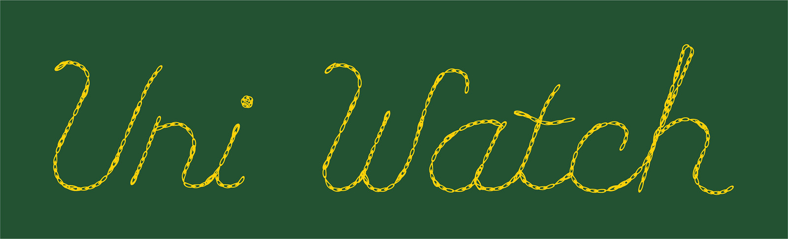
New T-shirt reminder: Paul here. In case you missed it earlier this week, our latest T-shirt in the Uni Watch Artist’s Series, designed by the great Scott M.X. Turner, is now available, and it’s a doozy.
Here’s the concept: If Uni Watch had a bowling team, what would the team be called? The Athletic Aesthetics, of course! And what would the team wear? A classic bowling shirt with chain-stitched embroidery, of course!
Scott’s T-shirt is based on that idea, with a simple “Uni Watch” insignia faux-chain-stitched on the front-left chest and a spectacular design faux-chain-stitched on the back (for all of these images, you can click to enlarge):
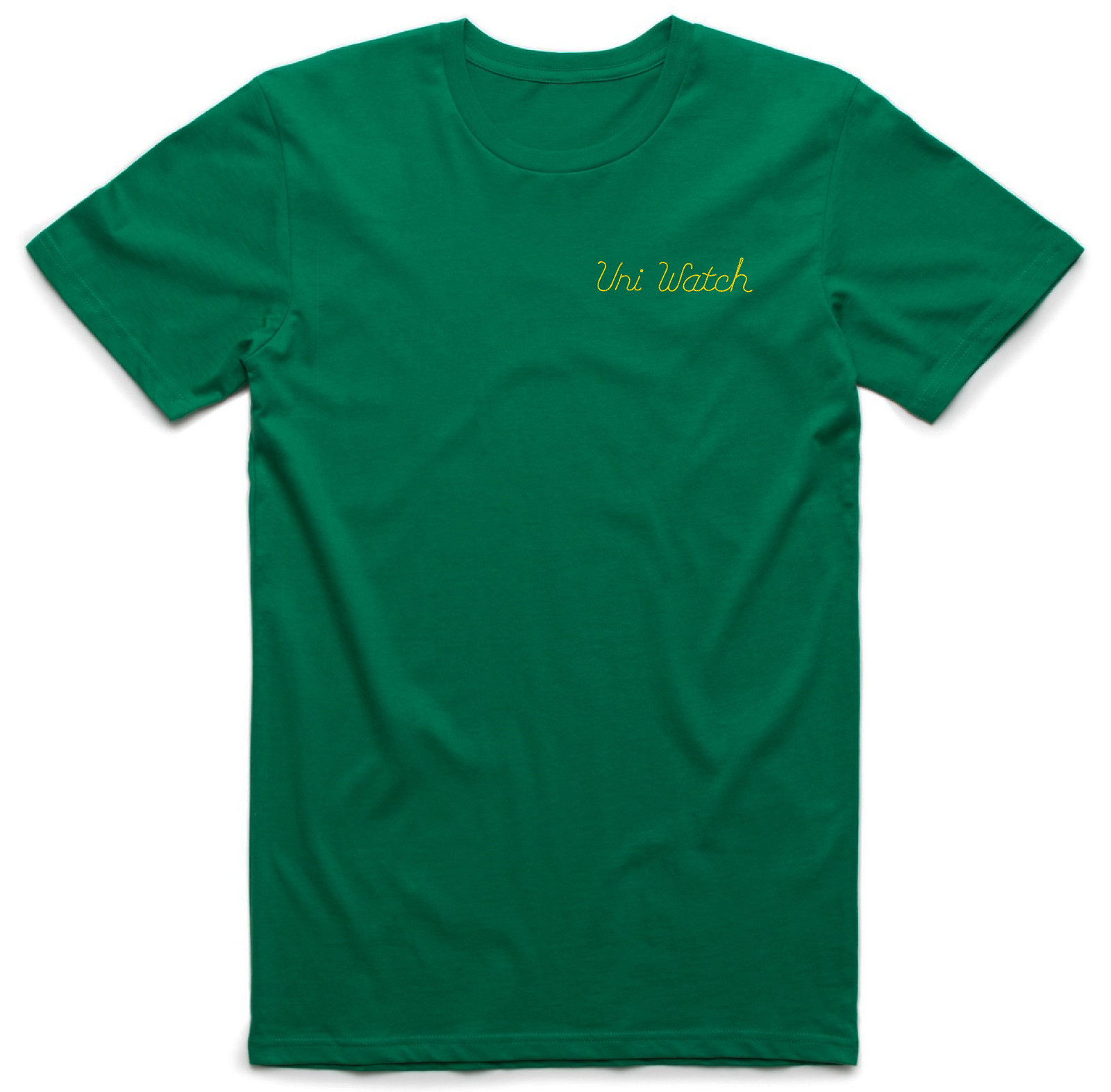
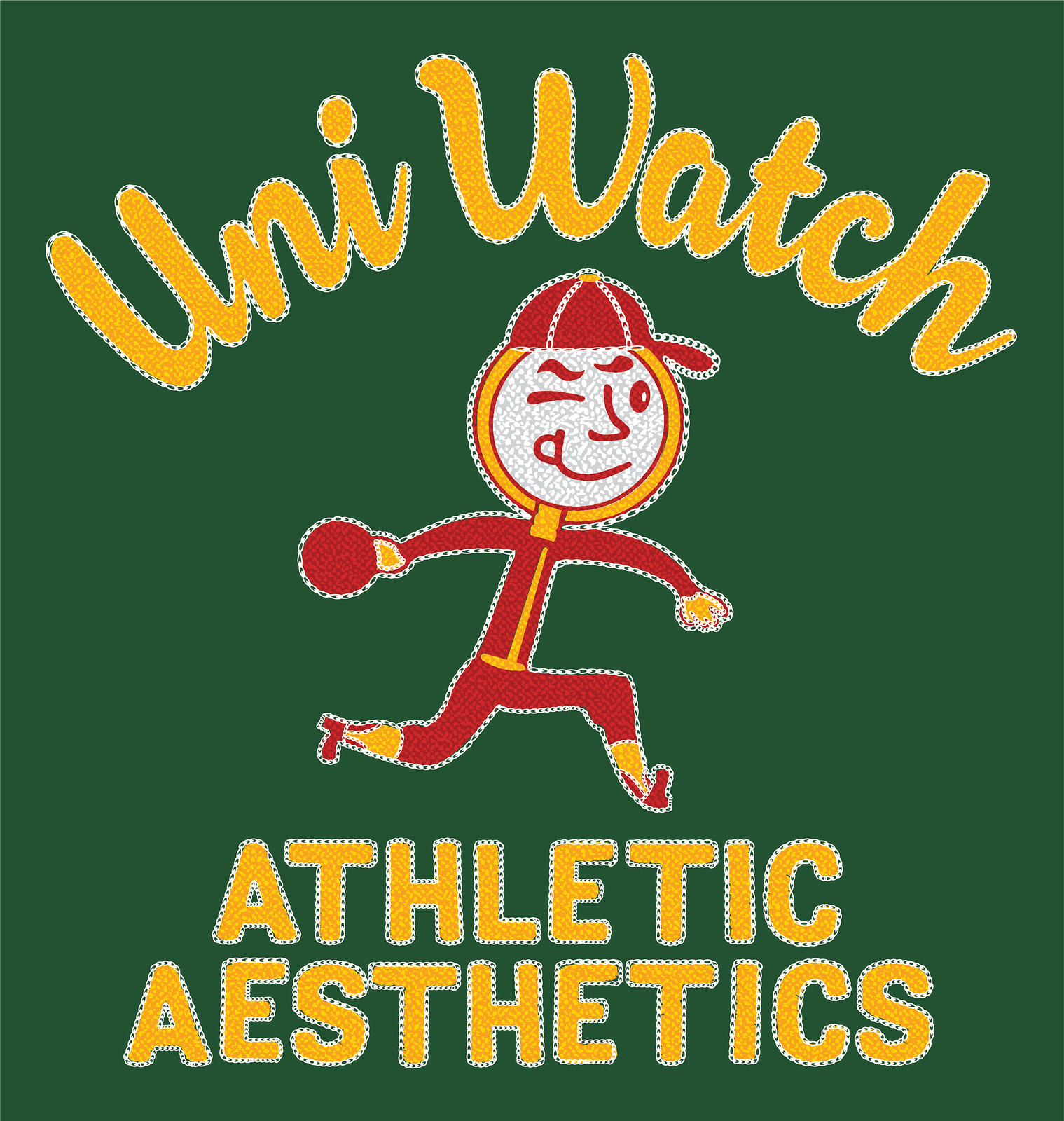
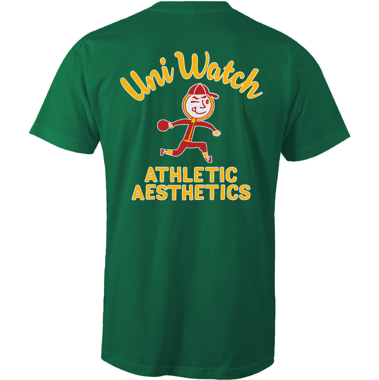
How great is that?! An anthropomorphized magnifying glass wearing a ballcap and stirrups — tremendous! The graphics really capture that old-school bowling shirt style, too. Even better, the design works well in a wide variety of shirt colors. Here are some of the ones we’re offering (there are several more on the sales listing page), just to show how flexible the design is:
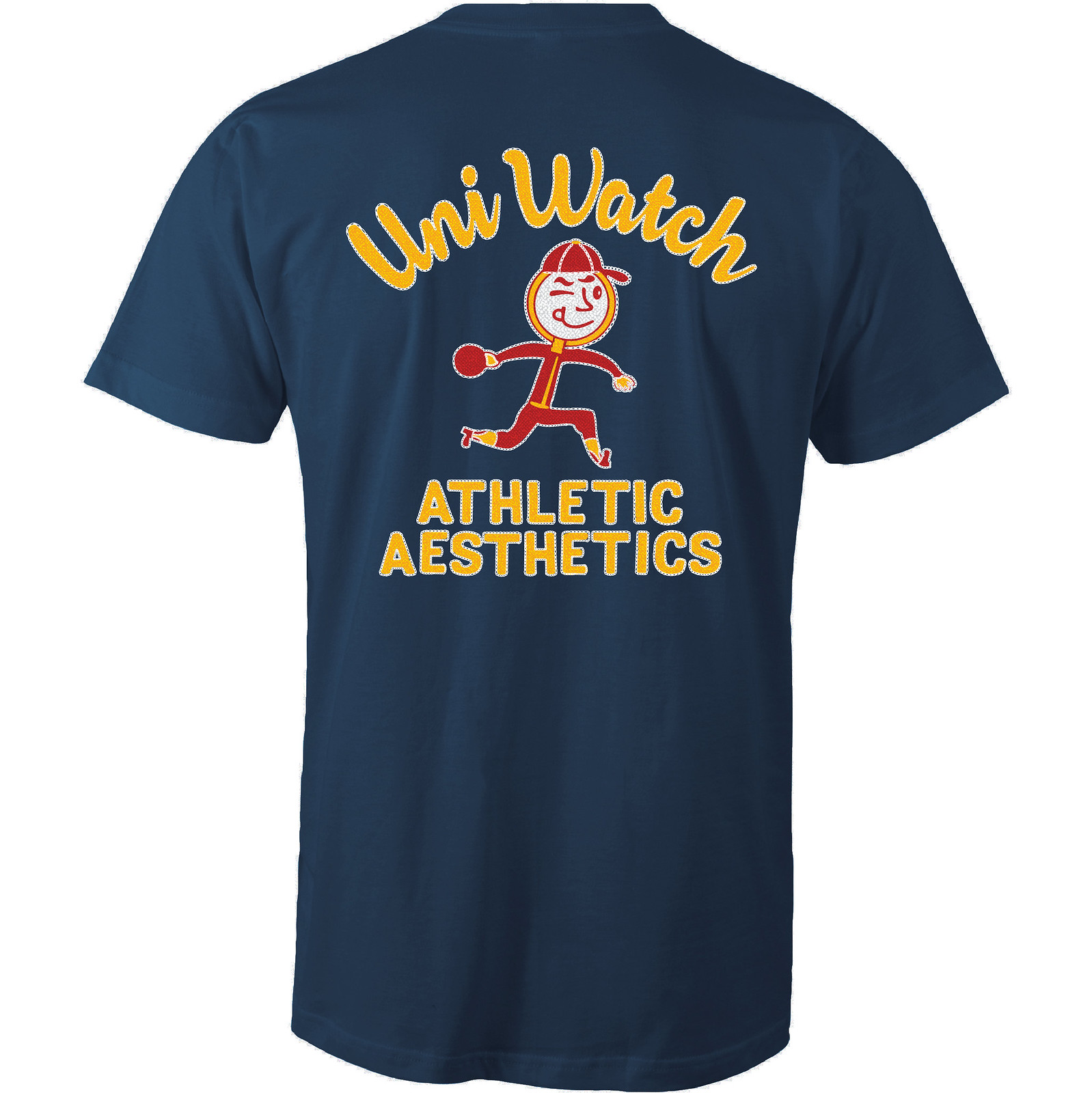
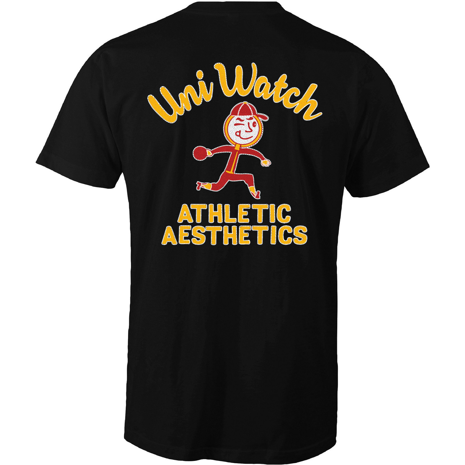
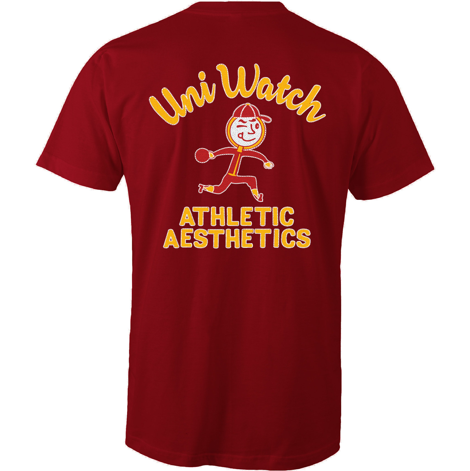
Like all of our Artist’s Series shirts, this one is a limited edition, available through next Friday. You can order it here. My thanks, as always, for your consideration.
.
Uni Watch News Ticker
By Phil

Baseball News: The Delmarva Shorebirds, a Single A MiLB team based in Salisbury, Maryland, have an awesome Maryland flag jersey (yea, I said it’s awesome — I have different standards for MLB and MiLB alternates — the lower you go, the crazier you can get). More information here (from David Cline). … “Some uni-centric artwork of note in (yester)day’s ‘Family Circus’,” notes Eriq Jaffe. “The kids are wearing stirrups, but they appear to have tucked their pants into the tops of the socks. At least the caps have nicely curved brims.” … Yesterday was “National Superhero Day” so of course the great Bruce Menard found some old comics with Batman, Robin & Superman playing baseball. There’s also this bizarre comic with Super Boy and mutant Supermen. … Yesterday, Youngstown State wore yellow laces to bring awareness to childhood cancer (from Robert Hayes). Also note the nice ‘rups. … Interesting 2016 World Champions logo seen on this sign here (good spot by DJ Chicken Skratch). … Oh my, this tweet from Navy reads: “What does the Goat say? Find out and channel your inner Bill the Goat tomorrow at the #NavyBaseball game with ðŸðŸ‘• for goatees!” (spotted by Christopher Newberry). … Looks like the NYSE replicated the 1986 Worlds Champs NY Mets banners, but didn’t quite get the historical logos correct (from Niko Goutakolis”). … The Orix Buffaloes and Softbank Hawks went retro last night, to Kintetsu Buffaloes and Nankai Hawks (from Graveyard Baseball). … The Florida Gators Softball team has added some 3-D helmet decals to their buckets (from Dave Doop). … Last evening, the Washington Nationals broke out their alternate blue patriotic caps (from James Beattie). … A tweeter who goes by The Fresh Prince of Daytona got himself one of them TMNT Tortugas jerseys. … Johnny Okray thinks the Brewers stance socks are “kinda cool” but kind of weird too. He’s half right. … Louiville has a set of mono black baseball unis (from Ethan Moore). … I was unaware this was a rarity, but yesterday featured “The rare black jersey and camo cap vs. black jersey and camo cap matchup between @SFStateBaseball and @TorosAthletics.” From San Francisco State Baseball. Those should be so rare they never happen. … I don’t drink beer (anymore), but I’d totally wear this Pabst Blue Ribbon uni (h/t Bruce Menard). … Charlestown High (Boston) repurposes the Minnesota Twins’ interlocking TC logo (from Paul Friedmann). … Former Met and current Nat Oliver Perez was wearing some Stance hosiery last night (from James Beattie). … We’re not the only one (at Uni Watch) who do uni tracking — and when your team is the Arizona D-Bax, there’s a lot to track!

![]()
NFL/CFL/College/High School Football News: “Just when we thought the marketing for NFL items couldn’t get more absurd, I saw on Sports Illustrated’s website a link for you to be able to drop $100 on new NFL “first round draft pick jerseys” from [Thursday] night’s draft, each with the new player’s name and number 1,” says Dan Tarrant. “So you can now wear a jersey for your favorite player that will never be worn on the field! Unreal.” … “I was messing around on Lids.com (yesterday) after (Paul’s) post about the 49ers switching from 3 sleeve stripes to 2,” says Alex Boehm. “Anyway, I found that they are selling (or will sell) the Patriot Pat era throwbacks in the new vapor untouchable template. I just find this weird since the Patriots almost definitely won’t wear those this year because of the one helmet rule, so why did they update the retail template? …(S)ome other things I found were the Bucs are sticking with the flywire template and the Packers are sticking with their really old Reebok era mesh template.” … Lots of guys inside the Bears War Room on Thursday night were sporting orange ties (good spot by James Gilbert). … Speaking of the Bears, here’s how they get the NOB on the #1 jersey so quickly (from C.D. Tatak). … Tweeter Broc says, “Couldn’t find a still of the Nikelace but AZ Cardinals did not upgrade to the new template for 2017 either.” … Two of the Titans selected in the Draft have already chosen their jersey numbers (from Wade Harder). … But wait — those look like the old Nikelaces (from Kendall Cruse). … “My buddy spotted this (Oklahoma/Arkansas mix-up jersey) in a thrift store the other day,” says Keith Weidemoyer. “Unfortunately he passed up on it. Would’ve been a hell of a jersey to wear. Oklahoma logos on the shoulder and chest with Arkansas printed across the chest.” … smow notes, “new Nike template last night, old one today. Really hope @AtlantaFalcons have the new template in 2017.” … Not sure who is to blame here, but this “Rookie” football card has the wrong Browns logo/helmet (the tweet comes from Michigan football). Spotted by Broc. … Also from Broc, the Houston Texans are also using the old template (or at least the mockup jersey for Deshaun Watson is). … The Marshall Thundering Herd will not have any changes to their uniforms for next season, with one notable addition: they will add player NOBs to the unis for 2017. … Yesterday’s ticker featured a mock photo of Leonard Fournette wearing a #7 jersey (which NFL rules prohibit running backs from having). Yesterday afternoon, Fournette revealed he’d be wearing #27 for the Jacksonville Jaguars. … Speaking of LSU players making the jump: Jamal Adams will wear #33 and honor his pop with the Jets. … The Baltimore Ravens posted a brief video on Facebook showing the fabrication of the jersey nameplate for their 1st Round Draft choice, Marlon Humphrey. At the beginning of the video there is a glimpse of a uniform graphic that includes the infamous gold pants that were worn by the Ravens on December 20, 2015 and the all-purple Color Rush uniform that was worn on November 10, 2016. “The sight of those gold pants elicited a few indignant comments from Ravens fans who generally believed the gold pants were a one-time thing never to be repeated,” says submitter Will Shoken. “Or will the gold pants be taken out of mothballs?” … Here’s a look at a individual letters being affixed to to KC Chiefs jersey. Interestingly it’s a RNOB (Roman Numberal on Back) too. … Uni maker Russell may have lost a few of their remaining college teams recently, but they’re Bringing Back The Gold for So. Miss. … “Auburn Photoshoped their own uniform on to a Nike template (note FlyWire collar) and forgot to add helmet stripes for Packers,” says Clint Richardson.

Hockey News: I know we’ve discussed the Cooperall pants phenomenon on here, but I’m not sure if we’ve ever seen this November 4, 1981 article from The Asbury Park Press which declared the Philadelphia Flyers “No. 1 in the world of NHL fashion.” (from Matthew Algeo). … Not quite sure what’s going on here, but two separate tweeters picked up on this “Wild/Blues jersey. Obviously it’s a piece of paper being held in front of the jersey…but I’m not sure why (neither provided context). From §ÃŸ and [insert Stanley Cup] respectively. … “Never realized how bad the oversaturation of sleeve numbers looks on the Blues,” notes W. Ross Clites. “It’s like an incorrect math problem.”


NBA/College/Basketball News: Never in the history of modern-day shoe endorsements have the big companies all stepped away from a potential top pick nearly two months before the NBA draft. But that’s now the case for Lorenzo Ball (blame his pop), as Nike, adidas and Under Armour have all confirmed they not interested in completing a deal with him (from Brinke). … I think we’ve seen this before (I lose track of whether I’ve seen it in the ticker or on twitter), but just in case: the new secondary logo for the Pacers (is official). It won’t replace either of their two primary logos — the P with the streaking basketball in it or the version featured at center court of Bankers Life Fieldhouse which is encircled in a gold ring that says Indiana on top and Pacers at the bottom — this is just another new logo (h/t Hoosier Steve). … “This is odd?!” says Eric Mahler “Adidas on Jordan doesn’t really work” (via Paul). … An ESPN interview with John Wall uses a stylized version of the “Wizard Man” logo (far right) that the team discontinued 2 seasons ago (good spot by Robert Anderson). … “Thought this was interesting,” says Matt Brown. “A Bucks assistant coach appears to be wearing their white game shorts.” … This photo looks awesome (and familiar too) — but ESPN used it last night and a couple people (Anthony Djerald and Jeremy Fallis) pointed it out.

Soccer News: FC Buffalo (a member of the NPSL – National Premier Soccer League) unveiled new kits yesterday, and they’re sponsored advertisement is for LifDental (whatever the hell that is) — even though the article is primarily about the advertiser and not the kits themselves (from Paul). It’s a local company: “Buffalo’s choice for an easy dental experience.” … “Just noticed that Real Madrid kits have a lowercase ‘i'” says Ryan Keberly. Here’s a shot of “iSCO” and “ASENSiO”. Ryan adds, “Interesting solution for a typeface that doesn’t have serifs on the capital ‘I’.” … Sporting KC got to the bottom of Solloi-gate (from Matt Newbery). … Apologies if this is a repeat (I *think* it might be): Detroit City FC unveiled their new jerseys and advertisers.

Grab Bag: While on vacation in Belize Jeffrey Schleicher stumbled upon this golf cart. He explains that “Golf carts are huge in Belize. For many it seems like it’s their main form of transportation.” He adds, “Looks like they got a little lazy with the logo design.” … UNM unveiled “a proposed new visual identity mark” yesterday (from Rob Montoya). He notes they used forms of this logo in athletics since the beginning. This is an academic logo change. … Remember those awesome tequila sunrise curling shirts we saw in yesterday’s ticker? Well, here’s a look at the backs (from Garret Heinrich). … Here’s your first look at your Captain Marvel-inspired US Ski Team uniforms (even though that’s dated yesterday, and it says “first look” — I have a feeling we’ve seen these before). … Interesting nugget in this article: Golf balls specifications for the United States were different than they were for the rest of the world (nice find by James Gilbert). … Also from James, apparently Luchador wrestling masks for your favorite college team are now a thing.
.
And that’s it for today. Hope everyone has a great Saturday (and is in a place where you can enjoy spring — it’s finally beginning to break out here in this little corner of the Elite Coast). Catch you guys tomorrow. But until then…
Follow me on Twitter @PhilHecken.
Peace.
“OK, so I enjoy pain. Can anyone point me to something that shows the cringe-worthy name of the new Nike Fball template? Can’t seem to find it on line and I need a good laugh.”
— Tim
.
Re: Oregon helmets
link
The 1st round draft pick jerseys for sale don’t come with the number 1. There is note stating that the jersey will ship speratley, after the players number has been officially announced.
Yeah it’s been like that for ages. Kind of weird for the site and reader to mess that up.
Does anyone even bother to read anymore? People are so quick to see a headline and immediately have a reaction without bothering to actually take any further steps before complaining. It says it right there, clear as day, “special event item” and proceeds to explain it will be mailed after the player chooses his number.
Most of the links are not working for me currently on the ESPN piece
I’ve got to ask…what is the significance of April 28th that would cause the Nationals to go patriotic?
Friday home games at night are blue patriotic uni. Friday day games are white ‘Murica unis. Go Natinals!
Charlestown High (Boston) repurposes the Minnesota Twins’ interlocking TC logo
Doesn’t work for me. When I see the logo on them I think TownCharles instead of Charlestown. Tweak the logo if you want to have the C on top or redesign a new one, but don’t just use it as is.
It’s Superboy, 1 word. And those are Bizarros, not mutant Supermen.
That Cubs world series logo has been discussed on this site before. It is something the Cubs have been using, and it is based on a historic 1907 logo. Just Google “cubs 1907 world series logo” and you should be able to see it.
Oregon: I have seen plenty of logos and uniforms sported by minor league indoor football teams. The Ducks would not look out of place next to the link or link.
Buffalo FC: Love the lightning bolts nod to hydro power and Niagara Falls.
I agree with Curtis Peddle — the ’74 Bert Campaneris card is a top notch card. Compared to the ’76 Johnny Bench, it’s a much crisper image. For me, action shots on Topps 1970s cards tended to be less sharp than posed shots. That said, I agree with Michael Ortman’s observations. Nice picks.
The problem with the Campaneris card is it is a 1974 card and it shows him in a 1972 uni. That eliminates it from being a ‘perfect’ card to me, I know that you can’t always have up to date unis, but they wore the gold jerseys with green lettering all of 1973.
Good point, Lou. I didn’t say it was perfect by my standards — I said it was top notch. And I don’t think Curtis was using this criteria, which is perfectly okay.
The NCAA doesn’t know how to handle the Balls, considering that these kids have an agent (their dad) while at UCLA.
No one has ever had the balls to so overtly promote their son (or daughter) while still a NCAA student-athlete.
I imagine the NCAA will eventually add a Ball Provision to the rules.
Typo: before the link you have “Lorenzo Ball” instead of “Lonzo”.
Typo: “Johnny Okray thinks the Brewers stance socks are “kinda cool” but kind of wierd too.”
Weird
The Flyers actually wore the CCM ProPak which was their answer to the Cooperall. The photo confirms that, as the ProPak girdle had a belt instead of the laces.
Yes, of course that is true. The Whalers also wore CCM ProPak in 1982-83.
However, for ease of understanding for common folk, uni watchers and hockey people have generally accepted Cooperalls as generic term to describe long hockey pants. Kind of like how we use a Xerox machine to photocopy or Kleenix to blow our nose.
I hope the CCM people are not to jealous ;).
*Oops, spelled Kleenex wrong.
Actually, I don’t know anybody who actually uses “Xerox” generically to refer to a copier, and I’ve been in the business for nearly 20 years now.
Agree Cooperall is now the commonly used name, but surprised to see that in a newspaper article from back in the day. These days, Nike/Adidas/UA would probably not tolerate such a major mis-branding reference. First hockey equipment reference to #fakenews??? :)
First half dozen or so embedded photos in the Oregon piece are not working, for me at least.
Nevermind.
RE: The Wild jersey with the Blues logo:
The Blues, currently coached by Mike Yeo, played the Wild, formerly coached by Mike Yeo, in the first round. (Yeo is the bald man wearing glasses on the *left* in the linked picture.) This fan probably whipped that up because he had tickets behind the bench, knew he’d be on TV at some point during a coach’s interview, and couldn’t resist the chance to troll Wild fans. I guess he’s still wearing it out of superstition since the Blues won the series.
Oregon uniforms. Stupidity in cloth.
Tastes are a matter of opinion, but in the case of Oregon, when you’re winning, then the crazy uniforms can seem kind of cool, like the variety is a trademark in and of itself.
However, when you’re stinking the place up like Oregon did last year, you just look like a bunch of clowns and people will start to think that the uniform gimmick is a distraction.
Joe Paterno used to say that his teams were there to play football, not to worry about looking fashionable. He might have been onto something.
Like turning a blind eye?
The reason for the wild/blues jersey was because the wild had just been eliminated by the blues in the previous round.
1 that johnny bench card is THE greatest card EVER for anyone fortunate enough to be a kid in the 70s collecting them.
2 i am SO tired of teams jacking with their uniforms to “honor” this group or make me “aware” of an illness. So today it is Boregon “honoring” the military. What is the deal, ducks? You hate cops and firemen, or something. I guess you are saying “teachers and nurses suck” since you don’t have anything on your uniforms about them.
GET OVER YOURSELVES, BOREGON.
JEEZ
“Anyway, I found that they are selling (or will sell) the Patriot Pat era throwbacks in the new vapor untouchable template. I just find this weird since the Patriots almost definitely won’t wear those this year because of the one helmet rule, so why did they update the retail template? …”
The red alternates are still very popular amongst fans and sell really well. For SB’s XLIX and LI, they even sold versions of the red jerseys with patches.
The Cowboys also updated their throwback to the new template (retail wise) and will certainly not wear it either.
The Maryland flag for the Shorebirds uniform is backwards. Unless you count the sleeves. But visually, it looks backwards. The black and gold should be in the upper left quadrant when displayed that way.