For all photos, click to enlarge
As the NFL prepares for tonight’s draft, assorted teaser photos are showing various teams’ jerseys rendered in Nike’s latest tailoring template (the one with the painfully cringe-worthy name, so I won’t be saying it out loud), which means they’re blissfully, gloriously free of the brutal Nikelace collar that’s been such a gridiron pestilence over these past five seasons.
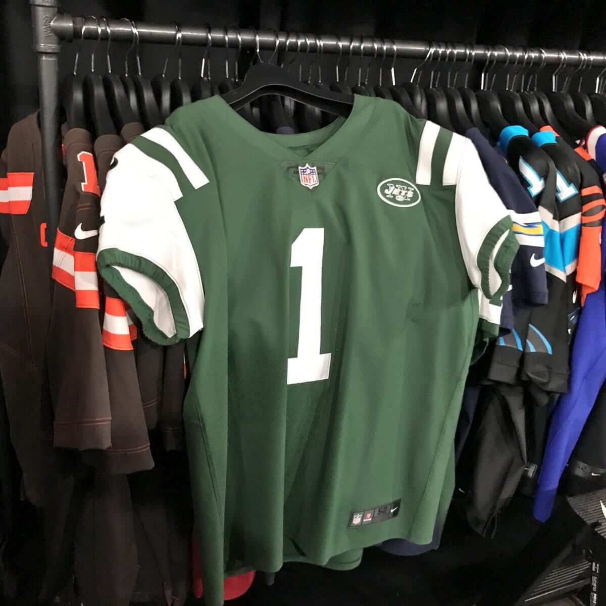
You can see the Jets’ new collar above. Sure looks better than this bullshit, right? And here’s how the new collar treatment will look in Philly:
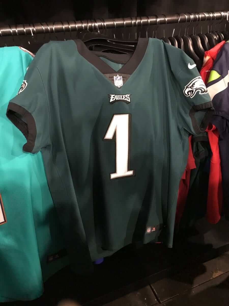
Yeah, the little triangle thingie is annoying, but not nearly as annoying as this. Let’s not let the perfect be the enemy of the good, shall we?
This next photo provides a peek at a bunch of additional teams’ collars. See if you can spot the one jersey that’s different from all the others:

That’s right, the Browns still have the Nikelace. Maybe they didn’t have one of the new jerseys available for the photo shoot. Or maybe Cleveland will be stuck with the old style this season while everyone else gets to wear the new style. Would anyone really be surprised by that?
The Browns’ latest potential indignity notwithstanding, that photo also shows how the new jersey style has some design implications for teams with striped collars. Look at the New England and Buffalo jerseys — the collar striping, which used to come to a point, is now truncated. I’d say this issue is much less objectionable than the Nikelace, but it’s still irksome. Several other teams could have the same problem if they adopt the new template. (Keep in mind that some teams, like the Packers, Panthers, and Falcons — all of which have striped collars — have been wearing the old Reebok template all along. It’s not yet clear, at least to me, whether they’ll transition to the new template or stick with the Reebok format.)
We’ll presumably get a better look at the jerseys during the draft tonight. But I won’t be seeing any of that, because I always spend the last Thursday night of the month seeing one of NYC’s most entertaining bands, so I’ll miss the riveting spectacle of Roger Goodell standing next to a series of overgrown children — what a pity. But I’m sure I’ll catch up on any jersey developments when I get home, right? Right.
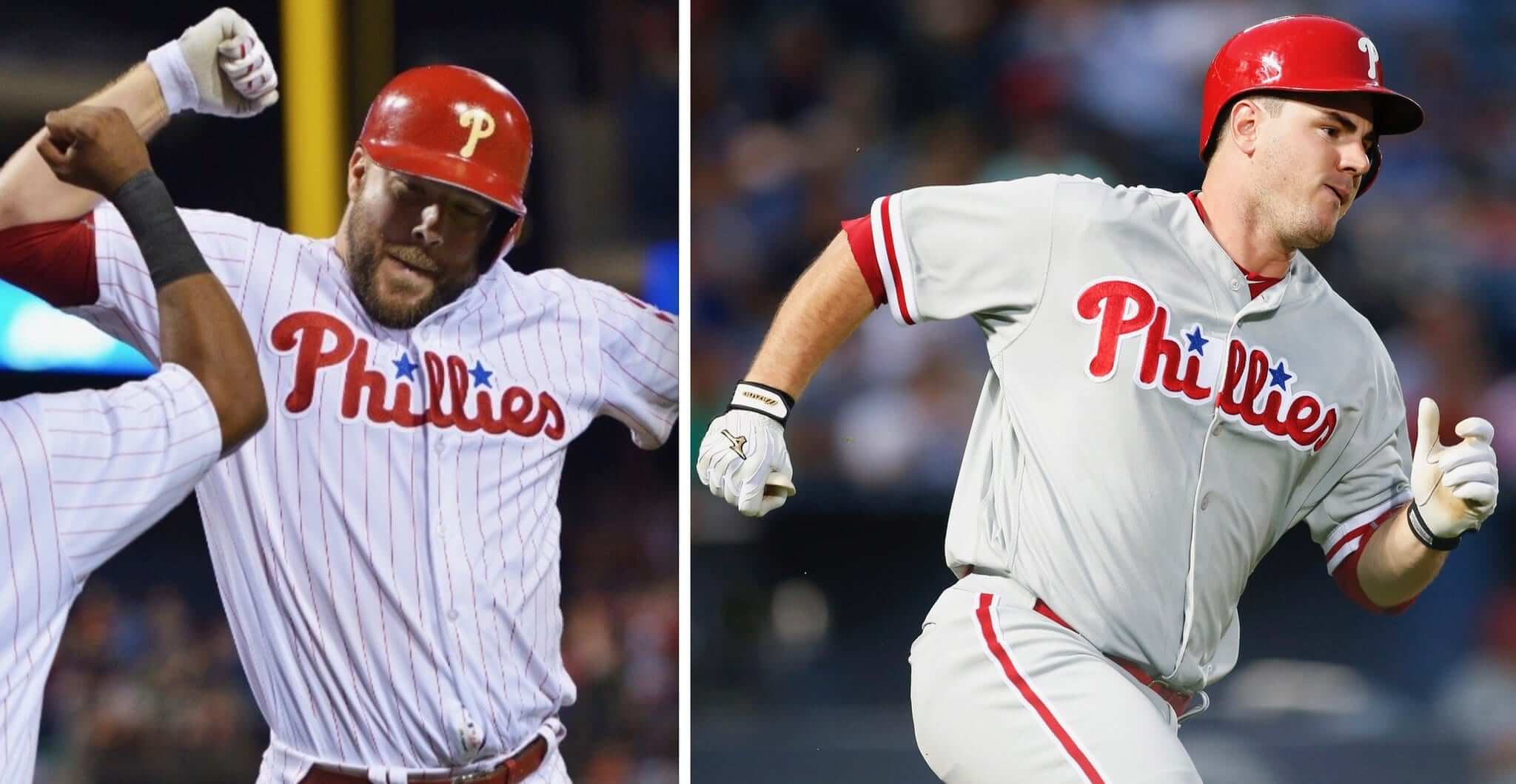
New ESPN column: Today I have a new ESPN column on the common MLB uniform trope of teams wearing their team name on their home whites and their city name on their road greys, with a closer look at the 10 teams that currently don’t follow that standard (including the Phillies, shown above). Check it out here.

Click to enlarge
Beauty is where you find it, Part 1: Last night I had dinner with my friend Shane at this Chilean restaurant in Queens (very good). As we walked back to the subway, we passed this cluster of gas meters mounted along the side of a house. I love how the pipes are sort of nested to created a repeating pattern. Kinda reminds me of a classic meander design, like this:
Click to enlarge
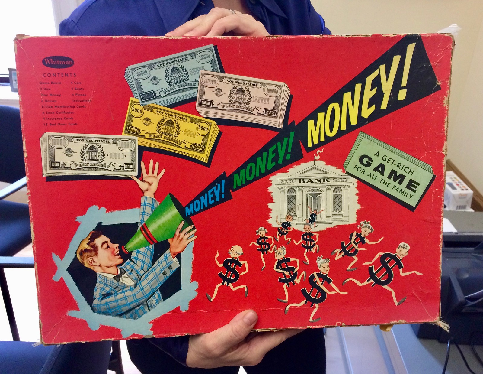
Beauty is where you find it, Part 2: My friend Nicole is a certified financial planner and a serious fan of vintage collectibles. Put those two things together and you get her latest find: the old board game shown above. Love the box design, especially the little anthropomorphized dollar signs running amok.
New T-shirt reminder: In case you missed it yesterday, our latest T-shirt in the Uni Watch Artist’s Series, designed by the great Scott M.X. Turner, is now available, and it’s a doozy.
Here’s the concept: If Uni Watch had a bowling team, what would the team be called? The Athletic Aesthetics, of course! And what would the team wear? A classic bowling shirt with chain-stitched embroidery, of course!
Scott’s T-shirt is based on that idea, with a simple “Uni Watch” insignia faux-chain-stitched on the front-left chest and a spectacular design faux-chain-stitched on the back (for all of these images, you can click to enlarge):
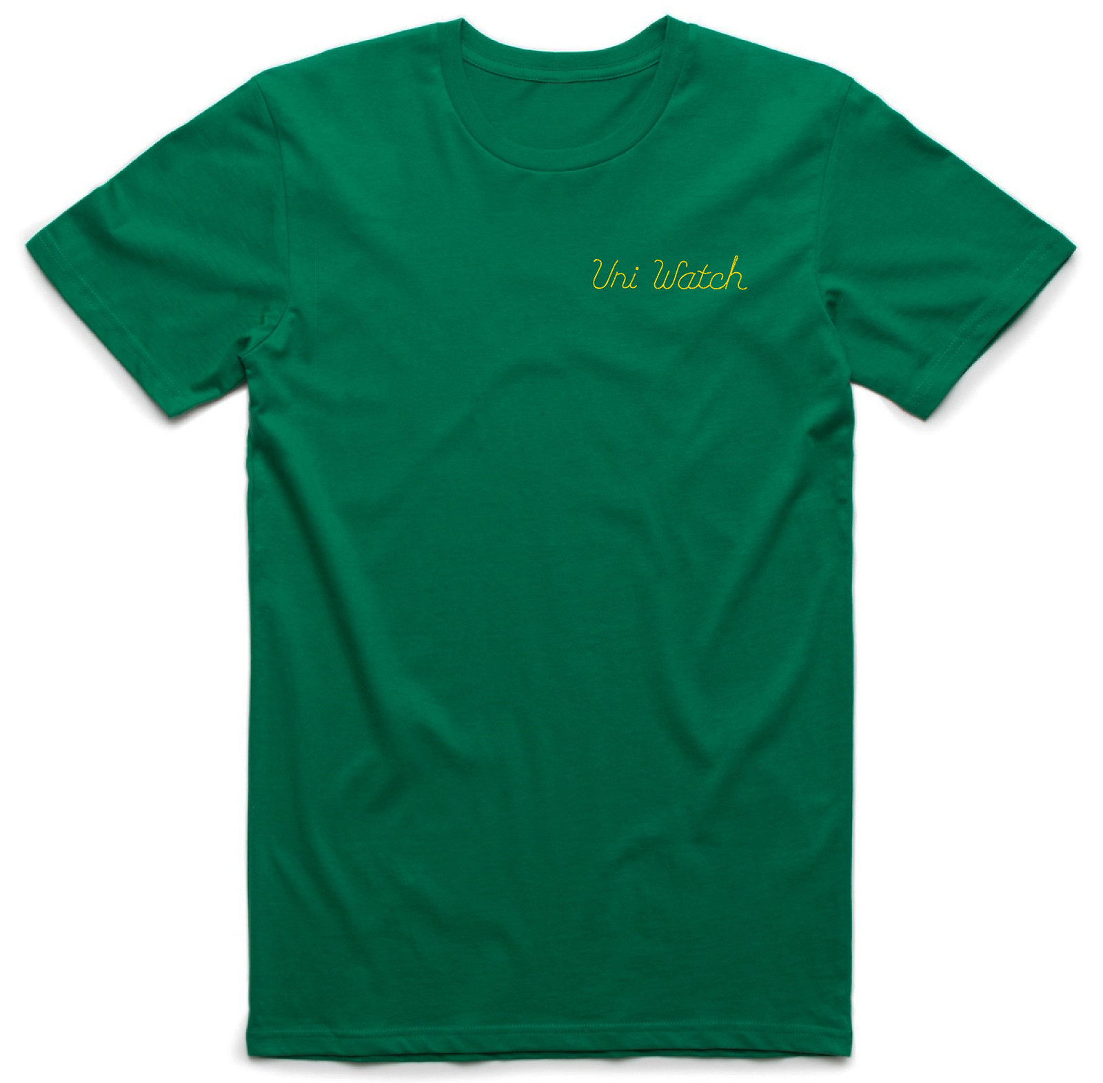
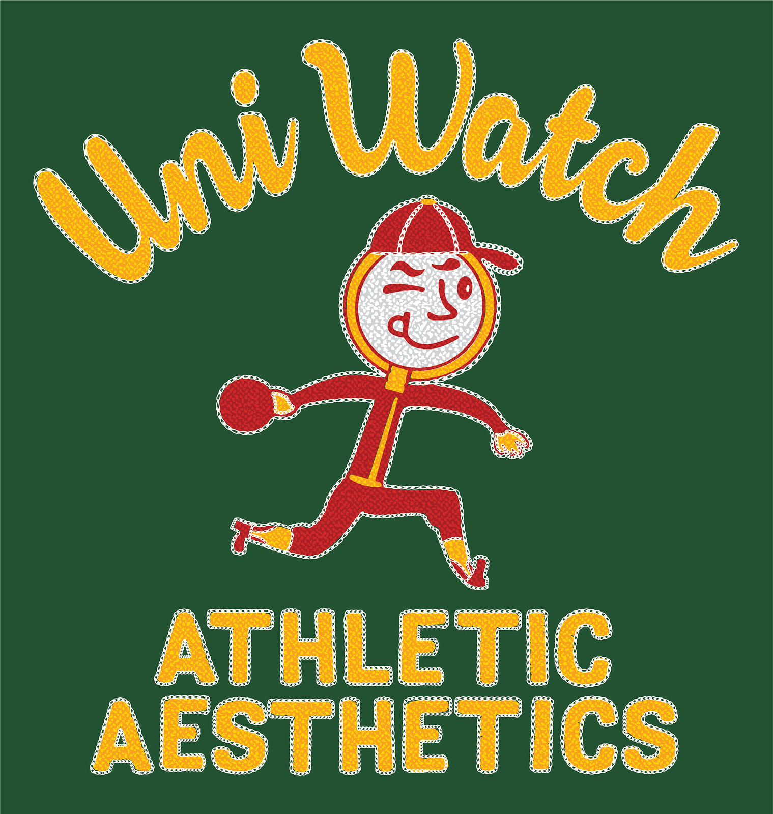
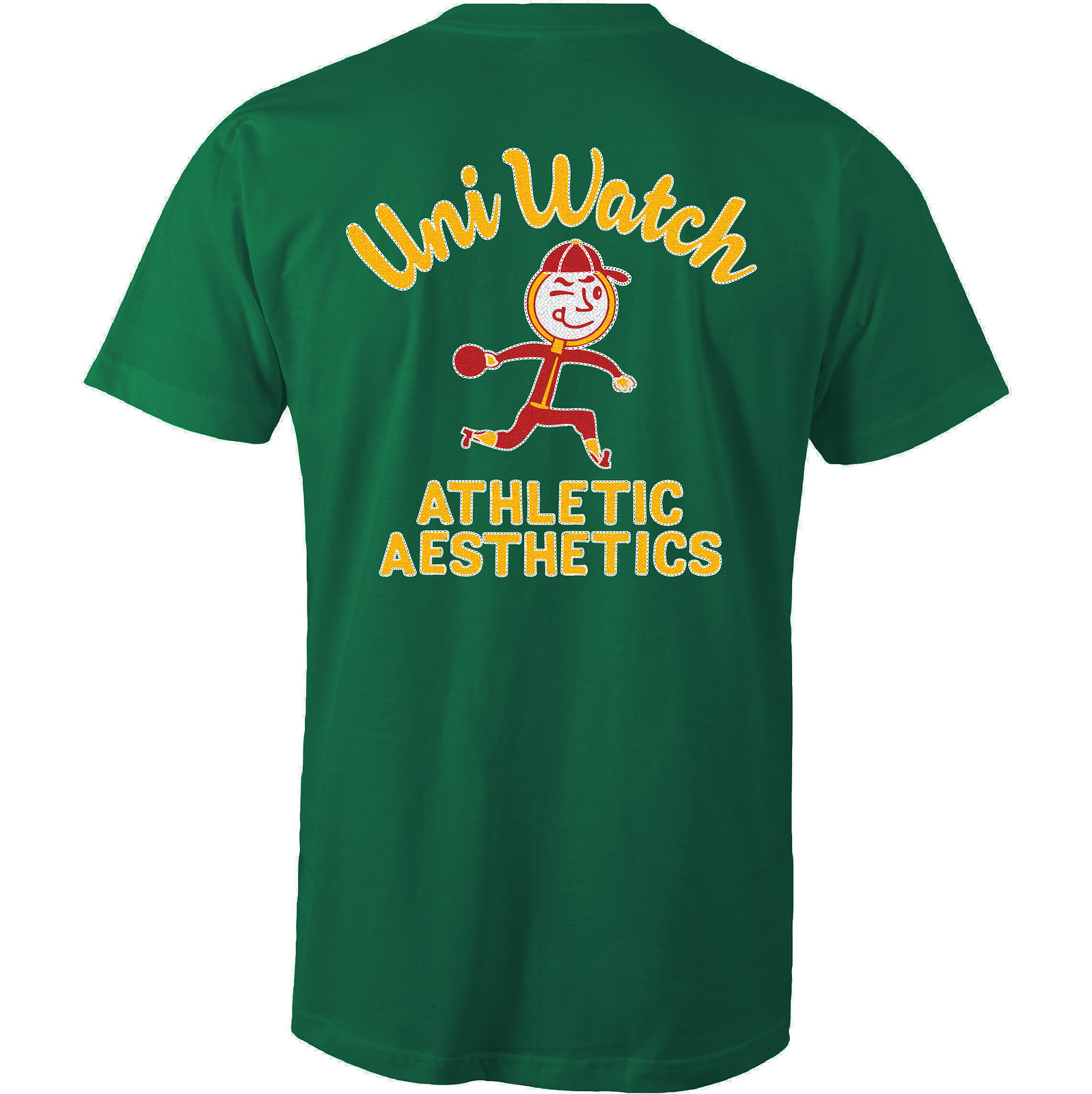
How great is that?! An anthropomorphized magnifying glass wearing a ballcap and stirrups — tremendous! The graphics really capture that old-school bowling shirt style, too. Even better, the design works well in a wide variety of shirt colors. Here are some of the ones we’re offering (there are several more on the sales listing page), just to show how flexible the design is:
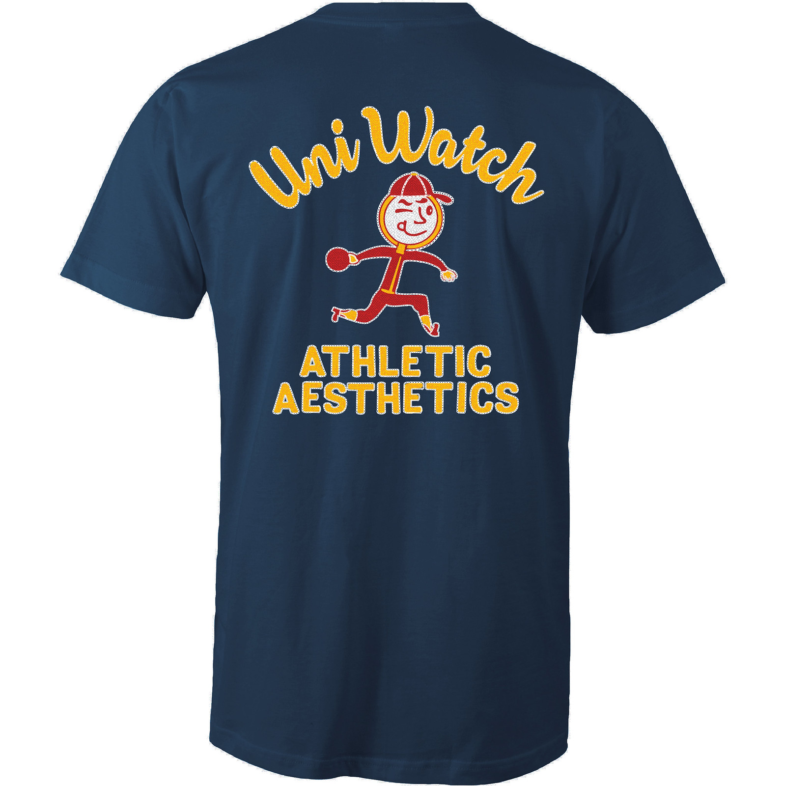
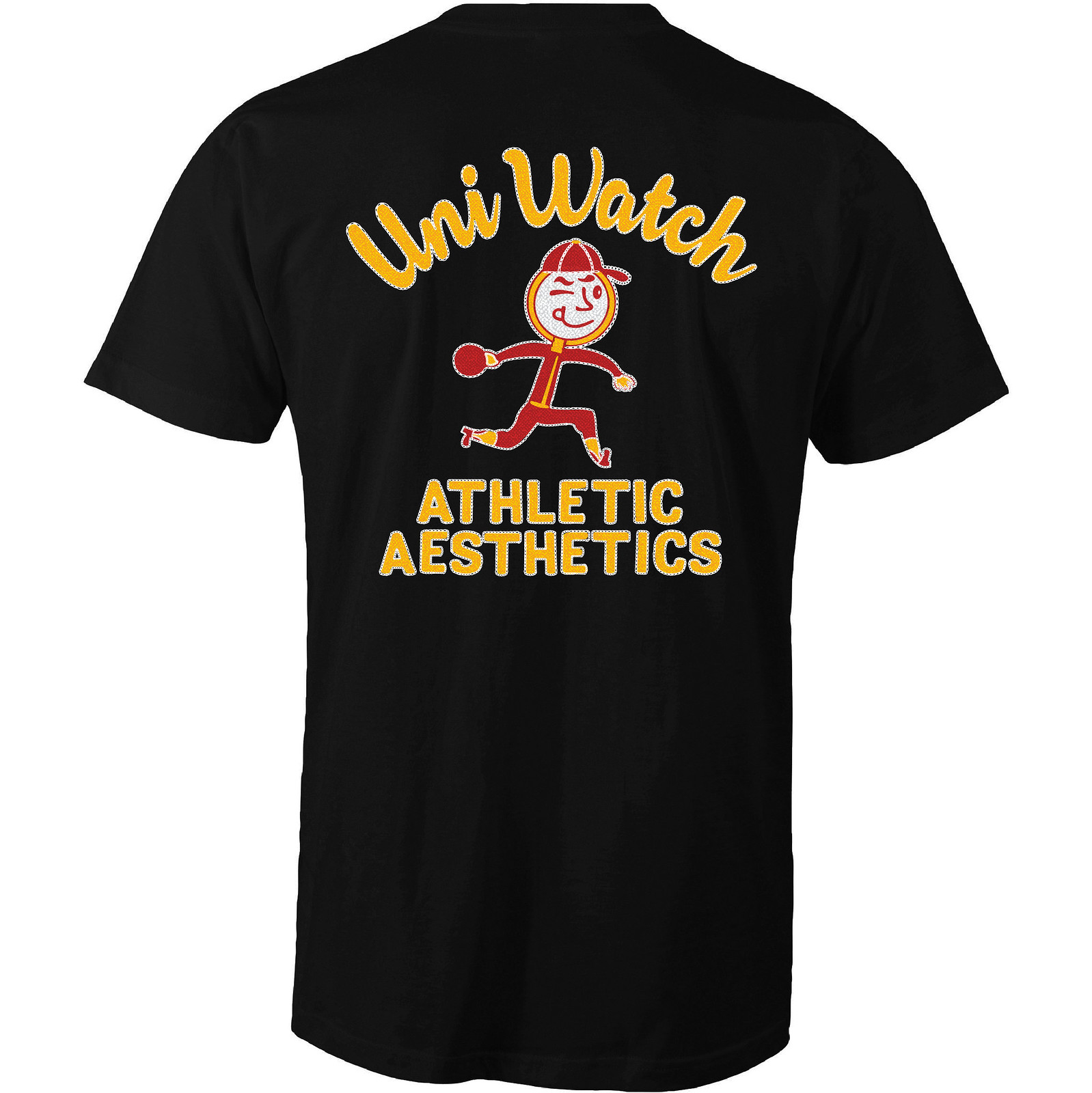
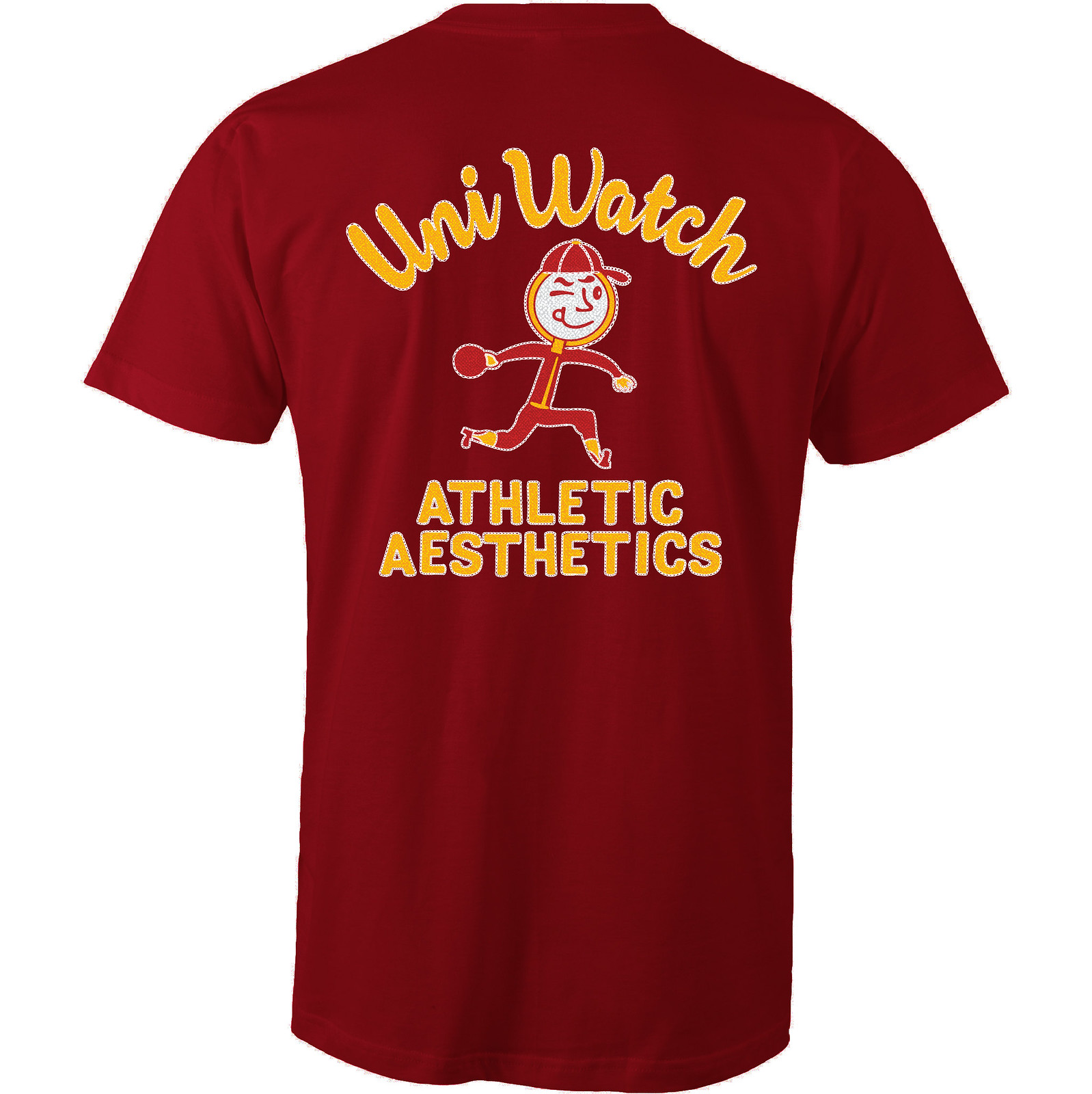
Like all of our Artist’s Series shirts, this one is a limited edition, available until late next week. You can order it here. My thanks, as always, for your consideration.
The Ticker
By Mike Chamernik

Baseball News: The Indians have been wearing red shoes at home recently, much like what they did during the 1990s. … Also, Jose Ramirez has been wearing dot-patterned TruSox, instead of Stance socks, much like what Francisco Lindor wears under his stirrups (from Nick Qualters and Robert Hayes). … Yet another Cleveland note: OF Abraham Almote wears a Mims Band, a modern version of the old “Say No to Drugs” personalized wristbands (from @PatDStat). … The Yankees’ Henry Cotto, who wore No. 28, had an upside-down 5 instead of a 2 during the early part of the 1987 season (good spot by Andrew Nesnay). … Braves P Julio Teheran has his initials sewn onto his spikes (from Jason Stewart). … A baseball field in Rhode Island removed five wooden poles that stood in play in front of the right field fence. The poles, which held netting that protected nearby homes, were determined to be safety hazards for players (from Matthew Algeo). … The Salt Lake Bees will wear black-and-pink jerseys on May 13 (from Brady Hack). … Newer ballparks have fewer obstructed views, but the trade-off is that some of the seats are much farther away than they were in older ballparks. … New uniforms for the Chinese team Uni-Lions, who at the very least have an excellent team name (from Jeremy Brahm).

NFL News: RB Marshawn Lynch will wear his usual No. 24 for the Raiders. The number was previously worn by Charles Woodson, whose second stint in Oakland ended in 2015 (from Brinke). … Also, the Raiders team headquarters has this logo display. I’ve never seen the logo at the bottom before. Have any of you? (From Rudy Gutierrez.) … NFL prospect Deshaun Watson is a fan of Cardinals’ black alternates. Arizona has the 13th pick in tonight’s draft and is considering drafting Watson if he is still on the board (from Phil). … A player’s suit and sense of style on draft day could determine future endorsement deals. … The Lions have new helmets, but a display at the draft hasn’t been updated with the new design (from @jawnes12). … The Rams have a new AT&T ad patch on their practice jerseys. Chris Cruz notes that not everyone has the patch yet, and that patches on the red QB jersey have a white background. … The Rams gave Skybound, the Los Angeles-based multimedia entertainment company, a new helmet that still has their old logo on the nose bumper (from Bob Novotny). … Pro wrestler Stone Cold Steve Austin wore a Patriots jersey with “3:16” on the front, in reference to his “Austin 3:16” catchphrase, during a trip to Boston in the late 1990s (from @YUNGGOD3HUNNA, via Phil).
College Football News: Michigan coach Jim Harbaugh gave Pope Francis a Wolverines helmet and retro Jordans during a trip to Rome this week. The helmet has a “266” decal, since Pope Francis is the 266th pope, and U.S. and Italy flag decals — arguably a mistake, since the pope lives in Vatican City, a nation with with its own flag (from Phil). … Oregon will sell excess equipment and uniforms to the public on May 6 (from Andrew Cosentino).

Basketball News: The Pacers filed for a trademark for a new Indiana-shaped logo. It made its first appearance on a Pacers racecar earlier this week when the team submitted their bid for the 2021 All-Star Game (from Conrad Burry). … Rutgers offered a sneak peek at one of its new Adidas basketball jerseys (from Phil).

Soccer News: New black away kit for Dundee United FC (from Ed Å»elaski). … New home kit for Indy Eleven of the NASL (from Nile Smith). … Neither @miked3783 nor I was aware that Lacoste once made soccer jerseys. … An Isis enforcer removed the “blasphemous” Real Madrid logo from a local resident’s jersey in Mosul (from Steven Nabil). … Players for Bjarg, a Norwegian soccer club, wear NNOB jerseys, but coaches have their names on their bench coats (from Roy Ellingsen). … Dulwich Hamlet is letting fans vote on next season’s home jersey design (from Ed Å»elaski”). … New 125th-anniversary kit for Liverpool. Additional photos here (from Jeremy Brahm). … Speaking of Liverpool: Here’s a short history of their crest (from JohnMark Fisher).

Grab Bag: Flyers legend Bobby Clarke once owned a house that had a pool in the shape of the Flyers logo (from Jackie Treehorn). … It’s always interesting to see athletes wearing “wrong” uniforms at the ends of their careers (from Phil). … Three finalists were announced for a new flag design for Tulsa, Okla. The public will vote to determine the winner (from @hardchargindady). … First Lady Melania Trump’s birthday was yesterday. Oddly, the American flag shown on her birthday card had only 39 stars (from Andy Moeschberger).
On a serious note: As many of you are aware, yesterday was not a good day up in Bristol. As news of the unpleasantness spread, many Uni Watch readers got in touch to ask if I was okay and offer their support.
I truly appreciate everyone’s concern and am happy to report that I was unaffected by yesterday’s events. In fact, I signed a new contract just last month, which means ESPN was willing to continue investing in my work even as they were planning cutbacks in other areas — a heartening and humbling realization.
Many of my colleagues, including one good friend and some people I’ve worked with in various capacities, were not so fortunate. My thoughts today are with them.
Typo: it’s Bobby Clarke. And that house is about 2 minutes from where I used to live. Good times.
Fixed.
Proofreading:
“had an upside-down 5 instead of a 2” That’s upside-down in two dimensions, isn’t it?
“wiht the new design”
Fixed.
Yikes, terrible how that Ram horn cuts off right at the mask line like that. I know they used to trim around bolts and would cut the horn off at the mask clip and start right after it agsin, but that one just has a tip showing right after the mask, with a sizable chunk missing.
-Still is an issue with the Jets and Eagles jerseys. They have not returned to kelly green! We need an NFL team wearing kelly green. They could use some inspiration from my favourite pro football team up north (Saskatchewan Roughriders):
link
– Re: players in the wrong uniform. Grant Fuhr wearing a Calgary Flames uniform seemed really wrong, considering all his glory days on the other side for the Oilers during the Battle of Alberta.
This may no longer be an issue in the Hi-Def era, but Kelly green used to blend into the grass on television. I recall some Eagles-Jets games that were really hard on the eyes.
In addition to the shade of green, the Jets unis continue to offend me with those stripe panels making a mockery of the Jets’ link.
The sad thing is, there’s an easy fix to the current template that would improve the look by leaps and bounds without having to alter the template! Just switch the stripe panels on the jerseys, so that the white-green-white panels are on the white jersey, and the green-white-green panels are on the green jersey. Then you’re not stuck with those ugly-ass corners.
The Indians have been wearing red shoes at home recently, much like what they did during the 1990s.
It’s never bothered me that red is emphasized on the Cleveland home uniform, while navy is the dominant road color. I think of it as their tradition, along with the navy blue jersey over white pants.
Does the Pope’s helmet *really* have the flags and 266 on both sides at the back??
Both photos show them on the near side.
Re the ticker text, I wouldn’t call Vatican City a nation. It’s a state all right, but it’s more of a microstate or a city-state – or even a corporate state – than a nation-state. With no natural-born residents or citizens, there exists no people whose national identity might be bound up with or represented by the Vatican state. So, not a nation.
And while it would seem obviously better to have crossed the Vatican flag with the US flag on the helmet, the Italian flag isn’t necessarily a mistake. Francis is the child of Italian emigrants, and primary among his official titles is Bishop of Rome. So while he is head of state within Vatican City, he is also the senior church official in Italy.
link
Country ≠State ≠Nation. The phrase “nation-state” is not a redundancy; those are two different words with distinct meanings. Not all states represent nations; not all nations have states. Most countries have states, and most states are countries, but not all countries are nations. Vatican City has territory and a state, and so is a country, but it is not a nation.
In everyday American English, we commonly use “nation” to mean “country” or “state,” so in the sense that it’s true that the Packers wear yellow, it’s true that Vatican City is a nation. When speaking in a context where terms of art matter, such as making a distinction between Italy and Vatican City, this would be more of a the-Packers-wear-athletic-gold situation.
I’m arguing an “also right” or maybe “somewhat more right” point here, not really a “this is right, that is wrong” point. Because of course the Packers do wear yellow.
“Nation-state” is not redundant; a nation is made up of a people that share a culture, while a state is the sovereign territory of a nation. The Cherokee Nation, whether they live within the boundaries of land granted them by the US government or not, is a nation of people. The tribe may have a ‘reservation’, but technically, they are a nation without a state.
Added to say, I’m a moron and read arrScott’s reply incorrectly. That is all.
If you go and stand in St. Peters Square or in the Sistine Chapel, you are not in Italy anymore. The Pope does not live in Italy.
I agree that the Vatican is a state unlike any other, but it is unlike any other state.
The #1 indication of a state: do the other states of the world treat it as a state? In this case, unequivocally yes.
Wouldn’t it be more appropriate if this particular Pope wore the number “666”?
No
I’m not sure why you think this particular pope would be more associated with the number of the beast than any other pope. Do you care to elaborate?
All-time worst case of an athlete wearing the “wrong” uniform: Johnny Unitas, San Diego Chargers (even though the Chargers had a nice uniform it still wasn’t right).
link
I agree.
Art Monk in a Jets uni was pretty bad too.
link
The list is far from exhaustive, e.g., Willie Mays, Duke Snider and Warren Spahn as Mets. As a matter of fact, the early Mets teams could be an entry in itself.
Willie Stargell as a Braves base coach was all kinds of wrong.
Today’s ESPN column is up:
link
Glad you’re still there. It’s a shame for a lot of people who lost their jobs are ESPN. But it’s good to know your stuff can be found there.
Cool column! I thought the Reds have a famous logo at home and COR Ã la Nats, Tigers, and Yankees, but granted the home jersey logo contains the word “Reds,” so you obviously disagreed in your judgment call. Either way, that’s a wardrobe that would not be improved by a strict NAH-COR.
Yeah, I included the Reds because the word “Reds” is there inside the logo. That counts!
I love that Phillies 92 road prototype, apart from the weirdly mismatched sleeve numbers. I hadn’t seen that before.
Until they figure out how to Respect The Placket, the Phillies should leave well enough alone. Imagine seeing “Philladelphia” or “Philaadelphia” squished onto those jerseys.
Do the Mariners count as an inverse of this issue for wearing their road blue “SEATTLE” uniforms at home last season?
In the link to 1933’s uniforms on DTTN’s, the Chicago Cubs home alternate is rendered in black and gold! Did anyone else notice this? I looked it up in my old copy of Okkonen’s book and that fancy Cubs rendering was blue and red, as I remember. Did someone hack the DTTN’s site? Or has new info on that uniform come to light?
I did some googling.It turns out that Todd Radom discovered a photo with accompanying text describing the logo and uniform as being black and gold. Maybe he could tell us where he found it, and the process of getting DTTN’s to revise the drawing. Good work, Todd, though it seems he found it a few years ago.
And an agreeable article in ESPN today, Paul. The city name should certainly be featured on road uni. It just makes sense. Placing the team nickname there makes fans suspicious about relocation.
Speaking of wrong uniforms… Harmon Killebrew went from this link..i&w=200&h=301&bih=573&biw=1129&q=harmon%20killebrew%20royals&ved=0ahUKEwjmrav_4sTTAhVIVyYKHa2FDcIQMwg2KBEwEQ&iact=mrc&uact=8 to this link..i&w=283&h=400&bih=573&biw=1129&q=harmon%20killebrew%20royals&ved=0ahUKEwjmrav_4sTTAhVIVyYKHa2FDcIQMwglKAAwAA&iact=mrc&uact=8
Some of those jerseys in the frames look like they have metallic NFL shields on the collars.
I must admit, I scrolled through that Deadspin list of cutback victims bracing for the worst…which thankfully never came. Very glad you’re still writing for the mothership, and my thoughts are with those who are not.
Enjoyed the story on ballpark “intimacy”. I lived in old Comiskey Park in the summers of the 1960’s, usually sitting in the first row of the upper deck between home and first. Section 19. Could hear the players all the time. But I lost count on how many times a fan below me took a foul ball of the head. In today’s world, that would have been countless lawsuits.
Went to a game at Tiger Stadium before they closed it. The right field upper deck hung over the field! Literally above the action. You’ll likely never see that again.
Originally Citi Field’s RF porch link the playing field, an homage to Tiger/Briggs Stadium.
They’ve adjusted the dimensions out there a couple times now, not sure if the porch is behind the wall now or not.
The upper deck box seats at Tiger Stadium, the orange ones, were the best in baseball.
I don’t like that the article compares Guaranteed Cellular Park with Wrigley. Concisely was a much more intimate venue. The Sox get no respect.
New York is a city of 20 million? Who knew?
Comiskey. Not concisely. Stupid autocorrect.
Mmmmm, Hotronix Fusion.
With regards to the “wrong uniforms” article, I’m surprised they didn’t mention Favre’s stint with the Vikings, because as strange as his season with the Jets was, seeing him in in the purple and gold of one of the Pack’s divisional rivals was much worse.
RE: Tulsa Flags
Councilor Anna America said her first thought at seeing the designs was to question why the city’s name had not been included.
“And then I started thinking … any flag that I can remember doesn’t say words,” America said.
Uh, last I checked Tulsa was in Oklahoma:
link
Not to mention many other examples…
Exactly. There are many memorable flags in the world. Oklahoma is not one of them. Nor Wisconsin, which also has the state name emblazoned across its flag.
Any list of memorable flags – flags most Americans would probably recognize – would include the flags of the United States, the United Kingdom, Canada, Japan, Chicago, Arizona, Alaska, the Soviet Union, Nazi Germany, the Confederate Army, and maybe some combination of Jamaica, France, Ireland, Italy, Mexico, and South Africa. None of which have words written on them. Any list of forgettable flags – flags most Americans would probably not recognize, even if the flags represent the place where they live – would include many flags with words written on them.
The one exception is California, which has a simple and memorable design that also includes written words.
What the awesomely-named-for-a-politician Anna America is saying is that henceforth, Tulsa will have a more memorable flag than Oklahoma. Which is a true statement.
As my phone was loading, I only had the headline. I was hoping so badly that this was a ‘skins update in reference to the national disaster. I’ll take getting rid of nikelace though.
Jackie Treehorn treats objects like women, man
Well that’s, just, like, your opinion, man.
Paul, did you look into getting custom bowling shirts with that logo? I know it will be expensive, but that logo is too good just for a t-shirt!
I may look into it. The thing is, it’s difficult bordering on impossible to find bowling shirts made in the old rayon fabric, which is what I’d want for something like this. Also very difficult to find someone willing to do the chain-stitching.
We could use cotton/poly and screened graphics, but that sort of defeats the point — wouldn’t be that much better than a T-shirt.
Maybe Melania Trump is a big fan of North Dakota, our 39th state? Go Fighting Hawks? Or maybe it’s the politician’s-wife equivalent of keeping 39 candles on one’s birthday cake will into one’s 40s?
Glad to hear ESPN’s still writing you checks, Paul. The UniVerse is definitely growing.
I don’t think Cleveland is jumping to the new template simply because their design features the contrast stitching. With the new template having such few panels that need to be connected, there’s very little stitching involved. Stupid reason (and design regardless) to resist change, but wouldn’t surprise me if that’s the reason
Ah, excellent point! So the stupidest part of their jersey (the topstitching) will necessitate keeping the ugliest part of their jersey (the Nikelace). Various forms of idiocy feeding each other.
That’s an interesting point. I remember reading here a month or two ago when the rumors of another Browns redesign were circulating that one factor was the uniforms were uncomfortable compared to others in the league. Considering all the teams are wearing uniforms from the same manufacturer that struck me, I wonder if there is a correlation there.
Didn’t see this mentioned (and why would it, since they’re now NAH-COR again) but the Orioles had their team name on their road jerseys from the 70’s to the late 00’s between the times when DC didn’t have a team to cater to the whole DC/Baltimore region: link
The O’s are also the last team to have no geographical reference anywhere on the uniform/hat combo, with the bird logo on the hat and “Orioles” on the home and road jerseys. This is assuming of course that the Angels “A” hat could represent the Anaheim part of their name.
The Mets had a fauxback uniform with an “N” and a “Y” on opposite sides of the placket. I think the old Kansas City Monarchs used a similar design. That’s an approach I wish more clubs would try when a city or team name is a compound word.
The NY Highlanders did this, back in, as I like to say, the day.
They thought those wooden poles on the Rhode Island baseball field were a hazard, when I played high school ball in Indiana, there were three light poles in play in the outfield. They were actually positioned about exactly where the three outfielders should be standing if lined up straight away. They had padding but were ran into many times. They have since been moved out beyond the fences. I never heard a logical excuse for why they were in play to begin with.
At least Ray won a Cup in Colorado.
That Henry Cotto picture with the upside-down 5 in place of a 2 is indicative of the fact that the Yankees in in those years had plenty of problems with uniform quality control. On more than one occasion they had guys going out on the field with a digit from the wrong font.
The Mets’ problem years with number fonts were 1979 through 1983. Example: Dave Kingman with the link. The Yankees’ down period was from 1987 through 1991.
Enjoyed your NAH-COR ESPN article. Surprised to find out this wasn’t the norm in the past.
The Angels seem to not really want to display the Los Angeles name, with no mention of it on the hat or uniform. Kind of like the Raiders. I think their Orange County fanbase wouldn’t be happy if the “Los Angeles” name was prominent. I thought when they changed their name back to Los Angeles they should have instead embraced the region and call themselves the “Southern California Angels”. Join other regionally named teams like New England, Tampa Bay, and Carolina. Also an interlocking SC would look great on their hat.
Until the Angels bring back the interlocking LA cap with the halo, they’re dead to me.
Yeah, when your team’s city name is an awkward point of resentment or controversy among so many people, it makes sense to leave it off the uniform. Something that probably helps reinforce the choice: throughout franchise history, the Angels seldom went NAH-COR (never during the “California Angels” era).
Of all their monikers, I prefer “Los Angeles Angels” for reasons of nostalgia and originalism. That matches poorly, though, with my favorite look of theirs: the 1993-96 California Angels unis.
The Angels have painted themselves into a corner. Whatever they pick is likely to piss people off; should have stuck with “California”. At least that would revivify the cool “state” patch with the halo.
I dislike team names that use states rather than cities, but I can tolerate them if there’s no other team in the state. But there are four other teams in California. I was over the moon when the Marlins became Miami. ;)
Agreed. When the Angels went with “California” they were the only California American League team, but that seems like a weak reason when there are two other MLB teams in the state. Again, I think Southern California is a good way to represent a region.
The athletes in wrong jerseys showed Hakeem Olajuwon in a raptors jersey. But to me that silly blue jersey also looks wrong.
Love the box design, especially the little anthropomorphized dollar signs running amok.
Seeing them all bare-armed and bare-legged, my first thought was, this must be where the phrase “a naked cash grab” originated…
Glad to see you’re still here! Really looking forward to the next contest — it’ll be my first time submitting a design.
Have the 49ers changed the stripes on their jerseys? When Solomon Thomas & Goodell held it up, sleeve stripes looked way thicker and look like only TWO now…
Yes.
Creamer has that as a raiders wordMark from 60-79
link
Re: Raiders logo
1962 AFL Raiders letterhead:
link
With the TruSox it’s not so much a ‘pattern’ as much as those are what make the socks TruSox.
I imagine eventually they will have many more colors including solid colors without the contrasting ‘pads’.
Regarding M. Lynch standing in front of a display of Raider logos, that logo was used in 1960, 1961, 1962 and 1963. After that they used it on practice t-shirts and practice sweats right up to and through 1968 or 1969. The logo also appears on/in programs from the early 60s. I’ve got a t-shirt and sweat jacket with the logo– somewhere. My brother and I were equipment helpers in the late 60s and 70s working for the great Equipment Mgr. Dick Romanski. > Joe Camicia