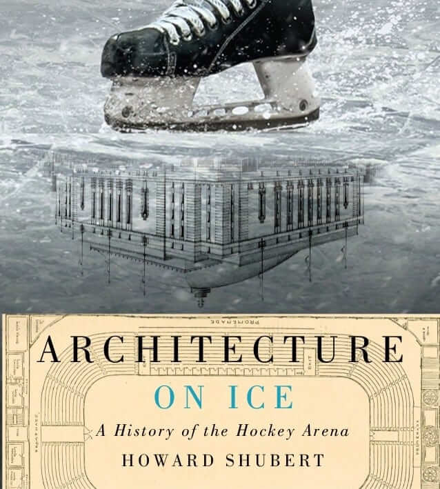
Serious discussions of architecture don’t usually involve sporting venues. And when they do, the venues are usually baseball or football stadiums. So I was intrigued when I recently learned about a new-ish book called Architecture on Ice: A History of the Hockey Arena. The book, which was published by McGill-Queen’s University Press last September, modestly posits that hockey arenas are “North America’s most important overlooked cultural buildings.”
”¨I’m not sure I’d go that far, but the author, Howard Shubert, an architectural curator who lives in Toronto, provides an entertaining look at the history of ice rinks dating back to the mid-1800s, and their role in the development of hockey as a powerhouse sport. Along the way, he provides dozens of excellent photos, illustrations, and architectural renderings.
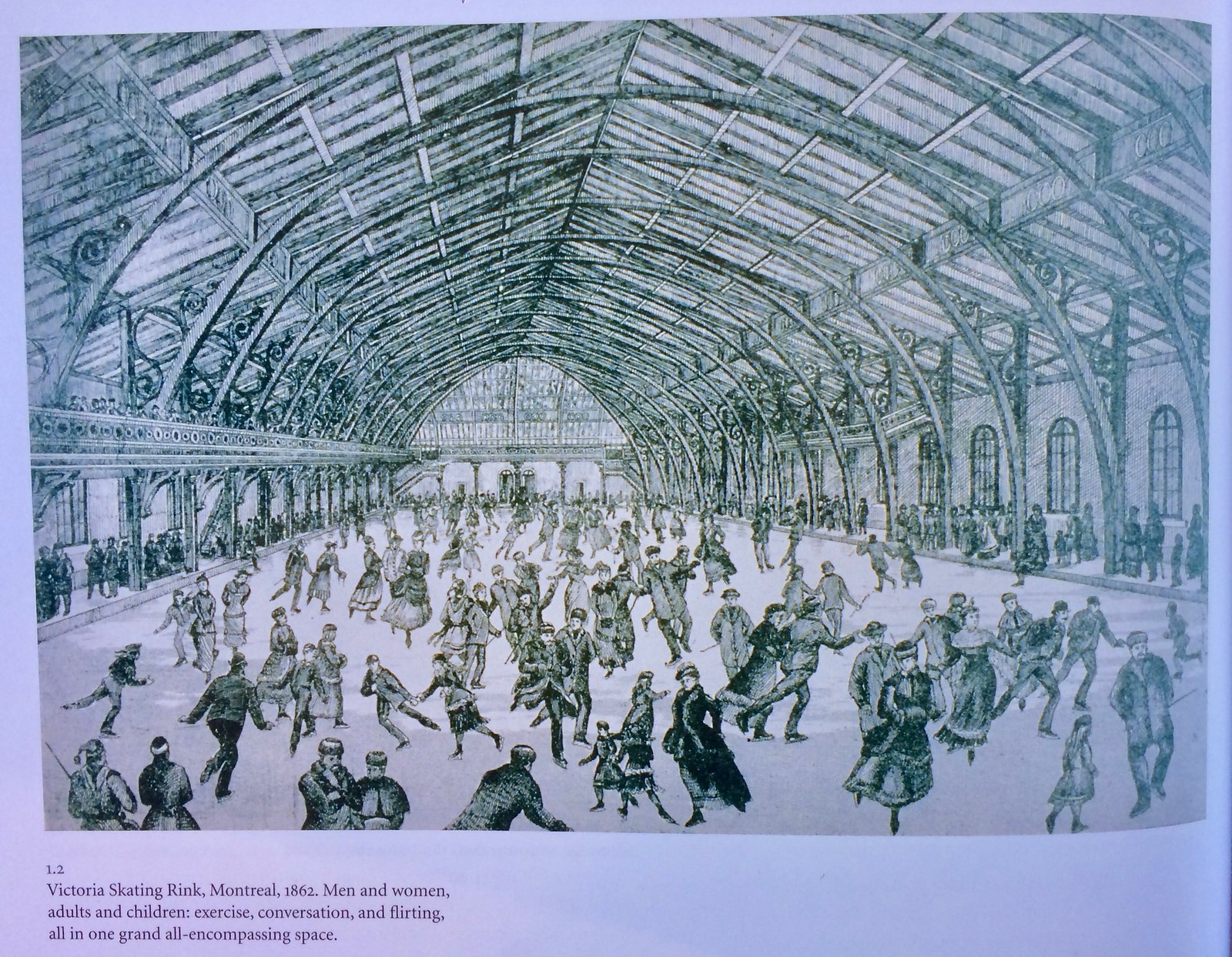
The earliest ice rinks were famously known as “barns,” and some of the book’s illustrations make it clear just how barn-like many of the facilities were. Check out, for example, this 1862 illustration of Victoria Skating Rink in Montreal (for all the images that follow, you can click to enlarge):
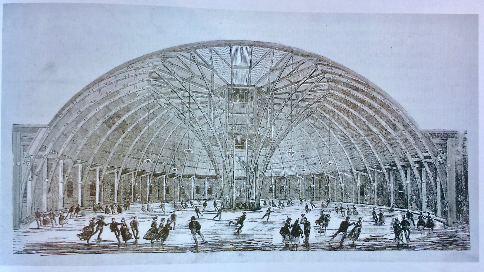
But other configurations soon followed. One of my favorite images in the book is this cutaway illustration of Victoria Skating Rink in St. John:
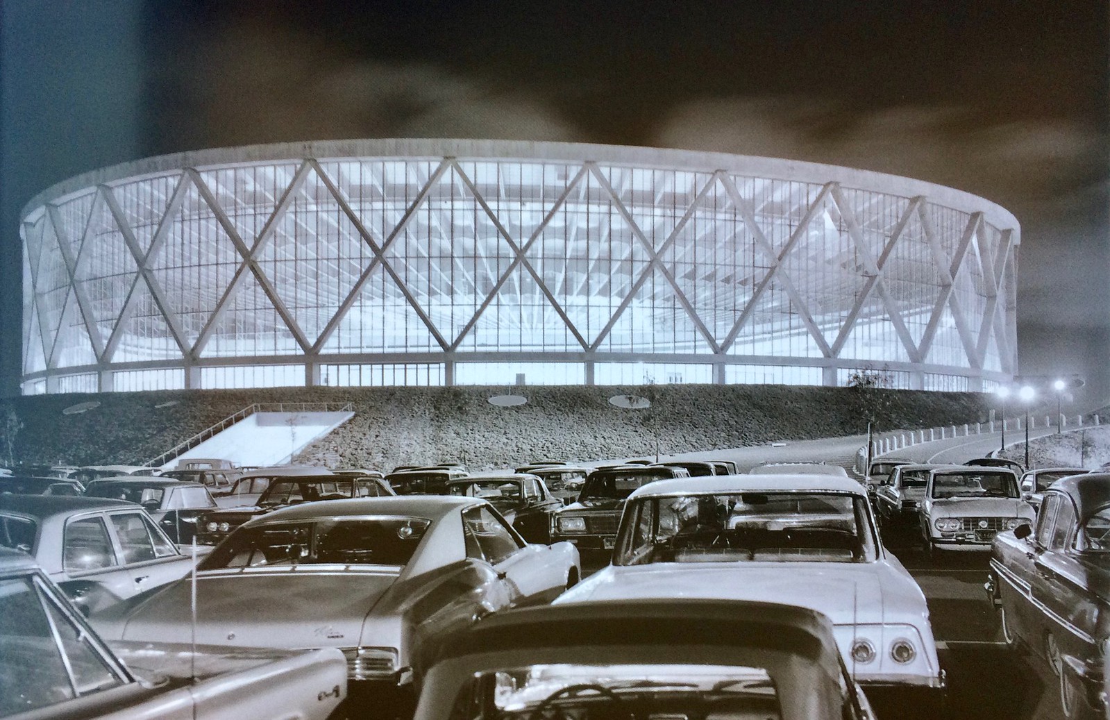
Back in those days, hockey was a fledgling sport, competing for rink supremacy with other ice activities such as ice polo, ice baseball, and even ice bicycling. But enough of that old-timey stuff — you want to see something a bit more modern, right? How about this great 1966 photo of the Oakland-Alameda County Coliseum Arena, which was home to the short-lived California Golden Seals:
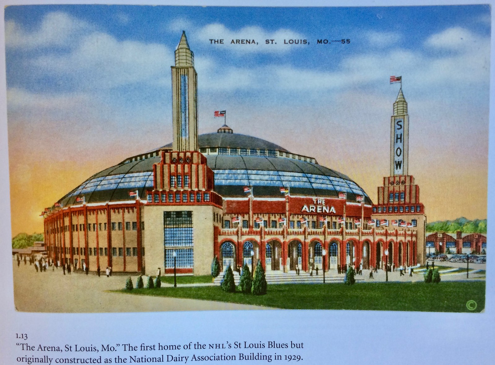
I also like this postcard of the St. Louis Arena, where the Blues played from 1967 through 1994:
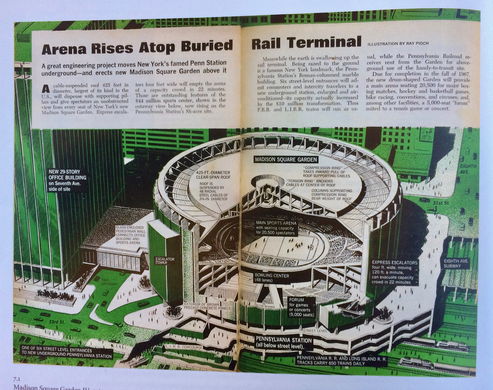
And here’s a great brochure showing how the then-new Madison Square Garden would be built atop Manhattan’s Penn Station:
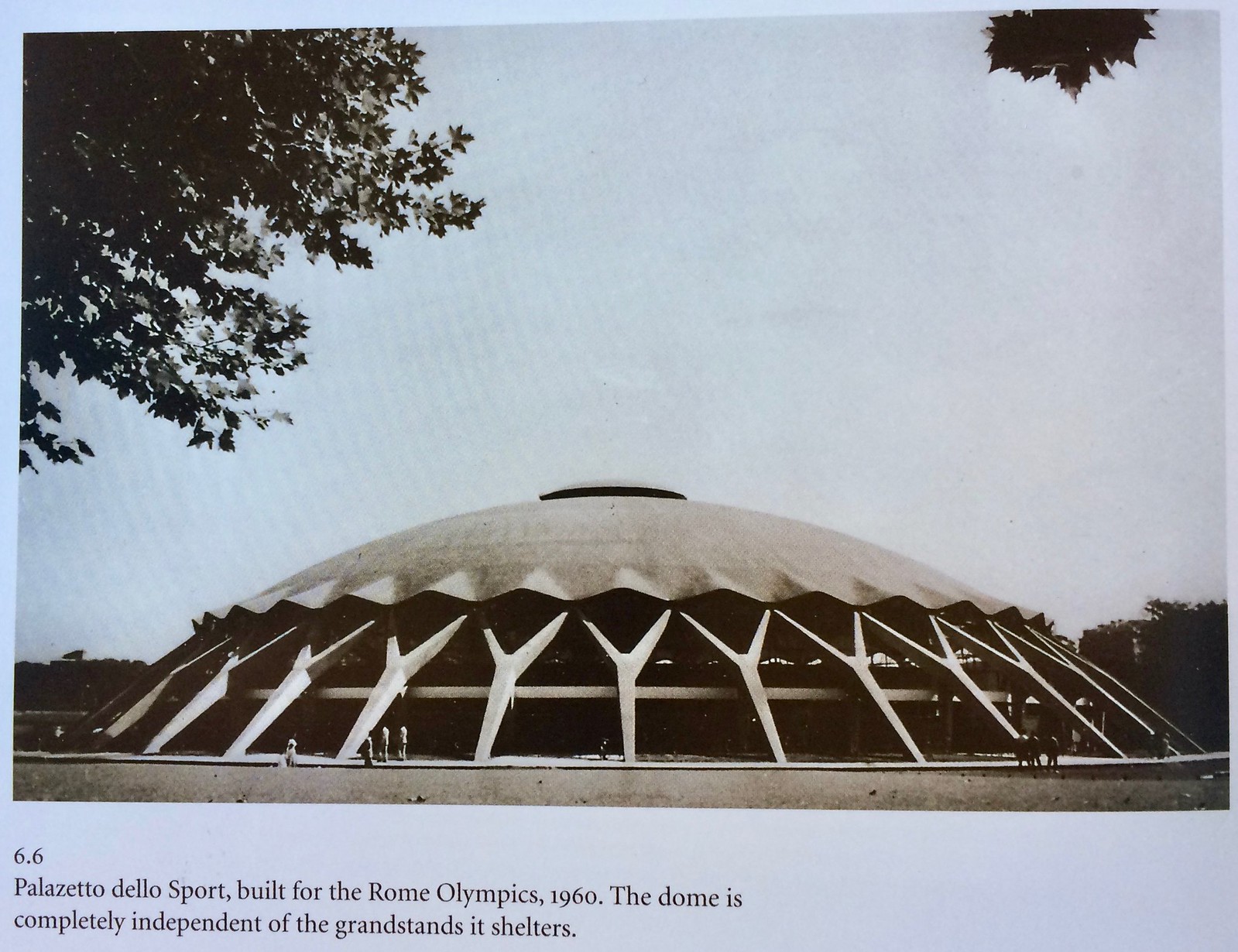
The book’s focuses mostly on North America, but there are a few overseas arenas shown as well, including the awesome-looking Palatzetto dello Sport, which was built for the 1960 Rome Olympics:
The book eventually looks at contemporary arenas with their modern amenities, and discusses the way the fan experience has changed at live events over the years, all of which is interesting but more familiar and therefore a bit less illuminating.
The publisher is clearly hoping to get some college textbook sales out of this title (presumably in architecture or cultural studies programs), because each chapter concludes with a little “What have we learned?” summary. There are a few other annoyances, like the footnotes all being buried at the end of the book. On the plus side, the book includes some useful tables showing, among other things, when various rinks and arenas were constructed, and the square footage of modern NHL arenas.
Overall: a recommended read for history-minded hockey fans and architecture geeks. Less essential for the casual fan, especially given the relatively hefty price tag. The book is available here.
Raffle reminder: I’m currently raffling off a free varsity-style satin jacket from Stewart & Strauss. Full details here.
Merch reminder: In case you missed it earlier this week, the Uni Watch social media avatar (shown at right, click to enlarge), designed by the great Larry Torrez, is now available on a variety of shirts, sweatshirts, coffee mugs, tote bags, and stickers. They’re all available here.
In case you’re wondering: The results of the Raiders-redesign challenge will be posted next week, probably on Wednesday or Thursday.

Click to enlarge
KRC update: The latest installment of Key Ring Chronicles is about a leather jacket zipper pull whose design is based on the logo for a brand of drums. Check it out here.

Position available: Are you handy with graphic arts software? Do you have the patience to spend potentially large amounts of time on tedious, detail-driven work in return for relatively little money? Does dealing with lots of extremely nitpicky feedback from me sound like your idea of fun?
If you answered yes, yes, and yes, then perhaps we should talk. Here’s the deal: I’ve been thinking about launching a new creative project in the near future. It will not be a uni-related project, although it might appeal to some of you and I’ll promote it here on the site, among other places. The project will likely generate a small amount of cash (a couple of hundred bucks, say), although I’m pursuing it mostly for the creative satisfaction, not for the revenue.
In order to execute this project, I’ll need help from someone with graphic design skills. Specifically, I’m looking to convert color photos and/or scans (all of very simple images) into flat art files suitable for print reproduction. I’ve been told that this means I’ll need a “‘vectorization artist’ who can turn raster images into vector, and can trace these out and turn them into flat art.” I don’t even fully understand what that means. But if you do, drop me a line.
Naturally, the person I end up working with will be compensated, via either a flat fee or, more likely, a share of the eventual profits (which, again, will likely not be huge). Thanks for your consideration.
The Ticker
By Mike Chamernik

Baseball News: The Cubs revealed, and handed out, their World Series rings. @BSmile points out that the ring has a billy goat on the inner shank, and @ih8nyy is surprised the Cubs mark on the ring is missing the trademark symbol like the logo on the uniforms. … The Nats wore their stars and stripes alts for Military Appreication Day yesterday (from Chris Howell). … The score bug on Rockies broadcasts this week have been using the yellow-and-white Padres “SD” logo, which was only used last year. The Pads are now back to solid white (from David Wishinsky). … The Riverton Railsplitters, a 14U team in New Jersey, wore retro-inspired jerseys last season. It looks like they took elements from the Astros, White Sox, and Blue Jays (from Bill Prendergast). … Even in the days before batting helmets, Ted Williams wore a shin guard (from John Mahoney). … The Erie SeaWolves will host an Alternative Facts Night in August. Fans will receive replica championship rings for the SeaWolves’ 2016 Eastern League title. Akron, that night’s opponent, actually won the league championship last year (from Kary Klismet). … Matt Goodwin found this 1998 New Era MLB hat chart the other day. … Reds INF Eugenio Suárez has added an accent to his NOB. It wasn’t there in spring training (from Joanna Zweip). … Speaking of the Reds, INF Jose Peraza has been wearing a double-flapped batting helmet. … The Astrodome originally had a semi-transparent roof and real grass, but players complained about glare from the roof/ceiling, so the roof panels were painted over — and the grass soon died due to lack of sunlight, leading to the installation of Astroturf. Here’s a 1965 shot showing the original grass surface (from Corey Buck). … After wearing Wahoo caps for their home opener, Cleveland went with the block-C cap last night. They had previously announced that the block-C cap would be worn with the navy jersey at home.

NFL News: The Lions will unveil their new uniforms tonight. The unveiling will be live-streamed on the team’s Facebook page, with streaming set to begin at 8pm and the uniforms due to be revealed around 8:30. Paul will have an assessment on ESPN, probably around 9:45. … Investigative reporters with Sports Illustrated wrote a longform piece on Tom Brady’s stolen Super Bowl jersey. Additional info on how they dealt with the story here. … Dale Earnhardt, a Washington fan, will drive a car with an Eagles paint scheme at Pocono in June. The NFL has a partnership with Earnhardt’s sponsor, Axalta Coating Systems, and Pocono is in Eagles country (from David Firestone). … Chris Borba sends in this cool old USFL pillowcase. … The players in the front row of this 1969 Eagles team portrait are all wearing green shoes. “Likely first team to wear non-black or -white shoes,” says @NFL_Journal.

Hockey News: The Rangers’ Mats Zuccarello has new team-themed skates for the playoffs (from @ch1088). … Matt Murray of the Penguins has new skates with a yellow stripe (from @redbuppy). … Babies born in two Washington hospitals will be given Caps-themed baby blankets and hats during the team’s playoff run (from William Yurasko). … The Blackhawks are giving away seven hats that were designed using Brent Seabrook’s jerseys (from Dan Thompson). … NASCAR driver Kenny Wallace has a St. Louis Blues racing helmet (from David Firestone). … Broadcaster Pierre McGuire said that the Kings’ slick black, silver, and white unis helped them win their Stanley Cups. I don’t disagree (from Alex). … New unis for North Carolina at Wilmington (from David Hoxie). … Wild LW Zach Parise has “Jeep” on his gloves. Zach’s father, J.P. Parise, was nicknamed Jeep. … Here’s an Instagram account that shows hockey jerseys reconfigured as basketball-style tank tops (from Casey Cherry).

Basketball News: A few of the Timberwolves’ new alternate logos and wordmarks have been found by Conrad Burry of SportsLogos.net. … Color-vs.-color in Cleveland last night as the Cavs wore their black sleeved alts against the Raptors, who wore red. Also, it’s a little hard to see because of the Getty watermark, but the Cavs wore fan appreciation warm-up shirts (from Zach Loesl). … The Celtics wore their grey sleeved unis at home for fan appreciation night, which doesn’t seem like a very appreciative thing to do (from @_cap22). … Jason Kidd wore a blue Bucks hat before last night’s game against the Celtics. “Great Lakes Blue” is one of the team’s official colors but is largely used as an accent (also from @_cap22). … The Magic’s new minor league team will be known as the Lakeland Magic. … Carmelo Anthony’s game towel is personalized with his No. 7 on it. He’s used his own distinctive gray towel for years (from Dan Gartland). … A Mormon missionary from Utah ran into a kid in Africa who was wearing his Junior Jazz jersey (from Benji King). … The basketball coach at Oral Roberts University was reportedly told by the school president not to recruit tattooed players.

Grab Bag: A team of researchers found out why shoelaces often come undone. They said that common shoelace-tying methods produce a weak knot that comes apart almost instantly when walking (from John Muir). … New Zealand rugby player Sonny Bill Williams will not have to wear logos from banks, alcohol brands, or gambling companies on his kit. Williams, a Muslim, made the request to not have to wear the ads, and Auckland Blues and New Zealand Rugby gave the okay (from Matthew Bonnett). … New logo for the 50th Milwaukee Summerfest. The fest is famous in part because of its iconic smile logo (from Kurt Crowley). … A Syracuse blog explored the Orange’s apparel deal with Nike across its entire athletics program (from Phil). … New name and logo for Fly Fishers International (from R. Scott Rogers).
Wonky link for last item in baseball section.
Fixed.
Proofreading:
“Akron, that night’s opponent, actually won the league championship year”
Nitpicking:
“Investigative reporters with Sports Illustrated” While the report may be investigative, it’s written by general assignment MMQB reporters.
Fixed.
Thanks for bringing the hockey architecture book to our attention! I’m one of those who has sought out tours of stadiums new and old when visiting cities, which is probably not too surprising on a site for those obsessed with aesthetics of athletics. I find them to be cultural and political time capsules of the cities in which they exist; I can’t wait to get my hands on the book.
Nice book feature.
That 1998 cap catalog isn’t the best year for caps but a total nostalgia fest. 20 teams had caps with different colored bills, two grey caps, one white, that gradient lettering for the Devil Rays, Mets and Reds BFBS, the Disney Angels… the list goes on.
1998 cap catalogue is a trip down memory lane. There is a label on one of the caps that is not accurate. I am pretty sure the red-billed Blue Jays cap was not the road cap. They wore a solid blue cap with road greys. This was an alternate cap that they wore with the blue jerseys.
I would be a very happy man if the Red Sox ever started wearing that Red alternate hat with the white B again. It’s a thing of beauty.
link
Dale, Jr. driving an Eagles’ themed car is a curious choice for that part of the Pocs. Long Pond is near NW New Jersey and that is pretty much Giants/Jets territory. When I ski in that part of the state, the amount of Giants paraphernalia easily outnumbers Eagles stuff. Eagles territory ends around Allentown. Maybe that it’s in the eastern part of PA they decided to go with the Birds?
Additionally, Dale Jr. is a die hard Redskins fan!
Does Pierre McGuire also have a theory to explain why the 1993 Kings, also sporting black, silver, and white unis, were defeated in the finals by the blanc, bleu, et rouge of Les Canadiens? Is it all about the new crest??
Does anybody outside of NBC even like or give a crap about Pierre McGuire? From my observations, he seems to rank up near Gary Bettman on the scale of least popular NHL figures.
Only Mike Milbury rates lower
How about Alan Eagleson or Harold Ballard?
Pierre Maguire looks like a penis…literally.
I’m sure there’s a widely held belief that teams with garish uniforms don’t succeed in the playoffs. There are a few exceptions (1982 Canucks, 1999 Stars) but not enough to disprove the theory.
That’s Canuck!
Why include the Stars but not the Ducks?There’s absolutely nothing wrong with the Stars cup team Unis.
It must have slipped my mind.
“The Riverton Railsplitters, a 14U team in New Jersey, wore retro-inspired jerseys last season. It looks like they took elements from the Astros, White Sox, and Blue Jays (from Bill Prendergast).”
Great idea, poor execution. My pet peeve with rainbow-guts versions these days is the number on the back of the jersey is almost always split between the white space at the top and the stripes. In the 12 seasons the Astros wore rainbow jerseys, the number always sat below the white space in the stripes, even in the bulls-eye jerseys of ’75 (the bulls eye went into the white space, but that’s another story). It took them a couple of years to find the sweet spot of readability, but once they put a white outline around the numbers in 1977, that was set in stone for the next 10 seasons.
Quit making the jerseys with so much white space at the top that you have no choice but to split the number between the white space and the stripes. How hard would it be for a manufacture to use Google, find a couple of photos of the original Astros rainbow jerseys and get it right? If you’re going to do these jerseys, do it right or don’t do it at all.
Well, my Google search turned up link rather high in the results. Seems the Astros themselves even managed to screw that one up.
Hideous execution on that throwback; where do I begin? Wrong number font, leather belts instead of solid red sansabelt, stripes on the leg are in wrong order. I’m sympathetic to the Astros realizing the original rainbow guts gave their players a huuuge strike zone, but the devil is, after all, in the details.
The new Timberwolves look isn’t the first time they stole their colors verbatim from the Seahawks.
link
That’s a good lookin’ ring Cubbies!
That’s Cub!
Shoelaces come undone mostly because of the importance of having a quick-release knot. That’s a small price to pay for the convenience of being able to quickly remove my shoes.
My shoes used to always come undone. I’ve found that tying a proper knot is most important.
A shoelace should be a square knot. If your laces come undone all the time, you are probably tying them into a granny knot. Ask any Boy Scout: square knot good, granny knot bad.
Look at how your laces lie on your shoe after they’re tied. If they lay across your shoe evenly, then you should be good.
If the laces try to lie vertically, then you’ve got a granny.
The easiest way to fix it is how you start the knot. If you start with the left lace over the right and you get a granny, then try starting with the right over the left. You can also change the direction that you go around the loop to change the knot.
A question for Paul, and apologies if this is off-topic or out of nowhere, but why do you list the publishers of the books you mention? I notice that you do this for every book you talk about, and you’re not alone. Any time a book is mentioned it’s usually followed by the publisher, but as a layman reader I’ve never known why. Is this just an industry thing that’s carried over? Is it for marketing purposes? Will a “serious” reader scoff at one publisher but respect another one?
Thanks!
Interesting question! It is indeed standard practice to list a book’s publisher when reviewing it. Why is that?
In the pre-internet era, knowing a book’s publisher was useful if you couldn’t find it at a bookstore and had to have the store special-oder it for you, because different publishers’ books were available from different distributors. Obviously, Amazon and other online booksellers have largely made that moot.
But even in the internet era, knowing the publisher can benefit a savvy consumer. For example, if you know that a particular publisher tends to put out particularly good (or particularly bad) books, then seeing that publisher’s name might affect your decision on whether to purchase a given title. In short, publishers are brands, and brand knowledge is always useful.
In the case of the book I reviewed on the site today, I mentioned that it’s published by McGill-Queen’s University Press. Even if you’ve never heard of them, you know it’s a university press, which means this book is probably pretty scholarly in its approach. You could view that as a plus or a minus, depending on what you’re looking for.
Thanks!
I would also imagine it’s a way for the “real” publishers to differentiate themselves from self-publishers too. “This book is more prestigious because this publisher published, not some publisher reject!”
When I pre-ordered the book, I think it may have only been available at first directly from McGill-Queen’s University Press.
The pre-order price was $34.97 CDN + $6 shipping ($40.97 CDN).
The price is a bit more there now:
link
Currently it’s a couple bucks cheaper for Canadians at Amazon.ca (Chapter/Indigo is 53 cents more than this):
link
Ok, I get the alcohol and gambling ads objection by Sunny Bill, but Banks? What does he do with the millions he’s paid to play rugby? Put it in his piggy bank?
That was the most interesting ticker item today, since it made me dream of a day when a player in our 4 major sports (especially an NBA player) decides he cannot on principle wear his uniform with the corporate logo of the company the team has climbed in bed with. Imagine the possibilities! -C.
An example would be the situation with Newcastle United and Wonga, a payday loan company.
link
It’s to do with charging interest on money lending which is prohibited within Islam.
SBW probably uses an Islamic Bank that complies with the “no interest rules”. Interestingly, though, I *believe* the religious prohibition is profiting from interest. In refusing to wear the logo, it seems more like SBW is preventing BNZ from profiting from him while he still is part of the team that profits from the sponsorship. I’m fine with his stand though and glad he has been accommodated. I do hope it leads to cleaner uniforms in general since rugby players increasingly look like NASCAR drivers in shorts.
Interestingly, it has been reported that the rugby union has had rules in place to allow for “sponsor opt outs” for about 15 years. I’m surprised it hasn’t come up sooner given that financial institutions and brewers are among the most common sponsors.
That Eagles team photo is GOLD, Jerry! GOLD!
I enjoy the whimsical illustrations of skating rinks (barns) from 100 years ago because they always show people skating in random directions – a sure way to insure collisions. I don’t know when the practice was instituted but ever since I was a kid, public skating rinks always had everyone skating in an oval around the perimeter of the rink, with the inside portion cordoned off for figure skaters who wanted to do twirls and such. You almost always had to skate in a counter-clockwise direction but there were times when they would blow a horn or whistle halfway through the session and have everyone turn around and skate in a clockwise direction… which was good because skating in the same direction in an oval when learning causes you to be able to cross over your legs to make a turn very good in one direction, but no practice crossing over in the other direction…
-Jet
Ever since I’ve been at it, it’s been counter-clockwise.
Exactly; going counter clockwise, crossovers are never a problem, but I can’t make my brain and legs work together on a crossover on a right hand turn.
I like how you calmly say, “here’s a 1965 shot of the grass surface of the Astrodome” with absolutely no mention of the mind-blowing content of the photo!!!!
-Jet
So well posed.
Eagles photo:
Whenever I see the white Eagles helmet it reminds me of Roman Gabriel for some reason. It must be my age and the time i became interested in the NFL. In googling Gabriel I see he wore 2 different Rams helmets and 3 different Eagles helmets (black outline).
It has likely been talked about here, but who is the record holder for most helmets worn over a career? Most with one team even? (I’d hate to count “special” helmets)
I know Sonny Jurgensen has worn a lot.
There was never a black outline on the Eagles’ white helmets.
If Helmet Hut says so, it must be true.
link
Link regarding black outline for Philadelphia Eagles feathers
link
From my count, with help of Gridiron Uniform Database – Jurgensen wore 5 different primary helmets with Washington. That has to be close to a record for 1 team.
Didn’t Gabriel just wear 2 different helmets as an Eagle?
Your questions got me thinking about the same thing in pro football here up north and candidates for the answers:
-Kicker Lui Passaglia played for the BC Lions from 1976 to 2000. Wore 4 different primary helmets with same team.
-Kevin Glenn has taken snaps as quarterback for 6 different teams from 2001 to present. If you count this upcoming year, this will be his 3rd stint with the Saskatchewan Roughriders and 3rd different primary helmet worn with the team (though helmet changes have not been massive). He has worn 3 different Blue Bombers helmets in 2 stint with them. Counting just primary helmets (and not road or alternates), this upcoming year will be 10 different primary helmets with the 6 different teams.
Dale Earnhardt ‘JR’
That’s for helping to clarify that “Sr.” will not be driving the Eagles car any time soon.
Please refer to the Cavs’ black, sleeved alts by their proper name, “big-boy jammies.”
In today’s post it states
“Back in those days, hockey was a fledgling sport”
Sometimes when I go on espn’s website, it still feels like a fledgling sport :)
The 1960 Rome arena looks very similar to Norfolk, Virginia’s Scope Arena
Looks Like Skiba might have some issues with fake memorabilia coming from the Giants
Jose Peraza started wearing the double-flapped helmet after being hit by a pickoff attempt last season.
link
Worth noting when talking about skating rink architecture – the Ingalls Rink at Yale, one of my favorites (I imagine it would be in the book, it was designed by a famous architect named Eero Saarinen who would later be responsible for the Gateway Arch).
link
Lions uni unveiling:
Throwbacks look good. Not a big fan of the all-gray Color Cash. Home & away, meh. Don’t love the blue pants with the white jersey. Numeral font is no more or less ridiculous than their last one. I don’t mind the wordmark on the sleeve stripes. And no more black trim anywhere.
Overall, not really an up- or down-grade. Meh.
Replacing BFBS with GFGS = BAD
Two shades of silver/gray = BAD
Big blue stripes on helmet = BAD
Big blocky but italicized numbers = BAD
Wordmark on stripes = BAD
As a Detroiter, I’m embarrassed. Call me weird, but I liked the last set. It seemed like a humble modernization of the Lions uniform set. The only way of saving this new uniform set would be if they redesignated the throwback as the main Jersey, and even that would be a little boring…
I’m much less bothered by the Lions wearing silver, which has been one of their colors forever, than black. If you prefer the black unis to the silver ones, fine, but it goes beyond GFGS.
If I understand you’re reply, you’re essentially saying gray = silver. I don’t see them as the same and that’s what bothers me.
I think the use of black in the previous (not color cash) uniform set was somewhat minimal and tasteful. Personal preference I suppose.
Oops that was meant as a reply to BurghFan
Best Lions’ unis ever were no White trim Alex Karras-era, then updated unis thru Barry Sanders-era. Very simple and great identity. To update for present-day, simply put TV numerals on the shoulders. Case closed. Everything else here is crap.
No NFL team should have the team name or city on their pants or jersey stripes. None. Stupidity distracting from the colors and style of the uniform. Zero point to it.
There are 32 NFL teams. You can tell them apart by colors, logos and striping.