Reader Charles Noerenberg got in touch with me yesterday to point out a very small uni-related detail regarding an NHL player — a detail I had never noticed or even thought about before. Charles broke everything down in such a brilliantly obsessive manner that I’ve decided to make it the focus of today’s entry.
The player in question is Blackhawks captain Jonathan Toews, and the uni-related detail is how he handles his skate heel flaps. In this 2015 shot, for example, he has them untucked:
“Most players, myself included, prefer that style, because it gives you more mobility when leaning forward (which hockey players are doing 95% of the time),” Charles told me. “Last spring, however, Toews began tucking his skate heels into his socks, a style teammate Patrick Kane has preferred the majority of his career.” You can see Toews sporting the tucked-in style here:
That last photo is from Feb. 28, 2016. Charles says that’s right around the time that Toews made the switch — and it’s also when he changed to a new Bauer skate model. So were the new skates the reason for the tuck?
Maybe — but maybe not. First, look at this shot of Toews going tucked in this year’s NHL All-Star Game:
In the first game after the All-Star Break, on Jan. 31 against the Sharks, Toews was wearing the same skate model, but had suddenly decided to go untucked! Look:
“Superstitious types like myself could also point out that this change back to untucked skate heels on coincided with an uptick in Toews’s scoring,” notes Charles. “He had been struggling through the worst statistical season of his career until the past two months. In the 42 games pre-All-Star break, he had just nine goals and 28 points. In the 26 games post-All-Star break, he has 11 goals and 28 points. So, he has increased his point per game average from 0.6667 tucked to 1.078 untucked.”
Now that, people, is some impressive uni-geekitude.
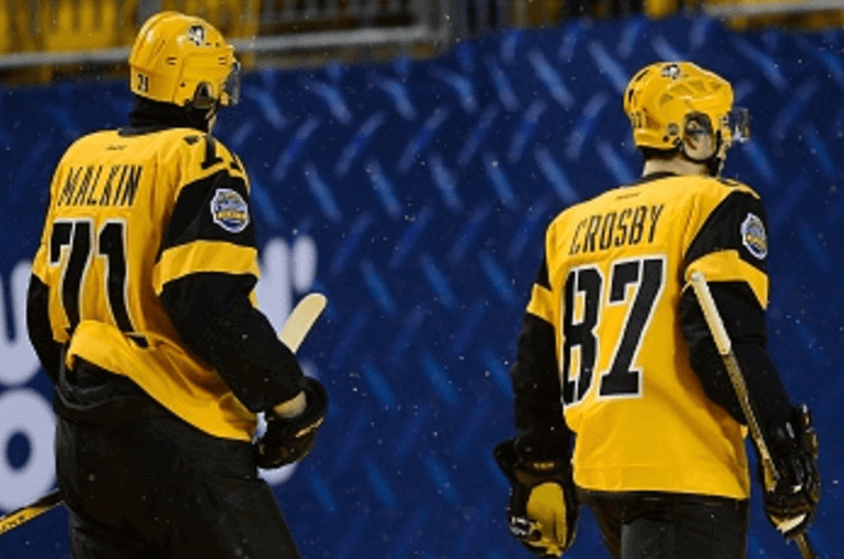
While we’re at it, Charles also notes that Sidney Crosby has had his jersey tailored with a straight hem, instead of the standard scoop hem:
He had this change made to his Stadium Series jersey, but not to his All-Star jersey, presumably because the Stadium Series jersey was team-tailored while the All-Star jersey wasn’t.
(Major thanks to Charles Noerenberg for sharing all of these observations with us.)
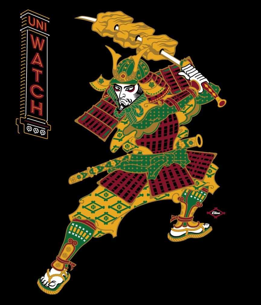
T-Shirt reminder: In case you missed it earlier this week, our latest limited-edition T-shirt in the Uni Watch Artist’s Series is by the great Larry Torrez (aka Eltee of DC). In the spirit of his Meatscots caricature series, he’s imagined a fictitious Japanese baseball team called the Kyoto Yakitori, whose mascot is a baseball-playing samurai with a sword that serves as a baseball bat and as a yakitori chicken kebab skewer (click to enlarge):
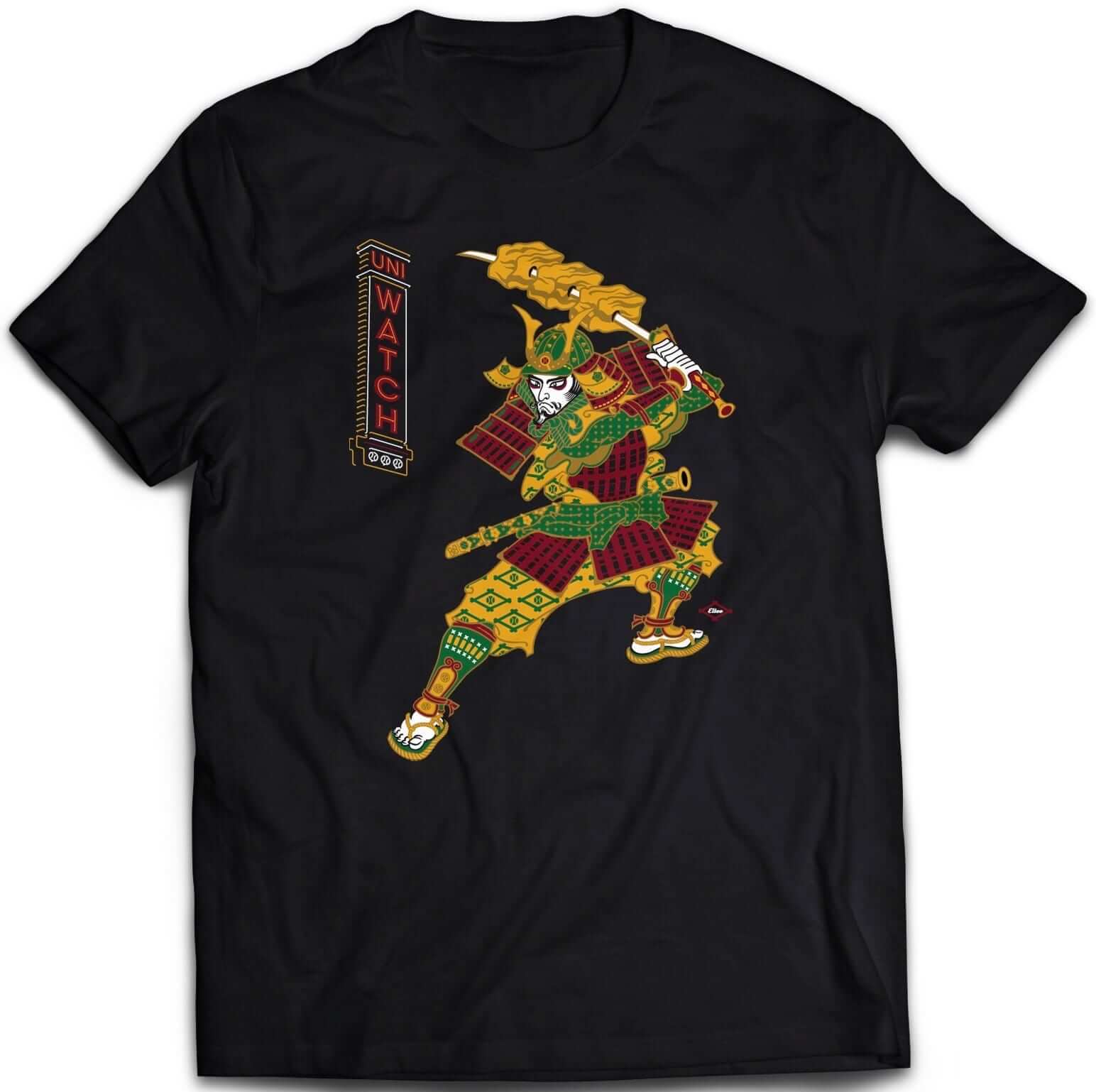
It’s available in three different black short-sleeve options (two of which come in sizes up to 5XL) and one long-sleeve option (up to 5XL). Plus I’ve also made the design available as a sticker. Haven’t done that before with any of our T-shirt designs — let’s see how that goes.
Some of you have also asked why I’m okay with this design if I have issues with Native American-based sports designs. That’s a perfectly valid question, and I’ve created a separate page to address it. Look here.
The shirt is available here through next Thursday, April 6. My thanks, as always, for your consideration.
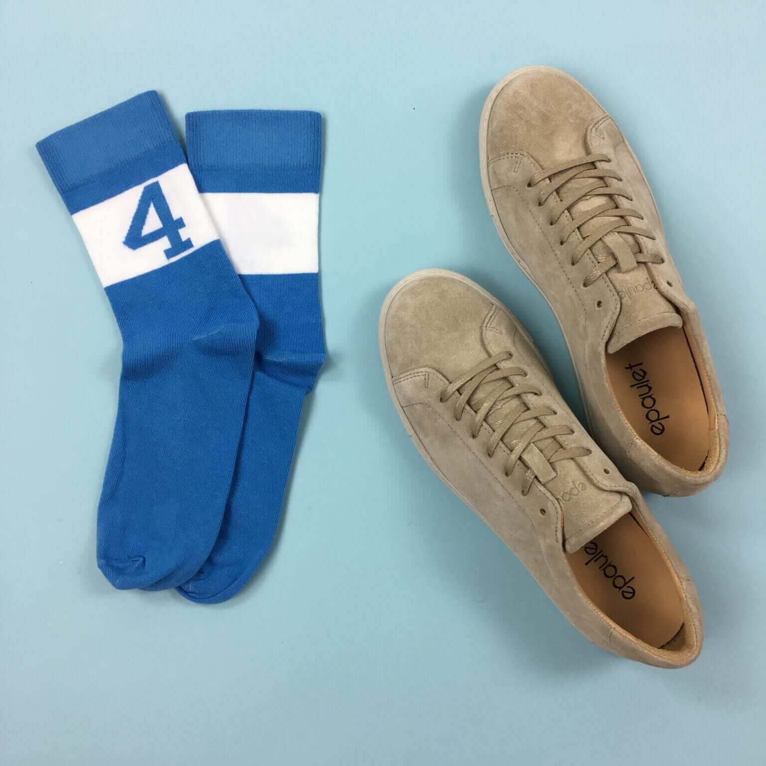
StripeRite sale: In honor of North Carolina making it to the Final Four, nicely symbolized by our Carolina blue sock with the “4” on it, we’re running a sale on our StripeRite socks. From now through April 7, use the discount code FINALFOUR to get 10% off. This applies to any order from our first or second batch of StripeRites. Thanks for your consideration.
Contest reminder: We’re running a new ESPN design challenge to redesign the Raiders for their move to Las Vegas. Full details here.
Signal Flare: If you’re a sneakerhead and a Size 9, drop me a line. Thanks.
The Ticker
By Paul

’Skins Watch: The current issue of SI Kids shows Cleveland SS Francisco Lindor wearing the team’s home white uniform with the block-C road cap, instead of the Wahoo home cap. Maybe the editors thought Wahoo wasn’t a very kid-appropriate thing to put on the cover (from Kevin Chmura and Danny Cunningham). … Reprinted from yesterday’s comments: A consultant who worked for prominent anti-Wahoo activist Robert Roche has been charged with embezzling funds that were targeted to help Native Americans in Ohio. Roche — the Native who very dramatically confronted an Indians fan in redface three years ago — has not been charged, but the charges against the consultant appear to implicate him (from Gavin).

Baseball News: The flip flop brand Hari Mari has introduced a new line of limited-edition flip flops made from Nokona baseball glove leather. … Check out the Dodgers’ minor league managers wearing pinstriped Dodgers unis in 1961 spring training (from BSmile). … The rapper Drake has famously branded his hometown of Toronto as “the Six.” That led to problems when a Toronto pee-wee baseball team tried to come up with a new logo that included the numeral 6 and was told that they couldn’t do so due to trademark restrictions. It’s a fascinating story, well told in this article. Highly recommended. … Pittsburgh Brewing, which makes Iron City beer, has introduced a line of retro-style Pirates-themed cans and bottles. Pretty cool 30-pack design, too (from Aaron Cohn). … A Sporting News writer wants the Braves to come out with some 1980s throwbacks. … Reprinted from yesterday’s comments: Angels P Matt Shoemaker, who needed emergency brain surgery last year after being struck in the head by a line drive, will wear a protective cap insert this season. That article has lots of really good info — recommended (from Hugh McBride). … Mets INF Wilmer Flores asked sidelined teammate David Wright if he could wear his jersey today, and Wright said sure. … All teams in the Class-A Midwest League will wear memorial patches for former league president George H. Spelius this season (from Zach Loesl). … Here’s an hour’s worth of color footage from a 1965 Reds/Cubs broadcast, which is uni-notable for showing lots of good views of Cincy’s drop-down NOBs (from Ricko). … The Nashville Sounds and Round Rock Express will be renamed as the Nashville Honky Tonks and Round Rock Dance Halls for a two games this season (from Chris Howell). … New black uniforms for Virginia Tech (from @DrinkinABeer).

NFL News: Check out this Falcons tissue dispenser, which Jorge Cruz saw at the Georgia Aquarium’s receptionist desk. … Remember when the Oilers used this old logo? Here’s a weird version of it with the Saints’ Sir Saint mascot (from Michael Clary, who also found a batch of old NFC Central patches with endearingly primitive logos). … With Raiders fans upset about the team’s impending move to Las Vegas, former Oakland QB Ken Stabler’s daughter convinced a fan not to burn her father’s jersey.

Hockey News: Here’s a Caps fan who’s sculpted his beard into the word “CAPS” (thanks, Mike). … Here’s the Frozen Four patch being applied to a Minnesota-Duluth jersey (from Jerry Nitzh). … David Teigland was at last night’s Wild/Sens game in Minnesota. “In the rafters they have banners with the 30 NHL club logos, arranged alphabetically by city/state name for each division, except that the Wild’s banner is closest to the center (not unusual to have the home team stand out),” he says. “However, I noticed that the Coyotes’ banner is between LA and San Jose, as if they were still known as the Phoenix Coyotes. They were renamed Arizona in 2014. I’m surprised the hockey-loving folks up here missed that.”

NBA News: This is interesting: The Trail Blazers’ original banner design for their 1977 championship mainly featured the NBA logo (from Manzell B). … There are long shorts, and then there are really long shorts (from Justin Mitchell). … The Bulls’ Jerry Krause memorial patch looks really weird on a sleeved jersey (from @HitTheGlass).

Grab Bag: New uniforms for USA Field Hockey. … Yesterday was the 50th anniversary of the photo shoot for the Beatles’ landmark Sgt. Pepper’s album cover. Lots of good info here. … Police officers in Quebec have been protesting cuts to their pension plan by wearing a variety of non-uniform pants — camouflage, tights, even clown pants. New legislation is being proposed to put an end to that. … This article about Hardee’s new marketing direction says the burger chain “is also getting a new, streamlined logo, removing a smiley face from its yellow star and replacing the red and white lettering with black.” … Here’s a great project: An artist has taken the maker’s marks on various pieces of sportswear and embroidered them with lots of plants, flowers, and birds. Great stuff (from Jon Solomonson and Jason Torban). … A regional airline in Vietnam has its flight attendants wearing bikini uniforms. … The West Virginia Senate has rejected a bill that would have allowed motorcyclists to ride without helmets.
I love a good hockey-centric post. This part of the skate is called the Tendon Guard.
I prefer to have my socks cover my tendon guard as well, as my shin guards are also over the tongue of my boots. My sock covers down to the ankle of my skate because of how I wear my shins.
…why don’t we ask Erik Karlsson how he wears his (still too soon?)
Two Norrises later I think he’s doing just fine, haha.
Wahoo is still on the sleeve of Lindor’s cover photo.
Yeah, but that’s a lot different than having him front and center on the cap.
Agreed. Much less prominent, but visible, nonetheless.
Agreed. If it was bad enough to remove from the cap wouldn’t it be bad enough to remove from the sleeve?
Maybe, but I think that demotion from the cap to sleeve-only might be a reasonable way of phasing Wahoo out. Many Indians fans are attached to Wahoo for understandable, good-faith reasons, and arguably deserve to be met halfway. At least, it seems a good deal less peremptory than simply banishing him in one stroke.
Besides, I’ve never liked Wahoo on the Cleveland cap on aesthetic grounds–he just takes up too much space. I do wish the Indians would improve on the block “C,” however … maybe something in cursive?
I do wish the Indians would improve on the block “C,” however … maybe something in cursive?
But then it wouldn’t be Cleveland’s “C”; baseball’s (or sports’) influence has permeated society to the degree that a style delineates, say, Detroit’s “D” from Dallas’ “D”, even without benefit of team colors. I think the 1978 Indians’ cap represents the best rendering of the block-C. But you’re right, mascots on the cap tend to be fussy-looking.
How about the caveman c? That screams Cleveland to me.
That would also be excellent. Look at me! I’m the arbiter of Cleveland! Maybe I should go there someday.
Here’s my thought process.
Liverpool’s soccer team wears red. But, imagine they have other city teams that wear blue, yellow and green. Years ago, the green team starts being called “the Irish” because of their colors, and they accept it. They start using Irish imagery of harps and shamrocks and it leads to a derogatory cartoon image of a thin, Catholic peasant crating potatoes to be sent to England.
Over the years, people claim it is offensive. The soccer team defends it, saying it is a traditional symbol and they are honoring the strength and fortitude of the Irish people.
Backhanded compliment? By a ruling group of people who almost decimated an entire group of other people?
There’s a difference here: imagine that an Irishman (one of very few in the league) played in that city for an earlier team before this “Irish” one was formed. It’s the logo that needs change, not the name.
In all honesty, the photographer probably just thought from an artistic perspective it was best not to have either logo repeated, especially since both are nearly identical in size. Had he been wearing a jersey with the “C” on the sleeve instead, the cap would have probably had Chief Wahoo on it.
Could someone please explain to me, in full gory detail, EXACTLY why Chief Wahoo is soooooo terrible? Because I really don’t get it. It’s a smiling, whimsical cartoon character, because baseball is a game, and it’s supposed to be fun. That’s all I see. What aspects of that logo are implying anything negative about Native Americans? Ok, he has red skin, but he has blue hair. It’s 3 color logo. No one cared about Bucco Bruce being orange. It’s the same thing. And how is a big smile a bad thing? Even the name, Wahoo, is an exclamation of joy. Please, I beg you, enlighten me. Because from my perspective, if you look at Chief Wahoo and all you see is racism, you’re the one with a problem.
Jeff, by his own admission, is drinking. Let’s please not rise to his bait until he’s sober. Thanks.
Walter here: Feel free to think I’m trolling, but I’m chasing a kernel of intellectual introspection. Bear with me. Where fans of Wahoo go awry is positing the nickname and iconography pay honor and tribute to aboriginal Americans. As you know, “tributes” can be pretty tacky, and bring to mind rain-soaked teddy bears and wilted flower stands at the site of a tragic auto accident. Indians can feel slighted by such “honors” and I can’t say I blame them. The respect we feel that Native Americans deserve might be more ably described if we say we admire them, even love them. America has treated them harshly, and it serves us poorly if we aren’t allowed to embrace them, albeit in our finite, limited ways. Thoughts?
I’ll just say this: You don’t name a team after a culture that you hate, because when you name a team, you take a part of that identity for yourself.
Its not okay to put an Indian on a jersey, but it is okay to put a Samurai with a pointy face and slanted eyes on a t-shirt to sell in the name of art (I already read the piece defending it. Not buying the argument.). Note, not one Japanese organization was asked to approve the shirt, while American Indians have been asked if Indian names/logos are offensive, and overwhelmingly they have responded with no. It’s a tired argument.
Oh Paul makes a perfectly fine argument for his samurai artwork… it’s just that it also works perfectly fine when used in favor of using native american imagery as well.
Native American imagery was part of US pop-culture before “pop-culture” was a term.
Copying/pasting from a comment I posted earlier this week:
And that’s the point. Chief Wahoo is not meant to approximate any real Indian. Can you find a photograph of any Indian, living or dead, and say there is a resemblance? Of course not! He is not meant to make you think of Cochise, Blue Jacket, Sitting Bull, Tecunseh or anyone else. He makes us think of BASEBALL. Hell, he looks like a martian with a feather. He is not “honoring” anybody! He is a cartoon that excites people about a baseball team.
…and while Native American activists protest, the Japanese are happy to sell you some anime, a dull katana, and a gibberish kanji tatoo. They aren’t complaining about appropriation, they’re profiting from it.
Yeah, those lazy Native Americans, always playing the victim. Why can’t they be more proactive like the Japanese?
Oh, they’re plenty proactive about selling the imagery. Just visit any indigen casino. And if they can make money that way, then good for them.
the Arizona Coyotes being put before San Jose may not be a mistake about being “Phoenix” like they used to be, but could b a subtle hint of a potential move to Portland or Seattle.
How did I miss that the Coyotes are back in the relocation rumor mill?
Admittedly, I stopped paying attention once the team finally had new ownership in 2013, and got more focused on the teams in the East who have serious problems… but I should’ve known that the drama never ends!
Love those NFC Central patches.
It’s like they were done by someone who saw an NFL helmet for the first time ever, then ran home and tried to make them.
I had no idea a skate flap/tendon guard even existed.
(clearly I’m not a hockey guy).
Thinking about that old Oilers logo led me to the realization that there’s no team (that I could find) called the Frackers.
It’s probably a bit too close to a certain other word. Also no one really names teams after professions anymore. There’s no way you’d get a Packers or Steelers today if they didn’t already exist.
Does the Chicago Fire count?
I know fire is not a profession, but their shield and everything seems to be about firefighters
The (Great) Chicago Fire was an event (for those who don’t know). Thus the cutesy turn of a phrase.
*sort of* like Buffalo Bills. Not a thing (not as the team is using it anyway), just a phrase.
link
Thanks Dumb Guy
More’s the pity. Our palette of team nicknames should be expanding, not shrinking.
Agreed, and so many are uninspired and generic
You’re probably right (and entirely right re Packers & Steelers) but Frackers has a delightfully AA Baseball feel to it
“Now batting for your Fargo Frackers, Number Nine, Roger . . . “
Fargo Frackers? No no no. Caprica City!
Proofreading:
Hockey News: “David Teigland last at last night’s”
Fixed.
I feel like the “‘Skins Watch” section should be renamed.
Or just go away entirely. Any sports story that even mentions Native Americans seems to end up in the ‘Skins Watch section, when logically it should only be stories that actually relate to the Washington Football Team Name issue.
Any sports story that even mentions Native Americans seems to end up in the ‘Skins Watch section…
Yes, because that section has always been the catchall for such stories, and the section’s name is a shorthand for our coverage of said stories. None of that is new, and none of it will be changing. It is a longstanding part of the site and will remain so. Let’s please move on. Thanks.
Blasphemy. I eagerly anticipate ‘Skins Watch every week!
I too enjoy it, but I was thinking “Native Watch” or something else like that so it encompasses all the other offending teams
…or at least move the Vietnam jet blurb into that section…
A Sporting News writer wants the Braves to come out with some 1980s throwbacks.
I found that batch of uniforms uninspiring. Lacking the beer-league humor of the ones that went before, and the pristine beauty of the throwbacks that came after. But they are the suits I associate with Dale Murphy, and if they bring good memories to Braves’ fans, trot ’em out.
The Braves wore the home white unis in a Civil Rights game in 2011 against Phillies.
I prefer the Gretzky half tuck myself
Wow, that Trail Blazers championship banner just screams 1970s design sensibilities. It’d be nice if it were still in the Coliseum somewhere, if not being kept in the current arena.
I do find it interesting that one of the consultants for a prominent Anti-Wahoo group is being looked at for embezzlement. Maybe that group as a whole is out more for the notoriety and marketing than the actual cause.
The one thing I find curious as well that nobody mentions…How come nobody is up in arms over Mario and Luigi? Two “mascots/characters” that are depicting Italians in a not-so-flattering way (Big Noses, Big mustaches, working as plumbers) but everyone’s ready to lose their shit over a cartoon Native American.
I think its just a fashionable way of proving you’re an “enlightened” person who’s more “thoughtful” and “respectful” of everyone else by making a huge deal over Chief Wahoo but not pointing out other instances of the same thing. Is it because Italians are white-Europeans so that makes them acceptable to be made fun of?
I understand Native Americans have been put thru a lot of terrible things in our history here, and I am not going to brush that aside or pretend that’s not the case. And I will not compare the plight that Italians had when they came over en mass in the early 1900’s, but facts are facts, both groups faced a lot of bullshit yet it’s OK to “make fun of one” but not the other?
Forgive me if I’m being dense here, but who are Mario and Luigi, and which team(s) are they the mascots for?
– Paul (who’s fashionably enlightened but clueless)
Mario and Luigi are “Italian plumbers” who serve as the de-facto mascots for Nintendo, a Japanese video game company. While that isn’t quite the same as a sports team mascot, it’s close enough to be a valid comparison.
Not being a video gamer, I can’t comment on Mario and Luigi.
Let’s say, for the sake of argument, that they’re demeaning stereotypes (which may or may not be the case, I don’t know). Let’s further say, for the sake of argument, that there’s been no public groundswell of objection to them like there has been for Wahoo (which may or may not be the case, I don’t know).
Even if all of that is true (which may or may not be the case, I don’t know), it doesn’t make any of the arguments surrounding Wahoo any less (or more) valid. It may (or may not) indicate that some anti-Wahoo people are selective in their outrage, or that those people are intellectually inconsistent, or even that they’re hypocrites.
But as we’ve noted many times here, indicting the messenger doesn’t automatically invalidate the message. An asshole can still be right. A saint can still be wrong. Ideas can and should be evaluated on their own merits, not on the basis of who put them forth.
They were Italian-American plubmers, from Brooklyn, no less… at least, as depicted in media in the 80s and early 90s. Mario was even depicted on The Super Mario Bros. Super Show by the late Captain Lou Albano, a genuine Italian-American!
And then Nintendo had to screw it up when they decided to have them voiced in-game on the Nintendo 64 console, and hired Charles Martinet to give them the most annoying voices possible, with a blatantly stereotypical Italian “accent”.
Supposedly, Mario is actually based on a real person.
link
Super Mario Brothers: Omnipresent video game, popular with the kiddles.
Does Nintendo still own the Mariners? That’s an admittedly very tenuous uni connection. ;)
There was recently a big hubbadoo (a word I nicked from Chris Russo) about the latest Mario Brothers game being sexist because Princess Peach needs to be rescued by men and she bakes Mario a cake or something. Nothing about Mario and Luigi themselves though. It must be exhausting to find outrage in everything.
It must be exhausting to find outrage in everything.
Almost as exhausting as projecting how other people’s minds work, eh? ;)
Italians have a pretty good sense of humor.
I was more offended by the “Italian-American” representations MTV threw on Jersey Shore than I have ever been or Mario, Luigi, or any of the various mafia stereotypes.
they only own about 10% of the team now. i think they had to do it because WIIu sales were crap and they took major hits in the stock market after Mario Run and Pokemon Go hit and people realize it wasn’t Nintendo that devloped those mobile games
Nintendo sold majority ownership in August of 2016. They have 10% of team.
wow.. how could you not know Mario and Luigi.. even if you’re not a gamer, they are part of the pop culture and have been for decades
Tony, I suspect there are lots of things I don’t know that would surprise you. For one thing, I watch very little television aside from sports. This means, obviously, that I’m not up on the latest TV shows, but it also means I’m not exposed to many TV commercials (thankfully), which have become a major component of pop culture.
Similarly, I’m sure there are many gaps in your own knowledge of the world that would surprise me. We often project our own data sets onto others.
@paul,
it’s just surprising being started out as the protagonist in Donkey Kong. there have been hundreds of different Mario game and is one of the world’s most recognizable corporate mascots in the entire world. i get that you might not be a gamer, but still Mario is a fairly known fictional figure for people outside of that realm
as an Italian-American whose father resembled Mario, I can say I am not all that offended by the caricature. I was more offended when my sister’s in laws were afraid we were tied to the mob because they watched too much Sopranos and Goodfellas.
Just look at the entire roster of Mike Tyson’s Punch-Out!!
or the more recent Punch-Out!! for Wii…stereotype after stereotype…classic!
Meh, my last name is German, so in the schoolyard I was equated with Hitler. Before long, I learned to estimate the quality of the argument, and the motives of the arguer. It helped me to create mental armor.
my parents could have done a killer Mario Bros Halloween costume if my mom was willing to wear a fake mustache. My dad already had the stache and the weight down.
Comment of the day.
Exactly! The Indians and non Indians who complain about a baseball mascot while their own “leaders” rob them blind need to develop some of your mental armor. However, it is easier to be a victim…
I am 100% Italian and I don’t find Mario and Luigi offensive, either. But a lot of the characteristic that we find in Native American imagery that people find wholly offensive are found in the characters as well. Is it because Italians are “White Europeans” that people don’t feel the need to be “up in arms” over their stereotypical imagery of Italians? I tend to think it is. I find in this day and age,there’s a heightened sensitivity for most groups (be it ethnic,religious, etc..which is a GOOD thing that I’m behind) and people will get skewered publicly for stepping over any lines in regards to them.
At the same time, it’s easier and easier to tee off on whatever group is in the majority. In this instance white European descent.
So long story short, I wish people would blakently defend all groups from any stereotypical imagery, and not just pick and choose what they’re offended by based on what the reaction would be from everyone else.
I don’t see what the advantage of being “up in arms” is, as that seems to endorse the “zero tolerance” vibe which quells free speech. A little empathy goes a long way; it’s a virtue in very short supply nowadays. But I don’t need to be a White Knight to imagine what things would be like in another person’s shoes.
I put a lot of thought into skate/sock tuck execution in the 90s as a youth hockey player.
I went no tuck for 2 reasons:
1. I always like to have my entire skate exposed because that’s a lot of surface area to build up puck/stick marks and battle damage. It was always cool to go to a public skate and have skates looked all banged up to prove I was a tough hockey player.
2. Sergei Fedorov was my favorite player, and through his career he had this great technique of having his tongue flop forward.
link
I don’t know how he did it, and I could never achieve the same look, but I loved the look.
It’s also worth mentioning that in the latest EA Sports video games, the players have their authentic sock tuck, so there’s someone out there keeping tabs on this.
That’s not a bad guy to emulate, on the ice at least.
When I was younger my sock style inspiration was Michael Handzus–I don’t know how he wore his shin pads and socks so low, but the stripes were at his ankles:
link
I used to think that looked cool, but then I also used to wear JNCOs….
Tarring the foes of culture misappropriation because Robert Roche might have dipped into the till strikes me as an example of throwing out the baby with the bathwater.
Marginalize or demonize your opponent so their ideas become invalid. Welcome to discourse in 2017.
Good question about the plumbers… Those of us from Cleveland look at a happy, smiling cartoon and we think of baseball, the same way you look at Mario and think video games or a samurai annd think of movies. I know of no American Indian with blue hair or crimson skin. And “Wahoo” (Like “Youppi” in Montreal) is an expression of unbridled joy, not any Indian word.
I am glad to see that these killjoys are being exposed so close to opening day. It will be interesting to see if they bother to show this year… How can they begin to argue with a straight face that our cartoon mascot is harmful to the indigenous tribes when their own designated poster boy and his accomplice have been caught embezzling 180 grand in tax money meant to help Indian kids?
At least now we have some clarity.
I can pretty much guarantee they’ll show up this year, in greater numbers than ever before, given the higher media profile, and therefore the more publicity they will get, due to the Tribe winning the pennant last year. Holy run on sentence, Batman!
It would be fun to go counter protest…”Fans Against Fun-Hating Indictees”
The best way to counter protest is to buy yourself some Wahoo gear. Just like the best way to protest is to not buy it.
Actually, Jon, leveraging the economics of a situation is just one way to protest or counter-protest. It is a perfectly valid way, but it is not the only way, nor is it necessarily “the best” way. There’s nothing wrong with activists on either side of an issue exercising their First Amendment rights to protest on a given issue, and reducing a situation to nothing but the sum of its economic factors trivializes the ideas being expressed.
It doesn’t trivialize anything. Bottom line, if Wahoo stops selling, he’ll disappear. If, next season, nobody attended Redskins games, home or away, or watched on TV, or bought their gear, guaranteed they’d change the name.
But there are people who like these things, and continue to buy them. And they are voting with their wallets.
I don’t have a horse in this race, so in the end it doesn’t matter to me. But even if it did, I only make decisions for myself.
Bottom line, if Wahoo stops selling, he’ll disappear.
Actually, you don’t know that. Team ownership may have lots of motivations beyond finances.
More importantly, some people are not able to exercise economic leverage. Some pro-Wahoo fans may not be able to afford Wahoo merch; some anti-Wahoo people (myself included) may not buy any kind of sports merch to begin with, so there’s no way to further divest in an economic manner; and so on.
Boycotts have their place. But to suggest that they are always “the best” form of activism is reductive and false. It equates speech with money, which is a major problem in our politics and our culture. It also suggests the growing sway of a phenomenon I’ve noted before: our collective shift from a market economy to a market *society,* which I find incredibly depressing.
Exactly. Capitalism isn’t designed to determine what’s right and wrong, nor does it make any effort to influence those participating in a given economy. I strongly dislike boycotts because, to me, it is the equivalent of saying, “Well, money is the most important thing in this world. Might as well accept it.”
Years ago, I went to a local multiplex. I forget what movie I was there to see. On my way inside, I was accosted by protesters who urged me not to see “Dogma”, which was also showing at the same multiplex. Know what I did? I went right inside and bought tickets to “Dogma”. Telling people what they should or shouldn’t do will often result in something similar. By the way, Dogma was hilarious.
Well, I’m convinced. Public protests — the right to which are guaranteed by the First Amendment, and which are part of what separates our way of life from totalitarian forms of government — are pointless because Jon decided to stick it to some people at a multiplex.
Good to know all those civil rights protestors in the 1960s were wasting their time. ;)
(P.S. I love Dogma.)
There was also this thing called the Montgomery bus boycott…
Look, I’m not shifting on anyone’s First Amendment rights. As long as you’re not violent knock yourself out. I’m just pointing out that these things often make people dig in their heels. And pointing out that if you hit a profit making enterprise in the profits, that’s where it hurts them.
In the Quebec Police pants link you missed the most relevant part! The video on the page shows an office wearing high cuffed baseball pants with striped stirrups! link
I’m generally very supportive of law enforcement, but if you voluntarily take a job that requires that you wear a uniform, then wear the damn uniform.
They also took a job that told them they were getting a pension…
True. But that’s irrelevant to wearing a uniform.
Not really. Their line of work doesn’t really allow them to strike (nor would the city likely be too interested in hiring scabs to cross the picket line). How else would you propose they attempt to convey their point? Driving around with sirens on 24/7? Indefinitely detaining anyone involved with making the decision to screw their pensions?
Arizona Coyotes:
I know it would be a ton of work and probably impractical, but you know what would be awesome, is if they rearranged the banners every day to show the current standings.
Hear me out: this used to be a thing in baseball. The Blue Jays did this when they were at the Ex and I remember other teams doing it at the time with banners and flags.
link
Shea Stadium did this as well, up until the realignment from four divisions to six in the 1990s. I believe that’s when they got rid of all the team flags and replaced them with American flags.
Like the Cubs do with the flags on the Wrigley scoreboard everyday?
As far as I know this is still done in the flag court in right field at Camden Yards. link
The team flags atop Yankee Stadium are also arranged in the order of the standings.
Here’s the NY Times story on the workers who rearrange the standings flags at Yankee Stadium:
link
Camden Yards still does it for the AL divisions. They rearranged the flags after realignment.
Also – in the article about “The Six”, its worth reading all the way to the end
They interview a Canadian IP lawyer who is of the opinion that the whole thing is bogus.
Point of note on the Quebec police officer pants story: as far as I can tell the so-called clown pants are actually just regular golf pants/curling pants.
Phil? Comment?
I play hockey and my MO is to tuck my skate tongue underneath my shin pad, but leave the tendon guard exposed. As for my jersey, I always tuck the back of the jersey into my pants. Though, if my team’s jerseys had hem stripes (we wear the Sabres “Buffaslug” template), I might not do that.
Today’s comments are the best ever!!!
must be a Friday in Spring kind of thing
And I’m fixin’ to join The Jeff in the consumption of delicious alcoholic beverages.
Hockey sock styles change over time, though I believe one reason leaving the tendon guard out has increased in popularity recently is the newer style (non-knit) socks are not as flexible and are more restrictive on the tendon guard.
It is unusual to see the tongue outside of the skates these days, the biggest reason I believe is the current practice of wearing shin guards outside of the skate tongues so they offer more protection. And you can’t do that and flop your tongues out.
Paul, you should do a bit about the increased popularity of shot blockers on skates. Once you know what to look for, you see them all the time.
And while we’re at it, extra padding on gloves. Every once in a while I’ll see an ex-Ranger on tv wearing gloves wth extra padding and think “he must have gotten accustomed to his Tortorella gloves.”
Indeed.
Another reason to like Sidney Crosby – his hockey jersey looks like a hockey jersey. The scooped-hem, or “diaper”, is a terrible look. Does it serve any practical purpose? When the Edge jerseys were introduced, the New York Rangers made all their jerseys straight-hemmed for a few years. I don’t know if the league or jersey supplier put their foot down, but the Rangers are in scooped-hems now.
Not only did the Dodgers have their coaches in pinstripes, but the Dodger script and their caps were link
(It’s been covered on Uni Watch before.)
I’m watching that YouTube video of the 1965 Reds-Cubs game (can’t say I’m happy about how it turned out), and it reminded me of something that really goes unappreciated about the Wrigley Field scoreboard back in the day: the numbers are slightly bigger than now, taking up their entire squares and are just slightly easier to read than the font they use now (which, I think, is Franklin Gothic, with a straight line for a 1).
Now there are thick white lines between each game and after each block of three innings, so I guess they made the numbers smaller because of that. They changed things in the 1990s or early 2000s.
Jump to 3:24 here to see it:link
Interesting. About five years ago I created a vector drawing of Wrigley’s scoreboard, and while I was at it, did previous versions based on old photos and screenshots. I made a “Wrigley’s scoreboard thru the ages” graphic detailing it’s changes and expansion. The graphic needs some revisions and your post about the number-size detail motivates me to check on that.
I also did the Sox old scoreboard but when trying a similar history graphic, the file size would freeze my drawing app. I’ve got more memory, so… .
Minor typo:
“Yesterday was the 50th anniversary of the photo shoot for the Beatles’ landmark Sgt. Pepper’s album cover photo shoot.”
Thank you. Fixed!
Unless, of course, there actually was a photo shoot of the photo shoot itself.
No one noticed on that Oilers patch that the red and blue are reversed on the derrick?
The Caps beard guy has also done his beard in some other Caps-related styles:
link
link
Thanks for the article on the skate heel flaps. I moved to a hockey town 11 years ago. Been to a lot of Stl blues games. Never paid attention to that before but I will now.
Noticed that the Oilers banner in that photo is out of date – has the navy/copper/red colour scheme, used from ’96-’97 through ’11-’12