
Click to enlarge
Intriguing sight at Pirates camp the other day, as infielder Gift Ngoepe appeared to be wearing Stargell Stars. Could this be heralding a full-fledged return of the fabled cap ornaments? I’m hoping to find out more today — stay tuned.
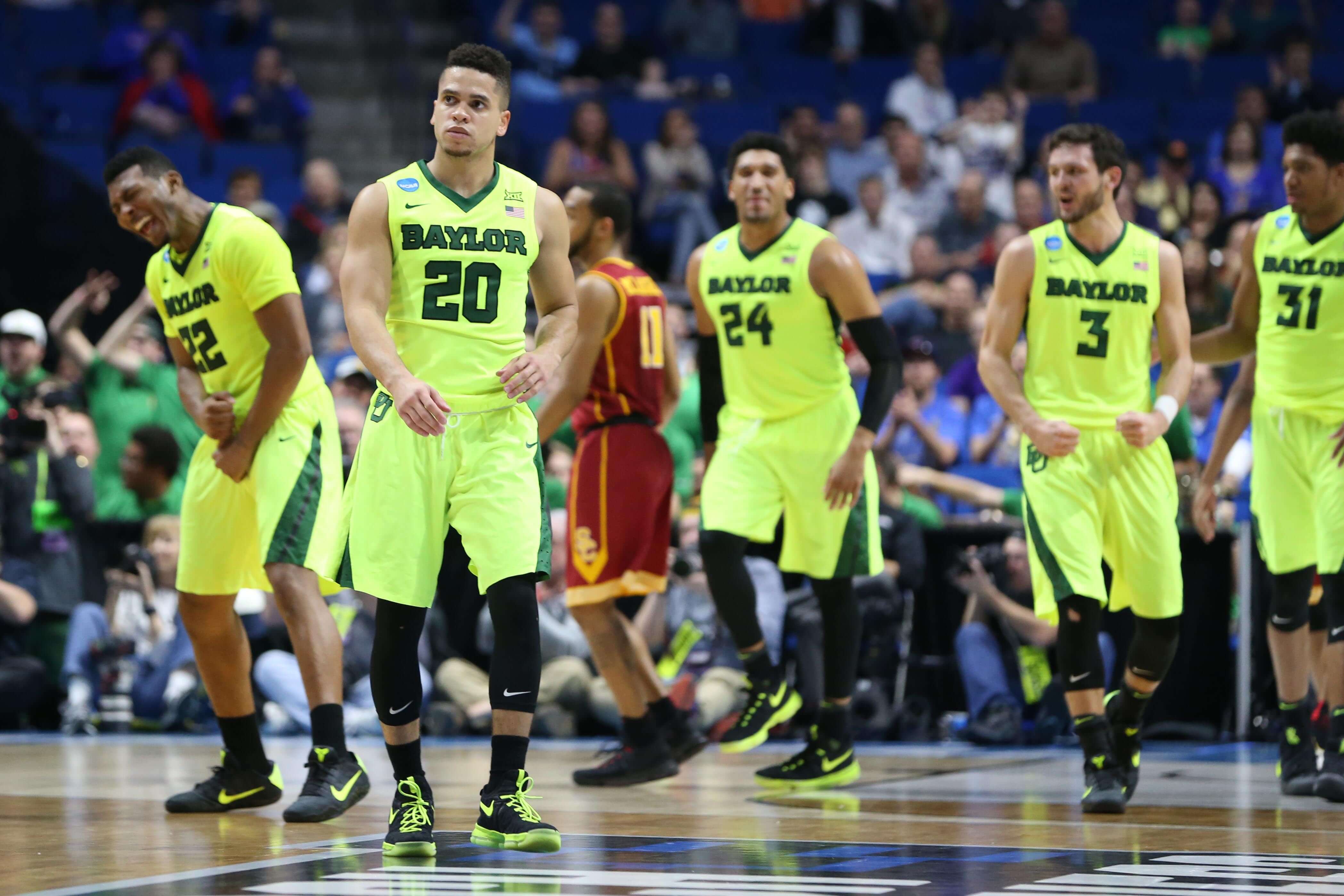
Sweet 16 rankings: With the Sweet 16 set to tip off tomorrow, I’ve prepared an ESPN ranking of the uniforms that we can expect to see on the court. Check it out here.
In addition, I have another ESPN piece today, about how Alex Ovechkin is poised to become the first NHL player to wear custom-painted skates. Check it out here.
T-Shirt update: Last month we debuted our Uni Watch Artist’s Series of 2017 T-shirts with a sensational design by Todd Radom. Our next shirt will be by Larry Torrez — aka the great Eltee of DC — and it’s a stunner. Take a look (click to enlarge):
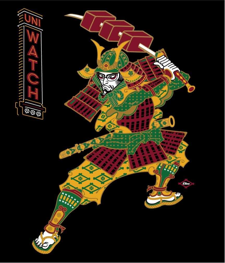
Amazing, right? Here’s the quick story behind this one: As you may recall, about a year ago Larry created a series of meat-themed caricatures of me based on classic MLB mascots, which he dubbed “Meatscots” (you can see them by scrolling down to the middle of this entry). This T-shirt design is variation on that project. The batter is a Japanese samurai warrior playing for the mythical team Kyoto Yakitori. His bat/sword has been reimagined as a kebab, honoring Japanese yakitori restaurants, which serve skewered chicken (which makes perfect sense because “samurai” literally means “one who serves”). The neon sign is a shout-out to the signage that such restaurants often have in Japan.
This design will be available on a black T-shirt either later this week or early next week. If you have feedback, Larry and I would love to hear it. Thanks.
The Ticker
By Alex Hider

Baseball News: Cubs OF Jon Jay, who has a history of sock shenanigans, is now the new brand ambassador for Stance socks. Also, why don’t the stripes line up on these socks? (From Phil.) … Speaking of the Cubs, they’re holding a series of “community nights” this season, and integrated their logo into the symbols of the groups they are honoring (from Jordan Cutler). … The Marlins’ Dee Gordon swapped jerseys with his much larger teammate, Justin Bour, during a workout yesterday (thanks Mike). … Patrick Johnston spotted this Rockies/Avalanche frankenjersey at Rockies spring training the other day. … The Fresno Grizzlies and the Lehigh Valley IronPigs, aka the Fresno Tacos and the Lehigh Valley Bacon, are letting fans pick their favorite food. The loser has to wear the other team’s “Fighting Food” cap for a game in June. Phil doesn’t know what to do. … The Biloxi Shuckers will be wearing jerseys designed by a local tattoo artist in late April (from Mike). … The Corpus Christi Hooks will wear some sweet powder blue fauxbacks during Friday home games this year (from Sam Levitt). … Rough dark gray/black matchup between Louisville and Cincinnati yesterday (from Jason). … Color-on-color matchup yesterday between Charleston and West Virginia Tech (from Dan Reilly). … Lots of stripe action for Louisiana Lafayette last night (from Travis Webb). … Wyoming club baseball has tequila sunrise jerseys (from Jon Spencer). … You don’t often see a batting helmet with such a curved brim.

NFL News: New Ravens S Tony Jefferson says he used Madden to help him model the uniforms for his potential new teams during free agency (from Phil). … Speaking of the Ravens, here are their new number assignments (from Andrew Cosentino). … The NFL made this graphic after QB Josh McCown signed with the Jets, though he won’t likely be wearing No. 12 this season. The Jets have retired No. 12 for Joe Namath (from Josh Kail). … Chiefs K Cairo Santos put on lineman Mitchell Schwartz’s size 18 shoes and tried to dunk on a hoop in the team’s locker room. It didn’t quite work (thanks again, Mike). … We can add former Chiefs punter Jerrell Wilson to the list of players that have played with an unbuckled chin strap. Also, it’s weird to see a punter wearing No. 44 (from Bill Kellick). … The Lions responded to rumors about a new helmet design (from Phil). … Newly signed Steelers DE Tyson Alualu wore a German national soccer team jersey to his introductory press conference.
College Football News: Russell Athletic is losing one of the few FBS teams it still outfits, as Ohio is switching to Adidas. As a former Bobcat myself, I really, really, REALLY hope Ohio’s shoulder loops won’t go the way of UCLA (from Jon Dies). … Coastal Carolina’s new teal turf ”” aka “Surf Turf” ”” should be ready for their home opener (from Brandon Long). … Ohio State’s practice jerseys have sublimated buckeye leaves in the numbers (from Karl).

Hockey News: The Penguins will break out their Stadium Series unis on the next two Sundays (from Jerry). … The Islanders are holding a design contest: They’re looking for the best Islanders-themed beer glass (from Brian Widman). …Check out this old photo of Flyers player Jimmy Watson wearing what appears to be a classic two-bar football facemask attached to his helmet (from Tom Asher). … The US National U-18 Developmental Team is auctioning off some fine-looking military appreciation jerseys the team wore earlier this month. The best part? You can bid on the striped socks as well (from Matthew Talbot).

NBA News: The Timberwolves will unveil their new logo on April 11. … The Bulls are expected to add a memorial patch for former GM Jerry Krause, who died yesterday (from C.D. Tatak). … Steph and Seth Curry wore “Family Business” shoes when their teams played each other last night. … Color-on-color matchup in Toronto between the Raptors and Bulls, as the Raptors broke out their Huskies throwbacks and alternate floor design. … The Trail Blazers’ Meyers Leonard wore socks with his dog on them during warm-ups last night (from Alvin Nguyen). … Sneakerheads might want to check out the first edition of Classic Kicks Magazine (from Nick Santora). … More color-on-color action last night in Brooklyn, as the Nets wore black “Los Nets” unis and the Pistons wore their road blues (thanks, Mike).

College Hoops News: Wisconsin’s Bronson Koenig just got quite the haircut (from Rob Montoya). … Spotted in Lexington, Kentucky: a March Madness soda display (from Nate Hargis). … Here’s what players will wear in this year’s McDonald’s All-American game.

Soccer News: Teams in the English Premier League will have a new number and NOB style next season. … New kits for the New York Cosmos of the North American Soccer League (from Marc Viquez). … This was in the NFL section, but we’ll put it here too: Newly signed Pittsburgh Steelers player Tyson Alualu wore a German national soccer team jersey to his introductory press conference.

Grab Bag: Love a good sign dust-up: Wind recently knocked over a bunch of highway signs in upstate New York, but the Federal Highway Administration doesn’t want the signs replaced. The feds claim the signs are illegal because the text isn’t uniform with other highway signs (from Bradley Loliger).
My thanks to all of you who sent along birthday greetings yesterday. It was a fun day, if a somewhat exhausting one. Good thing it only comes around once a year! ”” Paul
“Fesno” should be Fresno, twice.
Fixed.
Old photo of a Flyer=Jimmy Watson
Thanks for the ID. I’ll add his name.
Thank you both!
“Also, why don’t the stripes line up on these socks?”
I’m starting to get the impression that’s intentional. Yoots these days.
It is definitely intentional. I’m talking to a Stance rep tomorrow, so I hope to have more info on that soon.
At least they are displayed that way in the ad. I’d hate to order some and have them show up that way unknowingly.
Who would intentionally stitch a defect into their socks? No question, it looks defective.
I completely agree that it looks that way. But I’ve been told that it is indeed intentional.
It’s like asking, “Who would intentionally wear their cap sideways?” or “Who would intentionally leave the sticker on their cap brim?” To some of us (myself included), it looks ridiculous. But others see it differently.
Or, “who would intentionally design holes in jeans that cost $150.00?” I get that part…the worn look and it’s a fashion statement. But I don’t get the “defective look.” Oh well, can’t wait to see what the Stance stance is…
I don’t get it either and look forward to the explanation.
Uhhh, “branding”. What else.
Lee
I’m curious, too. I mean, technically, even on socks in which the stripes “line up,” they still don’t (they’re off by one line of knitting). My guess: if the stripes are misaligned by one line of knitting, it looks like a mistake up close, though it does look better from a distance because the misalignment is essentially invisible. If the misalignment is more exaggerated, it looks intentional up close (as most of you have already noted), but from a distance, *this* method looks like a mistake.
The only other thing I can think of is maybe they’re trying to solve some sort of phantom anatomical issue with the way the stripes appear to wrap around the leg, a la the 49ers angled sleeve stripes.
Either way, it strikes me as a solution to a problem that doesn’t exist. Maybe they’ll just come out and say, “We just want to be different because we can and we want out products to be distinctive.”
“Rough dark gray/black matchup between Louisville and Cincinnati yesterday”
Worse, all of the players in dark gray have the same last name (Louisville). Either put the players’ names on the back of the jersey above the number or don’t put anything above the number. Same goes for all of the Louisiana-Lafayette kids named “Cajuns” in the other photo.
Noted and agree 100%. Is SNOB (school name on back) going to be a thing now? Louisville is combining dark gray with SNOB. It’s like they’re trying to look ridiculous. May as well slap the Gothic L on the back of the thighs again.
My University team had the Team name above the number allegedly to show that no player was bigger than the team. In reality it was probably because we needed to sell the front of the jersey to an advertiser and to save on costs.
I’ve always assumed that it’s a cost-saving measure. If you have a player NOB, the jersey becomes becomes theirs, at least in the sense that schools usually don’t want to go through the effort of changing out names/nameplates. If you have school NOB, it’s easier to just trade out the jersey to a new player when the previous wearer graduates. Keep the same jerseys in rotation until the next purchasing cycle.
“The NFL made this graphic after QB Josh McCown signed with the Jets, though he won’t likely be wearing No. 12 this season.”
Nor will he be wearing that font.
That post also says the Jets will be his 10th NFL team.
It’s only his 8th.
It’s sad that the Jets mismatched shades of green are so commonplace now that they actually appear in an NFL graphic.
“Weird” punter numbers weren’t so weird in the late 1960s and early 1970s. The ones that spring immediately to my mind are Bobby Walden (Steelers – 39), Larry Seiple (Dolphins – 20), Curley Johnson (Jets – 33), Pat McInally (Bengals – 87). The main reason for this is that the punter oftentimes played other positions. Jerrel Wilson was also listed as a running back. Johnson and Seiple also played running back as well as tight end. McInally was a wide receiver. Danny White and Dan Pastorini also punted, but since they were QBs, they had “normal” punter numbers. Increased specialization (due to larger roster sizes) and the NFL’s designation that players wear numbers that correspond to their positions in 1973 have led to the death of the “weird” punter number.
I remember Chad Johnson (85) kicked an extra point and kicked off a couple of times (I think) for the Bengals. I’ll have to google it now.
Mark Simoneau (53) kicked an extra point for the Eagles in ’05 when Akers hurt his hamstring
Ndamukong Suh (90) kicked one also for the Lions around 2010
“Ndamukong Suh (90) kicked one also for the Lions around 2010.”
He is good at kicking…defenseless opponents while they were on the ground.
Also Gary Collins, #86 of the 1960s Browns, a fine WR as well as their punter.
Randall Cunningham, #12 in your Eagles program, had 20 career NFL punts (he was a 1983 and 1984 College Football All-America Team selection as a punter), including a record 91 yarder!
link
Good stuff. Danny White was my hero growing up.
Donny Anderson of the Packers also wore 44,since he was also a “halfback”
That “Roy-ker” jersey is like a bad penny – it keeps showing up! I found two instances where it was reported right here on Uni Watch, in link and link alone, and based on link, it dates back to at least 2009. And it’s not even unique – apparently there was a limited production run on these things, with different sizes available.
As a Colorado native who grew up at Rockies games, it’s got to go back further than 2009. Early 2000s at least. At the time it was clever. But now? Ugh.
I remember seeing several at Coors Field in about 2004-5.
From an artistic standpoint, the new “samurai” t-shirt design is pretty awesome, but how does this not fail the “cultural appropriation” test?
My guess is it passes because there aren’t any Samurai around anymore, just as there aren’t any Vikings or Spartans.
I still think the imagery should remain, I don’t want to say “property” of, but I do feel that it’s best left to the people of Japan and those with Japanese lineage.
Plus logo creep
The first baseball ticket item has Jon Jay identified as a Cub, but he is a Padre in the photo, no?
Sorry, ticker, not ticket. Always good to have a typo in your comment identifying a possible correction.
Nevermind, completely missed the first photo being from last year. I’ll just go sit in the corner for a bit until I’ve learned my lesson.
That picture of Bronson Koenig is from a year or two ago, not recent. As you will notice, that is an Adidas practice jersey, not the UA jerseys the Badgers wear now.
Adidas Practice Jersey – link:
How is you portraying yourself as a samurai any different than the cultural appropriation of native American imagery you rail against all the time? Obviously, there are levels (You haven’t used any offensive language like Redskins or Savages), but you still have said before that people should be the owners of their own heritage and culture.
FWIW, I like the design, and would have no problem with it in a vacuum. It just seems inconsistent with the values you’ve publicly stated.
Will address this shortly, promise. My next 60 to 90 mins are going to be frantic!
For the record, I’m not trying to attack you at all! You’re usually pretty open about your opinions, and why you hold them. I’m just curious about this one. Thanks for addressing it.
No worries, didn’t take it as an attack.
So: First, I was honestly unaware that the batter/samurai was supposed to be me. The other meatscots look more like me (or at least show more of the face) — this one doesn’t. Now that I’ve looked more closely and also checked Larry’s preliminary notes that he sent me a while back, I see that it *is* supposed to be me. That strikes me as unnecessary. Maybe I’ll have Larry remove the glasses or something.
As for cultural appropriation: First, as someone else has already pointed out in an earlier comment thread, there are no more samurais (just as there are no more Vikings). More importantly, though, it seems to me that samurais long ago crossed over from being a Japanese thing to simply being a pop-cultural thing. That’s why we have samurai link, samurai link, samurai link, samurai link, samurai link, and so on. You can add this design — which also references Japanese baseball (itself arguably a form of cultural appropriation) and Japanese foodways — to that list.
In discussing Native American iconography, I’ve often (but not always, I admit) tried to distinguish between appropriation and misappropriation. I think Larry’s work, which tends to draw on lots of influences, falls on the right side of that line. If you disagree, or if you think I’m moving the goalposts, so be it.
The same could also be said about Native Americans, as there are several movies, books, cigar store statues, automobile emblems, and other pop culture ephemera relating to them. The only difference is that one culture is still around to defend itself and its right to own its imagery and the other is not.
The only difference is that one culture is still around to defend itself and its right to own its imagery and the other is not.
Another difference is that one culture was marginalized almost to the point of genocide. But hey, why split hairs?
When we start saying “this is ok for these people, but not these people”, it’s a very slippery and dangerous slope in my opinion.
I was mildly shocked when I saw the design given this site’s long-standing opposition to “cultural appropriation” although I’m not sure that’s the phraseology Paul would use. Like you, I have no real problem with the image. Also, Is Paul actually depicted as the samurai? I’m not seeing it.
It’s more of a kabuki portrayal of a samurai based on the ukiyo-e art style.
Rob S,
Why yes, yes it is in ukiyo-e style. I thought about “Gangnum Style” but that would be a PSY South Korea thing. Hmmm, I wonder what they eat at the ballpark in South Korea?
I just wanted to say to all that to me, the Meatscots is at its’ heart a parody of the doings that go on in the real Uni Verse that we talk about, write about and get cranky about.
You know, parody?
par·o·dy
ˈperədē/
noun
A playful imitation of the style of a particular writer, artist, or genre with deliberate exaggeration for comic effect.
I understand that this may not be a salve for those who are upset about cultural appropriation, but I do concur with Paul’s thoughts about the Samurai Assimilation into pop culturedom.
Need more proof, I have only two words for you.
link
Simply the best animation going on right now in the business.
Mainspark, it clearly is supposed to be. The artist used the same mustache, goatee (or is that a van dyke?) and black rimmed glasses in his previous caricatures of Lukas Meatscots.
As someone who is familiar with the Manual on Uniform Traffic Control Devices, I’m fairly certain there are no provisions for identifying mobile apps, particularly for tourism information, on guide signs. The design of the large signs in particular are non-conforming, using non-standard fonts and two shades of blue backgrounds.
It would seem to me that this type of thing would be more appropriate on billboards than traffic signs anyway.
My NHL-related ESPN piece is up. It’s about how Alex Ovechkin is poised to become the first NHL player to wear custom-painted skates:
link
… WOW. I know the team event has nothing to do with politics, but given what’s been going on inside the Beltway, the timing just seems… odd. And that’s all I’m going to say about that.
With regards to the idea of custom-painted skates, though, it certainly is an interesting idea.
That’s an old picture of the UCLA uniform and abbreviated shoulder stripes. They lengthened them, and got rid of the strange pattern. They switch to Under Armour so I’ll be interested what they will look like this coming season.
link
I just noticed the Uni-watch “15” is back to a “7”…
It alternates randomly.
The “7” version (uw-header-orig.jpg) could be saved as “uw-header.jpg” and re-uploaded to the “header” folder of the site, overwriting the “15” version and leaving the “7” version the only one in use without having to alter any of the code to remove the randomizing element.
Wow. Larry’s t shirt design might be the most mind-blowing piece of design ever featured on Uni Watch. Absolutely stunning.
I know! Isn’t it awesome? I’m down for one.
The cultural relativism of this site just gets more ridiculous. Just the other day you went on about cultural appropriation, and here you are gushing over an image appropriated from another culture. Oh, one with meat skewered as a “tribute”. I guess as an Asian-American I should be used to not being a “real” minority, but this is bullshit. Seeing your birthday pics and how lily-white your world is, maybe it’s time to can the SJW stuff (you’re not good at it) and stick to uniforms.
Exactly. The hypocrisy is palpable. Anyone who says anything that could be remotely construed as an alternative opinion regarding the Native American debate should be burned at the stake.
Conversely, Asian American culture is ripe for lampooning and degrading. Or skewering, as it were.
Not to mention the logo creep
Hi, Paul – Once again, I like the t-shirt design; once again, I think it would look better on a magnet, sticker, etc. Heck, I would get that embroidered on a baseball cap – what a great look!
Could you maybe do a series of magnets in addition to or instead of t-shirts?
Way too intricate a design for cap embroidery.
Magnets: We’ll see!
I’ll not buy a shirt, because I have enough to last me until they stick me in a box. Along with pint glasses, shot glasses, coffee mugs, and Zippo lighters.
But a magnet? I’m listening….
Another vote for magnets (would
also buy most of last year’s shirt designs as magnets). With two kids and all the papers that bring home from school, it seems like there are never enough magnets on the refrigerator!
Interesting that the NFL knew not to put McCown in #13, which the Jets retired for Don Maynard, but didn’t realize 12 was retired for Namath.
Donny Anderson of the Packers wore #44 also. First time I ever saw a left-footed punter. A lot of punt returners had trouble gathering in a ball spinning in a different direction (at least at first).
My Sweet 16 uniform rankings are up:
link
I can’t believe Uni Watch likes that horrible Kansas font!!!!
Most true Kansas fans have hated it from day 1 and it is just ridiculous.
OMG that new shirt desgin, Larry, Paul- TAKE MY MONEY! ALL THE MONEY!
Great looking shirt design.
Even with the Canadian dollar still in the crapper and the very likely added shipping costs to Canada, I am going to be very tempted to get this one.
‘Rai Watch:
You guys may be supporting the appropriation of a culture. Think twice before you buy one of these cotton or polyester shirts.
If you like it, then buy one. If you don’t, then don’t. It’s not that complicated.
Don’t feed the troll.
The Reds are calling hot dogs sandwiches in their promo for the new food at GAPB. Not sure about that but some of the dogs do look good.
link
I’ve never been a Reds fan. Until now!
I dig the samurai shirt. I understand some of the comments here on it especially when factoring stances made on the site in the past. But it’s a samurai, in glorious colors, swinging meat.
Sign
Me
Up
Just back from Cactus League spring training trip. Best thing I saw was that the AZ D-Backs have gotten rid of the bloody sock pants, apparently.
Love the Reds “Mr Red” hat. Would be great to see them wear that as a Sunday alternate…
The D-backs changes were announced back in November:
link
Yeah, I vaguely remember that now.
The D-Backs need another 30 or so uniform combinations so team identity is abundantly clear
Timely discussion of cultural appropriation.
I’m going to be in Tokyo next month on business, and one of my usual spots to visit is Yakitori Alley.
link
(its a different place than Piss Alley, mentioned above. Piss Alley is fun, but Yakitori Alley is near our office)
I’ll have a Kirin for all of you and demolish a couple of skewers of chicken livers (rebÄ) and intestines (shiro)
I’m 99% sure that the actual yakitori chefs in Yakitori Alley will find it hilarious and want to pose for selfies with me.
I don’t feel the need today to be offended on behalf of someone else. I’ll buy a shirt and send back photos.
Mike 2,
OMG, my first yakitori was there too – awesome!
I had a large time talkin’ é‡Žçƒ with the locals. I walked in sporting a Dodgers cap and caught hell from a Yomimuri Giants fan (they’re everywhere). It was here that it was explained to me that the Nippon-Ham Fighters do not fight Ham.
just in case the yakitori chefs find the shirt offense and attack you with their steely knives… tell em it was all Pauls idea.
I’m more of a Swallows guy. Our old office was very close to Meiji Jingu stadium and I’d much rather watch a game outdoors than in the Tokyo Dome.
Given the infinite designs available — just like the infinite nicknames and mascots available to choose from — I don’t see a reason for this particular design to need to exist. Artist choice. Previous pop culture cross over. They can all be reasonable explanations, but just going back to the drawing board as an act of decency and respect would be reasonable as well.
Just as we question leaders who can’t seem to get enough of themselves (I won’t mention examples), so we should question a guy who needs to see his face on the front of a million t-shirts. At one point does this go from being a fun, little thing to ego run amok? Especially as cultural figures are remade in the image of the person selling the t-shirts.
As I’ve already explained in another comment thread, I didn’t even realize that the face was supposed to be me, and I’m going to have Larry change that aspect of it. Thanks for the feedback.
Pirates Stargel stars will only be worn for Spring Training. A buddy of mine that works for the Pirates confirmed it this morning.
Regarding the t-shirt design, I initially thought the pieces of meat were bricks and was wondering what it was supposed to mean. I would suggest varying the shapes of the pieces of meat slightly so that it is more apparent what it is.
Excellent feedback. Thank you!
Man, that t-shirt design is gorgeous. Just top-notch work.
What’s great about the new EPL numbers for next year is that they more resemble the numbers used in the 60s and 70s.
Re: New York road signs.
Why is Big Gubmint going after New York when there are plenty of other states who use welcome signs, adopt-a-highway signs, and the food-phone-gas-lodging signs? Trump is headed for a smackdown over this one.