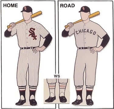
There are certain uniform variations and peculiarities that have become standard knowledge among the uni-scenti over the years. By now we all know that the Cowboys wore red, white, and blue helmet striping in 1976. We all know the A’s managers and coaches wore white caps in the late 1960s and early ’70s. And we all know that the White Sox changed from their usual black stirrups to special white stirrups for the 1959 World Series against the Dodgers.
Or did they?
I’ve always thought the White Sox lived up to their name in the ’59 Series, and that’s easily confirmed by looking at photos and video footage. Or, rather, it’s easily confirmed by most photos and video. But reader Will Shoken was recently watching some video highlights from the ’59 Fall Classic and noticed something interesting: While the Pale Hose did indeed wear pale hose in the first four games, they switched back to their standard black stirrups for Games 5 and 6. You can see highlights from those two games below (if the video doesn’t start at Game 5, skip ahead to the 21:22 mark, and you can see the Sox wearing the white stirrups in Games 1 through 4 earlier in the video):
.
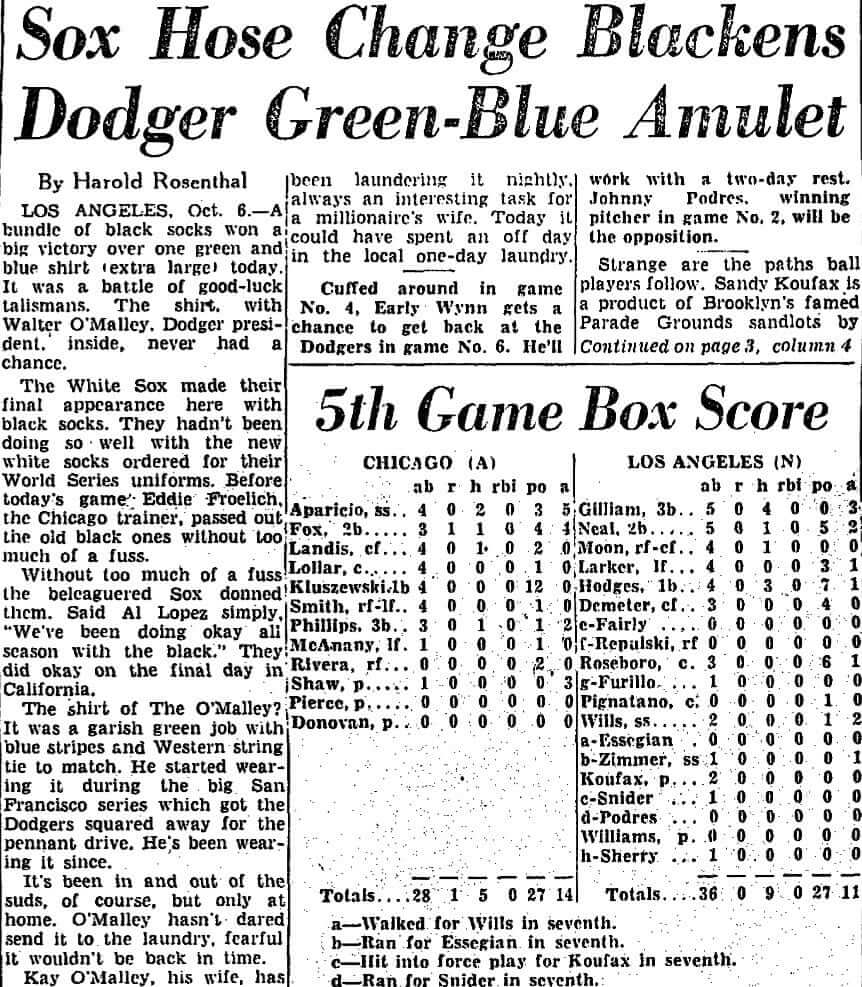
I hadn’t been aware of that (or if I ever did know it, I had forgotten), and I couldn’t find anything written about it online or in my personal library. So I consulted uniform designer/historian Todd Radom. Naturally, he had the full story, which is spelled out in this article (click to enlarge):
.
.
The short version is that the Sox were down three games to one and decided to go back to the black stirrups as a slump-buster move. It worked for one game, but then the Dodgers came back and won Game 6, ending the Series.
This updating of hosiery history has all been news to me. Did any of you folks already know about it?
(Big thanks to Will Shoken for bringing this situation to my attention, and to Todd Radom for providing the backstory.)
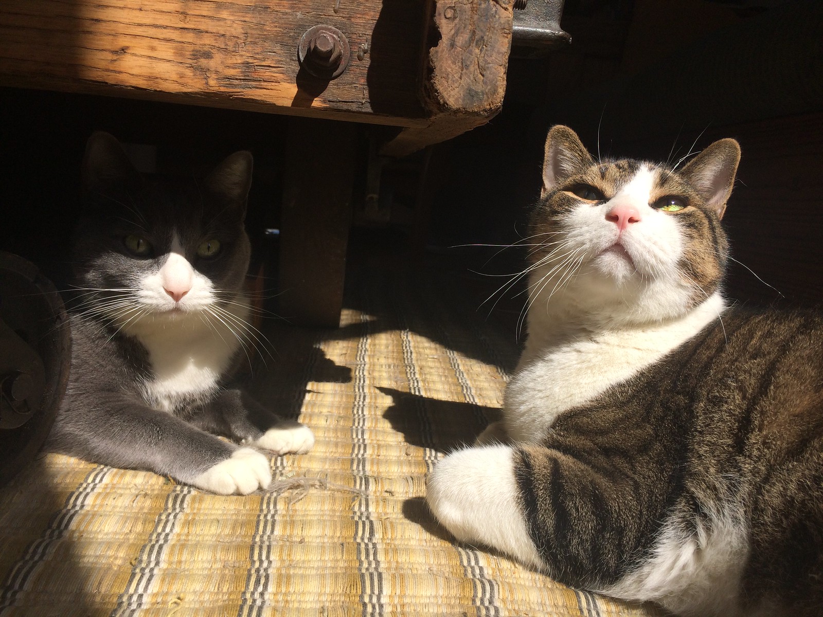
Photo by Mary Bakija; click to enlarge
Sunny Sunday: We’ve had a run of grey weather here in NYC, but yesterday was a sunny day, which made for a particularly picturesque scene with Uni Watch mascots Caitlin (left) and Tucker. Awwwwww.
Uni Watch Hit Parade: I’ve been listening a lot to Cut to the Chafe, the second self-released album by the L.A.-based punk band Thurst. The whole album is good, but the lead track, “Forever Poser,” is an instant classic ”” a hit single waiting to happen, with frontman Kory Seal leaning hard into his drone-heavy vocals and coming up with great lines like, “I’ve euthanized my youth.” You can listen to the album here, and “Forever Poser” is below.
The Ticker
By Alex Hider


Baseball News: Here’s another good piece on Team Israel, including a passage that describes the players giving the team’s mascot, Mensch on a Bench, a glass of Manischewitz wine before every game (from Jerry Wolper). … Niko Goutakolis figured out a way to get that annoying New era logo off of his Mets cap. … Chip Powell was watching Virginia and Clemson play yesterday and noticed the umpire was wearing his chest protector over his shirt, but underneath his sport coat. Makes the ump look like a cyborg. … Looks like Alabama is using the Blue Jays’ font on its jerseys (from Blake Rios). … Edside Manor got his hands on a Nebraska stars and stripes hat. “39 stars, 15 stripes. Made in Taiwan. Close enough,” he says. … Nicholls St. paired a tequila sunrise jersey with red pants yesterday (from Vincent Sbisa). … The Berenstain Bears Get Itâ„¢ (from Chris Flinn).
Football News: Mock-ups of the Falcons’ new stadium include murals of Reebok-era jerseys (from Will Chitty). … ’70s Color Rush? Check out this clip from a 1970 matchup between the Jets and Pats. The white unis the Jets wore that day didn’t have any green trim or striping. Anyone know why? (From Dave Miller.) … Pro Football Journal found a photo that shows Colts striping inconsistencies. … Spotted at a vacation resort in Cabo, Mexico: A mannequin donning both Cowboys and Giants gear (from Justin Berdar). … This blog post has a good breakdown of the Packers’ recent uni history. … Whoever applied the heat-press numbers on this old Broncos jersey apparently used an old newspaper clipping of a Broncos gamer as an ironing pad (from Broncos QB Club). … Lane Horcher found this awesome collection of gumball helmets in his dad’s basement. … Is Ohio State planning on using its throwback white unis as the main road jerseys next season? (From Daniel Bowen.)

Hockey News: The Jets wore throwbacks yesterday against the Wild. TSN’s graphics initially played along, but reverted to modern logos when the game began (from Martyn Bailey). … ICYMI: Here’s what the Leaf’s St. Pats throwbacks looked like on the ice Saturday. … The AHL’s Tucson Roadrunners wore cancer awareness jerseys on Saturday (from our own Mike Chamernik). … The Chicago Wolves of the AHL wore St. Patrick’s Day unis on Friday and later raffled off the jerseys (from Steve Johnston). … I get get behind this uni and mask combo on Mike Liut, a goalie for the old Cincinnati Stingers of the World Hockey Association.

NBA News: The Celtics wore their gold-trimmed St. Paddy’s day unis again yesterday in Philly (from Cole P.). … Apparently, Nuggets players love wearing their sleeved alternates (from Andrew). … The Hornets are still trying to unload gear promoting their phantom All-Star game. Friend of the site Steve Uhlmann found that shirt at the Hornets’ team store. … The Suns and Pistons went blue-vs.-orange yesterday, while the Spurs and Kings went purple-vs.-grey (from Zach Loesl).

College Hoops News: There was a color-on-color tourney game last night between USC and Baylor (from Blake Rios). … A protester flew a Confederate flag atop a parking garage near tournament games in Greenville, S.C., yesterday. This weekend was the first time the state had hosted a tournament game since 2002, as the NCAA would not allow the state to host a game while the Confederate flag flew at the state’s capital. … Check out the thigh pad on Jerry Stackhouse in the 1995 Final Four (from James Gilbert). … Here’s a March Madness-style bracket to determine the best high school logo in the Dallas area.

Grab Bag: The Blues, a rugby team in New Zealand, were set to get special jerseys from Adidas for an upcoming tournament. The kits were supposed to include coordinates for the team’s stadium, but the coordinates actually point to a nearby prison . What’s worse is that the team doesn’t expect Adidas to fix their error (from Matt Manley). … Birmingham, Alabama is looking to pick a new logo and is seeking the public’s opinion. … The winning players and coach of the AFLW — that’s women’s Aussie football —
will each receive an18-carat ring after the Grand Final this weekend (from Graham Clayton). … “I had previously theorized that driver Denny Hamlin wore a Jordan-branded/Simpson-made driver suit, and now I have definitive confirmation!” says David Firestone. … Also from David: Rookie funny car Jim Campbell is the first driver in any of the major racing series to wear a driver suit made by DJ Safety.
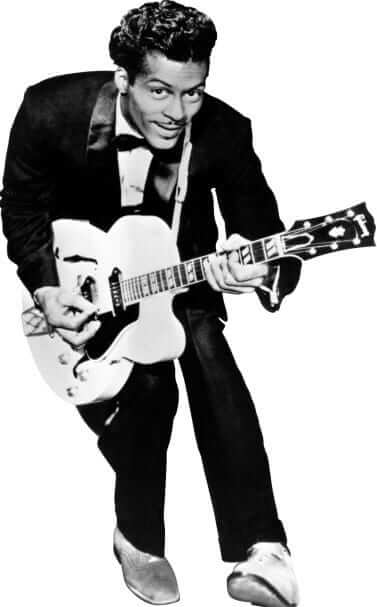
The best there ever was: Chuck Berry died on Saturday. For me, he was one of the greatest and most important artists America has ever produced, an artist who created not just a legacy but a dynasty. He invented rock and roll, and to my mind nobody has ever improved upon his execution of it.
Like most rockers of his era, Berry wrote mostly about girls and cars (his first hit, the great “Maybellene,” brilliantly combined the two), but with a wit and ingenuity that few have ever matched. I’ve never fully understood how a black guy in his 30s was so good at writing songs that appealed to white suburban teen-agers, but Berry had the knack. And his guitar style, which included elements of blues and country, is the cornerstone on which an entire international youth culture and its attendant industry have been built.
Berry could be sly. His 1956 song “Brown-Eyed Handsome Man” reads like an early black pride anthem, and “Memphis, Tennessee,” from 1963, starts out as a lament about a lost lover but then has a surprise twist in the final verse that still gets me every time.
Berry was no angel. Rock history is rife with unprintable and often unverifiable stories about him, but the stuff that’s in the public record is damning enough. As a kid, he was sent to reform school for car theft and armed robbery. In 1962, at the height of his stardom, he was sentenced to 20 months in prison for taking a 14-year-old across state lines “for immoral purposes.” Years later he served four months for tax evasion, and still later he took a plea bargain after cops raided his home and found videotapes of footage shot by a secret camera he’d installed in the women’s room of a restaurant he owned. While his artistic accomplishments don’t excuse those transgressions, neither do the transgressions negate the artistry. Like a lot of flawed geniuses, he was a complicated cat.
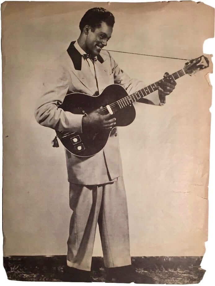
When I moved to New York 30 years ago, Berry would play here semi-regularly. By that time he’d developed a rep for playing with local pickup bands without any rehearsals, and also for sometimes engaging in what was charitably described as “erratic stage behavior,” all of which sounded depressing. Reports indicated that this remained his standard live performance m.o. for the rest of his life (longtime Uni Watch reader/pal Jeff Ash wrote a review of one such show in 2009), so I never went to see him play. On some level, I regret that; on another, I think maybe I’m better off not having seen him as a shell of his former self.
From a sports perspective, it’s worth mentioning that Berry’s 1958 hit “Johnny B. Goode” was the entrance music for Mets closer John Franco throughout the 1990s and early 2000s. On the down side, it’s always bugged me that the final verse of “Brown-Eyed Handsome Man” begins, “Two-three the count, with nobody on, he hit a high fly into the stands.” Come on, Chuck — there’s no such thing as a two-three count! Someone should have told him to change it to three-two, but I suspect you couldn’t tell Chuck Berry anything in those days, if ever.
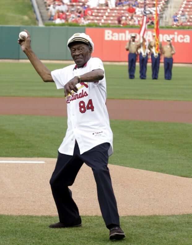
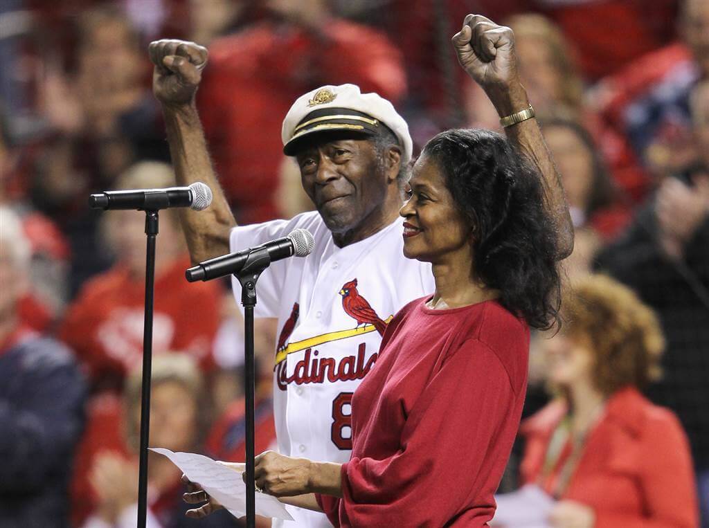
As a native of St. Louis, Berry was a Cardinals fan. In 2011 he threw out the first pitch prior to a Cards/Cubs game, and later that year he sang the national anthem prior to Game 5 of the NLCS between the Cards and Brewers. In both instances, he wore a Cardinals jersey. RIP.
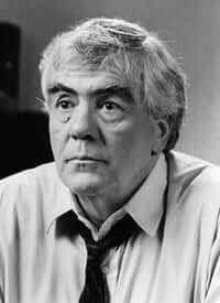
The best there ever was: The weekend’s other notable passing was that of writer Jimmy Breslin, who died on Sunday.
I haven’t had time to fully gather my thoughts on Breslin, but suffice it to say that he was one of the greatest — and probably the last — of the classic hard-bitten New York newspaper columnists. It was easy to view him as a caricature (the drinking, the smoking, the bluster, the shtick), but the reality is that he was a sophisticated wordsmith, an incredibly prolific author (his works include a book about the 1962 Mets and another about Branch Rickey), and a tireless advocate of the little guy. He could also be a real asshole when the mood struck him. Another complicated cat.
Breslin isn’t the reason I got into journalism, but it would be fair to say that his work provided lots of inspiration along the way. I don’t have even the teeniest fraction of his talent, but at a time when my fellow journalists and I have been branded as “enemies of the people,” I’m proud to have shared his profession. RIP.
For the past couple seasons, the Tampa Bay Lightning have been playing “Johnny B. Goode” when Tyler Johnson scores.
Part of me likes it, but part of me worries that soon everyone will have their own goal song.
The Blackhawks also play it for Jonathan Toews.
Before, after, or in place of Chelsea Dagger?
Pretty sure the Flames do it for Johnny Gaudreau too.
Re: Toronto Maple Leaf’s St Pats jersey, while most of the jersey numbers were quite easy to read (was at the game), for whatever reason No 11 (Zach Hyman) – took a lot to get use to, it looked more like 101.
I think the numbers would’ve looked a bit better if the background rectangles had been sewn next to each other to eliminate the gap. Otherwise, they looked pretty good.
I was a bit disappointed to see that CBC’s graphics didn’t play along. Speaking of which, with regards to the TSN broadcast of the Jets, they could’ve at least used the correct vintage logo in the pregame. It just seems odd to see the 1990-96 Jets logo when the throwbacks use a tweaked 1973-90 logo.
JETS STRIPLESS JERSEYS
As the 1960s moved along into the early 1970s, many teams still wore long sleeved durene jerseys as their standard NFL uniform. As mesh jerseys began to become commonplace in pro and college football, some teams resisted a full-on change to mesh jerseys, but wore the cooler and cheaper mesh jerseys for summer camp and preseason.
Jets preseason games in that era reveal it commonplace for the Jets to wear stripe-less white jerseys for preseason games. I saw them wear these same jerseys in Tulane Stadium to play a preseason game vs the Saints in New Orleans – I believe in 1971. Come to think of it – it was likely a GREEN version of the stripe-less Jets jerseys – since in that period the Saints had entirely done away with wearing Black at Home (1971-1974).
Also, the Bears and the 49ers did the same – wearing stripe-less and untrimmed jerseys – both dark and white – for preseason and even early regular-season games.
My best guess is that someone in each organization attempted to spare their players wearing long sleeved durene jerseys in the heat of those August-September games. If memory serves, the 49ers early season mesh jerseys did not even have TV numerals.
Interesting note here though, there are commenters on the original Facebook post of this Jets/Pats game claiming that the Jets radio announcers in the original game-day broadcast explained to the radio audience that the Jets had packed their practice jerseys by accident for this trip to play the Pats on the road. However, the Jets stripe-less “practice jerseys” here all have NOB, which calls into question whether the Jets always out NOB for practice, or, if they added the NOB here in a planned use of the cooler , less detailed mesh jerseys.
It would appear that they were actually preseason uniforms, based on the GUD: link
They apparently went with plain uniforms in the 1969 and 1970 preseasons, and it’s possible they continued using the preseason jerseys as practice jerseys in the regular season.
It’s certainly hard to imagine that a pro team’s equipment manager or staff would “accidentally” pack an entire teams’ worth of practice jerseys for a regulation game. Especially when they were so different in design.
Pretty sure the Vikings did this also.
Thanks for the tributes, Paul. Both were good. I especially liked how you didn’t shy away from both Chuck and Jimmy’s flaws. I thought this line summed it up nicely for both of them: “Like a lot of flawed geniuses, he was a complicated cat.” Nice work.
Just as celebrities are more than their body of work, they’re also more than their flaws. Reading about these two reminds me of when I read Carol Ford’s biography of Bob Crane. She gave you the sum total of his complicated life. It was neither celebrity worship nor a smear job.
The Falcons jerseys in that stadium mockup also aren’t even close to the right number font. It’s interesting that they would bother to put in such a small detail as the manufacturers’ logo (any one) yet completely ignore the Falcons’ distinctive font.
Yes, I knew the White Sox switched back to their black stirrups for Game 5 of the ’59 Series. But I’m a Sox fan; growing up I watched that World Series film intently, as I feared that was the closest the Sox would get to a Series win in my lifetime. If you’re not a Sox fan, it’s perfectly understandable if you didn’t know that little detail.
Black stirrups, white stirrups…at least (unlike now) they wore white *socks*. That’s the important part.
Now they’re just a ridiculous misnomer, as bad as the Padres not in brown.
I also knew about the change back to the black stirrups and I’m a Sox fan like DJ. The change to the white stirrups was written about in the days leading up to the series – it made a great feature story, then the switch back was during the tense period when the Sox were down. South siders probably cringed when the flamboyant white stirrups were announced and glad when the status quo returned. After all, it was the 50’s.
You can almost tell which year a photo of the Sox was taken from 51 to the mid 60’s, because when the team ordered new stirrups each season, they also changed the striping design slightly. Made me a fan of striped stirrups/socks. Plain ones don’t cut it for me.
And Jim – I bet almost all MLB players are wearing white socks – under their pajamas!
The current South Siders who wear their pants high are also wearing solid black socks.
RE the Jets in all white jerseys – 1970 was a year where several teams had stripeless mesh jerseys for their warm-weather games then switched back to their regular striped durene jerseys once the weather cooled. The Jets were one of those teams, along with the Bears and Vikings.
NickV bestie to it; should have refreshed before I posted.
Howzabout that NFL logo above the Mexican GiBoys mannequin??
At least Niko Goutakolis knows that seam rippers exist.
I would have spent the 90 minutes removing the annoying Mets logo from the front of the cap.
Ha!
The picture of the football gumball helmet display includes several helmets of the Buffalo Bills. One of those, almost in the middle, has a blue shell with a white face mask and the current Bills logo on the side. Did Buffalo ever wear that helmet in a game? If not, why was it made as a gumball helmet?
I considered that I’m overthinking this and someone simply put a Bills sticker on a blue shell. But I looked at all the other helmets in the display and none of them seem to be “homemade”. Any thoughts?
The Bills have definitely never worn blue helmets. If it’s not a custom job, the only explanation I can think of is that the team was considering blue helmets for their 2002 redesign and that idea got leaked to the helmet maker… but I’ve never seen anything that would back that up. They had a weird B logo and something resembling the buffaslug as concepts, but no blue helmet.
I have about 1500 OPIs and have a pretty extensive knowledge of OPI (Orange Products, Inc.) gumball helmet history.
The blue Bills helmet you’re referring to is a definitely a custom.
I know a few people who make them and have tried my hand at it, also.
The reason people get them made is either:
1) to get a helmet that never existed onfield, either a prototype or original design, as this person did, or
2) to get helmets that were worn onfield that OPI did not make, such as helmets prior to 1964 or 1994 throwback helmets like the Bills red shell fauxback with white standing buffalo logo, or
3) just to get a cheap version of a helmet that OPI did make that’s really rare or expensive, e.g., 1969 black Saints or 1964 Jets with white football logo.
I will be writing at least one article on OPI gumball helmets at some point in the future to hopefully appear on UW.
There is a Two-three count in the Nippon League. Maybe Chuck Berry liked Japanese baseball.
Not as of 7 years ago:
link
Spotted on eBay: link.
Notice anything unusual about it? It’s mesh, not solid. 1994 was the season when the Cubs began the year with a 14-game losing streak, mostly against the future division champion Marlins and Rockies, and supposedly they wore blue at home for the first time in an attempt to break this streak. The newspapers at the time weren’t clear about it, but it sounded like they were wearing BP jerseys in the game, which wasn’t done too much back then.
But the actual BP jerseys — I have one from that year — didn’t have NOBs. So perhaps they took stock BP jerseys and put names on them for this game.
When the Cubs had their 1990s throwback uniform game two years ago, should they have used today’s solid fabric jerseys? Later in 1994, did they make another solid-fabric version of this jersey as a genuine alternate?
William Henderson’s “MLB Game Worn Jerseys of the Double-Knit Era 1970- 2009” shows those 94-96 mesh BP jerseys WITH NOB’s, but without the standard Cubs number font. Instead they used “2 color— red/white Varsity style” numbers. So if the Cubs mesh BP jerseys used a standard number font (cost?) they may not have ordered a set of mesh ones late in the season made to game jersey specs.
The thing about Henderson’s wonderful guide is that it gives counterfeiters all the details they need. The seller seems legit, so maybe they did get a set of game meshes.
Now that’s pretty weird; maybe my 1994 Cubs “BP” jersey is actually a gamer! (The player on it is not famous enough to be worth counterfeiting, and the $50 I paid for it is not enough either.) Mine has that infamous giant gap between collar and number, and a NOB could fit in there.
I remember the Cubs having plain block numbers on their BP jerseys, and sometimes NOBs in a weird block font that doesn’t look like anything anyone wears in the regular season, in some years in the ’90s; I think they kept that style right up until they started introducing newer fabrics and they went to a slightly darker blue (I liked this!), without NOBs, in 2005.
(Speaking of font variation: I had a 1995 Angels ST #78 Juan Agosto jersey with the 7 in the “default” Majestic block font and the 8 in the Angels/Yankees/Tigers “full block” font!)
Now I’m wondering if the Cubs took existing BP jerseys and re-did the NOBs and numbers so that they looked like game jerseys from a distance, figuring that no one would notice the mesh!
By 1997-98 they had the new walking bear logo and had solid-fabric blue road alternate uniforms. Did they wear blue alternates in ’95 or ’96? Were they mesh or solid?
Looking at that umpire’s chest protector made me realize that the first image that comes to my mind for a home plate umpire is extremely outdated, as I still think of the big old external padded protectors that apparently fell out of favor circa the late 1970s.
When inside protectors were developed, the NL adopted them, while the AL stuck with the old balloon protectors. It’s why the AL had the rep of being a high-strike league, while the NL had more low strikes — the balloon kept you from getting too low, so AL umps positioned themselves directly over the catcher’s head, while NL umps worked the slot between catcher and hitter and got lower.
Eventually it was decided to standardize the inside protectors across leagues — in the 70s as you correctly recall — but umps using the balloons were grandfathered. It was sometime in the mid 80s when the last balloon guy retired.
More on this:
1. Influential NL ump Bill Klem, who worked from 1915-41, was a champion of the inside protector, while his AL counterpart Thomas Connolly championed the outside protector. These two umps (who are also the first umps ever inducted into the Hall of Fame) are the primary reasons the two leagues took different routes regarding chest protectors.
2. In 1964, the Umpire Development Program was created to streamline the training of new umps. Although the program provided umps for both leagues, it was staffed primarily by NL umps who encouraged the use of the inside chest protector. This was the beginning of the end for the outside protector, as more and more new AL umps went with the inside style.
3. Jerry Neudecker, the last AL holdout wearing the outside protector, retired in 1985.
4. The AL and NL umpiring crews were merged in 2000. Up until then, the two leagues had separate umpires’ uniforms.
The AL ditched the outside chest protector but kept the DH…Should’ve been the other way around, I tell you.
As I find myself so often saying, “That Jim Vilk fella makes a lot of sense.”
The retro Winnipeg Jets logo that Fox Sports North displayed was circa 1990-96. The gorgeous heritage uniform that the Jets wore yesterday is a tribute to the uni that the WHA Jets wore.
Saying Chuck Berry invented rock & roll is just as wrongheaded as saying Elvis did….
Who did then?
If anyone could be said to have invented rock and roll, it would be Louis Jordan or Wynonie Harris. It really had been around for years before “Rock Around The Clock”.
That’s not to take anything away from Chuck Berry, who defined rock and roll as much as anyone.
On a more objective note, despite what that record label says, Chuck released “Memphis, Tennessee” in 1959.
This rabbit hole is too deep.
It’s probably easier to say Chuck Berry, along with Little Richard, were the ones who took the style introduced by “Rocket 88” to a whole new level.
Chuck is the guy who made the amplified guitar the primary instrument of rock – moreso than Bo or others. He also is the guy who really invented the modern rock song format: opening guitar riff/lyric/chorus/guitar break/repeat all…that is what got people like Dylan…Lennon/McCartney…hell, EVERYone interested in writing.
No argument here, but Elvis inspired Dylan, Lennon and McCartney to start playing.
This is a chicken/egg situation. Nobody “invented” R & R. That was my point.
The photo of Chuck Berry throwing out the pitch has him in an 84 jersey. That would have been his age during the regular season. He’s still wearing 84 for the anthem in October.
link
He turned 85 a few days later. I’m wondering if he would have worn an 85 jersey, as that number is retired by the club for Gussie Busch. Probably he would have worn whatever number he wanted.
Damn, but his greatness is *still* great and reverberates deep. He will be missed.
Umpires wearing a jacket directly over their chest protector isn’t that uncommon, is it? I seem to recall it happening pretty regularly throughout the past couple postseasons.
link
link
link
I’d buy it that it’s much less common for umps to wear the jacket nowadays instead of a polo shirt, but when they do, they usually seem to go with it right over the protector.
Plate coats are fairly expensive, couple hundred bucks….
Totally off topic but can we change the round orange ETC logo for Grab Bag? Looks too much like the basketball for the NBA section when scrolling, and vice versa. I smell another Uni Watch contest…
Very good observation. Is there a story behind the logo for each section? Obvious ones are MLB and NFL, but why not have the national logo for NHL/NBA?
There is no NHL section. There is a hockey section. Peter Puck always struck me as the best icon for that section.
There is an NBA section (because college hoops, unlike college or minor league hockey, often generates enough news to justify having its own section). I didn’t use the NBA logo for that section because the logo has a vertical orientation, which is more problematic from a Ticker-design standpoint, because it it would take more lines of news to “fill up” the vertical space represented by the vertical logo.
Interesting! I always love learning more about the behind the scenes design and creation of the site
Thurst sounds likes Velvet Underground meets Iggy Pop. Nothing original there
Oh, couldn’t agree more that it breaks no new ground. Never said it was original. Said it was good! Which it is.
Toss in a little Jonathan Richman and the Modern Lovers.
Okay, the Jonathan Richman comparison sealed the deal, I gotta check em out…Ultimate Painting’s still getting burn in my rotation thanks to Paul’s mention a while ago.
They’ve also got both their albums available on Bandcamp to pay them as much as you like for whatever quality you like (up to and including FLAC): link
Re: Check Berry’s Two-Three count.
In a similar vein, I always wondered why Bruce Springsteen used the term “speedball” in Glory Days when “fastball” would have been more appropriate. Is “speedball” a colloquialism used in New Jersey/East Coast?
both ‘speedball’ and ‘two-three’ are what might be called artistic license….
The umpire’s chest protector is known as the “West Vest”.
Invented by and named for MLB umpire “Country” Joe West.
link
I was just at the Times Square Mets store and they actually had quite a few caps without the NE logo. Most of them had it, but I guess the old ones are still in stock if you like hunting them down.
Apostrophe catastrophe alert! Leafs is already plural, so possessive should be Leafs’, not Leaf’s.
Well done!
Of course without Marty Mcfly you would have no Chuck Berry.
I was lucky enough to see Chuck Berry live in 2003. And at 77 he gave a great and energetic performance. It was an emotional experience to have been that close to one of the most important artists in human history.
Didn’t realized the levels of Chuck’s scumbag demeanor but at least he (allegedly) punched Keith Richards so he can’t be all bad : )
Nice shot of Fox and Aparicio wearing the white stirrups:
link
It comes from a Pinterest board titled “1959 White Sox.”
When wearing the Blazer style jacket, it is customary for the umpire to wear nothing over the chest protector. This umpire in particular, is wearing a Wilson West Vest, which was redesigned last year and made in contrasting colors of gray and black. Also with a large W logo front and center. On past models, the vest was solid black with a small “W”, thusly more visible. I will try to get a pic of my chest protector to compare and contrast. It appears Logo Creep has moved in to the officials gear as well. Paul could do a whole article on the evolution of footwear for umpires. When I first started, everyone basically wore Spot-bilt. Now there are at least a dozen types of umpire shoes.
Roger, your info is bad. The West Vest comes in two models: Gold (which is colored black) and Platinum (which is colored gray) and was definitely not redesigned last year. The difference between them is mostly aesthetic, and a little to do with form. The Logo Creep is real, but comes from Wilson as they are the only official supplier of MLB umpire gear. MLB umps who wear other branded chest protectors have to cover the logos, sometimes with a Wilson “W”. Regarding footwear, the majors only wear New Balance, and us amateur guys don’t have many options. Seriously, only New Balance makes a dedicated umpire shoe anymore, and Reebok, Under Armour, Adidas, and Nike make turf shoes for multiple sports. Beyond that… it’s slim pickings.