I recently challenged Uni Watch readers to redesign those crummy jerseys that the Baseball Hall of Fame gives to its new inductees. A handful of readers responded, and today we’re going to look at the best entries I received.
One reader at a time (for all images, you can click to enlarge):
Best Pinstriped Design: Joe Hilseberg
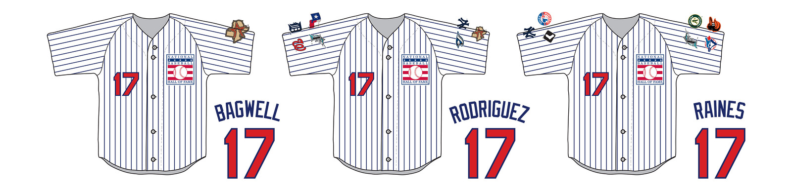
“I think this calls for something simple, clean, and timeless,” says Joe. I agree, and I think he nailed it very nicely.
Joe goes on: “I think it would be really cool is to have sleeve patches of all the teams the inductee has played for. As you can see, I mocked up what it could look like for the current class. I just used the logos I had on hand for the teams, but it would be better to use era-appropriate logos from the player’s time with the team.”
Best Non-Pinstriped Design: Adam Cain
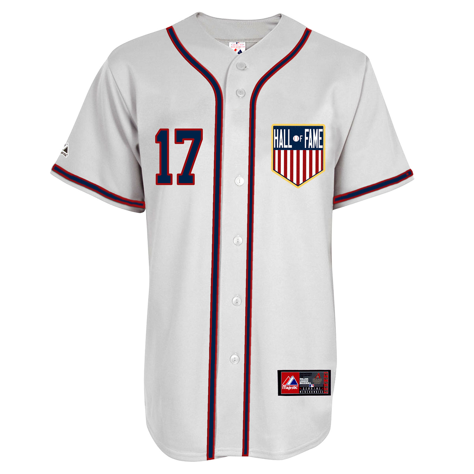
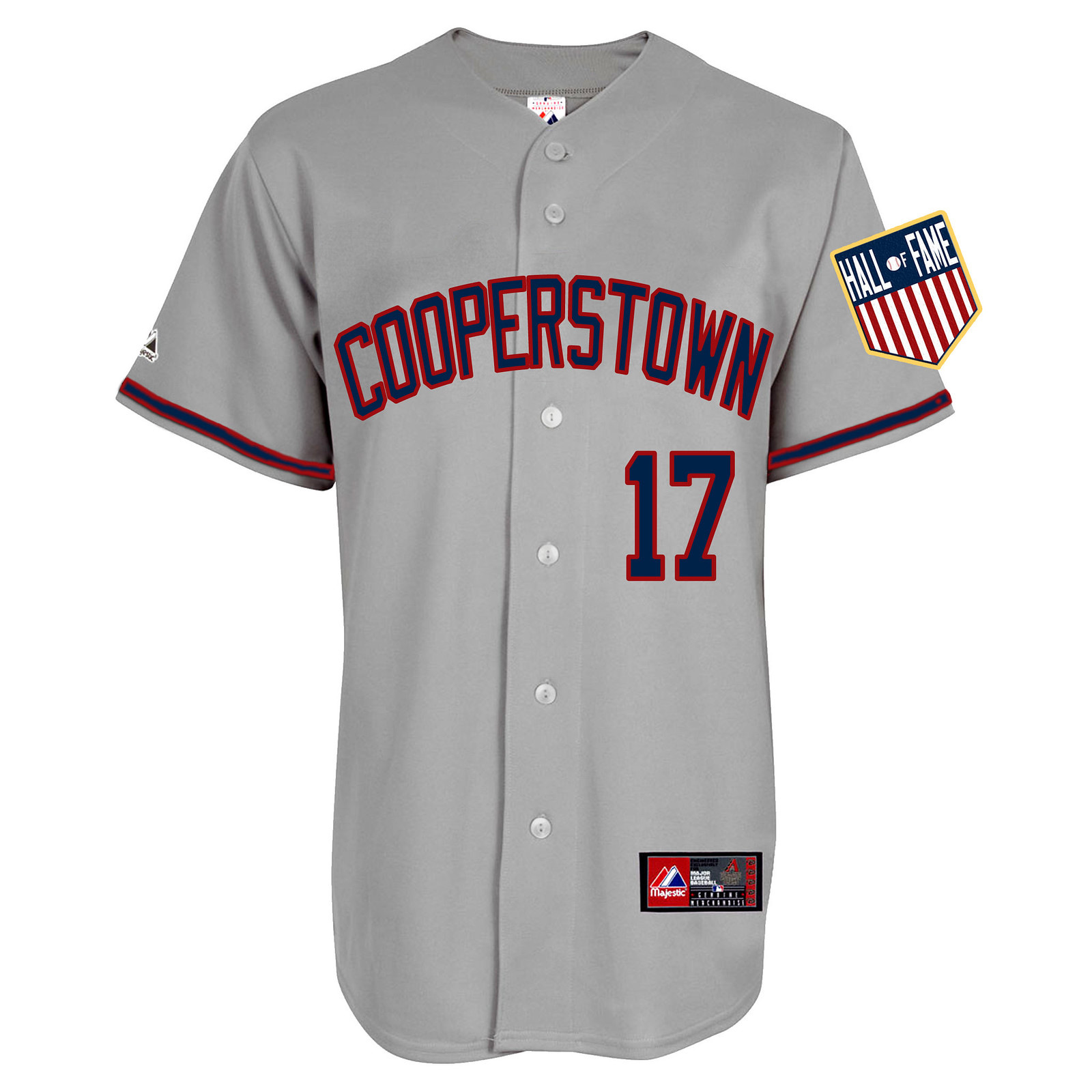
I really like that Adam included separate home and road versions. “I like the ‘Cooperstown’ lettering but couldn’t convince myself it belonged on a home white, so I went with standard road grey,” he explains. “The chest patch shown on the home white would also be on the caps. The number would of course change with the year of the class.”
Best Non-Jersey Idea: Alex Rocklein
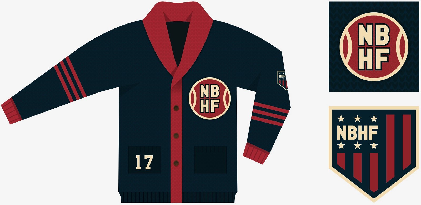
Alex decided to skip the jersey idea altogether and bring back baseball sweaters. Not a bad idea, since the Hall’s election results are always announced in January. “It even looks great with a shirt and tie underneath!” notes Alex, and he’s right.
Those were my favorite entries. Any of them would be a huge improvement over the current jerseys. Your move, Hall of Fame!
Want to see more? Here are all of the submissions we received (if you can’t see the slideshow below, click here):
Party reminder: Uni Watch gathering this Sunday, Feb. 19, 3pm, in the back room of the Douglass (which is the same place we used to meet at, Sheep Station, but with a new name). Phil will be there, I’ll be there, I may have theoretical T-shirts to sell, etc. Come join us!
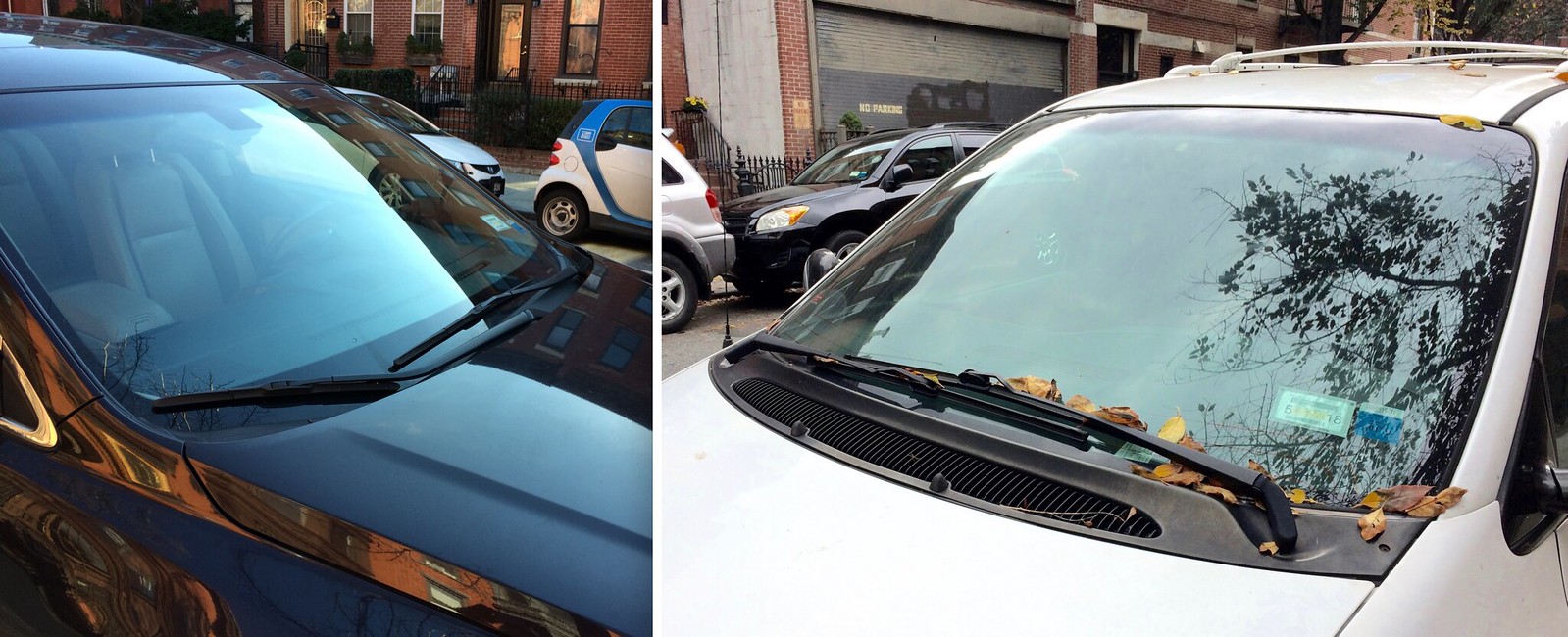
Click to enlarge
Delving once again into the inconspicuous: Lately I’ve become intrigued by windshield wiper design. Look at these two sets of windshield wipers shown above, for exampe: The wipers on the left are anchored close to each other and move in tandem, while the wipers on the right are anchored on opposite sides of the car and face each other. And for the car on the left, one of the wiper arms is straight and the other is bent. The more you look, the more you’ll discover that no two cars seem to have the same wiper configuration.
Wiper design seemed like an interesting niche to explore, and I wanted to learn more about it, so I did what I usually do when I want to learn more about something: I wrote an article about it. It’s up now on the science/tech website Ars Technica, and you can check it out here.
Big thanks to my Ars Technica editor, Eric Bangeman, for making this story happen. If that name sounds familiar, it’s because Eric is a longtime Uni Watch reader and Ticker contributor. He specializes in rugby items (he has a rugby contribution in today’s Grab Bag, in fact) and was wearing an Australian rugby jersey when I met him at a Uni Watch gathering in Chicago back in 2007. He’s frequently invited me to write for Ars, but I’m not the most science/tech-y guy, so we could never come up with a good topic — until now. Glad we finally got to work together, Eric!
The Ticker
By Alex Hider

Baseball News: We’ve seen this before, but once more won’t hurt: Here’s an awesome video from the 1967 World Series showing an ump swiping a Cardinals player’s hat after the final out (from Erik Spoonmore). … The San Francisco Cardinals? (From Tony Hansel.) … Looks like Notre Dame will be sporting kelly green pullovers this season (from Anthony Adamo). … Good to see that Eastern Michigan will once again be making heavy use of their script E logo this season (from Cam Newton).

Pro Football News: Weird Photoshop work on the Saints’ throwback unis in this Facebook graphic (from Ray Garofolo). … Found at a Cleveland K-Mart: A vintage T-shirt from the new Browns’ inaugural season (from Matt). … East High School in Rochester, N.Y., has a special display for alumnus Ronald Williams, who went on to become a tight end for the Super Bowl XXXIV champion Rams. The display includes this gold-colored football. Balls like this one were gifted to the high schools of every Super Bowl champion before last year’s Super Bowl (from Joseph Bailey). … May have been mentioned this before, but check out the orange goalposts the old World Football League used (from Steve B.).

Hockey News: Sabres C Sam Reinhart was wearing a cap with the team’s early 2000s logo in a recent postgame interview (from Moe Khan). … The Idaho Steelheads of the ECHL wore pretty bold uniforms in support of the Jayden DeLuca Foundation for pediatric heart disease (from Brett Thomas). … Louise Brooks FC found this WHA All-Star game prototype jersey.

NBA News: The Bulls and T-Wolves went color-on-color yestersay (thanks, Mike). … Oscar Robertson: The original Rip Hamilton (from Jeff Ash).

College Hoops News: William & Mary wore special warm-ups on Saturday for Charter Day, which celebrates the school’s founding. The shirts read “Chartered 1693” (from Gregory Koch). … Virginia Tech wore maroon at home last night, forcing Virginia to wear white on the road (from Andrew Cosentino). … Washington State and Colorado went color-on-(almost) color (also from Andrew Cosentino). … The Syracuse women wore pink yesterday against North Carolina (from Cam Newton). … Louisiana Laffayette’s floor is…interesting (from Jason Jones).

Grab Bag: DC United of the MLS has a new kit that is apparently full of Easter eggs (from Pablo Maurer). … A high school football team in Canada says a special decal helped reduce concussions last season (from Tony Arnoldine). … Players for the Adelaide Crows of the AWFL are wearing concussion sensors behind their ears (from Graham Clayton). … Some interesting points raised in this opinion piece about Nike’s pro-equality ad campaign (from Douglas Ford). … France’s rugby team wore its alternate kit against Scotland yesterday. France is the only rugby national team that does not currently have a jersey advertiser on the front, but the one worn on Saturday did have an ad ”” from the French Rugby Union. It said, “France 2023,” in support of France’s bid to host the 2023 Rugby World Cup (from Eric Bangeman).
I’m looking to get ahold of any of the uni-trackers if you could email me at link thankS
Love Joe Hilseberg’s idea of team patches on the HOF jerseys but Ivan Rodriguez and Tim Raines never played for Toronto.
Yeah that was weird.
link
link
I saw TOT listed as their teams at quick glance and just assumed Toronto.
That’s not just any “Cardinals player’s hat” that was Bob Gibson.
Screw with Bob Gibson’s hat and you could well die for it.
The ump took the hat from a guy (#25) who very much does not look like Bob Gibson. Gibson’s hat appears to fall off in the player scrum but Tim McCarver or another player picked it up.
#25 was Julien Javier, their starting second baseman.
Gibson’s hat did fall off during the scrum. It looks like Orlando Cepeda (#30) picked it up at the 0:07 mark.
Killer work on those HOF concept unis! Hard to pick just one favorite. HOF couldn’t go wrong with any of the designs.
I’m not sure that the Notre Dame picture is from this year, although they may end up wearing Kelly green pullovers anyway. In the background is the Georgia Tech logo; Notre Dame doesn’t travel to Georgia Tech at all this season, especially for the season opener.
Correct. They have a new version of the “script Irish” wordmark:
link
There’s also the more “out of the box” windshield wipers, Luigi Colani link.
Those are some nice looking machines!
Paul is an editor’s dream in terms of the quality of writing. Paul: how about a Chicago meet this summer to Commemorate 10 years since the first one?
I have lots of Chicago friends and am overdue for a visit. Maybe this summer!
Thanks for the kind words, Eric. I was once an editor myself, so I try to make my editors’ lives easier when possible.
Love the Hall of Fame Jerseys especially the grey one with the COOPERSTOWN inscription. That would be nice on a white or cream colored jersey. Either way, I would purchase them. Very sharp, clean, crisp, and classic. The Hall of Fame patch is the cherry on the ice cream. Great job, Adam!
Kudos to the designers. I like them all and the ones that were highlighted, they should be used by the HOF.
I was a car nut before I became a uniform nut, and windshield wipers (after backup lights and turn signals) are my favorite rabbit hole. Your discovery about the tight space under the cowl answers a long-standing question I have mulled: 1961-1970 Chevrolet/Buick/Pontiac/Oldsmobile/Cadillac full-sized models all shared a single windshield. Why, then, did only the Chevy use tandem wipers while all the others have opposed wipers? Didn’t GM engineers find one format superior to the other? Didn’t the tandem system clear a bigger area of glass? Did Chevrolet’s bigger production numbers warrant an economy of scale the other brands couldn’t claim? But now I have an answer. Thanks!
One unique wiper system not covered in the Ars article: the Toyota FJ Cruiser has three blades on the windshield. I’d guess that has to do with the relative height and width of the windshield, very low and very wide.
link
NFL.com used to have a database of all the players/high schools involved in the Super Bowl High School Honor Roll. The “front door” to that list is still active at link, but clicking the Golden Football to enter appears to lead to a dead link. Does anyone know of an alternate or mirror of that database?
Sorry to be a pain, but my last name is “Cosentino.” You usually get it right, but it’s an easy name to misspell. Thanks for always publishing my ticker submissions!
No need to apologize — spelling your name correctly is the least we can do! Now fixed.
Thank you, Paul! Much appreciated. Keep up the great work!
Surprised the NFL didn’t send them a new football that said “LA Rams” since they are doing their best to try and get rid of STL’s tenure with the team.
Since I change my wipers maybe every year (maybe), its like the proverbial monkey and a football trying to get the new one on. I search high and low to find the easiest replacement blade. Thanks for the article.
looks like the web comic “the Draw Play” should have entered in the Chargers redesign challenge.. they could have won big time
link
Did you actually read below the comic? The guy *did* enter, and seems slightly annoyed that he didn’t win or get mentioned.
i did not read the blog post.. totally skipped over that and saw the photos
Kmart is spelled without a hyphen. Maybe because my dad was a manager there for 35 years I can’t help but notice when it’s presented wrong. I loved the Hall of Fame submissions today. Good work, people!
Paul,
Regards to your wiper article. I work in the wacky world of design around components of automobile interiors. You could have just as interesting of an article written about more than just wipers.
It’s funny how much time I spend fascinated by your style of esoteric aesthetic/design analysis, but entirely forget my world is full of these types of quirks.
The Hall of Fame sweaters are such a great idea. They look fantastic, are an ode to the history of the game, and would look great over a shirt and tie. Plus they’d be a unique representation of the Hall akin to Pro Football’s blazer.
I find windshield wipers interesting as well. I had a 67 Bug and the wipers were either on or off. One speed. It had alot of electrical problems. It really stripped people’s gears that rode with me when it was raining because the right wiper went at a much faster rate than the left. But they were both working so I left it alone.
Also rear blinkers. Why are some red and some orange?
One of the pros when I bought a Honda Civic was the wipers went opposing ways.
In certain countries (Japan and Australia, to name two) the rear turn signals are required to glow amber. Some automakers think the multicolored lenses lend an air of sportiness, others think they have the whiff of a chintzy econobox, thus the dichotomy.
Totally digging on the Notre Dame kelly green pullovers. Do you think they should have navy belts with gold buckles to match the navy cleats with gold trim?
Sansabelts with pullover tops should be a hard-and-fast rule.
Proofreading:
Joe goes on: “I think it would be really cool is to have sleeve patches
May have been mentioned this before, but check out the orange goalposts
“Roland” Williams is the Rocheter native, Syracuse University alum, and former New England Patriot
Gaudere’s Law in action…
Nice work on the HoF jersey concepts!
I didn’t get around to doing one myself, but if I had, I would’ve had a headspoon like Adam Cain’s home concept, but I would’ve put “HALL OF FAME” in vertically-arched letters on the front (in a similar block font to Adam’s road concept), with the “OF” in smaller letters inside the placket (possibly stacked vertically).
The wipers on my 2007 Kia Optima are two different sizes. The driver’s side is 24″ and the passenger side 18″. Any other cars have different sized blades?
That’s very common.
I believe the umpire is Augie Donatelli.
RE: Saints pants photoshopped, I’ve noticed in almost all promotional art from the Cowboys staff, be it magazine covers, the cups you buy at ATT Stadium, promotional pictures, etc., the greenish pants worn with the white jerseys are always photoshopped to be silver and match the helmet and the blue hues are matched to navy. Why not just do this in real life?