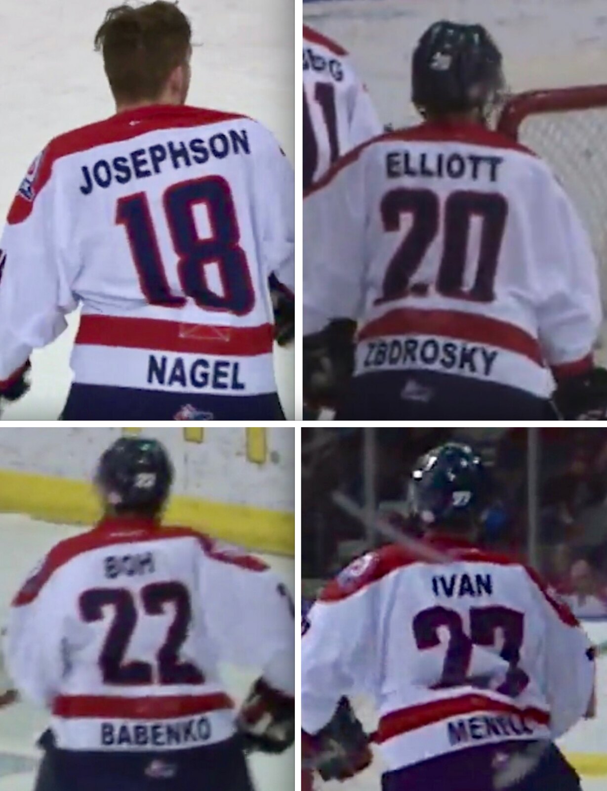
I’ve been writing about uniforms for nearly 18 years now, but sometimes I still see things I’ve never seen before. Take, for example, the players shown above, who play for the WHL’s Lethbridge Hurricanes. They appear to have been wearing two NOBs — one in the usual spot and one down near the hemline. What’s up with that? Are these double-decker FNOBs? Some sort of jersey advertising? Maybe season ticket-holders got to have their names added to the jerseys?
Nope, nope, and nope. Those screen shots are from last Sunday, when the Hurricanes wore 1997 throwbacks. That throwback promotion included something I’ve never seen before: The players wore their usual uniform numbers and two NOBs. The top NOB is the name of the player who wore that number back in 1997, and the bottom NOB is the name of the current player.
Weird, right? Seems like a lot of work for a major junior team to go through, plus you have to wonder how many of today’s fans still remember or care about the players from 20 years ago. Then again, the Hurricanes did win the WHL championship that year, so maybe the fans do have a special place in their hearts for those players.
The problem with this approach (aside from it just looking weird) is that some of the current Hurricanes wear numbers that apparently weren’t worn in 1997, so those players had the drop-down NOB for themselves but didn’t have a corresponding upper NOB for their 1997 counterparts.
I appreciate the thought behind this gimmick, but I kinda think there has to be a better way. At the very least, they should swap the NOB positions and make it current player on top, old player on bottom, to avoid having the blank top spot like I just described. (Having the blank spot on the bottom would be much preferable to having it up above the number, methinks.)
Still, it’s an intriguing idea, and something genuinely new (at least to me). What do you folks think of it? Would you want your favorite team, in any sport, to try something like this?
You can see the video from which I took these screen shots here.
(My thanks to Wade Heidt for bringing this one to my attention.)
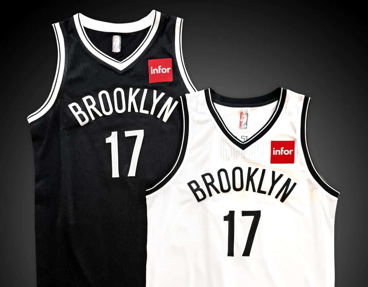
Late-breaking NBA news: Shorty after today’s entry was posted, the Nets became the latest NBA team to announce that they’ll have a uniform advertiser next season. The ad patch will be for Infor.
More on this tomorrow.
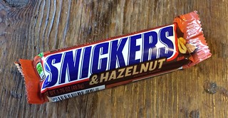
Candy break: I like Snickers and I like hazelnuts, so I was curious to try the new Snickers & Hazelnut bar, which launched in December. Nobody in my neighborhood seemed to be carrying it, but I finally found one yesterday.
My curiosity about this product was heightened by the fact that hazelnuts are a loaded topic for Mars, Inc., which owns Snickers. The company is owned by the famously secretive and somewhat eccentric Mars family, whose fondness for hazelnuts (particularly as compared to peanut butter) is spelled out in Joël Glenn Brenner’s awesome 1999 book The Emperors of Chocolate: Inside the Secret World of Hershey and Mars. Here’s a key passage from that book (it’s semi-lengthy but worth it, trust me):
“You want to know why Mars doesn’t make any products with peanut butter?” asks Alfred Poe, former marketing director of the [Mars] candy division. “It’s because the family doesn’t eat peanut butter. They don’t like it. (John, Forrest Jr., and Jackie didn’t eat peanut butter and jelly sandwiches growing up; they were raised in England, where peanut butter is despised.) In the early 1990s, Poe succeeded in convincing Mars to give peanut butter a try, but his PB Max candy bar didn’t last long. Launched in 1990, the Mars brothers yanked it from the market just two years later, even though it had reached [annual] sales of $50 million, an impressive performance by most companies’ standards. Mars continues to manufacture peanut butter M&M’s, the only other peanut butter product in its repertoire. But even that candy languished for ten years on the drawing board before the Mars brothers gave permission for its launch, and marketing executives say the brothers continue to be hyper-critical of its performance.
On the other hand, Poe continues: “You want to know why they’re so hung up on hazelnuts? Because they eat hazelnuts! It doesn’t matter if Americans like peanut butter and despise hazelnuts. They’re going to do what they’re going to do.”
Dozens of hazelnut-based products have been tested in the Mars kitchens over the years, and according to one food chemist in Hackettstown [site of the company’s headquarters], the Mars brothers believe Toffifay — a hazelnut candy manufactured by Germany’s Storck GMBH — is one of the best in the business, even though Toffifay sales have never topped $50 million.”
Later on in the book, there’s this:
The [Mars] brothers didn’t eat peanut butter growing up, so they never recognized its allure for Americans. Fanfare, a European candy bar made with hazelnut paste, is a family favorite. American hate hazelnut paste, and tests of Fanfare have always failed in the United States. But that doesn’t stop the brothers from repeatedly proposing hazelnut products, each of which fails at the product testing stage.
So with all of that as a backdrop, let’s turn our attention to Snickers & Hazelnut, beginning with the name. It’s not “Snickers with Hazelnuts,” or “Hazelnut Snickers,” or “Snickers Hazelnut” (the format used for the Snickers Almond bar) — it’s Snickers & Hazelnut, which is really weird. It’s like Tony Orlando & Dawn or something.
The explanation for the odd name can be found in the ingredients listing, where it turns out that peanuts are the third item listed; hazelnuts are fifth. So this is basically a standard Snickers bar with a few hazelnuts tossed in for window dressing.
This also explains the little illustration at one end of the wrapper, which shows a hazelnut and two peanuts:
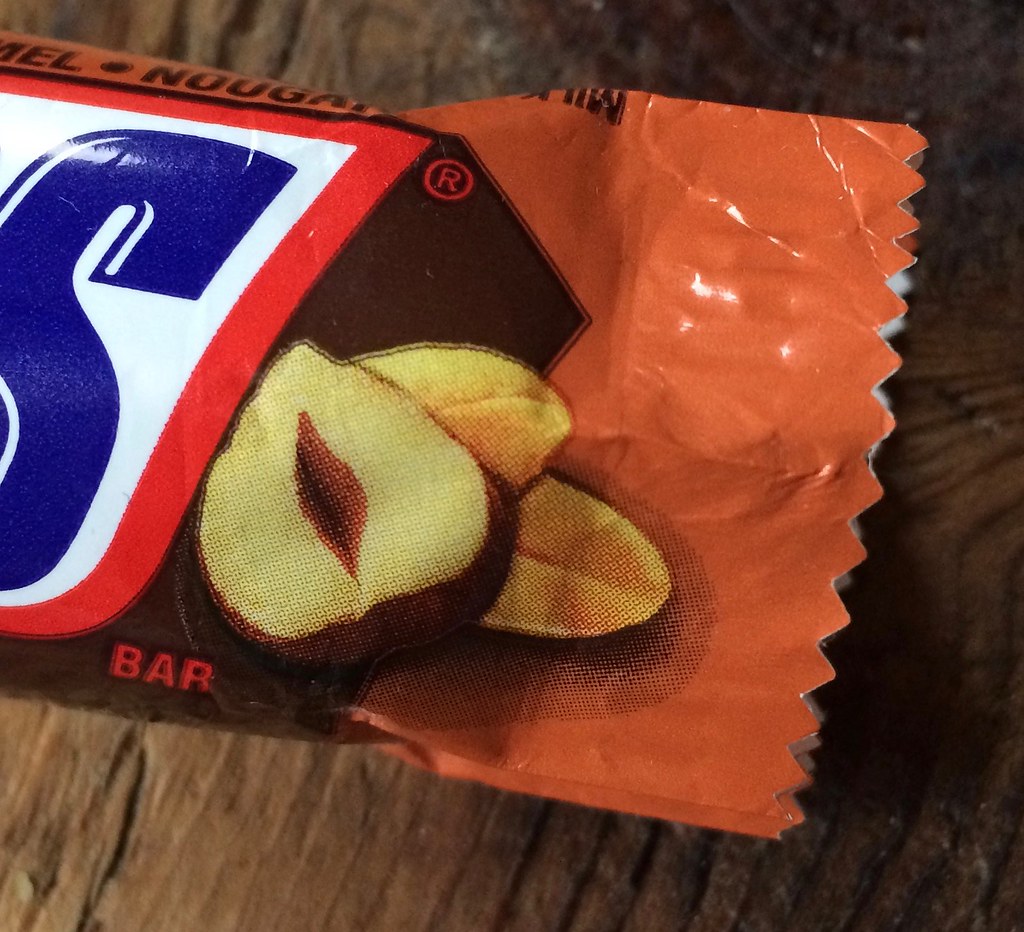
By contrast, the Snickers Almond ingredients listing includes no peanuts, just almonds (although I wish it had a few more almonds). Similarly, its packaging only shows almonds, not peanuts. (Snickers Almond, of course, is just a slight tweak of the old Mars bar. But I digress.)
And how does this new candy bar taste? Before I answer that, I should say that I like Snickers, and I really like Snickers Almond. With that in mind, I’d say the new Snickers & Hazelnut tastes…
… very much like a regular Snickers bar. In other words, it tastes pretty good, but not in a particularly new or remarkable way. The hazelnuts don’t taste or feel appreciably different or even discernible, at least not in the bar I ate yesterday. It would be interesting to do a blind taste test between the regular Snickers and the new hazelnut variation, but there’s only so much candy I can eat. Need to detox a little before trying that, but I’ll get around to it. Still, Snickers & Hazelnut makes for a fascinating new chapter in the Mars family’s obsession with hazelnuts.
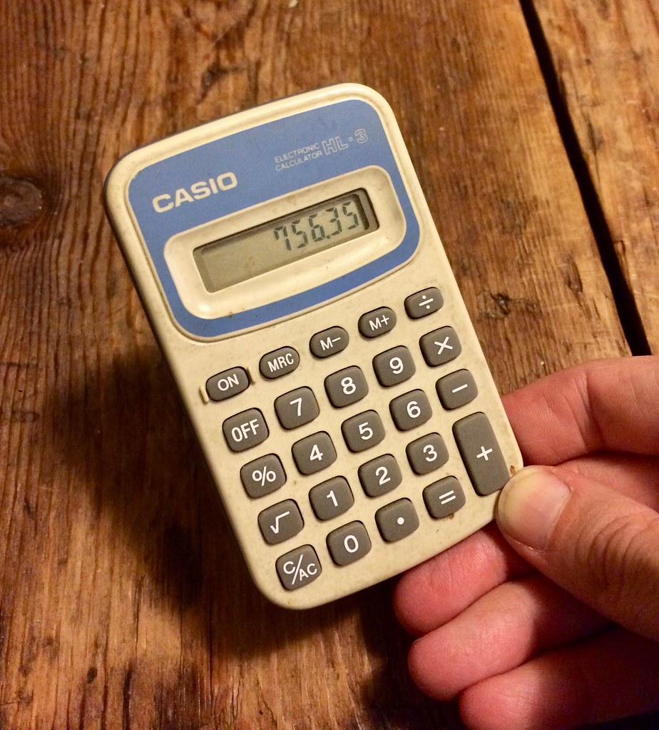
Keeps on ticking: I tallied up my 2016 tax receipts last night, which means it’s time for my annual post about my pocket calculator.
So: In February of 1996 I left my last office job and began working from home. I took a few items with me from my office, including a cheapo pocket calculator that probably cost $1.99 at most. I’d already owned it for at least a year when I took it home with me.
That was 21 years ago. I’ve never changed the battery (nor could I, even if I wanted to ”” it’s a solid one-piece case that can’t be opened). But the calculator still works.
Granted, I don’t use it much anymore. It gets a workout on the one night per year that I tally my expense receipts, and I turn it on maybe two or three other times per year, max, but that’s about it. Still, it seems pretty amazing that the battery hasn’t died.
This year, as in so many previous years, I’m thinking, “Okay, so now it’s finally gonna die.” But it’ll probably prove me wrong again. See you back here in a year.
The Ticker
By Alex Hider

Baseball News: It appears that the spring training caps will have grey underbills this year. They’ve been black in the past (from David Goodfriend). … Speaking of the spring training caps, here’s a piece on how the Mariners are reviving their old trident logo (from Alissa Katz). … File this under “Welcome Wagon”: The Royals put a Phillies wordmark on the dugout during the 1980 World Series (from Scott Criscuolo). … The Puerto Rican team in the Caribbean Series had a coach and a player wearing Cincinnati Reds helmets, instead of the standard “PR” helmet (from Harrison Huntley). … Looks like Western Kentucky is using the old Twins font for a baseball team wordmark (from Trent Steffes). … FAU will wear a fauxback with some nice placket lettering and some awful collarbone horns this year (from Cody Junot).

NFL News: It appears that ESPN blurred out a beer logo in this Twitter graphic of Rob Gronkowski (from Adam Vitcavage). … Check out the weird facemask for former Atlanta Falcon Ray Brown. “Looks like Julian Edelman’s beard,” says Ray Hund. … Proof that the Rams should have never ditched yellow for athletic gold (from Pro Football Journal). … Also from Ray: Check out Mad Magazine’s take on NFL uniforms, circa January, 1972. … Clayton High School in Wisconsin appears to be poaching the Chicago Bears logo (from Karl Greenfield). … Here’s how Trayton Miller imagined NFL teams as soccer teams.

Hockey News: Lots of rainbows in the NHL last night in honor of “Hockey Is For Everyone” Month. The Penguins updated their Facebook avatar, and Evander Kane had a rainbow NOB, to go along with the rainbow tape job on his stick, durig pregame warm-ups (from The Goal Net). … The Blues shared what appeared to be rejected uniform concepts on Twitter yesterday (from Joey). … The Panthers’ equipment manager had a Reddit AMA the other day, and explained why the Panthers and Stars went white-on-white a while back (from Josh Coles). … New Leafs goalie Curtis McElhinney has a new mask with a vintage logo (from Aloysius Koufax). … The Edmonton Journal ran a poll, and most Oilers fans prefer orange jerseys (from Moe Khan). … Lots of Hartford Whalers merch is for sale at the Hartford airport. But Benjamin Utter spotted this this T-shirt, which actually shows the logo for the Plymouth Whalers, a now-defunct major junior team. Odd that Reebok would make a shirt showing them as an NHL team. … Phil Kessel of the Penguins was showing only two sock stripes, instead of the usual three, last night (from Jeff Perilman). … Former Blackhawks coach Billy Reay has an awesome sweater in this photo (from Ray Hund). … Ray also sent along a collection of hockey-themed New Yorker covers.

NBA News: There’s no way to link directly to this, but ESPN.com’s Celtics beat reporter says, “Jonas Jerebko broke his nose during a collision with teammate Jaylen Brown in Sunday’s win over the Los Angeles Clippers. Jerebko is expected to wear a mask when Celtics open a four-game road trip on Wednesday in Sacramento.”

College Hoops News: Color-on-color games are now extremely common in the NBA, and they’re becoming more common in the NCAA as well. Case in point: Wake Forest and Notre Dame went color-on-color last night, with the Irish wearing their gold alternates for the first time this season (from Andrew Cosentino). … Another color-on-color game: Northwestern and Illinois (from Brent Yarina).

Soccer News: New red third kit for US Men’s National soccer team, with another kit, for the Gold Cup, possibly on the way (from Tyler Moss and Robert Hayes, respectively). … New home kit for New York City FC of the MLS. … The LA Galaxy will unveil a new secondary jersey today (from Phil).
The team playing Wake Forest in the color on color game is Notre Dame, not Pitt
Fixed.
Proofreading: “Pitt and Wake Forest went color-on-color last night” As is obvious from the photo, it’s Notre Dame, not Pitt.
I should have reloaded; Mike beat me to this.
Michigan State @ Michigan also went color on color last night. State was in their road greens and Michigan in their alternate maize unis.
No picture, but a Michigan player had his Nike headband upside-down. Saw it during a first half free throw attempt.
It’s impossible to wear a headband “upside down.” They don’t have told or bottoms.
Ok, technicality – the swooshie Was upside down.
Double NOBs would be a way to ease the number retirement issue with current players wearing high numbers. If a player is “worthy” enough to don the jersey number of an important retired player, then place the retired player’s name at the bottom as Paul suggested. Granted this may not work with all jerseys.
This. I wish for less retired jerseys and more numbers that can have legacies built upon over time.
The St Louis Blues have a banner (not in the rafters, but near section 107) for the “honored” number 7, which has been donned by Red Barensen, Gary Unger, Joey Mullen, and Keith Tkachuk.
That’s great, but no player since Tkachuk has worn it for the team! That’s a crazy way to keep the tradition of great players wearing #7.
Interesting with the Rams old gold and lighting as the same can be said with the Flyers 50th Anniversary uniforms. On TV, the gold numbers look greenish depending on the camera angle and lighting in the arena.
On Hartford Whalers gear at the Hartford airport. Whalers gear still sells great here in Connecticut. Bob’s Stores always carries a great selection. One of the BEST jersey logos ever. Too bad we built that stupid baseball stadium in Hartford. Been better of rebuilding the XL Center.
Plymouth Whales were owned by Peter Karmanos, the guy who moved the Whale to Carolina. Allegedly that logo was to be the new logo for the team after his purchase but the NHL shot it down.
Nets posted their jersey ad this morning – by far the worst looking so far
Just saw it this very moment. Will add to today’s entry momentarily.
For those who haven’t seen it:
link
Horrible and sad. The Infor logo is so blocky it’s thisclose to overlapping the NETS wordmark. I can deal with the red, but the shape is intrusive. Ugh.
A horrible ad befitting this horrible team. I hope they got a steep discount.
Depressing, ugly, craven, venal, a shame.
Horrible, atrocious, sad, and an affront to people who love and obsess about uniforms.
At least there’s a pop of color. . . . ?
That’s looking on the bright side, I guess.
Ha, that’s great…. as soon as I saw “falcon” and “weird facemask” I knew it was going to be that picture from the 1977 street and smith’s pro football yearbook… thanks to eBay, and having absolutely no life, I can have moments like this…
The white-on-white game was in the preseason back in October, not “a few weeks ago”.
Text adjusted.
Love the NFL-as-soccer concepts (who are the “San Diego” Chargers?… eh, kidding). Kinda surprised that only one team (Lions) went with a radically different change kit. Nice work.
Are those really Cincinnati helmets the Puerto Rican team is wearing? The RH flapped CoolFlo helmet is several years removed from the MLB. Plus, the “C” should have a black stroke around it.
link
Don’t think so. They look like they are Criollos de Caguas helmets. link
They are not Reds helmets, they are the helmets for the club team that is representing Puerto Rico as the champions of the Puerto Rican Winter League; Criollos de Caguas, (see here link). The Caribbean Series doesn’t feature national teams, it features the winning club of each domestic league, but the teams are considered to be representing the country and are often referred to as if they were the national team. This is how you end up with situations like Marlon Byrd “playing for Mexico” here: link
Ditto the above. If you notice the Mexican batting helmets had the awfully large A overlapping an M, which is the regular helmet for Aguilas de Mexicali. The winners of the Mexican Winter league.
Am I the only one who thinks the hazelnut on the Snickers wrapper looks a bit… ummm… “feminine?”
I knew it was coming. On a more serious note, I find it funny that they mention Americans disliking hazelnut paste, yet Nutella has become quite popular in recent years.
Sorry, it had to be said. Anyway, count me among those who don’t understand the big attraction to Nutella. It tastes good, but it’s texture is too “plastic” for my liking.
I’m going to count that to the recipe differences in American Nutella as compared to European Nutella.
Glad I wasn’t the only one!
Does this mean we failed the Rorschach test of maturity/decency?
Nutella is overrated. Peanut Butter is delicious. ‘Murica!
It does now.
Yeah, that American chocolate really overpowers everything else in candy bars, even hazelnuts. Try some European versions of American candy bars and you can actually discern the other ingredients.
So I guess this is the last year the NBA will have any aesthetic credibility.
You’re just figuring that out now?
The Mad Magazine take on NFL uniforms was the work of the late Jack Davis, who link much link work on behalf of several NFL teams as well as his (and my) link, the link of link
I have no truck with people who disparage peanut butter. The goober has come under attack the last couple of decades, Five Guys notwithstanding.
It’s a shame that these NBA teams are so low on funds that they need to advertise on the last remaining bit of blank canvas. The locally funded arenas and “affordable” tickets, concessions, apparel, etc. must not be working out the way they hoped.
Typo: “Still” missing second “l” at the end of the Snickers portion.
Also love the Tony Orlando & Dawn reference, timely
Fixed.
Every summer I go up to Harwich Port, MA in Cape Cod. Was at a Harwich Mariners game last season and one of the guys by the concession tent was saying how they are the only team in the Cape Cod league that doesn’t have to pay MLB to use their name. Reason being, the Harwich Mariners were around before the Seattle Mariners. Have bought 2 hats over the last few summers, one with the trident logo, another with the compass logo. The previous seasons hats they sell are always much cheaper.
Do the Cotuit Kettleers have to pay MLB?
No, it’s just teams that had the same name as an MLB team. A lot of teams have changed their names because of it. For example, Orleans used to be the Cardinals but changed to the Fire Birds because of it.
Love that new/old Mariners logo. One thing tho – I can’t believe I’ve NEVER (consciously) noticed the tiny serifs on the M before. I had to jump over to sportlogos.net to see if it was a new addition. I admit I was astounded to see them on the original trident. Crazy stuff.
The compass rose is nice, but the trident is the most inspired bit of iconography in the M’s quiver. I dislike efforts to pass it off as unlucky; the reason the Mariners were bad had mostly to do with being a young expansion team.
Wow, the Nets ad patch is the kind of eyesore I expected *after* the three year trial period.
Celtics: “And we’ll be all like ‘ad? What ad? Oh, this thing. No big deal.’ They’ll love it.”
Nets: “Screw that. NASCAR or bust.”
That Billy Reay Blackhawks sweater is gorgeous. It was probably came from Gunzo’s Hockey Shop like this jacket on eBay. I’ve always wanted the jacket but I would prefer a sweater.
link
Clean that calculator.
That would probably be the devices’s death knell.
Amen.
I’m Still Calling It Toffifee.
Too good for kids.
I still use my Sharp calculator with a green fluorescent display that my folks gave me in the mid 70s. Still works like a champ. It takes three AA batteries.
Yeah, but have you changed the batteries? That’s the issue at hand here.
Of course I have. Just pointing out that I’m also a member of the ancient calculator club . ;)
Dad has an old calculator with the red digital display. Not sure of the year. I think it’s also takes 3 AA batteries.
The calculator I have (and use nearly every day between September and April) is one I took from a roommate in about 1985.
It solar power tho, but works fine.
Lee
Phil Kessel was probably using black tape to hold his socks in place and purposefully or accidentally put it over the top stripe.
Also, The Lethbridge Hurricanes sure like using the Caps’ jersey template. Wasn’t there some kind of lawsuit a year or two ago alleging infringement of the Capitals stick/puck wordmark crest?
Aha 4-5 years ago by the dates on this post: link
Interestingly, an earlier WHL team wore the same jersey template before the existence of the Lethbridge Hurricanes.
The Billings Bighorns played in the WHL from 1977-82. They were born after the Calgary Centennials relocated to Montana. The Bighorns left Billings after the 1981-82 season and became the Nanaimo Islanders.
Below is a link during the time they wore the template, playing against the Medicine Hat Tigers. I like the goalie mask with the horns:
link
link
That Infor ad on the Nets unis is the worst case scenario everyone envisioned when this program was announced. It clashes horribly with the team’s uni, the color is garish, and it’s out of proportion also. Couldn’t they have tried a bit more to blend this in tastefully?
That said, unless you live in BK you won’t be seeing this. The Nyets aren’t on TV and won’t be anytime soon.
This seems an appropriate day to point to a joke on ‘Late Night with Seth Meyers’ a couple of weeks ago about NBA jersey ads.
link
That Snickers/Mars story is fascinating. Also, FWIW there must have been some kind of change in recent years, as Mars has had Snickers Peanut Butter on the market since 2011.
Read the dual-named throwbacks: I like the concept, but agree that it would look much better if the names were switched. Not only for players who wouldn’t have a throwbck number, but also in general because it looks strange to me that the current players name would be the one that moves.
This seems like a good time to re-watch Seinfeld.
link
link
Lethbridge should have just issued jerseys with the numbers worn in ’97. Sure some current players would be wearing an unfamiliar number but every player on the ’97 team would have been represented and nobody would have had only one name on his back.
In the first book excerpt: “…doesn’t not eat…”
Fixed.
From the looks of the Jan. 13, 1940 New Yorker cover, the Boston Bruins and the New York Americans appear to be playing a white-on-white game as well.
I had one of the Snickers Hazelnut bars a few weeks ago, and thought it tasted really weird. Maybe I had a bad one or something, but it had a strong flavor that wasn’t what I was expecting. I was expecting to like it, since I like Ferrero Rocher candies with chocolate and hazelnut. Again, something must have been wrong, because I had a very different experience than Paul.
I bought a Texas Instruments solar calculator for my chemistry classes when I started college in 1987. When I started pharmacy school in 1996, I figured the old calculator was on his last legs and did not want it to shit the bed during an exam. I bought a newer model to replace it and it promptly quit working. I went back to the old calculator and used it for the next 4 years. I used it on and off at work for the first 8 years or so after graduation. Now my wife uses it to do the home finances. My kids routinely mess around with it and use it for their homework. Still works almost 30 years after purchase.
How long before some NBA team with a color-contrasted corporate ad starts to integrate the color into their overall scheme? Does Brooklyn introduce a third jersey in a few seasons with Infor red accents?
The Celtics have enough clout apparently to make GE adapt to them, but it seems like smaller-market or underperforming teams might not have the leverage.
In regards to batteries lasting, my daughter was given a school bus toy that had alphabet buttons that made noise in 1995 for her first Christmas. It’s one of the baby toys of hers I kept. We were surprised to learn the batteries were still good a few years ago when it turned up again. This past Christmas the batteries finally gave out.They were never changed as I would have been the one to change them. So 21 years on that one.
Also loved the Snickers story. Snickers is the king of candy bars.
PB Max was the greatest candy bar ever.
I liked Bar None (the first version) a lot. I’m sure I’ve had PB Max, too, before, but can’t remember.
link
The linked USMNT kit is a concept, but the tweet implies that there is a new third kit out there. Does anyone have a link?
You’re never going to believe it, but I found it using the Google machine. Concept is way better than the supposed real thing: link
Proof that the Rams should have never ditched yellow for athletic gold
I believe you’re thinking of old gold, or metallic gold – link is the yellow-gold worn by the Packers, Steelers, and for most of their history by the Los Angeles Rams.
you know how we have a section for indian/redskin items? what if we had a section on here where you post the logo of any company advertising on NBA uniforms and then you put the circle with the red slash(A NO SYMBOL) through it to remind us not to patronize them? or does that defeat the purpose because “there is no such thing as bad publicity”?
Love the calculator and that you use it at this time each year. Also love hazelnuts. Ritter Sport dark chocolate with whole hazelnuts. That’s some good.
Someone ought to photoshop that basketball jersey ad from “infor” (whatever that is) to “inferior” (which it clearly is)
i still have my high school calculator – over 30 years old. Texas Instruments. Original battery! Your post cracked me up.
The Welcome Wagon reminded me that the Mets in the early 70s used to place the visitor logo in the on deck circle and would change the top of the bullpen helmet cart for each team. You can see what looks to be a SF Giants cap in the bullpen here:
link
I believe they also put visitors logos on the dugouts in the 80s as this photo seems to validate:
link
Is it always bad for uniforms to have advertising? What if the city benefits from it? What if the employees benefit?
Yes, it’s always bad for uniforms to have advertising.
Does it take away from a great jump shot if there is an ad in the corner of the shirt?