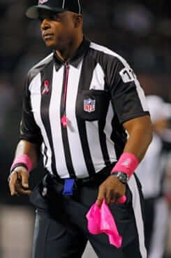
Big news out of the NFL yesterday, as word came down that October will no longer be breast cancer awareness month beginning in 2017. A little birdie had tipped me off to this one about two months ago but had sworn me to secrecy, so I’m glad the league has now gone public with it.
So does this mean the NFL is getting out of the cancer-awareness biz? Not exactly. From that previously linked article:
[E]ach club will choose its own cancer cause to support during a three-week window next October. The initiative will still be called “A Crucial Catch,” but teams now have a say in the cause they’ll champion for about 18 percent of their schedule. They can still choose breast cancer, or another detectable, screenable cancer such as prostate or colorectal cancer ”” or one to which a player or coach has a personal tie. Teams can also support more than one cancer cause per season, and they can change their choice(s) from one season to the next.
So what does that mean from a uniform standpoint? Let’s skip ahead to the following passage:
Details for 2017 are still being worked out, such as the design of a logo. There will likely not be an element on player uniforms in the first year of the campaign, and there’s not one signature color, so the NFL and [the American Cancer Society] are looking into other ways to raise funds beyond the sale and auction of gear and game-used equipment.
“The truth is, as we transition in 2017, it will be a different kind of year,” [NFL VP of social responsibility Anna] Isaacson says. “Once we see how that goes, we will know more for 2018.”
So it sounds like there probably won’t be any color themes in 2017 — or at least that’s the plan. But I’m skeptical. We’ve seen over the years that athletes love to accessorize to highlight a cause or send a message. With every cancer now having its own color, I suspect players will find ways to wear their teams’ cancer-appropriate colors via shoes, wristbands, athletic tape, and so on. Yeah, I know, the NFL can fine them, but will they really issue fines for players doing something to support a league-promoted campaign for a worthy cause? (And even if they do fine the players, so what? It’s pocket change to these guys.)
So instead of Pinktober, we may now have a mishmash Greentober, Bluetober, Purpletober (shudder), and so on. And even if that’s not how it plays out in 2017, it sounds like there’s a good chance it could happen for 2018. Seems like it could be a case of the cure being worse than the disease. The one plus is that it’s only slated to last three weeks, instead of the usual four.
People, I’ll be frank with you: Cancer has done a serious number on my family. It killed one of my brothers, both of my sisters-in-law, and one of my grandmothers (plus my father had cancer when he died, although it wasn’t his official cause of death). I had a cancer scare myself earlier this year. So I know a thing or two about how serious an issue cancer is, and I appreciate that the NFL wants to help.
Honestly, though, when it comes to watching a football game — or, really, any other game — I’ve developed a serious case of Worthy Cause Fatigue. It all feels like just the latest turn of the ratchet. These “special” uniforms and accessories never look any good, the messaging starts to feel preach-y, and someone’s always skimming money from the merch sales. The leagues and teams could do at least as much good simply by donating some cash and encouraging fans to do the same. I wish they’d do that instead.
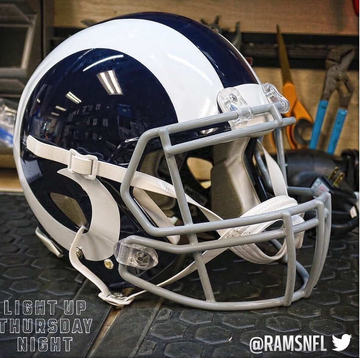
So here’s a question: As you probably know by now, the Rams will be wearing white helmet horns for tomorrow night’s game in Seattle. It will be the first time they’ve worn white horns since 1972 (and will also mark their third horn color of 2016 — apparently a single-season record).
As the news about the white horns was announced on Monday night and spread on Tuesday, reaction on social media was extremely positive. That matches most of the chatter I’ve heard from fans since the Rams announced their move back to L.A., which has included many, many people saying they should go back to the old blue/white look — not just the helmet, but the full uniform.
I find that surprising. For one thing, the Rams’ blue/white era was short, lasting only nine seasons (1964-72). Most fans on social media weren’t even alive, or at least weren’t watching football, during that period, so it’s not as though they have fond personal memories of that uniform. Moreover, the Rams’ change to yellow horns and yellow pants in 1973 seemed like the right move for the color TV era, especially for a team playing in Tinseltown. The snazzier color scheme seems even more geared for today’s high-def, short-attention-span uni-verse, no?
I’m not saying I don’t like the blue/white design — I do. But I’m not sure I like it better than the royal/yellow design that replaced it, and I’m genuinely surprised to hear so many fans embracing it. Seems kinda plain for today’s fan base.
Then again, maybe the blue/white partisans have just been louder, at least within my earshot. Yesterday I asked my Twitter followers which uniform they preferred — blue/white or royal/yellow. The responses leaned heavily toward royal/yellow (with several people adding they don’t like blue/white because it reminds them of the Colts), which wasn’t what I’d been expecting based on the background chatter over the previous year.
Which uniform do you folks prefer, and why? And to even the playing field a bit, pretend that both versions include the ram’s horns on the jersey (or that both versions don’t include that element, if you prefer).
The Ticker
By Paul

Baseball News: A new Lids flier promoting MLB authentic caps shows a Mets cap with New Era logo creep but a logo-free Yankees cap. “Does this mean the Yankees are exempt?” asks David Long. My understanding had been that all teams would be subject to the cap logo creep next season, so I double-checked with Chris Creamer, who was privy to the inner workings on this one. He said he had specifically asked about the Yankees and was told that they’d have to wear the New Era logo, same as everyone else. (Ditto for the Under Armour logo in 2020, he added.) Still, that Lids flier does seem to imply that the Yanks are getting special treatment, so Chris and I are both working our sources to see what’s what. Stand by. … Minor league teams often have issues with inconsistent pants, as you can see in this El Paso Chihuahuas shot, which includes a player with Majestic pants with no MLB logo, Majestic pants with the MLB logo, pants made by Russell Athletic, and player wearing home whites while everyone else is wearing grey (good one from Steve Vibert). … Here’s the logo for the 2017 Frontier League All-Star Game (from Steve Johnston). …. “I always thought the Mike Laga 1987 Topps card featured the worst baseball card airbrush job ever,” says Austin Gillis. “But while looking for something else, I just ran across Claude Osteen’s 1975 card, which gives Laga a run for his money.” … Gordon Blau ran into a guy in Key West who has some serious MLB team logo tattoos. “He’s a Brewers fan, and he said he put the Yankees and Cubs near his armpit, where they belong,” says Gordon. Too bad he didn’t save that spot for Wahoo and Atlanta’s whooping Indian — or leave them out altogether. … New uniforms for the Toledo Mud Hens. Further info here. … Here’s some home movie footage — a bit underexposed, but still pretty great — of an early-1960s Reds/Colt .45s game (from Bo Baize). … A new children’s book celebrating the Cubs’ championship inexplicably has Starlin Castro on the cover. He’s played the past season-plus for the Yankees (from Chris Flinn).

NFL News: Remember that padded helmet that Willie Lanier used to wear? I hadn’t realized — or maybe just forgot — that former Raiders RB Marv Hubbard wore that same helmet model. Stumbled across that photo the other day while looking for something else. … The Ravens, Browns, and Cardinals will all make their London debuts next season. … Here’s a close-up of Giants RB Paul Perkins’s chipped helmet shell and torn decal from Sunday night, as posted by Jints equipment director Joe Skiba (from Jamie Burditt). … If you go to this Deadspin story and Control-F on “Portland,” you’ll see a very amusing story from someone who seriously dislikes the Color Rash unis (from Eric Bangeman). … The eBay auction for this very nice vintage long-sleeved Dolphins tee will already have closed by the time of next week’s Collector’s Corner, so you’d better snap it up now! “Look at that Sears artwork,” says Brinke. … Former NFL great Jim Brown has a Syracuse lacrosse cane (from Dan Gartland). … Donald Trump was given a personalized Packers jersey during a recent trip to Wisconsin (from Phil, via @LukeTeeslink). … Rams exec Kevin Demoff announced last night that the team will wear its royal/yellow throwbacks on Christmas Eve against the 49ers.
College Football News: Whoa, check this out: The 1990 Freedom Bowl, which had Oregon playing Colorado State, featured a color matchup for the ages: green over yellow vs. yellow over green. Even for me, that might be too much of a good thing (from Benjamin Brune). … Very interesting article about naming advertisers for bowl games. If you prefer to avoid that corporate cesspool altogether, use our handy Naming Wrongs browser extension, which restores the bowls to their pre-corporate names. … The uniform program at Arizona State has gone so far off-course that a memo had to be issued reminding the athletics staff that uniforms should be primarily team colors (from Kenn Tomasch). … Who are these guys with the Oregon and TCU helmets? That’s a year-old shot of Congressmen Ryan Zinke (R-Montana) and Roger Williams (R-Texas) just prior to last season’s Alamo Bowl. Zinke, who’s reportedly about to nominated as Secretary of the Interior, played college ball at Oregon. Williams attended TCU but did not play football there. He did, however, play baseball, and later played briefly in the Braves’ farm system.

Hockey News: Flyers G Steve Mason, who’s been playing really well lately, may owe his recent success to a switch to a new model of skates, the Bauer 1S. Rangers G Henrik Lundqvist raved about that skate after switching to it last year (from Adam Brodsky).

NBA News: Do these video game screen shots show the 2017 All-Star Game jerseys? I believe the screen shots are legit (i.e., not a Photoshop job), but I have no idea if they show the actual ASG deisgn. … I’m not sure how old this photo is — at least 20 years, I’d say — but a Spurs player appeared to have an upside-down 5 on his jersey (from Sean Wilson). … The 76ers’ offices include a conference room adorned with jerseys from team legends (from Kary Klismet). … Paul George of the Pacers has designed a new line of Pacers caps (thanks, Mike). … LeBron James is wearing a safety pin — a symbol of support for groups that feel threatened by Donald Trump’s impending presidency — on the cover of the latest Sports Illustrated. Our own Phil Hecken wore a similar pin for one of our recent curling matches. … The Suns wore black at home last night, forcing the Knicks to wear white on the road (thanks, Mike).

College and High School Hoops News: UConn apparently had sleeved jerseys back in the 1940s or ’50s. … Check out the uniforms for Aliquippa High School in Pennsylvania: white jerseys, black shorts. I like it! But what I really like is the “Quips” chest mark.

Grab Bag: Here’s a very entertaining video clip about a 1969 novelty toy catalog. Good stuff (big thanks to Evan Dammarell). … This article about a new startup company that has created a product that can extend the shelf life of produce includes a photo that shows one of the company’s employees wearing a lab coat with a uni-style number and NOB. … Bojangles is debuting a new restaurant design in Greenville, S.C. Key passage: “New uniforms for all Bojangles team members will complete the updated look.” … New logo for the state of Minnesota (from Jeremy Formo). … Coupla auto racing items from David Firestone, including a new look for the NHRA Pro Stock Camaro in 2017, a new sponsor for NHRA driver Courtney Force, and a look at the evolution of the F1 steering wheel. … Retired Marine Gen. James Mattis, who’s been tapped to become our next Secretary of Defense, likes to wear his flak jacket backwards (from my longtime pal Rob Walker). … Spree candy is now available in throwback packaging (from Kevin Corcoran).
Sports should stand alone. No matter how worthy the cause, any particular NGO involved may be in some way objectionable.
Rams – as much as I love the blue/white helmet, I think the blue/yellow look is much better for the overall uniform (I reeeeally don’t like the gold – it screams 90s to me). Yellow is may favorite color so I may be biased, but I also feel like it “fits” with Los Angeles (sunshine, beaches, Lakers, etc.). If they kept the blue/white as an annual throwback I’d be a happy camper.
My favorite football helmets have representational decoration like the Rams, Vikings, and Eagles, not logos like the Titans, Raiders, and Washington. To my eye, the Rams helmet horns just look better in white. And the Rams in blue and white are one of the crispest uniforms in NFL history. While they share colors with the Colts, the two uniform sets don’t look anything alike to me.
Despite how much I like the blue and white look for the Rams, I think royal and yellow is the more fitting combo for the Rams in LA this time around. Not navy, royal. And not metallic or Vegas gold, but “athletic gold” yellow. It’s a bright, sunny, less formal color combo than blue and white.
arrScotty,
Cards on the table, as lifelong Ram fan they were my first choice of the three pro teams playing in LA back in the day, you know them and at one time, they all link.
LA LA RAMS
USC – University of Sports and Crime (ouch, that looks worse in type!)
UCLA Basketball – the real Wizards.
Yeah I know I’m a bit cynical when it comes to my political corruptness.
What we should be yakkin’ about is what the LA Scrams (that means YOU Jeff Fisher!) unis will look like when they move into their new football nirvana in Inglewierd. They have a tall task ahead of them to knock off the
While I always have preferred the NFL Rams’ royal/gold look to the blue/white look, I remember being frustrated while watching the CSU Rams play the Ducks in that bowl game. Way too similar of looks.
I was hoping the Spree throwback would have gone back to the package shown link.
39 year old Rams fan – yes we exist (I think) – I am extremely partial to the yellow/blue – however if the HORNS appear on the jersey shoulders I think I could live with white/blue.
The 70’s blue/white uniforms are plain and quite boring. I think the Yellow horns and numbers are JUST the right amount of style without being gaudy and hard to like (looking at you, TB Bucs)
Looking forward to the change regardless – the current uni set is awful.
“The Ravens, Browns, and Cardinals will all make their London debuts next season.”
FWIW, in 1989, the Browns played the Eagles at Wembley Stadium in a preseason game called “American Bowl IV.”
link
The NFL release notes it is the regular-season debut.
link
I too favor the Royal Blue/Athletic Gold uniforms of 1973-1998.
My suspicions are that the latest iteration of the Los Angeles Rams WILL eventually go to a Blue/White uniform at least some time soon. Why?
1. All of the coaches’ shirts, signs and logos placed around the L.A. Coliseum appear to me to be using the Blue/White colors and period logo.
2. The Rams wearing White over White at home – the closest uniform in similarity to the Blue/White uniform
Just a hunch, but I see it – the Blue/White Uniform – coming. Hopefully, some type of Gold or Athletic Gold will remain in the uniform as it simply looks better. They can start now by eliminating the horrible Blue pants with the totally mismatched ridiculous double striping. Enough already.
… so you don’t like the royal and gold of the 1999 team that won the Super Bowl?
(Just teasing)
The Mud Hens have ditched pinstripes for headspoons and vests for sleeves. A good example of a uniform change doing no harm. Slightly cleaner uniforms, but also less distinctive, so to my eye it’s a wash. One of the best-dressed teams in pro baseball at any level will still be one of the best-dressed teams in pro baseball. And that clown-suit alternate is pretty good. It’s nice that it’s not just the regular jersey with a different color fabric.
Biggest change for the Mud Hens may be the treatment of the road script. It used to break off-center TOL | E | DO, with the T, and its mascot hen logo, sort of tucked under the player’s right armpit. Now it will break with the L on the placket, TO | L | EDO, with the end of the city name sort of tucked under the player’s left armpit. But now we can actually see the T with the hen mascot. Neither approach is a great solution, but the new alignment is less-bad.
I agree with your assessments. The Muddies seem to recognize their heritage and uniqueness all at once. I like their new designs, and at the same time, don’t think any of their past iterations have been terrible. Even their “Hens” with feather alternate was well done.
I very much prefer both the gold and the yellow to the blue/white look for the Rams. They’re rumored to use the blue/white permanently, yes? I noticed on Sunday that all of the in-stadium branding (at least what was visible on television) used exclusively blue/white, including the end zones. I didn’t know if that’s because of Thursday’s game or if they’re hinting at something more grand.
Proofreading: “He’s played the past season-plus for the Yankee”
Fixed.
The Rams blue and white always felt old and generic to me; I’ve often wondered why. The white horns and uniform always felt incomplete as a concept, and especially in comparison to the royal and yellow. In contrast though, I also really disliked the navy and gold uniforms in comparison — at least as a color scheme. I have put more thought into this than I probably should have, yet I still can’t put my finger on exactly why. I have had a hunch based on some early stadium graphics/concepts that I saw that this re-rebranding was coming, but I think a tweaked template with the Dickerson-era colors would make the most sense in modern LA.
“Giants RB Paul Perkins’s chipped helmet shell and torn decal from Sunday night,…”
You can see the decal part fly off when he take a hit from Lee (I believe). I don’t have the footage unfortunately.
Yes I do!
The hit come at the 5:08 of this highlight reel.
link
In terms of form and cohesiveness, the white version of the uniform the Rams wore in their blue and white era is their best uniform. I think the blue version should match the white version, to be honest.
The single pant stripe has a better scale relationship to the bold horn on the helmet, and the single wedge or loop is a much better choice for the shoulder than repeating the horn on the sleeve, which makes zero anatomical sense.
Of course, the blue and white color scheme is far inferior to the blue and yellow palette. I think the best option is to propose a blue and yellow set based on the white version of the blue and white set. That is my perfect Rams uniform.
A’member, the metallic gold and navy Rams’ uniform was compromised by the stripping of the gold stripe from the jersey sides and the retiring of the gold pants. That said, it is still the worst of the Rams’ identities. The yellow and blue look should prevail, and perhaps drop the yellow stripes from the blue socks since they fail to match any other element of the uniform. After all, nobody has ever criticized the Raiders or Steelers for not having stripes on the socks. The blue+white Rams were relying on the helmet horns to carry the whole uniform, if you ask me.
I think they do. What doesn’t work for me on the blue and yellow set are the horns on the sleeves (as perviously mentioned) and the fact that there is white on the pant stripe, and nowhere else, save for the nameplate. It’s terribly out of place, if you ask me. I say take that road uniform from the blue/white era, make the pants and horns yellow, then color the sleeves, either yellow with a blue loop, similar to how blue/yellow jersey was colored, or blue with a yellow loop, similar to how the current jersey is colored. Then, obviously, make a blue version with yellow numbers and shoulder loops. Solid blue socks all around.
So with the Rams going to the ugly white horns, is this the first time an NFL team has worn 3 different helmet designs in one season?
It’s definitely the first time the Rams have worn three different horn colors. And yeah, maybe it’s also an NFL first. Hard to think of any competing examples. Anyone..?
At least according to the Gridiron Uniform Database, it appears to be an NFL first. I had thought there was a possibility that Washington Football Franchise might have done so, but the Spear and Feathered R helmets were never worn in the same season. The Eagles also didn’t throw back to the blue and yellow and kelly green helmets in the same season, nor did the Jets wear the Titans helmets and the mid-80s Jets logo in the same year.
Comment on the Yankees hat not having the New Era logo while the Mets did. The Yankees haven’t actually wore one yet since they weren’t in the playoffs but the Mets did. Probably some very basic photo shopping could have fixed that but that is what I initially thought
That’s probably what it is, but I’m still hoping the Yankees somehow don’t have to use it.
The Yankees have managed to exempt themselves from the Majestic logo so far, but that started under George. He was far more protective of the Yankees’ aesthetic legacy than his sons have shown themselves to be.
So what happens if a team refuses to use the markers mark? Do they not get the money from the deal?
You don’t get to “refuse” to wear the caps and jerseys that are issued to you. They can’t “refuse” to wear the maker’s mark any more than they can “refuse” to wear the MLB logo.
Paul, et. al.,
The linked pic showing next year’s New Era cap isn’t particularly clear. I’m guessing the Yankees cap will have a New Era logo on the side, but perhaps it’s a close, matching color (as opposed to a contrasting one) that makes it far less visible.
Do you know the details of the Yankees’ arrangement with MLB/Majestic/Whomever? They’ve gotten away with no jersey sleeve logo.
Majestic has allowed this (and also didn’t give them the mesh side panels last season) as a nod to Yankee tradition. I’ve heard no indication that New Era or Under Armour will be doing the same. In fact, I’ve heard the opposite.
The Chicago Cubs book was published in 2013, when Starlin Castro was still on the team. It wasn’t written as a celebration of this season’s World Series, but as a part of a series of books looking at the history of different baseball teams.
Yep. Even says so in the article’s text. A quick search on Amazon for the author’s name + “World Series Champions” reveals a whole line published in ’13, featuring all the teams that have actually managed to win the World Series at some point in their history.
Side note: fun to read the reviews by the Cubs fans who can’t read the publishing date (or is it the date it was first available on Amazon?) and put 2 and 2 together.
link
The link to the Spurs’ upside 5 links to the Freedom Bowl article.
Fixed. Here’s the proper link, so you don’t have to scroll back up:
link
The link for the upside-down “5” goes to the picture of the Oregon/Colorado State game.
Fixed. Here’s the proper link, so you don’t have to scroll back up:
link
Blue and yellow for the Rams. No horns on the sleeves. I would prefer they return to this as their full-time uniform moving forward:
link
I like that, although I’d prefer yellow pants.
Lee
I prefer the Rams current Blue/Gold helmets the best. Love when they went to the sparkly gold after winning the Super Bowl. I’d rank them:
1. Blue/Gold
2. Blue/Yellow
3. Blue/White (too plain – do not like any white helmets for any team besides maybe the Colts)
Pinktober always felt like pandering to the female audience to me with the added bonus of being an attempt at charity. With this and allowing players to wear special cleats one week, it feels like they are trying to shake the “No Fun League” stigma they have obtained and letting players have some personality.
But really it feels like the NFL is trying to not be the bad guy.
Blue and yellow/gold for me with the Rams.
As for the Deadspin comment/story on Color Rush, even though it was cringe inducing, it was still a fun read and great to hear that someone directly involved with the Color Rush design was told how ugly most of the designs are. That is assuming the story was true of course.
Gee, Paul, the NFL announces the drawing down of Pinktober, and corporate bowl games are ebbing. Why aren’t you doing a dance? The glass is half full!
Having “only” 35 out of 41 bowl games being corporate-named hardly qualifies as “ebbing.” I think what it really speaks to is the overabundance of bowl games — there are more games than they can find corporate advertisers for.
That Frontier League All-Star Game logo is possibly the worst logo I’ve ever seen. Everything about it is bad and amateurish. There are too many arching styles, the colors clash, the light banks/stadium facade looks like clip art, and the script “game” is unbalanced.
Almost looks like someone sent out a draft rather than final art. The tail on “game” is awful, no stroke on the “G” so that it blends into the tail. Rookie mistake. But it still made it out to the masses.
The Colts have one of the best NFL uniforms BECAUSE it’s simple and clean… I’m all for the Rams going “simple and clean” with a new (old) look.
Agree. I also like the all white for them and they should wear white at home.
Agreed. As a kid I always rooted for a home team and a team not from my city. So the Jets were my home team and I adopted the Rams as my “road” team. Grew up with the white horns and that’s what I appreciate but I wasn’t all that distressed about the yellow horns. Still prefer the white though because I wish all NFL uniforms could revert back to the clean look of the 60’s and 70’s – INSTANT recognition of what two teams were playing just by the colors, helmets, uniforms, etc.
+1
FYI, “preachy” is a legitimate word. No need for the hyphen.
Like I said on Twitter yesterday, I like both looks for the Rams, but I feel that the yellow, incorporating the horn design on the jersey itself, just pops more, and is really the definitive Rams look. Take away the helmet horns on the blue and white set, and they’re incredibly generic.
It likely helps that the Rams have had far more success in blue and yellow than they did in their short time in blue and white. Their first two NFL titles (1945 in Cleveland and 1951 in LA) both came in blue and yellow, as did their Super Bowl title in St. Louis (ironically, as they were about to change to “Millennium Blue” and “New Century Gold”). They dominated the NFC West from 1973-79, and were still a force to be reckoned with most years in the 80s. In the blue and white, they only made the playoffs twice in nine years, and never won a playoff game.
Something else I just realized… in all likelihood, my first ever exposure to the Rams most likely came from the movie Heaven Can Wait, which of course featured the team in blue and yellow.
Great movie.
Sure was.
Of course, if they re-made it with the Rams again today, we’d get to see tribute patches/decals for both Joe Pendleton and Leo Farnsworth. How many teams have two quarterbacks killed in one season?
I grew up a Rams fan in Long Beach, where they practiced for years. I prefer the white/royal, but the royal/yellow is also good. However I’d only be in favor of the white/royal if they wore white at home like they did with these colors. They rarely wore the royal jerseys, which had different stripes than the white. The white had great looking shoulder stripes similar to what USC has, where the royal had 2 or 3 stripes on the sleeves.
The Spurs player is Artis Gilmore from the mid-late 80s
When I think of Iverson, I think of the black/white jersey scheme (with red and gold and blue accent colors) that Pat Croce introduced. But I guess the throwback fits the traditional red-white-blue Sixers color scheme.
“Yeah, I know, the NFL can fine them, but will they really issue fines for players doing something to support a league-promoted campaign for a worthy cause?”
They have done exactly that, with DeAngelo Williams and William Gay: link
Then again, it’s arguable that the NFL doesn’t actually support campaigns against domestic violence (link).
If the Rams get such a positive response from both helmets is it irrational to think they cant use both styles in conjunction? While it may be percieved as collegiate, the helmet pattern is timeless and looks good both ways. The NFL has already allowed a 2-tone ugly montrosity into the mix, so why not encourage them use both?
The classic answer to this question is that because there are only 16 games in the regular season and because jerseys in practice tend to be split 50/50 between the often-chosen-for-home dark jersey and the white jersey, the NFL wants the helmet to stay consistent for the sake of branding strength. When the Seattle Seahawks went gunmetal blue, the NFL nixed a silver road helmet idea for this reason.
So I’ll anticipate the follow-ups: Why were full blown throwbacks once allowed? That’s a completely different look!
Good question. But teams had to choose between a color-swapping third jersey and a full blown throwback.
And isn’t the revolving door of decals also diluting the brand strength, especially when it looks like the same base helmet color from the nosebleeds? Especially when Thursday is one-color Color Rash day even when the one designated color looks terrible or makes no sense for the team?
I don’t think I disagree.
So back to the Rams. It’s still a blue base helmet with a horn decal, and the supremely unique horn is always the same shape with a difference in color, hard to imagine how that’s diluting the brand when both white or gold horns on blue look awesome, distinctive, AND throwback all at the same time… If any team could pull off a home/road helmet in the NFL, I think it’s the Rams.
The NFL used to have a rule prohibiting alternate or multiple helmets, except when used as part of a complete throwback uniform.
The Seahawks learned this when they created their dark blue uniforms in 2002; they wanted link but were turned down by the NFL. At the time, it wasn’t about safety concerns but rather preventing brand dilution.
RE: Rams
While I like the blue/white, it seems too plain. The Royal/Gold look is probably my favorite. Even as a child, the Ram-horn on the shoulder was probably my favorite detail. My preference would be for the rams to go back to Royal/Gold and then have the blue/white as a throwback option.
so the giants will repaint the helmet in a week and have it ready to go. Just shows that its nowhere near impossible to change colors for a throwback game.
Actually, we don’t know that. As Skiba’s post says, it will take “a while to repair.” So he may need a new helmet this Sunday.
And no, getting a new helmet to replace a damaged one does not violate the one-shell rule. For further details, look here:
link
If its broken then yes he gets a new shell within the rules. But since he said its getting repaired, then we know painting can be done on a short turnaround.
Actually, what I’ve been told is that NFL paint jobs take a long time to dry and cure. So no, we do NOT know it can be done on a short turnaround.
Moreover, when Skiba uses the word “repair,” that suggests that there may be more work to be done than a simple paint job.
Re-painting/repairing one helmet is entirely different than re-painting 53 helmets. And then painting them all back to the standard color the following week.
If its more work than a simple paint job then that means there is even less “inability” to change colors for throwbacks. Just a paint job is faster then repairs and a paint job. Sure all the helmets would take longer than one. but setup takes more time than anything. get the spray booth set up and get to it. The spray time needed for a helmet is not long. just line them up and go. Its not like a goalie helmet with art, its a single color (except the horrendous jags ones) with stickers. They won’t do it, but they clearly can.
As an old Baltimore Colts fan, I have a fond memory of the Rams blue/white uniform as pictured in this photo of Mike Curtis and Roman Gabriel:
link
Just an FYI, that is a 1987 Topps card, not 1986.
Fixed.
Mike Laga reference in the baseball section always brings to mind his claim to fame: The only player to hit a ball out of Busch Stadium II. It was a foul ball, but still, that’s a long way out of the concrete circle.
link
I prefer the blue and yellow for the Rams, as the yellow adds a nice pop of color. The blue and white is kind of a boring look in my opinion (reminds me of the Padres also boring uniforms).
I also would prefer if the NFL would simply donate money for cancer causes without making a visual on-field statement. A co-worker of mine who has had cancer twice once told me he loves going to Disney World because he feels like it’s the one place in the world he can go to and not be reminded of his illness by seeing a cancer ad or something along those lines. I feel the same way about sports. My mom has had cancer and various other illnesses over the years and, for me, sports have always been a welcome 2-3 hour escape from the reality and hardships of life. I think that ability to “escape” is somewhat lost when there’s pink (or whatever other cancer color) plastered across the field.
I suspect the move back to blue/yellow was because the blue/white reminded Carroll Rosenblume (forgive the spelling) of the Colts that he just traded for the Rams.
If I were in charge of the Rams unis…
Primary: Blue/yellow helmet, yellow jersey, white pants, blue socks with yellow northwestern stripe (like the 1950s sleeves), black shoes – 2015 color rash meets 1950s. Could be worn at home and on road for some color vs. color action.
Alternate: Blue/yellow helmet, blue jersey, yellow pants, blue socks with yellow northwestern stripe (like the 1950s sleeves), blue shoes – essentially the Ferragamos.
Fauxback: Blue/white helmet, white jersey, white pants, blue socks with white northwestern stripe (like the 1950s sleeves), black shoes – Ferragmaos meet the Fearsome Foursome. Wear them for the fourth home game or something
All jerseys would have the Ram horns and the facemasks would be blue. I mocked it up for the redesign the Rams contest earlier in the year and on my blog.
I really like this. I like when a team has one uniform they can wear for most games, like the Cowboys or LSU. I can’t think of any teams that wouldn’t have enough contrast so that the Rams couldn’t wear their yellow jerseys. This look goes way back, I think to the 1950s. I think for their all white uniforms, with white horns, I’d rather they stick to the old-school shoulder stripe like the Roman Gabriel days.
Not only do I prefer the blue and yellow look for the Rams, I think an important part of the jersey is using the really thick, heavy heat-pressed numbers as in the Dickerson era. Doesn’t look right with sewn on numbers.
In my humble opinion – Rams should be blue/yellow!
Actually the 1st year 1953 Colts wore plain blue helmets, plain white helmets with a single navy stripe, and also plain white helmets t=with the X-stripes on the x & y-axis.
Like Paul, my family has been deeply affected by cancer. But I have never been a fan of wearing ribbons or colors to show support for a cause. While the expression is no doubt usually sincere and heartfelt, it also allows for an easy, tacit demonstration of adherence to a certain position without necessarily requiring any real thought or effort from the wearer.
Furthermore, it can have a coercive effect in certain environments where the expectation is to support a certain cause. (“You aren’t wearing a red/orange/blue ribbon? Why do you hate people with link?”) I remain convinced that there are more meaningful ways to have an impact for a certain cause than the color of one’s wardrobe or accessories.
I agree. My family has been devastated by cancer, I don’t need my “awareness” raised. These things always seem to me to be more about “Hey, look how much I care!” than about any tangible measures. I’m not belittling anyone who’s into “awareness colors”, I’m just saying it’s not for me.
My condolences to you and your family, Jon, and also to you and yours, BvK.
Also, the 1962 Steelers started the season with plain yellow helmets with a single black stripe, added the very first logo to right side of the helmet in November, and then changed to the black helmet with a single yellow stripe for the Bert Bell Playoff Bowl in Miami at the season’s end. I think in this case we should count the Playoff Bowl as it was the first appearance of Pittsburgh’s black helmet.
Agreed, Bill. Good stuff!
I think part of the appeal of blue and white is that it is uniquely LA. The navy/yellow was shared with STL and the navy/true gold (one of the worst uni changes ever!) happened in STL. Blue and white is a good look AND goes back to the LA roots. My memories of the Rams are navy/yellow and that’s my preference, but I get the appeal of blue/white.
Count me in as someone who prefers the royal blue/yellow Rams uniforms. For lack of a better term they “pop” very well, and they have an LA look to them. My preference would be those as the primary, and white/blue throwbacks.
Anytime someone mentions a bad airbrush on a baseball card I think of this link. Look at that poor bird!
There is so much wrong with that hat… Good call.
I prefer the royal/athletic gold look for the Rams. But I have a lingering suspicion that the organization is planning on going to the blue/white look in another instance of the retail “tail” wagging the dog. It’s most likely easier to sell apparel in a color scheme of medium/dark blue and white than in bright royal and yellow tones. Wow! Has Big Uni really made me that much of a cynic??
I vastly prefer the royal and athletic gold look. Hell, I’m still hoping for a link. Would look amazing in the California sunshine.
Royal and yellow, for sure. That combo makes me think of guys like Eric Dickerson, Flipper Anderson and Jim Everett.
Blue and white is okay, I guess. I like how clean it looks and it doesn’t bother me that it’s so similar to the Colts.
The current blue and gold is my least favorite. The gold looks bland to me. It doesn’t pop nearly as much as the other combinations do.
I can top that – this link. Gotta be a contender for worst airbrushing, as he was traded from Philadelphia to Milwaukee in late 1972.
Topps did a number on his cap, and they painstakingly went over the link with blue. Didn’t seem to matter that the Brewers link and wouldn’t link.
Sorry, meant to quote the original. That was in response to:
“I always thought the Mike Laga 1987 Topps card featured the worst baseball card airbrush job ever,”
Wow, that’s a brutal airbrush. As much as Laga’s pink jersey grates on me, I’ve got to agree that Money is worse. If the pinstripes were not enough of an issue, I think that electric blue hat is an abomination in the eyes of the Lord.
White and blue gets my vote. My first memories of watching them are from late 60’s era, so it made an impression. Always thought the royal and yellow was too busy.
Oh, would I love to have seen that Reds-Colt 45’s game in brilliant color. Those classic vest uniforms. And white helmets! And of course the Colt 45 unis. I couldn’t watch the video for very long with the continual white flashing screen, felt like I was being brainwashed!
-Jet
This airbrush job for Gary Sheffield is pretty bad especially considering he never wore #11 for the Tigers: link
Great DIY concept: make actual jerseys based on bad airbrushed ones on sports cards. Especially thinking of those brutal NHL ones in the 70s that were painted with a brush.
I have become increasingly cynical as I age. My first thought as I read the “Pinktober” post was NFL Marketing feels they’ve maxed out the potential of Pinktober as a tool to sell merchandise and market the brand. By opening up the month to all kinds of cancer they can now sell more crap. They have appropriated suffering and death as a marketing tool.
Having lived in Southern California until ’78, I was a Rams fan and remember both color schemes. I have always preferred the white/blue. It seemed “old school”to me.
I definitely prefer the Rams royal blue and yellow look. I think it is an amazing helmet and uniform. I was extremely disappointed they didn’t go back to it upon returning LA (they could have gotten the ball rolling on that years ago. Even if the Rams weren’t approved to move and stayed in St. Louis, it would have been the right uni move, but especially for LA). I do love the blue/white helmet though and think it will be an improvement over the current look. Royal blue and yellow uniforms as the main uni white/blue horns as alternate uni. I wish that were the case.
In regard to the Rams, the blue and white is a fine uniform. Much better than the garbage they wear now. But given the option of the yellow, I don’t see how any sighted person could prefer something else. Their white jersey is beautiful.Dare I say perfect. I can’t think of another team that utilizes blue and yellow better.
In regards to the helmet worn by Marc Hubbard, it is a stock MacGregor MH100 with exterior padding, while Willie Lanier’s was one off design, created by the Chiefs EQ manager.
If I’m not mistaken, the Rams wore blue and yellow before 1964. Yellow jerseys for a while too. I don’t think Paul mentioned that. Anyway, the longest tradition has the Rams in blue and yellow. I believe it is the best looking color scheme, and it seems most posters here agree. Also as a firm believer in uniform superstition, the Rams won their only Super Bowl (34 in 2000) in the blue and yellow. They changed uniform design the next year to blue and gold. No Super Bowl champion ever rolled out a uniform redesign the next season. I’m sure it was because until that 1999 season, the Rams were usually horrible in St. Louis and may have been the most unexpected SB champs ever.
Yep, the Rams wore gold jerseys link. Must’ve looked link, too.
How about link at home and link on the road?
Time to sour your view of Aliquippa… they use an Indian chieftain in full headdress as their logo
Yellow is a much better look for the Rams. Goes with Stan Kroenke’s personality.
/bitter St. Louisan
I definitely prefer the Rams’ blue/white helmet/unis. Why? 1964 is around the time I began obsessing over uniforms in all sports. The blue/yellow combo seemed dated to me back then, because that’s what the Rams wore in my old football cards. When the Rams switched back to blue/yellow, that was the first instance that I had encountered where a pro team had “thrown back” to an earlier era.
One thing to note is that, much like the Cowboys, the Rams wore their white jerseys (with one stripe on each shoulder) at home and, as a result, rarely wore their blue jerseys (with two stripes on each sleeve). So any poll question that asks blue/white vs. blue/yellow should use the white jersey for comparison, not the mythical blue jersey from that era.
Royal and yellow for the Rams. The yellow pops so beautifully against the blue. Fills the almost inexplicable void of a royal/yellow color scheme in the NFL. The Rams with white horns has an incomplete look to me, like when the Bears wear throwbacks with the white C logo that looks like the orange part fell off.
My take on fans making noise for the blue/white Rams unis: Is there a saturation of uniform design where teams seem to lose their identity with the various uniforms they wear each season to the point where fans just want a touchstone brand, so to speak? At what point do you damage a team brand by generating numerous iterations of itself just for the sake of selling merch or impressing high school football recruits?
For the cancer awareness month: Scrap the one helmet rule, and allow (force) NFL teams to wear throwback uniforms for 2 games (home and away) in October, then auction off the helmets and jerseys to help raise money for various local cancer charities.
Pats fans love Pat Patriot, but I don’t believe New England has worn the white version since they switched in the early 90’s.
The Bucs could wear the creamsicle uniforms, along with the Super Bowl uniforms.
Denver could wear the orange crush uniforms at home and then the brown/white uniforms on the road. etc.
This would give fans some different looks to enjoy during October, and it would raise some money for the charities. But given that the NFL did the throwback uniforms for the 75th anniversary of the league in 94, I wonder if they have plans to do this already for the 100th anniversary?
Pats have worn the white Pat Patriot helmet many times since the early ’90s (and have also worn that helmet with the white jersey, if that’s what you meant):
link
Yes, I meant the jerseys. Even still it’s a different look, and it would be a way to raise money. Plus throwback uniforms might serve to make franchises who have worse uniforms now (Eagles, Chargers, Jaguars…big time) realize their mistake and go back full time to the superior looks.
I forgot about the 2009 AFL anniversary. And what’s worse about that is that as a Denver fan they had actually worn the uniforms at new Mile High against the Brown and yellow striped Broncos. It was the game where McDaniels was fist pumping at midfield after Denver won to go 6-0, that was the game before the collapse.
I am actually old enough to remember being in the freezing cold Maryland winter while watching Roman Gabriel play on TV in the golden California sunshine in those blue-white Rams uniforms. I liked them but when they went to the blue-gold uniforms in 1973 I liked them better, they just have that Hollywood look to them that went along with who the Rams were. I actually had a pair of white-blue Rams game pants that were given to me as a kid and I thought they were pretty dull looking in person, they were made by Sand Knit but looked like a pair of high school pants.
I have never liked their current uniforms, like other people have mentioned they have a 90’s look to them and at this point just have a tired old look to them. Next year I would like to see them go back to the blue-gold uniforms and for the two games they are allowed to wear alternate uniforms I would go to the blue-white throwbacks but have the white Ram horns on the blue jerseys instead of the two dull stripes they used to wear on the blue ones
Gordon Blau ran into a guy in Key West who has some serious MLB team logo tattoos. “He’s a Brewers fan, and he said he put the Yankees and Cubs near his armpit, where they belong,” says Gordon. Too bad he didn’t save that spot for Wahoo and Atlanta’s whooping Indian – or leave them out altogether.
There is so much wrong in this paragraph I don’t know where to start. Beginning with why you would tattoo your skin with the design of something you dislike. At least Wahoo and the laughing Brave *look* like tattoos, and validate the proud defiance that might might compel a person to get inked in the first place.
Rams Uniforms:
i like the white and blue helmets.
i love the old white/royal/yellow jersey’s, though.
maybe keep the blue and white helmets and keep the gold as an accent on a modern blue white motif?
i think a heavier lean on the white/blue w/ a yellow trim/accent is the way to go.
Rams uniforms should be royal blue and yellow.
Nice clip of the Reds-Astros game! Doing a little research on Retrosheet, it appears the game took place on April 27, 1963 (Cincinnati won 1-0). Boxscore here:
link
The battery for Cincinnati was Jim O’Toole (#31) and Johnny Edwards (#6), while Houston’s battery was Ken Johnson (#40) and John Bateman (#7).
The batters we see in the clip are:
Carl Warwick (#20) and Rusty Staub (#10) for Houston
Gordy Coleman (#18), Edwards, and Frank Robinson (#20) for Cincinnati
The rhubarb we see at the end was after Robinson was awarded first base due to catcher’s interference. He wound up stealing second and scoring the game’s lone run.
Rams helmets don’t look good tonight, partially because they are still wearing uniforms that have gold in them. If the uniforms were blue and white only, then maybe they’d be ok.
Seattle, on the other hand – that is brutal.
As most of us might now, the Orlando Thunder of the World League of American Football (1991-92) wore lime green MUCH better.
The cane that Jim Brown is using IS interesting, but what is more interesting to me is that the picture is with Ray Lewis AND Bill Gates!!…..IN DONALD TRUMPS OFFICE. At least I am assuming that is Trumps office. Not sure who else would have all those pictures of him on their wall, except The Don himself. Funny seeing our next president on the cover of Playboy Magazine.