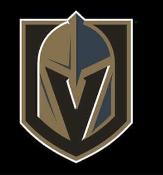
The NHL’s new Las Vegas franchise finally revealed its name and logo last night. I gave my thoughts on the logo in this ESPN piece, which was published last night (although, as I mentioned at the top of that piece, it’s difficult to assess a sports team’s logo without knowing how it fits into the team’s uniforms and larger visual program, so I may change my mind about the logo once we see all of that). Here are a few additional thoughts:
• Interesting that the official team name is Vegas Golden Knights. Not Las Vegas — just Vegas. From a branding standpoint, this is probably for the best, since a two-word city name and a two-word team name would be cumbersome. If anyone out there lives in Las Vegas, I’d be interested in hearing what you think of this. Do you care that they’re foreshortened your city name, or are you okay with it? Does everyone in town just say “Vegas” anyway?
• Speaking of the two-word team name, reader David Sonny points out that teams with two-word monikers are rare in the Big Four leagues. There are none in the NFL, one in the NBA (Trail Blazers), three in MLB (Red Sox, White Sox, Blue Jays) and now four in the NHL (Maple Leafs, Blue Jackets, Red Wings, and now Golden Knights). “I have to say it feels collegiate: Scarlet Knights, Crimson Tide, Golden Gophers,” says David. Not sure I completely agree with that, but I understand his point. Then again, Vegas team owner Bill Foley originally wanted to go with Black Knights as a tribute to his alma mater, West Point. When that turned out to be impractical for legal and logistical reasons, he settled on Golden Knights. So maybe he wanted a collegiate feel. (As I noted in my ESPN piece, I think the logo feels a bit collegiate as well.)
• The unveiling event included the screening of a video that was supposed to culminate in the revelation of the team name and logo, but it appeared to fall victim to a technical glitch and stopped in mid-stream. An attempt to re-start the video a few minutes later failed, causing another delay. Then they finally restarted the video and showed the team name and logo. Simple technical difficulties, or phony glitches designed to create manufactured suspense? Hmmmm.
Introducing the 2017 #Padres uniform lineup! pic.twitter.com/mDyUO7pMiX
— San Diego Padres (@Padres) November 22, 2016
Padres unveil new home/road uniforms: When the Padres said that the addition of yellow to their home uniform last season might end up being a one-year thing to coincide with hosting the All-Star Game, I didn’t believe them. I was sure (and also hoped) they’d stick with the yellow.
But nope — they’ve scrapped the yellow and are going with an utterly characterless navy “Padres” lettering treatment. They’re also updating the road greys with a return to the bow-tie lettering that was used on the urine-toned road unis from 2004-2010, and they’re keeping the Friday brown alternates, the Wednesday throwbacks, and the Sunday G.I. Joes (although the Marine camouflage will take precedence over the Navy camouflage, with the latter likely to be worn only twice). Details in the video shown above and in this article.
I’ve always liked the bow-tie insignia, so that’s an upgrade. But man, the new home design is a total snooze, and a major step down from the 2016 home design. This team’s visual program has been so completely lost for so long — it’s almost like they’re determined not to look good out there. Too bad.
The Ticker
By Paul

Baseball News: Reprinted from yesterday’s comments: New alternate cap for the Montgomery Biscuits (from Keith Cadelsberger). … DIY question from Joel Krinsky: “I purchased a World Series patch to put on a Cubs sweatshirt. As your probably know, it’s made out of plastic and can’t be sewn on. How do I get in on? With glue? Ironing? If I iron it on, will I melt it? I ordered it from Emblem Source, and it says on the packaging, ‘Not meant to be applied to clothing.’ The patch comes glued to a piece of plastic. I peeled off the plastic and there is now glue on the back of the patch.” Anyone..? … If you’ve always wanted to see Chewbacca in an Angels uni, today’s your lucky day (from @RoadTripSports). … New alternate uniforms for the Orix Buffaloes and the Rakuten Golden Eagles (from @bigdaddy45_1969).

NFL News: Grainy image, but it’s still worth checking out this nose guard worn by Don Meredith in 1967 (great find by Jerry Wolper). … The green laser light deployed against Texas QB Brock Osweiler is part of a regrettable trend at Mexican sporting events.
College and High School Football News: Here’s one of those deals where you can see your favorite team in its rival’s colors (thanks, Phil). … New uni combo this week for Vanderbilt (from Jerry Lawless). … Texas is adding a helmet decal to mark the 100th anniversary of the school’s Bevo mascot (thanks, Phil). … O’Neill High in Nebraska has a wing on one side of the helmet and a number on the other (from Brett Baker). … Doozy of a helmet logo glitch last night for Akron RB Manny Morgan, whose “Akron” script was peeling off of his helmet shell (screen shot by Brandon King). … In that same game, an Ohio player lost the “O” on his “Ohio” helmet logo. … Here’s the on-field logo for Friday’s Apple Cup game between Washington and Washington State (from @_CoachDave).

Hockey News: Ugly sweater jerseys are usually pretty awful, but this one for the Wilkes-Barre/Scranton Penguins is definitely better than most (from @ColHapablap). … Here’s an explainer on the stories behind the 30 NHL team names (thanks, Brinke).

NBA News: The Cavs have announced six dates when they’ll be wearing mid-1980s orange throwbacks. All six games are at home, so they’ll either be color vs. color or the visiting team will have to wear white on the road.

College Hoops News: Rough-looking game last night, as Purdue and Utah State went white vs. grey (from Nick Yeoman). … Here’s one observer’s picks for Kentucky’s worst uniforms (from Josh Hinton).

Soccer News: Last night’s MLS game between the Montreal Impact and Toronto FC was delayed for 40 minutes after officials discovered that the lines around the penalty box were painted too thin (from Michael Starbuck).

Grab Bag: “This past Saturday, Rutgers held their first ever Battle at the Birthplace, an outdoor wrestling match between Rutgers and Princeton in the North end zone of Rutgers Stadium,” writes Matthew Meo. “It was an amazing sight to see. Rutgers had a special mat with an event-specific logo and special one-off singlets with ‘BATB’ across the back.” … Nice shot of a young JFK catching a football while wearing black high-top Chucks. … The Nigerian Navy is cracking down on imposters who are pretending to be naval officers by wearing naval uniforms. … Check it out: a foldable paper bike helmet. … This is pretty funny: Adidas has been trying for years to trademark the term “Adizero,” but they can’t because a small church in Chicago has a trademark on the phrase “Add a zero” for clothing. Live by branding, die by branding (from Adam Herbst).
Gobble-gobble: I don’t know about you, but I feel like Thanksgiving really snuck up on me this year. Maybe it’s because a good chunk of the month got swallowed up by the election and its aftermath..? Not sure, but my brain definitely hasn’t shifted into holiday mode yet.
Anyway: If you’re traveling today, travel safe. We’ll continue to have content tomorrow and Friday (although it may be a bit lighter than usual), and Phil will have his usual content on the weekend. Peace.
On my iPhone, none of the ticker links are opening. I keep getting error messages saying the links are invalid.
The ESPN links do work, though.
i’m having the same problem on my mac – none of the links in the ticker seem to work.
Having the same problem on my work Mac. Though I first noticed it when I clicked the Purdue-USU link. I don’t know why I felt so compelled to click that one, I watched the game last night. And I had to do my usual complaining to my wife that Purdue looks too much like Ohio St. in grey. And I’m sure she rolled her eyes.
Fixed.
The ones I checked were href instead of http (with the “s” appended sometimes).
Likewiseon my iPhone. All hrefs.
Fixed.
Fixed.
They are coming up as hrefs: isntead of http: or https:
Was there a mass change from “ttp” to “ref” in the HTML?
Fixed.
Thanks
Linkless on Chrome, too.
Fixed.
Should be fixed now.
In the MLS playoff game last night the 18 yard box lines weren’t too thin. The box itself was to small by two yards on each side.
That’s a really bad mistake as the field is painted hours before the game and should be checked by officials at least during the teams warmups.
Also, why are they using spray cans when lines are normally painted with a roller?
I wonder if it has to do that they were playing on Olympic Stadium’s artificial turf.
I’m from several hundred miles away, and I miss my Expos. I’ve also seen CFL games and a Grey Cup there.
To call that place “star-crossed” would be generous. This line-painting miscue is almost the most Stade Olypmique thing ever.
(PS Was it the Astrodome or Stade Olympique which first had to have foul lines painted on the roof?)
They did spot the mistake during warm-ups. And they used spray cans (of green paint) to get rid of the mistaken lines, which had been painted with a roller, then used the roller to do the correct lines.
Thanks for clearing up Perry. That just makes the 40 min delay more amazing
Actually, there are now 4 NHL teams with 2 word names…You forgot Red Wings (officially, Blackhawks is one word).
I think the NHL has the most history with two word team names. Golden Seals, North Stars. Black Hawks was originally two words.
The Toronto Maple Leafs were known as the St. Pats from 1919-1927 as well.
Ah, right — will adjust text! Thank you.
On the DIY front, I’ve bought sleeve patches from MLB shop, and they have that adhesive on the back. I’ve never had a “plastic” one. I usually get my patches sewn on to the jersey, and I’ve never had a problem.
Even though there is adhesive on the back, you might try to get someone to sew on the patch.
MLB patches are (or at least were until a couple years ago and might still be) glued on to the jersey and then stitched. If yours still has glue, you should be able to press it to the jersey and then sew it for good measure.
The reason that the patches say “not to be applied to clothing” is because championship gear is a special license and they don’t want people doing just what you want to, at least not for sale. Same reason they have the additional backing; other than that they should be exactly the same as those on the authentic jerseys.
There are at least 4 NHL teams now with two word names as you forgot the Red Wings. I’m not sure when the Blackhawks changed from Black Hawks, though they used to be a two word name. There is also the California Golden Seals and the Minnesota North Stars in the past.
In 1986, someone in the organization found the original franchise documents, and found that it was spelled “Blackhawks”, and not “Black Hawks” as it was spelled up to that point. They decided to go with that spelling ever since.
That must have been an amazing moment, to realize that your team name has been “wrong” all these years.
If we’re including old teams, there’s also the Mighty Ducks of Anaheim.
You know your uniforms suck when you show your fauxbacks and throwbacks first. Yes, I’m sure they were trying to build suspense, but it’s still bad when your alternate uniforms (and only the brown ones are solid) look better than your primaries.
“I purchased a World Series patch to put on a Cubs sweatshirt. ……… it says on the packaging, ‘Not meant to be applied to clothing.’
Joel, you are such a scofflaw.
My personal experience with removing the plastic backed patches is as follows: place a dish towel on a countertop. Next place the patch on it with the plastic side up. Cover the patch with a small THIN wash cloth or rag. Finally, using an iron with the setting for cotton, run the heated iron over the cloth above the patch like you are ironing a pair of pants. Usually takes about 1 to 2 minutes to get the adhesive to flow. Make sure to check periodically, like every 30 seconds, until the plastic lifts off the patch. BE CAREFUL, the plastic will be hot. You can use needlenose pliers to separate the plastic from the patch. Usually, since the adhesive has reached its flow state, it will stick to the plastic, leaving the patch relatively residue free. This advise came from my wife a number of years ago since she is a packaging engineer and familiar with various adhesives and plastics. I’ve done this about 6 times with great success.
P.S.: for those who like to save Wheatley boxes but don’t want the adhesive residue on the box top or bottom, use a hankie or similar thin material to place over the box. Run the iron back and forth until the flaps come free. Then use a paper towel to wipe the adhesive off. Again, BE CAREFUL, the adhesive will be hot.
*** that’s Wheaties boxes (sorry the autocorrect changed the spelling.
As someone who lives in Las Vegas and works in Henderson, the suburb to the southeast, most locals just call the city “Vegas.” The fact that Las was left out of the name is no great loss in the mind of this local. In addition to the technical glitch last night, they only had one small tent set up to buy gear after the unveiling. For a town that is so adept at moving people from place to place and taking their money, the new team has a lot to learn in that department. Other than logistical issues, the people,of Southern Nevada are finally able to call their team something and it’s now feeling a lot more real that we finally have a major pro sports team! Go Knights!
If the team mirrored the logo, there would be at least a hint of the ‘L’ for ‘Las’ reflected in the mask above the mask’s obvious Vegas ‘V.’
I’m the opposite; live in Henderson, work in Las Vegas. Golden Knights? Eh, not the best name in the world but it’s fine. the logos (primary and secondary) I like quite a bit. However, not using the full city name rankles me a lot. “Vegas” is the Strip. “Las Vegas” is the two million people surrounding the Strip. The team is supposed to be for those people surrounding the Strip (in theory, at least)
It’s not a deal-breaker by any means for me personally just disappointing that the first top-level professional team here is reduced to just another attraction…
Golden Knights does work as an homage to West Point as the Army’s elite parachute team is called the Golden Knights. link
Another (better) image of the Meredith noseguard/mask.
link
I smell a “Design the Golden Knights” Uni Watch contest coming!
(I too cant open any ticker links.)
They should’ve went with New Vegas… and used red as the accent color instead of blue.
That’s steel grey, not blue. And they do have red as an accent color; it’s on the secondary logo.
I’m glad I’m not the only one who thought the grey was blue. It shows up as a greenish-blue (almost teal) on my screen. It makes the logo look pretty 90s…
I was going to mention that UCF changed it’s name from GOLDEN Knights to just Knights a while back (2007).
When looking for what year, i came upon this interesting quote from the Orlando Sentinel on why they changed to GOLDEN knights in the first place:
“In 1993, UCF was in the midst of poorly performing merchandise at the time and was looking for way to boost sales. Steve Sloan, who took over as athletic director that same year, told the school’s sports information directors to refer to all athletic teams as “Golden Knights” in what he called an effort to accelerate UCF’s popularity.”
meme: Sell ALL the stuffs!
Wish they’d go back to Citronauts
There is one two-word team in the NBA: The Trail Blazers.
Right you are. Now fixed. Thank you!
I know they are defunct, but would SuperSonics be considered one word or two?
Is there a name for a word that has multiple capital letters in it?
Camel case, or “CamelCase” if you prefer a self-demonstrating rendering.
First question: Tough one!
Second question: Intercapped.
I always preferred “StudlyCaps”.
Patches: I’ve had luck with two methods. First, I’ve bent the plastic until it cracks, and then slowly pried the plastic off with the help of a knife. Second, I’ve used boiling water to soften the glue holding the patch to the plastic, and peeled them apart.
Solid advice/how-to from the incomparable Jeff Barak on this topic:
link
Not sure about that ChromaFlex jazz, though. You might be out of luck.
Is there anyone who doesn’t think of the color brown when they hear “Padres”? They’ll never look right to me in any other colors.
I agree, but there’s a whole generation of fans who’ve never seen them wear brown (well, except as throwbacks).
I’d argue that we’re getting into the second generation. Kids who were 5 when the Padres went to navy are now 30.
Those Padres uniforms are so dull. Navy blue is one of the most frequently used colors and they don’t even have a secondary color to liven things up.
At least use the sandy brown that the road uniforms were made from a few years ago. The plain logo would look just fine if the background color were an interesting khaki instead of dull gray.
Here is a Padres uniform that has dull colors but still has style because of the cool font that they used for both letters and numbers:
link
The major league team should be wearing this too!
The only thing addressed by this overhaul is cohesion. I will admit the team’s wordmarks were improved, but that’s it. Baseball’s answer to the witness protection program.
Baseball’s answer to the witness protection program.
That just makes me want to watch My Blue Heaven again. Even the brown and orange of that era is better than what they have now.
“The Padres play the Mets every so often, though you folks would probably be Yankee fans. In my experience, most organized crime people are.”
I wonder if not going Brown as primary uniform color is a subtle pushback in favor of one subset of fans versus another subset of fans (clue: Brown Berets).
I’m curious about “Battle at the Birthplace” and what it means.
Didn’t Rutgers and Princeton play the first college football game? 1869, if I remember the centennial correctly.
The first-ever college football game was played at Rutgers in 1869, so I think it’s referring to that…the “Birthplace” of college football.
I’m the one who submitted, Rutgers refers to itself as The Birthplace of College Football, a reference to the first intercollegiate football game between Rutgers and Princeton in 1869. The video boards in that end zone actually display that moniker often during games and the opposite end zone has it permanently affixed to the wall.
As a Rutgers grad it never occurred to me that people would not know this. Rutgers won that first game in 1869, BTW. :)
Whether or not a team makes formal use of a two-word nickname, usage will shorten it in a hurry; to wit: Sixers, Jackets, Seals, Wings, Niners, Sonics, Ducks, D-Backs, Jays, Rays, Sox, Blazers, Leafs, Stars, Heels, Irish, Knights, Sioux, Middies, Horns, Hawks, Tide, Bears, Raiders. About the only circumstance where this isn’t the case is “Nittany Lions”. Compound words (Cowboys, Buckeyes, Redskins) usually remain intact, if they’re short. I’m sure I’ve overlooked a few.
As a huge Nebraska fan, it disheartens me to see and hear the nickname being shortened to Huskers. I almost always say Cornhuskers.
Notre Dame “Fighting Irish”
Bowdoin Polar Bears
To name just two
Yeah, I notice in this instance, most people with a vested interest do refer to the “Fighting Irish”. In this case, the uniform is the most obvious example of the curtailing.
About 2017 Padres uniforms – are there any other teams with a wordmark (city name or team name) across a yoke/headspoon whatever you call it ? Maybe the Red Sox ? It looks really awkward. IMHO, if you go headspoon, then you need to have a logo on one side of it (like the Nationals’ home jersey).
Well, the Mets, for a start!
At least the Mets have a logical way to split “New York”. The Padres split the D and interrupt the piping with it and the R. I think its too cluttered.
Here, you can look that up yourself on Dressed to the Nines:
link
Every team that has placket piping on their roads layers a wordmark across it. Off the top of my head – Atlanta, San Francisco, Seattle, Detroit, Tampa Bay. And, as mentioned, the Mets.
The Nigerian Navy link is interesting. I recently listened to a podcast (Reply All, I think) about “stolen valor” here in the US and how military members here are trying to crack down on it, but sometimes get it wrong and ruin lives of older veterans who served…
link
I love that legal reasons prevent the use of the Black Knights (Army) but say nothing about Golden Knights (UCF). I personally will refer to them as Vegas or UCF West. The adjective, when not in a historical context, feels very gimmicky and a “we can’t think of a better way to brand” move. The negative space on the helmet is well done, but this feels like a modern marketing flop. Was anyone else hoping for a team called the Vegas Sandstorm?
UCF dropped ‘golden’ from their name ten years ago
Maybe SandstormS. Team names that don’t end with an “S” sound second class.Or at least the S sound.
The new NHL team, just from the name and logo, looks straight out of a list of options you get when you choose to relocate a team in a video game. Seems pretty sad to me.
Wow — that is a *great* line, and a smart analysis.
I don’t play video games, so it would never occur to me to present that particular critique. Good one!
That’s exactly what I thought about the Padres updated unis.
Did JJ Abrams direct that Padres video? Holy Lensflare, Batman!
The weird thing about the Vegas reveal is that after the buildup and long technical glitch delay, they just showed the logo, said “buy our stuff”, and ended the program. No after-talk about the colors, name or design.
Yeah, I thought that was odd too. Not even a “Doesn’t that logo look great?” or a “Let’s hear it for our new team, the Golden Knights!”
The emcee literally said, “Now go buy some merchandise,” and that was that.
Doesn’t exactly instill confidence in the organization for me.
As a Las Vegas native, the answer to your question regarding “Las Vegas” vs “Vegas” is…depends who you ask. The older generation would never, ever omit the “Las” when referring to the city. That was, and is to some, an egregious violation. It’s nearly as bad as those who say “Ne-VAH-da” instead of the correct “Ne-VAD-a”. The younger generation and transplants, however, are far more likely to just say “Vegas” at all times. Personally, my preference would be “Las Vegas” with a single word nickname, but I’m not going to give up my season seats over it. I think most of us are just glad to have a team.
I was at the ceremony last night, and anecdotally can say the logos were very well received, the nickname will take some time.
I’m a NE transplant (Maine) but lived in the Valley most of my life. I say Vegas to locals and Las Vegas to everyone else. But I’ve always said Nevada wrong, I also butcher Colorado
Fellow Las Vegan here. “Depends on who you ask,” particularly with a generational divide, is fairly accurate.
I’d say my personal disappointment with the “Vegas” name is a bit stronger, though.
One of my favorite aspects of this site is that we’re asked to think deeper. Obviously, we gather here based on our shared obsession with the Uni-verse. But when discussing the jerseys/sweaters/kits that mean so much to us, we often end up at the base “Why?” Do we cheer for laundry, a la the famous Seinfeld quote? Or does it touch on a sense of civic pride, as Paul has previously described (and far more eloquently than I could achieve)?
When asked where I live, I say “Las Vegas.” Whenever I fill out an address form, I write “Las Vegas”. The local news begins, “Good morning, Las Vegas…” Put another way, my community feels like Las Vegas.
“Vegas” is where the tourists play. It’s the Strip we avoid but take our relatives to when they visit. It’s (*sigh*) marketing. An out-of-town friend once missed an import event I held because they couldn’t “handle a Vegas trip.” Vegas trip, I asked, who said anything about that?
Perhaps it’s just me, but the name announcement has profoundly soured me to the whole experience. As you said, I probably won’t give up my season tickets over it. I could care less what name Bill Foley gives them (Golden Knights? Eh, could be worse.) I was ecstatic to finally have a major sports team represent Las Vegas. I felt, I suppose, civic pride (“An NHL team, in OUR town?!”). The “Vegas” name doesn’t feel like civics. It feels like rooting for marketing, for business, or for laundry. Where’s the fun in that?
Perhaps I’m naive. But that’s my 2 cents.
I think also anyone who lives in the Valley calls the parts of town by separate names. Green Valley, Summerlin, Mountains Edge, Henderson, Southern Highlands, etc.
To visitors it’s all Vegas. I don’t call it the Strip though, always been The Boulevard. Like, “there is no way you are getting me near the boulevard”
“The boulevard”, huh? Been a while since I’ve heard it called that, or called it that myself. In fact, I recall I used to take pride in calling it “Las Vegas Boulevard” when giving directions.
But you’re 100% correct. “The Strip” is also a very much a tourist phrase. Ha, looks like I’m guilty of letting that creep into my lingo.
I’d never forgive myself if I ever mispronounced Nevada, though. That’s a bridge too far.
Kaine,
“Eye Roll” is perfectly accurate. I told friends I would be very disappointed with “Vegas”, but I can’t do anything about it so I’ll just have to go with it. No knocking Mr. Foley, without whom we wouldn’t even be discussing an NHL franchise, but were this team owned by a Las Vegan the naming process would have looked much different.
Really interesting analysis. This is precisely why I asked to hear from Las Vegas residents — I had no idea how the name might signify to you, and I wanted to hear about that. Thank you (and keep it coming).
Thanks, Paul. I’ve been reading the site and the comments for 8 or 9 years now. Never felt like I had any specific observation that would add to or otherwise elevate the conversation. I’m happy that on this topic I’m in a position contribute.
Concerning other locals I’ve talked with (family, friends, coworkers, etc.) the reaction to the “Vegas” name has been, well, call it a collective eye-roll. Let me put it this way: often times on a return flight here, the pilot will make the customary welcome, but say something like “Let me be the first to welcome you to Fabulous Lost Wages! Be sure to play the slots on your way to baggage claim!” The “Vegas” name feels very much the same.
For what it’s worth, “Golden Knights” seems to be generally accepted with a tinge of disappointment. Everyone I’ve talked to absolutely loves the logo, and the colors. I was hoping for a logo with some “LV” type insignia, but perhaps we’ll get that in a new secondary logo in a season or two.
Mostly lurk here and only lived in Las Vegas for two years a looong time ago (80’s). My take is we don’t call the New Jersey Devils the Jersey Devils so why use Vegas versus Las Vegas?
Not a fan of the name and logo at all. If they had gone with Silver Knights (being the Silver state and all) They could at least emphasize the LV in SiLVer. That and California is the GOLDEN state (Golden Bears, Golden State Warriors…etc) so why even entertain using “Golden” in the name?
Also, what seemed odd to me was they played “Back in BLACK” after the reveal. Even though they are the Golden Knights. I get the team colors being black but still seemed strange to me.
That sounds pretty spot on to me.
Chris,
Thank you for your comment. I agree completely that were this team owned by a Las Vegan the naming process would have looked very different. I respectfully disagree, however, that we cannot do anything about it.
Yes, without Mr. Foley we wouldn’t be discussing an NHL team here. For his efforts, and his commitment to be the first owner of a major sports franchise in this market, I am grateful. But I do think it’s a symbiotic relationship. Without us (the fans, the season-ticket holders, the general supporters in the area), he wouldn’t have a team to name. Granted, it’s his right to name his private asset. But isn’t also our right as consumers to voice our displeasure?
I don’t mean to sound ungrateful or entitled or the like. I just think a fanbase giving honest (constructive, polite, thoughtful) feedback is a healthy thing. If the name (or logo, colors, results, etc.) doesn’t sit well with me, or you, or anyone, why not let the team know? Conversely, if we love it, why not also say so?
Again, I hope I don’t sound like I’m complaining. As disappointing as I am at the name, I admit I’m still looking forward to the experience of following the team and going to games. I hope to see you there.
Ha. Just replied similarly but less eloquent. Spot on.
I agree that the Vegas nickname does sound collegiate. With Golden Knights (since shortened to Knights), Golden Gophers, Golden Bears and Golden Hurricane nicknames in college it’s surprising they didn’t go in a different, more Pro sounding direction.
That said, the Vegas NHL team’s nickname would have be truly “Vegas” if they had gone with Golden Nuggets!
I think all new nicknames sound somewhat collegiate, or at least amateurish, at first. Teams need time to establish their identity before earning that “pro” sound. How many collegiate Panthers are there? Yet now with the Carolina Panthers and Florida Panthers having established themselves, it sounds fine as a pro name.
The Padres uniform situation is so dire, my only theory is that they are planning a return to brown full-time but they first need to just bore the crap out of the entire fanbase — including the brown-resisters — so that even they will beg for something at least remotely interesting, including brown uniforms…
These new uniforms are just such a huge disappointment. The navy and grey/white is just so… bland and characterless. The yellow looked a bit better on the home uniforms last year but I wasn’t even a big fan of that — it brightened up the uniforms but it felt so forced.
IMO even worse than the uniforms are the hideous word marks. I’m kinda meh on the ‘bowtie’ treatment — I’ve seen it look both good and bad in different applications — but the typeface is just so bland as well. That’s why I can’t even get on board with their Friday brown alternates —Â that word mark just ruins them!
They need so badly to go back to brown, FFS! Own it! When you think Padres, you think brown (and yes, I do realize I am an older demographic that remembers that colour scheme) — every team from a branding standpoint should strive to be unique and stand out and this is the only way for the Padres to really have a unique look. If I am branding a sports franchise I would want them to be instantly recognizable when you see them on TV, much the way teams like the Flyers and Predators now are in hockey because they chose to ‘own’ a seemingly less popular colour.
After that, pick a secondary colour — I’m fine with yellow/gold (similar to their original 1969 look — the 70’s look might be just a bit too ‘out there’ for some) or go with orange (I still contend their 1985-90 uniforms were a tasteful brown uniform that could be considered ‘timeless’). I’d even take the combo of yellow/orange like the 1984 unis….
Then —Â get a better logo/wordmark. The swinging friar needs to be the central focus of the logo if the team adopts brown and the 1980-84 and 1985-90 Padres word marks are waaaaay more interesting/inspiring than the current abomination.
I’m with you on everything but the wordmarks: They’re a bit generic, sure, but that just means that they can carry whatever identity the team wants to pour into them, if the team ever bothered to create an identity for itself. Start with the swinging friar and the current SD mark, and build from there. (Though “generic” isn’t a great word here, since the Padres scripts don’t actually look much like any other team in baseball, making them quite distinctive in a way.) The Padres should look to emphasize the friar’s sense of whimsy and expansion-era baseball, as well as the civic connection to the Navy and Marine Corps. Brown as the team’s dark color, sure, but then either light blue or a brighter-then-the-A’s green would be my choice for a secondary color. Maybe yellow or orange as a minor accent color.
A uniform element that could set the Padres apart might be team-color pants home and away.
As a child of the Pads expansion days, it is interesting how my own preferences on their style choices have changed over the years. As a kid, I had no problem with the old Brown & Gold, but I remember loving the change when they added the orange to the scheme in 1980. Then, when they dropped the gold and went with the brown & orange set with pinnies in ’85, I liked that change too. But, I also thought the change to navy blue was fine when that happened. I remember at the time, the justification was that they wanted to make more of a connection to the old PCL franchise. I was thankful that, in doing so, they kept the orange instead of going with red as the accent, as they had in the PCL days.
But, in the late ’90s when they started (rather gradually if I remember correctly) deemphasizing the orange trim, I didn’t like that change. Now, I think I am one of the few people who actually liked the unis when they moved to Petco. I like the use of navy and beige together, and thought it was unique enough that it gave some character to the set. And, although I personally did not, and do not, care for the “bowtie” wordmark, I did like the “beige”, or “sand” or whatever that color was that was used for the roadies. Again, I thought it was distinctive enough that it made them stand out a bit (and not in a bad way, imho).
I did like the introduction of the yellow last year, but I too feared that it would be only temporary. And now, damn, I long for the old days, and really do think it is time to bring back brown on a full-time basis.
Sadly, as has been the case with pretty much every single f-ing decision that management has made over the last decade, this newest change SUCKS! It just summarizes, to me, the pathetic and completely misguided direction of this franchise. I have a sinking feeling that, in the coming decades, people are going to start talking about this franchise being cursed in much the same way that we heard the same for so long about the Red Sox and the Cubs.
Those of us who were fortunate to see it up close will have to hold on to our memories of the salad days of the franchise when Tony roamed right field. These days, nothing that management does is right, from the product they march out on the field to the duds that lousy product wears.
It’s just sad.
The lurking bogeyman in the Padres’ story is a streak of conservatism that tamps out anything odd or untoward. Anything outré is usually shown the door after a year or two. They remind me of parents who convert their left-handed child to the right.
The lurking bogeyman in the Padres’ story is a streak of conservatism that tamps out anything odd or untoward.
Which is link, if you ask me.
Sorry, not calling the team “Las Vegas” is just lame. It’s 6 syllables. The Los Angeles Dodgers have 6. SF Warriors and Giants have 6. San Francisco 49ers have 8. Also not a fan of having so many team colors. Two, three at the most, is good, not counting white. Black, gold, and red would be great. Don’t like the “steel grey”.
“The Los Angeles Angels of Anaheim” = 11
Frisco 9ers?
Yeah, except the Angels never wanted anyone to use that full name – it was a contractual obligation.
And for the second, nobody ever uses the name “Frisco” unless you’re talking about the city in Texas.
Vegas did commit a uni mistake. Too many colours. Having 3 trim colours (plus white) is always too many. Maybe they will not be using steel grey much in the uniform striping? We can hope. Will wait to see what the uniforms look like before I criticize.
Negative space “V” is cool. I always preferred full city name, but was relieved when I heard they selected Golden Knights. Reason being is I was concerned they were going to go with Desert Knights when I saw the final options.
has a college or pro team ever had jersey of a celebrity fan sold to the masses like Nike has done with the OSU Lebron James jersey?
link
Also OSU is debuting Lebron James football cleats vs TSUN this saturday
link
Lived in Vegas for most of my life. I guess we do say Vegas while talking, but I’d much rather it be Las Vegas. Golden Knights is a let down, Desert would have been better. Honestly it just seems like a shit show and has most of this last year. But hey, I’m not going to bitch just glad to have a team in town.
Somebody on the Padres must hate brown, or wants to eliminate their rich history by continuously starting over. No team in MLB history has ever been so schizophrenic with their uniforms than the Padres (maybe the Blue Jays).
Nah, the Jays had their Dork Age (2004-11), but they’ve since recovered.
Simple technical difficulties, or phony glitches designed to create manufactured suspense? Hmmmm.
Stay woke!
But really, it’s funny how we rely so much on the internet and smart technology, and the stuff doesn’t work half of the time.
Being a 49er fan, I can remember in the late 80’s early 90’s many people having gold satin jackets with Forty Niners spelled out on the back. And I know I have seen old programs and pennants with Forty Niners spelled out. I have not seen anything official in years, at least not since the official team lettering changed. Do you know if the team every came out and said we are no longer going to use Forty Niners and just use 49ers?
I remember link. Seems to have been link.
At some point, they must have updated their style guide, even if they didn’t make that change public.
But what I want to know is if link was ever official, or just something manufacturers link?
I don’t know the answer to your apostrophe question, but it’s in the wrong place (should be ’49ers, not 49’ers), so I’m going to guess it disappeared after the grammar police saw it.
Of course, the best one name vs two names argument:
rough riders vs roughriders
In regards to the Chromaflex patches, I actually just purchased a Super Bowl XLIX one which I will be putting on a Pats jersey so I had been wondering how to attach it as well. The link below shows someone sewing on the Broncos Chromaflex patch for XLVIII and says that the patch was “pre-fused” to the jerseys before they were sewn on.
link
Also just came across this great article about the people who put the 2016 World Series patches on the jerseys for the Indians. It includes a great slideshow. And it also confirms that the World Series patches were also sewn on rather than ironed on.
link
Give it three to five seasons and they will just be called the “Vegas Knights”
Hot Vegas Knights
Someone has probably mentioned this before, but the first things I thought of after seeing/hearing “Vegas Golden Knights” was “Vegas Gold…” and “Golden Nights”. As in a reference to the color Vegas Gold and the idea of experiencing a “golden night” in Vegas. I doubt if either was intentional, but both popped into my head immediately.
Another Vegas resident here. My company owns a box at T-Mobile so I had the opportunity to attend the VIP reception last night before the unveiling and heard some deeper explanation into the colors. They explained the color choices, but white was never mentioned as an official color. Their list was black, gold, red and steel gray. There was a meaning behind each color that’s too long to go into here. The technical glitch with the video was a true glitch. I have a little insight behind the scenes and there was some hell to pay for the mix up.
I have a few thoughts on the name and logos. I was very happy with primary logo. It feels understated and classy. I was glad they stayed away from the tendency for anything associated with Las Vegas to be garish and over the top. I feel the same way about the name. Golden Knights is fine but doesn’t feel inspired. I’m just glad they didn’t try to tie in any stupid reference to the image that the world has of Las Vegas. I was a little disappointed in the choice to leave “Las” out of the name. I will tend to use both Vegas and Las Vegas when I refer to the city and don’t have any real bias either way. I wish they had used “Las” in the name because to me the two word name Golden Knights feels formal and just using Vegas feels more casual. Dropping the “Las” seems more appropriate for a nickname in conversation, “Vegas Knights,” whereas the official team name seems like it should have the complete name of the city.
I agree completely that the “official” team name should have had the complete name of the city, with “Vegas Knights” being a likely conversational nickname. Seems to just make sense, no?
Also, interesting insight regarding the unveiling. Any word on why it seemed to end so abruptly? Was that the plan all along, or were there additional glitches/problems behind the scenes that hastened an early ending?
I don’t think the ending to the program was supposed to feel abrupt. The flow was interrupted because of the video malfunction, but it would have been much smoother had that gone according to plan. Their vision was that the celebration would continue after the unveiling as everyone came into the arena to see the layout of the rink, but ultimately that didn’t feel like a continuation of the program.
In case this hasn’t broken yet, I have some sad news to share. Long time Uni Watch contributor Terry Proctor has passed away.
RIP Terry.
Let me be the first to say I always got a kick out reading Terry’s offerings. This is too sad. Stamp out 2016!
Sorry to hear that. Loved his stuff.
I saw it on Facebook this morning. As interesting as his stuff was on here, it was even more detailed when you would talk to him. He emailed me a history of the manufacturers he worked with and it was like reading a doctoral thesis on sports uniforms. RIP, Terry. Thanks for all the help and just being a friend.
I’m very sorry to hear that.
Mr. Proctor’s insights were treasures. Thoughts and prayers to his family and friends.
I vote a rigorous thumbs down to the Vegas Golden Knights. “Golden” has not had a good track record in professional hockey, whether talking Seals or even more forgettable “Blades”, as in the short lived – New York Golden Blades of the WHA.
The logo, pretty boring stuff, with boring colors (slate grey, black and gold – yikes)
A technical glitch symptomatic of a bigger issue. an owner stupid enough to pay $500M for an expansion franchise, when a team like the Arizona Coyotes, in a like market, are valued optimistically at say $100M, a train wreck waiting to happen.
“Golden” Anything is like plastic wrap: Tear it off, throw it away.
We would love to but unfortunately, this plastic is recyclable.
“Golden” Anything is like plastic wrap: Tear it off, throw it away.
Case in point: the expansion Tohoku Rakuten Golden Eagles of Japan’s Pacific League, first expansion team in decades, founded in 2005. Nobody ever uses the “Golden” part of the nickname at all, and the caps even have an “E” on them.
Aside from the decision to go with “Vegas” over “Las Vegas”, I like the branding. Team name is decent, albeit a bit conservative, but I love the two logos. In particular, I like the use of the red star/sparkle from the iconic “Welcome to Las Vegas” sign in the secondary logo.
Take note, Team Formerly Known As The New Orleans Zephyrs, this is how you incorporate a bit of local flavor into your brand.
Last night, eighth round of shootout, No. 86 for the Ducks and No. 86 for Islanders both scored.
A few unrelated thoughts:
San Diego sports teams. Both teams have some of the most superior looking uniforms of all time in their closet. (Chargers powder blue and Padres brown and orange) Yet they refuse to wear them full time. Why?
NHL team names. They couldn’t call the Las Vegas team Black Knights because of another team……yet there was already a Panthers. There was already a Jets. (TWICE!) An Oilers. Hurricanes.Could it be they just didn’t want that them to use that specific name? Seems like the NHL already have as alot of names in use elsewhere currently or in the past. It doesn’t really make sense.
The logo for the Golden Knights looks reminiscent of the Bucks new logo minus the deer’s head. Similar use of space/negative to create city’s first initial.
Rumour has it that the Golden Knights’ dark jersey will be primarily steel grey, not black.
So changing the piping and sleeve patch constitutes for being new these days. Those are the same road unis the Padres wore in 2011.
So maybe I’m the only one wondering about this, but … If you’re in a situation where you have to list the NHL franchises alphabetically, do you slot the Vegas Golden Knights in at “L” or at “V”?
I thought the hype was for the name, logo and unveiling of the Golden Knights sweaters.
Oh well, I’ll keep waiting..
DRAB – That’s the first thing that comes to mind when I see the “Golden Knights” logo and colors. Even the “black” isn’t really black and more of a dark charcoal. Really, it’s so drab I have to ask is this a team in Las Vegas or somewhere along the Oregon coast?
Really, I haven’t been this let down since the last new team name unveiling… which was it again? I’ve forgotten.
The Wild and Thrashers were the worst.
Looking at the photo of JFK playing football, I think those shoes are either PF Flyers or Keds. The tread pattern on the bottom of the shoes is not the typical Converse pattern. Converse also had a blue rubber patch on the heel, there these didn’t.
At least Brandiose didn’t have their hand in designing the Golden Knights logos and colors.
It must be more difficult to come up with a unique team nickname that also sounds good; it seems that many of those nicknames have already been taken at the pro level. Maybe the new hockey team felt it was necessary to innovate at the other end, choosing to go by “Vegas”. Still doesn’t beat my choice for the team name: WTF Las Vegas, referring to the “Welcome to Fabulous” billboard.
Here’s a related point of view on the Vegas vs. Las Vegas name,
Back in 1993, there was some controversy here in Charlotte as to whether the new NFL Panthers should be known as the Carolina Panthers or the Charlotte Panthers. Jerry Richardson sold the NFL on the idea that his expansion team would represent an entire region since Charlotte in 1993 was not nearly the size it is now.
Most people here were cool with the decision to go with Carolina instead of Charlotte and at the end of the day you just kind of get used to it.
“I’m still calling them the Golden Blades.”
link
At least that’s what “Golden ________” hockey makes me think of.
I wonder if the logo turned upside down will be the A for Alternates.
Joel
In regards to your patch issue, my son is in Boys Scouts and we use an item called “Badge Magic” to adhere all his patches to his uniform. It works really well and is very easy to use. So easy, I am the one who attaches the patches!Give it a shot.