Click to enlarge
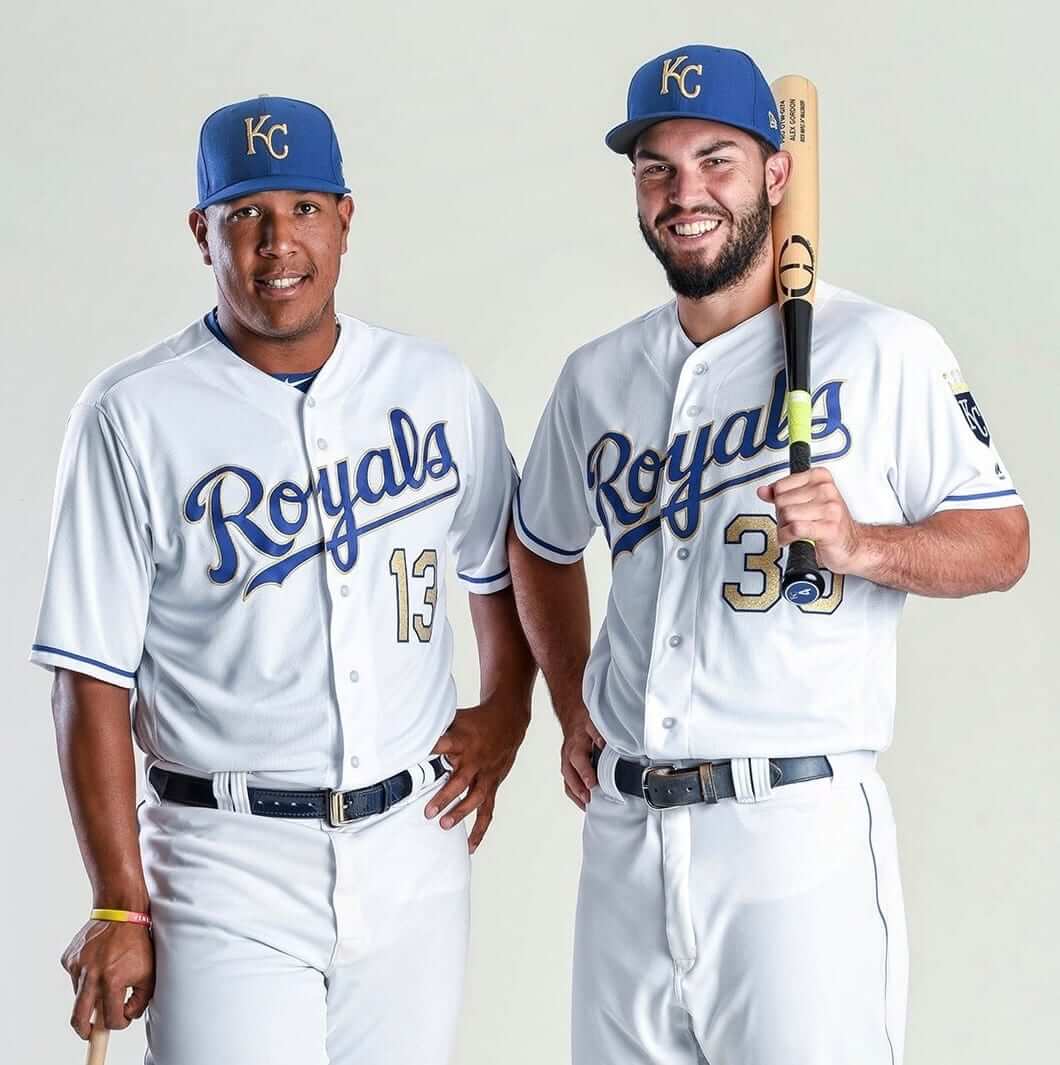
After the Royals won the 2015 World Series, they began the 2016 season by wearing gold-trimmed uniforms for their season-opening series against the Mets. Then they requested and received permission from MLB to keep wearing the championship unis for Friday home games. And now, as had been teased earlier the week, they’ve announced that they’ll keep wearing gold for Friday home games in 2017.
But the gold-trimmed unis they’ll be wearing next season aren’t the same as the ones they wore in 2016. Here’s a side-by-side comparison — last season on the left, next season on the right (click to enlarge):
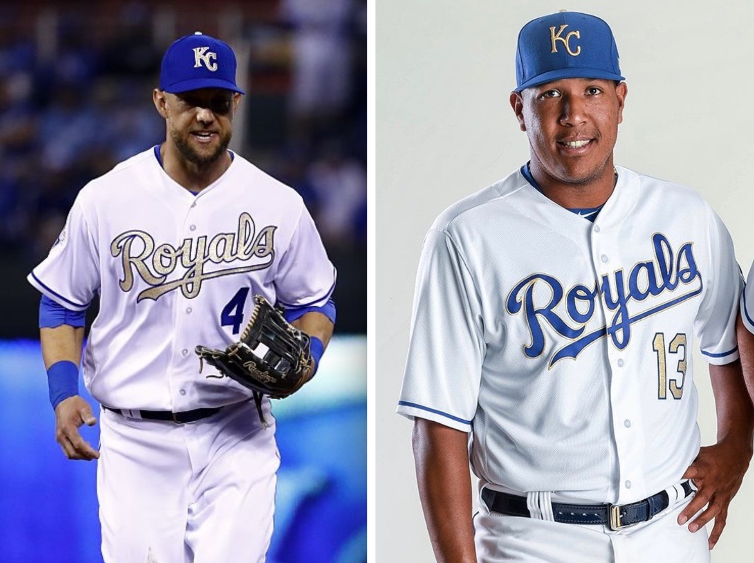
As you can see, they flipped the gold treatments of the chest insignia (which used to be gold outlined in blue and is now blue outlined in gold) and the front uni number (vice-versa). Also, the white outline that had been used in 2016 on the cap logo has been scrapped. Both changes seem like upgrades. The back treatment — gold numbers outlined in blue, with blue NOB lettering outlined in gold — is unchanged:

Is this “gold creep”? Yeah, definitely. When the Red Sox came up with the idea of wearing gold-trimmed uniforms to celebrate a championship in 2005, they only wore the gold attire for their ring ceremony. Then teams started wearing the gold in their season-opening game; then one game became two games, and two games become the season-opening series, and then that become a season’s worth of Fridays, and now that has morphed into a second season of Fridays. Seems like another case of the ratchet only turning in one direction, resulting in overkill. But if any team could get away with this, it’s the Royals: Gold is a Royals team color, and it’s also a “royal” color, so it makes a certain kind of sense.
Incidentally, when the Cubs finally closed out Game 7 two weeks ago, the champagne corks hadn’t even started popping when people started emailing and tweeting me to ask, “Will the Cubs have gold-trimmed uniforms in April?” and “What do you think the Cubs’ gold uniforms will look like?” and so on, which just shows how rote and predictable the gold thing has become. It would nice to see the Cubs skip the gold bandwagon, if only to buck the trend. Like, “Yeah, if the Royals wanna own that gold thing, they can have it.” But I’m not holding my breath.
Finally, one more thing about the Royals: If you look again at the photo at the top of this entry, you’ll see that the bat Eric Hosmer is holding has a “4” sticker on the knob. Hosmer was using one of teammate Alex Gordon’s bats! Great spot by reader Blair Riffel to catch that one.

And speaking of gold uniforms…: Gotta love that design the Saints wore last night. Sure, the sleeve and pant striping was nice, but the key was those gold uni numbers. So much better than the black numbers on their regular white jerseys. Allow me to be the 1,474,376th person to say, “They should make this their regular look.”
One other note: The 50th-season patch that the Saints have been wearing in 2016 was not included on these jerseys.
Oh, and the Panthers wore mono-blue, but we’ve seen that before. Additional photos here.
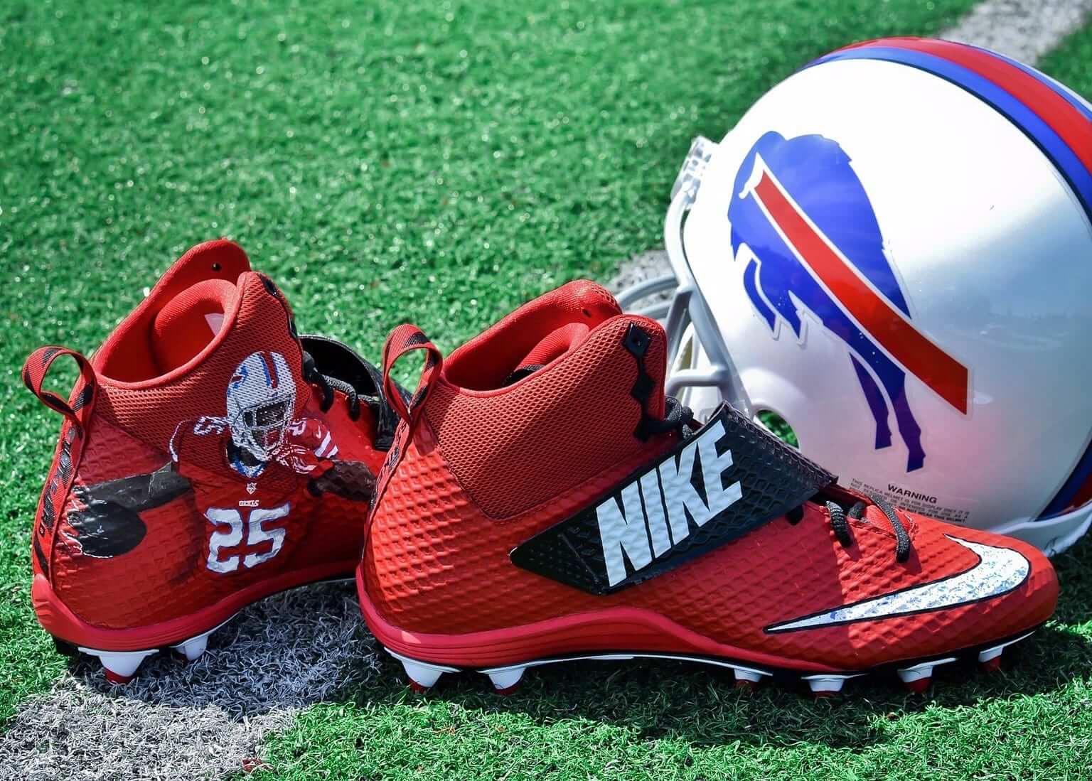
Click to enlarge
Custom cleat artists: This has been a big year for custom-designed NFL cleats. You might think the sneakers companies are the ones coming with the custom designs, but a lot of them have actually been produced by two guys in Buffalo (including the pair they created for Bills running back LeSean McCoy, shown above). I’ll have that story today on ESPN. Check it out here.
The Ticker
By Paul

’Skins Watch: Dan Steinberg, a clever and entertaining sportswriter who’s been doing great work for The Washington Post for many years, sees parallels between the media’s handling of Donald Trump and the media’s handling of the ’Skins name debate. Good stuff — highly recommended (from Tommy Turner).

NFL News: The Browns will wear their orange alts on Sunday (from Robert Hayes). … “I picked up some old Packers/Cardinals and Cubs/Reds home movie footage on eBay and got it transferred to DVD,” says Ryan Dowgin. “Trying to pinpoint the year of the games based on the unis and numbers and am leaning towards 1940/1941.” If you’d like to help him on this, look here and here. … Here’s the ceremonial shovel used for the groundbreaking of the Rams’ new stadium (from 37 Days). … RB Christine Michael wore SrOB while with the Seahawks but he’s apparently going with a conventional NOB with the Packers — at least on his practice jersey (from Dean E.S. Richard). … Some Dolphins fans have started a petition to have the team’s throwbacks reinstalled as the primaries (from Kerri Pedersen).
College Football News: Cincinnati will honor its seniors tonight by including their names and numbers in the team’s helmet striping (from @AdamtluA). … Here are this week’s uni combos for UNC (which will also have a stars/stripes end zone treatment), New Mexico, Syracuse, and Columbia.

Hockey News: “Most mornings (every day?), NPR morning news reader Korva Coleman does a Facebook Live video session answering viewer questions about the day’s news and NPR’s coverage,” says R. Scott Rogers. “On Thursday, she was wearing a No. 42 Joel Ward Capitals jersey. At the end of the Q&A, she took a final question about the jersey and explained that she was wearing it to celebrate the previous night’s 7-1 rout of the Penguins. Most of the comments in the comments sidebar during the video were about the jersey, mainly praise for ‘rocking the red’ or Ward fans saying she should get a Sharks jersey.” … Rangers G Antti Raanta has written a piece about the meaning of his mask design (from Jim Earing). … Some Calgary Flames players tossed a football around the ice while wearing Calgary Stampeders helmets the other day (from Nick Maibroda). … A Fox Sports writer has reviewed all 30 NHL teams’ uniforms (thanks, Mike). … Wayne Gretzky is apparently going to appear on The Simpsons, wearing an Oilers-esque uniform, completely with the jersey tucked in at one hip, but without the jersey crest (from @GKG_77). … Purple “Fight Cancer Night” jerseys upcoming for the Cincinnati Cyclones.

NBA News: Drake was given a Toronto Huskies jacket (from Marc-Louis Paprzyca). … Color vs. color last night in DC, as the Wizards wore their orange Bullets fauxbacks against the Knicks (from Brian S).

College Hoops News: Akron has a new kangaroo-themed set. … Check out last night’s Oregon/Valpo game. If only the NFL’s Thursday-night program looked even half that good! (Thanks, Phil.)

Soccer News: FIFA has opened a disciplinary case against England and Scotland for wearing poppies on Armistice Day, which they had been warned not to do.

Grab Bag: Good article about the current state of the Jordan Brand (thanks, Brinke). … Faaaascinating article about the struggle for market supremacy between the world’s two largest zipper manufacturers (from Jason Hillyer). … Crossing guards in Chicago are worried that safety will be compromised now that they can no longer wear police uniforms. … Here’s a close look at the latest in safer cricket helmets.
Not your article, but in the article from The Undefeated I think this is a typo: “Jordan Brand has high hopes for the Westbrook 0.2”
I don’t know what you think the typo is. His first show was the 0 and this is the 0.2 if that’s what it is.
+1 to the Saints and those uniforms – they are gorgeous.
On a completely different note, does anyone here know if there is a CFL equivalent of Gridiron-Uniforms? Been looking into the league lately, and would like to get a good feel for the history of their uniforms (they have ads on their uniforms currently).
Don’t think there is a CFL uniform database – certainly nothing on the scale of Gridiron.
Looks like someone tried starting one for certain years has 1978-93 so far:
link
There are some up on Wikipedia for what it’s worth:
link
Someone has worked on one for CFL helmets:
link
For some historical images there is always the online portion of the Canadian Football Hall of Fame and Museum:
link
and of course this blog – formerly titled “The Edmonton Eskimos ruined my childhood” – with his choices of the best and worst of CFL uniform history:
link
It would be great if there was such a thing like the NFL one. Would be quite a daunting task considering there are teams over 100 years old.
Have to rely on research from the web, past photos, books and articles. Some of us longtime uni obsessed CFL fans can pass along the wealth of knowledge of differences from year to year.
There is a Wikipedia site that has many uniforms on it that may be of interest if you have not found it already:
link
“wiht” sighting in the Christine Michael item in the ticker.
Fixed.
Proofreading: “Dan Steinberg … see parallels”
Fixed.
For the Cubs/Reds game – I know Dressed to the Nines isn’t 100% accurate, but it lists the Reds as wearing a black armband (clearly visible at the 1:32 mark) in 1940 only, which would put the game in that year.
Nice spot. Thanks!
Looked a little deeper and was able to pinpoint it to August 16, 1940. Since they started wearing the armband in August (in honor of William Hershberger who sadly took his own life), it’s the only day after that that Gene Thompson (Reds #39) pitched at Wrigley when he started Game 2 of a DH.
Just realized, he also pitched on September 7, 1940 as well (though in relief). the video looks liek Two pitchers warming up in between gamees but that’s not guaranteed.
You guys got in ahead of me with the Willard Hershberger spot!
At first I was hoping to use players’ numbers to pick out the year. The Reds had a very weird numbering scheme around that time. In all the years surrounding 1938 they ranged from about 1 to the high 30s or low 40s. Then in 1938 they for some reason *started* with 35 and went up to 63. (Note that the 2016 team started at the bottom and even then managed to go past 63.)
When I first saw their bizarre number list for 1938, I assumed that maybe the team had ordered a double-sized set of uniforms and covered two years at once, issuing the first half one year and the second half the next, but that can’t be what happened, because they got up to 38 the year before and 41 the year after.
Does anyone know what is going on with the Reds’ numbers in 1938?
Also regarding the Cubs: Dressed To The Nines has the Cubs wearing a vest jersey over a white undershirt in 1940, but I think the one in the video is the same sleeved design they had for the past few years (and which was worn in 2014 as a throwback; I have one).
Is it just me or does it look like there is no number on the back of the Cubs pitcher who is warming up after we see #39 Gene Thompson?
Expect a lot more gold trimmed fashion during the Donald Trump presidency.
Comment of the day if you ask me.
Isn’t every Raptors home game Drake night?
Like the fact the numbers were actually old gold, same with the striping on the Saints uniforms last night. Wish Nike would figure out a way to make the actual gold pants look that was instead of the urine stained monstrosities they are now.
I imagine next year you will see alot of NFL teams transition to the new Nike template without the Nikelace, or toilet collar, or whatever. I for one actually liked the flywire, and thought the two tone collar worked on certain white jerseys (Ravens, Washington, Saints). I like the way the NFL shield kind of locked the collar together instead of that horrid NFL Equipment Reebok tag. I think the vapor triangle collar thing does that but gives teams like the Bills, Patriots, and Cowboys (blue jersey) the ability to retain their striped collars while using the vapor triangle collar thing (see Giants color rush jersey). Man do I love over analyzing the most pointless stuff.
At least Kansas City already has gold as a team color. And the 2017 gold-infused unis are definite upgrade over 2016. Makes me think it wouldn’t be such a bad thing if the Brewers settle on royal and metallic gold instead of navy and yellow.
Makes more sense to me than the Twins adding gold trim, that’s for sure.
Given how much I hate gold trimmed unis, and gold in general, it’s surprising to me that I think it looks good on the Twins. I couldn’t tell you why.
I think it looks all right as well. I just don’t think it makes much sense.
I liked the Saints’ uniforms last night, but I wish the gold matched the color of the helmets. Is Nike the only manufacturer who has such a hard time with color matching, or is it all of them?
I actually like the Fox Sports article about the NHL uniforms. Partly because it’s not a ranking like so many of these tend to be, but mainly because the writer’s opinions happen to parallel mine for the most part.
TBH I actually REALLY like the new Royals gold-trimmed unis. As you and other commenters have said, it is a team color. The relatively minimal amount gives a little highlighting and makes their unis a little less boring (which I always thought they were). Gold and blue look nice together.
For the life of me, I can’t see any crossbars on the goal posts in that video of the Packers/Cardinals game.
Neither can I. Strange set up.
Based on link, it looks as though they would place a small thin bar between the two posts – maybe they didn’t always keep it in place?
That’s a great photo, Chance. Thanks.
“Allow me to be the 1,474,376th person to say, ‘They should make this their regular look.'”
As a Saints fan, I’ll be the 1,474,377th person to say it, but with a couple of caveats:
1. Wear the white pants with the black jerseys.
2. Wear the white jerseys with gold pants.
I do not like white jerseys and white pants together. At the very least, I’d love to see them go back to those numbers with serifs and sleeve stripes and non-vampire/neck roll/Nike sucks collar. Those numbers are similar to the original Saints numbers and the jerseys had a throwback look, which was awesome.
And please go back to that shade of gold instead of Nike’s khaki.
The Saints in black jerseys with white pants??
No.
For the Saints, black over gold and white over gold and maybe sometimes white over black.
Lee
White over gold and gold over white. Match all gold (including helmet) to what the numbers were last night. Sock striping to duplicate the sleeve striping.
Bring back what they used in 1968.
I for one think that teams that win a championship sporting a commemorative jersey to open the next season is a GREAT IDEA. It’s fun, it’s usually a one-off uni, and it’s something that can get the fans AND players excited. I think it’s a real cynical take to call it “rote” or “predictable”. It’s just uniforms, guys. It can be fun too.
The Saints used to have the old-gold color constant across helmet, jersey and pants. Their original uniforms had gold numbers with black borders; they brought that look back for a while when Ditka was coaching them. (Most Saints fans have blotted this time period out of their memory.) They didn’t go with old-gold helmets because of the one-helmet-per rule. The other change was the inclusion of the fleur-de-lis on the hip which didn’t start happening til the Mora era. The serif numerals were the same as the Saints used in 1967. I liked the one-color names (legible at last!) but didn’t like the lack of sock stripes (the sleeve stripes used to be duplicated at the top of the socks). The Saints used to always wear gold pants until Hank Stram came along (black pants with white jersey, white pants with black jersey) and they were changed back to gold when Mora came in. Ditka reintroduced the black pants as a one-off; last night’s white pants were the first since Wade Phillips was the interim coach back in the 80s.
Today’s ESPN column is up:
link
I hope the Cubs just replace the UBS in their chest insignia with HAMPS.
Ooooh, I like that!
(But will they keep the circle-R????)
link
I want you… to want this shirt!
Once every 108 years? I’m ok with this.
Someone correct me if I am wrong. Packers do not allow suffixes (Jr., Sr., III, et al) on their jerseys – which I love!
Only other entity I believe bucks this is BYU athletics. Sadly, Wisconsin football allowed suffixes this year.
I have Odell Beckham in Madden Mobile so I see how ‘Beckham Jr.’ would look on a Packers jersey (and Fuller V for that matter), not a pretty site.
Have sampled some games on NHL.TV and notice TV numbers for Florida Panthers on shoulders, first NHL team I know of to go that route.
I love the look, they finally at least look like an NHL and not an AHL team.
The only other example in the NHL is some of the Stadium Series template unis. Those were just one-offs.
I never liked the high numbers on the mid 00s nike swift international unis, but I think it looks fine on Florida.
Correction, y’all: the orange Edmonton Oilers jerseys also have TV numbers that are distinctly on the shoulder and not on the arms, and those jerseys came about last year. But to the extent that this is an element on Florida’s full time look and not just an alternate, then OK that’s true.
I don’t love the look…it’s hockey, not football. But it’s not the worst global element in NHL design. That distinction goes to front uniform numbers that the Sabres still have but the Sharks just abandoned.
TV numbers on shoulder yokes never look good to me. The Oilers did it because they’re being true to the WHA jerseys they’re throwing back to. I like the orange jerseys but they would look better with the numbers between the yoke and the stripes.
The numbers on the shoulders read better from the cheap seats. Wade mentions the Penguins below, and while the numbers in the sleeve inserts may be more aesthetically pleasing, they’re much harder to see.
A few other NHL teams wore numbers on the shoulders in the late 1970s and early 1980s.
1977-78 Cleveland Barons:
link
1982-83 Los Angeles Kings:
link
Early 1980s Pittsburgh Penguins:
link
Last rant.
I do not believe the U.S. Military would not allow Griffin III or Michael Sr. on uniforms.
Also I went to NFL Shop to see if I could get a hyphenated jersey that would honor both my father’s and mother’s maiden names. Not only were hyphens not allowed, but also anything over 11 characters. So don’t believe the ads on TV that says you can roll with uniforms just like the players.
Love those Saints jerseys…hate them paired with the white pants. I am generally not a fan at all of white-over-white football uniforms (I hate that Michigan stopped wearing the maize pants on the road the last two years, for example).
Saints used to have gold numbers on the white jerseys back in the late 90s, but they were hard to read in action as I remember….partly because their shade of gold is more “Vegas Gold”, rather than their original “old gold” that they used last night. I think that’s why they went back to black numbers.
I’d be all for the gold numbers returning, but if they did, it would be better to go back to the “old gold” color scheme too.
link
What is larger – the number of people who love the Saints gold numbers or the number of people who hate the Jaguars gold mono look?
What if the Saints had a gold jersey with white numbers (with white pants). Just use the black as trim?
The Royals have their 50th anniversary coming up in a year.
I guess I’ve been looking too much at the NHL “expansion six” uniforms – my first thought when I saw the Royals gold on twitter was that the special uniforms were in anticipation of their 50th.
Put stripes on their socks and those Saints uniforms would be perfect.
That Packers-Cardinals game looks to be from 1940 according to the GUID:
link
Bill Schaefer from the GUD is having web problems, so I’m posting this for him. The words that follow are his, not mine:
I’m confirming that the Cards/Packers footage is from 9/29/40 at the Wisconsin State Fair Park in West Allis, WI.
1940 was the only year the Cards wore those unique ‘white top/red bottom’ leather helmets.
Interesting note, 4 days before this Sunday game, the Cards hosted the Bears and wore those same unique helmets on a Wednesday.
Those appear to be the only 2 games the Cards wore them.
There may be one other instance, however. The Saturday following the Green Bay game, 10/5/40, the Cards played in Detroit. Unfortunately, we have been unable to locate a photo from that game. The Free Press did not include a photo of this 10/5/40 game in their Sunday or Monday editions following the game.
Fascinating. I wonder if the Free Press sent a photographer to that game, and there may be a copy floating around in either the paper’s archives or a private collection.
The Bullets/Wizards fauxbacks are red, are they not?
Another interesting tidbit on the Royals’ new-with-a-difference gold jerseys: they don’t have to change the batting helmets, because the caps are moving to match the helmets. I’d bet that that’s another case of “it looked great on the mannequin and good in the field test, but there was a better way all along.”
Ryan, that old Packers footage is amazing! I’d love a better look at it for my own research. Drop me a line if you have a second – contact info is link.
It’s cool to see the Calgary Flames support the Stampeders; however, what if one of the players got hurt horsing around on the ice with a football?
What do you guys think – link? I’ve been meaning to date this photo for a while.
The Saints Color Rush jerseys were phenomenal. Gold (Metallic) is also a part of the Ravens color set. I was pleased to see Old Gold and Metallic Gold used the way they were on both Color Rush jerseys. My fear is that teams that do not have some sort of gold in their color scheme will begin to add it to their uniform repertoire. We’ve had BFBS and GreyFGS. We don’t need GoldFGS, unless a team decides to wear gold-trimmed unis for one game in celebration of their previous year’s championship.
Personally, I like the World Series Champion wearing gold trim for st least their opening game. I wasn’t a fan of the way KC used the gold alts every home Friday this year, but I do think making a gold variant their alternate works. I also appreciate the changes. Not only are they aesthetically superior, but they also allow the popular gold concept to remain while letting the 2016 unis retain their spot as Championship commemoration only.
Paul,
Did you reach out to any other customizers for your piece like ODB’s artist Kickasso?
Nope. I realize there are others out there. Today I just wanted to tell the story of these guys.
Would love to see the Cubs buck the trend and return to the old school World(s) Champions unis. If there’s any team that could and should pull it off, it’s them.
The red shoe photo in the Jordan story is brimming with silhouettes (well, there are two).
the NBA logo on the sock and the Jumpman.
Who else could we add?
Pop-ups are being especially obnoxious today… especially since they get blocked by my work network before they load, so all I ever see (if I don’t close them quickly enough) is a security warning that the site is marked as potentially unsafe.
Usually, I only get one or two in the morning when I first visit the site after a new post, and then they don’t come back for the rest of the workday, but I’ve had four instances already this afternoon just replying to a couple of posts.
Love those Saints uni’s as well, but the gold is darker and bolder on the jerseys and pant striping than on the helmet. They need to darken the helmets to match.
I love the Saints all white with gold trim uniforms, but if they go with this look as their regular uniform I’d like to see them replace the white socks with gold or black.