For all photos, click to enlarge
Back in April I wrote about a 1958 aluminum siding catalog I’d scored on eBay. Today we’re going to look at another catalog I recently acquired, this time a 1968 catalog from Gill-line, “Designers and Manufacturers of Quality Screen Printed Advertising Specialties.” It’s full of spectacular graphics and eye-popping colors.
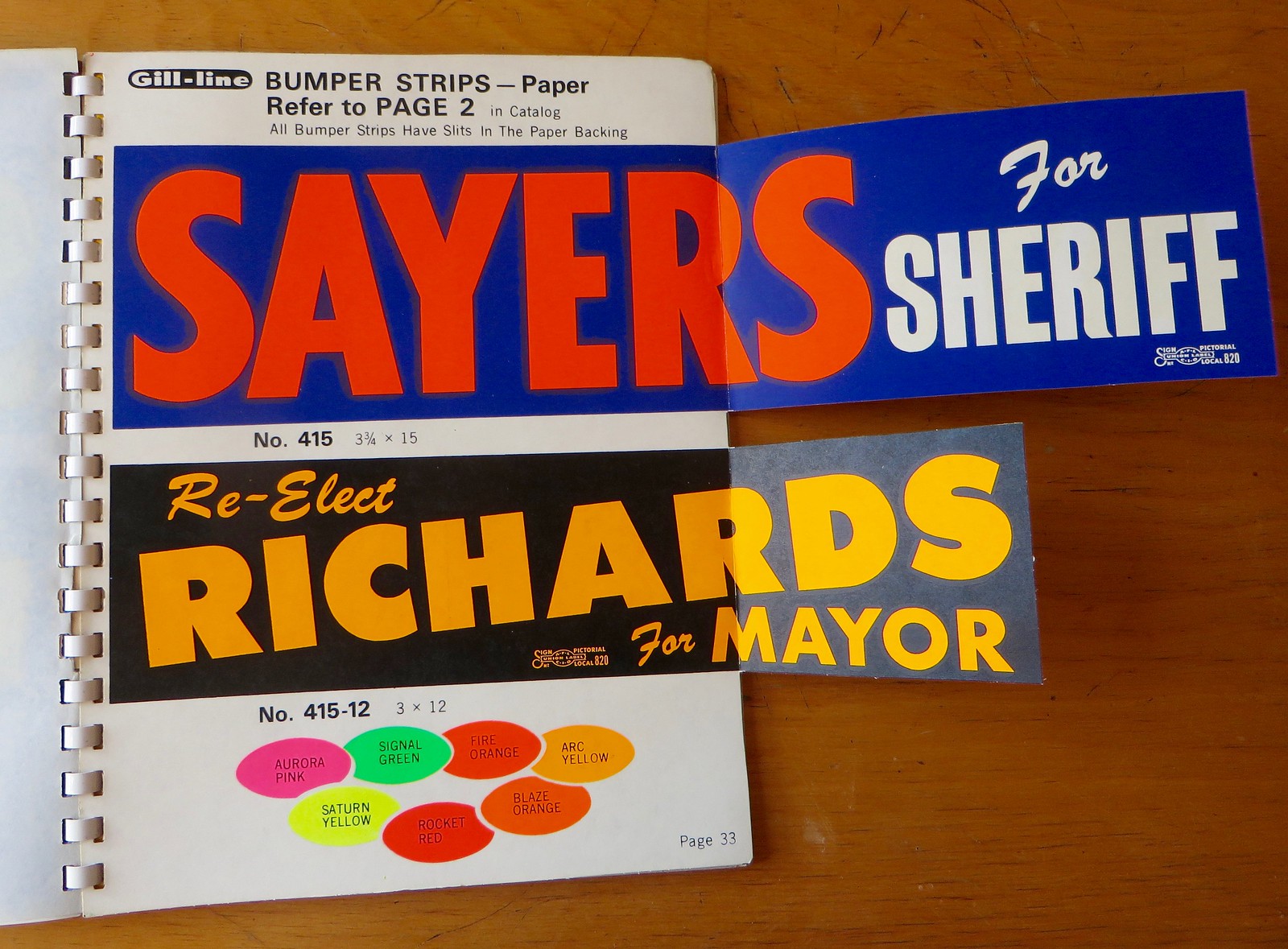
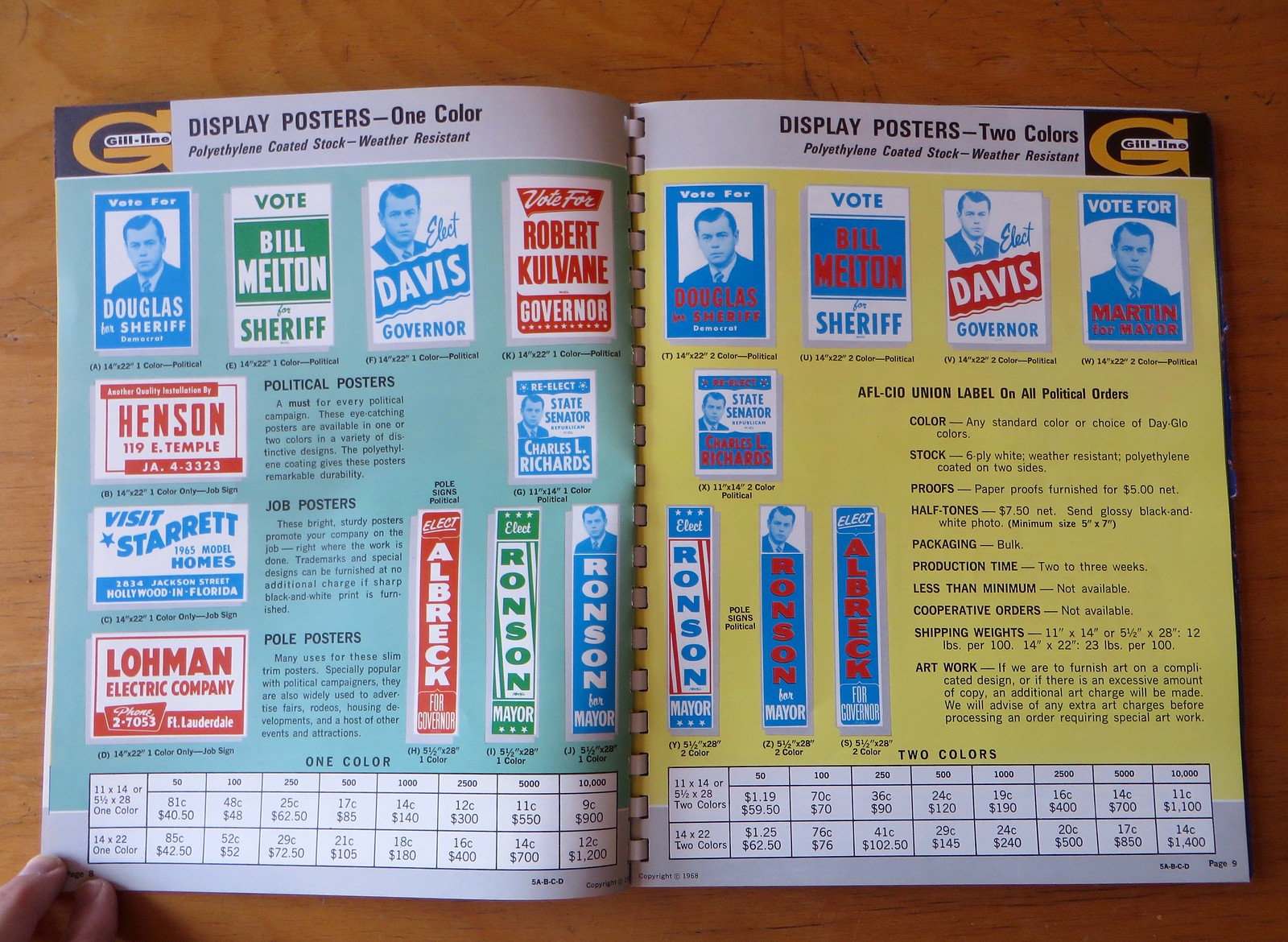
The most impressive page from the catalog is probably the one shown above, with a pair of real bumper sticker samples glued into place. They have real zip strips and adhesive on the back, too. And man, look at all those fluorescent color options at the bottom!
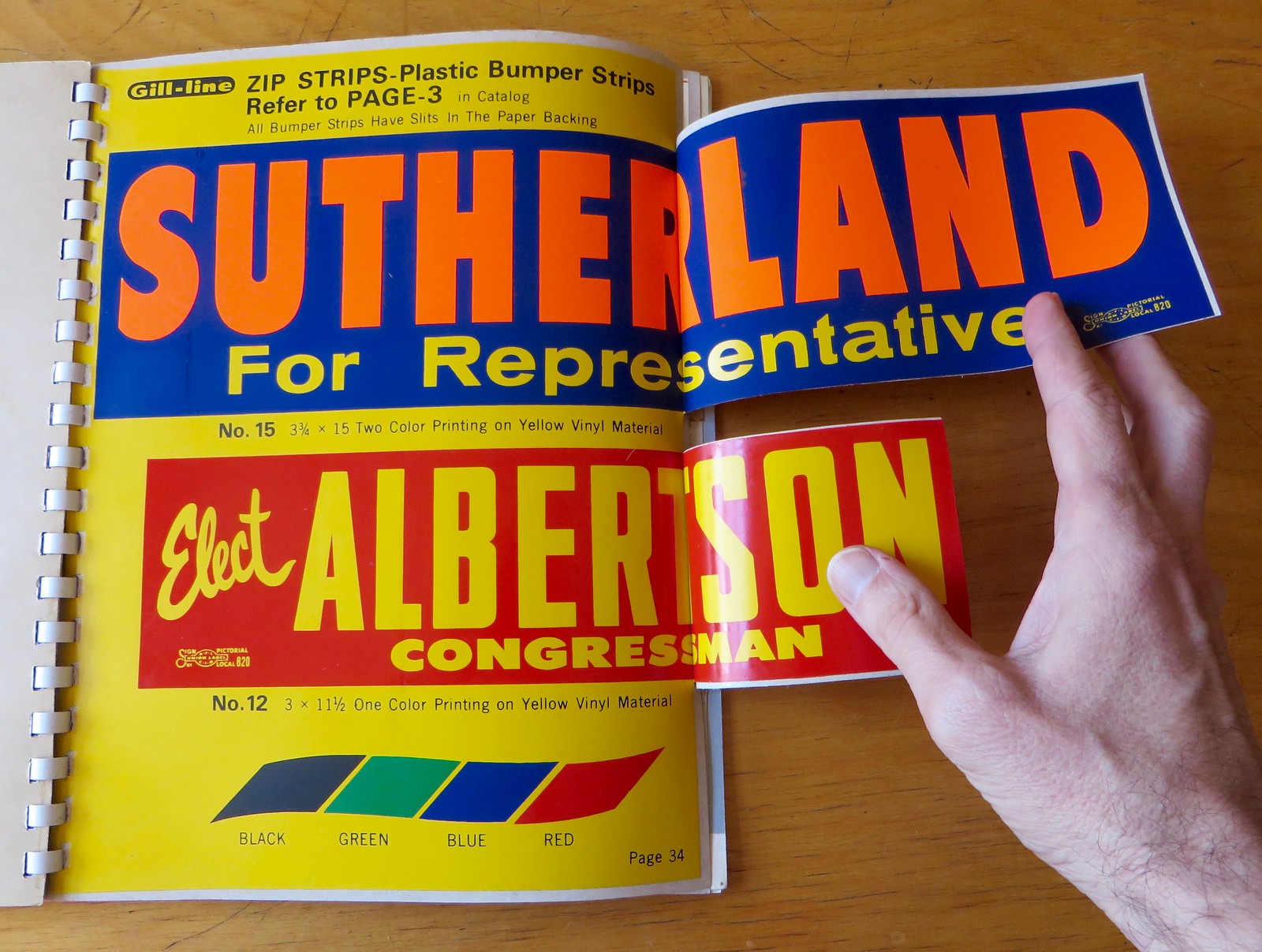
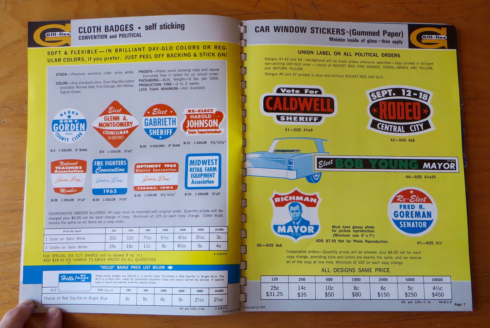
Here’s another pair of bumper sticker samples:
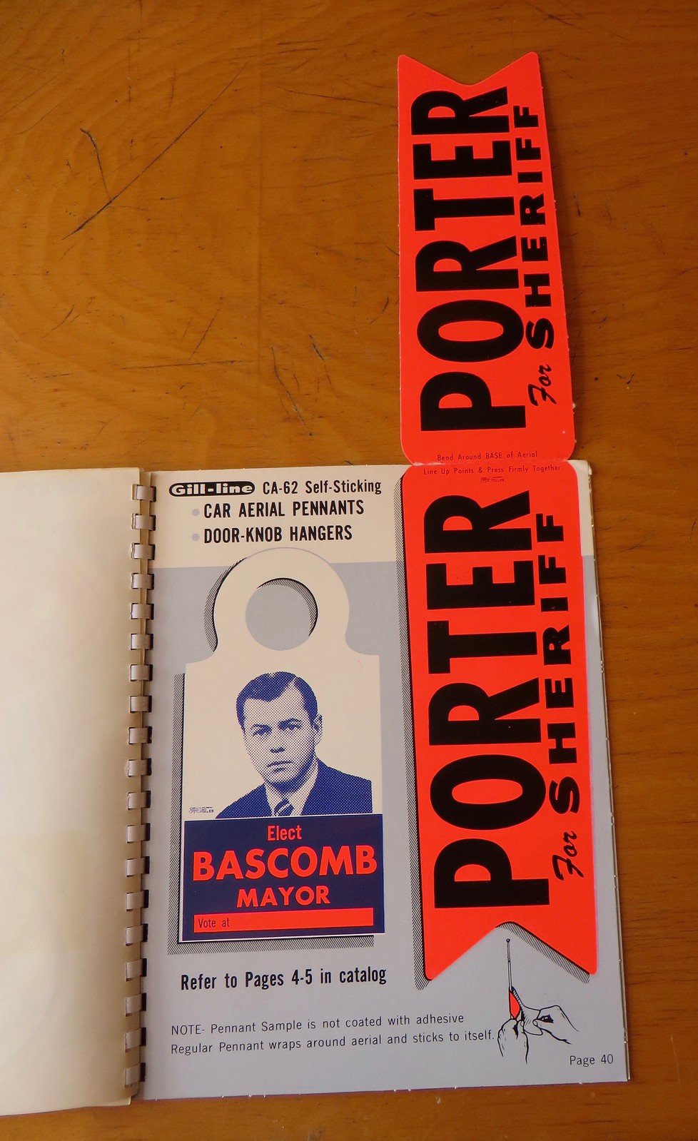
This next spread shows something very cool: “car aerial pennants.” In other words, bumper stickers for your car antenna:
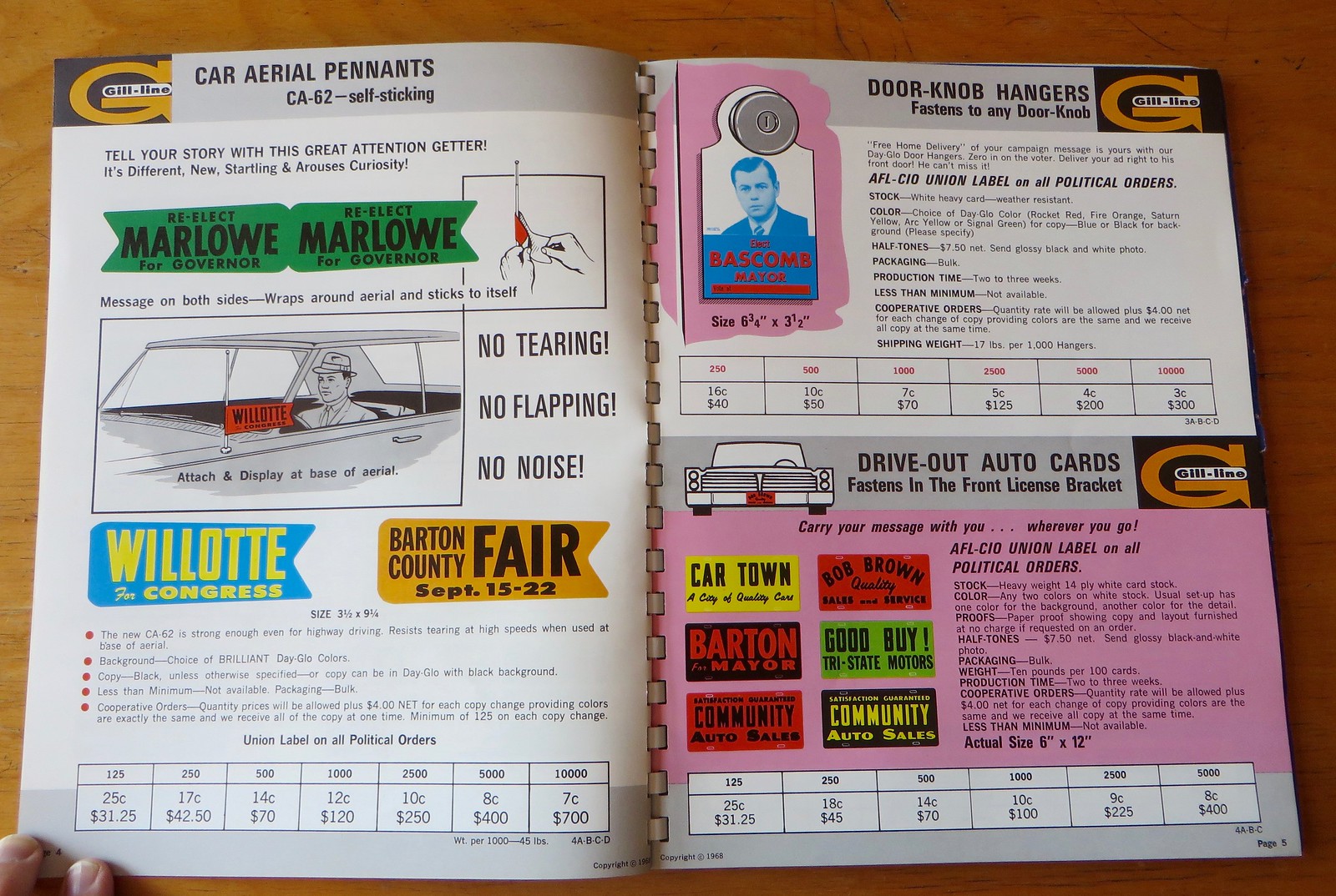
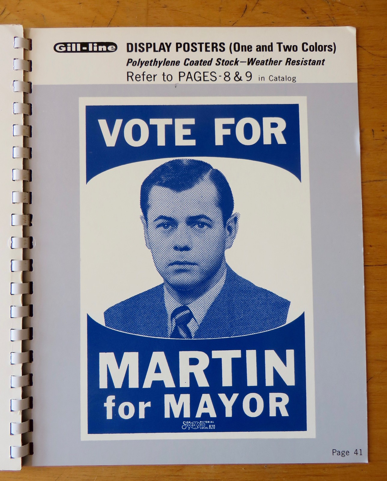
Also, at the top of the right-hand page, see that doorknob hanger for mayoral candidate Bascomb? I don’t know who posed for that photo, but he shows up again and again throughout the catalog (but with different names), as you can see on these next few pages:

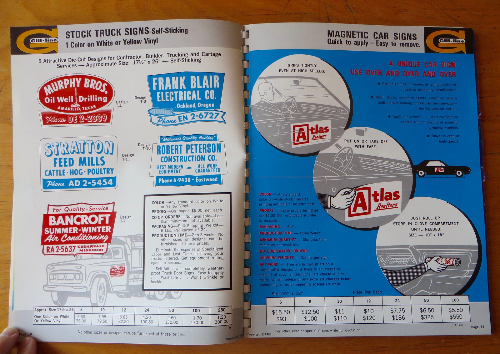
I really like the right-hand page of this next spread, which is touting magnetic car signs. Love the way the illustrations show the customer just rolling up the sign and stowing it in his glove box:
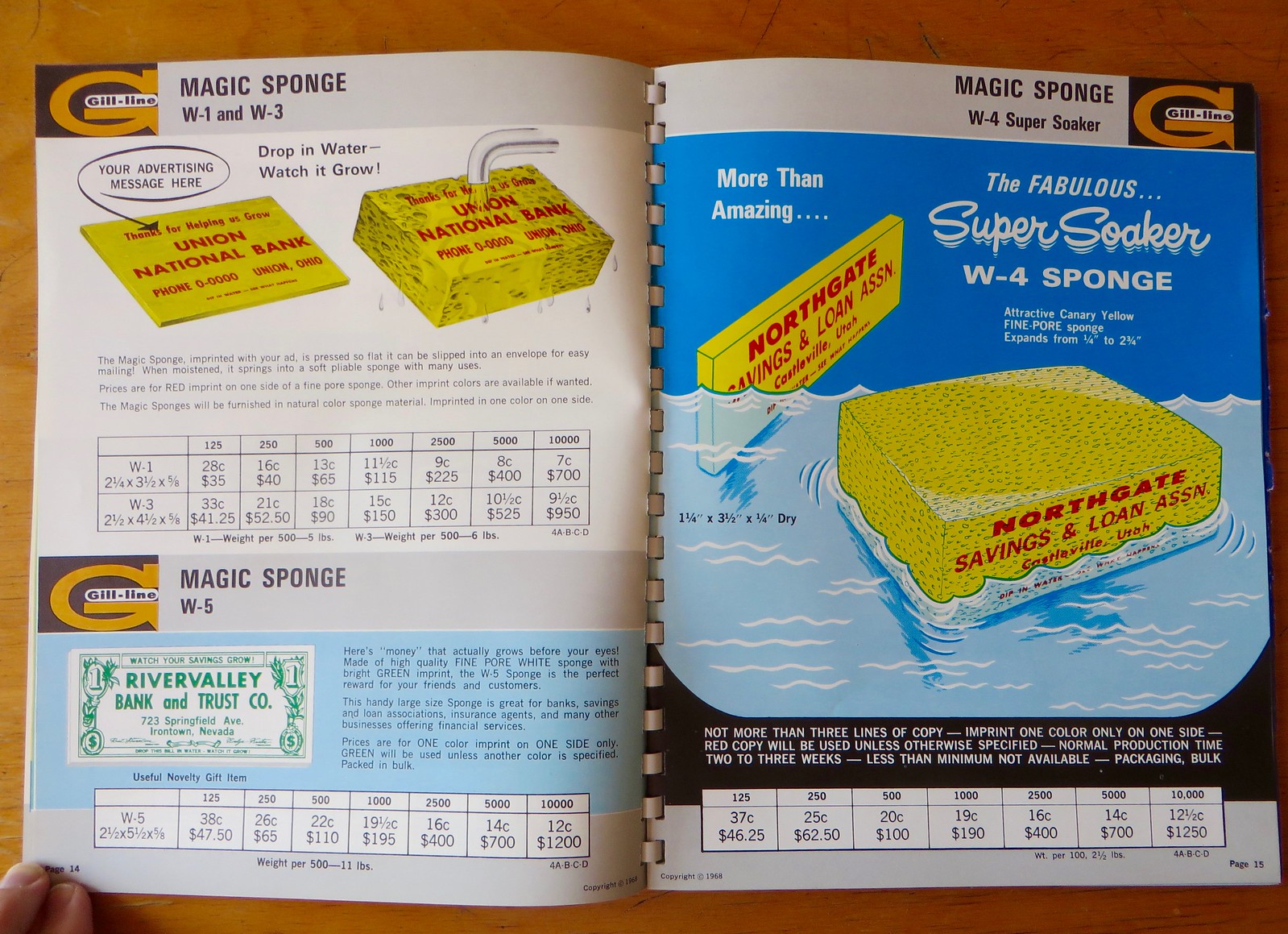
Here’s a promotional opportunity you might not have thought of: putting your company’s name on a sponge (or, rather, a magic sponge):
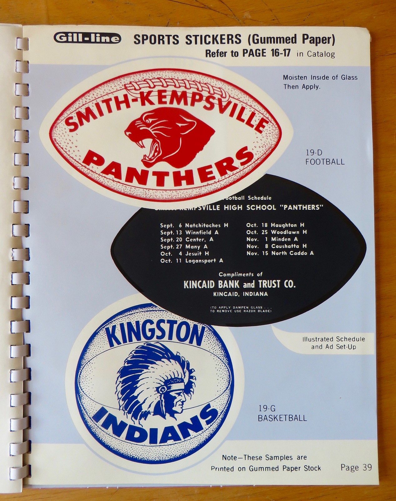
You say you want some sports-related content? No problem — can do. Too bad about the Indians sticker, though:

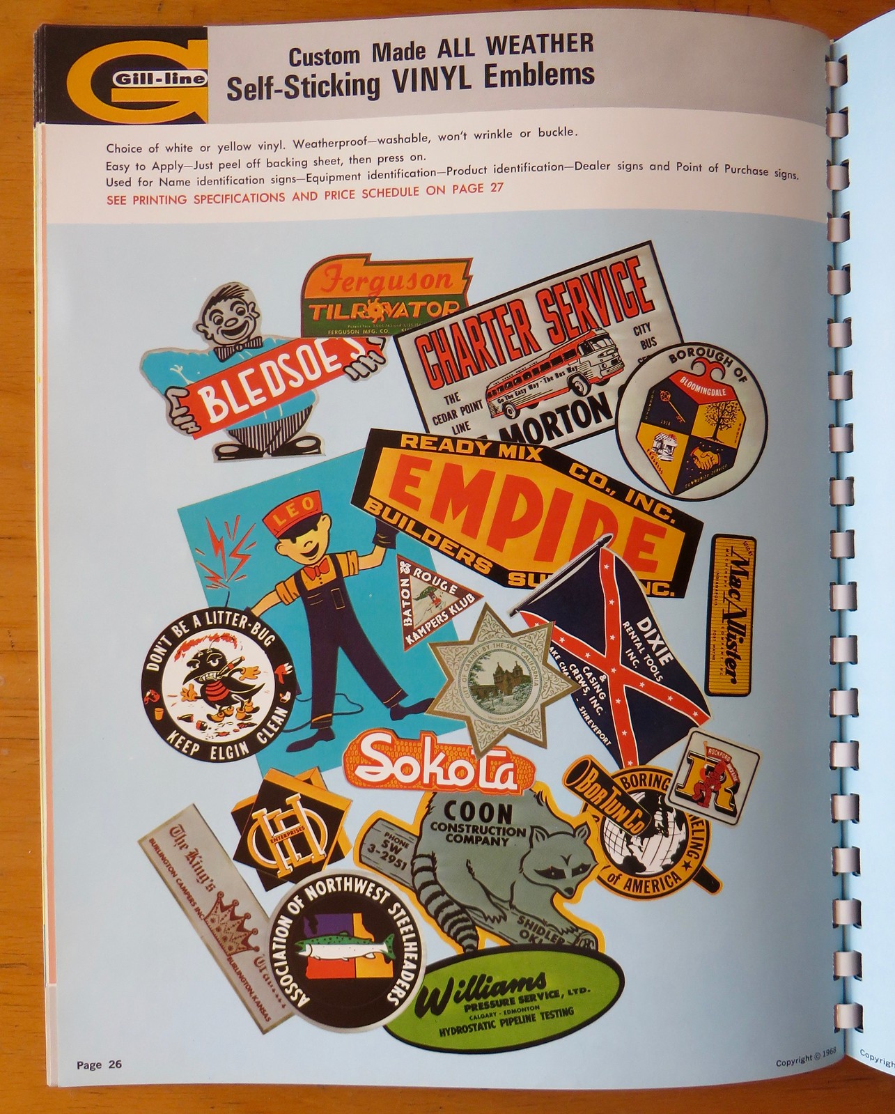
Lots to like on these next two pages, which show a bunch of very cool decal concepts. I especially like the “Don’t Be a Litter Bug” design on the first page (although it’s disappointing to see the Confederate flag design on that same page):
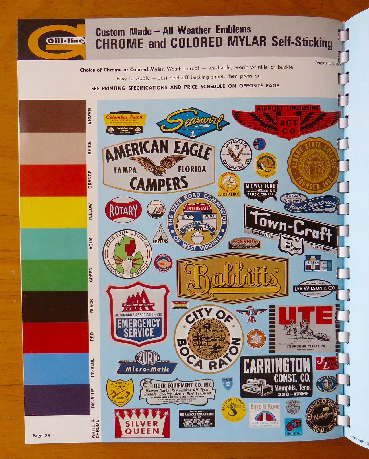
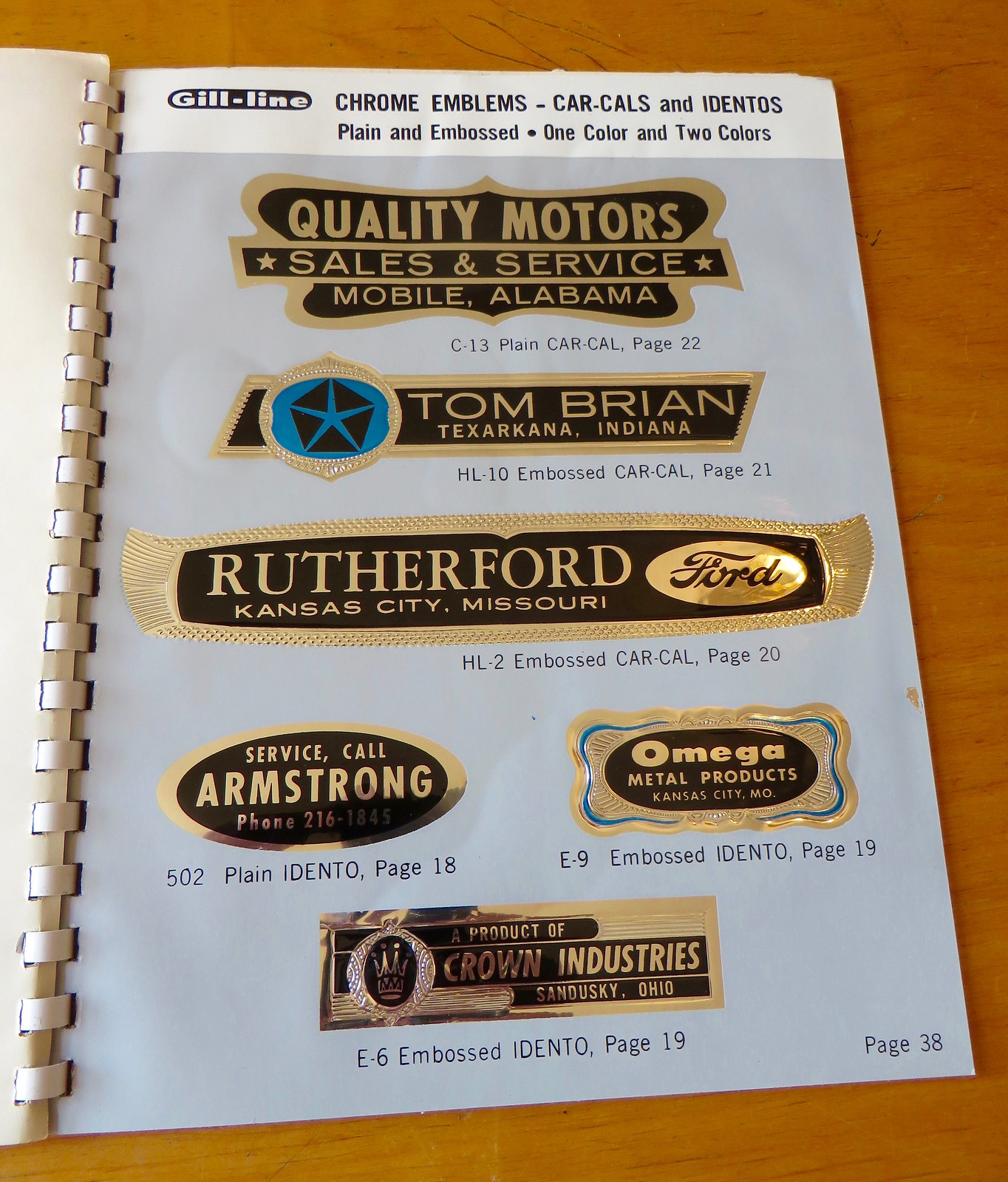
There’s also a page of chrome decals. It’s hard to capture just how dynamic they are — trust me, they look even better in person than they do in this photo:
There’s more, but I think that’s enough for you to get the idea. Thanks for bearing with me during these occasional forays into off-uni territory.
Gift Guide reminder: I’m currently accepting suggestions for items to include in my annual Uni Watch Holiday Gift Guide, which will run on ESPN on Nov. 29ish. If you know of items I should include, do tell. Thanks.
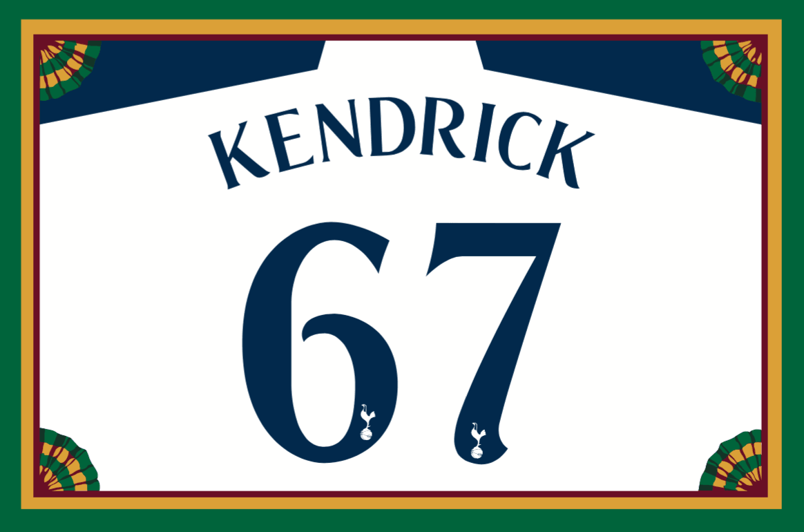
Membership update: Several new designs have been added to the membership card gallery (including David Kendrick’s card, shown at right, which is based on Tottenham Hotspur’s Champions League uniform). I currently have two open slots on the current batch. As soon as we fill those two slots, I’ll send this batch to the printer.
As always, you can sign up for your own custom-designed membership card here, you can see all the cards we’ve designed so far here, and you can see how we produce the cards here.
The Ticker
By Mike Chamernik

Baseball News: The Mets unveiled their New York skyline logo 55 years ago yesterday. A few tweaks have been made over the years but it is virtually the same. … Cleveland Scene, the weekly paper run by Uni Watch alum Vince Grzegorek, is running a contest to rename and redesign the Indians.

NFL News: Tonight the Panthers will play the Saints in one of the better Color Rush games. Cam Newton agrees. He says that when he plays Madden, he chooses the Panthers and plays in their all-blue uniform set (from Phil). … During a Thursday-night game a few weeks ago, Bucs WR Cecil Shorts gave his gloves to a fan, but Shorts’s rubber wedding band slipped off and remained in one of the gloves. The fan gave the ring back to Shorts, and Shorts gave him a jersey in return (from John McMunn). … Here’s one person’s opinion of the best throwbacks/retro uniforms in NFL history (from Phil). … Who are these very good-looking players? “They’re the St Louis Gunners, an independent pro football team who, through unusual circumstances, briefly joined the NFL,” says Ronnie Poore. “The Gunners played three games at the end of the 1934 NFL season. The uniforms are pretty flashy for the time.”
College Football News: Stony Brook will have golden apple helmet decals for the annual Empire Clash game this Saturday against Albany. The winning team takes home a golden apple trophy. … Iowa State will wear white helmets this weekend. … A friend of Chris Flinn got these Penn State nesting dolls from Russia. Here’s the reverse view. … Arkansas State will wear all white with red helmets this Saturday. … A columnist made the argument that alternate uniforms in college football have gotten out of hand. Of course, he kind of undermined his views by including the line “Full disclosure: I’m a grumpy almost-old man” (from Tris Wykes). … It was really foggy in Toledo last night (from @RNs_Funhouse, via Phil). … Colorado will wear black and silver this weekend. Here’s another look at the helmets (from Phil). … Louisville will wear white-over-red tonight (from Phil). … Cincinnati will be in mono-red tomorrow.

NBA News: The Spurs will retire Tim Duncan’s No. 21 in December. … Here’s a good concise history of the changes to NBA uniforms over the years (from Phil). … The Raptors hosted Drake Night for yesterday’s game against the Warriors. The Raps wore their black OVO alternates (the Warriors wore white on the road), and fans got commemorative T-shirts. Drake attended the game and wore a shirt with ESPN color commentator Doris Burke’s face on it. … Looks like 76ers C Jahlil Okafor has a bit too much space between his chest lettering and his uni number.

College Hoops News: Marquette will wear turquoise N7 uniforms on Nov. 30 (from Phil). … New unis for Southern Utah. … Marquette is flying in a plane with a Hillary Clinton logo on it. Clinton’s running mate, Tim Kaine, once flew in the plane during one of his trips to Wisconsin during the election season.

Soccer News: The Premier League will allow teams to wear advertising patches. The patch will replace one of the two EPL logos on each sleeve (from Josh Hinton). … Also from Josh: Barcelona reached to a jersey advertising agreement with Rakuten, a Japanese e-commerce company. The deal will last four years, starting next season. Qatar Airways is the team’s current advertiser. … Yesterday we noted that the Pennsylvania Stoners were one of the pioneers of uniform advertising. Douglas Ford notes that the team also went TNOB. Here’s more history on the Stoners. … The US men’s team will auction game-worn jerseys from last Friday’s match against Mexico. The proceeds will benefit a veterans’ service organization (from Phil).

Grab Bag: The Lehigh Valley Phantoms — that’s a hockey team — wore pink ribbon decals last night (from Phil). … FedEx, which has had several different color schemes for its various services — purple and orange for FedEx Express, purple and green for FedEx Ground, etc. — will now use purple and orange for everything (from David Firestone).
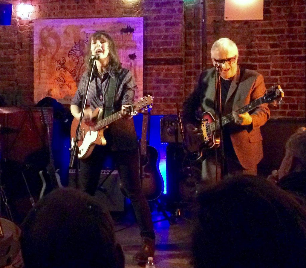

What Paul did last night: The past week has been rough on a number of fronts, but last night provided just what I needed: The wonderful singer/songwriter Amy Rigby was playing (part of the 20th-anniversary tour for her landmark 1996 album, Diary of a Mod Housewife, don’tcha know), with her husband, the great Wreckless Eric, on bass. Saw lots of friends, gave and received lots of hugs, and smiled more than I’d thought would be possible when I left the house. A very good night.
Here are a few of the songs Amy played:
Pg 28 has Northeast Michigan Electrical Association. I’m pretty sure that’s still around (albeit in an IBEW guise).
Looks like it starts covers Arenac, Iosco, Alcona, Alpena, Montmorency, Oscoda, Ogemaw, Gladwin, Crawford, and Roscommon counties. Not many people in those parts as only about 185,000 live in those counties combined today. My county just south of Arenac and our westerly neighbor have more people combined than those 10.
Gotta love the era between every business designs their own logo if they want one and the current era of “don’t get caught using a generic logo”
I’m not a Mets fan, but I’ve always been a fan of the skyline logo. Does anyone know why they ditched the NY?
I wrote about this in Uni Watch’s earliest days, back in 1999, for the Voice:
link
Thanks, Paul. Now that you’ve jogged my memory, I remember it was the same time they went BFBS. I guess they thought it looked too old timey.
Proofreading: FedEx, which has had several different color schemes for its various services – purple and orange for orane for FedEx Express, purple and green for FedEx Ground, etc. – will now use purple and orange”
Thanks. Fixed.
HO. LEE. CRAP. Paul, the Gill-line catalog overview made my day. It’s a beaut!
You’re absolutely correct about the chrome decals. It really is hard to capture their impact in photos. Those things were boss! In the ’70s, they were on practically every car bumper in town.
In my dad’s and father-in-law’s long careers as salesmen, they both had a period where they sold this sort of stuff (those ad-sponges were everywhere in my in-laws’ house). Sure it was mostly kitschy, throw-away stuff, but it put food on the table and kept hope alive till the next good gig came along.
Oh, and don’t apologize for running content such as this. Uni-design is great and all, but it’s nice to occasionally read about something slightly off-topic to alleviate my increasing disdain for corporatized modern uniform design. You’ve run lots of content like this before and us long-time readers get that it’s in your wheelhouse and this reader, in particular, is glad you shared.
So glad you like, Marc — thanks.
Here’s one person’s opinion of the best throwbacks/retro uniforms in NFL history (from Phil).
I’ve never heard of Jim Weber before, but his NFL taste is impeccable!
Every single retro NFL uni is better than their regulars.
I should have specified that I meant very single one on the list. There have been some bad retros.
All retro uniforms on that list are better for certain reasons. Though you know we are stuck with the Seahawks’ navy/lime green and Flying Elvis Patriots likely forever. And we can say goodbye to Bucco Bruce forever.
You could add other teams to the list whose old uniforms from not long back are better than what they wear now:
Jaguars, Bengals, Browns, Cardinals, Lions (get rid of black) and Jets (back to kelly green please).
Does say something about the state of NFL uniforms these days. Many could change back to what they were and we would be happy.
Paul – thanks for sharing the catalog find.
If I were running for local office, I would totally borrow one of those “retro” designs for my campaign signs and buttons. They would totally stand out against all the modern versions, which all kind of look the same to me.
Although most of the signs are somewhat generic in nature, there are always the few that pop out, usually because of a slogan “Who’s your buddy? Buddy Adkins” or because of some part of the candidates name that translates nicely into a nice graphic, like Kathy Tennis using a tennis ball on her signs. Seeing some of these clever signs in recent races made me think if anyone has taken it upon themselves to compile some of these more clever signs in a single place, like a webpage or book.
That’s a fun idea. In a nearby neighborhood a city council candidate oddly had a 1970s telephone as her campaign logo. My council reps didn’t capitalize on their eminently memorable and highly illustratable names (Charlie Brown until last year then Paul Kashmann).
Some years back my parents’ neighborhood had Lori Clapp with a depiction of two clapping hands.
Good you got to celebrate some with Amy Rigby and Wreckless Eric . . . must take at least some of the sting out of the loss of Billy Miller. Music’s power.
One friend I saw last night at the show had just come from Billy’s wake. She was pretty shaken up…
Amy Rigby rocks. Thanks for posting.
I am struck by a certain irony surrounding Marquette’s participation in Nike’s N7 Native American heritage project, considering the school’s checkered history with the use of Native American imagery for its sports teams. It feels like a PR move – an attempt to say, “Let’s not talk about the past. Look how progressive we are NOW!”
The goals for the N7 program seem perfectly laudable, for certain. It just feels like Marquette is trying to whitewash the past by not incorporating an acknowledgment of it into their participation in the project.
Or one might take the tack they were atoning for past transgressions.
I would agree with you that they might be attempting to atone for the past if there was a mention of that past. By not even acknowledging the past, it feels like an attempt to buy exoneration.
I wonder if the manufacturer is calling the shots on this uniform since there are a few schools wearing them. I don’t think Marquette has a choice but to wear it but I bet they pick which game.
That book is really cool, Paul. Thanks for sharing.
An insight to the less complicated and pragmatic advertising methods of the past.
Paul, the CBS Sunday Morning show recently did a story about Gill-line which is now called Gill Studios: link
Wow — great timing!
FYI, Gill-line’s website:
link
And they still sell sponges! link
I noticed something odd about the black football-shaped schedule (“Page 39” of the catalog): the “opponents” are schools from cities/towns in Louisiana, but the schedule is “compliments of” a bank in “Kincaid, Indiana.” That’s quite a travel schedule for the “teams” involved.