For all of today’s photos, you can click to enlarge
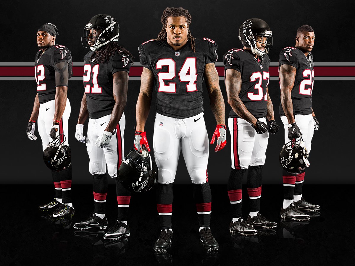
Unexpected move yesterday by the Falcons, who unveiled a set of black fauxbacks that will be worn for this Sunday’s game against the Chargers and again on Dec. 18 against the 49ers. There hadn’t been any advance notice (at least not that I’d been aware of) about this design being on the docket for Atlanta. Here’s some additional info and a photo gallery.
The uniform is a mash-up of several different elements. One thing at a time:
• The jersey and pants are based on the team’s inaugural 1966 design.
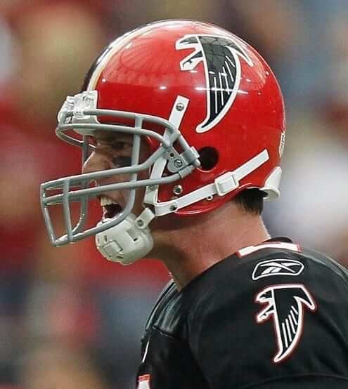
• The ’66 uniform had a red helmet, but they can’t go that route because of the NFL’s one-shell rule. So they’re going with the black helmets that were worn in the late 1990s, when the team made its only Super Bowl appearance.
• The socks are, to my knowledge, brand-new. I like them — a lot.
Overall, a very nice design — clean, sharp, and a major improvement over their current primaries.
Meanwhile, remember my piece last month about the various inconsistencies between the Falcons’ helmet logos and sleeve logos? How did they handle those elements on this uniform?”¨
First, let’s look at the uniform’s sleeve and helmet logos. Sure enough, they don’t match — the feather lines on the helmet logo connect to base of the wing, while those same lines on the sleeve patch float in space:

Okay, so we’ve established that the logos don’t match. But are they at least era-appropriate? Let’s start by comparing the fauxback helmet to the helmet worn in the late 1990s — fauxback on the left, former Falcons quarterback Chris Chandler on the right:

They got that one right. Now let’s compare the fauxback sleeve patch to a photo from 1966 — fauxback on the left, original uni on the right:
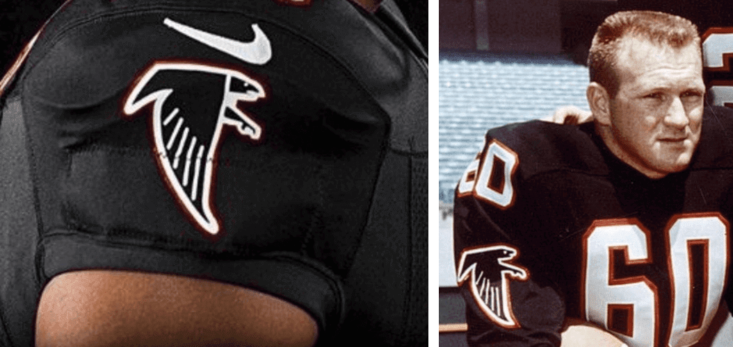
As you can see, they didn’t match this one properly. The fauxback has that vertical white line separating the falcon’s wing from the head and leg, which wasn’t present on the 1966 original.
The thing is, if they had used the proper era-appropriate sleeve patch, the sleeve and helmet logos still wouldn’t match, because the patch would have the floating feather lines while the helmet would have the wing-connected feather lines. Crazy!
But wait, there’s one more thing to consider: The Falcons wore 1966 throwbacks from 2009 through 2012 (this was prior to the one-shell rule, so they were able to do a true 1966 design with red helmets). What did the sleeve patches look like for those throwbacks? Let’s take a look:
As you can see, they used the same improper sleeve patch for those throwbacks as they’re using for the new fauxbacks. So if you like, you could say that at least they’re being consistent in their era-inappropriateness.
Slight delay: I had previously announced that my annual NBA Preview column would be running today. It has been pushed back a day. Thanks for your patience.
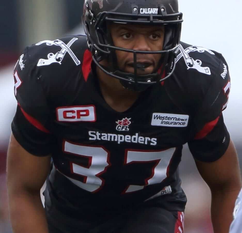
A uni-que memorial: The Calgary Stampeders of the CFL have a black alternate jersey, shown at right, that features a pair of crossed pistols on each shoulder. But now, in a very unusual uniform move, the team has announced that it will cover up the pistols for the rest of this season in memory of former defensive back Mylan Hicks, who was shot to death outside a Calgary nightclub last month.
It’s not clear if the patches will be covered up or simply taken off. Either way, I can’t think of another instance of a team removing something from its uniform as a memorial gesture, instead of adding something. Are there any similar examples I’m overlooking?
It’s also not clear whether the pistols will be restored next year. A statement from a team exec said, “Following the season, we will review all options in regards to potential changes to the design of the jersey.”
(My thanks to reader Ted Arnold for sending this one in, and to Mike Chamernik for flagging it for my attention.)
The Ticker
By Mike Chamernik

Baseball News: For the past 20 years, all World Series teams have worn the Series logo on the left side of their caps (first ones to do it were the Yankees and Braves in 1996). This year the logo will move over to the right side of the cap, because the newly added New Era logo now occupies the left side. … Looks like the Cubs’ trainer was wearing Tiger Woods’s personal logo last night (from Tm Larsen).

NFL News: The Dolphins will wear 1966 aqua throwbacks and play on a retro field on Sunday against the Bills (from Carter Mulvihill). … The Rams are in London for a game against the Giants on Sunday, so WR Brian Quick tried on some cricket gear and equipment. … An item in yesterday’s Ticker had a link in the sidebar to a 1966 AFL game that was broadcast in color. “Seeing the Broncos in their ’66 road unis with the orange helmet and sleeves was awesome enough, but the video opened with color footage of what I’m guessing was the 1966 AFL All-Star Game,” says Eric Bangeman. “Nice shots of Jack Kemp playing for the East and Lance Alworth for the West.” … Unlike Bill Belichick, 49ers coach Chip Kelly is fine with using tablets on the sidelines (from Brinke).
College Football News: Virginia Tech LB Anthony Shegog will wear the team’s No. 25 jersey tonight against Miami. A different special teams player wears the number each week to honor coach Frank Beamer, who retired before this season (from Andrew Cosentino). … Also from Andrew, the Hokies painted their on-field wordmarks for the Maroon Effect game. Here’s the endzone and ACC logo.

Hockey News: Which hockey team was the first to wear NOBs? Aside from a brief experiment by the New York Americans in 1926, NHL jerseys were NNOB until 1970, when Charles O. Finley brought nameplates to his California Golden Seals. But Kevin Vautour have found photographic evidence of the Red Wings wearing NOBs on their red jerseys during Bobby Orr’s first game on Oct. 19, 1966. According to the usually authoritative NHLuniforms.com, the Red Wings didn’t add NOBs at all until 1972, and didn’t add them to their the red unis until 1977. “The league did not mandate the NOB’s until a few years later [1977] and it may have been the only night Detroit wore this jersey because later visits to Boston this season did not feature the NOBs,” Kevin says. … And given that Orr’s first game was 50 years ago yesterday, Brian Codagnone sends in the game’s score sheet. … The Jets’ Connor Hellebuyck has a new mask design for Sunday’s Heritage Classic against the Oilers. … The Caps honored goalie Braden Holtby for last year’s NHL-record-tying 48-win season with an odd gift: a jersey with his No. 70 on the sleeves but No. 48 on the back (thanks, Stephen Krupin). … Anthem singers at Predators games wear jerseys with a musical note on the back (from Chris Howell). … North Dakota’s women’s team will wear pink on Saturday (from Patrick Thomas). … A rare set of trading cards, the complete 1971-72 Bazooka Hockey Panel collection, is up for auction (from Ted Arnold). … First and last grafs of this 1967 article discuss why Paul Andrea of the Penguins used white tape, instead of the usual black, on his stick (from Jerry Wolper).

Basketball News: The Kings launched Twitter and Instagram accounts that show photos of players’ sneakers. … New home uniforms for Marquette. Aside from the heavy Jumpman influence, I like them a lot. … New throwbacks for Louisiana-Lafayette (from Cody Junot). … The 1948 Findlay (Ohio) High School basketball team wore striped socks and matching kneepads (from Luke Schaffner). … Here’s some rare video of Charles Barkley wearing the Suns’ 1968-92 uniform. “He only wore that uni for the 1992 preseason,” says Eriq Griffith.

Grab Bag: Here’s a rundown of the best and worst road kits (or “change kits,” as they are known in the U.K.) in British soccer history (from Charlie Eldred). … The curbs will be pink at Martinsville for next weekend’s NASCAR series races (from James Gilbert). … While pink-outs at the high school level may raise breast cancer awareness, pink gear sales usually do not financially benefit any breast cancer-affiliated causes (from Tommy Turner). … An artist’s sports portraits, including a few drawn and painted large-scale classic trading card depictions, are on display at New York’s Anton Kern Gallery (from Ted Arnold). … There’s some talk about Wonder Woman needing a new outfit. … With more women entering fields like construction and welding, new companies are providing women’s workwear.
C’mon Atlanta, make these the primary. Now.
Ditto for the Dolphins and their throwbacks.
Agree on both, how do the owners/team/nike think the current Falcons & Dolphins are better then these beauties?!!! Mind boggling.
Because they’re “old” and “used”
Word.
Agreed. The idea of a black logo on a black helmet bothers me, but for whatever reason I actually like how it works for the Falcons in practice.
And with the cherry-red helmets!
If the wing lines connected to the outline on the shoulder patches, then the jerseys themselves would be straight-up late-90s throwbacks.
Only if they also eliminated the red outline on the patch. The red outline was used in the 1960s version but not the 1990s version.
I dunno, link.
Yep, link.
Interesting! I was going by this:
link
Yeah, as far as I can tell, when Deion was there, they didn’t have the outline on the black jersey, but it seems they added it by the time the Falcons made the Super Bowl. Not sure when it was added, but link.
Why not just throwback to 1990 with silver pants instead of this mishmash bullshit? C’mon Atlanta.
White numbers = better with white pants.
Sunday’s outdoor game is called the Heritage Classic. The Winter Classic is on New Years Day.
Actually, this year the Winter Classic is on January 2nd. The Centennial Classic in Toronto is on the 1st.
TOO MANY OUTDOOR GAMES.
No such thing! What there’s too many of is outdoor games with special uniforms that are better than what the team normally wears, but are never worn again.
*not enough
What they really have too many of, are different names for the same exact thing.
When I see those throwbacks to the Falcons I think back to the 1990s and Michael Vick
You do know his pro career didn’t start until 2001, right?
You know it’s possible that he meant that he thinks back to the 1990s, and also to Michael Vick, right?
(Insert comment about the proper usage of the comma here.)
Look at this fancy guy, thinking about 2 things at once!
I’ve had a shitty month. So sue me.
It’s not the NHL Winter Classic on Sunday, it’s the Heritage Classic (held every few years in Canada)
Fixed.
“The Jets’ Connor Hellebuyck has a new mask design for Sunday’s Winter Classic against the Oilers.”
Should be Heritage Classic. Also, the Jets have resisted using an alternate jersey since inception. Would be nice if they could come up with something like their 70’s version using their modern wordmark.
link
My absolute favourite Jets uniform is from that last year in the WHA. The jerseys with the shoulder yokes combined with the blue pants:
link
So basically, they are a combination of the 1966 uniforms, the 1990s uniforms, and the 1990s throwback to the 1966 uniforms, but with new socks. Also, with the added Nike logo.
And yet somehow that mishmash is worlds better than the cluttered mess they usually trot out.
Proofreading:
Looks like the Cubs’ trainer was wearing Tiger Woods’s person logo last night (from Tm Larsen).
Fixed.
Those great-looking Falcons uniforms bring back a lot of memories – especially that number 21.
The Falcons unis are great but I can’t stand the black helmet. Make these the primary and change back to the red helmet!
The black helmet is okay, but it should have a red+white stripe. But, yeah, the black jersey and red helmet was a singular look!
Interesting note from an Mlive article this morning with Glover Quin discussing NFL uniform fines. Midway through the article it says “the last time he was fined for such an infraction, it was because he was wearing too little pink for an October game a couple years back.”
Has anybody heard of this before or is this a case of a player being mistaken?
Full Article can be found here: link
The Dolphins’ retro field should be permanent. Very cool. Now if only they’d go back to the old logo…
And the old uniforms….
See I don’t like the new uniform shades, but the updated sun/dolphin logo isn’t nearly as bad.
On that close up of the Falcons’ sleeve it sure looks like there’s a rectanglular pouch sewn underneath logo (a seam runs straight through it). Anyone know what’s in there? It’s not where the GPS packs used to track players’ movements lives is it?
Those Falcons units are gorgeous! But what is the gold stripe on the original red helmet all about?
They used red as a shout-out to UGA and gold as a shout-out to GaTech.
A tribute to Georgia Tech, because the rest of the uniform was UGA colors.
*late, as usual.
ATL should go with these as their primary, including the socks.
Those socks are great.
The AFl game films were awesome. Today’s retro unis just don’t have the look from those back then. And the hits were brutal on film. Horse collars, clothesline, knee chops, etc. No wonder those players are crippled.
It’s always fun to watch old games from the 60s & 70s and count how many perfectly legal plays of the time would be 15 yard penalties and possible ejections today.
AFL
Liking the skyline socks in the Brian Quick cricket photo but I can’t make out the city. Also, odd to see all the double digits in the high school hoop photo, especially the higher numbers.
Barkley made SI cover in 1992 preseason.
link
Still their best uniform. And about the only instance where purple works outside of its “comfort zone”; that is, paired with neutrals or complements.
So Wahoo McDaniel punted for ’66 Dolphins!
link
There’s some talk about Wonder Woman needing a new outfit.
There have been many attempts to update WW’s bathing-suit costume, although none have stuck. I myself am partial to link. But then she bounced around to a link, none of which had any impact (link). Even recently we had a link, and she’s curently wearing a link.
This has also been an issue with the live-action adaptations; there was a pilot a couple years ago that tried to link. Better, but still not without link. The new film continues the link.
I think the real problem is the “eternal reset” nature of comic books. They experiment for a while and then return to the default, which for WW is a bathing suit. But then, if Batman and Superman can permanently link, maybe there’s still hope for Wonder Woman.
I think the real problem is the “eternal reset” nature of comic books. They experiment for a while and then return to the default, which for WW is a bathing suit.
Interesting concept! Applies to some part of the uni-verse as well, no? Blue Jays, Mets, etc.
Canucks. Capitals. Sabres. Bullets/Wizards. Islanders. Oilers. Astros. Penguins. Rams? Royals.
And the Orioles, with a nod to their most popular caps … and hopefully the Broncos will follow suit and put the D back on the helmets.
Everything old is new again!
In the New 52 they gave her a less revealing outfit but with Rebirth they’ve gone back to the Greek armor. They’ve touched more and more on her Greek Mythological heritage in recent years than they used to.
I’m pretty sure that Greek Wonder Woman is just Xena: Warrior Princess.
I’m pretty sure that Xena: Warrior Princess is really just Cylon #3.
All I remember about her is her wardrobe malfunction when singing the anthem in Anaheim back in the 1997 Stanley Cup Playoffs.
Back in November of 1991 a shooter killed 4 people and wounded some other people on the University of Iowa campus in their physics department. I couldn’t find any photos, but the Hawkeyes removed the logo and stripe from their helmets to honor the victims of the shootings at their game that weekend which I believe was against Ohio State.
And a few years later they did the same to honor the family of a team member that was involved in a fatal accident en route to the team’s Alamo Bowl appearance.
I was thinking the same thing with Iowa.
Also, while not a removal as a memorial, but a removal of a memorial after 11 seasons was when Jimmy Haslem got rid of the AL logo on the Browns jersey in 2013.
link
Even without the single best element of the 1966 throwbacks, which is the gorgeous red helmet, the Falcons fauxbacks are still really easy on the eyes. Love the socks. Just go back to the 1966 look already. Ditto Dolphins.
Go to these full-time, Falcons. The logo is so much stronger than the current one, and the white pants are a winner. Do it do it do it.
The “crossed guns” logo has always been a bit of an embarrassment to the Stampeders. Its not like its a beloved old logo with a lot of history and I don’t think the team minds removing it.
link
link
My uniform wish for the Stampeders is to go back to this. Just the traditional red and white:
link
Don’t think there is any need for any black at all for the Stampeders; for the CFL I’ll always associate red & black with Ottawa. The red & white is a great look for Calgary.
But saying that for some reason I’ve always had a bit of a soft spot for the grey pants for the Stampeders.
link
link
I remember in the early ’70s, teams playing on NBC’s NHL Sunday game of the week had nameplates added. Also, I had a bunch of those Bazooka hockey cards, and the Phil Esposito card was my favorite because he’s wearing his Haggars.
Several of the Bruins were shown wearing street pants in that set; they just threw on a jersey and posed with gloves and a stick. You’ll notice too that the gloves all had the same number, they just used one pair of gloves for each player to pose with
-Jet
One thing I will give Nike kudos on (which most of you are bound to disagree with me on) is that their “cutting edge” stitching and uniform templates (vapor untouchable/ elite 51) and their use of colors make throwback uniforms look incredible and not outdated. They give the throwbacks or the more traditional uniforms like the Steelers and Cowboys a modern and sleek look while maintaining uniform tradition. I don’t like the mesh Reebok template the Packers, Falcons, and Panthers still use. It looks cheap compared to other uniforms. The Dolphins and Cowboys’ (when they could still wear them) throwbacks are prime examples of how amazing classic uniform templates can look when given the Nike treatment. Hopefully most NFL teams will switch to the vapor templates next season, you can tell a big difference with the color rush uniforms compared to the elite 51 uniforms. The vapor uni’s seem to be much higher quality and are one solid fabric while still looking clean and modern. Makes a big difference aesthetically.
Its amazing what a proper number font can do for a uniform. Good job Falcons. ( and my sincere apologies Paul)
Fascinating find with that Redwings NOB. Thought for sure my Seals were the first.
-Jet
In looking at that video of the Broncos-Dolphins game (loved the stand-up sideline 10 yard markers), I stumbled on the following video, which not only shows Gale Sayers and Brian Piccolo in action, but at around the 11 minute mark shows how a corner of one of the end zones at Wrigley field was truncated. There also appears to be a further cut-out in that endzone to create part of an area for photographers!
link
Warmed my heart to see these Falcons throwbacks. Personally I prefer the black helmet over the red one as it brings back memories of the Glanville era when he made the Falcons relevant again (remember the game where the Falcons beat up on the Oilers 47-27?) BTW not a Falcons fan but that 1990 team were fun to watch, run and shoot offense with a physical defense and some great personalities – Deion, Andre Rison, Tim McKyer.
I defy anyone to tell me that the Dolphins throwbacks, Falcons back in black uni’s, Broncos color rush jerseys (throw in white pants and you’ve got yourself a fine looking uniform there) aren’t better than the current get ups. I’m not a fan of too many panels on jerseys (eg Falcons clown sleeves, Bengals side panels) and the novelty fonts on many NFL jerseys are a big turn off as is the dreaded unitard look.