It'll be like looking in a mirror for Oregon on Saturday.
(via @GoDucks) pic.twitter.com/RFCgg3V1i7
— ESPN (@espn) September 23, 2016
The Oregon Ducks will be a little more duck-like for tomorrow’s game against Colorado, as they’ll be wearing orange facemasks, socks, and cleats, mimicking the orange elements of a duck — or at least the orange elements of their own duck mascot, as seen in the hilarious animation above. There are lots of additional photos on this excellent page, which tells the full backstory of Oregon’s relationship with duck-themed iconography. Strongly recommended.
I kinda love this — the uniform, the animation, the backstory, all of it. In an era when every just about every team identity is based on being ferocious and intimidating, and when every uniform “story” is based on some fairy tale of valor, honor, courage, blah-blah-blah, it’s pretty cool to see Nikegon daring to be silly. Good for them! And hey, it’s a good-looking uniform.
I’ve heard a few people say, “Orange isn’t even an Oregon team color!” True, but that train left the station years ago. Ditto for the complaint that orange is an Oregon State color. Way back in 2006, Nike exec Tinker Hatfield told me that Oregon would never have a black helmet “out of respect for Oregon State, because they have black helmets.” Well, we all know how that one turned out. Look, Nikegon’s gonna do what Nikegon’s gonna do. The only remaining issue is whether their weekly experiment looks good. I think this one does.
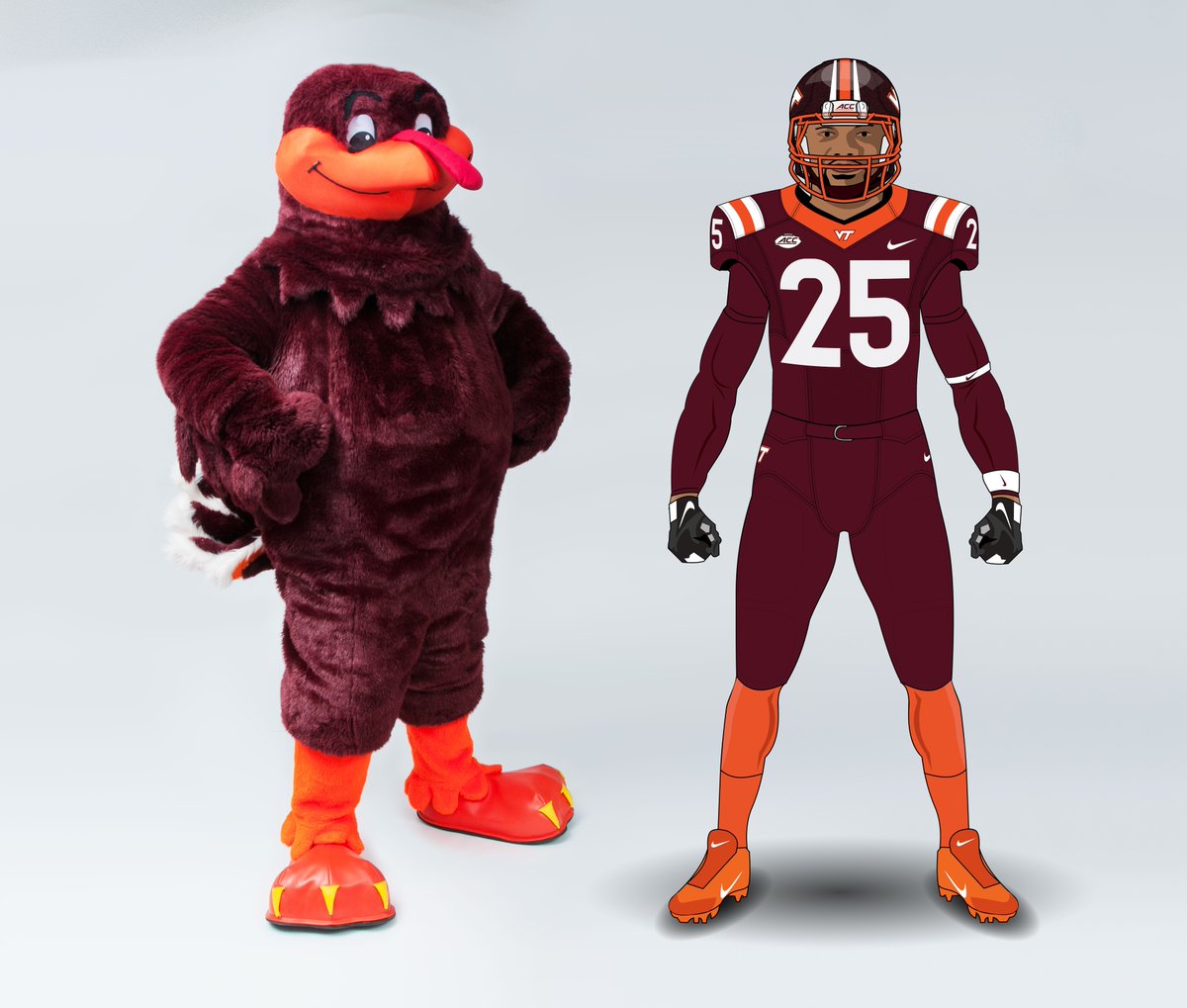
Meanwhile, reader Clark Ruhland figures Virginia Tech could do something similar based on its Hokie Bird mascot:
And that in turn led reader @Interpolyester to propose a Steelers version based on Steely McBeam:

And so on.
Click to enlarge
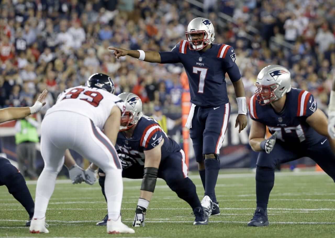
Color Rash, continued: Last night’s Color Rash game featured the white-clad Texans (a look they’ve worn many, many times, except it usually includes blue-topped socks), playing the solid-blue Patriots (who would’ve looked a lot better without that thick striping on the pants; in fact, their standard road pants would’ve been a better choice).
I heard from a lot of people who said, more or less, “The Pats should use this jersey full-time, with white pants!” Me, I’m not quite as enthusiastic. I love UCLA stripes as much as the next guy — maybe more — but I love them a lot more when they wrap farther down than the Pats’ stripes did last night. (There’s also the issue of these jerseys not having TV numbers. I don’t necessarily have a problem with that, but I doubt the NFL would allow it on a full-time basis.) But if someone with Photoshop skills wants to show us how this jersey would look with white pants — or with the team’s current silver pants, for that matter — I’d happily take a look.

Click to enlarge
Friday Flashback: With all the fuss over Color Rash, my latest Friday Flashback column on ESPN looks at the history of NFL teams wearing mono-colored uniforms (including the many teams that went mono in 2002, some of which are shown above). Check it out here.
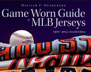
Special discount offer: I’ve said this many time before, but it bears repeating: Bill Henderson’s Game Worn Guide to MLB Jerseys is absolutely essential for anyone who cares above the history of baseball uniforms over the past 45 years. I find myself using it on a near-daily basis, and you’ll probably find it useful too (even if you don’t write about uniforms for a living like I do).
The current edition of Bill’s guide, which covers every MLB game jersey and BP jersey from 1970 through 2015 (and also includes coverage of prototypes, uni mysteries, typefaces, and more) is a bargain at its regular price of $40. But it’s an absolute steal with the discount he’s offering to Uni Watch readers today: Use the code purple200 at checkout (that Bill, what a card…) and you’ll get one-third off. Or you can use that same code to get the guide for your favorite team for one-third off the usual single-team price of $10. And because all of this is available as downloadable PDFs, you’ll be able to dive in as soon as you make your purchase. It’s the best thing you’ll buy today — trust me.
And just for the record: Bill did not pay anything for this plug. We were back-and-forthing last night about some uni-historical matters, and he said, “Hey, how about if I offer your readers a discount,” and I said sure, because I love Bill and love his jersey guide even more. You’ll love it too.
Click to enlarge
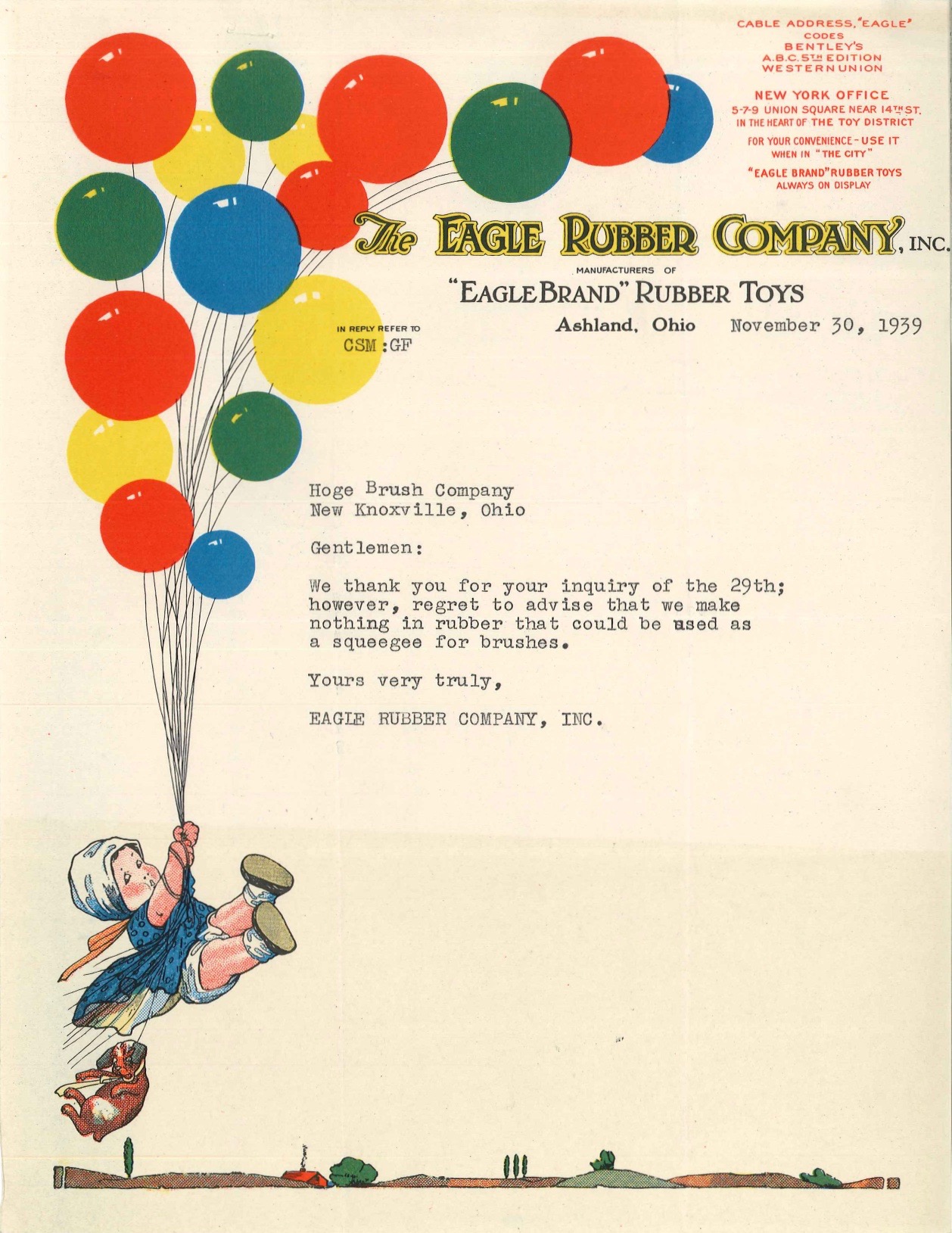
PermaRec update: It’s been ages since I took a dip into the files of the Hoge Brush Company, but I have a new entry today, and it’s a really interesting one, especially if you care about balloons, squeegees, north-central Ohio’s rubber industry, or spectacular letterhead designs like the one shown above. Get the full story here.
The Ticker
By Paul

’Skins Watch: More than 140 schools in California still use team names and/or mascots based on Native American imagery, but there’s increasing pressure on them to stop. … The upstate New York town of Whitesboro, whose official seal drew criticism earlier this year because it appears to show a white man choking a Native American, is now considering a replacement logo.

Baseball News: Yesterday I mentioned that I had once described New Era as a “milliner” and explained how that wasn’t really accurate, because a milliner is, technically speaking, a maker/seller of women’s hats. But KM Pro Cap apparently had no problem with that — they once described themselves as “Milliner to the Majors” (big thanks to Gary Olson). … Eric Trager notes that the Mets are selling No. 15 Tebow jerseys, even though that’s Matt Reynolds’s number. … The Braves gave a jersey to golfer Nick Faldo, with a “Sir Nick” NOB. “I believe this was brought about by the Braves’ recent signing of a multi-year partnership with sports manufacturer Mizuno,” says Patrick O’Neill. … Tigers 2B Andrew Romine’s batting helmet logo was MIA yesterday. … Lots of Blue Jays fans came over from Toronto for a series against the Mariners in Seattle, so an enterprising M’s fan decided to tweak them with a hilarious series of homemade signs. … This is pretty awesome: The Orioles’ farewell gift to Big Papi is what’s left of the dugout phone he beat to a pulp three seasons ago. Brilliant (from Andrew Cosentino).

NFL News: Interesting article on why the Titans aren’t wearing captaincy patches (from Wade Harder). … No photo or video, but Mark Gonillo says he spotted Bears QB Jay Cutler wearing a ’47 cap prior to last Monday night’s game against the Eagles. “A Bears staffer (wearing a New Era cap) approached him and seemed to be addressing the fact that he was wearing a ’47 cap on the field,” says Mark. “I’m not a lip reader, but he seemed to be motioning to the ’47 logo creep on the hat. Could he have been telling him that the ’47 cap wasn’t permitted on the field?” … We’ve heard about fans burning the jerseys of NFL players who’ve protested the national anthem. But according to this report, a man carrying a megaphone during Wednesday night’s civic unrest in Charlotte demanded that people burn Panthers QB Cam Newton’s jersey if he doesn’t protest the anthem this Sunday. … Meanwhile, Time magazine has put 49ers QB Colin Kaepernick on the cover of their latest issue. I was surprised to see the Nike logo creep on the crew sock, but it turns out that that’s what he’s been wearing on gameday. … A man who stole a Broncos helmet from the team’s practice facility nearly two months ago has been identified and summonsed. … This is odd: Dolphins S Michael Thomas appears to have cut holes in the backs of his socks, or tights, or whatever hosiery he’s wearing (from @willchitty4). … A Red Robin outlet in Portland, Ore., uses Seahawks-style 12th man toothpick flags. … Miami Marlins 2B Dee Gordon visited Dolphins camp yesterday and swapped jerseys with Jarvis Landry (thanks, Mike).
College and High School Football News: Michigan coach Jim Harbaugh was wearing cleats prior to last weekend’s game against Colorado (from Nick Curley). … Here are this week’s uni combos for Northwestern and Columbia. … Here’s Arizona State’s record since the most recent redesign, broken down by helmet and uni combo (from @JediASU). … Reprinted from yesterday evening’s comments: I had mentioned in yesterday’s lede that Texas A&M’s new 1956 throwbacks included a “9-0” patch, which seemed odd, because the ’56 team actually went 9-0-1. Turns out they’ve updated the patch (from Bill Banowsky). … Color Rash terminology has trickled down to the college level. Greeeaaaaaat. … Oak Ridge High School in California has an interesting battle axe-themed helmet design. The team is called the Trojans (from John Alexander). … Former Michigan State P Mike Sadler, who was killed in a car accident, is being honored at Spartan Stadium by having his No. 3 added to the midfield logo for Saturday’s game against Wisconsin. further info here.

Hockey News: Here’s a good view of how the Penguins’ 50th-anniversary logo will be worn as a patch (from Brian Cox). … Speaking of the Penguins, they’re selling a 50th-anniversary T-shirt. Could that be the basis for a heretofore-unseen anniversary jersey? … The pucks at Rangers games this season will feature the team’s 90th-anniversary logo (thanks, Mike). … New uniforms for Utah (from Matt Komma). … Great catch by Mike Engle, who noticed that the Canadiens have changed the ear loops and chinstraps on their home helmets from black to white. “Count me as a fan,” says Mike. Me, too.

NBA News: New 50th-anniversary patch this season for the Rockets. Here’s a video game shot that shows how it looks in context (from Ivor van Esch and @HitTheGlass, respectively). … New sponsorship advertising logo apparently in the works for the Spurs’ court.

College Hoops News: New uniforms for Fairfield (from Scott Criscuolo). … Holy moly, look at TCU’s mismatched jersey/shorts combo in this old photo (big thanks to Jim Vilk). … New uniforms for UMass (from Brian Sullivan). … New red uniforms for Mississippi (from Chris Buttgen).

Soccer News: There’s a new British documentary about the replica soccer kit company Admiral (from Mark Emge). … Here’s a ranking of MLS team logos (from Jon Hollomon). … FC Dallas is establishing a new tradition for players who wear No. 19 (from Jim Collier).

Grab Bag: Formula E auto racing is coming to Brooklyn. I’m not buying tickets just yet, but I’ll admit to being intrigued. … New logo for Disney’s DuckTales. … New alternate rugby kit for Ireland. “Ball gag not included,” says Eric Bangeman. … ISIS has prohibited civilians from wearing T-shirts with certain logos, including Nike’s and Adidas’s (from @seekarete). … Nike will no longer make golf clubs or other golf equipment but will still make golf apparel.
Proofreading: “This pretty awesome:”
Fixed.
Browns have had captain patches in the past, all the way back to 2007.
link
link
link
Thanks. I’ll remove that item from the Ticker.
To be fair, I couldn’t find any examples of them wearing the patch on the new uniforms last year.
Not that this is a departure from the usual philosophy of Nike and Oregon, but I feel like Oregon’s orange shoes are just an even more blatant excuse to sell orange shoes.
I’m sorry, but I don’t buy it’s a tie to a real-life duck, cartoon duck, or whatever bullshit Nike and Oregon are trotting out. At least with some of their usual fictional bullshit, you can see a connection if you suspend your thoughts of reality (such as LSU wore these uniforms in the 1940s, even though the sleeves were longer and we were in the leather helmet era).
Given that football cleats aren’t fashion wear by any stretch, I doubt they’ll be selling a ton of those particular shoes, assuming they put that particular model to retail at all. Nevertheless, it’s not like they’d need an excuse to sell orange shoes (or shoes of any color) anyway.
Hi Rich. They are not trying to look like a real duck (they did that 10 years ago with the mallard head green color shifting helmets) This uniform is meant to look like the mascot, and that animated gif does a great job of comparing back to back the mascot the player and I personally think they did a darn good job with the colors and positioning of elements to evoke “The Duck” with its orange legs, white “drumsticks”, green sailors jersey, and orange “bill” Will this make them win-probably not if you look back at last year’s most special uniforms, but at least they re going for school colors.
link
“The Orioles’ farewell gift to Big Papi is what’s left of the dugout phone he beat to a pulp three seasons ago.”
Should have also handed him a bill for it and a steroid syringe or an HGH container.
eh, I have smashed tennis racquets on the court and i am not on any steroids.
And I’m sure you didn’t test positive for them either.
Proofreading: “Former Michigan State P Mike Stadler”
It’s “Sadler.”
Fixed.
Re: Patriots with silver pants – Here’s the quick & dirty 30 second version. I think it works. At least, it’s not really any worse than the current uniform, IMO.
link
Agreed. Thanks!
It’s a much improved look over their current set. I think white pants and helmet would work also, but since the rest of the division already has white helmets maybe stick to the silver.
Will be interesting to see if any team ends up adopting a color rush jersey as their regular jersey down the road.
I’m loving those Pats jerseys with the photoshopped silver pants. They need to make that jersey permanent! Maybe replaced the Elvis logo with TV numbers; but a HUGE improvement over the paneled, pipinged mess they wear now.
As a Cowboys fan I pray every night that the Cowboys will adopt their color rush jersey (formerly known as the double star jersey) as the full time uniform with actual silver pants and navy and silver striped socks. I played with this combination in Madden and it looks phenomenal. Keep the blue jersey as the rarely worn color jersey (I actually like that the Cowboys’ various jerseys are all different designs instead of just inverted versions of the same jersey), and take the current home uni set with royal blue and green pants and make it the throwback since it can be worn with the normal helmet.
And good work to The Jeff on this. The silver pants in that image look good as well.
The Patriots red stripes on the jerseys are thicker than the ones on the pants.
It looked like the Patriots were wearing the Texans navy pants.
link
I’d say that’s easily better than their current uniform.
Uni-Watch readers are eagle-eyed, no doubt, but Mike Engle catching the ear loops and chinstraps on the Canadiens helmets is up there with the best of them. Awesome.
I just can’t believe I didn’t notice it earlier!
Well, going by the link, the Habs had been wearing black straps with the blue helmets since the 2000-01 season.
I could have caught it earlier because my source image is dated 7/14/2016, from Alex Galchenyuk’s Instagram. He was at a gathering with Bauer endorsers in the NHL and had the new equipment change. That’s more than two months of me asleep at the wheel, though to be fair I’m not a huge Instagrammer.
The link to the story ranking MLS logos reads “MLB Logos.”
Fixed.
Jim Harbaugh wears cleats during every game. Here he is last year in Michigan’s game against Oregon State:
link
Evidently, it’s because he tried to break up a fight when he was coach of the 49ers, and couldn’t get any traction.
link
My apologies if this has been covered already. Does mono chromatic mean same color tops and pants? I figured it meant one color head to to, or is that what makes color rush different?
It means same-colored jerseys and pants. Or at least that’s what it means to me.
On here, monochrome almost always refers to simply same color jerseys & pants. The difference between normal monochrome uniforms and the color flush uniforms is the socks and shoes being the same color as the pants as well, and the lack of the league mandated lower white socks. Also, as it was originally pitched, the games would be color vs color. Sadly, we only get 2 color vs color games, and a bunch of stupid things like the Packers wearing mono-white instead of freakin yellow.
I’ve always used “monochrome” to describe using the same color for uniform elements that are right next to each other.
If that’s not correct, then we need a specific term for the ugly combination of link.
We’ve had a term for that phenomenon for many years now: the dreaded leotard effect.
To me, monochrome meant teams with one team color (Colts, Jets, Red Wings, Maple Leafs).
I really think it’s an underrated look, although teams trying to look retro use it.
According to Wikipedia, a milliner designs, sells, or makes hats, although some definitions limit the term to women’s hats. link
Perhaps “hatter” would be the more gender-neutral term, but it seems that milliner isn’t used exclusively for women’s hats by everyone. I found it interesting that the term “milliner” probably comes from “Milan”, a city known for fashion and clothing.
Wikipedia is good for information, especially when it provides source citations. But for definitions, I’ll take Miriam-Webster:
link
I’m an OED man, myself.
Originally: a seller of fancy wares, accessories, and articles of (female) apparel, esp. such as were originally made in Milan. Subsequently: spec. a person who designs, makes, or sells women’s hats.
Fair enough.
Milan was for a time, the hat capitol of new europe, this occurred because europeans had forgotten the process for making felt – see dark ages.
The finest felt in the world at that time was coming from the Ottoman turks, who really knew how to make a hat (turban or what have you), and the trading cities that fueled the renaissance reintroduced felt to Europe.
So if you wanted a high quality felt hat, for a time you had to purchase it from the Milanese traders… or Milliners.
If they were really going for full Puddles, I think they could’ve gone further and made the back name plate look like the kerchief hanging over the back.
That being said, in the context of Oregon’s many past “versions” of the uniform, this one is not so bad. I at least would know from just glancing at the field that they were Oregon. Too often I find them unidentifiable without close inspection (which I think goes against one of the purposes of a “uniform”, but I digress)
Yeah, as a former Oregon student who occassionally checks in on his alma mater, I’d take these any day over black or Volt or whatever the trendy color of the day is.
like the old sports bra jerseys Nike had Oregon State wear about 10 years ago?
Regarding the Pats jerseys last night and the lack of TV numbers. Seems that at one time it may have made sense to have them when networks used fewer cameras and perhaps it was a way to figure out who was involved in a play. But with today’s coverage it’s no longer an issue. The fact that teams are occasionally permitted to not use them (and they are optional for college) seems to point to the fact they have more aesthetic value than function. The league was even ok with the Niners wearing their TV number free throwback for a good part of the ’94 season – including the Super Bowl.
Am I missing a reason there’s a need for the TV number to continue to exist? Not saying I don’t love them — the TV number has always been a distinguishing element of a pro jersey. But do they serve any real value?
Am I missing a reason there’s a need for the TV number to continue to exist?
Yes — spotters:
link
Tried to get to the link but am getting an error message.
Disregard Paul, I searched the web and found it.
I’d still argue that they seem to make due just fine without them. But of course I’m not a spotter.
They absolutely do. It’s just more frustrating and can make announcers look bad… which… they often do anyway. So… yeah, TV numbers aren’t a necessity. Personally, I’d take a uniform with proper sleeve/shoulder striping and no TV number and the increased risk of bad commentary over ugly truncated stripes any day. Half the time I watch games muted while I’m doing other things anyway. The league can always go back and rewatch the games if there’s any issues with accurate player stats anyway.
Are numbers on the lower sleeve still considered TV numbers, or just those on the shoulders? I ask because several teams do the sleeve numbers. The Cowboys double star/color rush jersey is an example, as are the Jets I believe.
Yes, sleeve numbers are considered TV numbers. For that matter, so are numbers on the side of the helmet, like Alabama’s.
You know, someone who’s actually attending the game. If my seats are on the 30 and the line of scrimmage is within 10 yards of it, I need the TV numbers to see who’s who.
Evolution of the football uniform. With the shorter and tighter sleeves now, there is not much room anymore to have stripes, a logo, and TV numbers at the same time on the jersey. The numbers sometimes have been getting smaller, like the Indianapolis Colts.
Our pro league up north here has followed the trend similar to those Patriots jerseys last night.
All CFL teams have had TV numbers on their jerseys since the practice of putting them on started decades ago.
Much to my surprise, with the switch to Adidas cut uniforms this year and each team doing at least a minor redesign, 4 of the 9 teams now do not wear TV numbers on their regular home and away uniforms.
A few teams have their logos appear on the point of the shoulder with this Adidas cut. Some striping and a logo. 2 out of 3 ain’t bad.
The Friday Flashback is up:
link
The Browns played in all four seasons of the AAFC, not three as stated in the article (and won all four championships).
Duh. Guess who can’t count!
I’ll get my editor to fix it.
Also, the link at the bottom of the article to the additional 13 NFL teams comes up with a 403 Forbidden page.
Getting that fixed as well.
I feel that the 1996 Baltimore Ravens should probably get a mention of some sort. I know it wasn’t actually monochrome, but their purple & black was the first dark over dark NFL uniform in the modern era, and likely influenced the monochrome storm that followed.
That was a terrible look too.
Terribly awesome, you mean.
I think the Pats’ pants would’ve been fine if the stripes had matched the UCLA stripes on their jerseys, with the red and white in equal thickness.
Speaking of the UCLA stripes, it’d be nice if Nike could do for the pro teams using them what they do for LSU (sometimes), and extend them down at least to the armholes.
To be fair, most of the Blue Jays fans in Seattle are not from Toronto, but are from Vancouver, British Columbia and southwest Canada.
You’re correct. I think in the past they’ve tried to do the Toronto series on a weekend to make it easier for road tripping fans but not this year.
And nobody calls it Southwest Canada. Not a thing.
But he didn’t call it Southwest Canada, as if it was a thing. He referred to southwest (lowercase s) Canada, as a descriptor of an area. The word southwest has a meaning which describes the area he was referring to. You can use directional words without it being a thing.
Formula E
You don’t have to buy tickets, you can get a media pass.
The series is really cool and the cara are faster than what one would think.
Formula E is so freaking weird… the cars sound like vacuum cleaners…
On the ESPN article, I’m not sure if you can find photos to verify this (I couldn’t on Google), but I think the Saints may have worn all black three times in 2001. They wore white at home until the last two home games of the year (49ers and Redskins) and the 49ers game would have been the third game you didn’t mention.
The Saints wore black pants with their white jerseys in 2001 so I think the reason they went mono-black is that they didn’t have gold pants that season.
My biggest issue with Color Rash v Monochrome is the socks. Monochrome can look good, because the socks add a pop of different. In the Color Rash, the socks are the same color. If they allowed different socks, I would be way more on board.
I know it’s been going on for a while and I know it’s here to stay, but to me the mono-color look still seems wrong for the NFL; it still strikes me as very Division III/high school. (My HS wore mono-maroon the whole time I was there, from 1984-’87, although we switched to white helmets my senior year.)
It’s amazing how what works so well in football — contrasting jersey and pants, contrasting sleeves — can be so wrong for baseball (softball tops and sleeveless vests, respectively).
I remember that in high school, we only had one pair of pants – grey. That way they went with both the color jersey and the white away jersey.
Grey pants would have looked great with my HS uniform; grey was a trim color. Maroon, white and grey is a nice combo.
Wow, Bill Henderson. Your generosity today is incredible! I’ve always wanted a copy of your expertise and I can’t wait to dive in! Wish the Expos had more entries post 2004 but that is not your fault at all! :-P
I am not taking sides on the debate, but it undercuts the argument when the graphic includes outdated logos (e.g Oakland’s McClymonds HS) or lumps in schools who use the nickname Warriors, but without Aboriginal iconography.
Agreed. Warriors, to me, is as objectionable as having a team called the Pilots or Sailors, if less original.
Big, big props to Dallas FC for giving out the number of a previous great to a young player who admires him rather than retiring it. I wish more teams — in all sports — would do this.
I’m in favor of more teams having “honored numbers” but still in circulation, while saving retired numbers for the most special of circumstances, much like how the Toronto Maple Leafs do it. In fact, that may be one of the few things the Leafs have gotten right since their last Cup win.
Holy shit, that Whitesboro town logo is insane! The counter argument seems to be that it’s based on a historical wrestling match between the townsfolk and the Oneida people, but my quick research shows that the logo was changed back in the 70’s to be less strangle-y and more wrestle-y. Can’t see why you can’t just make them grapple each other or something.
IMHO this Color Rush just doesn’t work when a team wears white. Just do it when you can have enough contrast to have both teams wear a COLOR. Agree about the abbreviated shoulder stripe on the Pat’s uniform. I noticed ucla has gone back to longer stripes this year after many years of Adidas screwing up their uniforms. Should be interesting what UA does with these next season. I expect some awful alternates.
-I like the idea behind the Oregon uniform. Like Paul said, there’s a fun element to it that’s missing in a vast majority of uniform jargon.
-I thought the Pats looked really good last night. Better than I ever expected. I think those jerseys with silver pants would (at the very least) make a good alternate.
New uniforms for Fairfield (from Scott Criscuolo).
WOW. Talk about no frills. I’d ask for my money back.
When I think of Puddles, I think of . . .
link
Hopefully Nike can institute just an “Alternate” uniform program so they aren’t stuck to the leotard theme. They’d still get their beloved revenue and the fans would get something fresh but I think the creative possibilities would be opened up. Maybe we could finally see the Texans wear the red jerseys with blue pants, Cowboys wear actual silver pants with white jerseys, etc.
Also, after seeing it on the Bills and Pats, I can officially say that the “Vapor Untouchable” Nike uniforms (dumbass name aside) look fantastic. Really like the collar area with the shield and the way the jersey has less seams and less mesh than the elite 51 versions. I was a fan of the flywire collars but like they new “triangle thing” where the shield is placed too. Really hope the Panthers and Falcons update to the new template, their uniforms look cheap and outdated with that old Reebok template.
In regard to the “UCLA stripe”, which the Uni-watch world I think is in general agreement, should wrap around, it’s ironic, that the only prominent uniform today (based on my recollection), that it actually does, is the Carolina Panthers, which unfortunately is a relatively blah looking uniform
Saw the Utes (club hockey) new jersey, the Montreal Canadiens trend is finally upon us.
As a uni-watch topic, have you ever thought of doing a high level overview of club hockey uniforms. Most of the prominent schools in the US, at least have a club team.
Ole Miss has UCLA stripes that just about loop all the way around the shoulders.
I thought the striping on the Pats’ pants was fine last night, matching however unevenly, the jersey’s UCLA stripes. Their standard navy pants would not have worked last night. It would have been nice to see some white socks on the Pats. “Color Rush” to me means matching jersey and pants.
I also liked the stripes on the Patriots’ pants. Wide stripes on the pants of a monochromatic uni always make the look somewhat bearable. Leotards are never a good look.
Am I the only one who looked at the white Massachusettes hoops uni and thought, “Why are the numbers bleeding?”
Hopefully it’s just the way it’s folded, and that effect won’t actually make it to the floor.
Another way to look at the Henderson MLB uni guide: After the discount, it’s only 0.9 cents a page (3,005 pages total). It’s a ton of content!
Look, I don’t mind a pants stripe down the side, but for heavens sake, PLEASE make it match the stripe pattern of the jersey! – Yeah, I’m looking square at YOU New England Patriots. The jerseys were soild, but the pants not so much. The stripes didn’t match! This isn’t rocket science.
SOLID, not soild… heck, maybe they were soiled too. LOL
Thanks for the discount to Bill Henderson’s uniform guide. Love it!
Speaking of monochromatic looks, I have long wished that the Browns would wear an all-white helmet with the white jerseys and white pants as their throwback look in tribute to their AAFC championship teams. It could also be their color rush uniform. Alas, now it will never happen. I hate you, one helmet/shell rule.
Paul,
I love all of your ancillary projects, but especially PermaRec. I really love The Hoge Brush Company Files because, since it’s not a regular feature, it seems like a special treat when I scroll down and see an update.
The gorgeous letterhead with the balloons, the history of the rubber industry in Ohio – it’s all great stuff. And of course, the flowery salutations. “Very truly yours” seems like such an odd phrase to me. Now I’m compelled to try to find the original of it.
I second this. I reaaly enjoy seeing the Hoge Brush letters.
ESPN has a feature today where they give the Oregon treatment to several classic college football uniforms. link
One of the designers is Ryan Foose, who I recognize from the Lewis and Clark baseball uniform design competition.
Jim wearing Air Jordan VII cleats, nice!!