Icing on the 1st place cake. pic.twitter.com/UNhG8lWtqB
— Boston Red Sox (@RedSox) September 8, 2016
Fun game last night in San Diego, as the Padres celebrated the 80th anniversary of the old Pacific Coast League Padres by wearing 1936 throwbacks. Last night’s visiting squad, the Red Sox, also wore ’36 throwbacks, creating a weird mix of major and minor league looks. You can get good looks at both uniforms in the video shown above. (Update: Commenter Ryan H. informs me that the PCL Padres were actually a Sox farm club in 1936, so there’s a throwback connection!)
Here’s a closer look at the Padres design (for all of today’s photos, you can click to enlarge):
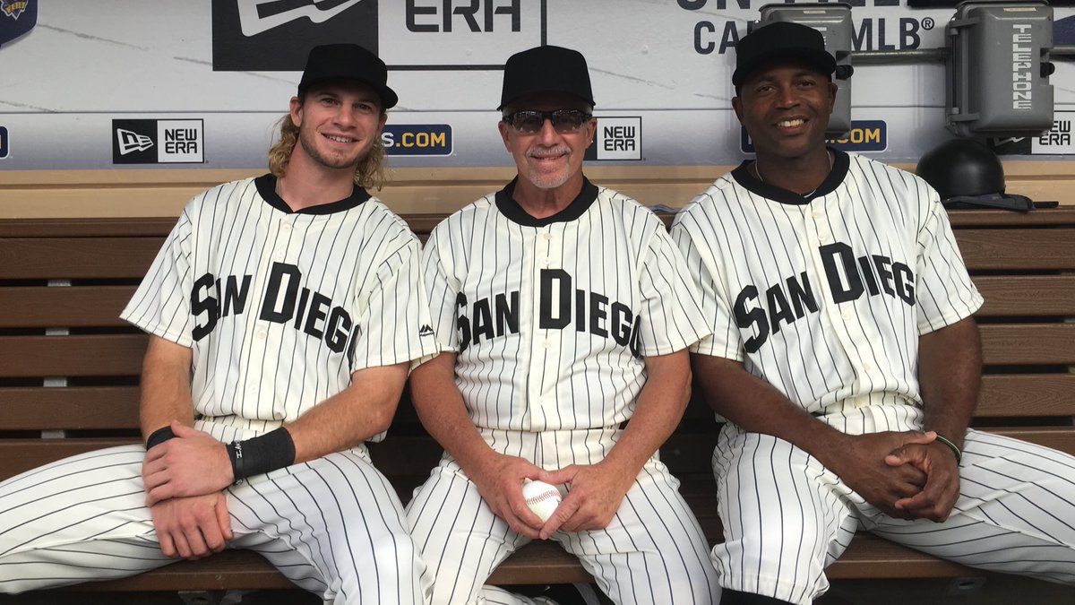
The Padres wore this same throwback design in 2011. As you can see in that link, they had striped red/white/blue socks for that game; this time they just went with solid black (and most of the players went low-cuffed anyway). On the plus side, this time they had blank matte black helmets to match the blank black caps:
Matte black helmets tonight 🔥 pic.twitter.com/J5pnujN6Q9
— San Diego Padres (@Padres) September 7, 2016
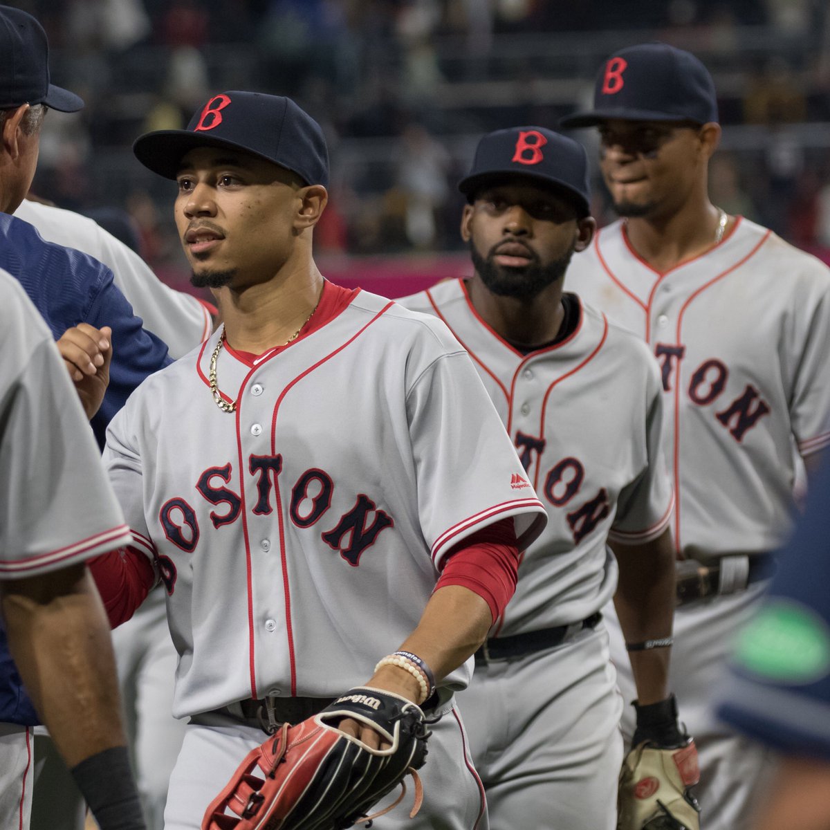
If you’re thinking that the Sox design isn’t all that different from their current road uni, you’re right! Here’s a closer look:
A few Red Sox players showed off some very nice striped hose, which occasioned some broadcast chatter and looked particularly good when the players did their little postgame victory dance:
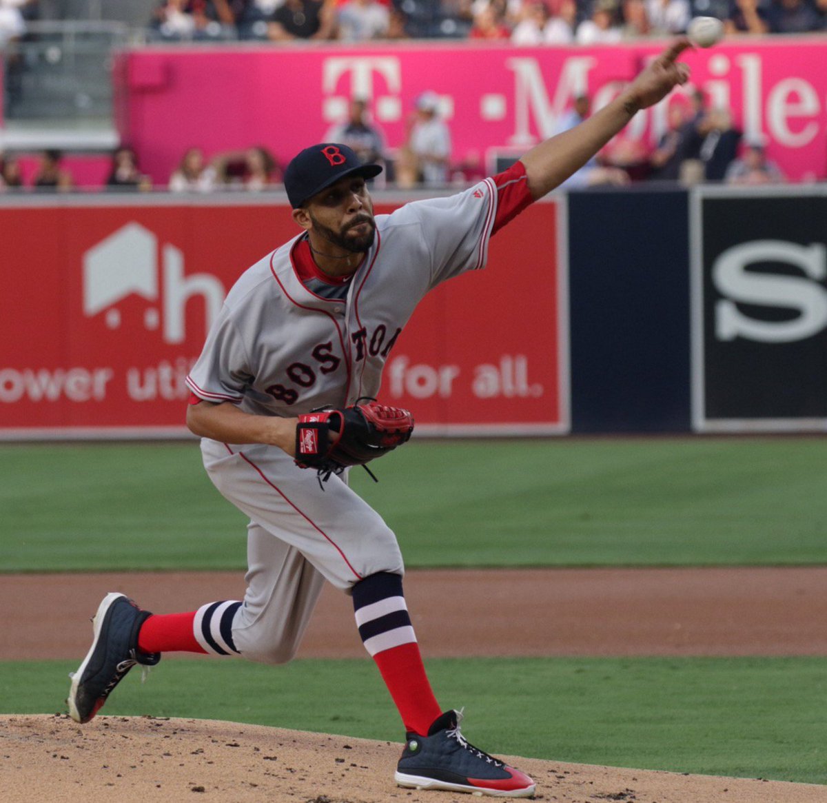
@UniWatch pic.twitter.com/t2rk9UajEO
— Chris Fairchild (@cw_Fairchild) September 8, 2016
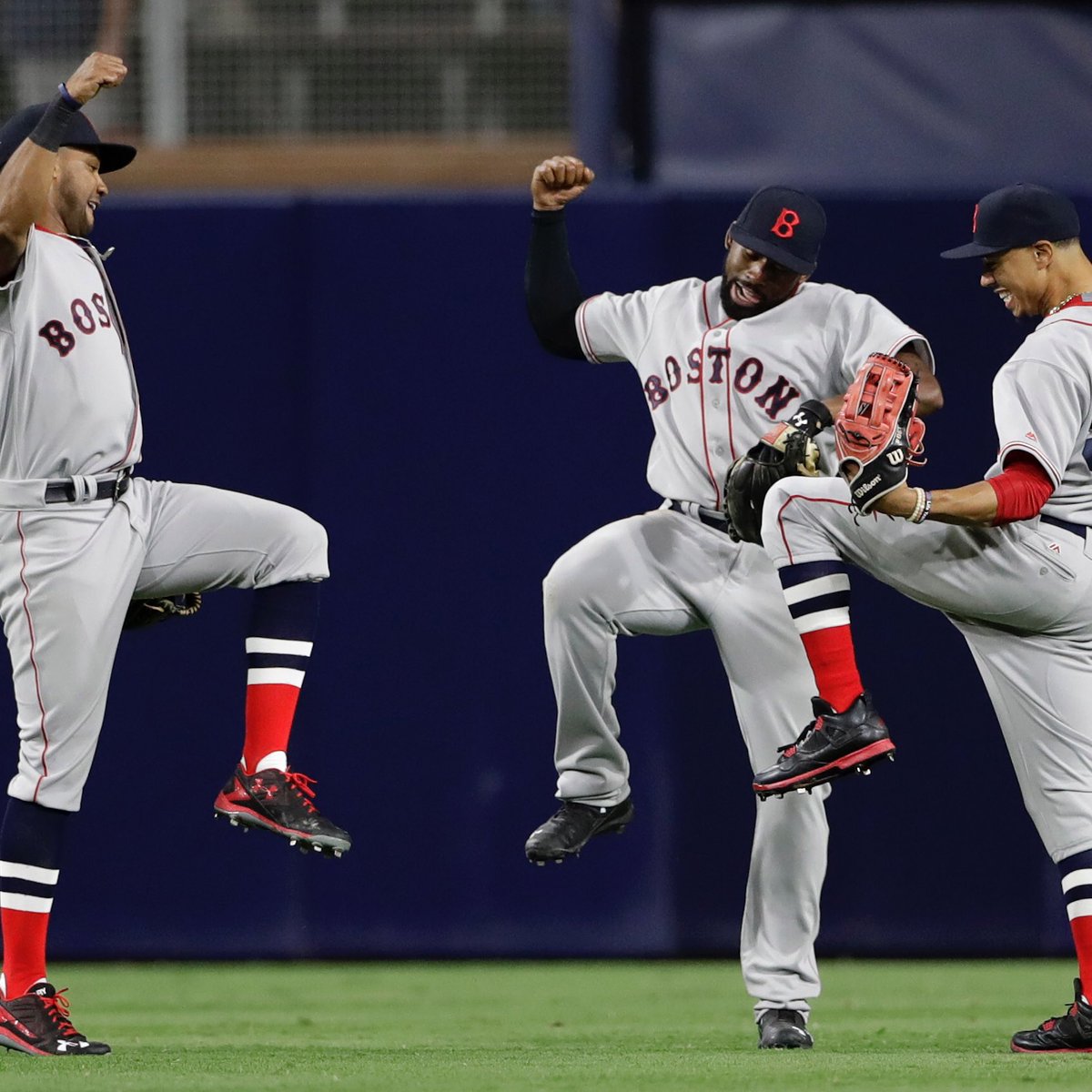
In a welcome development, it was nice to see that the MLB logo wasn’t used on these throwbacks:

Another nice touch: All the scoreboard graphics and video were in black-and-white.
@UniWatch Plus the scoreboard and replays were in black and white pic.twitter.com/Win5n1augL
— Willie Price (@williep1414) September 8, 2016
And here’s an oddity: During BP, assorted Sox personnel were wearing a mix of BP caps, regular game caps, and throwback caps.

(My thanks to Chris Fairchild and Jared Sloan for their contributions to this section.)
And a taco truck on every corner: Hispanic Heritage Month technically runs from Sept. 15 to Oct. 15, but MLB isn’t waiting. They’ve initiated a program called “PonleAcento” (“put the accent on it”), which features an accent-clad version of the silhouetted batter logo. I really like the simplicity of using the accent on the logo; I don’t like that the accent’s placement, as many other observers have noted, makes it look like the batter is wielding a hockey stick.
Several teams have been holding Hispanic-themed promotions this month, including the use of #PonleAcento T-shirts during BP. The Pirates wore the tees last night, and there’s a schedule of when other teams will be wearing them here. Judging by the wording on the schedule, it also appears that the Reds will probably be wearing their Rojos jerseys on Sept. 16, and that the Giants will likely be wearing Gigantes jerseys on Sept. 17. Also, it looks like the Cardinals may be wearing Cardenales jerseys on Sept. 30, which I believe would be a first. Sure beats the “Los” approach.
MVP: Super-giant shout-out and countless thanks today to reader Ken W. He knows why. Thanks again, Ken.
T-Shirt Club reminder: In case you missed last week, we’ve launched our latest Uni Watch T-Shirt Club design.
My creative partner on the T-Shirt Club project, Bryan Molloy, no longer works at Teespring, so we’re doing this shirt with his new employer, Represent, which operates almost exactly like Teespring does. From your standpoint, the customer experience should be virtually identical.
Now then: Our latest shirt is devoted to soccer. Here’s the design (for all of these images, you can click to enlarge):
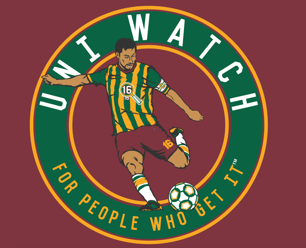
We’re offering this design in four different shirt colors — maroon, black, dark green, and heather grey:
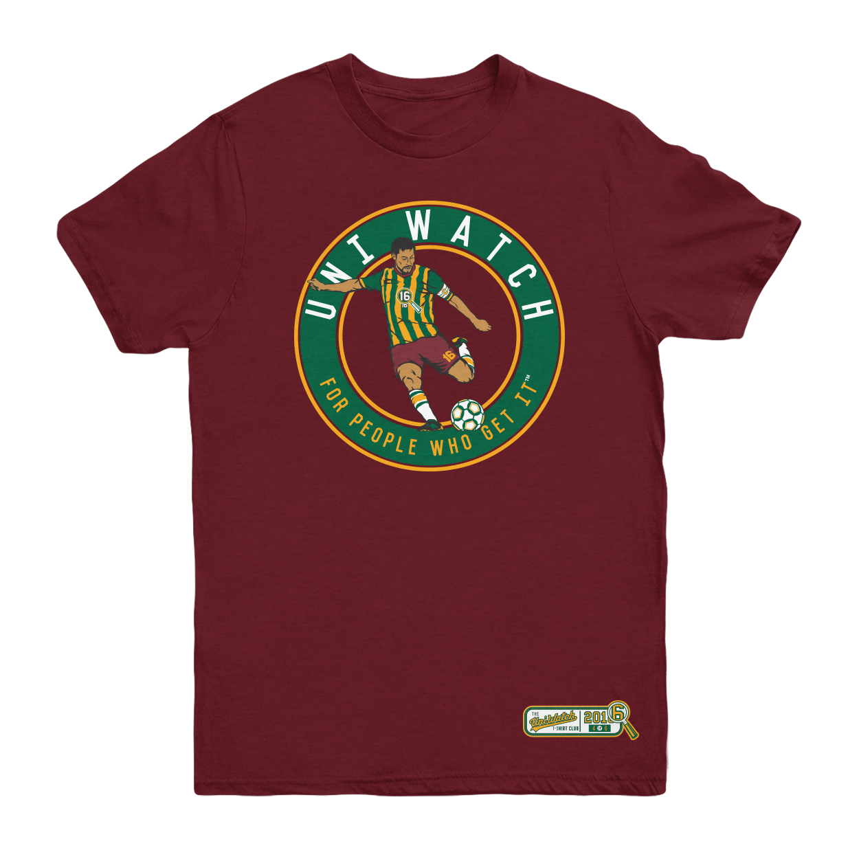
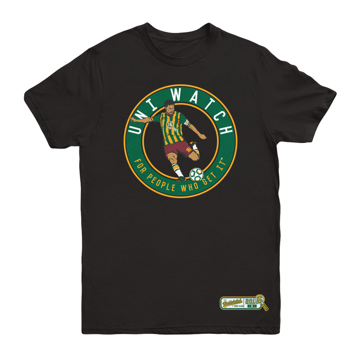
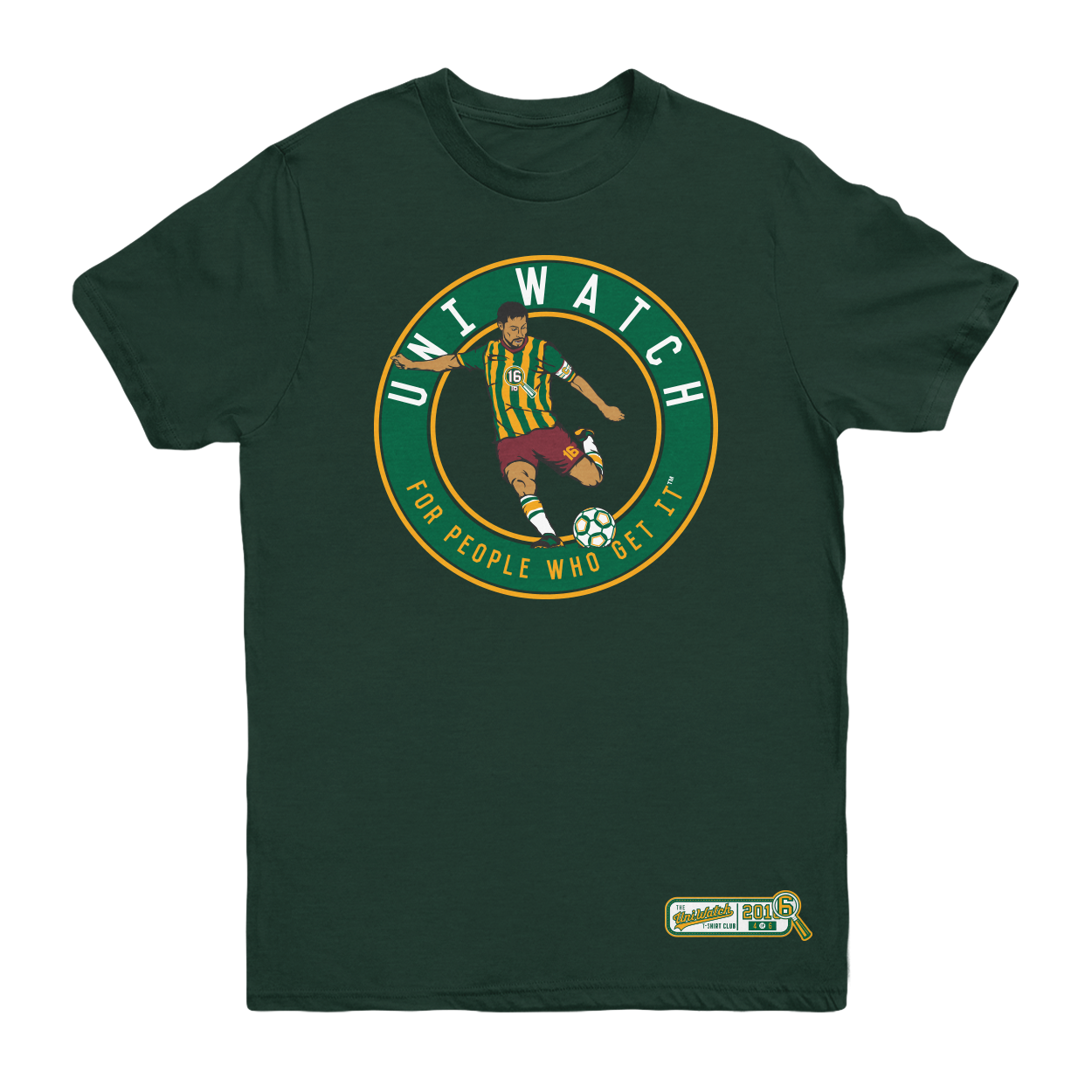
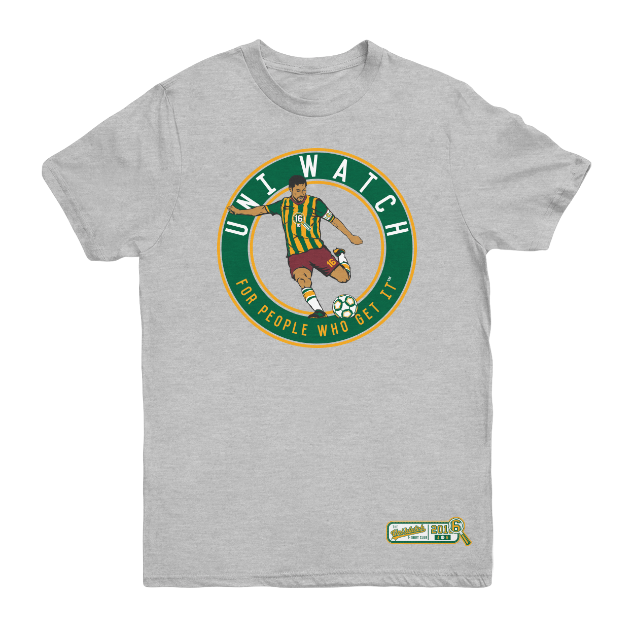
The shirt is available here. It’s available for a slightly longer period than most of our previous shirts, in part because I want to build in some extra time because of the Labor Day weekend, and also because traffic here on the site is a bit lower during my August break. Basically, I just want to make sure everyone has a chance to see and order the shirt.
One more time, the soccer shirt is available here. My thanks, as always, for your consideration.
And speaking of the T-Shirt Club…: Reader Allan Chandler raised an interesting point in yesterday’s comments. He asked if I had considered taking the jersey design shown on the soccer-themed T-shirt and making it avialable for sale as an actual soccer jersey. The same could be done with the jerseys shown on this year’s baseball, basketball, and hockey shirts (plus 2016’s two remaining shirts, which will feature football and a mystery design).
That might be fun, right? I have a pretty good idea of who could probably manufacture these jerseys, although I don’t know what they’d cost. But first things first: Would anyone actually be interested? If so, shoot me a note (and also feel free to discuss this in the comments). Specify which jersey(s) you’d potentially be interested in purchasing. If you want, you can also specify a price ceiling — the most you’d be willing to pay. I’ll get back to you if/when we decide to pursue this.
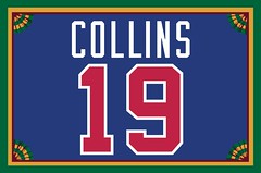
Membership update: Membership enrollments are always slow during my annual August break from the site, although we did get a couple of orders (including one from David Collins, whose Bad Boy-era Pistons treatment is shown at right). I’m going to send those new card orders off to the printer on tomorrow, and there are several additional slots available in the current batch. So if you sign up today, you’ll get your card with only a very short wait — a win-win!
As always, you can sign up for your own custom-designed membership card here, you can see all the cards we’ve designed so far here, and you can see how we produce the cards here.
The Ticker
By Mike Chamernik

Baseball News: Yesterday was Roberto Clemente Day around the league. The Indians had special plates on the bases, while the Pirates wore throwbacks, painted a tribute onto the field, stenciled “21” into the right field grass, and changed their social media avatar. MLB Network broadcaster Dan Plesac wore a Clemente pin. … White Sox 3B Todd Frazier wore stirrups yesterday (from Matt Bond). … Several Indians players are wearing wristbands with their faces on them. They are similar to the Say No To Drugs wristbands of the late 1980s. … A Cleveland fan sent the players, coaches, and broadcasters team-colored hand-crocheted afghans. … The Braves are roughly halfway done with the construction of their new ballpark. … Here’s a good piece on outlandish and unconventional first pitches in Korean pro baseball (from Jason Hillyer). … In 1983, Tommy Lasorda, Kareem Abdul-Jabbar and Jack Lemmon all participated in a Dodgers celebrity game (from Morgan Doninger). … New Hampshire Sen. Kelly Ayotte, who’s running for re-election, wore a green Red Sox cap in two new political ads (from Sean Connor).

NFL News: The Bengals will unveil their Color Rash jerseys next Tuesday at the Cincinnati Zoo’s white tiger exhibit. The unis will be worn for the September 29 game against the Dolphins (from Johnny Bruno). … Speaking of the Bengals, they’ll be wearing black on the road this Sunday, which means the Jets will be wearing white at home (thanks, Phil). … The Texans enlarged their midfield logo, and apparently tweaked the colors, too (from Jeff Rohrbach). … The NFL and Twitter revealed emoji hashtags for each team (from Garret Heinrich). … The Chiefs will wear a 9/11 memorial ribbon helmet decal on Sunday. Is the rest of the league doing the same? … Also, it looks like the Chiefs sell a sandwich with the team logo pressed into the bun. … It’s been widely reported that 49ers QB Colin Kaepernick’s jerseys sales have risen significantly since he began his protest over the national anthem. He now says he will donate the proceeds of the merch sales back to the community. … From yesterday’s comments: Falcons players are protective of the team logo on the center of the floor in the locker room. … Patriots number update: CB Eric Rowe will wear No. 25, and practice squad RB Bishop Sankey will switch to No. 34. … As for the Ravens, WR Mike Wallace changed his number from 12 to 17, which he wore with the Steelers from 2009 to 2012 (from Andrew Cosentino). … New custom cleats for Jaguars QB Blake Bortles. … The new banner at the Saints practice facility shows a collection of the best players in team history — but not, unfortunately, in period-appropriate uniforms (from @Boat_Lawyer). … If a NFL team moves to England full time, Tottenham hopes to be its home. The Spurs’ new White Hart Lane stadium is slated to host two NFL games a year for the decade after it opens in 2018 (from Phil).
College Football News: Virginia Tech will wear these smooth black helmets for the Battle at Bristol this weekend against Tennessee. … Under coach Urban Meyer, Ohio State has a training camp tradition where freshmen players start with strips of black tape on their helmets and get them removed when they prove to be worthy of being a Buckeye (from Jason Hillyer). … Syracuse will wear all orange on Friday against Louisville (from Phil).

Hockey News: In September 2011, a plane crash killed all the players and coaches on Lokomotiv Yaroslavl of the KHL. The son of goaltender Stefan Liv is honoring his dad with a custom mask (from Mark Coale). … The Saskatoon Blades to wear Gordie Howe-themed jerseys in September. Howe grew up in the city, and a Howe statue stands outside the Blades’ arena (from Phil). … New unis for Wisconsin hockey. Here’s a better look at the pants, and a tidbit about the sweaters (from Jeff Ash). … It appears that Russia’s World Cup of Hockey uniform includes one red glove and one blue glove (from Joey Freshwater).

NBA News: The Jazz showed off their new home jerseys. I still need to get used to the numeral font. … Here’s a gallery of the shoes Allen Iverson wore over the years. AI will be inducted into the Basketball Hall of Fame on Friday. … Check out the uniform that Wayman Tisdale wore in high school! Transposed panels, numbers above the letters, and it was untucked (from Chris Corbaz). … Looks like Michigan State changed the waist on its shorts (from Joey Zurek). … Mark Aguirre wore a Raiders jersey when celebrating the Pistons’ 1989 title. I’m assuming its a customized jersey because Aguirre wore No. 23 with the Pistons, and the Raiders didn’t have a 23 on the roster in 1988. The Bad Boys Pistons had a connection with Al Davis’s renegade Los Angeles Raiders. Davis opened up the team’s training facility to Isiah Thomas after the guard sprained his ankle during Game 6 of the 1988 Finals against the Lakers.

Soccer News: A hot rumor says that Real Madrid is leaving Adidas for Nike (from Josh Hinton). … The Oly Town Artesians of the Western Indoor Soccer League will wear a patch for Austin Kelley, a player who went missing in the Salmon River in Idaho last weekend.

Grab Bag: Great collection here of 1980s production company intros (from Roy Bellamy). … Hope College’s Chapel Choir has different color robes based on voice type. Sopranos wear yellow, altos wear orange, tenors wear red, and the bass wears violet. “I did a little research online and found out that the original robes were designed by the husband/wife designer duo Charles and Ray Eames, who seem to be a heck of a lot better known for their furniture design work,” writes Joe Hollomon. This PDF has more of the story.
I’ll be away for a good chunk of today, as I’m heading to Baruch College in Manhattan to participate in a panel discussion on the use of Native American imagery in sports. I’ll be back later in the day and will definitely be watching tonight’s Panthers/Broncos NFL opener. Play nice while I’m out, and I’ll see you back here tomorrow, okay? Okay!
At long last an answer to the musical question link?
Seriously that is a fantastic intersection of advertising with team identity.
As I mentioned in yesterday’s comments, I would TOTALLY be up for a UW baseball jersey (button front, with green trimmed headspoon green “Uni Watch” script, trimmed in gold, with same treatment for #OB). In faux flannel. That might push the price point up there, but I’d at least be interested in knowing if it is doable.
Although I bet a UniWatch jersey would look great (whatever the sport), I probably couldn’t be counted on to put my money where my mouth is.
I am a little torn, but hasn’t buying “overpriced polyester jerseys” been frowned upon by this site for a long while and now you are going to sell them?
Get it right: It’s overpriced polyester SHIRTS.
I think it’s fair to say that this would be more of a fun creative project than a crap merchandising project. We’ve covered that distinction before. Look here:
link
Yeah, Uni Watch jerseys would be really cool. I’d personally be interested in purchasing the baseball and soccer ones and I definitely wouldn’t want to spend upwards of $100. $40-$50 would be nice, but that may not be possible.
also, would the socks and stirrups from the soccer and baseball uniforms, respectively, be available for sale? Cuz that’d be awesome.
Here’s an appropriate photo of last night’s Pirate throwbacks:
link
I’ve said it before, and I’ll say it again. If you don’t want people stepping on your logo, DON’T PUT IT ON THE FUCKING CARPET!!
Hear, hear!!
It’s intentional. They want people to occasionally step on it so they can be shamed, as a form of forced deference to the team. Or at the very least force everyone to walk around it for the same reason.
It’s asinine, is what it is. And nobody will ever be able to convince me otherwise.
Agreed. Of all the traditions in sports, this is one of the dumbest.
+1 that’s what I said yesterday in my comment – just don’t put the thing on the floor if you respect it so much!
Seems lots of places are going for the Branded Burger Bun these days.
Here’s another sports related one I know of:
link
Bill Kilmer is conspicuously absent from that Saints tribute!
Even more conspicuously missing is Kilmer’s old battery mate, Danny Abramowicz.
Sooooo… Do we think the Bengals will be wearing all white for their Color Flush game? Or are they giving us a schwerve?
I would love for the Red Sox to adopt those uniforms as their full time road uniforms, and change their hat to that logo again – that is a great look.
If the Bengals are unveiling their Rash uniforms at the white tiger exhibit, does that confirm that they are going to be all white? And what about the helmet and the NFL’s “one helmet” rule?
Yeah, last night’s Boston uniforms looked great; better in fact, than their home uniforms. Therein lies the problem. No team should ever put more effort into their road uniforms than the home suits. Lose the headspoon and/or the sleeve stripes and you have a keeper. But I’m way digging the navy hat with solid red “B”.
I’m generally opposed to un-outlined red logos on dark navy caps. The contrast is too low. See the invisible C’s on the Indians’ navy cap and the everyday Twins cap. But maybe it’s a feasible design now that hi-def broadcasting is ubiquitous. The B will still be invisible to fans in the stands at the game; nothing to be done about that. But for most of the eyes on the game, the logo should be adequately visible.
Ray and Charles Eames were also known for their architecture, although their furniture is probably the most well known to the general public.
It was mentioned on the Red Sox broadcast that, in 1936, the San Diego Padres were actually a minor league affiliate of the Boston Red Sox. Has this scenario happened before that a team wore throwbacks to a time that they were an affiliate of the team they were playing?
Ahh, interesting — didn’t know that part! I’ll add that to the text (and credit you, of course).
San Diego native & future Red Sox legend Ted Williams was a rookie on that ’36 Padres team – another good reason for the throwback uniforms yesterday. link
Right! And Ted wore link with the Padres, which provides a great link to link.
I hope the teams paid some tribute to Ted before the game.
Saints photo is very cool, even though they are all wearing the current uniforms. Would be cool to see some mock-ups of other teams in a similar photo.
1. I would like one of the Uni-Watch soccer jerseys. I’d be interested to see how the back of that jersey would look.
2. In yesterday’s comments, I had a discussion with some people about the Falcons perhaps being the first BFBS transition. Someone brought up the Kings, which I didn’t consider because I thought that transition had been to look like the Raiders…but might that also be considered going BFBS?
As far as BFBS and the 1990 falcons I would vote no. Black is one of their colors, they just reversed what was the dominant color. It’s not like the Cardinals,49ers,or Lions who have no business having a black jersey.
You may have something with the Kings though.
I always attributed that to Glanville’s whole “man in black” shtick.
It all kinda happened at the same time. Raiders jerseys became fashion items because of rap culture, the Kings switched to Raiders colors… Glanville wore black while coaching in Houston… the “Bad Boys” Pistons were selling black & silver merch… It was just a perfect storm.
From my research, the Los Angeles Kings started the trend in 1988. Falcons changed to black in 1990. link
The Kings definitely started the trend. The change to black and silver corresponded with Gretzky coming to LA so it was a perfect storm.
It all depends on your definition and perspective of BFBS. I agree with Brent. Teams that have no business wearing black jersey and pull one out as a 3rd is the darkest shade of BFBS.
The Kings were more of a redesign with influence provided by the Raiders. They were not copying any hockey teams as that was not a common used colour scheme in hockey(except junior Hull Olympiques).
College sports teams do a lot of BFBS.
I would consider that black Los Angeles Lakers alternate uniform to be more BFBS than the Kings uniforms.
The Reds en español son Los Rojos.
Last year I sewed my Uni Watch 15th anniversary patch onto a white with green pinstripe button up baseball jersey. Paul posted a pic. It looks great, and I think UW jerseys in general would look outstanding. But I probably wouldn’t buy one since the one I have is enough.
A flannel version by Ebbets would be outstanding, but expensive.
Maybe I’m just being pedantic, but the Padres weren’t marking the anniversary of the PCL – the San Diego Padres began play in 1936, but the league itself dates back to 1903.
Not pedantic at all to point out a factual error. I apparently misunderstood the promotion’s intent. Will adjust text now!
NFL twitter hashtag things….
Rams, Vikes, Chargers have “interesting” ones.
That darned Eagle is still backwards!!
Re: Real Madrid to Nike–equally hot rumor (rumour?) on the same page: Nike to dump England/FA because of 2016 Euro disaster, and Under Armour may come in…
For a long, long time the Badgers men’s hockey team have aped the Red Wings’ jersey design. It’s nice to see them adding a bit of their own identity to the look with the two stripes, though those cuts in the stripes come off as a bit dumb-looking.
The “Forward” cuts are so small, I’m not sure they’re visible enough to look like anything, dumb or otherwise. I’d have liked it better if the “Forward” cuts were thicker.
I dig the new unis, but these are the rare uniforms that leave me wishing for an alt. How about link on the front, or vertical red/white stripes?
It’s a fine design. Not reinventing the wheel, but they look like Wisconsin. I don’t mind the slits in the striping, It kind of reminds me of the 70s Canucks striping ‘V’
On the link, a user by the name of Wally1912 points out that the 1936 Red Sox uniforms actually had link. The link shows red piping for link, and, indeed, for the entire period from link.
Wally1912 link that the stripes on the socks should be grey, not white. He offers link.
I would definitely be interested in a uni-watch hockey jersey/sweater, but my ceiling on spending would probably be around $60.00 which I realize is probably too low.
That Syracuse number font is still awful. At least they’re wearing orange, I guess.
Count me in as someone who would be interested if you decided to make a uni-watch hockey jersey/sweater (my cost ceiling would probably be ~$90).
I would be really interested to see a Uni Watch football jersey, but I suspect my budget would be much lower than the actual price point.
The Cardinals wore “Cardenales” jerseys on June 11, 2011, in Milwaukee. link
I wonder if the mismatch blue glove on the Hockey World Cup photo is a photoshop error?
It looks like some players are wearing red gloves, and some blue in today’s warm-up game. Not seeing any mismatches in a single player though.
On a related note, looks like Datsyuk has 2 WCoH logos on the back of his helmet, instead of WCoH on the left and NHL team on the right. He is on Arizona’s roster, but NHL retired and playing in the KHL in Russia. Not sure what pure KHL players have on their helmets.
That was my thought too. Would have looked terrible and made zero sense, in addition to being a supply chain nightmare.
This photo of mannequins (in the article here: link) has matching gloves.
Even in the Olympics, the Russian team is consistently inconsistent. Everybody seems to have some combination of red, blue, and/or white. But everybody’s right hand matched his respective left hand.
It’s a complete amateur hour shop job. For one thing, the dark jersey for Russia is red from below the shoulders all the way to the waist, and both sleeves are red except for the white and blue stripes.
I have no idea why they decided to color the lower half of Ovechkin’s uniform blue, but you can tell it’s an obvious and poorly-done job just by looking at how the blue bleeds into the bottom of the logo.
Russia wore red gloves in World Cup warm-up game vs. Czech Republic.
link
That photo is just a photo shop thing for promotion I guess. I do not think a national team in hockey, or any other legit team, would wear mismatching gloves.
As well, Team Canada actual gloves for the tournament have red in them.
link
I think a Uni Watch baseball jersey or hockey sweater would be cool, but I’m probably in the crowd whose budget ($40-$50) is probably lower than what the price point would end up being.
Something I would buy, if they were available, would be refrigerator magnets featuring the graphics that have been used on the t-shirts. I think I could probably shake the couch cushions to come up with enough to afford a few of those!
A question: Has the sport for the mystery shirt already been determined, or is it a topic that might be up for suggestion, maybe even a poll?
My guess is curling.
Pretty sure Paul said at the start that it wouldn’t be curling. I’m guessing women’s tennis.
World Cup of Hockey: Streaming the Czech Republic vs. Russia pre-tournament game. Most Russian players are wearing solid red gloves, but a few have two-color red and blue gloves. The Czechs are all over the place with their gloves: blue, blue and red, blue-red-white.
And the red, white and blue collar necklace on the Czech uniform is hideous. It is so bad, it almost distracts you from seeing the SAP logo on the shoulder.
Russia’s rear helmet logos seem all over the place, some players have it right with the world cup logo on the rear left, and NHL team logo on the right. Some have the world cup on both sides (even players that are full-time on an NHL team)
If nothing else, could the Red Sox adopt that spectacular striped hosiery to their home and away uniforms?
And the Wisconsin sweaters look great. Stripes on the sleeves, stripes on the hem, and Thank You God, striped pants!
It would be better to go with Major League Béisbol than the Ponle Acento.
I think a uniwatch jersey set would be neat. I would order an American Football one for sure.
Sweet throwback unis on the Bosox!
I’d go for a Uni Watch soccer jersey. I’d pay $60, max.
Uniwatch basketball jersey would be keen.