Paul here, still pinch-hitting for Phil this weekend.
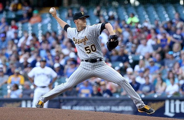
The Brewers and Pirates wore late-1990s throwbacks last night in Milwaukee. The Brew Crew’s unis were designed back in the day by longtime Uni Watch pal/ally Todd Radom, who I’m sure enjoyed seeing his creation back on the diamond.
Most of the players went low-cuffed, which makes sense, since we’re talking about a late-’90s look here. A few went high-cuffed, and Pirates second baseman Josh Harrison wore period-inappropriate striped socks:
You can see lots of additional photos here.
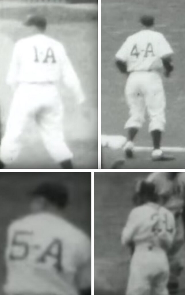
“You sunk my battleship!”: What’s the dealio with these 1940 Louisville Colonels players wearing alpha-numeric uni designations? Turns out it was based on their positions and their status on the depth chart. The starting second baseman would wear 4-A, the primary backup would wear 4-B, and so on. It was supposed to make things easier for fans but ended up being more trouble than it was worth.
This all came to light thanks to some home movie footage that was recently discovered. Further info here and here, and you can see the home movie footage below.
Click to enlarge
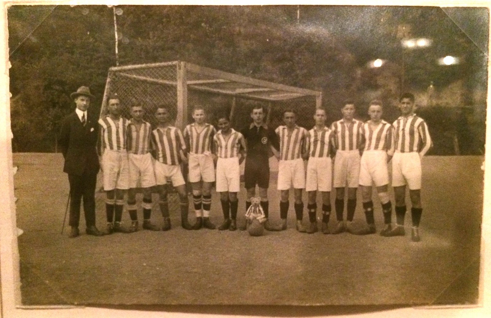
Bearly there: Yesterday some friends and I went to the New Museum, where we saw an exhibit about collections and the collectors who collect them. The show-stopper was a room filled with 3,000 old photos of people posing with teddy bears, all collected over many years by one person. There were musicians with bears, people with guns and bears, families with bears, children with bears, grown-ups with bears, naked people with bears — pretty much every teddy bear-inclusive situation you can imagine.
Including sports teams with bears. The great thing about the photo shown above is that the bear, who’s in the center of the photo, in front of the keeper, is wearing the same striped jersey as the soccer players!
There was also a baseball team with a bear, a basketball team with a bear, a soccer or rugby team with a bear (note that the bear’s stripes are horizontal while the players’ stripes are vertical), and more. I have no idea why posing with a bear became a thing, but it definitely appears to have been a thing. Weirdly endearing.
For more on the bear photos and the woman who collected them, look here.
The Ticker
By Paul

Baseball News: The Mets retired Mike Piazza’s No. 31 last night. Players wore Piazza patches on their sleeves and caps. … The Indianapolis Indians wore Negro Leagues throwbacks on Friday night. Here’s some video footage. … Charleston RiverDogs president emeritus Mike Veeck, whose family helped create the Chisox leisure suit design, has responded to the Chris Sale incident by issuing an “ex-Veeck-utive order” that all RiverDogs jerseys will have collars for the rest of the season. “Mike was out of town, so it took a few days to make this happen, but better late than never,” says team spokesman Nate Kurant. … Mariners closer Steve Cishek had his left stirrup come untucked yet again yesterday. Something like the fourth or fifth time that’s happened this season (from Paul Demay). … Red vs. red! That’s Lebanon vs. Alton in the New Hampshire American Legion state tourney (from Tris Wykes). … Here’s one of those time-lapse GIFs, this one showing the evolution of MLB team logos (from Scott, who didn’t give his last name). … Here’s Giants P Madison Bumgarner next to a Lego version of himself (from Nathan Reid).

NFL News: Check out this shot from a 1984 game, which appears to show a Chargers player with two Band-Aids on his helmet. “Maybe that’s how they treated concussions back then,” quips Gene Sanny. … Good article on the electric football championships (from Tommy Turner). … The Cowboys are adding a helmet decal to show solidarity with the Dallas Police Dept. and the local community, but only during practice (from Chris Mycoskie).
College Football News: This is supposedly Michigan’s new number font. We’ll find out for sure on Tuesday afternoon, when the unveiling is scheduled to take place (from Seth Gladstein). … I think we’ve already seen this, but just in case: New uniforms for Appalachian State (from Chris Daniels).
Over and out: Tomorrow I start my annual August break from the site. Phil will be running the show here, and webmaster John Ekdahl will be handling the weekends. I’ll probably be making cameo appearances now and then, and I’ll still be on the clock over at ESPN (we’ll have the Timberwolves-redesign contest results soon — maybe on Wednesday), but for the most part I’ll be avoiding the blog. See you in September!
Don’t understand the evolution of MLB logos link: it just shows a photo of an American Legion team?
Refresh the page and try it now.
Still does not have the cowboy-hat-on-baseball first logo of the Rangers
“the bear, whose in the center of the photo” — should be “who’s”.
Thank you, Joe. Fixed.
Enjoy your break, Paul – we’ll look forward to Phil’s work this month, and catch you on the blog when you’re back from break!
Love the Michigan numbers – but why are the 4 and 5 so much thicker than the others? They’re the most distinctive numbers in the set – the others look like a version of Block Varsity worn by, among others the NHL Flyers and Red Wings.
Yeah, the bottom of the 5 should be identical to the bottoms of the 3 and the 9. And the top of the five should be the same as the top of the 6, only with square corners.
4 matches the M. 5 for 5 National Titles.
Interesting idea. Problem is, to 99.9% of the world, that meaning will be lost and people will just wonder why the 4 and 5 are noticeBly thicker than the other numbers.
Typical Nike stuff, LoL. Not sure if you’ve seen it, but a V is also integrated in the M in some jerseys and apparel.
Is it just me, or does Appy State’s new white jersey not have the Sun Belt patch on it.
Mike Piazza had some good times in the black Mets uniform. This could contribute to why he likes it.
I have to disagree with him. I like the Mets wearing traditional blue and orange, without the black. Was never a fan of the Mets in black.
Same goes with the Knicks. When they added the black trim I was really not a fan of that. Glad both teams fixed it.
If the letter in each Louisville Colonels player’s uniform indicates his rank in the depth chart, does this mean that number 2-L is the twelfth-string catcher?
Yeah, but at that point that guy is non existent. Probably didn’t even give the guy his own jersey if he’s that far down the depth chart- for a catcher, no less!
Enjoy your vacation Paul and thanks for doing what you do.
I often put down the ’90s, and rightfully so…90 percent of the time. Those Pirates unis are one of the exceptions. After the strike, baseball *sort of* got me back in ’96. The ’97 Bucs brought me back all the way.
The ’97 Pirates – Cordova, Rincon, and Mark Smith. That was the highlight.
Watching last night’s Brewers game, I learned their interlocking MB logo of the ’90s was intended to suggest an industrial stamp, honoring Milwaukee’s manufacturing heritage. And here I thought it just looked crappy for all those years.
Those were not late 1990s throwbacks
Pirates wore gray caps with a black bill with those pinstriped unis back in the late 90s. I like them better with the black caps myself. They’d make a nice road alternate.
I thought the black caps with the red bills circa 1997 were pretty sharp looking.
Enjoy your vacation Paul!
That GIF is fun – see how many times you have to watch it to catch the Pilots logo!
MLB team logo evolution gif starts the Texas Rangers off with the wrong logo. Leaves out their original Cowboy hat logo of 1972-81, starts with the TR/state logo of 1982-83.
I hate retro/throwbacks 95-97% of the time. The few exceptions seem to be for 90’s and early 200’s looks.
The Brewers looked amazing last night, they need to bring that look back full time (the first version of it with the green on the road). And I always liked the Pirates look in the 90’s. I never did care for the plain gray hat they wore with the pinstripes. I always felt it would look better with stripes similar to the old Reds white home hat. But seeing the solid black hat worn with it looked very nice as well. And it was really nice to see the scripted “Pittsburgh” on the road again. Yes, I HATE the script PITT but love the script Pittsburgh. I’d love to see the script Pittsburgh used on an alternate road uniform and keep the one with just the “P” as a home alternate.
If you want the Brewers to go retro, it’s gotta be the ball and glove logo. The 90s logo was awful.