Paul here, pinch-hitting for Phil this weekend.
On Wednesday afternoon I posted this tweet about the logo for the Lake Erie Warriors, a new junior hockey team slated to begin play this fall:
Quite a logo for the Lake Erie Warriors, new team in the National College Prospects Hockey League. pic.twitter.com/2NMzQHi9oT
— Paul Lukas (@UniWatch) July 27, 2016
I didn’t say anything except “Quite a logo,” because I figured it spoke for itself.
On Thursday I followed up with this post. I wrote, “I don’t have much to say about this one, because the whole thing pretty well speaks for itself.”
Lots of other media outlets jumped on the story. Most expressed outrage; many called the logo “racist.” The smartest take came from Deadspin, which posted a short article with a headline that read, “Hey, Come Look At This Hockey Team’s Logo Before They Apologize And Change It.” The article consisted of two sentences: “The National College Prospects Hockey League, a pretty low-level junior league, begins play this year, and below you’ll find the logo for the Lake Erie Warriors. [Embedded tweet showing logo.] We wish the Warriors luck with the design and unveiling of their next logo before they take the ice this fall.”
Sure enough, the Lake Erie Warriors no longer exist, at least not under that name. Yesterday they were unceremoniously renamed the Lake Erie Gulls, and an amusingly Soviet-style scrubbing of the team’s very short history took place. The Warriors’ promotional video — the one that said, without apparent irony, “You’re only as good as your values” — no longer exists. And some photos from the old Warriors site were Photoshopped, with the Warriors logo removed and a new Gulls logo clumsily swapped in:

As of this morning, the team has been renamed again. They’re now the Lake Erie Eagles. The photos with the Photoshopped Gulls logos have been replaced with photos like this one:
As you can see, now they’ve just Photoshopped the league logo in place. The funny thing is that the player in that photo is wearing a Warriors jersey. Earlier this week, before the controversy blew up, the entire jersey was visible. Now they’ve cropped it so you can’t see the Warriors chest logo.
As news of the first renaming spread in our comments section yesterday, reader Mike Wissman asked, “Any possibility that this was a really lame attempt to draw attention to the league?” I usually roll my eyes at conspiracy theorizing, but I have to admit that something feels a bit off regarding this entire episode. Consider:
-
It’s hard to fathom how any team could have chosen to go with that Warriors logo in 2016.
-
The video, with its “You’re only as good as your values” slogan, was almost too perfect in its tone-deafness.
-
Replacing “Warriors” with “Gulls” is, again, almost too perfect. It’s like when the band Anthrax responded to the anthrax scare by jokingly saying they’d change their name to Basket Full of Puppies. (Now that they’ve changed it again to Eagles, it seems a bit more legit.)
-
The Photoshop jobs on the photos are comically bad. They’re like the dictionary definition of “inept Photoshop job.”
If The Onion cooked up a gag involving a team with a Native American logo, this is probably what it would look like. I’m not saying the whole thing is a gag, mind you, but it certainly could pass for one.
It would be simple enough to do some very simple diligence by, say, calling the phone number listed on the Gulls Eagles website. Honestly, though, I’m not sure I want to know. As I’ve said before in other contexts, sometimes the question is more interesting than the answer.
Click to enlarge
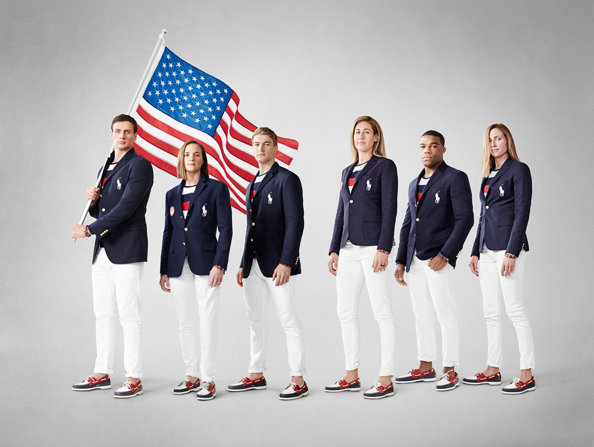
Skippy, Muffy ready for Rio: Yesterday morning brought us the unveiling of the outfits that will be worn at the Rio opening ceremonies by Team USRL (that’s United States of Ralph Lauren). You can see my thoughts in this ESPN piece, which was posted yesterday.
One thing I’ll never understand: The Lauren folks routinely release some of their fashion sketches for these opening ceremony outfits, and they always show the clothing being worn by the standard anorexic models doing the Barbizon prowl down the catwalk — which would make sense for a regular clothing collection, but not so much for something designed to be worn by athletes at the Olympics:
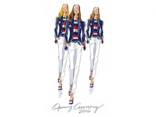
Of course, maybe they do it that way because they’re more concerned about selling this stuff at retail than about the actual Olympic Games. But I’d never make such a churlish suggestion myself.
Lots of additional info, plus a slideshow of previous opening ceremony outfits, here, and still more info on how the Ralph Lauren people put this together here.
Friday Flashback reminder: In case you missed it yesterday, my latest Friday Flashback column over on ESPN is about the White Sox’s infamous shorts, plus lots of other shorts that have been worn by minor league teams.
Even if you read the Flashback yesterday morning, here’s an update you might not have seen: I originally said there’s no footage of a Sox player sliding in this shorts, but that turns out to be untrue! Longtime reader Kurt Rozek just directed my attention to a video that actually shows two shorts-clad slides. We added it to the Flashback later in the day. If you missed it, skip ahead to the 1:51 mark:
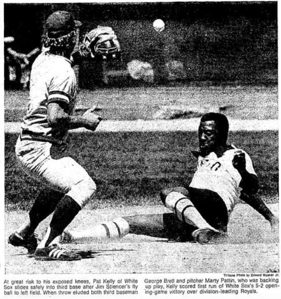
Never seen that before! Big thanks to Kurt for pointing it out. In addition, Jerry Wolper found this shot of Pat Kelly sliding in shorts:
Raffle results: The winner of the Indians cap is longtime reader/commenter R. Scott Rogers. Congrats to him and thanks to all who entered.
That brings our July cap raffle series to a close. It was really fun to give away all this stuff. If you didn’t win, don’t worry — we’ll have more raffles soon.
The Ticker
By Paul

Baseball News: The Brewers will be wearing these Todd Radom-designed 1990s throwbacks tonight. And in a nice touch, their opponents, the Pirates, will also be retro-attired. … The Mets will retire Mike Piazza’s No. 31 tonight and will also wear Piazza patches on their sleeve and caps. … One of the high schools in the Iowa State Baseball Tournament is wearing a tequila sunrise jersey that looks a lot like one of last year’s Uni Watch T-Shirt Club designs (from Blain Kupka). … Cardinals SS Aldemys Diaz is the latest player to add a faceguard to his batting helmet. … Mets 1B James Loney’s bat identifies him as a member of the Rays (from Chris DellaMedaglia). … Phillies 1B Ryan Howard wore teammate Cody Asche’s batting helmet last night (from Glen Macklin). … Great view of the Pirates’ original spring training Clemente memorial. If you’re not familiar with the story behind that, look here (from Jeff Wilk). … Have I mentioned lately that we’d all be better off if jerseys had never been made available for retail sale? (Photo courtesy of Mikey Brethauer.)

NFL/CFL News: WR Anquan Boldin, now with the Lions, has worn No. 81 throughout his NFL career. That was Calvin Johnson’s number, so Boldin will wear No. 80 (from Jerry Nitzh). … Bills CB Nickell Robey has legally changed his name to Nickell Robey-Coleman, so he now has a hyphenated NOB (from Joseph Pitirri). … Reprinted from yesterday’s comments: Here’s one person’s picks for the best T-shirts for each NFL team. … Lake Erie College is now sponsoring advertising on the Browns’ practice jerseys (from Daniel McDonald). … In a related item, the drop shadows on the Browns’ game jerseys and practice jerseys face opposite directions. … Some practice uni number fun for the Steelers (from Jerry Wolper). … The Montreal Alouettes added an “86” patch for Ben Cahoon’s number retirement.
College Football News: Michigan’s new uniforms may have leaked, although the legitimacy of that shot has not been confirmed. We’ll all find out early next week, when the unveiling is scheduled to take place (from Stallion Maverick). … Ranking the Mountain West’s helmets? Sure, why not (from Damon Hirschensohn). … New logo for the UNC-Charlotte marching band (from Jon Spencer).

Olympics News: Here’s the story behind the Team USA golf outfits (from @cupojoe61). … Good article about how female Muslim athletes will be competing while wearing hijabs (from Tommy Turner). … Lululemon, a company best known for yoga attire, is making Team Canada’s Olympic beach volleyball uniforms (thanks, Phil). … In a related item, here’s a really interesting article about how Lululemon is blowing its chance to make inroads with men because of logo creep (from Chris Johnson). … Looks like the Venezuelan basketball team had some cheapo jerseys for last night’s game against Team USA (thanks, Phil).

Hockey News: MLB slugger Jose Bautista’s bat-flip celebration has somehow made it into an NHL video game (thanks, Mike). … Whoa, check out the stitching on Ted Lindsay’s captaincy patch (from Russ Levine). … The Rangers are sending 90th-anniversary gifts to team alums (from @GKG_77). … Adam Rickert’s NHL-redesign project has moved on to the Central Division.

Grab Bag: A new cricket team in India will be called the Chepauk Super Gillies. … If you’ve always wanted to buy a Ryder Cup hockey jersey, this year you’ll have your chance (from J. Walker). … Costa, which is basically the Starbucks of the UK, has agreed to remove the recycling logo from its cups after it turned out that the cups aren’t actually recyclable.
Glitch on the “Whoa, check out…” link in the Hockey section of the Ticker.
Fixed.
Since cutting-and-pasting is a pain on this device, I’ll just say “Fix the second hockey item, which is probably supposed to be more than one.”
The Pirates should want nothing to do with the 1990s where the Brewers are involved. Bad memories, man. Bad BAD memories.
Funny you should mention that, the first thing I think about with this uniform set is the rocket throw by Jose Guillen next to the right field wall at Coors Field. The throw nailed a Rockies baserunner attempting to take third base, it’s one of the more amazing throws you’ll see.
Here’s that throw: link
Man, I miss Guillen. More than kind of a jerk, and inconsistent in the extreme, but when he was good, he was really good.
There was one good memory: the 1997 “Freak Show” Pirates…my favorite non-Stargell team. Despite finishing with a losing record they were in the pennant race almost up to the end. And they did it with a team payroll less than Albert Belle’s ’97 salary.
Hoping the Pirates wear the gray caps to match the 1997 road throwback jersey. However, they did rarely wear the solid black hat with that set, so we’ll see if accuracy beats convenience. Since this is a promotion at a road game, I’m thinking convenience will prevail.
Caps are easy and cheap-ish to buy and use for a day. Ship directly from New Era to the clubhouse, not too heavy and they pack fairy well. I would however never expect different helmets, which I believe would be black gloss to be accurate but convenience would dictate black matte.
it is so weird to see a man dunking a basketball on a football jersey
Something about those “BM” initials on the Brewers caps have always bothered me. Just can’t quite put my finger on it…
don’t like Bloody Marys??
That logo and Brewers cap always bothered me. I remember not liking the uniform when it was first introduced. I would throw it into that pile of 1990s disasters for uniform changes.
IMO it just is not very good. It looks like a busy looking, mangled mess rather than an interlocking “M” and “B”. Strange looking “B”. And…this was the logo that replaced the clever and classic ball-in-glove logo.
Did not like the navy blue, dark green and gold colour scheme replacing the royal blue and yellow either.
Here’s the best Bills t-shirt
link
Very old school Buffalo Bills
link
I alwqys thought that recycle logos on items meant they were produced with recycled material
link
“retro-fitted” > “retro-attired”
The Browns jersey sponsor is actually Lake Erie College of Osteopathic Medicine, which is located in Pennsylvania, not the Lake Erie College which is in Ohio.
As with all things that Tony Grossi reports, you should double-check as he can’t be bothered to do it himself.
In hindsight, I am surprised the Mets did not go to a black throwback for Piazza weekend…maybe because anyone of an age to likely buy that throwback already owns a vintage one
link
I’m guessing what happened with the Lake Erie team is as follows:
They decided to change their name to the Gulls, and they told that to a graphic designer, and said “whip up a logo”. He mishears it as Eagles, and makes an eagle logo. The team execs say, “ah, whatever” and change their name again.
Speaking of a whipping up a logo, the Lake Erie Eagles appear to have revealed theirs:
link
Equally ugly, just not racist.
If that’s the real logo… it’s even worse.
Just judging the technical merits of the rendering, it’s hugely better than the Injun logo. The racist tropes of the Injun logo were inappropriate, but the poor quality of the art was offensive. This may not be a great logo, but at least it’s competently drawn. Not enough red inside the Eagle figure to justify it as a team color, but that aside this is a perfectly adequate minor-league logo.
A shame they didn’t stick with Gulls. That’s a good nickname that’s too seldom used in sports. Can’t say that about Eagles.
Though a team in Pennsylvania called the Eagles wearing mostly black and yellow? That seems … problematic from a sports branding perspective.
IMHO, every single logo in that league is crap. There are just varying levels of crap. The Injun logo was – pardon my French – liquid dysentery, and the new logo is – again, pardon my French – a gold-plated bird turd. That is all I have to say, and sorry if any of y’all are perpetually scarred by my imagery.
Wait… what? How in the hell is that competently drawn? It looks like a generic clip-art eagle head and some quickly drawn wings on top of a clip-art hockey player. The bird is holding a hockey stick in it’s talons (I assume), but then it also has human legs. That thing needs to be shoved back into whatever radioactive hole it crawled out of, before it mutates into something even worse.
At least the indian looked mostly human.
“Generic clip-art” is by definition better than amateur. That’s the point of clip art! Originality and technical competence are two different characteristics of a work of art. This eagle may or may not be highly derivative of some other logo that I’m sure you can post a link to, but whether it is original or not has no bearing on whether it’s well drawn. The eagle simply is well drawn, at least by the standards of low-level minor league sports. And the Injun didn’t look remotely human. The proportions of the face were all wrong, facial features were not in line with the simple rules every schoolchild learns, the shoulder musculature was comically inhuman and essentially random, the head and shoulders didn’t connect with an even remotely plausible neck – one could go on. Your average teenage comic-book nerd could doodle a more credible muscle-bound figure during study hall than that logo. Of all the crappy Jim Aparo ripoff superhero drawings I made as a teenager, none were as bad as that Injun logo. It was really remarkably badly, inhumanly drawn.
In regards to your comment on Ralph L̶i̶f̶s̶h̶i̶t̶z̶’̶s̶ Lauren’s fashion sketches, that’s actually how we’re taught how to draw in fashion school. It’s supposed to elongate the body so you can show all the details.
(which is a pretty dumb reason, I was told it was to abstract the body so you don’t get caught up in how the body is shaped but how you want the garment to be formed)
I continue to maintain that, at least on a subconscious level, the cleansing of Indian nicknames and logos from sports teams is really just a whitewash of history.
Americans feel collective guilt over the fact that we are living on stolen land, and we’re doing our best to slowly eliminate all references to the people who were here before us.
Because you must admit, other than the occasional story of a casino opening or a politician claiming to have some Indian blood, sports teams are really the only time Native Americans are referenced at all in mainstream culture.
We rarely hear about Japanese internment camp victims, either. Let’s name some teams after them, shall we? After all, anything else would be a “whitewash of history,” and everyone knows sports team names and logos are the best possible vehicle for teaching people about history.
We also don’t often hear about homeless people, domestic abuse victims, or those living in chronic poverty, so let’s also name some teams after those groups. Anything else would be a “whitewash of history,” and there’s certainly no better way to raise awareness of these groups than to name a sports team after them.
And so on.
So a team called the Klamath Japs (or, to go from Redskins to Braves territory, the Nisei), with this mascot logo:
link
The resulting publicity likely would raise awareness of WWII internment camps!
Still, the scrubbing of Native American cultural references can go too far. The Lake Eerie team missed an opportunity. They rolled out a Redskins-level identity, and when challenged responded as if there’s no alternative between Redskins or Blue Jays. But the Seahawks incorporate Native imagery effectively and respectfully, as do the Spokane Indians, the Florida Seminoles, and a few others. The point isn’t that we can’t touch Native American cultural images, it’s that doing so requires a little more thought and effort than building a brand around a songbird.
Also Italian and German North Americans faced similar treatment. That has REALLY been whitewashed from history.My family served in the military on both sides of the 50 and my grandpa was “scrutinized” as an “unfriendly alien and possible threat”, the man couldn’t even sign his name until he was 40.
Seriously doubt that American Indian nicknames were named with that thought in mind
Well, the Brooklyn Dodgers were known colloquially as the “Bums”.
Speaking as a Native American, we really do not need nor want cartoon Pretendian images based on old John Wayne movies to represent us, past or present. Americans are so attached to daft stereotypes they’ve never understood actual Native people. Piling on more cartoon images does not help.
You know things are bad when an italic default-font G with a stroke is your best logo option. Having said that, the weird eagle with human legs is bizarre enough for me to actually kind of like it.
I can just see the whole name thing unfolding. Conversation was probably something along the lines of: “we can’t be called the Gulls, that’s wimpy, we need something tough. How about Eagles?”
Make the character white, give it a massive bushy beard or waxed moustache and call them the Hipsters, problem solved.
I was so hoping the Islanders would rebrand themselves as the Brooklyn Hipsters when they moved.
The world wouldn’t be any better if jerseys weren’t available for retail sale. The creepy guy would just have his message on a t-shirt instead.
When did the White Sox actually play in shorts??? I first thought the photo was showing Pelé in a sliding tackle attempt before noticing the baseball glove…
Three games in 1976. All at home.
The shorts were one of three different types of pants that were part of the uniform; the others were traditional baseball “knickers” or plus-fours, and clam diggers. All were solid navy.
Late in Bill Veeck’s tenure, they added a white pair with a navy stripe down the side. When the Reinsdorf/Einhorn group took over, and couldn’t immediately change the uniforms, the Sox wore the white pants for both home and away games in 1980.
That Ted Lindsay sweater definitely saw a lot of game action. There’s at least one outright hole in it!
I was just thinking about Marquette University changing its nickname from Warriors to Eagles before I even read today’s article. The Lake Erie logo was obviously awful, but it made me wonder why “Warriors” somehow has to be linked with Native Americans. It seems to me “Warriors” is generic enough of a name that it could be used and change the logo to a Spartan-Roman-Trojan-Minuteman or something like that. You could even just use a shield or a bridge. No one is clamoring for Golden State to change their name.
Never seen this one before. Opening Day, 1940 Louisville Colonels. All the pitchers wore 1, catchers 2, first basemen 3, etc., and individualized by letter. Starting second baseman was 4A, his backup was 4B. Damnedest thing I’ve ever seen: link