
Click to enlarge
Each year reader Jesse Gavin covers the Iowa State Baseball Tournament, which is currently taking place in Des Moines, and spots all sorts of uni-notable items. “If this week is any indication, the future is bright for baseball players’ hosiery stylings,” he says. “Lots of striped stirrups.” What’s particularly interesting about the player shown above (who’s from Don Bosco, a Catholic school in Gilbertville) is that he appears to have his pants tucked into his stirrups!
If that player’s lack of blousing troubles you (as it does me), you’ll feel better after seeing this player from Hinton Community School, who did a nice blousing job to reveal his hoop-striped socks:

And there’s a lot more, including digi-camo with star-spangled catching gear; purple jerseys with word clouds on the shoulders; an odd way to place “St.” on the front of a jersey; the return of pullovers; uni numbers that might be just a bit too large; White Sox-inspired beach blanket unis; tequila sunrise tops; a conference sleeve patch; and a ballpark with a really scenic backdrop.
You can see loads of additional photos here — definitely worth checking out. Big thanks, as always, to Jesse for his detailed report on the tournament.
(My thanks to Mike Chamernik for his assistance with this entry.)
Click to enlarge
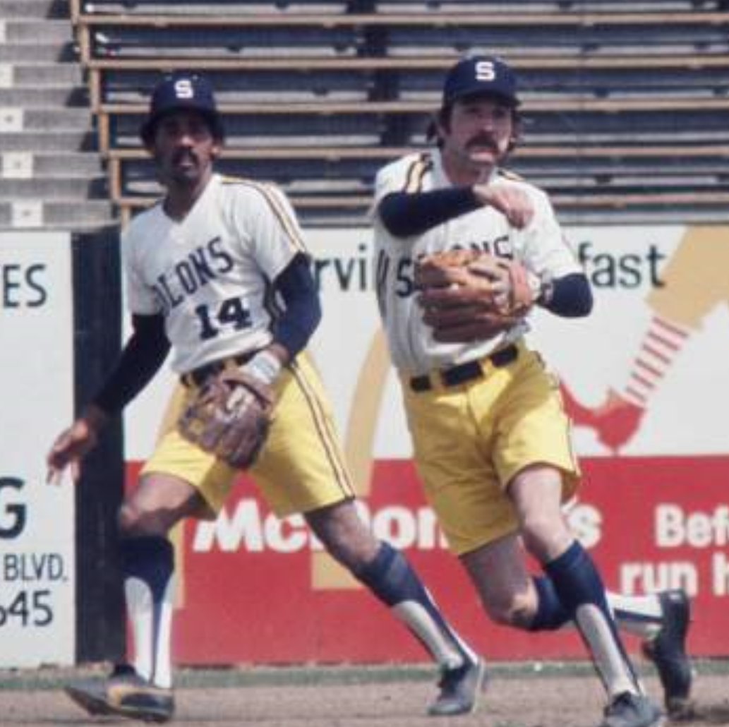
Friday Flashback: Imagine how Chris Sale would have reacted if the White Sox had broken out the shorts, instead just the leisure suits! By coincidence, the 40th anniversary of the White Sox’s shorts is fast approaching, so my latest Friday Flashback column for ESPN takes a look at that chapter in MLB history, and also examines some other pro ballclubs that have worn shorts (including the 1975 Sacramento Solons, shown above). Check it out here.

Raffle results, and today’s new raffle: The winner of the Tigers cap is Sammy Barbour. Congrats to him, and thanks to all who entered.
Our next and final ’47 cap up for raffle is this Indians cap, which has a cloth adjusta-strap in the back (note that this cap is different than the Cleveland snapback we raffled off earlier in the month):
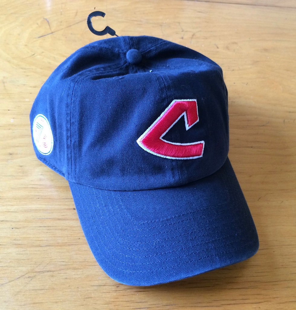
Here’s a closer look at the logo on the side (against a different background). There’s a ’47 maker’s mark on the other side.
To enter, send an email with your name and shipping address to this address (not to the usual Uni Watch email address, please) by 8pm Eastern TODAY. One entry per person. If you’ve already won one of this month’s raffles, please refrain from entering this one and let other people have a chance.
That brings our July cap raffle project to a conclusion. I’ve really enjoyed bringing a little happiness into someone’s life each day — fun stuff. Big thanks to our friends at ’47 for providing the caps, and doubleplusthanks to an unnamed reader (he knows who he is) who very generously provided a batch of custom-sized shipping boxes for me to use, which was incredibly helpful.
The Ticker
By Mike Chamernik

Baseball News: New Cub Aroldis Chapman wore catcher Miguel Montero’s helmet while in the on-deck circle last night. Chapman wears No. 54 (from @joesamp15). … Also, Anthony Rizzo yanked Dioner Navarro’s batting gloves out of his back pocket last night. The two were teammates on the Cubs in 2013. … The slump-busting Chris Davis batted bare-handed again last night. “Of course, he had a hit in the 4th inning,” says Andrew Cosentino. “It’s working!”… Jim Harbaugh wore his trademark khakis and borrowed Cubs OF Matt Szczur’s spikes to throw out the first pitch at Wrigley on Wednesday. … The Hillsboro Hops wore Portland Beavers throwbacks last night. Here’s another look. The Beavers were a Triple-A club that played in Portland from 1903 to 2010, when they moved to Tucson (from Phil). … The Angels’ Jefry Marte wore a patterned gray sleeve last night (from @RNs_Funhouse). … Mike Trout wore an oversize gold chain and sunglasses when giving David Ortiz his retirement gift before yesterday’s game (from Phil).

NFL News: Antonio Brown customized his Rolls-Royce with a flashy Steelers motif (from Arthur J. Savokinas). … A Bears helmet with an orange facemask popped up at training camp yesterday. John Koziol assumes that it’s probably just a fan’s replica helmet (that’s GM Ryan Pace signing autographs in the photo). … The Bears made posters out of a few of their old programs and display them in the United Club at Soldier Field. Here are a few close-up shots (from Jonathan Safron).
College Football News: A South Carolina O-lineman revealed a new matte black helmet for the Gamecocks (from Andy Shain). … The Big Ten is holding a conference at Purdue, and the conference put a big 3D logo sign outside the building. Note that the “TM” has its own block! (From Aaron Parrish.) … IndyCar driver Graham Rahal will wear an Ohio State-themed helmet for the Honda 200 race this weekend. Rahal is from Columbus, and the race is being held in Lexington, Ohio, a town roughly halfway between Columbus and Cleveland (from Luke Rosnick). … The NCAA is backing away from playing semifinal games on New Year’s Eve. But NYE was so awesome, I loved watching college football through confetti!

NBA News: Nuggets G Emmanuel Mudiay has a new personal logo. As many have pointed out, it’s pretty much a combination of two of the most loathsome logos in history. … Here’s a gallery of every outfit that fashion icon Russell Westbrook wore to playoff games this year. … Rimas Kurtinaitis, a Lithuanian shooting guard who played for the Soviet Union in the 1988 Olympics, participated in the three-point contest during All-Star Weekend in 1989. He wore a blank No. 12 jersey for the occasion. Here he is in action (from Mike Wissman). … Kevin Garnett loved that a guy in the Price Is Right audience wore a KG Celtics jersey-shirt. And, as you can see by that link, SI.com got a much-needed redesign (from Brinke).

College Hoops News: New silver alternates for Furman. Here’s the reverse. Maybe it’s the lighting, but it looks like the jersey and shorts’ shades don’t match (from Ben Wallace).

Soccer News: West Ham United opened Europa League play on road and wore its home kit with NNOB and no ad on front (from Robby Aces). … New third kits for Chelsea, Liverpool, and Manchester United. … Here’s an article on the high-tech training gear used by EPL clubs (from Tim Cross).

Grab Bag: Star Trek‘s innovative typography has been a fixture in pop culture for half a century (from Adam Herbst). … The U.S. Olympic rowing team introduced a new uniform that will better protect them from Rio’s sewage water (from Phil).
Looking ahead: Phil has this weekend off, so I’ll be handling the site’s content tomorrow and Sunday. And then on Monday I begin my annual August break from the site — Phil will be in charge on weekdays and webmaster John Ekdahl will run the show on weekends. I may make cameo appearances here on the blog now and then, and I’ll still be on the clock over at ESPN (except from Aug. 4-11, when I’ll be on vacation), so we’ll still provide links to my ESPN work (including the Timberwolves-redesign contest results, which might run next week, or maybe the week after). And I expect we’ll unveil another Uni Watch T-Shirt Club offering in August, so I’ll be showing up here to promote that.
But I’m getting ahead of myself — it’s still July. For all you weekend readers, I’ll see you back here tomorrow.
uni numbers that might be just a bit too large
Nope, that’s about right.
I think I might like the Bears with orange fasemasks. I will need to see a full team of them.
I couldn’t find any orange-mask photos on their website however.
I notice the kid in the Bears photo is wearing an PL fave:
link
(heavily discounted, btw)
That link is for a counterfeit site. Every team store is through NFLShop.com.
The U.S. Olympic rowing team introduced a new uniform that will better protect them from Rio’s sewage water
I wouldn’t go in that water with anything less than a space suit. Trying to figure out the rea$on$ why the I.O.¢. didn’t take these games away from Rio a long time ago.
The link from the Iowa baseball tournament are magnificent.
The Friday Flashback is up:
link
I believe the sleeve mentioned in the baseball ticker is from Father’s Day
link
I was about to comment that Harbaugh’s trademark khakis are actually link, but it appears that, at his wife’s behest, he switched to link at some point late in his Niners tenure. Welcome to the mid-to-late 1990s, Jim!
Interesting (to me) article on different logos on t-shirts. Links to a lot of smaller producers I’d never seen:
link
The only thing that could make the Portland Beavers uniforms better is if the beaver was shown gnawing on the bat. Or maybe have a log that he has gnawed half of into a bat shape.
Oh, there’s something else that could make that uniform better.
They could have included the best undershirt in baseball history:
link
Remember that time I DIYed the Beavers striped undershirts?
link
Anything that involves a beaver, a piece of wood being gnawed and baseball motifs is instantly awesome to me. Oh, and striped stirrups. Those too.
‘Skins logo placement….
Does this look correct to you? or should the circle be centered?
thoughts?
link
same question for this Titans shirt.
link
The Portland Beavers throwback is a great uniform. Got me thinking about how we have seen a partial shift in the pro sports landscape in the US Pacific Northwest and Western Canada in the last 20 years with evolution of sports business. Not something I would have predicted 20 years ago.
We have seen an exodus of Triple A baseball from Portland, Vancouver, Calgary and Edmonton. There has been an exit of NBA basketball from Seattle and Vancouver.
However, there has been an emergence of great support for Major League Soccer, with fans in Seattle, Vancouver and Portland supporting their teams well.
The old stadium of the Portland Beavers has never been more intimidating as it is now home to the Timbers Army.
The Calgary Cannons could just never get a new stadium built. The old Foothills Stadium was rundown and no longer appropriate for Triple A baseball. They tried to build a new one downtown, but instead they used the site as a skate board park. Add to that the weather here is so unpredictable because of the mountains. It’s not unusual to get snowstorms in late May, and as a lifelong Calgarian, I’ve seen it snow here in all 12 months of the year. That led to lots of postponed and cancelled games during the first half of the season.
Once Calgary was gone it was just a matter of time before Edmonton would leave. It’s too far from everyone else, you could make a bit of an argument that it was okay when teams would come here and be able to play series in two cities, but to have to go that far north for just one series wasn’t feasible.
It’s amazing that Tacoma can keep their team viable with Vancouver and Portland both having left the PCL.
I just watched the home movie clip on YouTube of the White Sox wearing shorts in the August 22, 1976 game against the Orioles. I also looked up the box score of the game and found that three future Hall of Famers played in that game for the Orioles. Jim Palmer pitched a complete game win. Brooks Robinson (near the end of his career) pinched hit and walked in the ninth inning. Reggie Jackson (who played for Baltimore in 1976 before joining the Yankees) also pinched hit in the ninth inning and hit a grand slam which can be seen in the movie. Also Hall of Famer Earl Weaver was the manager of that Oriole team. Pretty interesting footage.
Reading the friday flashback, but s it common for teams to change uniforms in a doubleheader? I understood the Chisox did this with the shorts uniforms in two of their games.
What’s a doubleheader?
Mets did it earlier this week, for Tuesday’s doubleheader against the Cardinals.
Game 1:
link
Game 2:
link
Thanks
Well that was quick. All mention of Lake Erie Warriors is gone from the NCPHL site from yesterday. New team: Lake Erie Gulls
link
Not only that, but they’ve photoshopped a new Gulls logo over the Warriors logo on their photo backdrop, and cropped their photos so the old Warriors logo doesn’t show:
link
Here’s one where the cropping still shows part of the Warriors logo:
link
Wow.
Wow the new “G” logo for the Gulls is incredibly creative!
Photoshop catastrophe. Generic “G” over everything. Err…almost everything.
Paul- any possibility that this was a really lame attempt to draw attention to the league?
Paul- any possibility that this was a really lame attempt to draw attention to the league?
Is there *any* possibility? Sure. There’s almost always *some* possibility of almost anything.
Ok let me restate given your response. Do you think it was a stunt?
No.
But as conspiracy theories go, that one’s semi-plausible.
And now it looks like they changed it again from Gulls to Eagles? Seems like even less of a chance for stunt now.
Here’s an interesting article from Indian Country Today about the social media uproar that Paul’s article about the Warriors’ logo created yesterday:
link
A shame they seem to be keeping the colors. Red, yellow, and black are just terrible colors for a team named the Gulls. Also a shame they couldn’t have kept the Warriors name, but dropped the badly drawn, racist Injun logo in favor of a hockey-stick tomahawk in green, brown, and red.
But the tomahawk logo would still lead some people to believe that all Native Americans are/were warriors.
The Bears made posters out of a few of their old programs and display them in the United Club at Soldier Field.
Very cool, especially the one with the running bear. Love it when teams do this.
That St. Mary’s Logo with the odd St. placement looks like a modified St. John’s logo, no?
link
“cloth adjusta-strap in the back” I believe the industry approved nomenclature for this type of hat is “strapback.”
Those black & white shots of baseball teams in shorts, especially the Miami Beach Flamingos and Austin Braves, are begging to be colorized. Austin manager Hub Kittle looks thrilled with his outfit.
I burned my eyes on that Liverpool shirt. Aargh.
The good ol’ “jersey shirt.”
Or, as we’ve always called them, “shersey.” To mock jersey party-goers, a good buddy of mine always wore a shersey to parties. His staple.
Cross On Back for the Knights of Kuemper Catholic High School in Carroll, Iowa: link
Also for St. Mary’s Hawks in Remsen: link
Possibly something similar for the Bishop Heelan Crusaders of Sioux City (also, great view of the state Capitol beyond the outfield): link
Will there be an Olympic basketball uniform overview of all the countries?
Dodgers Justin Turners batting helmet is missing the LA logo tonight through the 5th inning.