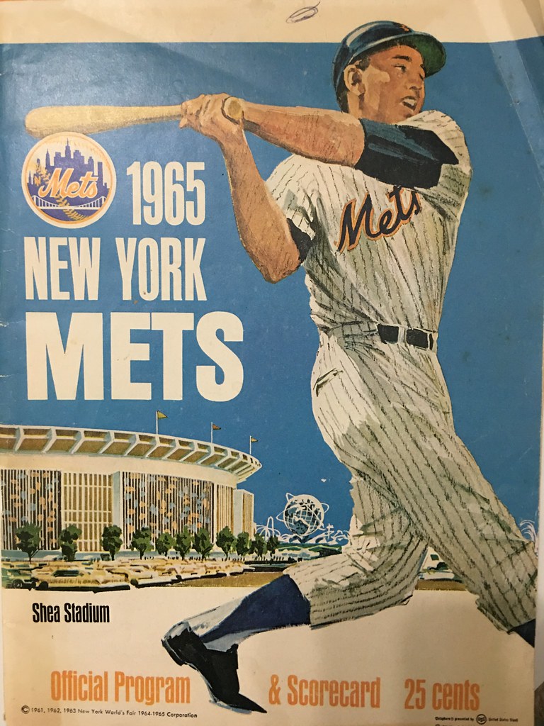
Reader Brian Sullwold’s mother was recently going through her attic and found something cool: a 1965 Mets program, apparently purchased and saved by Brian’s grandfather half a century ago. His grandfather even filled out the scorecard, which was apparently from this Mets/Cardinals game, played on Aug. 21, 1965.
There are several noteworthy things about the program, beginning with the cover (shown above), which shows a Mets player with no front jersey number. As it happens, 1965 was the year that the Mets added a front number, after having gone number-free for their first three seasons. It’s not clear if the lack of the number on the cover illustration was a carryover from the previous look or an attempt to make the illo player seem more generic by not assigning him a real player’s number.
A few other things that caught my eye (for all photos, you can click to enlarge):
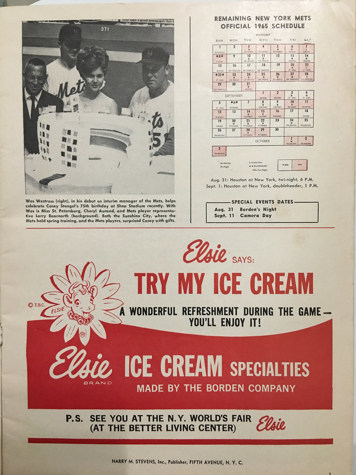
• Looks like the Mets celebrated Casey Stengel’s 75th birthday by presenting him with a Shea Stadium-shaped cake. Or at least I think that’s what they gave him — the caption doesn’t specifically say that the item in the photo is a cake, but that’s what it looks like to me:
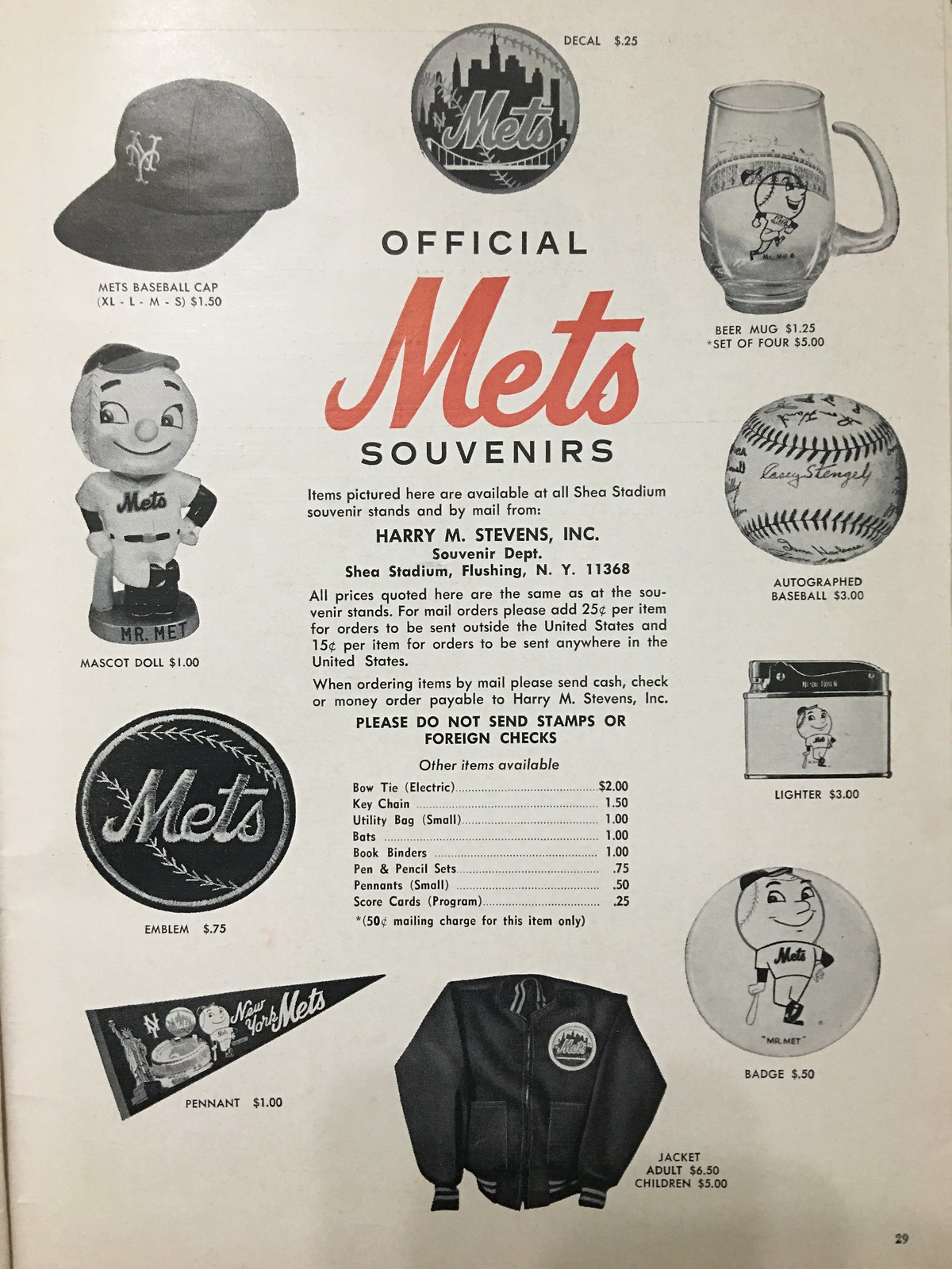
• In 1965 you could buy a Mets cap (for $1.50!), but not a jersey. Quite a variety of Mets scripts on the assorted logos:
• This is interesting — an ad for Orlon socks. Thanks to the selective use of color, the unstated implication is that MLB stirrups at the time were made of Orlon (which I suppose they may have been, but I suspect not):

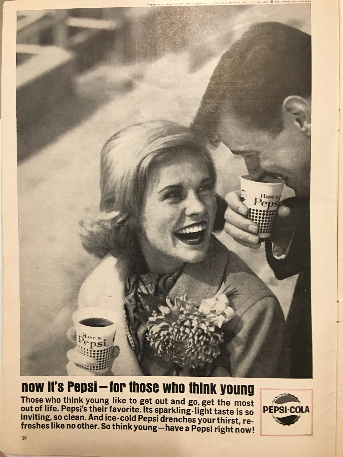
• Interesting to see a Pepsi ad with the “For Those Who Think Young” slogan. As I wrote in 2011, this was part of a long run of generationally charged Pepsi slogans — a very different approach than Coke has taken over the years:
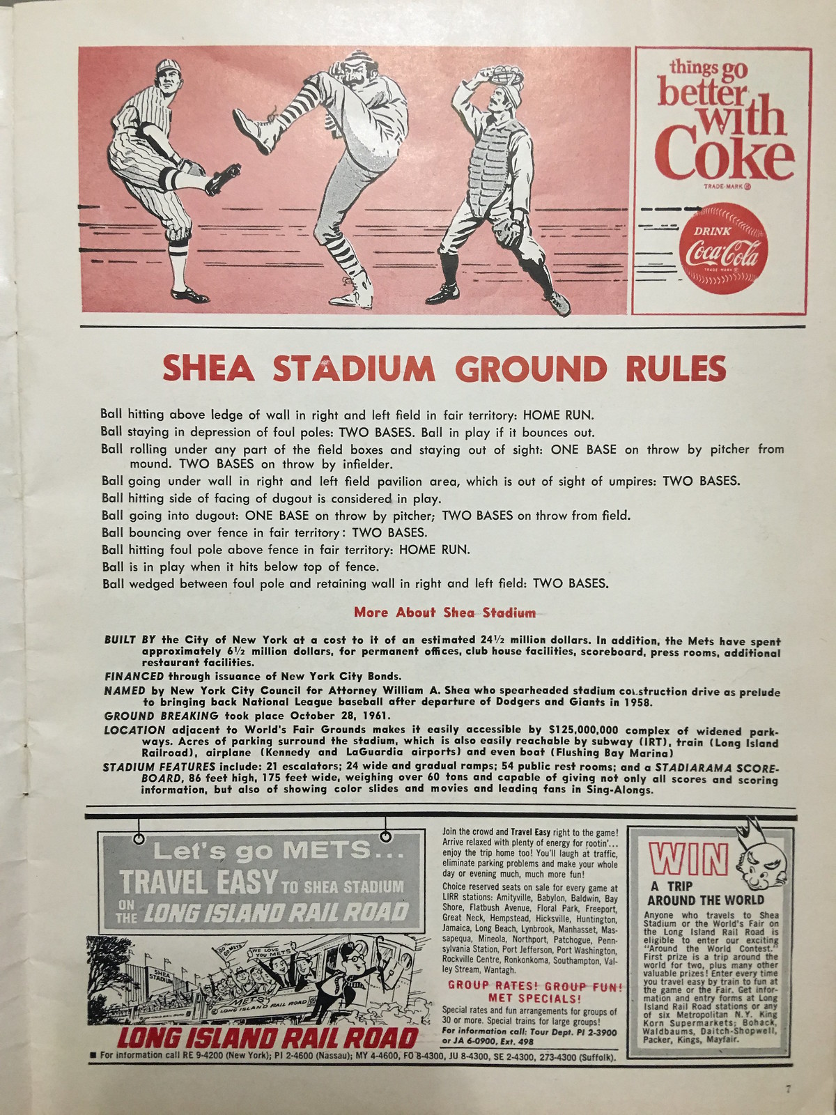
• And sure enough, here’s a Coke ad with a non-generational slogan (“Things Go Better with Coke”) and, for reasons that aren’t entirely clear, three players in old-timey uniforms and gear. Note that two of them have mustaches, which were unheard of on the field in 1965:
• Speaking of beverages, it’s striking to see how many ads for hard liquor are scattered through the program. Here’s one of many (you can click through all of the program’s pages to see more here):

• I began eating Milky Way bars back in the early 1970s, and the package design hasn’t changed much since then. But it was apparently a lot different in 1965. Also, at the bottom of the page, the Mets jersey on the little boy in the ad actually says, “Met’s” — with an apostrophe:

Want to see more? You can see the entire program here.
(Doubleplusthanks to Brian Sullwold for sharing this family treasure with us.)
Click to enlarge
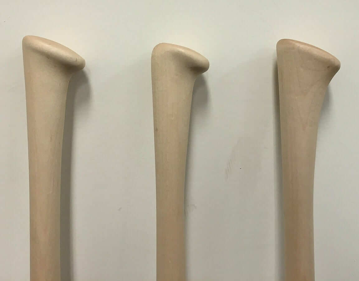
Special handling: Last Thursday I mentioned that Twins catcher Kurt Suzuki was using an axe-handled bat. That prompted a communiqué from Matt Peterson, the PR manager for axe bat manufacturer Baden Sports, who explained that the company actually has three separate axe handle designs. He sent the photo shown above, and the following note:
The one on the far left is our standard Axe knob. This is still the most prevalent, and the one being used by players such as Mookie Betts, Jake Lamb, Dustin Pedroia, and Kurt Suzuki.
The middle version is the variation being used by Carlos Correa, as you can see in this photo. The backside has more of a curve to it than on the standard version. Our director of R&D, Hugh Tompkins, says, “The idea is that guys who sit all the way down (on the knob) will have a little bit more freedom through the swing.”
On the far right is the variation Avisail Garcia has used for most of this season. The main difference, as you can see from the picture, is that the ridge of the knob has been filled in on the sides and on the front hook. The bottom perimeter is the same size as the standard knob. From Hugh Tompkins: “This can be better for guys who have bigger hands or who really like to get all the down on the knob, or might even hang a finger normally. This lets them sit all the way down and not feel like their pinky is being kicked out by the hook, and not feel like they have the side hook pressing into their palm.”
There are several more variations we’re working with right now, but those are the main three you’ll see around the league this season.
Click to enlarge
Collector’s Corner
By Brinke Guthrie
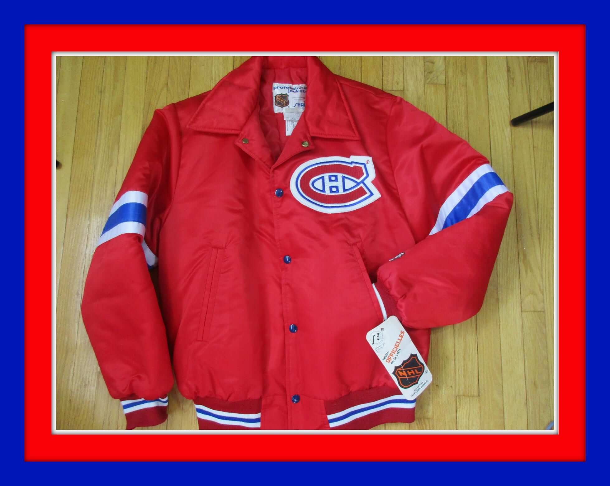
Canadiens fans! This is one nice-looking 1980s jacket, made by Shain of Canada. “Vestes Officielles de la LNH.” Of course it is. Now, I can’t really find much on Shain, but it looks like they made a good product!
Now here’s the rest of this week’s picks:
• How about this vintage Chiquita Banana NFL ball? This was a premium you could send away for — and get yourself a set of my beloved Chiquita NFL stickers. Interesting point here: this one comes with an inflation needle, so I guess you could pump it up! I would swear these things were made of really hard-packed foam, like a Nerf. (And how many Nerf footballs did I go through every summer! Those things could sure soak up the water at the Terrace Park Swim Club. And then lifeguard Sally Beach would bench all of us. Had a quicker hook than Sparky Anderson.)
• These vintage Oscar “Big O” basketball shoes look decidedly lo-tech, don’t they? Curiously, no brand name anywhere that I could find (and that era woulda pretty much been Converse or Keds, right?).
• Here’s a Vikings T-shirt of alleged 1970s vintage. I don’t recall ever seeing this type of facemask used on an NFL team T-shirt before.
• I also don’t recall ever seeing a Saints version of these great 1960s Acrometal helmet plaques, but here you are.
• Had one of these! These big ol’ 1970s beer stein mugs with the gold trim around the top. This Bengals one sat next to my 1975 and 1976 Reds World Series mugs, as I recall.
• Here’s an unused vintage 1960s Washington Senators glass. That “W” looks familiar, no?
• I guess if you didn’t have permission to use Bucco Bruce, you had to go with a generic football player for your “Follow the Bucs” window sticker.
• What’s A FlyerJak, you ask? Well, you’re gonna need to click here to find out.
• Look at this old Detroit Tigers kids duffel bag!
• With all the World Series logos and years, this jacket makes it clear that you are indeed a fan of the Cincinnati Reds.
• And from reader John Nolan, a set of amazin’ 1969 Mets programs — a perfect capper to today’s main entry.
The Ticker
By Mike Chamernik

Baseball News: Cardinals OF Tommy Pham removed his cap to shield his eyes from the sun while catching a fly ball in Seattle the other day. Inventive! Never seen that before. … Cards P Adam Wainwright nearly hit a bird with a pitch last night. By rule, that means we have to cue up the old Randy Johnson video. … Cubs 3B Kris Bryant tore his pants last night (from Matt Barnett). … XYZ: Red Sox DH David Ortiz had an unzipped fly yesterday (from Ted Zeigler). … Also from Ted: The Yankees had two third basemen on their lineup card yesterday. Aaron Hicks played right field. … D-backs C Chris Herrmann turned his Kobe II Elite Lows basketball shoes into baseball cleats (from @DizzleAZ). … New Balance released a line of spikes for the All-Star Game. … The Cardinals added a girls’ “Dizzy and Daffy Dean” playsuit to their Hall of Fame Museum (from Elena Elms). … Here are the All-Star practice unis for Nippon Professional Baseball. @GraveyardBall tells us that two games are played, one in Fukuoka and one in Yokohama. … Also in Japanese baseball, the Yokohama Bay Stars revealed uniforms for a Kids Star Night in July (from Jeremy Brahm). … “I was shopping this weekend at a Dick’s Sporting Goods and was disappointed to see that almost the entire stock of baseball pants comes without elastic cuffs,” says Dan Herr. “The pajama pants look seems to be institutionalized at this point.” … The White Sox have tightened up the letter spacing on the fronts of their 1980s alternates. Last year was more spaced out than this year, particularly evident between the “S” and the “O” (here’s another look at Carlos Rodon from both last year and this year). The spacing on the original mid-’80s jerseys looked to be closer to last year’s version (from Eriq Jaffe). … You know those rubber bands that players train with during spring training? A Phillies prospect suffered a freak eye injury due to one of those bands. He’s already had one surgery and may need another, and other reports say the injury may be career-threatening.

NFL News: The Buccaneers are installing new video boards. … Not uni-related but amusing: LA Rams rookie WR Pharoh Cooper’s nickname is King Tutt-chdown. … David Firestone found a 1957 Steelers jersey on eBay. It’s only a cool $17,000.
College Football News: New unis for Miami (Ohio) (from Phil). … Buffalo players got to see their new uniforms. The official revealing will be held this morning (from Mike Monaghan). … Lou Holtz wore a Miami hat once while coaching Arkansas. That screenshot comes from an old tape so I can’t quite see if that’s the legit “U” or some type of parody logo.

Hockey News: Are the Rangers switching helmet logos? They previously had the “NYR” wordmark on the sides, but the Rangers tweeted this photo yesterday that shows the primary logo on the helmets (from Mark Grainda). … This has probably jumped the shark with a lot of you, but here are Crying Jordan logos for all 30 NHL teams.

NBA News: J.R. Smith celebrated the Cavs title by going everywhere shirtless for an entire week. Now a “shirtless” J.R. Smith T-shirt is on sale (from Andrew Cosentino). … President Obama says that he loves meeting with championship teams and even encouraged the Cavs to stop by the White House before he leaves office. … Bulls rookie Denzel Valentine will wear No. 45, which was Michael Jordan’s number after his return from baseball in 1995. Three Bulls players have worn the number since then, most recently Rasual Butler in 2011 (from Brinke).

Soccer News: The Richmond Kickers’ jerseys are so light and tight that they are easy to rip. The USL club has suffered eight jersey tears this year (from Tommy Turner).

Grab Bag: WTA tennis player Camila Giorgi doesn’t have a corporate apparel outfitter. Drew Stiling says that her mom, a fashion designer, creates her attire. … Good list here of the most notable regional hot dogs. I need a Papaya dog and a Sonoran (from David Firestone). … The SafeTrack repairs have shut down entire rail sections in Washington D.C. Shuttle busses are helping to move people around, and that includes an old Northern Illinois Huskies bus (from JohnMark Fisher). … An illustrator added some intricate detailing to some athleticwear company logos (from Brinke).
Good to see fMiami finally come back to reality. They were an embarrassment for all of college football.
Also, if the vintage programs interest you, @History_Cle has been posting lots of vintage Cleveland stuff.
Those Miami uniforms were so bad that these new ones, which are not so great either, are a welcome sight.
Not a sandwich
Nothing is a sandwich. Nothing has ever been a sandwich. Sandwich is not even really a thing, when you think about it. Like time, or the dog park.
Isn’t funny how we drive in a dog park and park in a dog drive?
Wait…
+1
Everything is a sandwich.
Well, I don’t buy that, but if the choice is nothing or everything, then I go with everything. Because a hotdog is one.
People are not allowed in the dog park. It is possible that you will see hooded figures in the dog park. Do not approach them. Do not approach the dog park. The fence is electrified and highly dangerous. Try not to look at the dog park, and, especially, do not look for any period of time at the hooded figures. The dog park will not harm you.”
Not a sandwich:
link
Sandwich:
link
Is a quesadilla a sandwich? I mean, if sandwiches are even a thing that exists, which they’re not?
Look how small those Pepsi cups are in that ad? If that were today, they would be 64oz.
This is what I was going to comment on. Probably 8 oz cups. I remember going to McDonalds in the late 60s and getting maybe a 12 oz cup, which made sense since you drank 12 oz cans from the store. I don’t remember how many ounces the bottles were, but I’m guessing 10 or 12 ounces. And of course there was no free refills.
” this one comes with an inflatable needle,”
Perhaps you mean “inflation”.
*I* come with an inflatable needle! Hey-O!
LOL
Proofreading: ‘Also, at the bottom of the page, the Mets jersey on the little boy in the ad actually says,, “Met’s” – with an apostrophe:’ Nothing better than the double comma when pointing out the unnecessary apostrophe.
And that’s not just any 1957 Steeler jersey that’s so overpriced. It’s Ernie Stautner’s, whose number 70 was the only officially retired number the team had until 75 was retired for Joe greene a couple years ago.
Should be “Joe Greene,” of course.
Fixed.
My guess is that Ernie’s jersey is from 1962 or 1963 as from 1957-1961 the Steelers did not use TV numbers.
I love to see old advertising to see how much has changed. Liquor (obviously) is the biggest one, but the fact that DuPont could advertise a compound that people didn’t know what it was besides the name and the Bordon’s ice cream at the “better living” center for the Worlds Fair are two that strike me as the most telling of the times. The fact that Coke and Pepsi are in the same pamphlet would be unheard of in today’s world.
Especially, since at the time, RC Cola was being served at Shea!
“Tommy Pham removed his cap to shield his eyes from the sun ”
But if you watch the clip (and the shadow of his cap) it really didn’t work. Oh, he caught the ball, he just didn’t shade his eyes.
There were several instances of shade over his eyes. Maybe he didn’t need shade the whole time, just time enough to locate the ball if he didn’t see it at first.
Today, the equivalent of Ambassador Deluxe Scotch would be bottom-shelf swill. But back then, when basically all of Scotland’s whiskey went into blends, it probably contained a good percentage of what would today be expensive single-malt product.
But interesting that the product capitalizes Scotch, what with it being a proper noun and all, yet the ad’s text renders it scotch with a lower-case s.
Well, the 25 y/o Ambassador blend from that era at least includes product from reputable (and still-extant) distilleries from both the Island and Campbelltown regions of Scotland:
link
That said, the bottle depicted in that advertisement contains no age statement, even though Ambassador also marketed an 8 y/o blend at the time. It also bears noting the 1960s was an era of unprecedented growth in Scotland’s whisky industry, which strained distilleries’ existing supplies of aged product and left them grasping for whatever stock was available to keep pace with export demand (the situation Japan distillers find themselves in currently, and have all but ceased issuing age-statement whiskys). My guess, then, would be that the Ambassador blend marketed in the US at that time consisted mostly of assorted grain whiskies leavened with a smattering of less-than-fully-matured malt whiskies to lend it some modicum of character.
“‘I was shopping this weekend at a Dick’s Sporting Goods and was disappointed to see that almost the entire stock of baseball pants comes without elastic cuffs,’ says Dan Herr. ‘The pajama pants look seems to be institutionalized at this point.’”
Speaking of, is the MLB high-cuffed census still something we should be looking forward to, or did that project get put on the back burner?
Soon. Ish.
Hooray!
August 21, 1965- only six days after the famous (first) Beatles concert at Shea.
” Speaking of beverages, it’s striking to see how many ads for hard liquor are scattered through the program.”
Well given the Mets first three seasons, they don’t seem too many
The Holtz thing is a taped pregame shot before the start of the 1978 Orange Bowl. Barry Switzer talks while holding an umbrella, then Holtz speaks. If you go to the 21-minute mark, once the game starts, Holtz is walking the sidelines without a cap.
link
link
Thanks for sharing the Mets program. A true attic treasure.
It reached 96 degrees here yesterday but I lust for that Canadiens jacket featured in Collector’s Corner.
The real question from that program is, what the heck is an electric bow tie?!
Very amusing (and perfectly appropriate for Uni-Watch) that on a night when Kris Bryant had one of the best offensive games in MLB history, the headline here is that he tore his pants.
The Sealtest ad at the bottom of the page featuring the Mliky Way ad… Looks like the cap that forms the “P” in the word “champions” has a Yankee insignia. The “Y” in the Mets insignia crosses the vertical lines of the “N.” In the Sealtest ad, that does not appear to be the case.
The $17,000 Steelers jersey has this neat comment from the player on the prominence letter.
“We sometimes had the crouch (crotch?) piece cut out and sewn in because we didnt like them much”
looking at the second pic of the ebay posting, it appears one side of the crotch piece hangs lower than the rest of the hem.
Is this an example of a 1957 unitard football jersey?
(provenance)
I’m glad I could share this with everyone here – I finally have a pretty sweet contribution! What amazes me most, though, is the sheer luck that it took to get that program into my hands. It was stored in an attic for decades, in a home with folks who aren’t baseball fans at all, then moved to my mom’s attic (no information yet as to why) where it sat for even more time. That she saw it without just throwing it away and noticed that it is a Mets program, called me and gave it to me, is just another layer of luck that brought it to us here – there were many times along its path where it could have been destroyed, thrown out, etc. Sure, it has essentially no “cash value” whatsoever, so this seemed to be the perfect place to share it before it’s framed.
Thanks, Brian!
“… this one comes with an inflatable needle.” Very cool. Would like to see how this works.
“Those things could sure soak up the water at the Terrace Park Swim Club. And then lifeguard Sally Beach would bench all of us.”
~~~
(pictures a young Brinke…)
“Here it is! It’s no big deal.”
Loved the LIRR ad in the Mets’ program and bonus points for the old style exchange phone numbers in it. Example: RE 9-4200
On the Vikings T-shirt… I think that is more “early to mid-80’s” because the helmet design is the exact same one as the ones that were featured on totes the traveling NFL book bag salesman was peddling at my elementary school when I was in 5th grade (1984). You know, they would gather the whole school into the gym for a sales demonstration, and inevitably pick out the fattest kid in school to come down and stand in the bag to show how strong it was. (talk about fat shaming!) The Colts had just moved to Indy and that was the big seller… Though I’m a Colts fan now, I ordered a Saints bag to be different. –My favorite though was the older style, vinyl NFL bags with the hard board bottom. I carried one of those for years.
I had no idea there were so many variations of the hot dog. God Bless America!
Looks like I have some travelling to do …
All those varieties, and not a single one of them is a sandwich.
With Buddy Ryan passing away today, arizonasports.com had a story about it and his 1994 season in Arizona. It included a picture showing the Cardinals with gold pants and 3 thin white stripes on their red jersey and the front numbers smaller and offset onto the upper right side. This is totally different from anything I Have seen and the picture is shown from this link:
link
any history on this uniform? was this just preseason?
That’s the 1994 NFL Diamond Anniversary throwback:
link
University of Buffalo revealed their new logo and uniforms: link
I like the Rangers wearing their primary logo on their helmet. Better than the “NYR”. They should make the primary logo on the helmet a bit bigger.
Re: Flyerjak. They did this for several teams. I have one for the NY Islanders. And I think they were from the early 80s (1982 or 83) I remember getting mine near the end of the cups.
Paul: Are the stirrups on the Mets program cover on backwards?
Arguably. Tough to say based on the view provided.
Those are my Crying Jordans! Haha