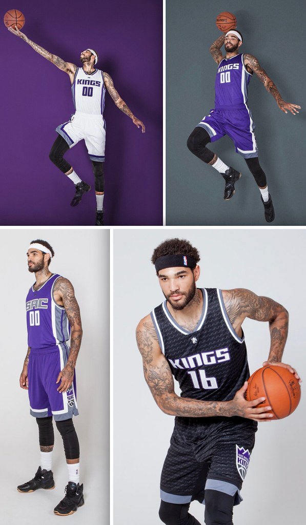
Click to enlarge
The Kings unveiled their new set yesterday. The four new designs, some of which had already been seen via video game leaks and team teasers, can be seen above.
So what do I think? The short version is that I think this set moves the Kings from the bottom of the pack to somewhere in the middle; the longer version can be found in this ESPN piece, which went up yesterday afternoon. You can also get more info on this interactive page. And here are some additional photos (if you can’t see the slideshow below, click here):
Meanwhile you know how the Kings’ new logo is based on the franchise’s old Cincinnati Royals logo from the early 1970s? I recently interviewed the guy who designed that original Cincinnati mark. To my knowledge, his story has never been told. And as you might imagine, he’s pretty pleased about the Kings reviving his design. Further details next week.
T-Shirt Club reminder: In case you missed it yesterday, the Uni Watch T-Shirt Club’s third limited-edition design of 2016 is now available for your consideration.
As you’ll recall, we’re going one sport at a time this year, and we already covered baseball and hockey. Our latest shirt takes us to the hardcourt, as we’re launching two different basketball designs — one showing a home uniform and one showing a road uniform (click to enlarge):
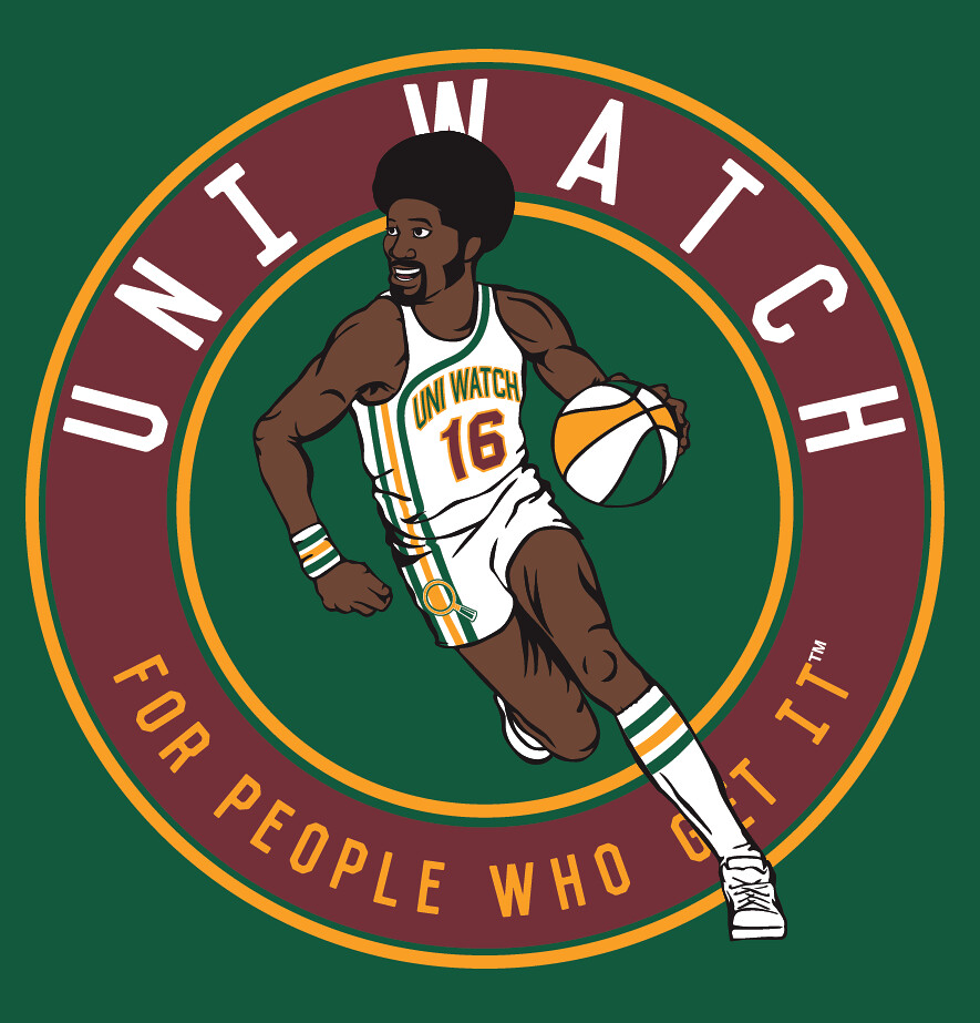
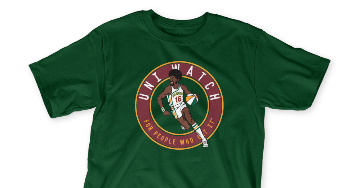
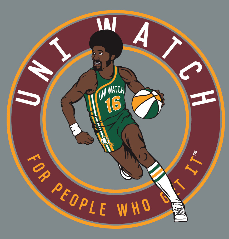
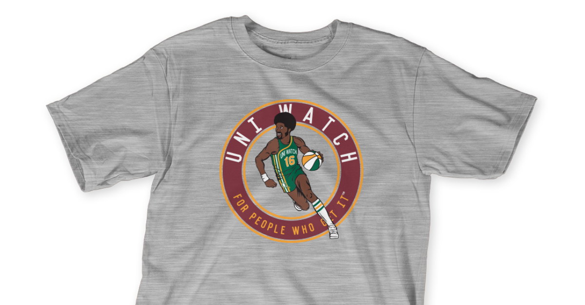
Pretty cool, right? I really love seeing that racing stripe uniform concept done up in Uni Watch colors, and ditto for the ABA-style ball.
Important: Although green and grey mock-ups are shown above, we’re offering both of these designs in four different shirt colors (green, grey, black, and white), and also in two different styles (short-sleeved and long-sleeved). As usual, they’re available for one week.
Here’s where you can order the home and road designs. You only need to purchase one of them — the home or the road — in order to maintain your 2016 “Collect ’Em All” eligibility (although you’re welcome to purchase both, obviously).
As always, big, big thanks to my Teespring partner, Bryan Molloy, for his great work on these. I’m very happy with the way they turned out.
Also! After I posted about the T-shirts on Twitter yesterday, reader DW Jones posted a good question: “Does the basketball player have a name?” I hadn’t thought of that, but it’s a fun question. So here’s what we’ll do: I’ll give a free shirt to whoever comes up with the best name for the player. Post your suggestions in today’s comments.
One more time: The home shirt is available here and the road shirt is availble here. Thanks.
The Ticker
By Paul

’Skins Watch (a day early this week): The board of trustees for the Onteora school district in upstate New York has voted to replace the district’s Indian mascot with an eagle (from Rob Yasinsac). … A Native American tribe in North Carolina is suing Anheuser-Busch, alleging that the brewer illegally used the tribe’s logo and slogan in advertising.

Baseball News: “Legends of the Hidden Temple” jerseys upcoming for the Lake County Captains (from Andrew J.). … A college summer league game featured red vs. red (from @OuttaBoston). … Padres P Brad Hand is my new hosiery hero (from DJ). … Speaking of the Padres, they used the Marlins’ old logo on their scoreboard for yesterday’s throwback game. … Auburn softball player Haley Fagan had a patch problemall season long.

NFL News: The Steelers will wear their bumblebee throwbacks in Week 5 against the Jets (from Jerry Wolper). … Check this out: Steelers-themed golf headcovers (from Rob Montoya). … Covered and smothered: Titans DB B.W. Webb loves Waffle House so much that he wear a Waffle House compression sleeve (from Preston Penn and Eric Wright).
College and High School Football News: Interesting plans for Notre Dame, where uniform No. 1 will be rotated on a weekly basis and Nos. 2-9 will also be in flux (thanks, Phil). … New stadium scoreboard for Utah. … High school officials in Chicago say some of their shoulder pads and other equipment are more than 20 years old and woefully out of date. … Riddell has launched its 2016 Smarter Football Program, which provides grants and equipment to high schools that encourage safer football practices. Further info in this video.

Hockey News: The AHL’s new franchise in Springfield, Mass., will be called the Springfield Thunderbirds (from Chris R). … Hmmm, should the NHL retire Gordie Howe’s No. 9 league-wide? … Humorist John Hodgman is a big fan of the Hartford Whalers’ logo, as he discusses in this podcast. He even got Whalers logo designer Peter Good to design a Whalers-style “JH” logo for him (from Lee Wilds). … Ladies and gents, your Stanley Cup Champion Buffalo Bills!

Basketball News: Here’s a new one: The Bucks have sold the naming rights to their new arena’s construction site (from Matthew Hippe). … An Illinois newspaper’s coverage of Game 5 of the NBA Finals featured amusingly outdated Cavs and Warriors logos (from Matt Eurich). … Gross: An auction house is selling a game-used Steph Curry mouthguard. Interesting that it has his name, number, and team logo, though (thanks, Brinke). … The Cavs aren’t allowed to wear the black sleeved unis at home for Game 6 tonight, but they’ll be giving away black T-shirts to their fans (from Kevin Chmura). … I’m still calling it Hofheinz Pavillion (from Corey Buck).

Soccer News: Best story you’re likely to hear today: St. Pauli manager Ewald Lienen wasn’t available to attend the press conference for a newly signed player, so they used a guy wearing an Ewald Lienen mask instead (from Bryan Justman). … Interesting infographic on the chemistry behind the Euro 2016 ball (from James Gilbert).

Grab Bag: The San Francisco airport has an exhibit on flight attendants’ uniforms. … Pro sports teams are cracking down on scalpers. … New 75th-anniversary logo for Wonder Woman. … An artist created a rendition of the Rolling Stones’ lips/tongue logo by using 4,300 postage stamps. … Great article+podcast on a California police department that experimented with dressing its officers in blazers in the late 1960s, and how that fits into the larger history of police uniforms (from R. Scott Rogers). … Some homemade curling stones left in a school parking lot were mistaken for a security threat. … MLL player Rob Pannell is a big golf fan, so he’ll be wearing U.S. Open-themed gloves for an upcoming game (from Kevin Meuller). … In a vaguely related item, the folks at Verizon are getting their U.S. Opens mixed up. … Here are 11 things that the new Milwaukee flag looks like. … The sport of ultimate Frisbee (yes, I know it’s really just called ultimate, but not everyone knows that, so I’m adding “Frisbee” in there for the sake of clarity) has always been self-officiated, but now there’s some talk of adding referees to the mix.
Never a dull moment: By the time most of you read this, I’ll be on my way to NYU Langone Medical Center, where I’m scheduled for some surgery this morning. (Never mind what it’s for.) It’s an outpatient procedure, so I’ll be back home by the end of the day and should be able to resume normal activities in time for the weekend. But I’ll definitely be off the grid today, and it’s possible that I’ll be out of commission for tomorrow as well.
In terms of my health, there’s a good chance that the procedure will end up being a big nothing. And even if it ends up being something, it’ll be a something that can almost certainly be dealt with simply and easily. So while I’ll admit to being a little stressed out about the procedure itself, I’m not too concerned about any long-term issues.
Phil will be in charge of things here today — please play nice. And we should have a full slate of content tomorrow: I already have a lede written and ready to go, ditto for my Friday Flashback over on ESPN, and Mike will be compiling tomorrow’s Ticker, so it should be business as usual, more or less.
If there’s breaking uni news today, I won’t be in a position to cover it, and I also won’t be responding to emails or tweets. Sorry about that. Thanks for understanding.
Here’;s a post on ‘The Chemistry of Football (Soccer) Shirts’ from the same author as the Euro 2016 ball one.
link
That blog is well worth exploring!
How about Byron “Bubble Gum” Hawkins for the new uniwatch teeshirt?
Regarding the basketball player’s name on the teespring shirts:
Jefferson “Sideburns” Tweed
Tweed to give it a little more “uniform” flair, Jefferson because I believe a long first name balances well with a short last name, and “Sideburns” is self-explanatory.
Awesome! Love it.
Good luck Paul
Yeah, what he said. ;)
Proofreading: “that he wear a Waffle House compression sleeve”
Hope the procedure goes well.
Hope all goes well for you today Paul
How about Dr. UW?
I didn’t think NCAA football players were allowed to change numbers during the season.
If they can it seems like a good idea for teams to switch numbers around every week so the other team doesn’t know who the quarterback or running back is and stuff like that.
didn’t Michigan do that with the #1 and #98 a few years ago
“Michigan’s Devin Gardner is wearing No. 98 during Saturday’s game against Notre Dame in honor of former Michigan quarterback Tom Harmon,” link
Charles “Chops” Jankins
That makes me think of Charlie’s Chips
As someone who grew up in the 90s and went to a school with purple and yellow as their school colors I have to say the Kings new jerseys are a marked improvement. Could do without the “SAC” wording and the grey (pick black or white). The sky/baby blue though is still the star.
The SACs would have looked much better if they’d paired the purple with the baby blue, instead of with gray/black. Not a terrible NBA uniform set, and ten years ago it would have been among the best in the league. But the NBA has turned a corner from the era when pretty much every team looked like crap all the time. While I think darn near every aspect of the new Kings look is a missed opportunity, the team erred on the side of restraint in almost every detail. That’s how a not-great uniform set manages to be B work instead of D-minus.
Still like the old “checkerboard” design on the sides. They should bring those back. They seem to win more when wearing those. These are an improvement though.
How about “Orange” Julius Jones? It’s got that ABA flair to it in terms of names.
For whoever is fixing things today, there seems to be a missing space in the Auburn patch item.
Hope everything goes well today, Paul!
“Milwaukee Tool Construction Site” actually sounds appropriate… because whoever came up with that crackpot idea to actually sell the name of the construction site is a money-grubbing tool.
Roscoe “High Socks” Jones.
Good luck with the procedure Paul.
not sure if this an interesting fact or not.. but the Lumbee tribe isn’t recognized by the US government as Native American tribe, but is by the state of North Carolina. There is controversy about their heritage, a lot of the other Native American tribes don’t believe their claim that they are descendants of Lost Colony inhabitants and the Croatan tribe, some say they are either from other Native American tribes.. and others say they are descendants of African American and caucasian descent. so because of all the uncertainty, the US government wont fund them as a Native American tribe.
They are far from the only ones, the Shinnecock on Long Island fought for decades for recognition and the Metis people in Canada have also. It can be really difficult to prove Native heritage four centuries after contact and everything that has gone on historically since.
Five centuries. Math skill is escaping me today.
“Slick” Joe Hoops is what came to mind. I just like to imagine Hoops underneath the number on that uniform.
Let’s name the basketball player Sugar Dunkerton
Good luck Paul,
“Sorry that your sick day is due to actual sickness”
get well soon.
My name proposition: Maxwell Hooper.
Speaking of UW mascots, was it ever disclosed or guessed correctly who the hockey skater model was?
The purple “SAC” alternate jersey is the most disappointing of the Kings’ new jerseys. Aside from the wordmark on the chest, it’s the exact same as the road jersey. What’s the point, then? On the plus side, the black jerseys are pretty sick.
Ditto to many of the previous comments Paul–good luck with your procedure.
Godspeed Paul.
How about Ulysses “Nightingale” Ingram (“UNI”?
Good luck today Paul!
Ulysses Watts would be what I would call the hoopster.
I like the Kings Purple Sac jersey, but find the other three incredibly bland.
Good luck with your procedure Paul.
The player? Stripes Goldengreen. Nickname of “Dr. Stripes.”
/best of luck with the procedure
What about Burgundy Goldengreen? If you’re going to include the colors, include ALL of the colors. Plus, it brings to mind some particularly colorful ABA player names.
re: New UW shirt: I really like the magnifying glass with the magnified stripe. Nice touch.
How ’bout “U.W. Lukas?” Or go back to the 70s and steal Uniroyal’s “Uni, Roy and Al” bit and name him “Uni W. Atch.” On second thought, don’t do that.
So glad somebody else remembers Uni, Roy and Al.
Hmmm, should the NHL retire Gordie Howe’s No. 9 league-wide?
I don’t see why not. Nine is retired anyway for a lot of teams.
It’s been retired on a lot of teams because #9 was a star forward number for so many years when hockey teams mostly stuck to traditional numbers 1-20. I can understand #99 given the quantity of records and the fact that nobody else notably wore the number.
I like teams having #9 as an option so there are fewer high numbers.
I’m all for the wings nixing the corporate name for their new arena to be named after Howe.
I’d rather have the arena named after Fern LeBlanc than a corporate advertiser.
I was originally ok with it being called “The Pizza Hut”
I don’t think it should be retired singularly for Howe because so many other greats wore it, most notably Rocket Richard. How about this upcoming season, anyone who wears 9, has “HOWE” stitched into the bottom of their back jersey numeral?
Best of luck.
Oh, and how about Luscious Stripes for the name?
Curtis “Rob Roy” Holloway. His nickname was given to him by his teammates because he likes to wear plaid on game days.
Paul, God bless you and your operation today. Hope all goes well.
I am a little confused by one line in your ESPN piece: “The fabric is imprinted with an “S” pattern that looks a bit like chainmail but was actually inspired by the Sacramento city flag.” That almost implies the chainmail (usually just called “mail”) appearance is just a coincidence. Surely not. Surely they incorporated the flag into a pattern to look like a medieval king’s chest armor?
Hmmmm… His name is most definitely Earl Rudolph Biggins IV
Jefferson “Sugar Shack” Monroe.
Refuah shleima, Paul! Be well…
Completely agree with Paul in the ESPN piece that the black Kings uni is the best of the bunch and a rare black uni that looks good. I think the black shorts really stand out with minimal striping and the big logo. The other shorts are too cluttered with multiple stripes covered by a logo.
I think their new purple is a good shade, It seems less cartoonish than their previous purple and is a distinct shade that won’t be confused with say, the Lakers.
Overall, nice modern set. Conisdering how the Kings front office has functioned lately, I’m surprised how nice these turned out.
Good luck today, Paul.
Ditto.
The Kings’ previous black alt was also their best look. Loved the retro script “Kings” on it.
3 blue stitches on the bottom side, the Sac Proud badge and the blue collar on the jerseys? Hmmm.
Could you explain the blue stitching that seems to be at the base, side, and collar on all 4 Kings unis? Surely there’s some cool marketing blurb about that.
How do we get the UW jersey shown on the new t-shirt? I’d wear a Jefferson Tweed replica.
seconded
Good luck today, Paul!
didnt Webb wear the Waffle House sleeves as a Steeler last summer and the NFL put a stop to it?
link
Cornelius Dunkus.
Hey, Cavs… THIS is how you do a black alt (not that you need one). Nice contrast on the Kings’ unis. I’d wear them all.
I hope everything goes well for you Paul
Good luck today Paul!
Good luck, Paul.
Jive “Don’t you dare call him Jeff” Walker… FOR THE WIN!
It’s got a good 70s ring to it.
Corduroy “Collard” Green
Fuzzy Zoeller gives you a +1.
The basketball player looks like he should be called Sonny “Garbage Time” Hightower. Good luck with your procedure, Paul.
The basketball player’s name is Reginald “Smooth” Rhodes
Of course Reginal Rhodes has NNOB “SMOOTH”
**Reginald
**NickNOB (NNOB = No Name on Back)
Thanks for the help… You’re right.
BTW… Special K? Clark Kellogg?
No, my first name starts with a K, and I like to think that I’m something special. When I turned 14, my birthday cake was decorated to look like a box of Special K cereal, and I’ve kind of adopted that moniker ever since.
Eddie “The Hightop” Emerson
New primary logo was born out of the previous Kansas City-Omaha Kings failed franchise, which was known for what basketball fans? Yes. Tiny Archibald? That’s about it.
The new look is safe, predictable and traditional…all fine… but when a team has the opportunity to rebrand from scratch, shouldn’t an entirely new identity be developed that’s belongs (proprietary) to the Sacramento region?
And SAC? Hmmm…
Rating: 5 out of 10. Yawn.
when a team has the opportunity to rebrand from scratch…
Redesign, not rebrand:
link
As you can see, surgery has had no effect on my hardass-ness on this point!
I love the names for the UW b-ball player, especially Jefferson “Sideburns” Tweed. Keep them coming!
Isn’t always better to have SACRAMENTO on the front of your uni than SAC…?
link
You think that design looked *good*?
Ugh — such a mess.
There may be a more effective way to get all of “Sacramento” on a jersey, but it’s clearly a challenging word — too many letters.
World B. Floyd.
julius Greene
Or if you prefer, “green julius”
The Springfield Thunderbirds logo looks like the Colorado Eagles logo.
link
Octavio “Crunchy Peanut Butter” VelJohnson
Haywood Soxstripes
I love the new shirt. How about the “Uni Baller” for the name?? Also the wording on the Home Whie jersey is outlined in gold and no outline for the road jersey. lol
the wording on the Home Whie jersey is outlined in gold and no outline for the road jersey.
Yes, because things look different against a white background as opposed to a green background. We played around with various combinations and decided these were the best. If you choose to see this as inconsistent, so be it. We still think this was the right way to go.
How about John Smith? Or Bill Stevens?
Why are so many suggestions so suggestive (not sexually suggestive but ethnically so).
If I’d been asked to name the hockey player, the result would have been suitably Canadian.
And the resulting soccer player’s name would probably be South American or European.
Utah “Get It” Wadsworth might work as a name.
Bingo Clark, or Bingo Clyde. The hair reminds me of Bingo Smith and the pose reminds me of Archie Clark…or Frasier, if you’d rather, but I had an Archie t shirt when he was with the Bullets and he was in that EXACT pose…in the old racing stripes jersey…
That dude’s name is Willie Dunkit.
Yes!
Fred
B’Rock O’Slamma
Lucas Livingston Jr.
get it… jUNIor…
Darryl “Swish” McGee
Freddie “Muttonchops” Silas
Welcome back Paul…his name is Unique Watkins.
Wouldn’t the Kings story be held until annual purple day next May? Just kidding…
Retiring #9 league wide for Gordie Howe:
not necessary other than in the Red Wings organization.
Wayne Gretzky introduced hockey to many young followers and fans in the 80’s myself included. He actually reintroduced the league and sport worldwide, seeing #99 retired league wide has meaning. Howe is a Detroit Red Wing, Gretzky is the NHL.
Has the NBA retired Wilt Chamberlain? No.
MLB Babe Ruth or Roberto Clemente? No. There are great reasons why #42 is retired league wide though.
Just my 2 cents.
I like Ulysses “Pokey” Washington as the name…
Nothing about Michael Bradley’s captain armband today? Very classy and understated move, I thought
link
TheoThetics “Uni” Watchman
Name for player on shirt? How about Lukas Paul?
That beer company versus the Lumbee Tribe could be the beginning of Indian Tribes using intellectual property law and copyright or trademark claims in their efforts to limit and reduce Native imagery in sports and media. (They’re using your idea!)
I wonder what the most popular replacement mascot is for teams that drop Native American mascots? Eagles seems to be popular. So does Red _____ (storm, hawk, bird).
Kings new uni’s might actually be WORSE. That gray trim is hideous. Black uniform sucks. The logo on side of shorts way too big. Fail.
With NBA teams being allowed sponsorships:
Sacramento Reality Kings
“Our play on and off the court is NSFW.”