
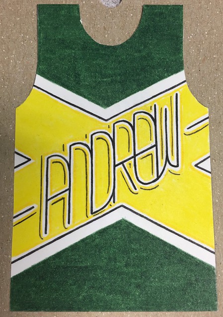
Click to enlarge
The photo you see above is part of an amazing project that’s been unfolding at the Oklahoma City offices of Paycom Payroll, where Uni Watch reader Justin Southwell works. I’ll let him explain:
Each year we have several employees participate in “Gavin’s Super Groovy NBA Playoffs Bracket Challenge.” Twenty-one co-workers entered the third annual bracket challenge for the 2016 playoffs.
The bracket challenge was created by Gavin Otteson. Each participant fills out a bracket to predict the winner of each series, and each round has a weighted point value for correct picks.
But what makes this challenge stand apart from March Madness brackets is that each participant is given a hand-drawn mini-jersey with his or her name.These mini-jerseys are used to show the participants’ rankings. The top 10 are placed on “The Leader Board,” while the remaining contestants are on “The Bench” [as shown in the photo at the top of today’s entry ”” PL].
Participants choose primary, secondary, and tertiary colors that they would like on their mini jerseys. Gavin Otteson and I design and create the jerseys using a variety of markers and colored pencils.


Oh, man — how great is that? What an excellent little project. Big thanks to Justin for sharing it with us.
Click to enlarge
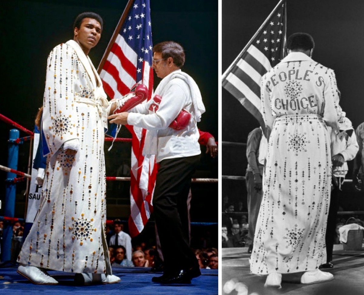
Friday Flashback: Back on Monday we took a Uni Watch look at Muhammad Ali. My weekly Friday Flashback column on ESPN expands upon that, with a closer look at Ali’s trunks, footwear, and the amazing rhinestone-studded robe he wore for his 1973 bout against Joe Bugner (shown above), which was made for him by none other than Elvis Presley. Check it out here.
Incidentally, if you look at that first photo above, you can see trainer Angelo Dundee putting Ali’s left glove on his hand, and Ali’s right hand is taped up but not yet gloved. This was fairly common back in the day — fighters often entered the ring with their hands not yet gloved. That’s no longer the case, as it’s now standard for the gloves to be laced up in the fighter’s dressing room, with a representative of the opposing fighter’s camp watching, to ensure that there’s no funny business.
Speaking of Ali, look at this fantastic photo of Ali “boxing” a three-year-old girl. Here’s the story behind it.
Finally, here’s a faaaaascinating New York Times article about how lots of newspapers — including the Times — kept referring to Ali as Cassius Clay for years after he changed his name. Really interesting stuff — highly recommended.
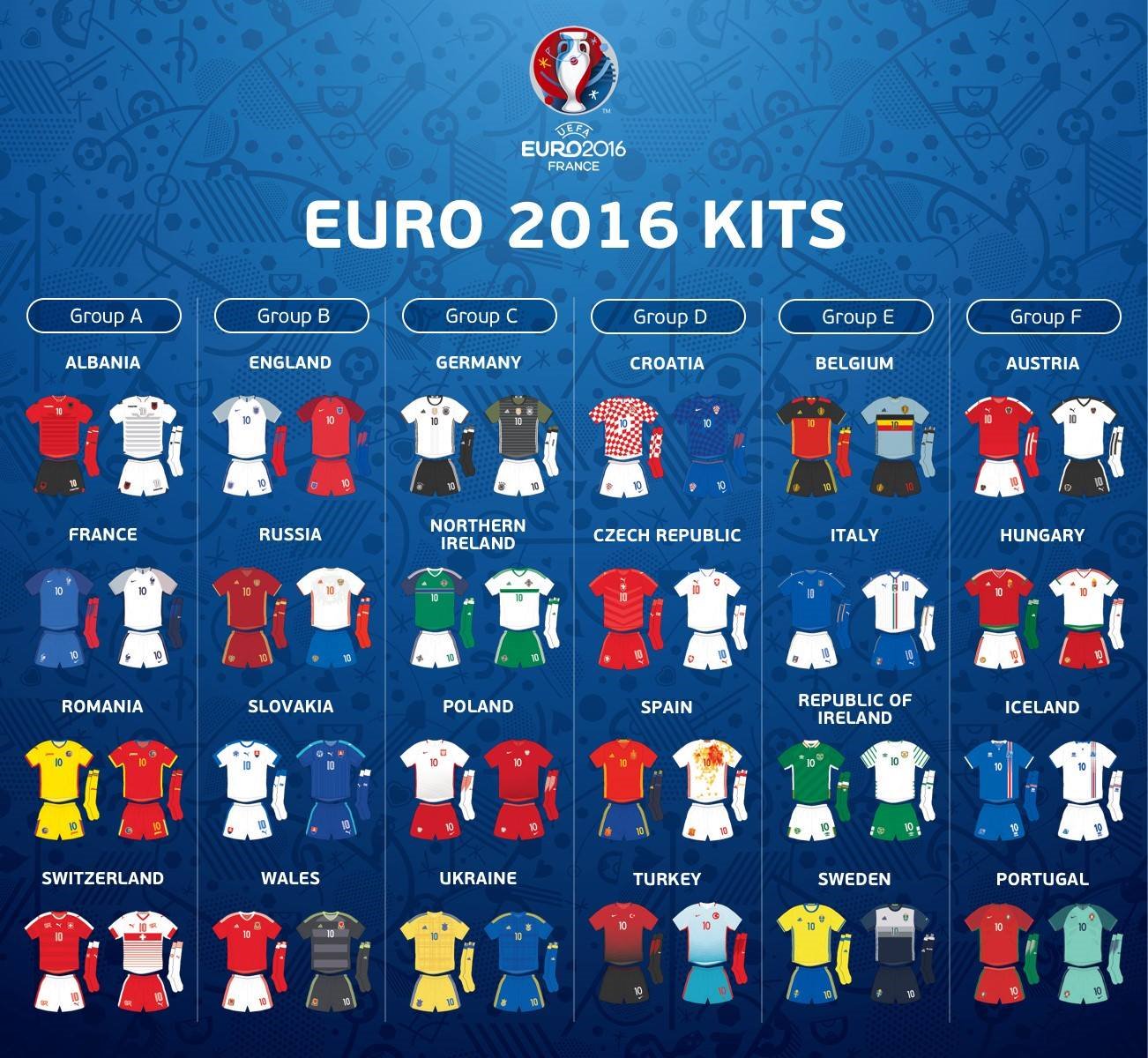
Click to enlarge
Euro 2016 primer: Euro 2016 gets underway today. The chart above, sent my way by reader Conrad Burry, shows all the kits you can expect to see.
In additional Euro 2016 news:
• Here’s a ranking of the home jerseys.
• The big outfitters at Euro 2016 are Nike and Adidas.
• Here are some superhero-style illustrations of key Euro 2016 players.
• Bill Radocy has prepared an excellent spreadsheet showing every match-up, including dates, times, TV networks, and so on.
William Bell overture: The great 1960s and ’70s soul singer William Bell did a free show in downtown Brooklyn yesterday (part of an amazing series of free weekday-afternoon R&B shows that’s now in its 22nd year), so I hopped on my bike and went to check it out.
Bell recorded for Stax but isn’t as well-known as many of the other Stax artists from that period (Otis Redding, Rufus Thomas, Sam & Dave, etc.), in part because was drafted into the military right after he scored his first two hits, which put his career on hold right when it would have been taking off. But he was a big behind-the-scenes guy at Stax, writing a lot of songs for other artists, and I’ve always loved his stuff.
He turns 77 next month but looked and sounded fantastic, his voice only a teeny bit diminished by age. Here are two video clips I shot:
How awesome is that? And it was a beautiful day — sunny, mid-70s. Did I mention that this show was free? Sometimes I really fucking love NYC.
The Ticker
By Paul

’Skins Watch: Yesterday was the first day of the MLB draft. Interesting and encouraging to see that the Cleveland gave its draftees caps with the block-C instead of Wahoo (from John Sabol). … I see they’re also using the block-C for their All-Star voting emojis.

Baseball News: Reader Greg Allred volunteers as a clubhouse attendant for the Double-A Birmingham Barons. Here he is at last week’s Rickwood Classic wearing a jersey from a previous Classic, based on an old Birmgingham A’s uni. … Amelie Mancini’s Left Field Cards project, a longtime Uni Watch favorite, is shutting down. … While looking for something else, I noticed that Royals P Yordano Ventura wears his cap over his ears. First guy I remember seeing with that look was Mets P John Maine back in the late aughts, although he more often went with the more conventional fit. … Looks like Orioles skipper Buck Showalter may have a custom front pocket sewn into his pants. … Daniel Graf reports that the current issue of Mad magazine includes a not-very-funny gag that shows a Star Wars storm trooper in baseball attire, including stirrups over his boots. … This year’s MLB ASG caps are beginning to show up at retail (from Steven Hom). … Looks like the Giants have a mannequin in their clubhouse showing the uni combo du jour (from David Williams). … Here’s the story behind the unusual uniforms worn last night by the Durham Bulls (from @CarolinaDurham). … A look at how the Cardinals’, Royals’, and Giants’ uniforms have evolved over the years.

NFL News: Buried within this Patriots mini-camp report: “For some reason Jabaal Sheard and Malcolm Brown swapped jerseys for the practice. Brown wore No. 93 while Sheard donned the defensive lineman’s No. 90.”
College Football News: Here’s our first look at Old Dominion’s new stadium (from Andrew Cosentino). … ESPN had a bunch of its college football writers pick the best uniform in each Power Five conference (thanks, Phil). … Here are the NFL jersey numbers for every Ohio State draftee. … Here’s something on the history of Clemson’s orange pants. … Florida is naming its field after Steve Spurrier (from Kyle Baker).

Hockey News: Reprinted from yesterday’s comment: Here’s how NHL team logos might look if they were Vegas-ized (from Chris Hilf). … An amateur animator is claiming that the Panthers ripped off his artwork (thanks, Mike). … 43% of the sticks used in the Finals were made by CCM — the most of any brand (from Richard Obrand).

NBA News: If you go to the 9:15 point in this audio clip, you can hear Derek Anderson talking about the Cavs’ 1990s uniforms (from Troy Fowler). … The same company that owns the Raptors also runs the Maple Leafs, so it’s not surprising that their CEO says he’d welcome ads on NHL uniforms. Sure, once you’ve ruined one league’s unis, why not ruin another’s? Honestly, you’ve gotta wonder how these people even look in the mirror (thanks, Phil).

College Hoops News: New court design for Youngstown State. … You already knew about Indiana’s candy-striped warm-up pants, but check out these old sweats. Very cool (from Darrell Frazier and Matt Mallonee). … incredible Creighton vs. Marquette photo from 1925. Love that Creighton jersey (from Micahel Brighton).

Soccer News: Sunderland striker Jermain Defoe signed a contract extension through 2019 and celebrated with a No. 2019 jersey. … An Iranian goalie was suspended for wearing Spongebob pants (from Griffin Smith). … New kits for Mainz, Bayern Munich (I think we’ve seen that one before), Leverkusen, and Arminia Bielefeld (all that from Robert Marshall).

Grab Bag: Looks like Wisconsin’s athletics department will unveil the school’s new Under Armour uniforms on June 30 (from Taylor Meiklejohn). … In a related item, here are the details of UCLA’s deal with Under Armour (from Phil). … Really good article about championship merch. Among other things, the losers’ merch usually doesn’t end up overseas anymore. … I like this patch for the St. Louis [high school] Officials Association. “It shows the St. Louis Arch and a football, a basketball, and a volleyball,” explains David Stephens. … Research has come up with the world’s ugliest color (not purple, surprisingly), which is being used to discourage people from smoking (from Scott Davis). … Great piece on how Jewish designers shaped British menswear fashions over the past century. … The city of Chicago is bringing back some throwback trains and buses this summer (thanks, Mike). … The Confederate flag will be removed from two stained-glass windows at the Washington National Cathedral in DC. Here’s what Webb Simpson and Rickie Fowler will be wearing at the U.S. Open (from Jake Patterson). … New logo for Williamstown, New Jersey. … The latest development in the legal dispute between Nike and track and field star Boris Berian is that Berian can’t wear anything but Nike for the next two weeks. Key passage: “After the ruling Wednesday, Berian removed the photo of New Balance racing shoes he’d been using as his Twitter profile picture. He replaced it with a shot of himself wearing a Nike-issued Team USA uniform ”” with the ubiquitous swoosh on the chest apparently removed.” … Thieves pulled off a big heist at a Manhattan Apple Store. Key quote: “Their cover was [wearing] clothing similar to Apple Store uniforms, which have been converted to a single set of blue shirts rather than their previous seasonal rotation. … Toyota is threatening legal action because the Brexit movement has been using the Toyota logo without permission.
I think the Indians have made it pretty clear for the last two or three years that the block ‘C’ is their primary logo. They gave the draft picks block ‘C’ caps but they also gave top pick Will Benson a home white jersey which prominently features Chief Wahoo on the left sleeve.
I think the Indians have made it pretty clear for the last two or three years that the block ‘C’ is their primary logo.
Yes, but the block-C cap is NOT their primary home cap — the Wahoo cap is. So when they use an alternate cap for such an occasion, that’s meaningful.
I see what you were saying now.
Technically block-C/navy bill isn’t an alternate cap, it’s their road cap.
Slightly amusing typo: “Great piece on jhow Jewish designers shaped British menswear fashions over the past century”
That’s a cool idea for a board. I don’t know how many artistic people in my work would go for, or think of, that.
Read the ODU article, and I’m glad they didn’t increase student fees OR go looking for tax dollars.
“Finally, here’s a faaaaascinating New York Times article about how lots of newspapers – including the Times – kept referring to Ali as Cassius Clay for years after he changed his name. Really interesting stuff – highly recommended.”
No link?
Missing a link to Times story on Ali/Clay?
Thanks — now fixed.
Here’s the link, so you don’t have to scroll back up:
link
When is MLB going to get past the “tradition” of having non-playing managers suit up in gameday unis. I know the dugout rule about team uniforms only and all that, but seriously, how can the Swooshkateers and UnderArmourers not see this potential revenue stream of designing for non-players (their target market) in dugout Unis?
I say this not because I want to see another revenue stream to deal with, but because most managers and staff have their own style of dress already – Mike Scioscia I am talking to you.
Nor is it because I do not want to see portly men in whatever the fabric of note is today, but simply to show that dugout staff could have their own fashion line (see Oakland A’s hats of the early 70’s.) and not destroy the dugout uni-rules.
Just a thought. Happy weekend to everybody.
proofreading: Creighton vs. Marquetee photo
Marquette, right?
proofreading again: jhow Jewish designers
how?
Thanks for both of those. Now fixed.
“43% of the sticks used in the Finals were made by CCM – the most of any brand”
Perhaps should be in the hockey section. Although if they were using sticks in the NBA finals that might make it more entertaining than it has been so far.
Fixed.
I have to say that those Vegas NHL logos are pretty damn cool!
Step up and play Red Wing Roulette to find out your playoff seeding!
Bobby Higginson of the Tigers went through an ear-tucking period. I don’t get it…
link
RIP, Gordie Howe.
As a native Michigander, but one TV market north of Downtown DET, I’m fully expecting a one hour news session focused on nothing but this tonight.
Interesting some outlets are using Hartford Whalers photos for their stories and not Detroit as one would expect. On that matter, i was intrigued to see a picture with Gordie and sons wearing not the familair HW logo but the W with a harpoon across the front.
I wasn’t into hockey as a kid, when Howe was at the very end of his career, so I never saw him play. But man oh man, just watch him score his final goal at age 52:
link
Fifty-two!. And thanks to the era he played in, and the teams he played for, just about every photo or film of Howe is an absolute beauty.
First hockey game I ever attended in person was Flames-Whalers at the Omni in 1980. Got to see Gordie and his sons playing for Hartford. RIP.
Gotta say that there are a few nice uni-notable pics being posted by some teams with their Twitter tributes.
The Edmonton Oilers in particular shared link.
The New York Rangers shared link. This was from January 4, 1956, the last year the Wings wore white sleeves.
The Dallas Stars shared a pic of link when the latter was with the North Stars. Interestingly enough, the Minnesota Wild shared link, which based on the striping of that other jersey, was likely also against the North Stars.
That Williamstown rebrand is fascinating. We called it Williamstown when I was growing up, and it was a rural town that wasn’t all that – lots of land but not very nice. Then suddenly, all of these fancy developments were being built in “Monroe Township”. The high school is still Williamstown High. It’s like they can’t decide what they want to be. Nobody from around here calls it Monroe Township, any more than people refer to Marlton as Evesham Township.
So, on this whole “ears/cap” thing……
When I was a kid, NOBODY wore their cap over their ears. Now I see it frequently.
Show of hands…
Tuck or no tuck?
As a kid I tucked my ears in – mainly because the hats I wore young were too large and then it became a habit. It took till I was in high school to start wearing it ‘properly’.
As far as the cap for the Indians, i believe it’s up to their starting pitcher everyday to choose what uniform they wear, especially at home.
I look forward to hopefully a chief wahoo-esque logo someday that folks are not offended by.
As far as the cap for the Indians, i believe it’s up to their starting pitcher everyday to choose what uniform they wear, especially at home.
MLB Style Guide shows Wahoo cap as primary home headwear.
In an era where some teams wear their colored alternate jersey more often than their primary gray jersey, does that designation actually mean anything?
Yes.
I would say you are both right, in different ways.
It obviously means something because that is how the team chooses to present their brand.
On the other hand, it often doesn’t reflect what is actually worn on the field, so it can be meaningless in that regard.
Sigh. Just once I would like to get thru a day without “brand” appearing on this website.
I will stop reading and commenting then.
I won’t claim to be an expert on Apple Store attire, but the blue is not standard as the article states. They still seem to rotate frequently, employees are wearing green right now to celebrate their stores being energy efficient or some corporate mumbo jumbo.
That said, when your uniform is a plain t-shirt with an easily-copied logo on it, it’s easy for a thief to mimic it, no matter the color or how frequently it changes.
Hmm…how can we show our energy efficiency? Let’s have some sweatshop in China being powered by coal and manned by minors create thousands of green shirts with our logo on it and then ship them by jet burning fossil fuels and distribute using diesel powered trucks!
Stay classy Apple.
Can you verify? There are a lot of t-shirts made in the U.S. these days.
Just going for a worst-case scenario. I’m not an apple fan.
According to the eBay listings I searched just now, all of the Apple Store staff t-shirts available that list where they were made or show sufficient detail on the tags to read the “made in” statement say they were made in the USA.
Whether that means actually stitched together in the USA, or sewn together elsewhere but screen-printed in the USA, I don’t know enough about American labeling laws to know one way or the other.
If only there was site or a blog that could tell us which vehicle we *should* be driving?
Per a co-worker with a second job at he Apple Store, all of their staff shirts are made in the USA.
And yet the Indians went full Chief Wahoo against Seattle yesterday.
Those cardboard jerseys are utterly phenomenal.
Ha — I knew you of all people would appreciate this project!
I don’t get the National Cathedral’s decision to remove the Confederate flag from stained glass. I understand people not wanting the flag flown on public property. But in an artistic representation of historical reality? Are we just going to remove inconvenient parts of history that are disagreeable?
Also, I don’t know one Christian church that says, “If you are a sinner (read: racist) you can’t be a member of this church.” I understand church to be a hospital for sinners, not a museum for saints. Religion, ostensibly, should make one a better person if one lives by its precepts. Sadly many don’t, but that doesn’t change the fact that’s what its intent is.
Leaving the flag intact could be instructive. For instance, they could say, “This is how white folks viewed things in the 50s when the windows were installed. Here in the 21st century, we also take into consideration the views of minorities on this conflict. We’ve come a long way.” I mean, if the bishop didn’t even know it was there for two years, how could it possibly even be a concern?
They say if we don’t study history, we are doomed to repeat it. How can we study history if we insist on whitewashing it? War sucks. People die, many of them non-combatants. Sometimes it may be necessary but that doesn’t make it any less ugly. Trying to beautify the ugly because it makes people uncomfortable doesn’t make it any less ugly. The fact that it was once legal in this country to own human beings as if they were cattle should make people uncomfortable. While that flag may represent different things to different people, to a large segment it represents slavery, period. I don’t think the horror, evil and injustice of that part of American history should ever be forgotten and its historical depiction is helpful, even if it makes some queasy nowadays.
Agreed wholeheartedly.
The windows were originally created at the urging of the Daughters of the Confederacy during the Civil Rights movement, and to this day the National Cathedral accompanies them with an inscription describing Robert E. Lee and Thomas Jackson as “exemplary Christian people.” Personally, I have a lot of problems with that – there was nothing exemplary or fundamentally Christian about either man’s decision to break the oath of loyalty to his country that each had sworn before God in order to wage war against the United States of America, and to do so for a cause that was explicitly and openly based on preserving the institution of slavery. These were traitors who broke their oaths to God in order to murder some Americans in defense of the enslavement, rape, and killing of other Americans. Both men did evil things in service of an evil cause.
So yeah, a Christian church is the wrong place to celebrate these particular American traitors and Gospel betrayers. But plenty of church art is not about celebrating the subjects. The devil often appears in Medieval church art, such as stained glass windows – not because Christendom of old was all into celebrating Satan, but because some aspects of Scripture and Christian tradition are lessons of warning, not of tribute. Heck, the National Cathedral has a gargoyle carved in the likeness of Darth Vader, and nobody mistakes that as a pro-Sith statement. As such, if the National Cathedral would change or remove the inscriptions below the windows, I’d be happy for the windows in question to remain as-is. Lee and Jackson’s treason is a valuable warning about idolatry and hubris, and you can’t tell their tragic, and importantly American, stories (including in Lee’s case later real repentance and grace) without depicting in some way the Confederate rebellion. And the Cathedral’s decision to remove the Confederate battle flag from two panels but leave in place the Confederate national flag on one panel makes no sense to me. Either leave the windows as-is, and let the Confederate flags stand as the symbols of folly, evil, and treason that they are, or remove the windows entirely in favor of subjects other than Lee and Jackson.
To my mind, depicting Lee and Jackson without the Confederate emblems is worse than displaying Confederate emblems. The story of the Confederate rebellion is an ugly one; it can’t be prettied up. We should face that ugliness, or avoid the subject entirely.
National Cathedral is not a Christian Church, it is Episcopal (see why the Pope did not speak there on his recent US visit).
Episcopalian is a denomination of Christianity. The word you’re looking for is “Catholic,” as in, “It is not a Catholic Church, which is why Pope Francis did not speak there.”
More to the point, every member church of the worldwide Anglican Communion (including the various Episcopal denominations in the United States) regards itself as a member of the one global, holy, catholic church, the living Body of Christ on earth. Like Lutherans, or any denomination that professes the Apostle’s Creed as a statement of faith, Episcopals are not only Christians, they are catholic. But they are not Roman Catholic, in that they do no regard the Bishop of Rome (currently Pope Francis) as the head of the global church. A case where capitalization matters!
“National Cathedral is not a Christian Church, it is Episcopal (see why the Pope did not speak there on his recent US visit).”
~~~
What?
Seriously, know your facts before posting. Artie & Arr already posted pretty much what I would have said, so kudos to them for knowing theirs.
And not that you’re wrong Scotty, but if I remember from my (long ago days now), it was “one holy, catholic and apostolic church,” but for all I know that verbiage has changed.
Nah, you’re right, but I was focusing on the “catholic” part of the Apostle’s creed. The “apostolic” bit doesn’t actually change the “catholic” bit in terms of theological meaning. It’s just Greek for “universal.”
When someone declares that any given denomination is not actually Christian, there is a 100% chance that either the person saying it is not a Christian and is just confused by denominational names – understandable, thanks to the fragmenting of the Western church after 1500! – or is a Christian of one or another fringe, fundamentalist sort and is expressing a pretty deep religious bigotry.
Whoever researched the SF Giants uniform timeline needs to check the team uni history again. The city name on the 1977 orange jersey was replaced by the team name in 1978, not 1980. The road grey uniforms with the SF emblem on the left chest debuted in 1983, not 1986. Also, the black alternate with the city letters logo listed for 2002 debuted last year. They omitted the black alternate home & road jerseys of 2001.
Not only that but they used Jeff Samadzjia as the model for the 2002 black tops. Wasn’t he still catching passes at Notre Dame then?
I’ve seen a few of these fanatics uni timelines…there’s always some factual error in them. It always burns me up! The errors are so obvious. There’s even a spring training patch on that “2002” jersey! I wish they had a comments section for those timelines…
I recall Vic Darensbourg wearing his hat over his ears late in his career. But couldn’t find a good pic.
The interesting thing regarding the Indians ASG emojis is that the block C with a red bill isn’t even worn by the team, though I wish it were what was paired with the home script whites.