If you can’t see the slideshow above, click here
The Dodgers unveiled new batting helmets for their home opener yesterday. The matte finish is nothing new, of course (the entire N.L. west has now gone matte), but the “LA” logos on the helmets are definitely worth a closer look. They’re raised off of the helmet shell, and were produced by a 3D printer. The slideshow above provides a good sense of how it looked.
I had an exclusive on this story — you can get the basics in this ESPN piece, which was posted just as yesterday’s Dodgers/D-backs game got started. If you haven’t read it already, I strongly recommend starting there before going any further or commenting.
Here are a few details I didn’t include in the ESPN piece:
• To my surprise, Dodgers equipment manager Mitch Poole told me he intends to have the team’s catchers use the raised logos on their catching helmets. That seems like asking for trouble, because the horizontal strap of a catcher’s mask will constantly be rubbing against the raised logo. At the very least, it’ll get dirty; at worst, it’ll come loose. Why not use a flat decal for the catchers (or no logo at all)? But Poole said he wants to try it with the raised logo. I think that will end badly, although it appeared to hold up fine yesterday:
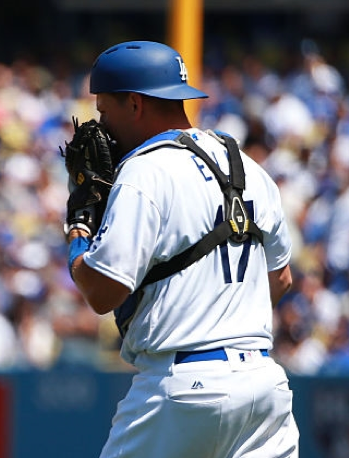
• Poole said one of his biggest issues with teams using matte helmets is that they’re still using their old shiny logo decals, creating what he views as a matte/glossy conflict. The Dodgers’ director of graphic design, Ross Yoshida, told me he feels the same way. So one of their big priorities with this project was to make sure the finish of the raised logos matches the matte finish of the new helmets.
• At one point the Dodgers were considering using the matte helmets with the 3D logos at home, and sticking with the glossy helmets and standard logo decals on the road. Ultimately, though, they decided to use just one set of helmets.
• As we’ve discussed before, the Dodgers actually have three distinct “LA” logos — the one on their cap (which has soft, somewhat rounded serifs), the one in the MLB Style Guide (which has crisp slab serifs), and the one on their helmet (which is wider than the one in the Style Guide). The Dodgers considered using the cap version, with its softer edges, for the new raised helmet logo. In the end, though, they stuck with the helmet version. So the new mark is a 3D version of what they’ve been wearing on their helmets for nearly half a century.
• My story mentioned that the raised logos on football nose bumpers are made from rubber and cast from molds, while the Dodgers are using plastic logos produced on a 3D printer. Some further background on that: The Dodgers considered going with rubber, but cutting a steel mold turned out to be fairly expensive. If the plastic logos look good and are well-received, the team may spring for a mold and go with rubber logos in the future. But for now they’ll stick with the 3D-printed plastic because it’s less costly. (You might think, as I did, that an organization like the Los Angeles Dodgers wouldn’t have a problem spending a few extra thousand dollars on a project like this. But as it was explained to me, “We all have our budgets to stay within,” and that was that.)
• Pro Helmet Decals, the vendor that provided the raised logos, is the same company that supplies the Mets’ raised orange helmet squatchees. The company’s owner, David Sulecki, initially thought the same process used to make the little orange domes could also be used to create the Dodgers’ raised lettering, but he ran into two problems: (1) That process only allows for a glossy finish, not the matte finish that the Dodgers wanted. (2) The “LA” wouldn’t have projected out far enough to provide a good three-dimensional effect. So he scrapped that idea.
• After Sulecki had the logos 3D-printed, he had to apply adhesive backing to them. If the logos had been flat, he could have run them through a machine that would have applied the adhesive, but he couldn’t do that because the logos are curved. Instead, he had to put a rectangular sheet of 3M adhesive over each logo and then use an X-Acto knife to hand-trim the sheet along the edges of the logo (which is why you can see the 3M logo on the back of each helmet logo) — a seriously painstaking process when you multiply it by many dozens of logos. He said it was a tremendous pain in the butt.
• It was Sulecki who first tipped me off about this project, in mid-March, but he swore me to secrecy. Everyone involved eventually agreed to let me do a story as long as it didn’t run before yesterday’s gametime, because they didn’t want to ruin the surprise, and of course I was fine with that. Poole promised me an exclusive, which was great, although I was still worried I’d get scooped if some beat reporter saw the helmets lying around the Dodgers’ clubhouse an hour or two before the game and then tweeted a photo of them. Fortunately, that didn’t happen.
• If you watched Ken Burns’s new Jackie Robinson documentary, you may have noticed that the Dodgers appeared to have a raised helmet decal on a matte helmet back in 1956:
@UniWatch watching #jackierobinson documentary and his 1956 helmet looked to have a raised helmet decal. @Dodgers pic.twitter.com/LWentWU4ea
— Steve Humphries (@stevenhumphries) April 13, 2016
That helmet was flocked, of course. The logo was probably felt, which was common on flocked helmets back in the day:

Were the Dodgers consciously mimicking the flocked/felt look with their new helmets? If so, nobody involved mentioned that to me.
Now, the big question: Do I like them? I think I do. I’m qualifying that with “I think” because I want to see more of how they look on the field. The initial returns, though, are good. Some observers said the raised logo on the matte background reminded them of fondant on a cake, and I can totally see that comparison based on the photos that ran with my ESPN article. On the field, though, I thought they looked significantly better than that.
I do think they’d be better off going with rubber, however. It would be more flexible, and therefore less prone to chipping or breaking loose. Maybe they’ll end up making that switch eventually.
Meanwhile, about an hour after my ESPN story went up, I heard from Ike Guerrero, the baseball coach at Theodore Roosevelt High School in California, who informed me that his team began using raised helmet logos earlier this year (click to enlarge):
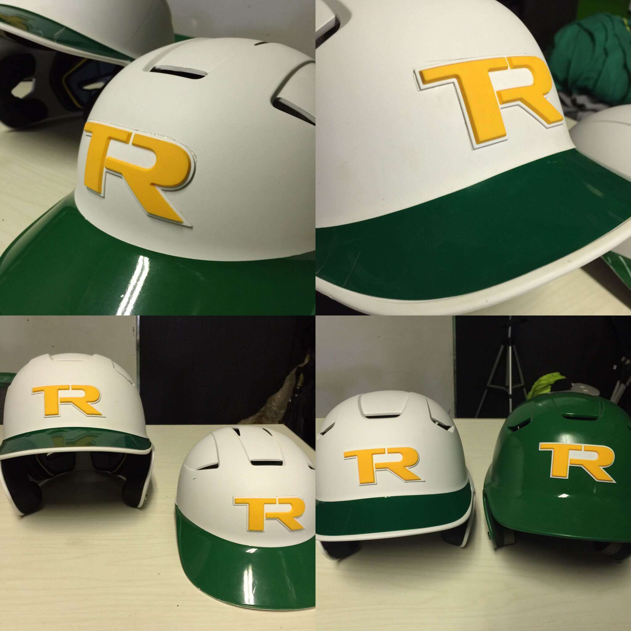
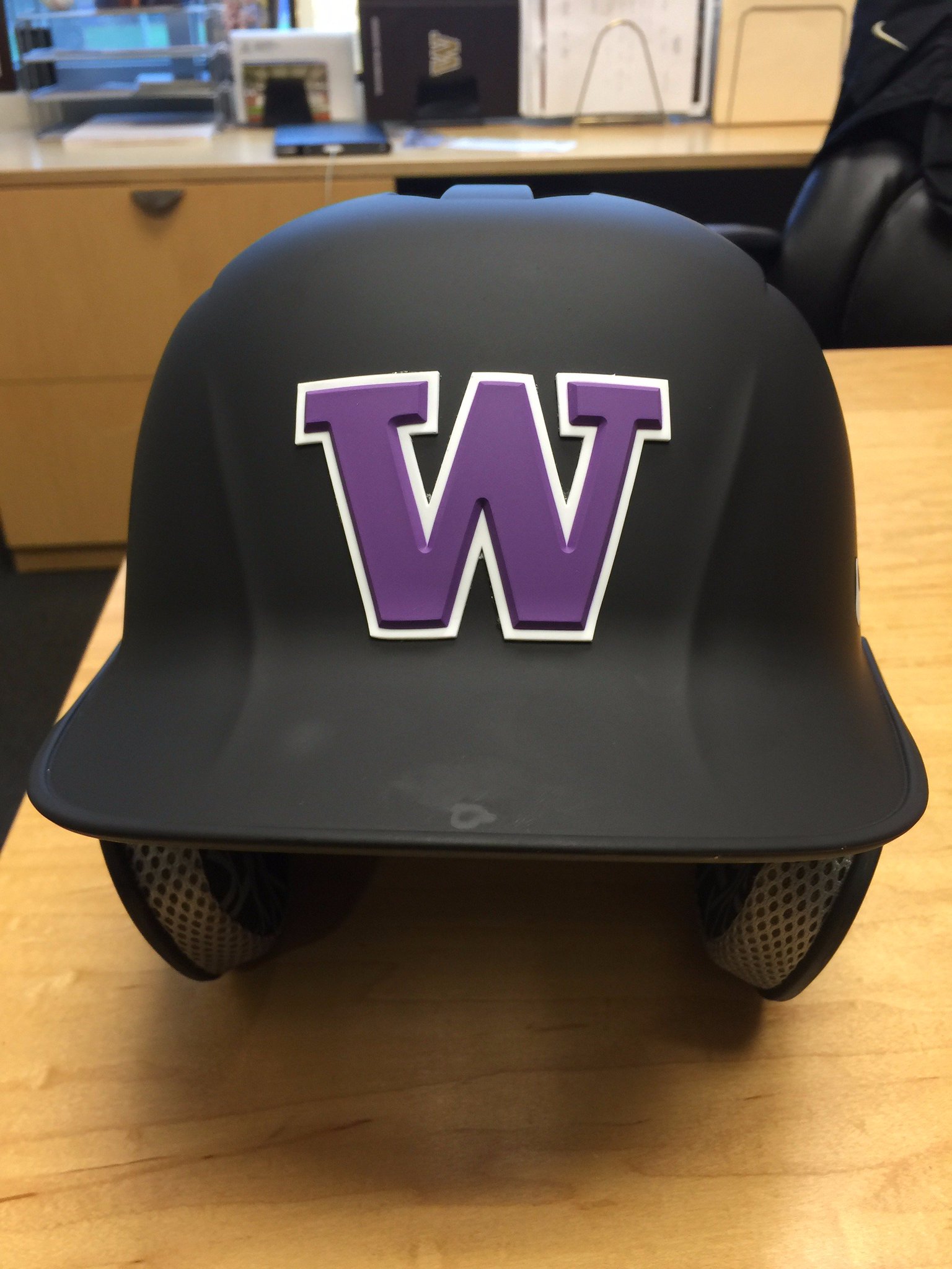
Those logos were supplied by a company called Raised Decals, which operates out of Auburn, Washington. Turns out they’ve worked with a number of teams, including the Washington Huskies (click to enlarge):
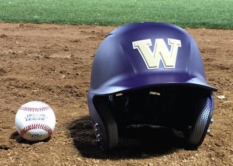
Unlike the Dodgers’ logos, the ones created by Raised Decals are made of silicone and cast from molds. I spoke last night with the company’s founder/owner, Joseph Walter, who explained that he has a utility patent on his production technique. He’s sending me some samples, which I’ll share with you once I see them.
In any case, no matter which materials are used, it seems like the phenomenon of raised logos on batting helmets may catch on. Like any trend, it’ll probably be taken too far. For now, though, I kinda like it.
Click to enlarge
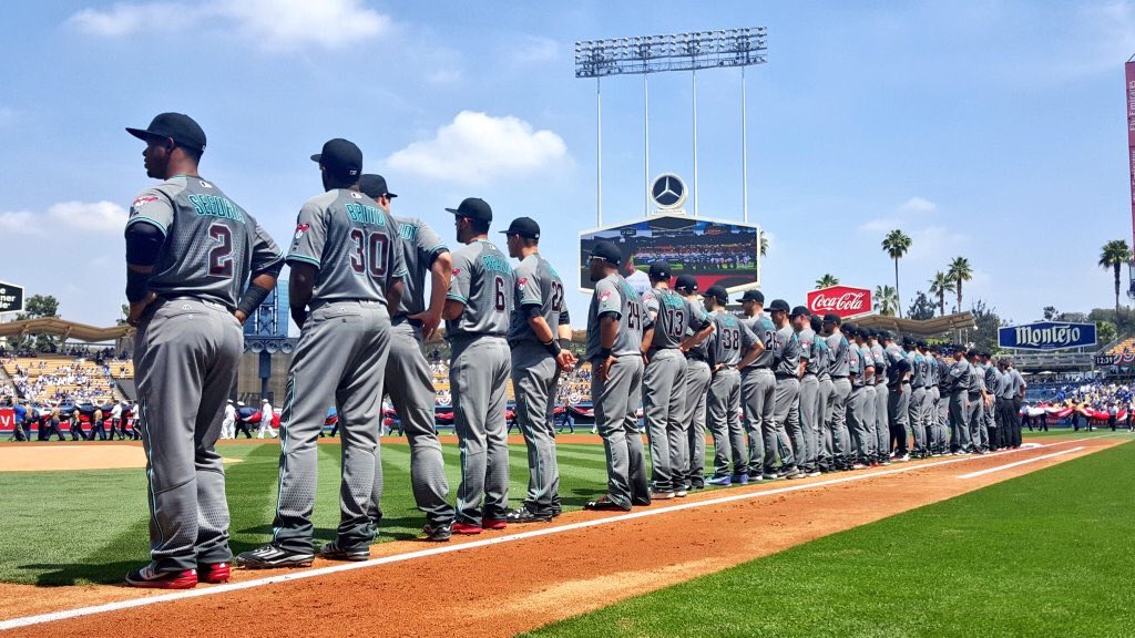
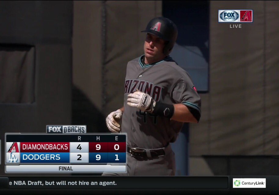
As for that other team”¦: The Dodgers weren’t the only team wearing something new yesterday afternoon. Their opponents, the Diamondbacks, wore their road greys charcoals for the first time. I watched some of this game, and it was just a disaster, especially when the players were against a dark background (click to enlarge):
It’s hard to express how awful they looked. Or at least it’s hard for me. But Rob Lowe, of all people — yes, the actor — got it just about right:
The Diamondback's uniforms make them look like futuristic maintenance men working on a trash truck in space. pic.twitter.com/hZ3eompYvy
— Rob Lowe (@RobLowe) April 12, 2016
If Phil ever needs a weekend off — or if I need a day off myself, for that matter — I’m calling Lowe.
Manifest destiny: We are apparently living in the final days of American exceptionalism, as NBA owners are reportedly ready to finally pull the trigger on uniform advertising for the 2017-18 season during a vote taking place later this week. That would bring an end to the Big Four’s longstanding history of going ad-free.
You already know all the obvious reasons why I’m opposed to this, but here’s another one I haven’t mentioned before: As soon as this vote goes through, there’s going to be endless chatter and speculation — some of it serious, some of it “humorous” — about which corporations will be advertising on which teams’ uniforms, and the whole thing will become an exercise in corporate theater, which is the sort of thing in which I have exactly zero interest. Sigh.
Of course, there’s still time for an asteroid to slam into the Earth before the vote is taken — or a few brave NBA owners could decide to do the right thing and vote to safeguard the integrity of the league’s uniforms. I’m pretty sure the asteroid scenario is more plausible.
Although this battle may have been lost, it’s important to keep the contagion from spreading to the other the other Big Four leagues. Or maybe we should start calling them the Big Three, since the NBA has decided to look more like a minor league. Too bad. #NoUniAds
The Ticker
By Paul

Baseball News: Jackie Robinson Day is the day after tomorrow. All MLB and MiLB uniformed personnel will wear No. 42. ”¦ In a related item: On Friday Jackie’s signed contact with the Brooklyn Dodgers, as well as the contract he signed in 1945 when he joined the Montreal Royals, will be on display at the New-York Historical Society. The documents will be displayed at the NYHS for a limited time before embarking on a U.S. tour. ”¦ Also, UCLA wore Jackie throwbacks last night (thanks, Phil). ”¦ A pair of Arkansas high school teams went light blue vs. light blue the other day (from Ben Schmuck). ”¦ Here’s a shot of Frank Robinson, then with the Reds holding one of his stirrups (from Lance Smith). ”¦ The Omaha Storm Chasers are, uh, see for yourself (from @spomedome). ”¦ Mike Wissman recently contacted the Phillies to complain about the new adjustments to the jersey script and was pleasantly surprised by the response he got: “The person I spoke with (of course I forget his name) was genuinely interested in my feedback. He didn’t get into the why of the move but said they would be evaluating the look over the course of the year and see how that might impact 2017. I referenced the topic being on Uni Watch and he even pulled the site up while talking with me. He said one thing the team likes about the new script is that the blue stars are much more prominent, as they had gotten smaller over the years. He then asked my opinion of the new red alternate (I told him I thought it was a little too much red for me but appreciated the introduction of something new). He seemed to be actually listening to what I had to say and in the course of our chat described himself as a uni geek as well.” ”¦ If you like green and gold as much as I do, you’ll love this tequila sunrise design being worn by SUNY-Oswego (big thanks to @jaytothefuture). ”¦ Braves OF Mallex Smith had to leave Monday night’s game after his helmet came off and gouged his forehead during a stolen base attempt. ”¦ When All Games Are Special, No Games Are Special Dept.: The Royals have received permission from MLB to wear their gold-trimmed championship uniforms, which they wore for the first two games of the season, for Friday home games, wheee! ”¦ The Lehigh Valley IronPigs are going a step further on Jackie Day by wearing a big “42” on the side of their cap (from Bill Madison). ”¦ Tigers C Jarrod Saltalamacchia, who normally wears two batting gloves, wore only one yesterday, which had the bonus effect of exposing the neon press-ons on his signal-calling hand (from Jason Whitt). ”¦ The Buffalo Bisons’ mascot, Buster, has a new team-colored glove (from Zach Polvino). ”¦ Paul Rudd showed up at Rich Eisen’s studio yesterday in a Royals uni. Note that it had no number on the front but 42 on the back (from Jesse Gavin). ”¦ Speaking of raised/textured headwear logos, check out these new caps for the Hannibal Cavemen. ”¦ Great story about a nonprofit that collects used baseball equipment and distributes it to needy youth programs (from Andy King). ”¦ Interesting to see that Alabama, of all schools, has a jersey with a Blue Jays-esque font (from Dustin Semore). ”¦ Remember, the Diamond Uniform Database continues to track what each MLB team is wearing every day.

NFL News: The Chiefs have a group of former players called the Chiefs Ambassadors, who do public/goodwill appearances in the community. Several of them recently appeared at the University of Kansas Hospital wearing Chiefs jerseys with big honking ad patches. “I work at the hospital, and this is the first time I recall the players wearing jerseys with ads on them,” says Ron Baker. Douchebags.
College Football News: Some uniform changes for Clemson. ”¦ Ohio State is adding a Will Smith memorial decal for this Saturday’s spring game (thanks, Phil).

Hockey News: Longtime Uni Watch reader/pal Teebz, who runs the excellent Hockey Blog in Canada site, is running his annual NHL playoff pool. Enter now for your chance at what Teebz describes as “some decent prizes”! ”¦ Did you know hockey players often trade sticks? They do! “It’s mostly done in private, and there is an understood class system,” says Ted Bloss. ”¦ Good article on goalie mask artist David Gunnarsson (from Erikk Hokenson)

NBA News: The Suns have purchased the D-League’s Bakersfield Jam and will move the team to Arizona, where it will be known as Northern Arizona Suns (from Conrad Burry). ”¦ Lots of good photos in this feature about the Rockets’ stay at a Portland hotel (thanks, Mike). ”¦ Here’s a comparison of Kobe Bryant’s career stats while wearing No. 8 vs. No. 24 (from Daniel Donell).

College Hoops News: Here’s a good find by Tim Calloway: If you go to the 11th page of this PDF, you’ll see what the NC State student newspaper wrote about the school’s infamous unitards back when they debuted in 1989. According to the article, “several other universities, such as Georgetown and Syracuse, may follow suit.” As I wrote yesterday, for now we only have confirmation for one other school having worn the unitards — Oklahoma State. I’m pursuing a lead on another school, however — stay tuned.

Soccer News: The Daily Mail ran a story on the 10 worst soccer team logos, and one of the teams responded by listing its 10 worst newspaper logos (from Anthony Emerson). ”¦ New alternate kit and mascot for the Tampa Bay Rowdies.

Grab Bag: Singer Erykah Badu took some heat after voicing her opinion on New Zealand schoolgirl uniforms. ”¦ A New Mexico firefighter is under investigation after a photo surfaced showing his wife breast-feeding their child while wearing his uniform. ”¦ New logo for U. of Buffalo athletics (from Mike Monaghan). ”¦ Lakeland College in Wisconsin is becoming Lakeland University and has a new logo (from Brian Kerhin). ”¦ Here’s an article on six schools whose team names have religious roots. ”¦ New Balance is coming out with a 3D-printed sneaker (from Andrew Cosentino). ”¦ Here are the Indy car liveries for the Long Beach Grand Prix (from Tim Dunn). ”¦ New uniforms for the Canadian Olympic team (thanks, Phil). ”¦ New logo and slogan for Stockton, California. ”¦ Domino’s “Pizza” has come out with a pair of box designs that mimic the company’s logo.
Proofreading:
“Did you know hockey players often trade sticks? The do!”
Fixed.
The new Omaha look is way over the superhero-wannabe line. Yikes.
I saw those jerseys at the Storm Chasers team store and I thought they were just a crappy fan jersey. Unfortunately, they are game jerseys. Puke.
Here’s a question for the LA Dodgers equipment manager, why did he use the paper style adhesive instead of putting logos on their back on a cloth/cardboard and use the 3M spray adhesive, I find that to be much tackier on hard surfaces than the stickers.
Also…I thought the D-backs couldn’t get any more D-ouchey uniforms.
Interesting.
In any case, the Dodgers’ equipment manager didn’t make the call on how to apply the adhesive. The vendor, Pro Helmet Decals, did.
Gorilla glue would probably work best of all. Seriously, if you don’t use the correct adhesive, as you’ve noted, they will peel.
Double sided foam tape. It holds our furniture together at work, and on the occasions we’ve had to take the furniture apart it’s a job.
3M VHB tapes’ll get ’em
IMO, the 3-D matte helmet treatments overall are drab and too fussy… I’d much prefer a return to the more colorful style of teams such as the ’80’s Padres who’s helmets had more interest and style than the Dodgers.
link
Wow, so many additional Easter eggs in that edition of the Technician. Had fun reading that one.
The Diamondbacks uniforms are a train wreck. Just outright ugly whether home or away. Those charcoal greys are horrible on TV too. A few years from now those uniforms will fall into the ‘what were they thinking’ bin.
On the raised logos, I like them on actual batting helmets but not on the catcher’s helmets. It’s not just the issue of the logo becoming dirty or peeling but could it also create an issue with the mask moving around a bit more than usual.
Although I hate everything else the Diamondbacks have done uni-wise pretty much their entire history, I don’t hate the charcoals. I’ll take them over softball jerseys any day. Baseball shirts are the same color as the pants, dammit!
I am in the minority here but I like the charcoal unis! I am curious to see what they look like during a night game. The jerseys would look good with white pants IMO.
The charcoal grays would be better if the primary color of the uni numbers weren’t BLACK. Flip the colors, have the numbers be teal with black outlines, and that’d at least be a good start. Not sure if that would work as well with the red charcoals, though.
#DbacksHaveTooManyDamnUniforms
Agreed. Black with the teal outline also makes the NOBs damn near impossible to read too.
Terrible uniforms still, but that would at least make them functional.
Decent prizes are still rolling in as well.
There is a pile of clothing, including a pretty sweet UW-favorite hockey jersey, that is available to be won. I’ll post the prize list some time this weekend! :)
Thanks again, Paul, and good luck to all!
Curious, since I’ve never been to your site before – is there a reason why almost half the team logos on your site are out of date/defunct?
Running joke?
All were current when I started the blog in 2007. I’m a huge fan of hockey history, so I leave it there as a reminder of the ties to the past whether it be good or bad.
Besides, I think it’s awesome to see the Buffa-slug, the Thrashers’s bird, and the screaming eagle of the Caps still in use. :)
Oddly enough, one of the first ones that stuck out to me was the previous Bruins logo. Anyway, carry on!
Yeah, the Blue Jackets, Stars, Kings, Senators, Sharks, Lightning, Canucks, and – starting next season – the Maple Leafs all need updating.
Pretty crazy to think 12 teams have changed or altered logos in the last decade.
What’s really odd is that while the other 29 logos were in use during the 2006-07 season, the Flames’ logo shown had not been used since the 1993-94 season! It’s missing the black outline that was added in the 1994 offseason.
True, Rob. I generally prefer the Flames without the unnecessary black, though. Damned flaming horse! LOL
You and me, both!
The 1994-2000 Flames uniforms always struck me as weird, with the diagonal stripes coming up toward the logo from out of the horizontal waistline stripes. It always seemed to me like it might’ve been some kind of a nod to the franchise’s Atlanta days, but the 45-degree angle of the diagonals doesn’t match up with the 55-degree slope on the Atlanta “A” logo.
I do like that the Flames resurrected the “A” logo as their alternate captain’s patch, starting in the 1996-97 season – the franchise’s 25th season overall.
More like 50 degrees on the slope of the A, now that I’m examining it better, but still, it’s enough of a difference to be noticeable.
I have one of those jerseys, Rob. I’m aiming for some customization of #24 Iginla – the number he wore in his rookie season in the angle-striped jersey. The collection of ugly jerseys grows! LOL
The Daily Mail is gutter press, only made to look vaguely newspaper like by the Sun.
I’m quite amused that whoever runs Zenit’s Twitter account burned them not once but twice.
The helmet-decal question I find asking myself in regards to yesterday’s LA/ARZ game is…do the Diamondbacks have separate sets of black helmets to wear with the uniforms with the standard red trim vs teal trim, or do they have one set of black helmets and swap out the decal every time they switch back and forth?
I watched a little bit of the Arizona/LA game, and to me the Diamondbacks looked like little shadows running around the field. Not a pretty sight.
If batting helmets are made in a mold, as I assume, I wonder if incorporating the raised logo into that mold might eventually occur, i.e. the logo is made out of the same stuff as the rest of the helmet.
that’s not too terrible of an idea
Bear in mind, if all 30 MLB teams were to have helmets with custom-molded logos, that would require no less than 9 molds per team – assuming sizes small, medium, and large, with lefty, righty, and double-flapped varieties available. That’s 270 new molds right there, with the need to store and maintain them as well, not to mention retooling for every logo change. The logos would also have to be painted. Ultimately, it would not be very cost-effective.
There’s really no functional advantage, either. If a team wants to have an alternate or throwback logo on their helmets, that’s an additional set of molds for each logo, whereas with a decal or 3-D applique, it’s comparatively easy to have the equipment staff remove the regular logos and apply the new ones, and then reverse the process for the next game.
It’s an interesting thought, but in the end, there are too many negatives, and virtually no positives I can think of.
Minor League teams should wear #9 in honor of Robinson which is the number he wore during his Minor League career in Montreal.
That’s a cool idea.
I know it’s still only a few teams in baseball and a growing number in football, but the matte helmet exercise is overdone.
If you do use Lowe as a guest writer, one of you probably will have a long editing job on your hands, based on that tweet. Take a look at his lack of attention on how to use an apostrophe in a plural possessive manner.
Sadly typical of Twitter, however. I deal with social media professionally, and I counsel my colleagues to use proper grammar and punctuation on Twitter to the greatest extend possible. Aside from credibility, it imposes good discipline; your thought will almost always be better expressed if you rephrase to leave room for punctuation than if you drop punctuation to maximize letters. But it’s a losing battle; even political leaders I know to be bright and articulate increasingly throw grammar and punctuation out the window when tweeting.
Do you mean “greatest extent possible”?
Ironically, yes!
Rob Lowe also dissed link recently, so his qualifications for Uni-Watch duty are definitely suspect ;).
It was already mentioned in Sunday’s Uni Watch Ticker.
Yes, but not his possible internship at Uni-Watch HQ.
There appears to be something wrong with the link to the New Mexico firefighter article.
Fixed. Here’s the proper link:
link
I think the 3D logos are a cool experiment and worth the effort. They should probably find the best material (silicone, rubber, plastic) that can be glued on to the helmet with best durability. Cutting adhesives with an exacto knife is silly.
I can’t have any sympathy about the cost…uniforms and equipment may even be a profit center as teams can sell almost any of it to collectors.
Gunnarsson is a hack. He utilizes everything that’s wrong with goalie mask design to make ugly, glossy, obnoxious collages. I pray that his garbage NEVER reaches baseball as he hopes.
If memory serves, MLB put in a rule specifically make sure this sort of thing doesn’t happen in baseball. I think John Buck was the last grandfathered catcher to have a personalized helmet like that, and it was never so wild as you see in hockey.
Agreed. He clearly is skilled with an airbrush, but his design leaves a lot to be desired. Or should I say, a desire for less?
Hi Paul, I hope I didn’t send you down the wrong path with the Iowa unitard thing, but I still think I read about it in a local paper, probably the Cedar Rapids Gazette or Des Moines Register. At the time Iowa was coached by Tom Davis, who allowed the players to design the uniforms (I think there has been mention here of Iowa’s “faux-untucked” look from about that time). Iowa was at one of those early season tournaments (don’t remember which one), so the home crowd never did see the unitards. Syracuse sounds right for being one of the four.
Another Iowa uniform oddity was discussed on one of the boards recently, belted basketball shorts. I know it was fairly common in the late 50’s and early 60’s, but Iowa was using them in the mid 70’s. Can send a pic if you’re interested
I hope I didn’t send you down the wrong path with the Iowa unitard thing…
You didn’t. I’ve hit paydirt. More on this soon.
:)
Cool. I had some vague memories of maybe a U of Iowa unitard uniform, but a quick search through some of the likely sources of local papers didn’t turn up anything. I’m interested to see what paydirt you dug up.
Still working on it. Soon.
Proofreading: “That would bring an end the Big Four’s longstanding history of going ad-free.” Are you missing a “to” in there, or am I misreading the sentence?
Yes, thanks. Fixed.
Paul – does the fact that the Dodgers’ ‘LA’ logo is rendered in a single color make the 3D process used unique to them and to any other team that also use just one color in their helmet logo? I’d be curious to know how the Marlins’ or Twins’ logo would be prepared if they went this route, for example.
Good question. Not sure.
link
Loved the Cubs sewn patch emblem on the batting helmet front from back in the early-to-mid ’60’s…
3D printers typically only print i the color of the thread installed. Paint would be required to add another color. Although there may be new technology or really expensive printers that could do another color… and I am already link. Two heads can do two colors – otherwise a single head has to be stopped to change the color. The even have 3-way heads with color mixing nozzles…
Process may be different, but the Theodore Roosevelt and U of Washington samples above look to be multi-color and multi-layer, so it can be done.
I was wondering how, say, the Astros might go. Would the H stick out above the star or would it be recessed into the star? (I’d vote for the latter.)
I think Houston is an argument for not every team doing this. Though Houston (and Milwaukee’s ball-in-glove logo) should also be an argument for not every team having puffy embroidery on their regular caps, but every team does anyway, so given time I expect about one-third of teams to have ugly raised helmet logos.
For a few teams, like the Twins and Indians, raised batting helmet logos would be a definite upgrade. The C in both the Twins and Indians cap logos suffers from low color contrast with the cap/helmet, so a depth of shadow akin to what the Dodgers have achieved would help the logo’s legibility.
I viewed those behind the scenes pictures of the Rockets in Portland. It is interesting that no mention was made of the teddy bear in the second photo.
Thank you!!!
> or a few brave NBA owners could decide to do the right thing and vote to safeguard the integrity of the league’s uniforms.
Unfortunately, money in the pockets lords over integrity probably 99.999% of the time. Ugh.
Can’t wait for NBA teams to look like European Hockey Teams.
link
A very clever way to save the Topps art department the arduous task of airbrushing a player’s logo onto the front of their cap… simply turn the cap inside out? Or at least that’s what appears to have happened with Ralph Gagliano’s rookie card high series photo?
link
link
Forget airbrushing. Just turn the hat inside out and shoot!
Here’s all of the “holiday” unis for MLB this year. Ugh.
link
Normally I don’t mind the special caps. As a stand alone retail item, that is. Some of them aren’t bad if they’re not clashing with a uniform. But,criminy, these don’t even work on that level. Just plain ugly. Barf.
Wow, even by MLB’s recent standards, those are across-the-board terrible. Some of the Father’s Day jerseys will look OK, but beyond that, just wow. And bad as most of the holiday caps are, MLB has somehow found a way to make the ASG game caps the worst of the lot.
I’m downright giddy over seeing “Yankees” scrawled across the home run derby hats in Padres’ “balloon” lettering in those tasty taco colors! Just all kinds of wrong, but fun to see.
jesus h. christ…
They look like the kind of knockoffs they used to sell on Canal Street in Manhattan or at street fairs before Customs went after imported trademark violations.
The July 4th hats ESPECIALLY bad…
My guess with the uni-ads as far as leagues go: NBA is first to do it, then the NHL follows the next season since they need all the revenue they can get. NFL would be the next, but they might hold off a while. Could be a team-by-team choice which the Rams will have changed names to the “Toyota Prius McDonalds Big Macs” since the owner could give two poops about anything but money.
MLB probably will never do it, they are much to traditional UNLESS MLB strikes a deal for all the teams. Yankees/Dodgers/Cardinals will likely veto and protest anything that happens though.
Did the Dodgers think they were the first to try this? Did they know about the company Raised Decals? Did they think they could do it cheaper, or did they try to invent a wheel that’s already been invented? Do they know how to Google? The Dodgers’ 3D logo looks cheap and the application process is Mickey Mouse.
So which will happen first: An entire division will have 3D helmet logos, or MLB will decree that the MLB logo on the backs of helmets be puffy, like the Mets helmet squatchees?
My reservation over the Dodgers’ insignias has to do with the sharp edges. If the plastic is as sharp and hard as a Lego block, the players stand to slice up their fingers if they mishandle their helmets
link
I don’t remember this being mentioned in the MLB Champions article, but in this clip you can see the Indians with a AL Champs patch from 1998.
I hate to think of the carnage that could ensue if what happened to Mallex Smith were to happen to a Dodger with the 3D logo. Ouch!
All-Star Game and Home Run Derby caps out!
link
Penguins wearing the Black and Yellows, such a great jersey, PLEASE SWITCH TO THESE PERMANENTLY
Prediction: in the year 2026, those Who Get It will be writing about the “matte” helmet fad in football and now baseball with mocking and humorous “what were they thinking?” type articles.
The rowdie mascot link doesn’t work
link
update on the Dodgers new 3 d logo on the batting helmet: It looks like Puig’s helmet has a chip in the logo already! part of the A is chipped off.
link
On the topic of batting helmet logos – is there a source to purchase Cubs embroidered logos? So I could put one on my hard hat for work? Thanks in advance…
Not that I’m aware of. I had one of the logos years ago:
espn.go.com/i/magazine/new/050617_cubslogo.jpg
But I don’t recall what happened to it. Year-end raffle, maybe..? Can’t remember. Not sure who the vendor is.