Click to enlarge
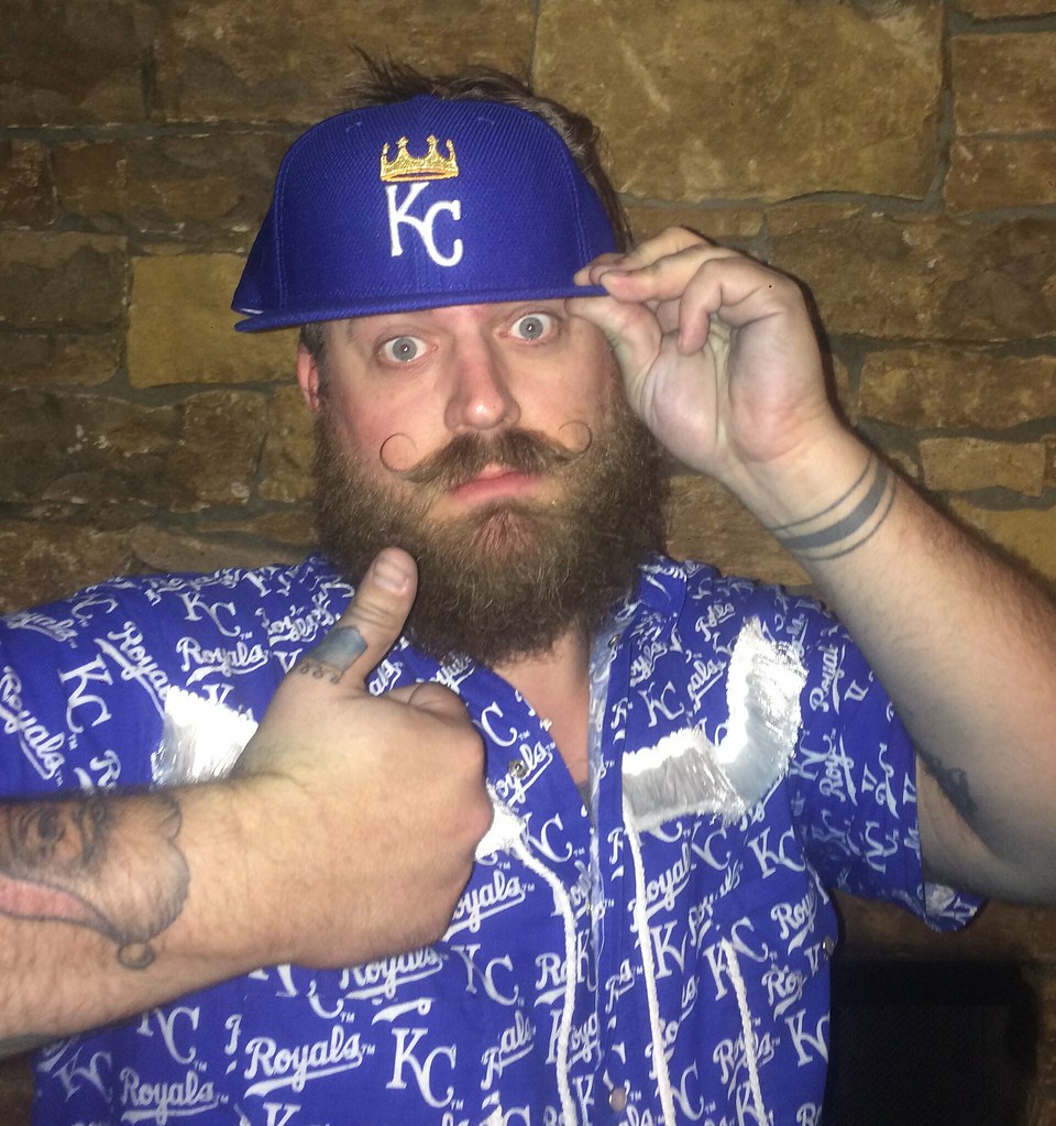
Meet Jeremy Scheuch, a lifelong Royals fan who lives in Chicago but still gets back to KC to see important games — like Sunday’s Opening Night game against the Mets. He’s holding the cap that Royals starter Edinson Volquez mistaken wore during the first inning of that game. The story of how he ended up with the cap is a good one, and I had the pleasure of telling it in this ESPN piece, which went up yesterday afternoon.
Lots of people wrote about Volquez wearing the wrong cap, but I’m pretty sure I was the only one to get an interview with Jeremy. How did that happen? Simple: He tweeted during the game that he’d bought the cap. Several readers saw that tweet and retweeted it at me (thank you!). I saw that Jeremy’s Twitter profile included a link to his website, so I went there and used the “Contact” link to send him an email asking if I could interview him (plus I also sent him a tweet asking the same thing). He emailed me back but explained that he was at Kaufman Stadium and didn’t want to do an interview until the game was over, so we agreed to have him call me after the final out, which took place shortly before midnight my time. We had a nice chat, maybe 10 minutes long, and I had my story. (He also provided enough details and specifics to overcome my initial skepticism about whether he might be a bullshitter who was just claiming to have acquired the game-used cap.)
I figured some other writers might see Jeremy’s tweet and contact him just as I had done, so I asked him if he’d be willing to give me a 24-hour exclusive on the story, and he graciously agreed. Then I went to bed and wrote the story when I woke up the next day.
As you can see in the photo above, Jeremy is a bit of a character. He’s also a serious Royals diehard with the team’s logo tattooed on his thumb! “I know that picture of me and the hat is terrible,” he wrote when emailing me the photo, “but it’s midnight and I’ve been tailgating and baseball-gaming since noon.” Fair enough.
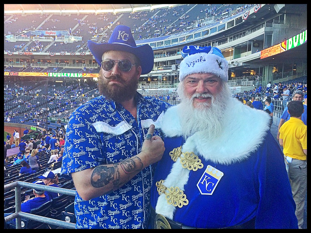
And it turns out Jeremy isn’t the only Royals-crazy fan in his family. He also sent along this shot of himself with his dad — wow (click to enlarge):
As for the Volquez cap, I was initially a bit surprised that the Royals chose to sell it. Granted, we’ve seen lots of players accidentally wearing the wrong cap, so it’s not such a crazy story, but this situation was unusual because the Royals were wearing their gold-logo championship caps, which is no doubt how Volquez got mixed up in the first place — that adds a new dimension to the story. Plus it was Opening Night. Given all of that, I kinda thought maybe the cap would’ve been sent to the Hall of Fame, or at least be kept at the team’s Hall of Fame.
But I guess the authenticators and such didn’t see it that way. Still, I’m glad a serious Royals fan like Jeremy ended up with it. Nice guy, nice story, nice resolution.
Finally, there was another cap snafu last night, although this one was a lot lower-profile, as Cubs coach Mike Borzello had the wrong headwear:

Not sure who, if anyone, ended up with that cap.
For all photos in this section, click to enlarge
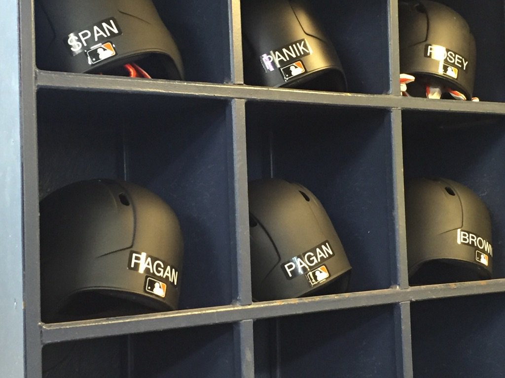
Opening Day suprises: A bunch of teams waited until just a few hours before their first games to reveal a uniform change. The one that seemed to cause the most buzz came from the Giants, who have become the latest team to switch to matte-finish batting helmets (see above). Here’s how it looked on the field:

I think black looks really good as a matte color, so I’m fine with this. And speaking of matte black helmets, the Rockies waited until shortly before gametime yesterday to tell us that they too are going that route:
You’re not gonna believe this, but I actually preferred the metallic purple version. That just felt more Rockies to me. The matte version doesn’t look bad, but it doesn’t feel ilke the Rockies.
A bunch of people are referring to the matte helmet phenomenon with words like “epidemic” and “rampant,” but let’s not get carried away. There are now exactly five teams that have gone matte: the Pirates, Diamondbacks, Padres, Giants, and Rockies. Is it a budding trend? For sure. An epidemic? Please. And as trends go, it’s not a bad one — I think most of the matte helmets look pretty good.
Other changes that we didn’t know about until yesterday:
• The Diamondbacks have added a memorial patch for Joe Garagiola:

It’s a nice patch design, although it’s interesting that they went with a catcher’s mask. True, Garagiola was a catcher, but he never played for the D-backs (duh) and he was much better known as a broadcaster. Still, Garagiola’s son was a longtime D-backs exec, so I guess he wanted us to remember that his father was a ballplayer, not just a broadcaster. Fair enough.
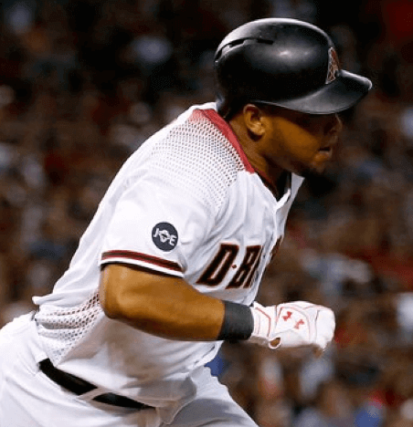
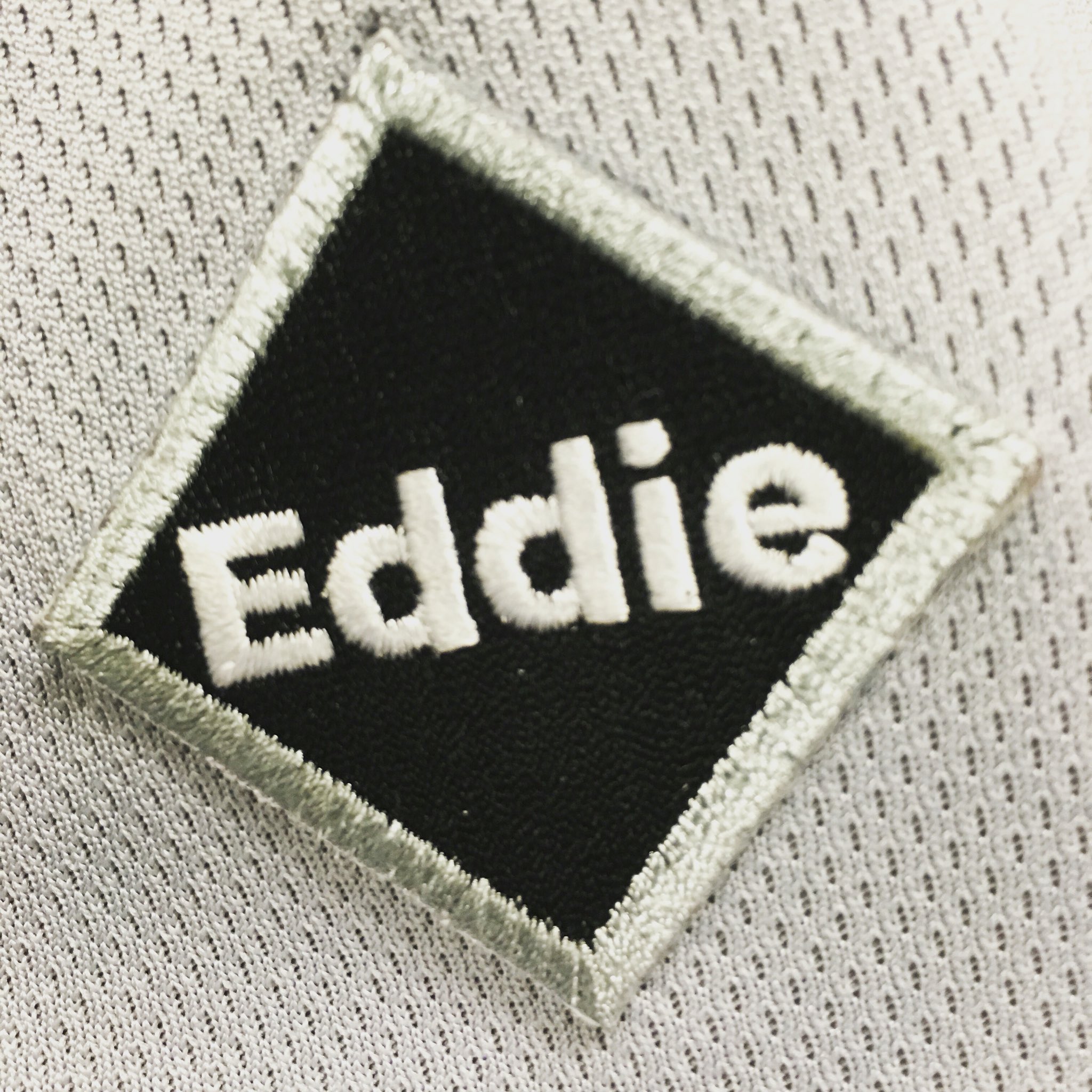
• The White Sox have added a memorial patch for Eddie Einhorn:
The interesting thing about this one is that it continues what we can now call an established design protocol for White Sox memorial patches. They used this diamond-shaped format in 2012 when memorializing Moose Skowron and Kevin Hickey, and again in 2014 for David Reinsdorf. There’s no other team I can think of that consistently using the same memorial patch design (unless you count the simple black numerals that the Yankees use for Hall of Famers, like their current “8” patch for Yogi Berra).
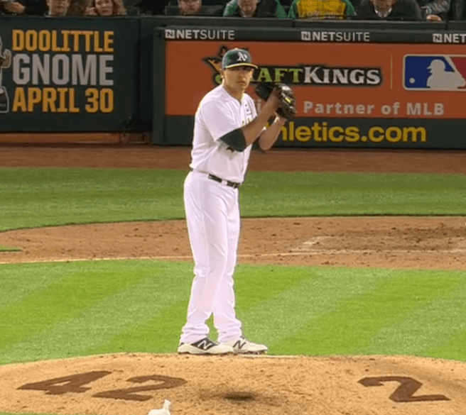
• The A’s added memorial patches for former players Dave Henderson and Tony Phillips:
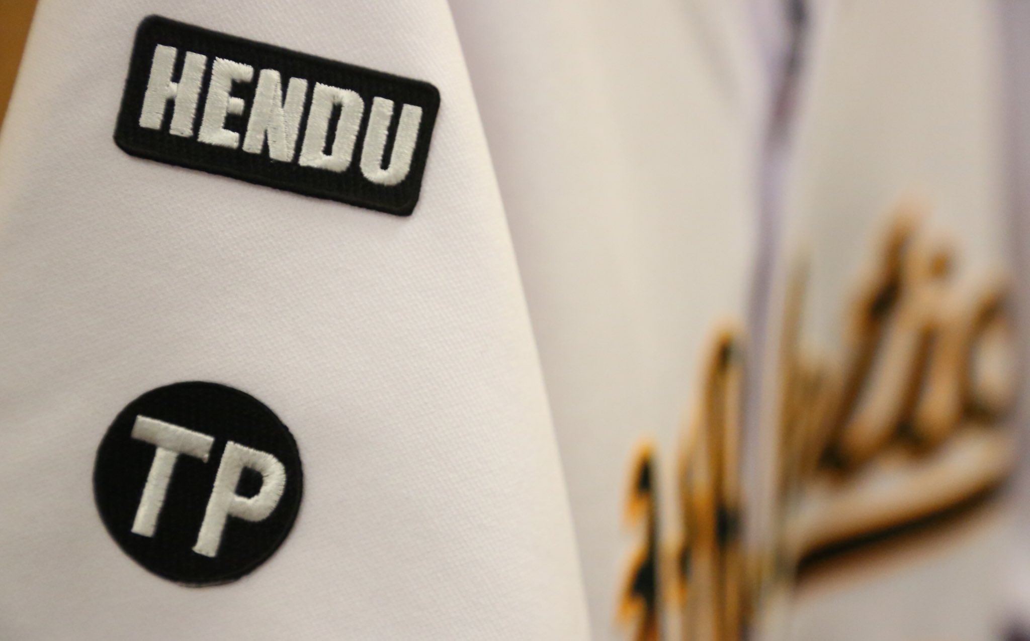
That photo, from the team’s Twitter feed, showed the patches on the right sleeve. But in last night’s season opener, the patches were on the chest:
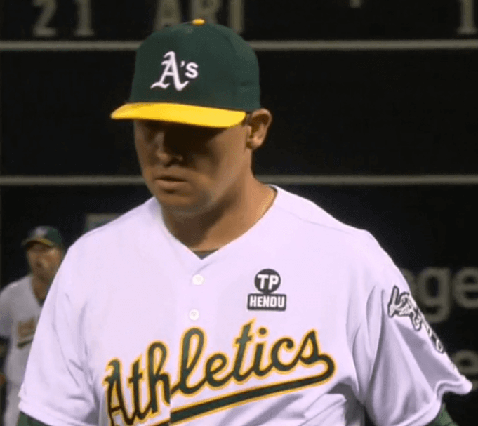
These patches were only for last night’s game and will not be worn for the rest of the season. In addition, the A’s put Henderson’s and Phillips’s numbers on the back of mound last night:
• And the Twins have added red outlining to the NOB lettering on their road greys, which had previously been plain navy:
Turns out this one is actually shown in the MLB Style Guide, but it wasn’t included in the Guide’s list of changes for this season and the team never mentioned it in any of their press releases, so I didn’t notice it. (I double-checked yesterday to see if the Guide showed the Twins making any other changes that hadn’t been announced, but there don’t appear to be any.) From my perspective, it’s a downgrade. The plain navy lettering looked clean; the new version looks too busy.
On some level it’s sort of annoying that all these stuff was held back until the last minute, because it means my MLB preview column is now badly inaccurate, or at least incomplete. But I respect the fact that these teams had the discipline to wait until Opening Day, instead of splashing their changes all over Twitter weeks ago. They wanted to provide their fans with an Opening Day surprise, and that’s what they did. Good for them.
I can tell you that there’s at least one more team that has a surprise in store, and they’re planning something that, to my knowledge, has never been done before on an MLB uniform. Unfortunately, I’m sworn to secrecy. But you’ll see soon enough.
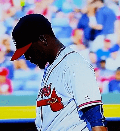
Meanwhile, here’s an oddity: The Braves had announced that they’d be wearing a left-sleeve memorial patch for coach Bobby Dews, but the patch was MIA for yesterday’s season opener:
In a related item: In my MLB season preview I said that the Cubs would be wearing a sleeve patch for their centennial at Wrigley Field, but I neglected to say that they’d only be wearing it at home (which makes sense). That explains why they weren’t wearing it for last night’s season opener in Anaheim.
(My thanks to all contributors, and my apologies for not keeping track of who submitted what — busy day yesterday.)
Click to enlarge
Collector’s Corner
By Brinke Guthrie
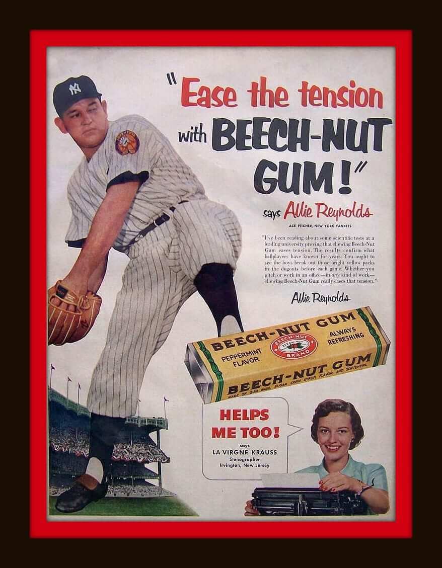
It’s Opening Week in the big leagues, so we’re all baseball today, beginning with this ad that says, “Ease the tension with Beech-Nut Gum.” And in a nice uni-related bonus, note the Yankees 50th-anniversary patch on Allie Reynolds’s left sleeve!
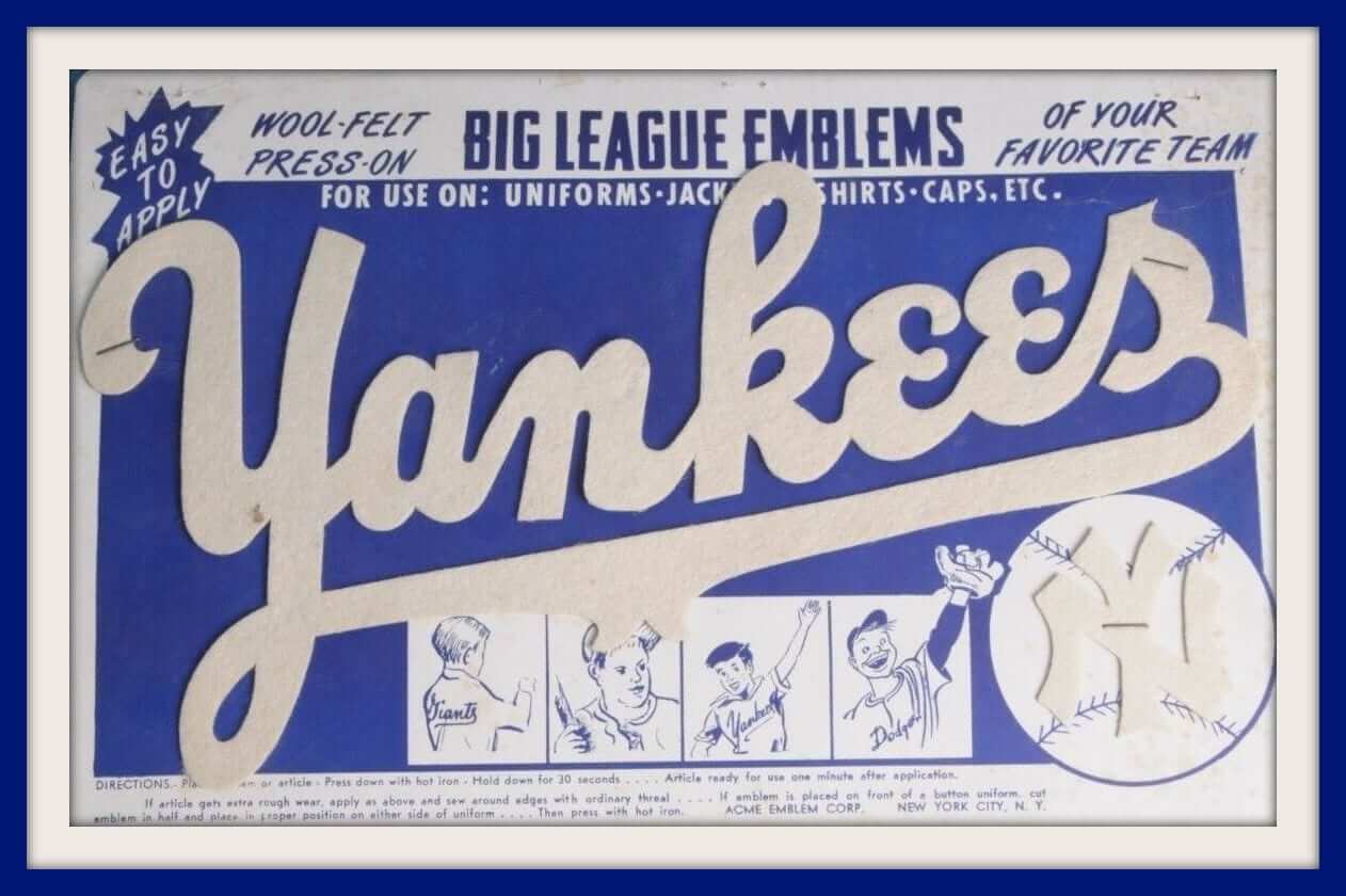
As long as we’re talking about the Yankees, how about this Yankees felt logo from the 1950s. They didn’t market jerseys and such back then, and this was the closest you could get to being in the pinstripes along with Mantle, Ford, and the others. Just press down with a hot iron for 30 seconds, and you are all set. From the ACME Emblem Corp of New York City (click to enlarge):
But hey, we can’t have all Yankees, all the time. So here are the rest of this week’s picks:
• How about this 1970s Houston Astros Soapy Slider. Can’t tell if it has a rope on it, or the Astros logo. Obviously, this hasn’t been used!
• Stayin’ with the ’Stros, this 1960s Astros/Astrodome pennant is in good shape!
• Did you know the there was a 1950s minor league team back called the Miami Marlins? Here’s the button to prove it.
• What do you do during a 1960s Mets rain delay? You got out your coloring book, of course.
• Show the world you’re a Phillies fan with this 1970s Phanatic window sticker for your car.
• Here’s a 1970s San Diego Padres/Union 76 bumper sticker: “Catch Us If You Can!”
• Remember this Braves “a” cap design? Here’s a Little League rayon-wool-felt version of it. (The listing says 1960s, but what do they know.)
• Check out this 1950s Yankees coffee mug. The logo hasn’t really changed, has it.
• And from their first year in the league, here’s the 1969 Montreal Expos pocket schedule. From O’Keefe: The right ale for right now!
Product endorsement: Aside from my annual holiday gift guide, I don’t often promote straight-up merch, and the term “lifestyle brand” gives me a rash. But Roots of Fight has just come out with a line of baseball-themed merch that’s too good to ignore. Dig (click to enlarge):
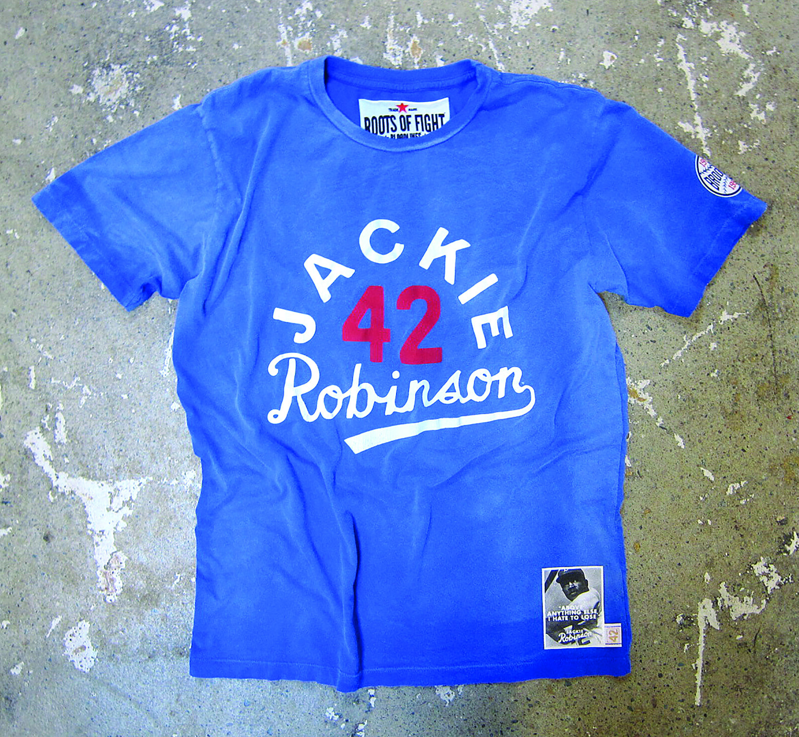
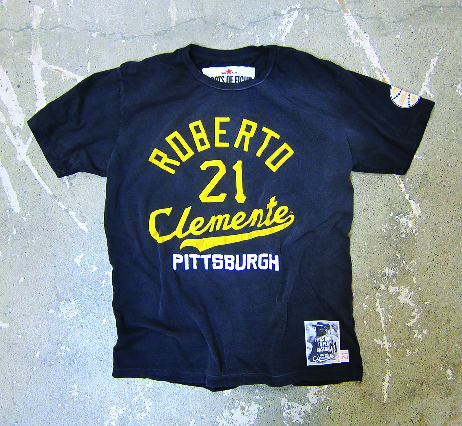
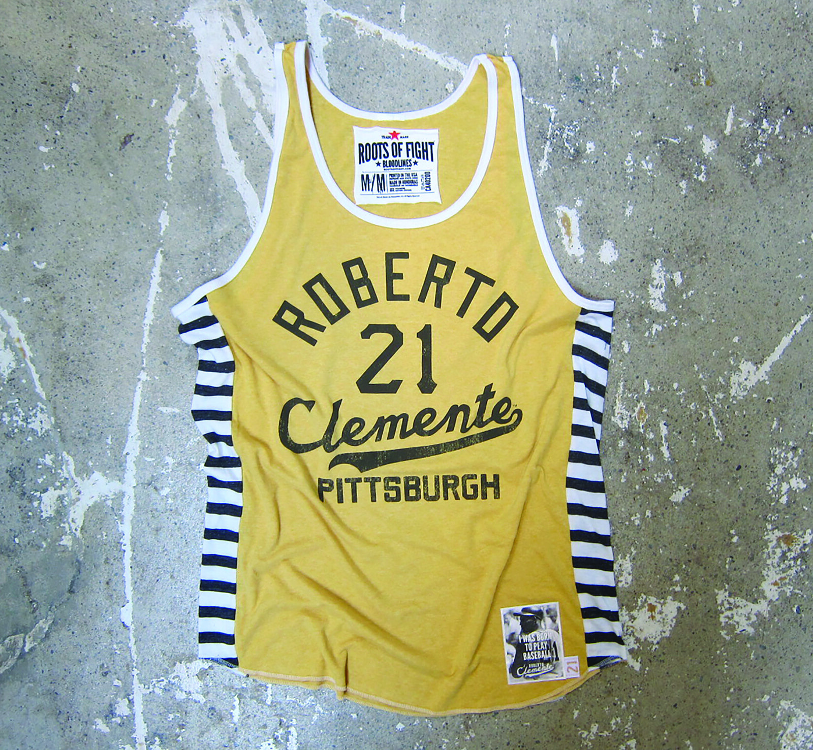
Nice, right? This stuff is expensive, and the product line also includes some additional items I don’t like as much, but those Jackie and Clemente items are gold. If you want to know more, look here.
Caricature T-shirt reminder: Larry Torrez’s caricature of me is now available as a T-shirt. We’re offering it in a variety of colors and styles — grey, black, white, and a white baseball shirt with green sleeves. We’ve also added women’s sizes. Further details here, or just order it here. Thanks.
The Ticker
By Mike Chamernik

Baseball News: Nats OF Bryce Harper, apparently channeling his inner Donald Trump, wore a “Make Baseball Fun Again” hat during his postgame media scrum yesterday. … The WWE wrestler the Big Show threw out the first pitch at the Rangers’ opener yesterday and had a nickNOB jersey (from Cory Hoad). … A pair of Orioles fans wore EAOB jerseys yesterday ”” that’s Engagement Announcement on Back (from John Falardeau). … The Padres wore home whites last night and will wear brown today and camo Wednesday. … Not a particularly insightful list, but here’s someone’s compilation of the most stylish baseball unis from over the years (from Phil). … Some good photos of old White Sox unis can be seen in this retrospective of ChiSox Opening Day moments (from Phil). … A little cross-sport action here as Slam Magazine found a photo of Kobe Bryant in a baseball batting stance. He’s a lefty batter and, though he can shoot with either hand, he’s a natural right-hander. … Check it out: MLB jersey throw blankets. Most teams have their alternate jerseys represented (from Eric Juergens). … The Diamond Uniform Database will once again track all of this year’s uni combos (from David Taub). … Sign of the times: A suburban Chicago collegiate wood bat league team will be nicknamed the Drones (from Jeff Demerly). … @AZJoshM asks if Cards P Seung-hwan Oh is the first MLB player to wear a Descente glove and spikes. Descente did makes the Pirates’ uniforms back in the ’70s, of course. … Christopher LaHaye covered a high school baseball game yesterday and noticed the ump wore football forearm pads and that a base coach wore his hat backwards underneath his helmet. … Dodgers OF Carl Crawford appeared to be wearing earplugs yesterday. ”¦ As you can see in that last shot, the Dodgers opened the season wearing their “Dodgers” alternate grey jerseys, not their “Los Angeles” primaries. ”¦ In 1968, the Royals — then a fledgling expansion franchise — needed a logo, so they asked the KC-based Hallmark company to come up with one. Here are some of the results (from Jon Saddler, via Phil). ”¦ Arizona Cardinals WR Larry Fitzgerald wore a D-backs jersey while throwing out the first pitch last night in Arizona. … Speaking of the D-backs, their newfangled uniforms made their regular season debut. Lots of photos here. … Not uniform-related, but because I have nowhere else to put this I’ll say it here: I’m going to say that my favorite team, the Brewers, will lose 105 games.

NBA News: Allen Iverson certainly has a style all his own. AI was elected to the Hall of Fame yesterday and he wore Jordans during his SportsCenter announcement interview. … Speaking of AI, here’s a good article on his right-arm sleeve. ”¦ Yao Ming was also elected into the Hall of Fame. At his introductory press conference in 2002, the Rockets presented him with a FNOB jersey (from Mike Engle). … The Jazz announced their new D-League team, the Salt Lake City Stars. Here are the team’s logo and uniforms. … Justin Hodnett asked Sacramento Bee reporter Jason Jones if the Kings are getting a new logo and uniforms next year (ctrl+f “logo”). Jones said he’s heard rumors but hasn’t seen any concepts.

Soccer News: West Bromwich Albion and Sunderland squared off on Saturday, and both teams wore their traditional vertical-striped jerseys. “They are both outfitted by Adidas, yet the Adidas logo is in the center below the neck line for West Brom but worn at the side of the chest for Sunderland,” says John Foran. … New uniforms for both the men’s and women’s teams at Bryant & Stratton College. ”¦ Retro rainbow-patterned jerseys for Sporting KC (from Phil).

Grab Bag: Chuck D is an artist in more ways than one! The Public Enemy frontman was an aspiring sports cartoonist as a kid (from Brian Mazmanian). … Here’s what Rory McIlroy will wear during the Masters this weekend (from Aaron Rector). … Might the Miami football team be adding merit decals? That’s a photo from Stacy Searels, the Hurricanes’ O-line coach (from Adam Apatoff). … Lots of people sent this in: Wal-Mart is selling a shirt that has University of Maryland graphics inside the outline of Massachusetts. Definitely a horrible blunder, but as that link shows, the two states are kinda-sorta close in shape if you squint. … Cornell’s lacrosse helmets have a graphic of the stadium wrapped across the back (from Kevin Mueller). … The women’s bowling team at Union College in Kentucky wears diamond-patterned uniforms (from David Petroff). … Not uni-related, but chefs around the country named the most overrated and underrated cuts of beef. Hanger steak is a hidden gem and filet mignon, evidently, is for suckers (from David Firestone). … Here’s a good examination of museum logos (from Brinke). … Here’s a map of every bar in Chicago with an Old Style sign hanging out front (from Gil Neumann). ”¦ Air France requires its female flight attendants to wear headscarves when they disembark a plane in Tehran, which has caused a dust-up with the flight attendants’ union (from Jason Hillyer). ”¦ Paging Janice Rand: With more U.S. military combat roles now available to women, the Navy is trying to get away from gender-biased terms like “rifleman” and “mineman.” But one term has proven to be tricky: “yeoman.”
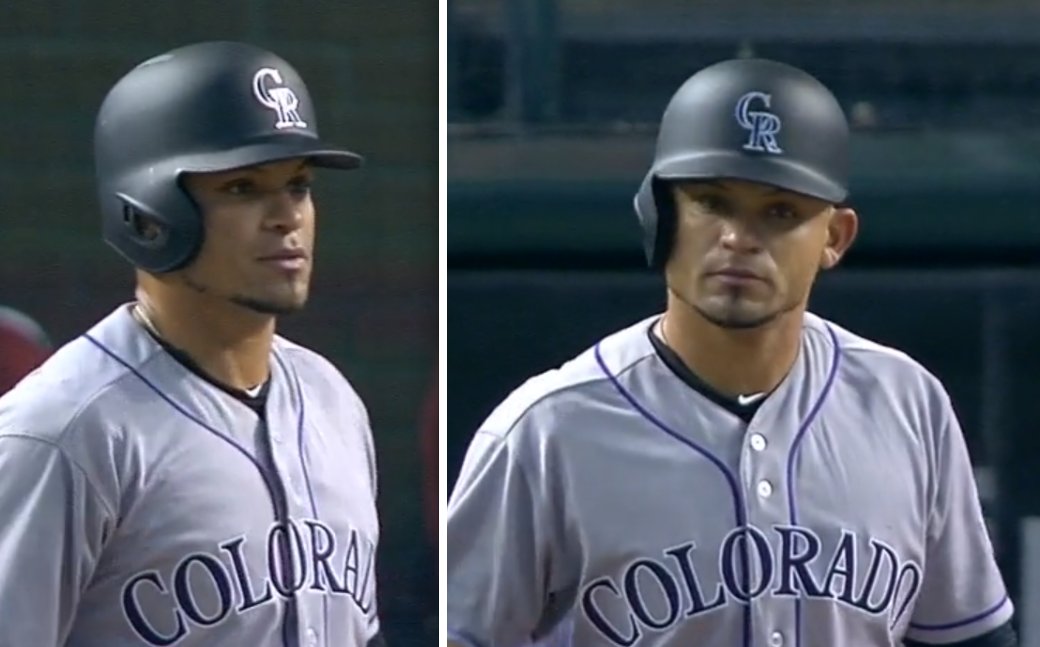
How come Pagan rates two helmets?
He’s a switch-hitter — has left- and right-flapped helmets.
Doh!
Bad link for “yeoman”
Fixed.
I don’t really care for the Giants’ matte helmet for the same reason Paul doesn’t care for the Rockies’. The glossy finish just feels more the Giants to me.
More simply – glossy finish feels more baseball. There’s a subtle beauty in the stadium lights (or sunlight) reflecting off a helmet, or the way a glossy finish highlights the excessive use of pine tar by some players. The matte finish feels dull and lifeless.
I have exactly the opposite reaction. Baseball caps aren’t shiny, so the shiny batter’s helmets have always looked a little off to me. I’d rather the Rockies wore purple than black – across the board, not just their caps and helmets – but I find that I much prefer matte helmets over glossy for the teams that have switched.
It’s worth remembering that the first batting helmets were flocked, because they were supposed to mimic caps. The matte finish reminds me of the old flocking.
Exactly. What batting helmets should look like:
link
Except with earflaps and stuff so they’re actually kind of safe.
Paul stole the thunder I came here to post. I like the matte for baseball because, to me, it’s a throwback to the flocking. Maybe some folks newer to Getting Itâ„¢ could use a refresher.
I will say this, though: This is about the only application where I like the matte look. If you ask me which I’d rather have representing my teams — dull and lacking gloss, or glossy, shiny and polished, the better look to me will almost always be shiny. It’s a more-finished, bolder look. Matte football helmets do nothing for me.
Here’s the thing:
As I mentioned earlier, original batting helmets were flocked specifically to mimic the cloth look of caps. But helmets bear much less resemblance to caps these days — more padding, more vents, earflaps, etc. So one could argue that there’s no reason to use a matte finish to evoke the feel of a cap, because the helmet is no longer a hard-shell version of the cap. The helmet has become its own thing, and as such should be allowed to have its own design flourishes (like, say, a glossy finish) instead of being tied to the look of a cap.
I’m not saying I 100% agree with that, but I think it’s a fair argument.
I also think it’s a fair argument to say, “I just like the matte look — not because it evokes the look of a cap, but because I just think it looks good.”
Could this perhaps be another generational split? I was born in the 80’s, so batting helmets have “always” been shiny. A matte finish looks dull and lifeless by comparison, and feels trendy.
I get the connection to flocking, and really like the idea of using matte finishes for throwback unis, but it feels less polished (literally and figuratively) as the standard for a uni.
I agree with Adam N…the matte finish just looks like the helmets have been sitting in a dusty room for a few years.
I tend to agree as well. There’s something about these matte finishes and they way light interacts with them that makes the color look very muted. Whereas the glossy finish reflects light in crisp contained highlights, the matte finish spreads the refections out over the surface and robs it of its vibrancy.
Matte helmets with shiny stickers look wrong. The finishes should match.
Matte helmets are perfect. They have just the right amount of sheen on it. The shiny helmets look silly and really unnecessary in comparison. They look like Christmas ornaments rather than athletic gear.
I think they probably added the outlining to the name to match the lettering on the front, which is probably a good decision, but I just don’t like the way the coloring of the lettering is a reverse of the numbers. Give me single-color lettering that matches the outline color of the numbers, or give me everything in a matching two-color treatment.
The Twins are descending into a Brewers/Padres circumstance; that is, wearing so-so uniforms they can’t resist tinkering with. I would have rendered all the graphics using the Kasota Gold drop shadow. It would keep Minnesota from looking like they borrowed from the Indians, Angels, Nationals, Cardinals, et al.
I’m kind of with you, Andrew, except that I’m OK in theory with contrasting colors on the back provided that the (big) number is outlined in the color of the (much smaller) NOB, and that the NOB has no outline. Makes both the number and the NOB pop against the other, and provides a sort of vertical continuity between the elements. It’s almost like the NOB “bleeds” into the number outline. Adding the contrasting outline to the NOB ruins that and makes it look like two unrelated designs rather than a single integrated unit. Oh, and it makes the NOB harder to read, which means that it’s just plain bad design, since legibility is the whole point of having a NOB.
The Twins had decent uniforms up to 2009 and then systematically trashed them. And somehow the constant tinkering mostly makes already bad uniforms worse. The only positive change in the last six years has been the introduction of mustard, but in typical Twins fashion they’ve made a complete hash of that in the execution.
Would it be too hopeful to think they are intentionally making a bunch of so-so uniforms and muddling them up so they can justify a full-time return to the cream pinstripes?
Arr. What you’re saying is exactly what I’m advocating. I like the name to be one color, and I like it to be the same color as the outline of the number.
One, the scale relationship of the lettering and the outline is very similar, which is why it looks so good when they are the same color, and two, if the one color name is the same color as the fill of the number rather than the outline, it looks like an unfinished version of the number to me. Lots of teams do this, but I just don’t like it.
All things considered for the Twins, though, having the name coordinate with something (the Minnesota script) is better than it coordinating with nothing. If they switched the numbers to blue with a red outline so everything matched, that would also be acceptable to me.
White Sox diamond patches: it matches the sock in a baseball diamond logo of theirs, so I see the symmetry. I like it.
Diamondbacks Joe logo: not only was Joe Garagiola a catcher, but he used to say that The Today Show people would call him Joe the Catcher because Garagiola was too hard to say. For that reason, I think it’s inspired. I’m a fan.
Iverson in Jordans: What, did his Reebok contract expire?
The Sox have also used that Memorial patch last year for Minnie Minoso & Billy Pierce (link)
Who is “J.E.”?
that’s what it looks like to me.
J-mask-E
One thing that’s also different this year is the Phillies wordmark on their jersey, its thicker and squattier.
I don’t care for it.
That’s not an official change (specs in the MLB Style Guide are the same as always), but I agree that it’s an *evident* change. I’m going to be in touch with Majestic about it today.
Perhaps the wordmark was “thickened up” to match what I call the puffiness of their number font?
Looks to me like they switched manufacturers.
Regarding Bryce Harper’s hat, That game against the Braves was plenty fun! So far that hat hasn’t shown up in the National’s team store….YET.
I will buy one for Goose Gossage. He would love it.
“I can tell you that there’s at least one more team that has a surprise in store, and they’re planning something that, to my knowledge, has never been done before on an MLB uniform. Unfortunately, I’m sworn to secrecy. But you’ll see soon enough.”
Hopefully its not the Yanks adding last names to their uniforms.
Hey now, April Fool’s Day was last week!
Pretty sure that’s been done before on an MLB uniform.
I’m guessing some sort of glow-in-the-dark element.
The Jeff – My thoughts exactly. Rays?
CTRL+F “logo”
thats a new one
What do you mean? I put that there so readers that click the link could find the logo/uniform pertinent part of the chat. My fault if that isn’t clear and it looks like poor coding or something.
I thought it was perfect, Mike — I smiled as I was editing the Ticker and saw how you handled it.
Maybe Tony is using an Apple product and doesn’t know what CTRL+F means.
I use PCs, and I didn’t know what “ctrl+f” was. I like using mouse controls for things like that.
The White Sox aren’t the only team with consistent memorial patches, the Phillies have worn the same black circle with initials since 2007. They’ve placed them all differently, but they are all the same design.
Talking about matte finishes
On Sunday, the F1 race at Bahrain was held at night. Normally the cars are shiny but Red Bull decided to use a matte finish on its livery
link
Following up on the missing part of the Final Four midcourt logo… one of the designers posted a schematic drawing to his Instagram account: link
As you can see in the comments, they did notice the mistake. I’m guessing it was too late to fix it over the weekend.
Looks like he and the other designers were invited to Houston for the games. He has another picture clearly on a court with the correct logo application (link). I think the Final Four usually has a second (smaller) court set up for kids (and adults) to shoot hoops and play games. I’m guessing that picture is from there.
That third base coach with the backwards hat under his helmet is one of, if not the, worst things I have seen in my life. How is any player supposed to take someone that looks like that seriously. Also, you are a coach! Get yourself a helmet that fits. As a collegiate base coach I am embarrassed. Great story about Eddie’s hat though, Paul.
Agreed, he looks like Max Patkin out there.
Nah…..link.
Yao actually played his first preseason game with the FNOB. I think they disallowed it afterwards.
What is the tattoo on his right forearm? Is that a Santa tattoo?
Hey Paul, why does your caricature have the number 7 on his uni? Is there any special significance that you can share?
I like the number 7. It’s also on my Uni Watch membership card.
I’m still curious as to why the site’s banner still randomly alternates between 7 and 15, when we’re past the 15th anniversary and the year 2015. (If this was answered before, I apologize for the repeat, but if I did post the question earlier this year, I don’t recall seeing it answered.)
I definitely agree with you on the Twins’ NOBs, Paul. Generally, I don’t care much for multi-layer NOBs to begin with, and they’re usually unnecessary anyway, and 2-color NOBs should only be used if there’s an actual need for contrast. 3-color NOBs really have no good reason to exist at all.
… and they’re freaking heavy!
Those Roots of Fight shirts are righteous. I love the look of hand lettering; very artisanal.
That did indeed feel like a statistically representative game for the Brewers. Three decent innings, followed by what amounts to a double-A team flailing around in the big leagues for six innings. I’m not sure I would expect 105 losses, but if I had to bet money either way, I’d take the over. And worst of all, it turns out the loss of the pants stripes makes a huge difference for the Brewers’ uniforms. I’m in the tiny minority of folks who actually like the current Brewers unis, but they desperately need the pants stripe to tie the whole thing together. Hopefully this is just a one-year interregnum on the way to a total navy-and-yellow overhaul for 2017. And hopefully they don’t fire Craig Counsell when all the losing is over in October; I like that guy, and he’s not the one who decided to try fielding MLB’s first all-volunteer roster.
On the plus side for this recent Wisconsin transplant, I can get behind the Brewers now and I’ll never have to worry about being accused of being a bandwagon fan.
Hey Paul, not sure if you’re aware of this, but the stripes vs. stripes soccer jerseys don’t make much of a difference to the players. My roommate used to play semi-pro, and he said what really matters is the shorts and socks colors. His reasoning was that soccer players are constantly looking down at the ball, so only having to glance up at someone’s knees makes it much quicker to fire off a pass, shot, etc. As long as those two differ between teams, the jersey doesn’t matter as much.
Mike wrote today’s Ticker, not me, but thanks.
My problem with matte paint on helmets (football, baseball, hockey) or anything else for that matter (cars for example) is that it’s excruciatingly hard to keep from chipping without some sort of cover. Baseball helmets are probably the least prone to paint shipping/shattering of any of these examples but players that toss their batting helmets could really make them look funky in only a couple of games use. Does the MLB have something in place for that?
Also, proofreading:
“One some level it’s sort of annoying that all these stuff was held back until the last minute”
Probably should be “On some level”
Fixed.
Lots of good baseball stuff in Collector’s Corner.
My favorite is the Mets coloring book, particularly the picture of Mr. Met mixing it up with the bleacher bums at Wrigley Field.
Does anybody else here kind of wish baseball teams (and those in other sports) would dial back the “memorial patch” thing a little?
Not only does it kind of look bad (especially if you believe the uniform is something of a “sacred” space”) but by adding one for seemingly anybody who dies who is remotely associated with the team kind of cheapens the whole thing.
If I had my druthers, a season-long memorial patch would be limited to when a current player or coach dies unexpectedly…this would be sad and traumatic enough to merit the current players wanting to memorialize their deceased comrade.
For former players, etc., I think maybe a one-game or one-series patch on the uniforms would be more appropriate, and if the team wants a more permanent memorial it should be a sign, etc. somewhere on the outfield wall.
Kindred spirit here, dude. I disapprove of the hairshirt that passes for standard M.O. when a solemn event befalls your favorite team. It seems grief that isn’t garish doesn’t count.
Another example of “ratchet” culture — it only goes in one direction, never goes back.
My kingdom for a black armband.
Would you assume this fad began (in the sports realm) when the G.H.S. became a permanent fixture of the Bears’ uniform?
No. I don’t think perma-memorials are a separate thing.
I think the rise in memorial patches is due to three things:
1) The rise of “because we can” culture.
2) The rise of “look at me/us” culture.
3) The rise of digital design (making it easy to create a patch design quickly).
I think there should be a limit on how long you wear it. Yes, I’m looking at you, Bears! Put up a statue, put up a plaque, name a street after him, just lose the initials. How would you feel if the Yankees were still wearing a “5” on their sleeves, or worse, a “GS” patch?
Another observation as long as we are talking about culture…there was once a time when we honored great men from the past who accomplished things…now we “memorialize” people we have lost…almost as though we’re being trained to focus on the past instead of the future…
there was once a time when we honored great men from the past who accomplished things…now we “memorialize” people we have lost…
Speaking strictly from a cultural standpoint (not from a sports patch standpoint), I’m not so sure the former (which led to a lot of bullshit mythologizing) was better than the latter (which places a value on empathy). But at least we didn’t have so many patches.
Love your point about “ratchet” culture above.
All of these comments about patches make me wonder about another slightly off-topic item. Will we ever see the total elimination of the American flag from jerseys, helmets, etc. of professional sports teams?
Not as long as we’re in a perpetual “war against terrorism” (which is not actually a war, and will therefore never end, and will therefore provide an endless rationale for keeping flags on NFL helmets, on NCAA hoops unis, etc.).
Analyzing grief has transfixed me since 9/11. We have in our presence a killing ground, and in a sense it binds us with other cultures who have suffered unspeakable tragedies. My worry is: Will it shape us, or will it imprison us? Dan T’s concern is justified. Are we becoming a backward-looking society, condemned to regretting the past?
I’m not sure how “honor[ing] great men” (Dan’s term) is any less backward-looking than “memorializ[ing] people we have lost” (also Dan’s term).
I’m not suggesting that one is necessarily better or worse than the other. But if backward-looking-ness is your preferred metric, I’m not sure I see a difference between them.
Fair enough. I think I equated Dan’s two-part thesis with choosing between the future and the past, a mistake on my part. I certainly aspire to be an empathetic person, and I don’t wish to dismiss anybody’s sorrow. But grief ought to be temporal. One reaches a point where lamenting and anguish are not appropriate. It’s regrettable to allow sports (and while we’re at it, life in general) to become the equivalent of the tacky roadside memorial. The dead have their place, and we can choose not to live in their shadow.
I see the White Sox are still going with the “Sox” patch on their left sleeve. I still wonder why they went away from the “diamond white sock” patch.
I’d love to know the thinking behind that change. The white sock was so perfect and the Sox logo is just so redundant (from their caps) and…dumb.
I co-sign this completely.
There was a discussion the other day about over-patching baseball jerseys. A team that simply repeats the hat monogram on the sleeve looks like crap.
Don’t get me started on the Angels…
The Indians wearing the block “C” batting helmet with the Chief Wahoo jersey and hat makes my eye twitch. I hate both logos, but it’s even worse when they’re combined.
Regarding the link to White Sox opening day photos, here’s another: link The lighting is pretty bright and the sun is to the White Sox backs, but the photo clearly shows the 69/70 Sox road uni’s in GREY. (Not powder blue – please note, Mr. Creamer and Colorwerx.) It also shows the short lived white numbers and NOB’s, which were probably replaced with a set of the blue home numbers and names on the first home stand.) Photo proof. That should settle it.
WOW! That is a holy grail!!
Michael Emody does not F around when it comes to the 69/70 Sox in gray. Dude called me an idiot in this space a few years ago for screwing that up.
link
But I have to say that does look like powder blue
link
I’m sorry, Mike. You’re right, it DOES look powder blue… but it’s really grey. (That Aparicio photo is tinted.) Find a bunch of quality color photos and you’ll see. Go to “That’s My Boy” or “crosley-field.com” where he’s got the 69/70 jersey in the same photos with real powder blues.
It may be there’s some blue threads in the weave that shine under certain lighting conditions. I also think photographers knew the Sox came out with powder blues in 64, and in many cases adjusted the color in the photos to match what color they thought it should be. Here’s a photo of an authentic 70 road from an auction, where they wanted the pic to truly show what people were bidding on: link
It’s just people who are experts are basing their conclusions on tinted photos or Topps cards and should know better. It’s one of few debatable things in the uni world, and well… we ARE here for the “obsessive study of athletics aesthetics” are we not?
I DID post a b&w photo, so I don’t take myself that seriously. Sorry again for being harsh… But, I’m a Sox fan, and wish people would get it right.
“You’re not gonna believe this, but I actually preferred the metallic purple version.”
Who are you, and what have you done with Paul?
Yankees do not have the mesh side panels that would look so stupid without pinstripes.
link
Did anyone else notice paul didn’t actually tell us how the guy got the royals hat…? Just 300 words to say he did. O.o
Uh, did you read the ESPN piece that’s linked from today’s blog entry?
You might wanna try doing that.
Just a thought.
The Padres are wearing brown jerseys tonight. Are these throwbacks? The lettering looks too large. Either way, they look pretty good!