
Click to enlarge
A moment for the ages during yesterday’s Yanks/Cards Grapefruit League game, as Yankees catcher Eddy Rodriguez stepped in the box against Cardinals pitcher Tyler Lyons, creating a rare (first-ever?) No. 70 vs. No. 70 match-up.
Lyons has made the Cardinals’ 25-man roster but Rodriguez is ticketed to the minors when the final roster cut-downs are made (plus he’d probably be issued lower numbers if he made the cut), so this match-up couldn’t happen in a regular season game. But it raises an interesting question: What’s the highest uni number that’s ever been represented on the mound and in the batter’s box at the same time? Did So Taguchi ever come to bat against Turk Wendell? And at the other end of the scale, has Adam Ottavino ever stared down Omar Quintanilla? Get on this one, all you number-crunchers out there!
Update: It didn’t take long for reader Jacob Resnick to inform us that Rudy Owens of the Astros and James Jones of the Mariners, both of whom wore No. 99, faced off four times in 2014. Here’s video of their first encounter:
(Big thanks to @RNs_Funhouse for the screen shot.)
Click to enlarge
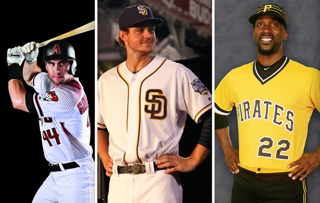
The best Uni Watch day of the year: My 18th annual MLB season preview column, with all of the changes for the coming season, is up now on ESPN. This is always my favorite column of the year to work on, and many of you have told me it’s your favorite one to read. Enjoy!
No Friday Flashback today — just the MLB preview. The Flashback will return next week.
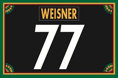
Membership update: Membership orders continue to trickle in very slowly these days (including Paul Weisner’s Steelers treatment, shown at right). We have a few spots open on the current sheet, so if you order now you’ll get your card very quickly.
As always, you can order your own custom-designed membership card here, you can see all the cards we’ve made so far here, and you can see how we produce the cards here.
Caricature T-shirt reminder: In case you missed it yesterday, Larry Torrez’s caricature of me is now available as a T-shirt. We’re offering it in a variety of colors and styles — grey, black, white, and a white baseball shirt with green sleeves. We’ve also added women’s sizes. Further details here, or just order it here. Thanks.
The Ticker
By Paul

’Skins Watch: Democratic presidential candidate Bernie Sanders thinks the ’Skins should change their name (thanks, Phil). … The Arizona Diamondbacks’ 2016 promo schedule includes “Native American Recognition Day” on June 11. The team will be giving away a “tribal hat” for the occasion. … Longtime 49ers TE Vernon Davis reportedly signed with the ’Skins yesterday. An NBC website avoided using the team’s name while delivering that news (from @mt_vern).

Baseball News: A slew of MLB mascots will be featured on Good Morning America today. … Anchor Brewing — the people who make Anchor Steam beer — have a new lager with a Giants theme (from @LindysBrews). … Geez, ya think the lettering on the El Paso Angels’ jersey was big enough? … Here’s an old shot of pro wrestler Stone Cold Steve Austin wearing a Mets jersey with No. 3:16 (from @JayJayDean). … The Royals’ gold-trimmed championship uniforms for the first two games of the season will include gold-logo batting helmets. Interestingly, the gold helmet logo doesn’t have a white outline, while the cap logo does. Seems odd that they wouldn’t match. … Check it out: Then-prexy Richard Nixon trying on a 1969 Mets championship ring (great one from @BSmile). … Interesting note from Richard Paloma, who writes: “I was just informed that the Oakland Coliseum will no longer have the rotating-arm turnstiles anymore due to them being obsolete.” One could argue that the entire Oakland Coliseum is obsolete, but it’s still an intriguing development. … Reds 3B Seth Mejias-Brean is another player with HNOB (from Tom Denne). … Matte helmets continue to appear on some of the Orioles. No word yet on whether these will be used in the regular season (thanks, Phil). … 1940s throwbacks this season for the PawSox (from @peskeys_pole). … The Mets and Cubs played an exhibition game in Las Vegas yesterday. The Mets still had their “FL” sleeve patches and the Cubs still had their “AZ” patches, even though the game wasn’t played in either of those states (from Shannon Shark).

Pro and College Football News: Here’s the latest on what the Lions have planned regarding new uniforms in 2017. … Oklahoma is letting fans choose the end zone design for the team’s spring game (from Mickel Yantz).

Hockey News: Justin Bieber wore a Coyotes jersey onstage for a show in Glendale the other day (from A.Dub Miranda). … All sorts of cool Maple Leafs cards, stickers, and so on showcased here. … Fun article about a beer league team with a John Stamos-themed jersey design (from @hail2chimp). … Whoa, check out this shot from the 1957 IIHF World Championship. “The Tre Kronor never changes, the Russians loved stripes, and Czechoslovakia looked solid,” says John Muir. … Also from John: Don and Tony Granato were introduced as new members of the Wisconsin hockey team’s coaching staff and were given jerseys with FIOB. … This will be the first season since 1970 that no Canadian teams have made the NHL playoffs, as shown in this infographic (from Mike Styczen). … The Syracuse Crunch will wear their orange alts tomorrow in support of the Syracuse basketball team, and fans who wear orange will get a $5 ticket discount. … Jack Connell was looking through his closet and found this rather bold Flyers jersey. … The Stars wore white at home last night against the Coyotes.

NBA News: Good, thorough article about the Warriors’ “The City” uniform. Recommended. … What’s worse than the Clippers’ road unis? The Clippers road unis and the Thunder’s sleeved white alts in the same game. “Practice uniform battle,” says Phil Hamilton).

College and High School Hoops News: “Here’s a 1993 photo my old high school, Jewish Day, playing against a team simply called I-270, referring to a nearby Interstate,” says Mike Rosenberg. “Not sure if it’s a local all-star team or a school that no longer exists. Either way, I thought it was a cool team name on front.” … Can’t fit “East Texas” on your jersey? Just use “Etex.” That school is now Texas A&M-Commerce (from Ryan Sprayberry). … Very good story on UNC’s shade of Carolina blue, with an accompanying trickier-than-it-seems quiz on college school colors (from @Jason Smith). … Buick has made a Cascada convertible for each of the Final Four schools (from Alex Dewitt). … Here are the “National Champions” shirts for each of the Final Four teams (from Zach Shaben).

Soccer News: Buried toward the end of this story is the news that Barcelona will add a “Thanks, Johan” jersey memorial for Johan Cruyff. … The Wales women’s team is stuck wearing men’s-tailored jerseys (from Yellow Away Kit). … New uniforms for the Ft. Lauderdale Strikers (from David Selig). … New kits for Rayo OKC. Here’s an answer key for the rainbow-striped design (from @tvaughn7). … A Coca-Cola sign at a soccer stadium in Uruguay was printed in black and white, instead of the soda’s traditional red and white, because the team’s biggest rival wears red. Hmmm, is that an April Fool’s joke?

Grab Bag: Good piece on the design of London’s manhole covers (from Gil Neumann). … I just won this completely amazing-looking aluminum siding salesman sample catalog on eBay. Further details to come when I receive it from the seller. … Oh man, this has gotta be one of the best Olympic sweaters you’ll ever see (great find by David Firestone). … The U.S. Navy has just approved more permissive guidelines regarding tattoos. … Virgin America got out in front of April Fool’s Day by floating a not-very-funny prank about redesigning their logo. … New logo for Dubai Expo 2020. … New logos in the works for WCBS-TV in New York.
Eddy Rodriguez is not on the Yankees’ 40-man. The only catchers on the 40-man are McCann, Austin Romine, and Gary Sanchez.
Will fix.
MLB mascots appearing on Good Morning America TODAY!
D’oh! Fixed.
#99 Rudy Owens of the Astros and #99 James Jones of the Mariners faced off four times in 2014. Here’s what they did those four times: link
MLB.com made a video to commemorate the occurrence as well.
Hope that answers the question!
Good work! I’ll add this to the text and credit you.
Tyler Lyons made the opening day roster. He’s spent part of the last three seasons on the big league roster and has always stuck with 70 to this point.
Oh, wow — he wasn’t on the 25-man roster yesterday, but he is today! I’ll adjust the text.
I’ve always thought that the Royals should incorporate some gold into their logos, unis.
Going with gold caps and helmets would be a good look for them this season or at least the first two games.
I agree, I’ve always thought gold belonged throughout the Royals’ design. And if it was actual gold rather than yellow, it would be a unique color scheme in MLB. This special uniform confirms my suspicion that it would look really good.
The vernon Davis item has a text hiccup, I think.
Fixed.
That 1957 IIHL pic is awesome. I’d love to see it colorized.
Proofreading:
“Justin Bieber for a Coyotes jersey onstage for a show in Glendale the other day”
Fixed.
Nothing wrong with trading Biebs for a Coyotes jersey and a bag of pucks to be named later.
Today’s ticker is just chocked full of great stuff! The Warriors article is fun, love the shot of Wilt waving from the back seat of that Ford convertible.
You’ve made my Friday.
Thanks, Bob — glad you like!
Did J-Lo go to Etex?
Breaking Uni-News from FC Barcelona:
link
In regards to the Vernon Davis story from Skins Watch, I also noticed that on yesterday’s Pardon the Interruption, the Skins were referred to as “Washington” and the graphic used featured the curly R logo instead of the regular helmet logo.
It appears that more and more media outlets are boycotting the team’s name.
I found extra striking since both Kornheiser and Wilbon use the team name, even though both agree it is a harmful term. Pablo Torres was filling in for Wilbon yesterday. Maybe he is not comfortable using the term?
Tony also works for one of Dan Snyder’s radio stations in DC.
As to the main point, in another sport the NFL, has there ever been instances where CB’s with a 20-29 lined up wide out with a RB with a 20-29 that matches in an abnormal/situational lineup? I can do it in Madden no problem but I don’t know if I’ve ever seen it on TV
Well I guess all the way to 49, forgot how high they can go
The MLB Season Preview is up:
link
Great preview as always. Just in time for me to use in decorating my Opening Day cookies. I think the Padres new design is the only one I wasn’t aware of.
Count me as one of the people who loves your annual baseball column Paul. In fact, either the 2007 or 2008 version was the first thing by you that I ever read and what brought me to this site.
Double word – “Not sure it it’s a local all-star”
Fixed.
I enjoyed reading the ESPN MLB Preview. It was more of a reporting out on the happenings than judgement.
1. I thought the Marlins had some kind of announcement though. Didn’t they retire a hat or say they were doing something with a lesser used uniform?
2. I like what the Padres are doing with their color scheme and uniforms this year. These are good changes and hopefully a lasting image for them.
3. That Blue Jays patch is yuge.
I enjoyed reading the ESPN MLB Preview. It was more of a reporting out on the happenings than judgement.
My season previews for all sports/leagues/etc. tend to be be compendiums of information, not of opinions (although I usually drop in a few opinions here and there). That’s been the basic approach for well over a decade.
I’ve noticed that. You tend to keep your opinions for this site, which is fine.
Actually, I express all sorts of opinions on ESPN. Just not in my season previews.
Mike Rosenberg. Which school is Jewish day as I have not heard of it?
I’m curious as to where it is too, considering there are four iterations of I-270 in Maryland, Columbus, St. Louis, and Denver.
Denver pops up first in a google search on “Jewish Day School,” but there appears to be one in Columbus too. I’ve never heard of either, and I grew up outside Columbus and now live near Denver!
Denver Jewish Day School is in the southeast part of town, a bit more than a mile south of Fairmount Cemetery.
MD is the most likely bet. One of the largest JDS’s in the world is located in Rockville, barely a stone’s throw away from I-270.
I’d agree that it’s the Old Line State as I’ve never heard of an I-270 athletic program in the Denver area and there is link.
Currently. It was the Charles E Smith Jewish Day School of Rockville, MD. Sorry for not making that clear.
Meh. The shape of the “KC” logos on the cap and helmet don’t match anyway. Why would the colors?
This is also the worst Uni Watch day of the year because of all the dopey April Fools’ new uniform “pranks” that teams are gonna pull today.
Happy to see 2 MLB changes that were long overdue. They have been brought back only as alternates. Hopefully, it is a progression for this becoming their full-time uniforms:
-Milwaukee Brewers “ball in glove” logo back. Bring back royal blue!
-San Diego Padres in brown.
Padres and Brewers – Listen to the fans! This is what we want! Your present primary uniforms are not worth sticking with.
I’m glad to see the Brewers ditched the ugliest jersey in MLB, the Dijon mustard ones. Not a Brewers fan, but I see them often vs. my team.
Black Coke ad
The Pumas UNAM team made a huge change a couple of years back when, instead of letting the logos of their sponsors appear in their regular colors, forced all to be part of the trim colors.
So you can see coke logo in gold, white or blue depending on the jersey, or the roshfrans logo (oil company whose logo is yellow, red and green) in gold, blue or white.
They still have a shitload of ads (around 6) but it makes the jersey look cleaner
You went the more accurate way with this…
I was going to say the black/white Coke ad was for Coke Zero. :)
I hadn’t thought of that possibility, but it would have made the fans less crazier.
The jersey from UNAM a couple of years back (probably 4) link
You can see the sposnsors logos are all navy blue. Only Banamex has blue in their regular rotation.
Now this one is from 10 years ago approximately when they had the marker’s mark in red, some green logo and then another colorful logo on the back
link
When Coca-Cola sponsored the Football League in England, they had advertising hoardings at each ground, in team colours. All seventy two of them. Can’t find a pic of it in the wild, but this picture did the rounds at the time as a promotional thing over this way: link
Hmm… if the Lions are going to go with new throwbacks in 2017, maybe they’ll base them on the link this time.
Barring a miracle turnaround in 2016, 2017 will mark the 60th anniversary of the Lions’ last NFL title, and the previous throwbacks were based on what they wore in their championship seasons, so it’s interesting that they intend to leave that throwback design retired.
link
legos as NFL logos
Guess I was expecting bigger, more intricately constructed logos, not those small, minimalist ones.
Paul, do you have links or know of any way I can read your old MLB previews? Thanks
If you google “lukas espn mlb preview 2015” (and 2014, etc.) you should be able to find them.
Or you can hunt thru my ESPN archive:
link
Sorry for the late reply, but there seems to be a link snafu in the soccer section. Clicking on “men’s-tailored jerseys” leads into nirvana. Seems like several ticker elements were fused together.
Try it now. Should be fixed.
To me one of the best features on a uniform is the number. For example, Jeter, Gretzky and Jordan all had great looking number fonts (minus the years when #99 was on a slant with the horrible Blues uniform experiment).
Peyton Manning’s 18 looked bad in Broncos number font as did Ray Lewis with Ravens. I guess you could say I do not prefer rounded numbers on a uniform.
As much as I hate April Fools Day Jokes – I will give the Devils full marks for completeness (including designing a logo and jersey)
link
I always used to joke that since Tampa’s baseball team saw such an increase in success when they changed their name from Devil Rays to Rays, that perhaps the hockey team was going to become the New Jersey s.
B^}
I have to believe there are more Stone Cold Steve Austin 3:16 jerseys out there…
Here’s original Flying-Elvis Pats-style Austin: link
Many thanks for another great MLB preview column. Best move of the year in my opinion — the White Sox throwing back to their 1976 navy jersey, one of my all-time favorites (I’m coincidentally wearing a T-shirt with that design right now). I myself am pleased they’re not wearing the shorts and can only hope they wear the navy pants. To me, that was a great look, while the navy top paired with white pants took a great jersey and made it look like just one more softball top.
Those White Sox uniforms were the best outside-of-the-box idea for baseball in the past fifty years.
One hopes the Sox learn from last season and tailor the jerseys to be more snug, rather like t-shirts. The baggy modern cut just ruined last year’s jerseys.
Loved the MLB preview, per the usual.
One small error though: Jesus Montero is no longer with the Mariners. He was waived and is now in Toronto.
Im sorry if this has been covered but do the current Spring Trainining hats have a subliminated “league” logo on the right side? Or are those old hats that had a previous patch removed? Noticed Mike Scioscia’s hat during last night’s game had a “subliminated” AL logo.
link
what the Golfers will wear during The Masters.
Small point of order: The Soviets liked stripes in that hockey photo, not the Russians.