For all of today’s images, click to enlarge
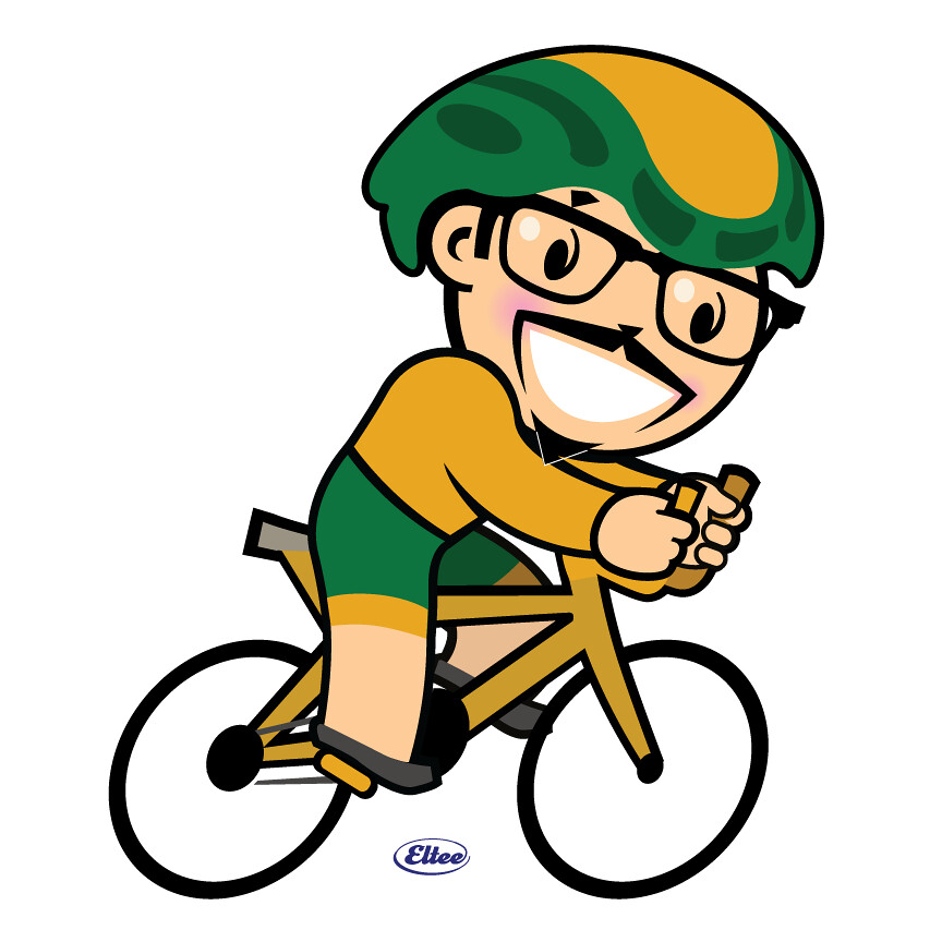
Like many people, I often don’t like the way I look in photos. But I love the way I look in this caricature, which was whipped up by reader Larry Torrez, who’s a professional artist (and who you may know in the comments section as Eltee of DC). I don’t actually wear biker shorts when I’m biking, but if I did, that’s definitely how they’d look. So cool!
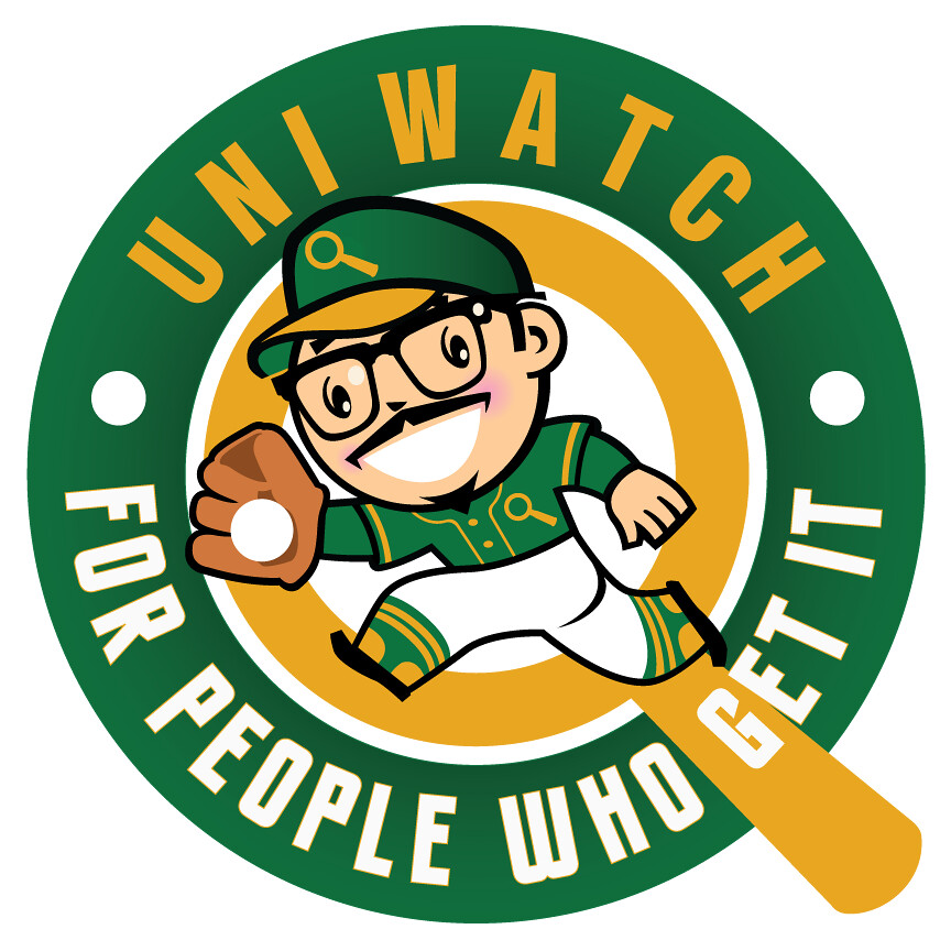
That’s not the only caricature of me that Larry’s done. He also depicted me in his version of a Uni Watch baseball uniform:
Once I saw that one, I asked Larry if he could change the uniform to match the one we used for our recent T-Shirt Club design (plus I suggested a few other tweaks), and he happily obliged:
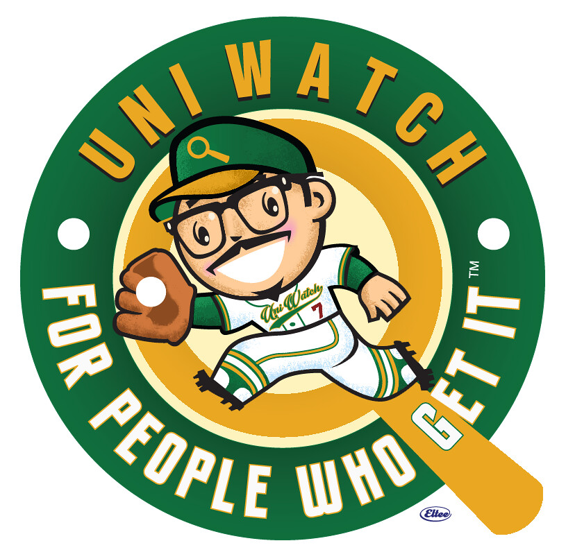
Fun, right? I love Larry’s style, which clearly draws upon retro influences but still feels fresh and contemporary. There’s also an obvious intelligence in his work — his illustrations feel very, very smart. I think it’s safe to say that I’ve never looked better than I do in these renderings.
With that in mind, Larry has created a set of characters called Meatscots, which are classic sports mascots with two adjustments: Each one has a meat theme, and each one now has my face. The result is a crew of mascots that reflect my love of sports graphics and carnivorism.
The first one is really simple — meet Mr. Meat:
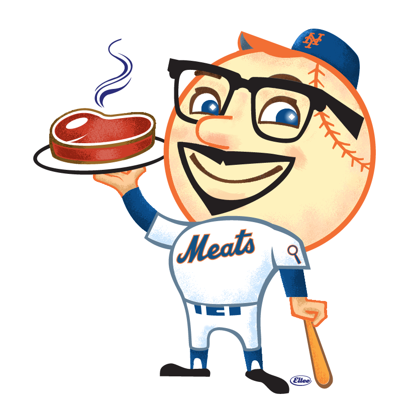
This one, obviously, is based on Mr. Met. I love that Larry used the Meats script from my theoretical T-shirt design.
Next up we have a take-off on the Brewers’ old Barrel Man character:
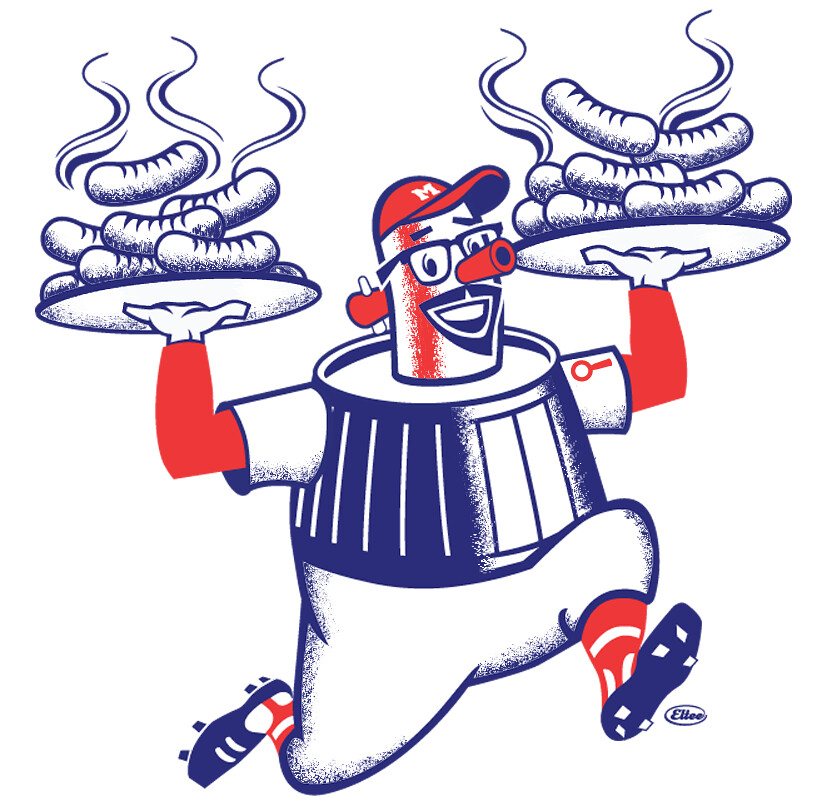
Naturally, those are bratwursts on the platters.
The next one is based on the Padres’ classic swinging friar character:
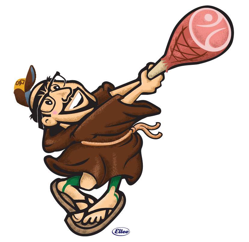
“I chose to merge the 1969 version of the friar with the 1996 update,” says Larry. “For the meat, I decided to go with a hambone, mostly because it worked better graphically than a turkey or chicken leg. I also added the Padres’ old ‘Taco Bell’ cap for a bit of additional local flair.” And he added the green stirrups, which of course I love.
For the last one, Larry chose a somewhat more obscure mascot — this old Washington Senators character, which the team used in the late 1950s:
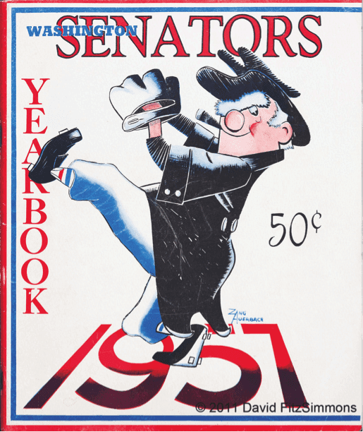
The character, which was designed by Zang Auerbach (Red’s brother; for further info, look at the next-to-last paragraph of this blog post), shows an old-fashioned United States senator. Here’s the Meatscots version:
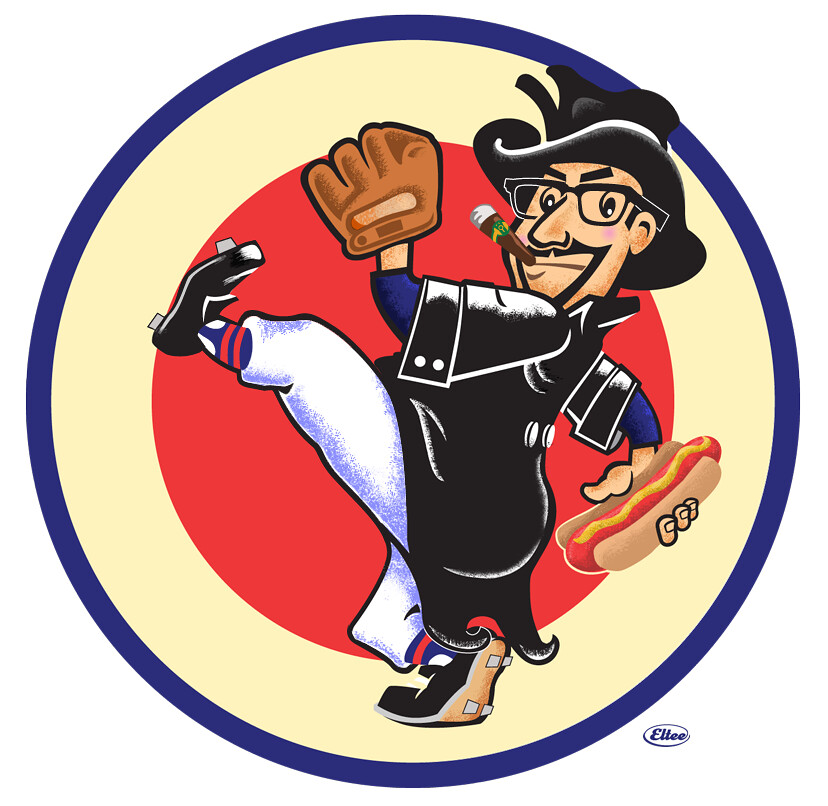
“I took some liberties with the original artwork, such as cleaning up the cleats and glove, changing the stirrup colors, and adjusting the fedora to fit Paul’s head,” says Larry. “I also moved his pitching arm to show off the meat offering. Speaking of which: For the meat, I chose the ubiquitous (at least to DC residents) half-smoke — similar to a hot dog, but usually larger and spicier, often half-pork and half-beef, smoked, and served with herbs, onion, and chili sauce. I prefer brown mustard on mine and, so that’s reflected in the artwork.”
(I told Larry that it looked weird to see myself throwing right-handed, so he flopped the image to create a lefty version. But I think the righty one feels better, for reasons I can’t quite explain.)
And there you have it — the Meatscots. Good stuff!
“The images were made using Adobe Creative Suite (Illustrator and Photoshop),” says Larry. “I wanted the artwork to reflect the spirit of the original compositions and be infused with a bit of humor. I also wanted to mimic the traditional 2-D process of spot color and airbrush work. As a bonus, I gained an appreciation of how these images came to be, not to mention how well they stand up over time. They still work today.”
Nicely said. Big thanks to Larry for including me as the face of this project, literally. It’s definitely the most fun I’ve ever had by looking at myself.
One footnote to all of this: Back in my former life, I edited a book about caricatures. But I’d never been caricatured myself until now. An enjoyable and interesting experience.
Click to enlarge
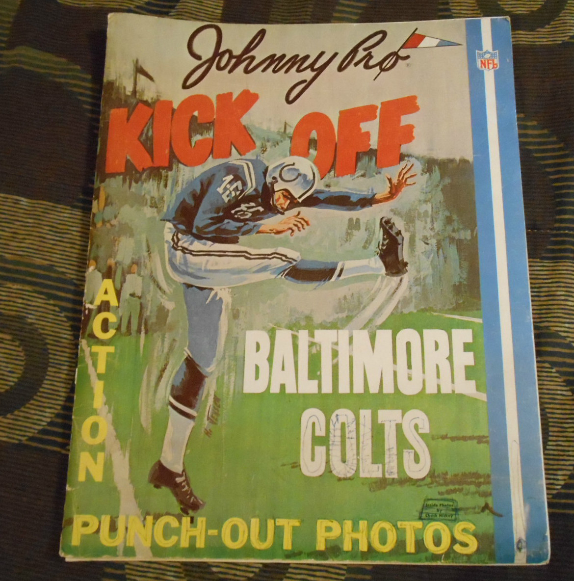
Too Good for the Ticker: Our own Brinke Guthrie, always on the lookout for good Collector’s Corner material, spotted something really cool yesterday: the 1960s Baltimore Colts punch-out photo album shown above. Check out how cool the punch-out images are (click to enlarge):

You can see additional photos at this eBay listing (which ends on Sunday night, which is why Brinke sent it to me now instead of holding onto it for next week’s Collector’s Corner installment).
Brinke says he’s never seen an item like this before, and neither have I. We’re both wondering if similar albums were made for other NFL teams, but so far we haven’t turned up anything. In any case, it’s a very cool item. Here’s hoping it ends up with a Uni Watch reader.

Click to enlarge
PermaRec update: The woman shown above is named Jessica Ferber, and the photos scattered around her are part of a large stash of materials that she acquired after the death of a homeless man. Those materials led her down a deep rabbit hole, very similar to my own journey with the old Manhattan Trade School report cards. It’s a great story — get the full scoop over on Permanent Record.
The Ticker
By Mike Chamernik

Baseball News: The White Sox printed phantom tickets for the 1982 World Series. The Sox finished six games back in the AL West that year. … Georgia Tech softball has tequila sunrise alts. The team wore them last year, too (from J.R. Gray). … No photo, but Brewers OF Domingo Santana wore No. 3 yesterday. He normally wears No. 16. .. Orioles and Phillies went orange-vs.-red and the Mets and Yankees went blue-vs.-navy yesterday (from Andrew Cosentino). … The Pirates are bringing back the pillbox caps, and Buster Olney argues the case for the return of Stargell Stars. Unfortunately, only the first few paragraphs of the piece aren’t behind a paywall. … New home uniform for South Carolina. Darren Stoltzfus notes that the set looks a lot like the Gamecocks’ football unis. … The Diamondbacks have a lot going on the year. The latest development is striped socks. Also, D-Backs prospect Gabby Guerrero bats bare-handed, just like his uncle, Vladimir. … Matt Smith coaches the baseball team at Higley High School in Arizona and his players wear striped stirrups. … Rusty Smith’s 11-year-old son plays on an Expos Little League team. “We’ve tried hard to stay close to the original,” he says. “Still waiting on the white and red jerseys.” … If you think UMD makes creative use of the Maryland flag, check out the baseball jerseys for Washington College, a D3 school (from Kevin Connor).

NFL News: If you sort the Falcons’ roster by number you see that the team has five guys named Matt (and a tackle named Jake Matthews). I hope newbie Matt Schaub picks a single digit number to continue the trend (from Brinke). … A sports fan and artist custom-paints and sells his own football helmets. A gallery of Hard Hedz Custom Helmets can be seen here (from John Ogle). … “My now-wife and I gave ourselves a two-day mini-vacation in downtown Seattle,” writes Markus Kamp. “We took the occasion to visit Paul Allen’s Hendrix-inspired EMP Museum. I wasn’t expecting (but was not surprised by) a new Seahawks exhibit, which featured a few cool displays.” Markus provided captions for each photo in that gallery, so check it out. Also, the reason for his mini-vacation was because he got married this past Sunday, March 6. “Our original plan for announcing it to family and friends was by a picture of matching custom Sounders jerseys lettered with JUST MARRIED and the day’s date. As one should come to expect from the modern corporate sports world, they arrived a day late. Still a fun pic!”

Hockey News: The Flyers’ first uni set had odd-looking “1” numerals. … A Flyers fan created a clever customized Shayne Gostisbehere jersey. The defenseman is known as Ghost Bear, a play off his name (from Matthew Solly).

NBA News: Phoenix wore Los Suns jerseys last night. Here’s the complete uniform set (from Phil). … Stephon Marbury teased a new set of illuminating sneakers as a part of his Starbury line. … Two good NBA art galleries on Behance: a collection of 1997 posters and current players as Monstars from Space Jam.

College Hoops News: UTEP (previously Texas Western) wore 1966 fauxbacks last night. … DePaul, my alma mater, continues to wear black alts with illegible NOBs (from Schlomo Sprung). … A Minnesota high school has Indiana-esque candy-striped warm-up pants. … Louisville used to have a neat dunking cardinal logo. Well, not quite dunking — it’s like he’s doing a Lew Alcindor-style pseudo dunk. … We’ve all seen players wearing protective masks after suffering facial injuries, but Rhode Island’s Jarvis Garrett, who recently sustained a broken jaw, has what is probably the craziest mask ever seen on a basketball court. … Here’s the floor design for the First Four game in Dayton. … Also, the court for the ACC tournament uses three different shades of hardwood. “It looks good, all natural,” says John Muir. “And fairly low-clutter from logos.”

Soccer News: Here’s what the Ukraine will wear for UEFA Euro 2016. … Swedish women’s club FC RosengÃ¥rd won the fight to wear the Pride flag on its uniforms (from Phil). … A couple players in the Champions League switched shirts at halftime yesterday (from Greg Dewulf).

Grab Bag: NC State is celebrating the 50th anniversary of Carter Finley Stadium (from Drew Johnson). … New logo for Principal Financial. … A new “Made in Wisconsin” logo will promote products produced in that state.
AMEATZING characters!! Really,really well done. Would strongly suggest/request you get those guys on shirts, would definitely purchase.
@Paul I strongly agree! I would quickly snap up one if not all of those as t-shirts! Especially if in appropriate “team” colored shirts… ie: brown for the Friar… orange/blue or maybe even mets pins striped for the Meats etc….
Also agree, and with all due respect to your T-shirt club offerings thus far, if you were to put these on shirts they’d immediately become your most awesome offering yet. (Sorry for the “I’d totally buy that” post, which we all know is Paul’s fav kind of post).
The Orioles where playing the Phillies yesterday not the Reds.
*were*, I have fat fingers this morning.
How fat? the W E & R are miles away from the H on a keyboard. LOL
Fixed.
The Meatscots are awesome!! Well done Larry and Paul!! Artwork is perfect!!!
The D-Backs’ striped socks are awesome and solve the problem of the bloody/dirty cuff.
Simms currently has the #8 Schaub has usually worn, though Simms didn’t play in the regular season last year (he was cut by the Bills after the preseason and spent the year on the Falcons’ practice roster). So it’ll be interesting to see how that plays out.
The mascots are pretty neat. Maybe Eltee could work up something for Phil next?
The country name is Ukraine, just Ukraine. The usage of “the” is from the old Soviet days when it was part of the USSR.
The use of the definite article with Ukraine is not an artifact of Soviet days. The usage predates not only the USSR, but communism itself, by centuries. The word “Ukraine” in Ukrainian describes a territory – “within the borders” – and English has a long history of using the definite article with territorial, rather than national, names. The Netherlands, the Gambia, the Raj, the Yemen. It’s an archaic usage, and since Ukrainian doesn’t even use definite articles like that, plain old Ukraine is definitely the correct name. But “the Ukraine” is based on habitual English usage, not Soviet domination.
Calling Ukraine “The Ukraine” is considered insulting by Ukrainians.
You not say Ukraine is weak! I come from Ukraine.
It’s a sitting duck… a ROAD APPLE!!!
Neither Russian nor Ukrainian have definite articles; as such, neither Russians nor Ukrainians have no word for “the”. I’d blame English speakers. Also not pictured: the Maldives, the Sudan and the Philippines.
Bravo, Larry! Great work.
The butter-knife “1’s” actually came from the Flyers’ third uni-set. Here’s the first one
link
Beat me to it, Barton. Good catch.
Larry Torrez, the updated logos are fantastic! Is it time for Uni-Watch to have an alternate logo? Great stuff.
That Johnny Pro Standups book is one of three or four issues that were put out in the Baltimore and Philadelphia area in the early 70s. They had sets for the Orioles and Phillies and they did a multi part stadium promo set for the Orioles. I have all the Orioles in both sets. I have some of the Colts as individual pieces but I never have seen them in the original ‘book’ until now. That’s an amazing find to me, a Baltimore Colts collector.
I blogged about the Orioles versions a couple of years ago:
link
Just to add a bit to this…the company that produced these was Johnny Pro Enterprises of Baltimore but I don’t know anything more. The photos, at least the ones in the Orioles sets. were shot by Jerry Wachter who worked for Sports Illustrated among others.
OMG, I had one of those Colts’ books when I was a kid.
Jerry Wachter was a great photographer in the Balt/Wash area and a great guy who passed away a few years back.
So I’m confused about the Behance thing. It states it’s an ‘homage to the 1997 season’, but then virtually every poster is using uniforms/logos that were out of circulation by ’97.
The Knicks changed their uniforms after the 1996-97 season, so Ewing’s current for 1997, as is Jordan (Pippen’s picture is based on link, so that’s not a game jersey).
The Monstars one bugs me, though, because it’s basically just some slightly monstrous features slapped onto the current players. The Monstars ought to be cartoonish caricatures with exaggerated proportions, not a bunch of extras from a Ghost Rider movie.
Yeah, but what about the T-Wolves Garnett, Sonics Kemp, Hakeem Rockets, and the old Cavs Starter jacket?
And about that Starter jacket – it had the logo on the correct sleeve, but then for some reason had a Champion tag hanging from it?
Don’t get me wrong – the artwork is great, but I’m not getting the 1997 part.
I only pointed out the ones that were still technically correct for 1997. The rest are definitely outdated for that year (including Grant Hill, as the Pistons had switched to their teal, or “Piston Green”, unis in 1996).
And Grant Hill and Malone, to boot.
and why are they all so sweaty?
“The Pirates are brining back the pillbox caps…” You must have meat on the brain ;-)
Fixed.
Meatscots t-shirts and sweatshirts, hoodies please, are now required! Those are simply awesome! Indeed, your caricature should be one of the emblems of this website Paul. Great artwork.
It would be sad if i were the only person who notices this website has quickly become about feeding Paul’s ego. Maybe Paul can sign the casts of all the fanboys who hurt their wrists patting him on the back! :D
“Quickly”? The site is nearly 10 years old and has *always* been about my ego. You just noticed now?!
;)
Bazinga!
Well played!
The only thing the caricatures are missing are grommets in the food
Awesome stuff Larry! I’d totally wear this on a t-shirt.
You mean theoretically, right Phil?
Hypothetically speaking, of course.
Phantom tickets in 1982 is news to me. I only remember seeing ’77 & ’83. :(
Wow! Larry Torrez really knocked it out of the park with those Paul/Uni/meat caricatures – outstanding work!
Awesome artwork Larry!
I’ve heard that Under Armour sent South Carolina those new home uniforms without any request and/or design input from the school. Not sure if this is common or not, and I think it’s unlikely they wear them very often (but who knows). The sleeves looked terrible on TV, but I do like the new black hats.
I live in Maryland. My girlfriend and I have resorted to calling the overabundance of Maryland flag apparel and stuff as “Murrland”. It is everywhere!
“Maryland pride” has gotten a bit out of control, if you ask me…even though my dog has a MD flag styles collar, so I am guilty as well…
So you pronounce it like a native, then?
basically, yes
it’s no different than ‘Merrica!
I absolutely would buy the t-shirt with your caricature in the baseball uniform in the classic Uni-Watch colors. I actually prefer it to the inaugural 2016 t-shirt design. The player on that t-shirt does not “scream” Uni-Watch, but the faux Lukas, now there’s a beauty!
I absolutely would buy the t-shirt with your caricature in the baseball uniform in the classic Uni-Watch colors. I actually prefer it to the inaugural 2016 t-shirt design. The player on that t-shirt does not “scream” Uni-Watch, but the faux Lukas, now there’s a beauty!
I second that Chris M. Let’s get the Lukas catching the fly ball image as a UniWatch t-shirt… XXL for me, please…
No reply from Mr. Lukas so I assume we are out of luck.
Third
Oh man… those painted helmets are horrendous. The guy slaps on some acrylic paint and is a pretty awful painter.
Starting at only $150 – No thanks.
I thought it was just me, but they do look pretty amateur. I make helmets as well, and would never pass of some the stuff I saw in his gallery on to my customers.
I do applaud this guy’s imagination and effort, but think he still has room for improvement.
DePaul grad here.
Terrible alternate uniforms – what is the point of having illegible NOBs? Come on, Blue Demons, get back to those classy unis of yesteryear!
You know, if MLB would try and retaliate on the Pirates on the Stargell Stars, all they need to do is use the argument that they’ve done it in the past and it’s a part of the uniform. No other team really did a hat decoration like that, so it’s unique to the Battlin Buccos.
Here’s Ray Black of the Giants, in some pretty sweet striped stirrups yesterday!
link
WOW!! LOVE the Meatscots. If he is looking to do another one, how about the Minnesota Twins logo of Minne and Paul shaking hands across the Mississippi link
It would be fun if it was Paul (Lukas) and Paul (holding a fish maybe?)
Stunning work Larry…thank you for sharing this, Paul!
Absolutely incredible art, Larry! As a serviceable but unaccomplished portrait artist, I have occasionally dabbled at a random caricature but with little success. You have not only captured Paul’s essence, but done so in creative an whimsical ways. Without exaggeration, the Paul Padre (Pauldre?) is easily the best cartoon drawing I have seen in months. The joy in that picture is palpable and the stirrups with sandals made me audibly laugh. Well done, sir.
Fantastic work by Larry Torrez. Tremendous art that puts a smile on yer face when you look at it. Thanks to Mr. Torrez for doin’ what he does, and thanks to Paul for creating a place that attracts such talented folks. Y’all rock!
Larry’s caricature’s are amazing. Brilliant artwork, fun and creative. The Senators one is my favorite.
The only caricature I’ve ever had done was by a talented artist at the St Louis Zoo. The finished work was everything a woman wants in a portrait–made me look younger, thinner and prettier.
I love the work by Larry Torrez. Well done. When you’re done up in green and gold you bear a bit of a resemblance to Eric Sogard of the A’s.
link
link
It’s just “Ukraine” not “the Ukraine”, correct? Not that it’s a big deal, but we all have a thing for minutiae, right?
Scroll up to see earlier comments about this.
Some of the caricatures bear a resemblance to Leon Trotsky…
Dave,
Thats’ funny, my wife asked me why Groucho Marx was throwing a hot dog?
That’s odd, considering Groucho was never known for having a beard of any kind.
I pointed that fact out to her. I then told her who it was… to which she replied… Paul is related to Groucho Marx?
sigh
Schaub’s not a newbie to the Falcons – he made his bones there backing up Mike Vick the year Vick got hurt and missed most of the season….
Great job, Larry, on the Paul characters! Very cool and fun.
(Paul, you edited Savage Mirror?! wow!)
Hi, Sean. Yes, that was one of several Steve Heller books that I edited a million years ago. Those were really fun projects.
The characters are great – my only criticism is that the half-smoke is missing capers.
I don’t know if you noticed this, but if they keep Ryan, Schaub, and Simms as QBs, and Schaub goes single digit, all three QBs will be named Matt, which will make things a little difficult for the QB coach if he want’s to be real familar with his players. (“Hey Matt!! No not you, Matt, the other Matt!)
Loved the PermaRec story. I totally get her need for doing this! I have a box of turn-of-the-century photos I have spent a fair amount of time researching the family – no direct descendants left – all because there were intriguing unanswered questions. I have the need to provide record of their existence for some reason.
Awesome Colts figures from Brinke. I just emailed Paul a picture of Ohio State 1930s figures pretty much like those Colts ones in action poses and with the grass.
Larry Torrez does indeed have talent.
Larry, I have not received an email from you.
Hmm I sent to Phil too since I colorized it. I sent to this email link,
Here is b&w version of the figures
link
Thanks Larry — we both rec’d it. Your colorization (great job!) will run in the next Colorize This!
Paul,
Maybe the reason you prefer righty throwing Paul senator is you’re used to seeing you in a mirror – as a righty.
A thought.
No. I always prefer seeing myself as a lefty.
I just think the *composition* of that one logo looks better with me as a righty (almost certainly because I’m used to seeing the Senators logo character depicted that way).
Eltee, I really El Oh Vee Eee those caricatures. Great stuff, sir.
Did anyone else notice that the ’97 KG poster reads “TIMERWOLVES” down the side?
Larry – amazing work!
Are you an NCS member? My brother in law is a working caricaturist up in Rochester, and I was wondering if you might know him? (Dave’Bippy’Boyer)
And I agree – shirts!
Umplou,
Never knew of it’s existence, wow. I have seen Bip’Boyers vid, he is a riot. I can tell you of a colleague who I thought was a great character artist and his name is Pete Emslie and you can view some of his work here. A master caricaturist…
link
The other is Kevin Kidney, an imagineer of the highest caliber, logos, poster art, the works. Helluva artist.
link
Mike – Go Terriers!!! (The daughter goes there and I saw your 8th grade class of #### picture).