The jerseys for the World Cup of Hockey were unveiled yesterday, and for the most part they’re not bad. Here are the home designs, except for Russia, for which we have the road design):
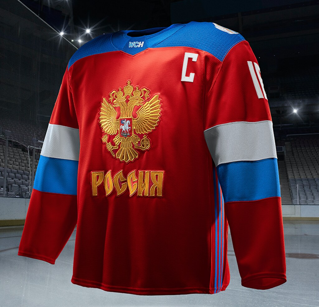
Russia
Absolutely gorgeous, РоÑÑиÑ. These uniforms by @adidas will be worn at #WCH2016 by Russia’s best and brightest. pic.twitter.com/GzYElM9NRT
— NHL (@NHL) March 2, 2016
.
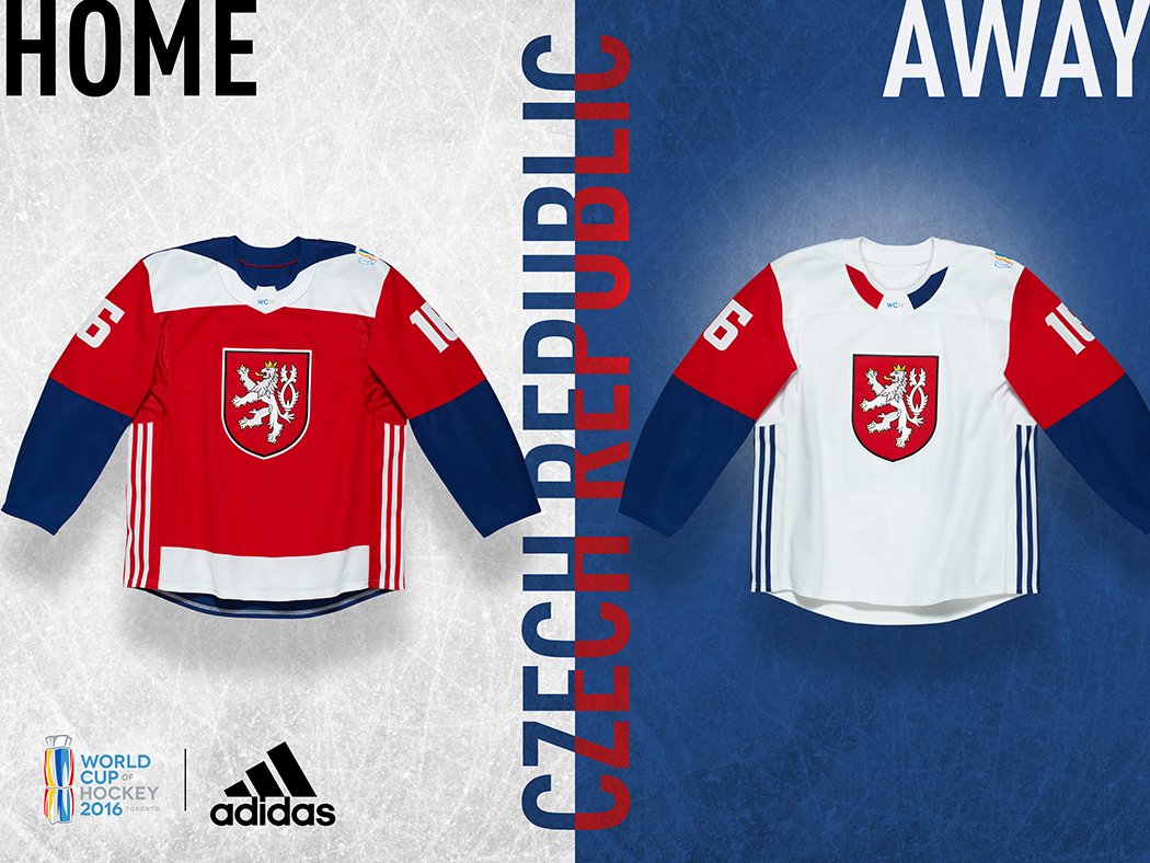
Czech Republic
Czech them out! These are the #WCH2016 Czech Republic uniforms by @adidas. pic.twitter.com/ddjDRFYSrp
— NHL (@NHL) March 2, 2016
.
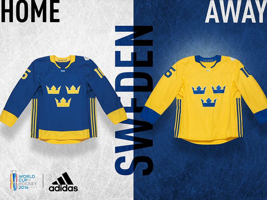
Sweden
How “Swede” are these? @adidas has designed some stunning #WCH2016 uniforms for Sweden. pic.twitter.com/N5ZnQPvFiF
— NHL (@NHL) March 2, 2016
.
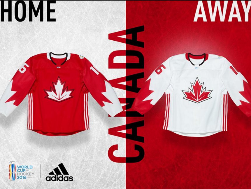
Canada
Canada will be looking very sharp at #WCH2016 in these beauties by @adidas, eh? pic.twitter.com/A1N2M06wFR
— NHL (@NHL) March 2, 2016
.
Finland
The finest Finnish hockey players will be rocking these uniforms by @adidas for the #WCH2016. pic.twitter.com/UPjjC7JYeg
— NHL (@NHL) March 2, 2016
.
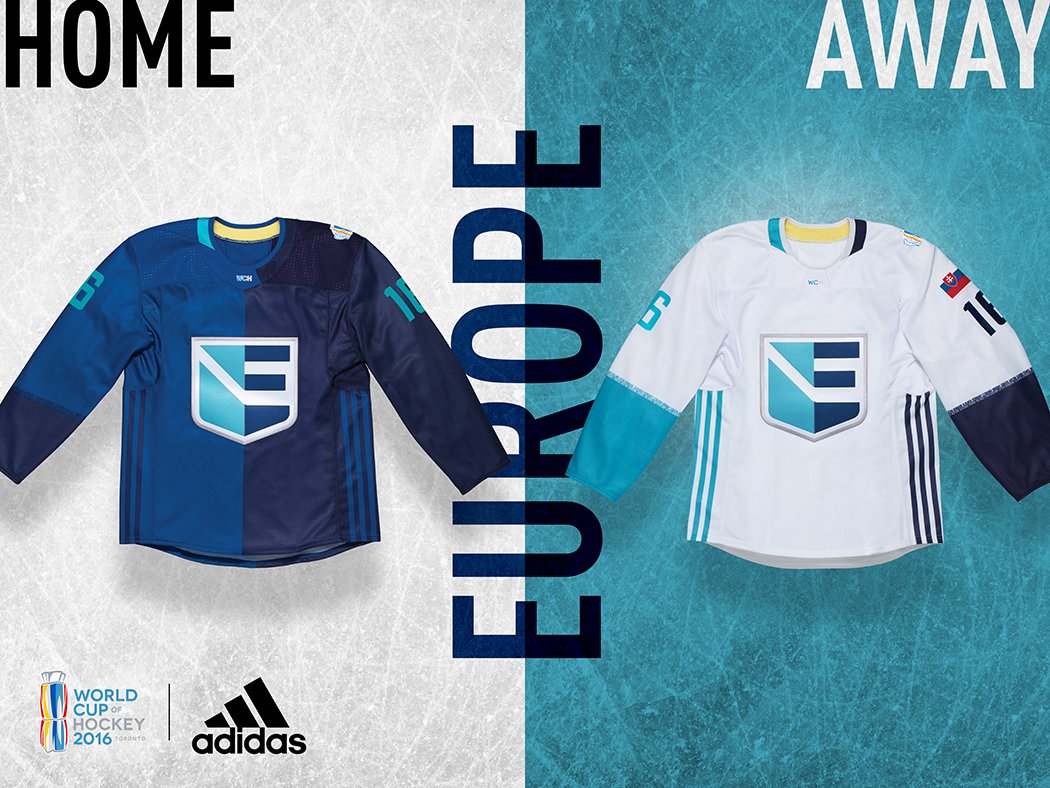
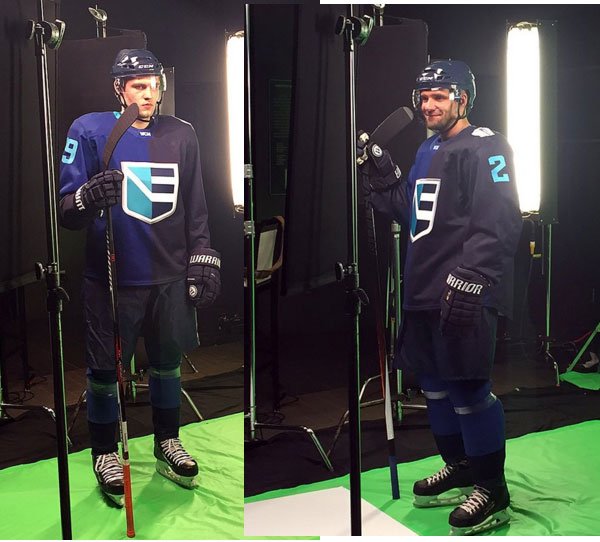
Europe
Signifying a unity of nations, behold the #WCH2016 Team Europe uniform by @adidas. pic.twitter.com/AdOshnmxZt
— NHL (@NHL) March 2, 2016
.
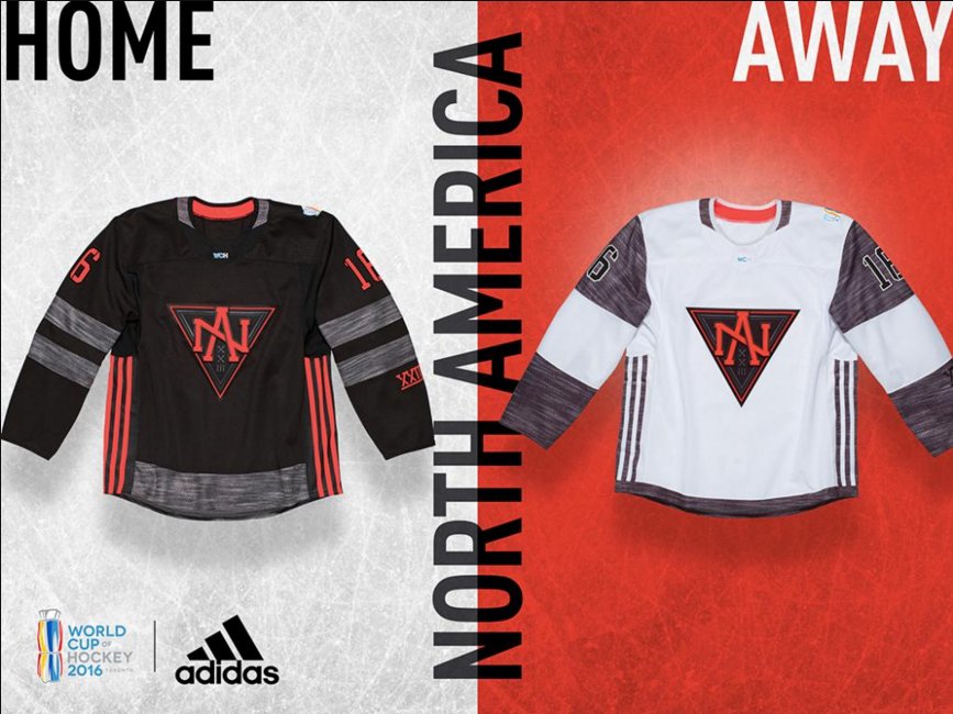
North America
Now that's a look fit for hockey’s rising stars. Here are the Team North America uniforms from @adidas. #WCH2016 pic.twitter.com/OrKsW388PH
— NHL (@NHL) March 2, 2016
.
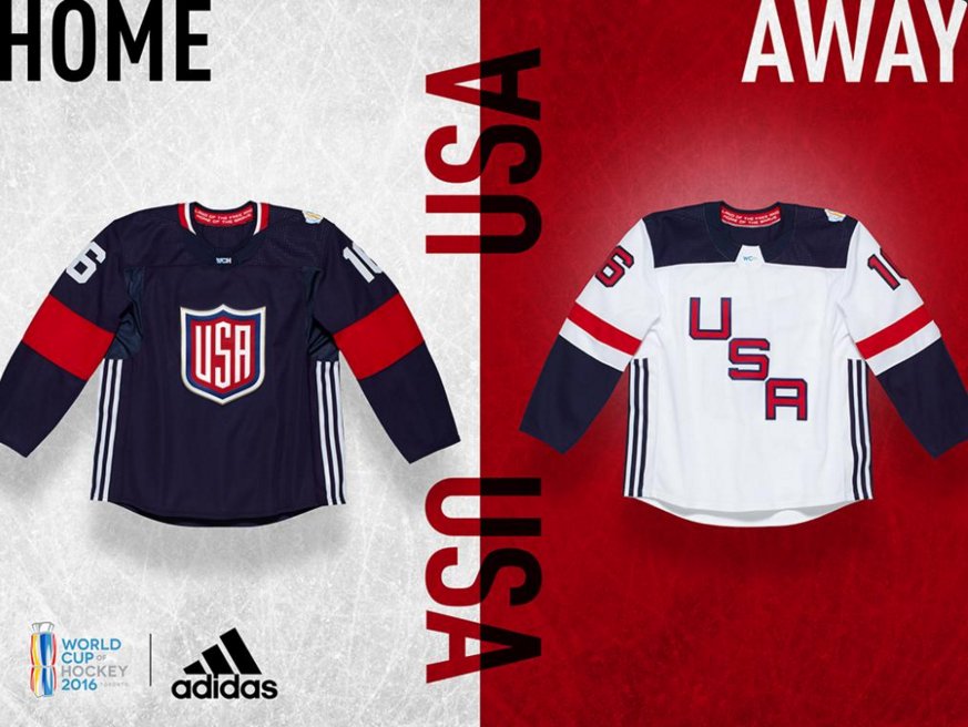
USA
Red, white, and beautiful. These USA uniforms by @adidas for #WCH2016, that is. pic.twitter.com/KrBIB1vymz
— NHL (@NHL) March 2, 2016
You can see my initial thoughts on each design in this ESPN piece, which was written yesterday afternoon, based on the eight videos shown above. Since then, Russia’s home jersey has been released, along with the road jerseys for all the other teams. Here they are (click to enlarge):
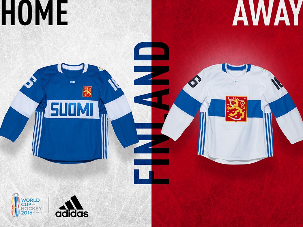
In some cases, I think the road version is a big improvement (USA, Finland), but overall it’s a mixed bag.
Meanwhile, it’s tremendously frustrating that they’ve unveiled the jerseys without showing us the entire uniforms. There are a few other promo videos and images floating around that provide peeks at some of the pants, but to my knowledge there’s only one uniform (Europe home) that we can see from head to toe, and one other (USA home) for which we can see the pants and get a glimpse of the socks:
Red white & blue. Your first look at Team USA's #WCH2016 sweater, designed by @adidas pic.twitter.com/cjAeZHRtYM
— NHLPA (@NHLPA) March 2, 2016
If you want to see the press release with all of Adidas’s embarrassing descriptions of the designs, look here (but don’t blame me if you end up with a cringe cramp).
Meanwhile, the tournament’s logo suggests that an unpopular trophy design may be making a comeback.
(Several of the images in this entry first appeared — or at least I first saw them — in Chris Creamer’s Twitter feed. My thanks to him.)

Hairy situation: Republican presidential candidate Ben Carson essentially ended his campaign yesterday, thereby assuring that two little-noted streaks will continue: We have not had a president with facial hair since William Howard Taft (who served from 1909 through 1913), and we haven’t had one with a beard since Benjamin Harrison (1889-1893).
I found it rather startling to see a presidential candidate with a goatee. (Yes, I know it’s technically a Van Dyke, but that rhetorical battle has been lost.) Then again, I also found it startling the first time I saw a goatee on an MLB umpire, an MLB manager, an MLB general manager, an MLB commissioner, an NFL head coach, an NHL head coach, an NBA head coach, a Sunday-morning talk show host, and so on, all of which would have been unthinkable a generation ago. It really shows how far our collective concept of formality has shifted over the years. So while Carson may be the first presidential candidate in memory with facial hair, I suspect he won’t be the last.
And yes, I have a goatee myself, which I’ve worn since 1993. I can assure you that I have no ambitions to run for president, but it’s nice to know that I could now do so if I wanted to. (But I still couldn’t play for the Yankees, which is A-OK with me.)
Design contest reminder: In case you missed it earlier this week, I’m running an ESPN design contest to redesign the Detroit Lions. Full details here.
The Ticker
By Paul

Baseball News: Royals C Salvador Pérez has gotten the team’s World Series patch as a tattoo (from EggsTyrone). … The New Hampshire Fisher Cats will wear split-colored “bipartisan” jerseys for Opening Day (thanks, Phil). … Good for the Orioles, who wore their regular home whites, instead of the new spring training jerseys, for yesterday’s Grapefruit League opener (from Andrew Cosentino). … Speaking of the O’s, check out the logos on their bases yesterday. … Yanks and Tigers wore their regular unis yesterday as well, although the Tigers wore their brutal orange caps. … In that same game, a Tigers pitcher forgot to bring his jersey and had to wear coach Gene Roof’s jersey instead (thanks, Mike). … Meanwhile, Majestic maintains that the Yankees will wear the Flex Base mesh panels like everyone else, even though the mesh hasn’t been shown up yet in their spring training camp (from Joey Boots). … Oh baby, check out this amazing old ad featuring Shoeless Joe Jackson living up to his nickname while wearing stirrups! (Thanks-a-plenty, Phil.) … Kentucky wore new blue tops for yesterday’s home opener. … Jar Jar Binks jerseys upcoming this season for the Altoona Curve (thanks, Mike). … The Harrisburg Senators are doing a promotion with life-size bobbleheads (from @acustom). … Pirates P Jared Hughes, who had experiemented with the new protective pitcher’s headgear last month, wore his regular cap for yesterday’s game (from Jerry Wolper). … The Royals and Rangers went blue vs. blue yesterday. Also, note that Mike Moustaka has his name on the top strap of his shinguard (from Brandon Fischer). … We reported yesterday that the Reds will be adding a memorial patch for longtime equipment manager Bernie Stowe. Perhaps it will look like this graphic that they’ve added to the top of their dugout. … The trend of wearing gold-trimmed uniforms to celebrate the previous season’s championship has spread to the minor leagues. … As you’ve probably heard, Mets OF Yoenis Céspedes recently bought a hog, which is now going to be butchered. Too bad Céspedes doesn’t have one of these theoretical T-shirts, eh? … Here’s a really nice segment on longtime reader Jimmy Lonetti’s glove-repair service. … ALS-awareness cap patches this weekend for East Carolina (from Matthew Moss).

Pro and College Football News: Yesterday’s Ticker mentioned that Sports Authority might be filing for bankruptcy. Now they’ve gone ahead and done it, which could create problems for the Broncos. Aw, what a shame. … New uniforms for the University of Northwestern (from Drew Elrick). … Check it out: a UNC uniform from — get this — 1890! That’s from this exhibition (from Ryan Frazer and James Gilbert). … New uniforms for Oklahoma State. Further info here (from Jeremy Moore).

Hockey News: Great story in Popular Mechanics about the origins of the Zamboni machine (thanks, Mike). … Parade Day jerseys this weekend for the Binghamton Senators (from Mike Kuruc). … You can now buy smart phone cases adorned with hockey skate laces. … Newly acquired F Brandon Pirri will be wearing No. 11 for the Ducks. “This means the Ducks now have Perry (No. 10) and Pirri (No. 11),” notes Chris Cruz. … Star Wars jerseys this Saturday for the Quad City Mallards.

NBA News: All three Jeopardy! contestants failed to identify the Warriors’ logo the other night (from James Gilbert). … You can now hear the radio call of Wilt Chamberlain’s 100-point game (thanks, Mike). … NBA teams are wearing “Los” shooting shirts this week, but the Nuggets’ version has last year’s font (from Alan Baca, via Phil). … Check out Knicks teammates Robin Lopez and Kristaps Porzingis wearing bowling shirts patterned after the team’s throwback uni.

College and High School Hoops News: An annual rite here at Uni Watch is when Jesse Gavin checks in with some notes from the Iowa State Basketball Tournament. Among his observations this time around: “The girls from Cherokee are all wearing headbands this week, including one with a massive swoosh (far left). A girl from the opposing team, Osage, had a headband with an even larger swoosh.” Also, we had previously reported that there’s a school called the Nikes (referring to the Greek goddess, not the company). Unsurprisingly, their uniforms are made by Nike, but their coaches are wearing Under Armour. … The women’s ACC Tournament will have a pretty crazy-looking court design (from Cameron Ilich). … Oklahoma honored Blake Griffin’s jersey but, per team custom, didn’t retire his number (thanks, Phil). … UT-Arlington is going G.I. Joke tonight (from Chase Stevens). … Brutal combo last night for Virginia Tech, which went pink-trimmed BFBS (from Andrew Cosentino). … USC and Oregon State went gold vs. orange last night, while West Virginia and Texas Tech went gold vs. red.

Grab Bag: The Colorado Rapids’ new jersey may have leaked (from Leland). … Funny car driver Tim Wilkerson is wearing last year’s driver suit. “Note the old Mello Yello Drag Racing Series logo on the suit, and new logo on cap,” says eagle-eyed David Firestone. … New logo for the Hattiesburg, Mississippi, Fire Dept. … “I went to my son’s high school track coach’s preseason parents’ meeting and was surprised to have the uni-industrial complex intrude,” says a reader who prefers to remain nameless. “The coach mentioned that the team would be getting new unis this year — not because the old ones were worn out, but because Bainbridge High is ‘now an Adidas school.’ I wonder what will happen with the cross country team in the fall. It is the largest team in the school, with over 130 boys and girls running the past few years. A lot of the XC gear is bought by a parents’ group that does a bunch of fundraising. I honestly don’t recall the manufacturer (it could be more than one) but am certain that they won’t be happy if they’re told that they need to buy a whole new set to keep Adidas happy. Kind of silly for a small public school on a small island west of Seattle.” … Interesting piece on the socio-cultural politics of the hoodie.
I REALLY hope they don’t put white helmets on Team USA like they do in IIHF competitions. Those lids are fine with the white jerseys but horrible with the blues. Even better would be two sets of helmets based on the jersey color like they do in the NHL.
Might want to change the title of the Blake* Griffin link
Thanks. Fixed.
The Team North America jerseys look like there used to be white stripes on them, and someone tried coloring them in with a black sharpie as a late design change
link
Maybe Cespedes would be interested in a (theoretical) “Los Meats” shirt.
The Shoeless Joe Jackson “ad” is cool – but it’s not actually a vintage ad. It’s part of a brilliant set of paintings from artist Ben Sakoguchi called, “Orange Crate Label Series: The Unauthorized History of Baseball in 100-Odd Paintings” – They were all done from 1994-2008, Jackson was part the series.
I guess that explains the bowl of orange wedges in the “ad”, then.
Thanks, Bruce – that’s why we invented the internets – so we could find out the story behind the story! Ben Sakoguchi obviously gets it, and I wouldn’t be surprised if he is a UniWatch reader. To see what I mean, check out the uni detail in the rest of the series link
New football uniforms for N’western and Oklahoma St.
How is that different from any other week of the season?
It’s not Northwestern University — it’s the University of Northwestern (which I realize is confusing, esp. since both schools wear purple).
Thanks for the Ticker post, Paul. UNW’s a D-III Christian liberal arts college in St. Paul, MN (I’m a designer there). The confusion with NU in Chicago is a daily occurrence, but we’re doing our best to build our brand in our niche of higher ed and D-III athletics.
Pretty exciting to see my alma mater in the ticker! Go UNW Eagles!
I think the Team North America (not really sure why that team and Team Europe even exist) jerseys are horribly bad. IMO they are the 2 worst jerseys from the Home/Away pictures shown. I just can’t decide which one is worse.
Team North America is for players aged 23 and under. Team Europe is for the other European players.
That answers the question I scrolled down here to ask. I didn’t expect there were too many top-level ice hockey players from Mexico and the Caribbean.
Terrible jerseys, yes. But I can’t fault them too much. That was a very difficult design task. There really is no visual identity for “North America.” Ignoring Central America, we’ve got three countries with distinct and largely incompatible visual identities and symbols. The color red is pretty much the only thing they have in common. Ignoring Mexico because, well, hockey, we’re still left with red and not much else. I have a hard time imagining how any North America team uni would not ultimately be a failure. That said, it would have been better to have a design that failed but looked pretty, instead of a design that failed and looks ugly.
Now when you say the jersey will “ultimately be a failure,” I assume you’re referring to the profitability of said jersey? Let’s face it, that’s one of the main motivations behind the design. I don’t know, I think you’re wrong. I bet the sell nicely.
The reason for those two teams is summed up in this excerpt from the league’s link last September:
NHL Commissioner Gary Bettman said Team Europe and Team North America were created to ensure that as many NHL players as possible will participate in the tournament.
“Those two teams, they’re more competitive than any other country team would have been for this event, so it will make the competition more competitive as well,” Bettman said. “Otherwise, you would have had a country with maybe just a couple of NHL players. Now you have what are going to be two very strong teams highlighting more NHL players being included than any other way we could have done it.”
No. No. I understand the reason given behind having a Team NA & Team Europe. I just think it’s not necessary. Both teams look very weak compared to Canada, Russia (at least offensively), & Sweden.
I like the Team Europe jerseys. The hockey stick in the negative space on the E evokes the original Vancouver Canucks logo (link), but is even better. The colors are sort of blah, but I don’t mind the half and half thing. As each player will have his own country’s flag on his shoulder it will allow people to identify where the player is from. I’m not sure if the North American team is doing the same thing.
The North American away sweater’s TV numbers can’t be read with black numerals over… graphite?
Who will play for team North America? Canada and the US have teams in the competition. Is it Canadian and American also-rans? Mexicans? Mexican’ts? Caribbeans? You’re telling me that Slovakia could not have fielded a better team than this “North American” team?
If this is what adidas is going to do to hockey sweaters, I am fearful for what will happen to the NHL. There are so many teams with solid, traditional looks that would look horrible with the 3 stripes.
An unfortunate parallel for the North America logo: link
By that logic, they’re also in the same ballpark as link, then.
People trying to stir up things that aren’t really there.
Interesting points about facial hair. If we go back a few more generations, the opposite was true, where the richest and most powerful Americans had prominent facial hair.
link
That was a brief interlude in America’s predominantly clean-shaven history. England went clean-shaven at about the same time as the rise of the Puritan-leaning middle class under the Stewarts, which coincided with English settlement of North America. So our colonies inherited the (higher-status) male social norm of shaving one’s face. That lasted until the Civil War era, when we had a bearded president and when the war itself produced an egalitarian mixing of young men across regions and classes in conditions where regular shaving was an inconvenience anyway. And as a basically working-class vocation, the military already had a culture of (often elaborately dandyish) facial hair. As long as the Civil War generations – the older men involved in politics and military command during the war and the younger men who filled the ranks – were culturally and politically active, facial hair remained a norm for men. As soon as those generations were gone, so was facial hair.
Why didn’t the same thing happen after WWII? I don’t know, but it is worth noting that military culture had turned decidedly against facial hair other than trim mustaches by the early twentieth century – and perhaps not coincidentally, the 1940s were the last time either party nominated a man with a mustache.
My understanding is that proper fitting of gas masks was used as an excuse to require soldiers to shave.
I’ve worn a full beard for 23 years. I now wear it pretty long (4+”), in part that’s because it works better for Santa season that way.
In 1948 my grandmother – a lifelong Missouri native and Republican both – held her nose and voted for fellow Show Me Stater Harry S Truman in 1948. SOLELY b/c Thomas Dewey had mustache.
I always felt Finland had such a promising approach to its international jerseys — but they always seemed to fall short. I really like these, even the home jersey with the giant name (the “Suomi” is such a huge part of their jersey heritage).
I was ready to hate the Team North America and Team Europe looks. I find that the Europe one is actually pretty decent as a generic hockey jersey with no connection to the geography.
Not digging the main leaf on Team Canada. Sleeves look great. I may be biased though. I think the team’s best jersey is still far and away the ’72 Summit Series look. link
Maybe this is nitpicking, but Bart Giamatti’s goatee WAS a generation ago — he’s been dead 26 years.
I’m not sure a goatee has anything to do with formality, anyway — I agree standards of formality have changed quite a bit, but I think that’s reflected more in clothing (especially the decline of the necktie) than facial hair.
Or rather, it’s not the presence/absence of facial hair that reflects degree of formality, but its style. The acceptability of the 3-days’-growth look does, I agree, reflect a change in standards of formality.
3 days growth does now seem to be an acceptable thing even in formal settings. I don’t get it.
But then again I’m also from the 80s, when 3 days growth was paired with pastel suits, and men bought the Miami Device to maintain a consistent 3 day growth like Crockett.
You’re telling me Slovakia could not have fielded a better team than either “Europe” or “North American kids not good enough to play for the USA or Canada”? That’s weird.
If this is what adidas is going to do to NHL sweaters, I am fearful. Too many teams have traditional looks that would look worse with 3 stripes running down the sides of the torso.
If this is what adidas is going to do to NHL sweaters, thumbs down. The 3 stripes don’t belong running down the sides of the torso on a lot of solid, traditional sweaters. Like the apron stripes that always looked out of place.
I’m always afraid when a new manufacturer comes in with their new “template”.
Is that a Uni Watch membership card I see at about the 2:20 mark of the D&J Glove Repair video?
Paul for President…hmmm….
Just think of the monthly jersey presentations at the White House.
Those Knicks bowling shirts are pretty sharp.
It was the Orioles Spring Training Home Opener yesterday. They already had a road game but I can’t find any pictures to confirm what they were wearing.
They wore their orange ST jerseys (which are also their regular season orange alt jerseys with the FL ST patch and sublimated #s/letters), and all-black ST hat, with gray pants.
link
One thing I love about the Rapids, and I hope it hasn’t been pointed out elsewhere:
This is a Colorado-based team that plays with the symbol of a building in San Francisco on its jerseys.
Thus they join the illustrious ranks of soccer clubs that wore the wrong place on their shirts:
Hamburg SV – “Dubai” for one game (to avoid a clash with Arsenal’s Emirates, who also sponsored them)
link
Arsenal – “Dubai” for the game in Hamburg
link
Atlético Madrid – “Marbella” first, “Azerbaijan” later
link
link
Sheffield Wednesday – “Azerbaijan” as well
link
FC Homburg 08 – “London” (a condom brand) in the late 80s
link
Cardiff City – “Malaysia”
link
RE: World Cup jerseys:
Well, I really like the Adidas jerseys from the 1980s, second to the Tackla jerseys of the early 1990s as my all-time favorites. I would actually rather have seen the adidas stripes down the sleeves like they used to do, rather than in the underarm/side panel area.
The number/letter fonts bug me more than the jerseys themselves do, though the jerseys are not terrible. I do find that many of them fall short of what these countries have worn in the past, and wonder why good designs can’t be recycled/kept in use.
I remember the Tackla jerseys as having a serious case of logo creep, with their “diamond” logo replicated three times on each shoulder.
Yeah. I thought it was a cool logo and cool look, combined with the rounded shoulder yoke.
Never give up on the term van dyke! Goats don’t have mustaches!
Has anyone ever noticed on undercover boss the first thing they do to change their appearance is grow facial hair. Its like there is a well groomed glass ceiling in this country
Here’s a pretty good collection of vintage adidas and Tackla jerseys of the German national team:
link
I wonder if the Yankees were using last year’s jerseys? The pinstripes won’t be worn again until Opening Day, so I guess we will have to wait and see. Hopefully the Yankees say no to the flexbase home jersey.
I think the facial hair thing also has a racial element (not to be confused with racism). Goatees, beards, Van Dykes are fairly common among men of color. This whole “MoVember” thing is a recent phenomenon, mostly among white men of a certain age.
I have no idea what the hell MLB is doing. What was the point of rolling out this huge new spring training uniform program if half the teams completely ignore it and where their normal jerseys for games? The league needs to set a mandate so we can have consistency, whether that be the fancy spring training jerseys or normal home/road jerseys. Everyone should look like they’re playing in the same league at least.
*wear
It shows how seriously teams take the obviously sales-driven spring training uniform “program.”
Uniform consistency? From an organization that allows its teams to have seemingly as many alternate and special-event jerseys as they want throughout the regular season?
Does it really matter what the teams wear during exhibition games? As long as teams look good during the regular season, that’s all that matters. Unfortunately, too many teams break out their awful dark-colored jerseys all the time.
From Yankees photo day….
Is that a mesh crotch on the new pants?
link
As a Yankees fan who hasn’t shaved since Oct. 2014, I always feel silly in my Yankees cap.
Does anyone else think the logo for the North American U-23’s appears to look too close to a white supremacist Aryan Nation’s logo?
re: Hockey – Noticed Adidas used identical font for NOB and Jersey Numbers.
May have been mentioned, but didn’t see it.
Paul – Great write up, as usual. Cheers to you and your team.
Nevermind. Slight differences, but very similar font styles.
Can someone from the UW community what Individuals are included on the the North American team? Seeing how Canada and USA have their own teams, are the people from Central America since is still technically North America? Or just leftovers from the Canada and American teams? Or are they players who live in either country but aren’t living in their Native country?
The North American team is for those Canadian and American players at age 23 and under (hence the Roman numeral XXIII in the logo) that would, for the most part, be overlooked by the Canadian and American teams which are always veteran-heavy.
U.S. Soccer rolled out a new logo yesterday.
And it seems someone forgot about it in the She Believes Cup this evening. The only representation of the new logo was around the field on the ad boards.
The U.S. women’s team is not only wearing the old logo (and the white-and-green kits), but the souvenir pennants they give to the opposing starting 11 all had the old logo!
Thanks Rob! Much appreciated my man!
“If you want to see the press release with all of Adidas’s embarrassing descriptions of the designs”
Embarrassing? Really? If you find that embarrassing you’re either way too sensitive or take yourself way too seriously. I generally enjoy the blog, but this is a perfect example of how much better your contributions to espn are. Same topic, but without all the ridiculous commentary. Espn provides adult supervision and it really improves your work.
Unless you’re my ESPN editor (in which case: Hi, JB!), you have zero idea how much supervision I have at ESPN. In any case, I’m glad you like my work for them. Thanks!
I’m not sure how my characterization of the Adidas press release makes me “way too sensitive,” since the press release has nothing to do with me. But yes, I think statements like “This uniform admits the wearer to the exclusive club of the next generation” and “National emblems and banners inspire an unapologetic shield and word mark” are embarrassing. If you think they’re examples of good writing and/or good marketing, that’s certainly your prerogative, but I think it would be fair to say we have very different standards and tastes in those areas.
I like Canada’s tip to the 1972 series unis.