Some PGA follies at the Honda Classic yesterday, as pro golfer Gary Woodland had to remove his pants in order to take a shot while standing in a water hazard.
The announcers’ mention of Henrik Stenson was a reference to the 2009 WGC-CA Championship at Doral in Florida, when Stenson stripped down to his boxers to play a shot (further info here):
And now this is the part where I have to mention Steve Lyons of the White Sox absent-mindedly pulling down his pants during a game against the Tigers in 1990:
There are also lots of NFL players whose pants have dropped on the field, but usually unintentionally. You can see a bunch of these shots, which might be a bit NSFW if you’re in a particularly uptight office, here.
Heads up ”” new design contest coming: Last week I said my next ESPN redesign challenge would be for an MLB team. But with the Lions gearing up for a 2017 makeover, we’ve decided to issue a call for Lions submissions.
The formal announcement will come later today over on ESPN.com, but you can get started now. All the usual rules apply, and the deadline will be a week from tomorrow evening.
Uni Watch personal shopper: I was poking around at a thrift shop near my house and came across this vintage Chiefs pullover by Logo Athletic (click photos to enlarge):
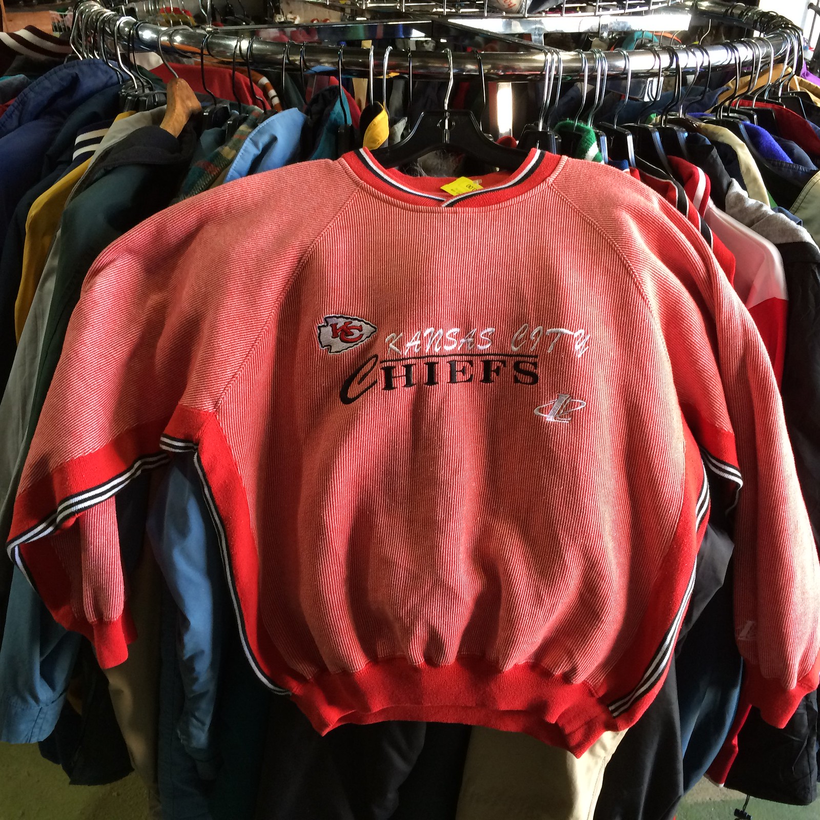

Seems like the kind of thing Brinke would feature in Collector’s Corner, right? It’s tagged as a medium and priced at $10. Appears to be in very good shape. If any Chiefs fan out there wants it and is willing to cover the 10 bucks plus shipping, give me a shout and I’ll pick it up and send it to you.
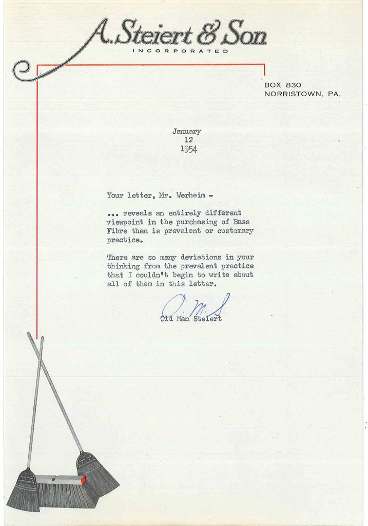
PermaRec update: My latest look into the files of the Hoge Brush Company features a deliciously understated dig from the head of a rival broom operation. Get the full story over on Permanent Record.
The Ticker
By Paul

Baseball News: Mets 3B David Wright’s new glove has Mets color accents and a silhouette of Wright making a play. ”¦ The Red Sox had two No. 7s in camp yesterday. Neither is on the team’s 40-man roster, however. ”¦ Rod Carew showed up at Twins camp on Saturday, and the players surprised him by wearing “Heart of 29” shirts. Carew suffered a heart attack last September (thanks, Brinke). ”¦ The Orioles wore T-shirts for an intrasquad game yesterday (from Andrew Cosentino). ”¦ I was in a bar yesterday and saw this commercial for BetAmerica.com, notable because it shows a horse racing jockey whose silks feature the Cardinals’ cap logo. Anyone know more about that? ”¦ The Yankees appear to have changed from pro button placement to even-spaced buttons. ”¦ Speaking of the Yankees, check out this shot of UNC hoops coach Dean Smith throwing at the first pitch in the Bronx while wearing a Yankees cap and windbreaker. ”¦ Pretty bold uni match-up yesterday between Mississippi and Louisville (from Andrew Beckner). ”¦ This happens every year around this time: People notice players from the Giants (and sometimes some other teams) posing for photos with grey-underbrimmed caps and wonder if the grey is making a comeback. The answer: No. The Giants (and sometimes some other teams) just have a bunch of old caps laying around their Photo Day studio, so it’s the same old grey-underbrimmed caps getting reused year after year.

Hockey News: The Flames wore their throwbacks on Saturday night. “They should wear these full-time again,” says Wade Heidt. “Much better look than their current uniforms.” ”¦ “The Rangers have acquired Eric Staal,” writes Alan Kreit. “He will play with his brother Marc. Will Marc add an initial? Will Eric have an initial and Marc won’t? Will neither have an initial?” Good questions. ”¦ Graffiti-style anti-cancer messages on the ice last night for the Indy Fuel (from Mark Grainda). ”¦ Ditto for the Evansville Icemen. ”¦ With goalie Anders Nilsson being traded from the Oilers to the Blues, the Blues’ equipment staff used tape and decals to make his mask look like a Blues mask and also used cover-up vinyl on his pads (from Erik Spoonmore). ”¦ The Hurricanes wore their black alts yesterday, and the Ducks wore their orange alts. ”¦ The Wild celebrated captain Mikko Koivu becoming the franchise leader in games played with a graphic that shows the evolution of the team’s uniform (from Nick Kimlinger). ”¦ The South Carolina Stingrays will go pink in the rink this Saturday.

Basketball News: Not exactly a surprise to learn that Steph Curry is a hot branding commodity at the moment (thanks, Brinke). … Last night was Senior Night in Oregon, so the Ducks’ seniors wore special shirts for the occasion. ”¦ You have to see it to disbelieve it: a magenta and white checkerboard uni (blame Eric Celio). ”¦ Wisconsin once again wore their red Black History Month throwbacks at home, with Michigan wearing white on the road.

Grab Bag: One observer thinks the Dallas Cowboys should go back to their old number font. … Tottenham’s Harry Kane wore a mask yesterday to protect a broken nose (from John Muir). … “I grew up in Baltimore, the epicenter of duckpin bowling,” writes Steven Marks. “My mom was a frequent kegler, and was quite good — so good, in fact, that in 1977 she received this awesome patch from the National Duckpin Bowling Congress for rolling a game 50 pins over her average. Amazingly the NDBC is still alive and kicking, though sadly there are only 21 duckpin centers left open in Maryland.” ”¦ KKK members clashed with protestors in Anaheim on Saturday, leaving several people injured. Interestingly, the Klan members weren’t wearing their traditional white robes and hoods — instead, they wore black shirts with lots of patches, including a Confederate battle flag sleeve patch. At one point one of the protestors tried to tear that patch off of a Klansman’s shirt. ”¦ Punjab has banned the sale of military uniforms after terrorists disguised themselves as army members. ”¦ Here’s your latest chance to vote for the NASCAR paint scheme of the week. ”¦ Somewhat unusual to see a track and field athlete wearing glasses. That’s Brown University sophomore Zack Emrich, who won the 500-meter title yesterday at the Ivy League Indoor Track & Field Championship (from Joel Mathwig).

What Paul did last night two nights ago: Flux Factory is an artists’ collective in Queens that has done all sorts of cool stuff over the past 20 years. Two years ago they built a gigantic Rube Goldberg machine running through their large studio space — it spanned several rooms, went down a set of stairs and then up another set, and so on. This past Saturday night they prepared to operate the machine for the final time before disassembling it and invited the public to come see. The Tugboat Captain and I went to check it out.
It was so much fun! Not just the machine itself (which the Flux Factory folks call “the Exquisite Contraption”), but also the experience of being surrounded by lots of smart, super-creative people. Very stimulating and inspiring.
We had to scurry from room to room to follow the machine’s progression as it operated, and it was a lot to keep track of, so I didn’t get to take any photos or video. But here’s a video from two years ago that gives you a sense of it (it’s very compressed — the actual machine takes about six minutes to run):
To learn more about the Exquisite Contraption, look here.

Emancipation Day: Twenty years ago today — Feb. 29, 1996 — I walked out of my office at Billboard Books for the final time and began life as a full-time freelance writer. I’d been freelancing on the side for the previous two and a half years and had decided it was time to take the plunge. Giving up a secure job was a little bit scary, but I had to at least give it a try, because I wasn’t happy with my life or career up to that point and knew I needed to make changes or else I wouldn’t be able to keep facing myself in the mirror each morning.
I haven’t had a regular job since then. (Also haven’t had employer-subsidized health insurance or most other job-related perks, but of course I knew what I was getting into in that regard.) At the time, I thought of going freelance as an experiment. After two decades, I guess we could now say the experiment has been something of a success.
Anyway, as I like to remind people (and also remind myself) each year on this date, the moral of the story is this: If you want to change your life or reinvent yourself, don’t just sit around fantasizing about it ”” go ahead and do it. Even if the experiment doesn’t work out, at least you won’t be wondering about what might have been.
When I’ve run this item in past years, some of you have gotten in touch with me and said something like, “That’s really inspiring. I’d like to reinvent myself too, but where do I start?” The biggest thing, I’d say, is to have a sense of direction. It’s one thing to know that you want to make changes to your life; it’s another to know what you want those changes to be. In my case, I had never felt particularly satisfied as a book editor, but it wasn’t until I began doing some freelance writing on the side that I realized, “Oh, being a writer, that’s definitely what I’m supposed to be doing with my life!”
Of course, maybe you already like your life just fine the way it is, in which case more power to ya. Either way, thanks for listening, and have a great day.
Those jockey silks look to have an altered StL logo. If you look closely, you can see the crossbar of an “E,” as well as the top line too, so it think it maybe reads as “StE” or “ESt.” Either way, a blatant rip.
Mr. Kreit does know that the brothers Staal play different positions, right? Marc’s a defenseman while Eric is a forward.
What does their positions have to do with the NOB?
The most recent similar situation with the Rangers was Dom and John Moore, Dom was there first and only wore his LNOB. When John joined the team he wore FIOB. I would suspect they will do the same with the Staals.
Yes, I do know that. What’s that have to do with the nob?
Dom Moore went initial-less because he was the veteran. They are selling the E. Staal sweaters with the initial already in the NHL store. I am sure that Marc’s sweater will remain unchanged.
When the Sabres recalled Ryan’s brother Cal O’Reilly Cal wore FIOB and Ryan did not.
When Jordan joined Eric in Raleigh, both brothers added FIOB.
This guy needed some longer shorts… link
The t-shirts the Orioles wore yesterday were to honor the late link two years ago on that date. The article says they will wear them again at some point.
Yes I do know that, but what’s that got to do with the nob?
I agree totally on the Cowboys’ number font opinion piece. Never understood why they changed it.
Agree here as well. I have been saying they should go back almost from the moment they switched in the first place. I love the serif font.
+1
I could not possibly agree more. I love the old Cowboys look…
Other teams used the same serifed numbers, the Eagles and Packers among them. I always found it interesting that each league developed a different “default block varsity” font, where you’d never see these serifed numbers on an MLB or NHL uniform.
That Rube Goldberg machine is so great, I love it!
The anti-cancer messages were actually on the ice of the Toledo Walleye. They were hosting the Fuel. Fans had the opportunity to write messages that were on the ice all three games this weekend.
Anyone else love Love LOVE those Wisconsin throwbacks? They’re gorgeous!
Yes! They are great!
Paul, thanks for your words of encouragement regarding career/life direction. It was the perfect day for me to be reminded of it.
It was the perfect day for me to be reminded of it.
I hope that doesn’t mean you’re having a crappy day, Dave. But if you find my words helpful, I’m glad to hear that.
The David Wright glove link in the ticker doesn’t appear to be working…
Fixed.
Here’s the new USA Soccer crest:
link
Being soccer-clueless, I have no context in which to assess it. What say ye, soccer fans?
Anything is an improvement over what they’ve been using so on the good/stupid scale this is GOOD.
I applaud the simplicity, but have a feeling this will look dated in a couple of years.
That red/black/blue clash jersey that’s going around is just brutal though.
Never really liked the old one with the ball, but this isn’t much of an improvement. I find it a bit too sparse and somehow the colors seem off. Too much white space?
They have a scarf design where the two ends of the scarf can be put together to form the crest. I blame those stupid football gloves for this trend.
A definite improvement. Check out the various national federation crests here:
link
The old USA crest looks a lot like other North American crests, or like an African crest. That’s sort of like if a baseball team looks more like a AA logo/uniform than an MLB logo/uniform. Whereas the new crest, while still a bit on the brash side, has more of the look and feel of a European (or, to a lesser extent, a South American) crest. It’s a more suitable symbol for a team that is firmly among the world’s elite.
And domestically, it’s long past time when the US national team needed a crest that identified it as playing soccer. American sports fans get it now sufficiently that a simpler USA logo will be more effective and unifying than the old “check it out, we’re playing this sport called soccer, you may not have heard of it but here’s what the ball looks like when your kids play it at recess” crest.
But most importantly, what does the women’s version of this crest look like? Three stars in a line over the flat top, or are they keeping the triangle pattern?
This link goes directly to the USA page:
link
I really like the 92-94 logo, but then that the was the first one I became familiar with. All the others look like needless updates to me.
Not good. Simple as that.
The new crest is far, far better than the prior iteration but could have been even better. I like the fact that it no longer has the flying soccer ball, but I prefer the Centennial crest they used in 2013 that didn’t even incorporate the letters “USA.” The new crest has way too much empty, white space for me, and is too reminiscent of the USA basketball scheme.
Centennial Crest:
link
USA crest is to CONCACAF what Lithuania’s crest is to UEFA or Turkmenistan’s crest to AFC. Very drab.
Not to mention: “a team that is firmly among the world’s elite?” The mind boggles.
An improvement on the old crest, but they could have done better.
Things I like:
– the red and white stripes
– no more soccer ball
Things I dislike:
– the “USA” instead of a blue field with white stars (a la the aforementioned centennial crest); I’m ok if they keep “USA” or “USSF” or “United States” on it, but it seems too prominent.
– there is lots of white
For some reason, the logo feels like it should belong to an American winter Olympic team, like skiing or luge.
Some other solid, recognizable national team crests, for point of reference for the non-soccer crowd:
Germany: link
England: link
Spain: link
Netherlands: link
Brazil: link
Argentina: link.svg/785px-Asociaci%C3%B3n_del_F%C3%BAtbol_Argentino_(crest).svg.png
Eric Staal played with his other brother Jordan in Carolina for the past couple of years and wore E. Staal on his name plate. I would assume it would be the same with the Rangers.
Paul, you did what most people lack the courage to do and that is take a risk when you left your job. Everyone who has been successful at anything has taken a risk at some stage.
Too bad the Flames didn’t wear those the other night when Kings went retro-yellow/purple. Would have been a classic!
The PermaRec letter from “Old Man Steiert” reminds me of the greatest letter ever written, the Browns reply to a season ticket holder.
Wish the full story was known the proceeded the Steiert retort.
link
Like.
Congratulations on the anniversary, Paul. I use you as an example in my classes of the kind of career that can be made when you have talent, determination and focus. You’re a hell of a writer and reporter, and should be proud of your accomplishments.
The photos of the Yanks’ jerseys reminds me of a question: is there a hard-and-fast distinction between set-in sleeves and raglan sleeves?
Are the sleeves on the Yankees jersey considered raglan because the (vertical) seam doesn’t go all the way around the shoulder? Or are they set-in because there’s no angle between the bottom of the sleeve and the neck (instead having 2 horizontal seams going from the shoulder to neck)?
If you think I need a hobby, I already got one – uni-watching.
Happy Emancipation Day Paul!
I don’t think Woodland had to remove his pants to hit that shot off the bank of the pond at the Honda yesterday. He certainly had to remove his shoes as he was standing ankle deep in water but his ball was on dry land, albeit in a marked lateral hazard. I’m not suggesting he removed his slacks as titillation. My best guess is that he did not want to splash mud on his white slacks and/or did not have rain pants in his bag to pull over those slacks prior to the shot.
Happy 5th Emanciversary!
Love the old Cowboy font. It was also a darker blue that matched the blue on the helmet stripes and star.