Click to enlarge
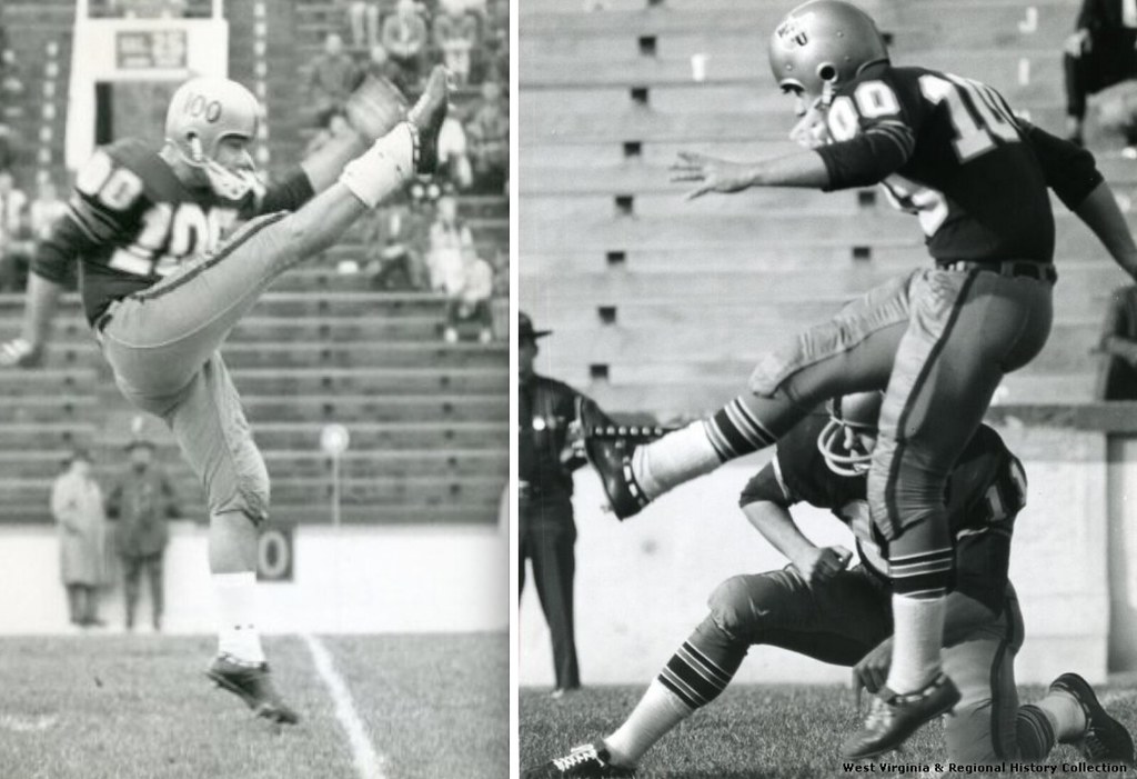
Up until now, I was aware of only one college football player who wore a triple-digit number. That would be West Virginia punter/kicker Chuck Kinder (shown above), who wore No. 100 in 1963. That was the year that all WVU players wore “100” on their helmets to commemorate the state’s centennial, but only Kinder had permission to wear the number on his jersey.
But it turns out at least two other college gridders have worn No. 100. You can see one of them in these photos of a Louisville/Memphis State game from 1969 (the team in white is Louisville):
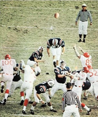
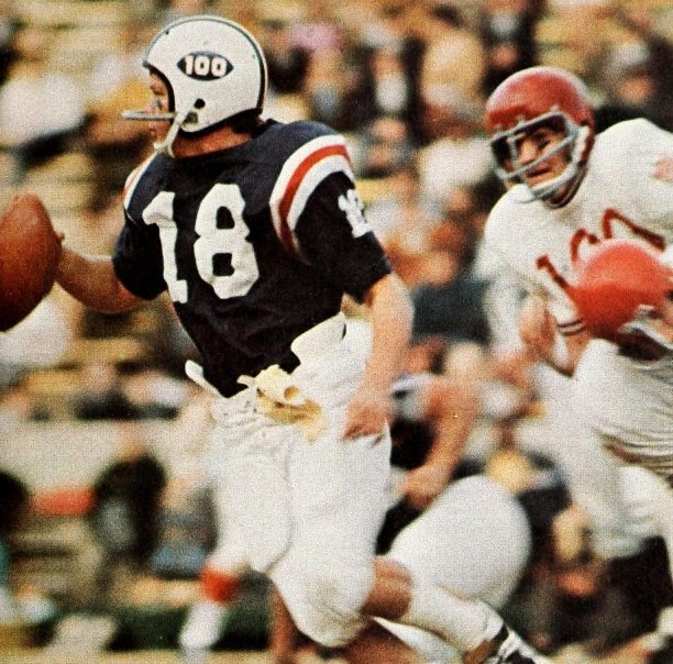
Those photos were posted on Twitter earlier this week by Jeb Hill, who says he found them in an old Memphis State yearbook. As you can see, there’s a Louisville player wearing No. 100. By odd coincidence, Memphis State was wearing “100” on their helmets — that was the college football centennial logo, which many teams wore in 1969. Was the Louisville player’s number also a reference to the centennial, and who was the player? I posed those questions to Louisville media relations department but haven’t yet heard back — stay tuned.
After those Louisville images began circulating, Lloyd Davis directed me to a book about Kansas football called Tales from the Jayhawks Gridiron (which happens to viewable online). It includes the following passage:
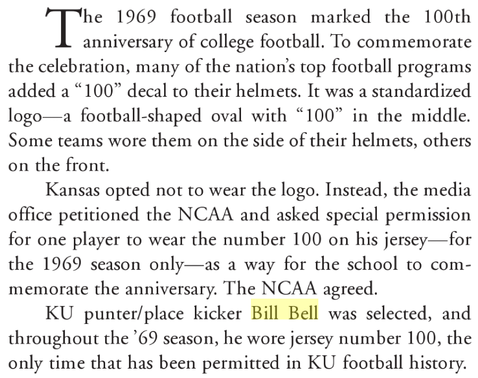
And then there’s a photo of Bell (love the square-toed kicking shoe):
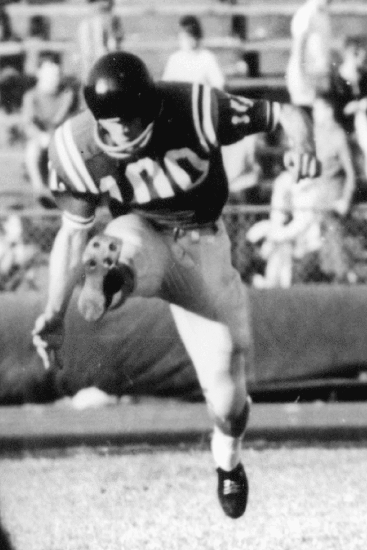
So in Bell’s case, we know he wore No. 100 as an alternative to the entire team wearing the centennial helmet logo. It seems likely that the same was true of the Louisville player.
I wonder how many other schools went this route. Anyone know more?
(Big thanks to Jeb Hill and Lloyd Davis for the Louisville and Kansas shots.)
The Ticker
By Mike Chamernik

Baseball News: Here’s a good look at the embossed league logos on the Spring Training hats (from Phil). … New Spring Training logo for the Mets. … Clark Ruhland created some Virginia Tech redesigns using all 30 MLB teams as templates (from Andrew Cosentino). … A few schools debuted new Nike uniforms (from Phil). … A six-minute comedy about Billy Ripken’s famous “Fuck Face” baseball card will debut next month at a film festival in San Jose (from Andrew Cosentino). … A site has compiled the Pantone colors for all of the MLB teams (from S Preston). … Mets closer Jeurys Familia is working with bachata musician ZacarÃas FerreÃra to create his own entrance music. ”¦ New purple tequila sunrise uniforms for Northwestern (from Matt Simpson). ”¦ New “SB Strong” uniforms for the Inland Empire 66ers. The term refers to a hashtag that arose in the wake of last December’s San Bernadino mass shooting (from Kristopher Sharpe).

NFL News: This photo gallery shows how Tiffany & Co. makes a Lombardi Trophy. The laces and stitches are done by hand in what looks to be a painstaking process (from Kary Klismet). … Jim Brown turned 80 yesterday and a part of the Browns’ celebration for him was a birthday logo (from Jason Hillyer). … Ali Rahmoun, a 3D artist, has built a Photoshop program where users can customize football uniforms. To demonstrate, he made a Uni Watch uniform. Pretty slick!
College Football News: Northern Illinois will play a game at US Cellular Field, home of the White Sox, this year. Here’s how the field will be laid out. … Notre Dame’s head equipment manager was interviewed on a Fighting Irish podcast. He discussed the school’s partnership with Under Armour and how he gets the helmets to shine (from Shaun Sullivan).

Hockey News: CCM might have used the inaccurate stars for Blackhawks goalie Corey Crawford’s Stadium Series pads. The stars, which are based off of the Chicago flag, are supposed to have six points (from Dan Erbach). … Backup goalie Niklas Treutle practiced with the Coyotes for first time yesterday after a recent call-up. Here’s his mask (from Dave Vest). … Gotta love this NHL 93-themed goalie mask (from Jamie Uthe).

NBA News: The Kings will play on a retro alternate court six times through the end of the season (from Phil). … A neat interactive page shows all the jerseys Kobe Bryant has worn over his career. … The Jazz’s D-League team will wear uniforms featuring Barack Obama, Maya Angelou, and Frederick Douglass for Black History Month (from Phil). … The Nets have a large swoosh hanging at their practice facility. The NBA’s deal with Nike doesn’t begin until 2017 (from Jared Peterson).

College Hoops News: North Dakota State is wearing memorial patches for an officer that was killed in duty last week. … Houston Baptist is also wearing memorial patches, with these in honor of one of the best players in school history (from Phil). … Two interesting items in this 1973 edition of the Pittsburgh Press: Notre Dame wore shamrock jerseys and Saint Louis wore jerseys with “St. Louis” on the front, which is normally a big no-no for the school (from Jerry Wolper). … Under Armour defended its NCAA basketballs, which were recently criticized by players for their inconsistent feel (from Phil). … UConn women wore unis with pink accents last night. The school will auction off the uniforms to benefit the “Play4Kay” breast cancer charity (from Phil). ”¦ UNC projected an argyle pattern onto its arena exterior prior to last night’s game against Duke (from James Gilbert).

Soccer News: The Seattle Sounders unveiled new uniforms (from Tim Dunn). … The Houston Dynamo have a new alternate kit. More details here. The club unveiled the uniform through a graffiti artist. It’s a little reminiscent of how the Milwaukee Bucks speed-painted their new logo last spring. … Derry City will reveal its new kit through a treasure hunt (from Alan Evans). … Referees in the Champions League wear police-style epaulets (from Chris Carrillo). … When Leeds United faced Standard Liege in 1968, both teams showed up wearing white, so Leeds went back in and changed (from @the_boot_room).

Grab Bag: Nike has terminated its endorsement deal with Manny Pacquaio after the boxer recently said gay people are “worse than animals.” ”¦ A new breathable fabric is infused with living bacteria (from Phil). … Two-handed bowlers are becoming more of a mainstay in the PBA (from Jason Hillyer). … Nordstrom is selling some oddly-colored jogging pants (from Steve Dodell). … Two items from David Firestone: The helmet designs of drivers in the Sprint Cup Series and a look at NASCAR autos through the years. … New logo for New York’s Metropolitan Museum of Art.
Proofreading: “Lloyd Davis directed me to book about Kansas football”
Fixed.
Maybe in 2019 we can see someone wearing number 150.
What’s the deal with the Memphis State QB’s helmet??
Very motorcycle-ish.
Another photo.
link
N. Illinois’ game at US Cellular Field looks like it’s headed to the one-end zone fiasco when Northwestern played at Wrigley in 2010. One end zone looks unplayable from a safety standpoint which prompted the Big 10 to make the change.
Which one? If you’re thinking the one closer to the White Sox dugout, that’s a possibility. The one closer to the right field wall ought not to be a problem, as they’ll probably dismantle the fence for the occasion.
If you are referring to the right field end zone, there is a bullpen bar patio area that is flush with the playing surface/warning track. This they may not need to go with the one way play.
No this game is headed to fiaso by the fact it NIU and Toledo. I’m an NIU alum with season tickets, and even with this included in the normal ST package I and many others have no desire to go to this game. Its the one meaningful home game on the schedule and they moved it to a neutral site that will have lousy football sightlines, on a weeknight in November. 10K or less at this game is my guess.
The Houston Dynamo kit with the three shades of orange is a nice shout-out to the tequila-sunrise Astros’ uniform.
Agreed. Plus, adidas also had the respective “template” already in their database, as the kit basically is a black version of the 2014 Germany home jerseys. No idea if that is valid enough to serve as a good omen regarding a 2016 MLS title, though :D
i can’t get the link to the photoshop program for football uniform templates to open… is this only me, or my old version of Safari? :)
Links are working fine for me, Gene.
Here’s the guy’s main site: link
A third interesting tidbit, although not uni-related, from that Pittsburgh Press page showing the “St. Louis” uniform. Scroll down a bit and there’s a box score from a Georgetown-Penn State basketball game in which apparently only 11 players appeared, 6 for G-town and 5 for Penn State.
I don’t know if I’ve ever seen a team use no subs, even 40-50 years ago. Maybe they only listed players who scored in the box score? Still kind of unusual.
So Nike is doing the faux flannel thing now, too? It doesn’t look as good as the Under Armour version, but hey, at least they’re trying.
Here, spanks, lemme help ya out.
it wasn’t the image file itself that I was referring to. It was the fact that I didn’t close my tag.
But that is a big improvement.
ugh. bad HTML. Sorry.
Am I the only one disappointed by the new Met logo? Beyond being a bit iffy on the smooshed-up lettering, I can’t help but feel that the old logo is so perfectly representative of the institution. I’m well aware the Met is seeking to modernize (Great New Yorker piece on this here link), but my absolute favorite place on Earth just lost a touch of charm.
Are you referring to the logo that is critiqued in the story titled “The Metropolitan Museum of Art’s New Logo Is a Typographic Bus Crash”?
I’m guessing you’re not alone in your disappointment.
All the Florida spring training teams are using the same template for spring training logos. Just replace the team logo in the center and the color of the interstate road sign and you have it for all of them.
Nothing beats those classic Lakers uniforms Kobe began his career in. The modern set is a downgrade with the wishbone collar, and clumsy side panels. Cool feature with all of his uniforms still.
Re the 1973 Pittsburgh Press item concerning Saint Louis Univ., that style guide idiosyncrasy may not have been adopted yet. Their men’s soccer team, for example, had “St.” on their jerseys in 1967, though that had changed by 1969.
link
Outstanding work from Clark Ruhland on those Va Tech baseball designs …
My favorite was the one based on the Oakland A’s.
Yeah, that was obviously a labor of love. Kudos! Helped along by the unusual VT color scheme.
Funny to see players with 100 on jerseys. It just looks peculiar.
I know back in the late 1910s or 20s Minnesota Gophers coach had players with 4 digits. I think he did it as a form or protest or strategy for scouting?
The Lombardi Trophy gallery was very cool, but it looks like they’ve mixed trophies. They’re captioned to be the trophy from Super Bowl XLVI (and most of the ones where you can see a number do say XLVI), but picture 45 is pretty clearly XLVII.
The interesting part of the D-Backs Spring Training Uniforms are the black number inserts with “2016 Spring Training” running through them.
I saw something similar when Manny Acta tweeted his Mariners uniform yesterday. I originally thought it was some sort of camp treatment
link
The addition of the sublimated elements on the spring training letters/numbers was reported several weeks ago.
The first look at the pants is not good. Even worse than I imagined, to be honest. link
DOH!
Is anyone else tired of the “___ Strong” motto or whatever you want to call it? Boston was the first to do this, if I remember correctly, following the marathon bombing. San Bernardino is hardly the first since. I’ve seen other uses of it, both with respect to tragedies and, a slightly more ludicrous example, the high school my wife teaches at using it as a slogan for some community involvement program or something like that.
other mottos/things I am tired of:
Team ______
Planet ______
Extreme (or Xtreme) ______
probably more I can’t think of right now.
_______ Nation
Ugh. Yes!
The US Army had been using that slogan for 7 years before Boston. New Jersey even beat Boston to the punch with its use as a post-disaster rallying cry (JERSEY STRONG), post Sandy. Boston just has a special way of oversaturating things… I know I risk sounding insensitive, because people here in Boston really did seem to take some comfort in that gesture of defiance. However, as with military “tribute” jerseys and all things “pink,” oversaturation really made “______ Strong” pretty cringe-worthy after a while.
Oh yeah, I completely forgot about “Army Strong.” I don’t recall having heard “Jersey Strong” (I’m in flyover country), which is just as well.
As for the cringeworthiness, the oversaturation definitely makes imitators seem lazy.
“Hey, we need a slogan for our tribute to forts belonging to stubborn weightlifting astronauts.”
“How about ‘Headstrong Strongman Armstrong Strongholds Strong?'”
Yep. Corey Crawford is due a refund for those Stadium Series pads. link
For some reason, I kind of like the fact that football games are starting to occasionally be played in baseball stadiums again.
Football stadiums are pretty generic, let’s face it. So from a fan’s perspective sometimes squeezing a football field into a baseball park creates some interesting angles to watch the game and from a TV perspective provides a more interesting backdrop than the usual rows of seats.
Bill Bell went on to the NFL as a 17th round draft pick by the Atlanta Falcons, who thought they would save a roster spot by employing a punter/placekicker….until they actually saw him punt. As a placekicker, Bell is most remembered for missing a 10 – yard field goal (goalposts were still on the goal lines then) in the final seconds of a 21-20 loss to New England…..wasn’t blocked, just some how missed. Hardly need to mention he was gone the next year……
That’s not the only goalie mask inspired by old-school video games (although mine is based on NHL’95 since I played it more as a kid).
link
Nothing wrong with going with NHL95. It was the first game to have the 82 game season.
I’m a little confused about the Pantone colors for the MLB teams. It has been my understanding that Pantone 200 is Pantone 200 regardless of who uses it or where it is. Pantone 200 will always be the same color. However, both the Phillies and the Braves are labeled as using Pantone 200 and their reds are very and obviously different. Additional teams are labeled with Pantone 200 and have differing shades of red as well. Have I been fooled all my color knowing life?
Very surprised to see the red or orange (can’t tell) trim on the Memphis State unis. I know their school colors are blue and gray and never knew they used red or orange in anything.
Also I know this is late, but proofreading- “San Bernadino mass shooting” should be “San Bernardino mass shooting.”