
For all photos, click to enlarge
[Editor’s Note: Today we’re fortunate enough to have a guest entry by the DIY genius known as Wafflebored. Enjoy. ”” PL]
By Wafflebored
I’ve always liked jerseys that incorporate padding or other functional details. Stuff like the built-in padding in soccer goalkeeper jerseys and the double-reinforced elbows on hockey jerseys appeals to me.
I decided to make a jersey based on the classic waffleboard goalie blocker. I made this jersey a while ago — before I adopted the Wafflebored moniker, in fact. But it goes to show how much the look of those old leather blockers appealed to me — a great design detail from hockey’s past.
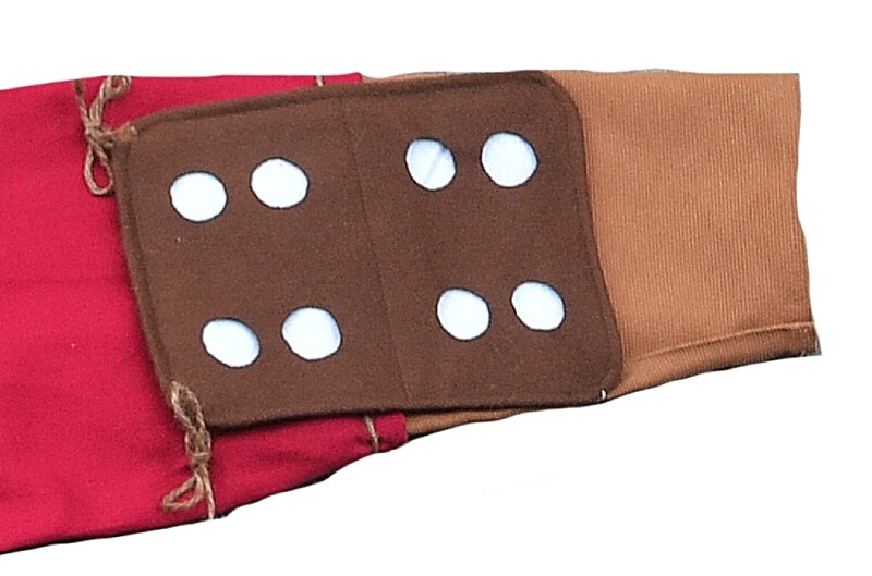
The jersey’s main body is made from brown melton wool fabric with a white polyester felt backing. On the old blockers, the leather face had the holes punched out with a translucent white plastic backing. The two materials are only joined at the edges of the blocker, so I replicated this on the jersey by omitting any stitching around the holes.
Some of my favorite old blockers were the ones used in Detroit in the 1950s and ’60s, made by a local company that went by various trade names, including Lippman’s, Tool Shop, and Olympia. I really like how the manufacturer’s tag was sewn onto the face of the blocker, so I made a similar tag with the name Coopman’s — a blend of Lippman’s and Cooper (the most recognizable name in waffle board blockers):

I maintained the Detroit theme for the rest of the jersey, including using red cotton twill for the back and sleeves:
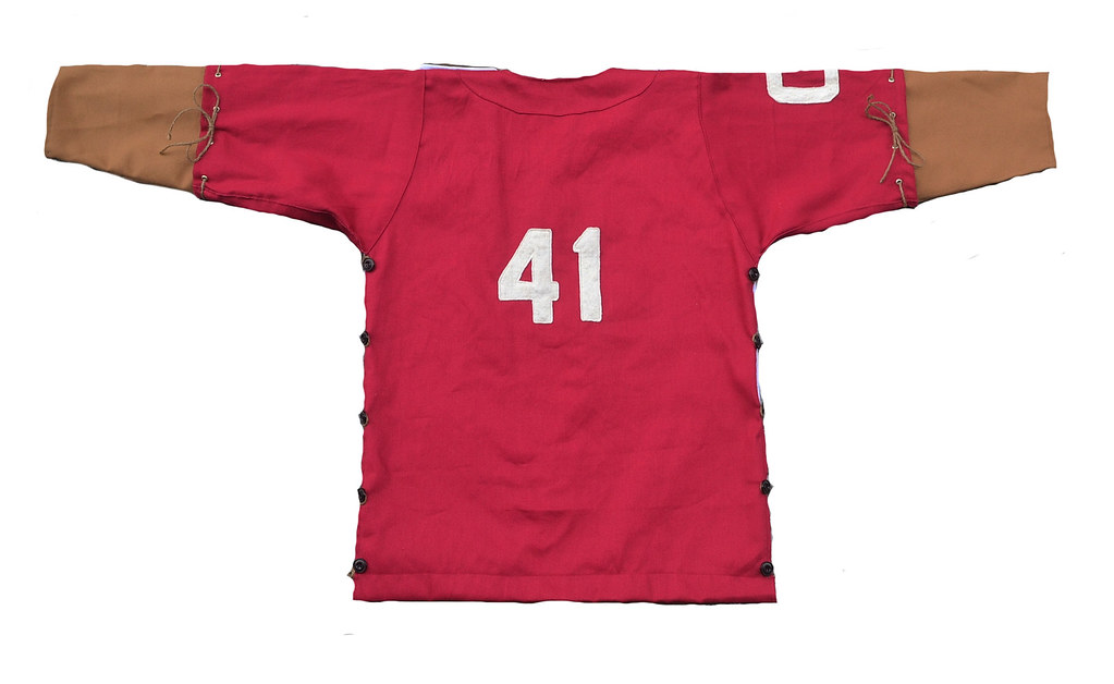
I like the idea of modular jerseys, especially since many of the old hockey sweaters didn’t hold up too well over time. In this case, I designed a heavy lace-in canvas fore-sleeve that could easily be replaced as it wore out. I used jute twine to tie it all together, plus I used it for the lace-up collar [with grommets! ”” PL].
If you look at old photos from the 1930s and ’40s, you’ll see that a lot of goalies wore padding on the outside of their jerseys to protect their inner-elbow area. This exterior padding makes sense, because the sweaters of the time weren’t roomy enough to accommodate much padding underneath (and I can attest that this is a very painful part of the body to take a hard shot to, even with today’s modern padding). So, I designed a mini blocker exterior pad as an extra detail for the left sleeve:
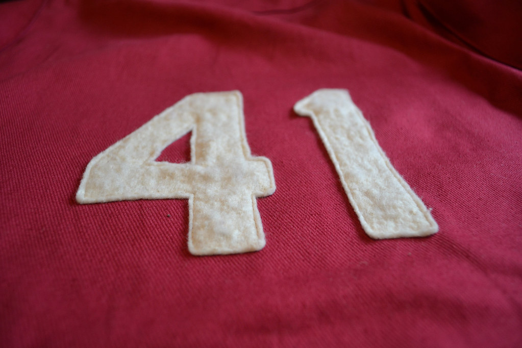
I used a cotton batting material for the cresting, as it adds to the vintage look. The team name is the Cephalopods, with a “C” logo on the right sleeve, as a nod to Detroit’s octopus tradition. I picked the number 41 for the jersey simply because I always liked the look of this number when Eddie Mio wore it for the Wings. As an added bonus, 4 and 1 are two of the easier numbers to sew, due to their simplicity. I decided to make the numbers quite small, like on a vintage baseball jersey:
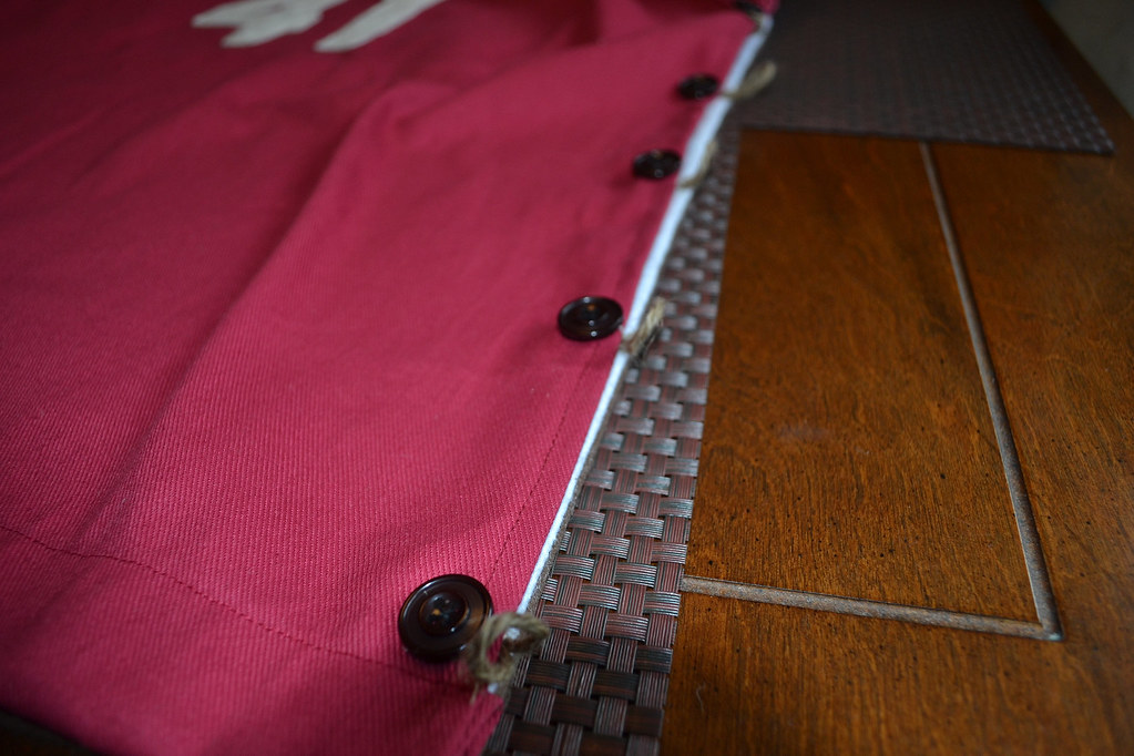
Due to the multiple layers of thick material used, sewing the front and back of the jerseys together would have been difficult, so instead I used twine loops and vintage-looking buttons to hold it all together:
Overall this was a fun project, although I wonder what the rest of the team would have worn?
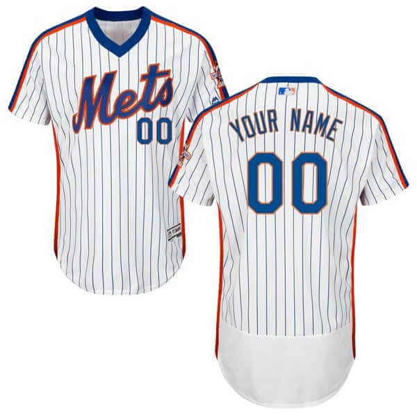
Sure enough: On Tuesday I noted that the Mets were selling an ’86 throwback pullover jersey and mentioned that many fans were assuming that this meant they’d be wearing the throwback at some point this season to mark the ’86 team’s 30th anniversary.
Now it’s official: The ’86 throwback is being added as a new alternate.
Phil and I have known about this since last summer but weren’t allowed to talk about it until the Mets broke the news (I was being coy when I mentioned the jersey on Tuesday). That announcement was supposed to happen on Feb. 22, but they apparently decided to accelerate the timetable once fans spotted the retail jersey.
But here’s an exclusive detail not mentioned in the news story linked above: The mock-up of the throwback in the MLB Style Guide shows it being worn with high-cuffed pants and stirrups. (The stirrups are actually backwards, but I’m sure the intern in charge of the mock-up just doesn’t know proper stirrup protocol.) No other uniform in the style guide — throwback or otherwise — has been depicted this way in many years, so the Mets apparently plan to go all the way with the ’86 look.
Now, whether they can get all the players to go along with it — that’s another matter. I’m betting we see lots of pajama pants out there. But it’s nice to know the team is at least trying to do this the right way.
Meanwhile, as long as we’re talking about the Mets, newly re-signed outfielder Yoenis Cespedes has had an accent added to his NOB:
@PhilHecken Yoenis said he asked for an accent on his name on the back pic.twitter.com/0eLTQtFwi9
— JameRock (@JameRockT7L) February 3, 2016
As many observers quickly noted, that’s not one of the new Flex Base jerseys — woven MLB patch, no butt flap.
Click to enlarge
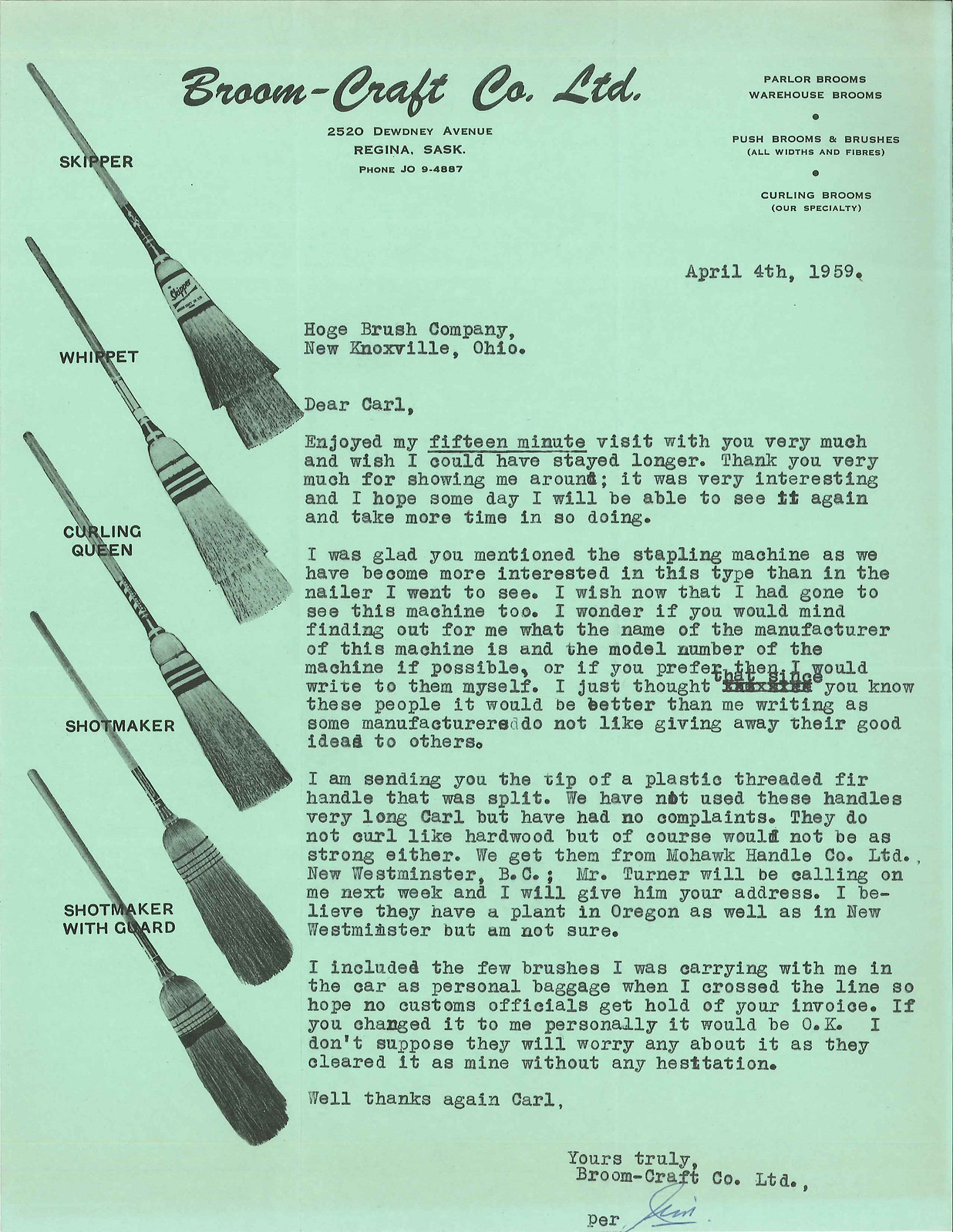
PermaRec update: The latest letters from the files of the Hoge Brush Company are from a manufacturer of curling brooms! Get the full story over on Permanent Record.
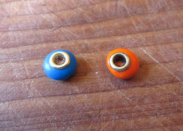
Gromm•It update: At first I didn’t think it would be possible to install grommets into M&M’s at all — too small, too hard, I figured. Then I tried heating the butt end of a drill bit over a flame and pressing the heated bit into the candies to create a cavity. That worked — twice. I went through two full bags of M&M’s and came away with only two successful installations (which, as you can see above, happened to be in Mets colors — nice). Most of the time the candy shell shattered, or the chocolate melted too much, or I pressed too hard and the heated bit went all the way through the far side of the candy. Tricky business. Eating the rejects was a pleasant task, though.
You can see this and all my other explorations of grommeted foods over at Gromm•It.
Meanwhile, if you think Gromm•It is weird, trust me, I’ve got nothing on the guy who recently started posting videos under the name the Food Surgeon. Wanna see him perform a “Reese’s Peanut-Butter-Ectomy with Oreo Cream Transplant”? Dig (further info here):
The Ticker
By Mike Chamernik

Baseball News: Kentucky wore its new jerseys during a training session yesterday (from Phil). … Mike Clary has been on a roll with finding cool old photos. Here are three more: In 1969, Babe Ruth’s locker was placed in the stairwell of the National Baseball Hall of Fame; Charlie-O, the A’s mule, was quite the sight in 1965; and Phil Rizzuto looked resplendent when broadcasting the Yankees. … The Binghamton Mets will wear the Declaration of Independence on their sleeves on July 3. … Here’s a good breakdown of some of Los Angeles’s bygone stadiums. I’ll always remember the L.A. Wrigley Field from episodes of Home Run Derby (from @allen_y_). … An upcoming auction in Nashville has some neat World Series ticket stubs and scorecards up for bid (from reader KC).

NFL News: Dozens of corporate entities have plastered their names all over Levi’s Stadium for the Super Bowl (from Brinke). … A shoe artist made a custom pair of Superman-themed Under Armour Curry Twos for Cam Newton. The Panthers QB wore them during the Super Bowl media event Monday night (from Brinke). … Packers WR and hoodie fanatic James Jones has a custom suit with a hood on it (from Eric Wright). … Here’s a look at the Broncos’ uni evolution over the years. … In 1993, NASCAR driver Dale Jarrett wore NFL-themed racing helmets. In addition to the Rams, he also wore a Bears helmet.
College Football News: Yesterday was National Signing Day, and a bunch of schools had their own logos for it, including Oklahoma, Oklahoma State, Michigan, Wisconsin, Miami, and UCF. … Also with Signing Day, it looks like Michigan coach Jim Harbaugh wasn’t wearing socks with his suit (from P.K. Richardson). … Wichita State is teasing a possible return of its football program, which last played in 1986. … New helmets for the Colorado School of Mines. … “There appears to be a change in the helmet for the Florida Gators coming next year,” Steve Skor writes. “All of the recent Tweets and other football graphics have used the white helmet with two separate logos that was worn a couple of times this past season instead of the traditional orange helmet.” … New helmets for Charleston Southern.

Hockey News: A Canadian TV channel used the Florida Panthers’ logo in a Super Bowl graphic. Wrong Panthers, guys (from several readers). … The AHL’s Binghamton Senators will wear purple jerseys on Saturday for mental health awareness. … The Reading Royals wore Penn State THON jerseys. … Club hockey players at Oregon like their new uniforms. They definitely have a California Golden Seals vibe (from Kenny Ocker). … The Wu-Tang Clan is selling a hockey sweater in its online shop (from Anthony Miranda). … University of Wisconsin-Stevens Point wore pink for a breast cancer awareness night against Lake Forest College on Saturday. The referees wore pink as well (from Michael Bialas). … A man in a Flyers winter cap robbed a bank in Hamilton, Ontario. ”¦ A pair of fans sat right next to the Sabres bench while dressed up in full Sabres uniforms — including pads, helmets, and Gatorade towels — and then proceeded to drink beers (from Aaron Husul):

NBA News: Even though it was a road game, the Heat debuted their new white 1990s throwbacks in Dallas last night, while the Mavs wore their standard road blues at home. Miami will wear the throwback set throughout February. … The Warriors and Wizards went blue-vs.-red last night as Washington wore its Chinese New Year jerseys. … JP Josetti was at last night’s Hornets game and noticed the font on the baseline is different for the letters O and E in “Charlotte” and “Hornets”. “What is interesting is the O in ‘Charlotte’ has similar font as the E in ‘Hornets,'” he said. “Also, the H and T’s are the same font in both words.” … Speaking of courts, Sports Illustrated ranked the 30 NBA court designs. The Nets were first, the Bucks’ two-court combo was second, the Celtics were third, and the Clippers were 30th. Consider this a mini-QOTW: What’s your favorite NBA court design, and least favorite court design? Historical examples are good too, and if you need a refresher on what every court has ever looked like, you can consult this extensive archive.

College Hoops News: Maryland wore black with yellow shoes and socks last night. … Also from yesterday, Kansas women’s juco hoops had a grey-vs.-red matchup, and Crowleys Ridge College and Morthland College went neon yellow vs. green (second item from Reid Cure). ”¦ A Mississippi player was missing his NOB last night.

Soccer News: It appears that Adidas screwed up Washington’s slogan on D.C. United’s new jerseys (from several readers). … The NWSL’s Houston Dash have new home uniforms based on the U.S. Soccer template (from Saurel Jean, Jr.). … Also from Saurel: FIFA unveiled its logo for the Confederations Cup. … New jerseys for the Philadelphia Union.

Grab Bag: IndyCar’s Scott Dixon has brought back the lightning bolt livery (from Tim Dunn). … A book on renowned graphic designer Aaron James Draplin, who designed lots of well-known logos, is coming out in the spring (from Coleman Mullins). … NASCAR Camping World Truck Series driver John Hunter Nemechek has a helmet with WWE legend Ric Flair painted on it (from David Firestone). … Also from David: “This might be the first picture of Robert Hight’s all Camaro funny car body. The one raced in 2015 was a Ford Mustang body with a Chevy Camaro nose. It takes a full year for a manufacturer to design and build a funny car body. Since John Force lost Ford as a manufacturer in the middle of 2014, and the deal with Chevy was not announced until late in the 2014 season, there was no time for Chevy to make their own body. As such, John Force went to Ford, and asked if they could amalgamate the body, and Ford agreed.” … IndyCar racer Tony Kanaan teamed with a Japanese tech company to design a shirt that monitors heart rate and muscle performance during athletic activity (from Brinke). … New logo for the City of San Diego. … I believe we’ve seen this before, but a wool products company makes some pretty neat logo history banners for teams in the four major sports and the NCAA. I have a Brewers one and a Heat one (from Dean D.). … A shin-high Nike shoe from Belgian fashion designer Raf Simons has not been well-received. ”¦ New uniforms for USA Rugby.
Congrats to Mets fans, the original 1986 uniform is that franchise’s best.
Favorite NBA court designs? The 1987-94 Chicago Stadium court and the original parquet Orlando Magic court at the Orlando Arena are just two that come to mind.
Absolutely agreed with the ’86 Mets uniforms. By far the team’s best uniform ever, and easily one of the best uniforms of its era in all sports. And while I don’t agree with Paul’s preference for pullovers in baseball – sure, a button front serves no purpose, but then again neither do the Tigers’ rear belt loops – the racing-stripe Mets jersey for me is one of the few pullover designs that looks right to me.
It’s amazing what big differences small details can make. Just a few years ago, with all the pointless black barfed seemingly at random over their uniforms, the Mets were among the ugliest teams in MLB. Today, the Mets are one of the best-looking teams in the bigs. Even their alternate unis are above average – though that’s a decidedly low bar to clear.
why did baseball go away from the pullover look… to me that shirt type makes more sense to play in than a button up does.. and it looks better too
I can’t agree on the looks better part. I also find the button downs more comfortable.
Custom weather-related football helmet being raffled off by Channel 6 news in Tulsa.
link
Is the 86 alt (which for my unbiased Yankee fan eyes is the second best Mets look behind only the blue pins) replacing any of the other Mets alts or are they just adding it to the two blues and the camo?
No more camo this year.
Favorite court design – The Buck’s MECCA floor from the 70s
I second the MECCA design as my all time favorite court
Bobby Labonte (who also drove for Joe Gibbs Racing) also wore NFL racing helmets during some of his races.
The differences in the Hornets baseline lettering is based on the position of the letters next to a “rounded” letter v. a “straight” letter. That’s all.
The Philadelphia Union is a soccer team (MLS), not a hockey one, yet the mention about its jersey is in the hockey section of the ticker.
Fixed.
it’s also in the NBA section
FYI that’s not a raf Simmons Nike shoe.. He does design athletic shoes but not that one..
The one linked is done by ricccardo tisci..
While browsing to purchase a new Marlins cap, I noticed a couple of peculiarities. Their new Spring Training logo is also available on a “Game” cap, with the same fabric and embossed league logo, but without the ST patch and different team logo embroidery(flat on ST, raised on Game). This “Game” cap is also marked as a “Special Event” item.
ST cap: link
Game cap: link
In looking at a few other caps, it seems most, if not all, the ST caps are available w/o ST logos, as I will suppose they are also the new BP caps. However, none are referenced as “Game” caps, nor “Special Event.” Also, all the other teams have consistent team logo embroidery.
The inconsistent embroidery of the Marlins cap logo seems to be an ongoing thing with New Era, as part of my ritual is purchasing a new cap each season. Sometimes it’s flat, sometimes raised.
The other point is, it looks like the Marlins have a new alt. game cap, replacing the orange one. It’ll be interesting to see if the embossing and material is the same on the field as it is in stores.
Does anybody else think the Marlins’ monogram looks better without the white thread? I dislike the way it is repeated 3x on the uniform (Hat, sleeve, 1st “M” in Miami); subtracting the white adds a bit of variety.
link
I always get bothered by their St. Louis Blues pennant since the logo’s are in the wrong order.
link
The Circa “1986” one was an original logo from the late 60’s, the circa “1984” one became more rounded in the late 80’s but kept the red through 1997.
I can never understand why it hasn’t been fixed, these have been out several years!
They should just go off this list, it’s the most accurate.
link
i was about to post about their pennants. the orioles has some that i’ve never seen (maybe a short lived secondary) and omits actual primary logos. My dad has it and it always bothers me. i wonder how they desinged these banners and how much thought actually went into it. probably very little. i wonder how many teams are even correct.
Proofreading: “I always liked the look of this number when Eddie Mio for it for the Wings.” wore it
Fixed.
In that Phil Rizzuto photo it looks like the bat in the Yankees logo is wearing a stirrup! Have we seen this variation of the logo before?
Probably this is so last week, but does anybody know if the Broncos will use a different white jersey (sans the blue stripes) for SB? I sae this one for sale at the NFL shop and it says event jersey
link
They’ll definitely be wearing their regular white jerseys with the blue stripes/horns (unfortunately):
link
Least favorite court is easy: Mid-90’s Rockets.
link
My favorite was the Mecca during the Sidney Moncrief/Terry Cummings era of the Bucks.
Binghamton Mets Declaration-sleeved clown suit: Now that is how you do an Independence Day jersey. About darn time someone remembered the reason for the season – it’s not Flag Day (that’s in June) and it’s not Armed Forces Day (that’s in May) and it’s not Memorial Day (also May) and it’s not Veterans Day (November). The Glorious Fourth is about our national origin in an act of Congress notifying the King to please get lost.
Pundits in Houston are observing that the new Dash uniform strongly echo the Astros’ Tequila Sunrise shirts.
And I can’t explain why, but that video of the unholy union of Oreo and Peanut Butter Cup unnerved me.
Thanks Paul, the it is just some jersey template with the super bowl patch on it
Sixers have the best floor. I’m glad the Knicks ditched the orange for all blue, and I love the fonts they use the most.
The Es and Os on the Hornets’ baseline are just different letterforms within the same font. The letters with the serif on the upper left corner are used when the preceding letter has a beveled corner on the upper right (like the NE combo), or when the preceding letter has an open space in the upper right (like the LO combo). The serif is omitted when the preceding letter has a square upper right corner (like the TE or HO combos). The serifs would run into the square cornered letters if they were used in those cases.
The neck tape on the D.C. United jersey is probably just that, a tape with a print that repeats TAXATION – WITHOUT – REPRESENTATION over and over again. It’s probably cut randomly to minimize waste. A better solution would have been to keep the entire phrase together instead of separating each individual word with the eagle. That way it would have been more clear that the phrase has an intended order. Either way, I think any intelligent person can understand the intent there.
Paul:
In response to our twill conversation late in yesterday’s comments: I was replying to Steve, explaining the difference between a woven and a knit so that when Majestic says they are using a lighter twill for the jersey, it is understood that they do in fact mean the numbers and lettering because the garment itself is a knit and therefore is not a twill.
I know you know that tackle twill is a fabric. :-)
Just a bit of extra knowledge: the characteristic that makes a twill a twill is the offset that creates the diagonal wale in the fabric. One type of twill. as you mentioned, is one in which the weft passes under two warp threads and over one, but a twill can also be made with a two under, two over pattern, a three under, one over pattern, etc. You can also use a twill weave to create diamonds, houndstooth, herringbone and other decorative patterns involving directional or color changes. The key is the offset that creates the diagonal wale.
Great look from Jim Harbaugh, what a dork!!
I wonder if the Mets will wear a cap with a blue squatcho(ee) with their ’86 throwbacks. It’s worth nothing that both in 2002 and 2006, they did.:
2006: link
2002: link
Excellent point!
The MLB Style Guide, which does indeed show squatchee colors, shows the Mets wearing this throwback with a blue squatchee. I think it’s a safe bet that at least some of the players won’t get the memo and that we’ll see a mix of blue and orange squatchees out there.
which is why they need to get rid of the orange squatchee hats…
Huskers trotted out another gimmick last night, wore NOB’s Maple Leafs style, white letters on white jerseys. Thankfully sat in third row and made them out, I thought coach had ripped off NOB’s.
NU will wear ‘Black History Month’ throwbacks (also given to Louisville and Mississippi State) for one home game and two road games later this month.
I don’t know, that Mets ’86 throwback, while it looks quite nice, just reminds me it’s been 30 years since their last title. :\
Which is the MLB average wait between World Series championships, and the Mets are looking to be in good shape to make the playoffs this year. Which is to say, not playing the violins for Mets fans here.
With two World Titles and a handful of WS appearances, the Mets are actually above the Mendoza line in terms of prosperity. That can be cold comfort, especially when the other team in town has that embarrassment of riches. But their trophy case is not unduly barren.
the Mavericks were wearing their navy skyline alternate at home, not their standard road blues (which are more of a royal blue)
that waffleboard sweater would be great for dressing up for a Renaissance Festival.
True,
Arise! “Sir Gordorn of Howe”, “Sir Robert of Orr”, “Lord Stanley of Makita”… Oh hell, we should all link.
Happy Birthday link – BOTD in 1951. Nice to see a stripe-y Expos batting helmet, and link about this journeyman ballplayer.
Lord, that Food Surgeon – Oreo/PB Cup video is hysterical. I chuckled through the whole thing. I think the dude might be on to something though; a cup with oreo “stuff” in it sounds yummy. Glad to see he made it a double-stuffed (I’m not really sure why they even make the single-stuffed oreos any longer; they are nowhere near as tasty). “The guy with the rubber gloves was surprisingly gentle!”
Houston Dash isn’t based on the US Soccer kit…it’s a simple Nike template that was used for both (and many more teams).
Uni Watch is the only place where I can bring up the following and maybe not be seen as insane,
The Mets ’86 throwback in the picture looks off to me. The Mets script, while they did not use the current bloated, crooked script, still seems too thick and too slanted. Here is the link. The 1986 original itself is a bit clunkier than most Met scripts of that era, as it was the year Goodman made the script as opposed to Rawlings (which to me is the quintessential Met script). The only other Goodman script the Mets used was the infamous link Don’t know how that one ever went into production…looked like a cheap knock-off.
Apparently I don’t see a lot of Magic games, because I didn’t realize they’ve had a parquet floor throughout their whole existence.
The Nets’ court certainly looks better than the uniforms. I wouldn’t put it at #1, though. Top ten, maybe.
They nailed the Clips and T-Wolves at the bottom. I’d throw the Rockets down there until they add mustard to their ketchup. At the top I’d put the Hornets, Jazz and Hawks.
None of these would make my all-time favorite list. because I prefer the era when they acknowledged the fans sitting on the non-TV side of the arena. They also weren’t always in the same colors as the team. The ’79 Coliseum, Hartford Civic Center and HemisFair Arena come to mind. For ones in team colors, I loved the pre-Sterling SD Sports Arena (even though there was only one logo facing the camera), the ’85 Seattle Center Coliseum, the blue & orange Coliseum, and perhaps my favorite, the ’79 Kemper Arena. Go KC Kings!
Least favorite: any mid ’90s over the top monstrosity.
Also among the current ones I like the Kings, Grizzlies, Spurs and Sixers.
I love the Nets’ herringbone look.
The only team I can recall that’s ever tried herringbone was the Raptors in the Skydome era. Great looking court in a ridiculous setting.
link
The Gromm-It M&M’s ended up in Mets colors. Because of the lighter blue, the first thing I thought of was this year’s Super Bowl match-up.
I find it interesting that the Oregon hockey jersey are not Nike
Club team. It’s only a recent phenomenon where the company that supplies varsity teams with apparel also extends it to club sport/rec sport/intramural teams.
Only reason they even get to use UO branding is because there’s no varsity team representing the team in hockey.
For example, link.
News on the link front,
It appears that the venerable A-10 Warthog willlink.  Which is actually a good thing since there is nothing flying that can do what it does.  Destroying Russian tanks straight outta a 1970’s cold war scenario. Â
Now the F-35 is another story altogether.
How does this relate to the Uni-verse you may ask?  Well have a gander at the link.  Go team.  Although my personal fav has got to be this link from the MD Natinals Guard, same for the link from the Pennslyvania ANG.
Of course the link is appropo too.
The existence of the Food Surgeon doesn’t make Gromm*It any less weird. In fact, it might even make it weirder. Ha!
2017 Confederations Cup logo:
link
Sorry, but the food surgeon thing is waaaaaaaaaay cooler than grommetting things. Hell yes I want to see someone transplant a SNickers with a Twinkie or something like that.
No need to be sorry – I totally agree that the Food Surgeon thing blows Gromm-It out of the water!
“There appears to be a change in the helmet for the Florida Gators coming next year,…All of the recent Tweets and other football graphics have used the white helmet with two separate logos that was worn a couple of times this past season instead of the traditional orange helmet.”
Not all: link
The staff has said that the players wanted a white helmet too, so they made one; the traditional one isn’t going away. It gives them options.
Many of the kids are featured without helmets; I think it’s probably just kids being kids, wanting to swag out with the new hotness.
Hey there Paul…For those Stooge nuts like me, Gilmore Stadium was the filming location for “Three Little Pigskins” short. One of my favorites!