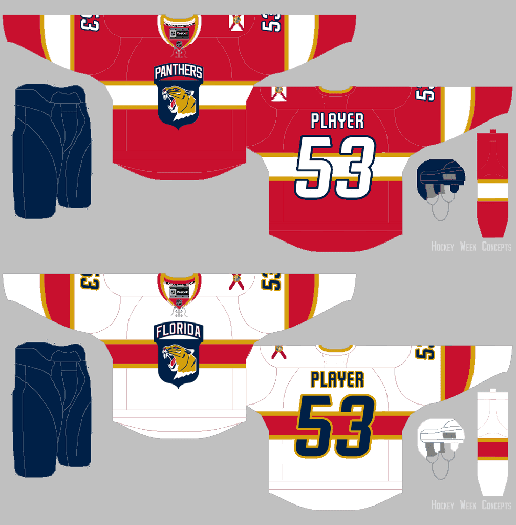
Originally posted on SportsLogos.net; click to enlarge
We’ve known for about a month now that the Florida Panthers would have new uniforms next season. Now we may have gotten a peek at what they’ll look like — or at least a reasonable approximation thereof.
The mock-up shown above was prepared by a SportsLogos.net reader who goes by the name “Hockey Week.” He based it on a series of descriptions that were tweeted on Jan. 1 by the Miami Herald’s Panthers beat reporter, George Richards, who has apparently seen the new designs. When Richards was shown the mock-up and asked if it was close, he said, “Not bad.” (All of this and a lot more was presented yesterday in a post by SportsLogos.net poobah Chris Creamer, which is definitely worth reading. Lots of good info there.)
It’s worth repeating that this is just a speculative mock-up based on a verbal description delivered via Twitter, so certain aspects of it are almost certainly incorrect. Still, it’s an intriguing design, so let’s examine its two most prominent aspects:
1. The horizontal stripe. This is, obviously, a Canadiens-esque move. That seems to piss off some people, who see it as a copycat move, but I don’t see why Montreal should have an exclusive on this particular design element, especially since the Habs don’t even use it on their white jersey. It’s a good-looking design feature (and not just in hockey), and I think it looks sharp in these mock-ups. I hope this aspect of the mock-ups is accurate.
2. The crest. Richards, the beat reporter, says the chest mark is based on the logo of the Army’s 101st Airborne Division. Here’s a comparison of that logo and the mock-up:
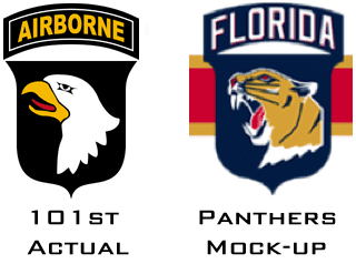
I’m not nuts about either one, frankly.
But hey, whatever you think of the logo, the 101st Airborne is located in South Florida, so it’s part of the local culture, right? Wrong. The 101st Airborne is actually based in Kentucky. So why is it reportedly going to be the basis for the team’s new logo? Because team owner Vincent Viola, who took over the team in 2013, served in the 101st. So this isn’t just yet another gratuitous military tribute — it’s also an self-indulgent move that has nothing to do with the local community. A lose-lose.
As for the rest of the design, we’ll find out soon enough.
Collector’s Corner
By Brinke Guthrie
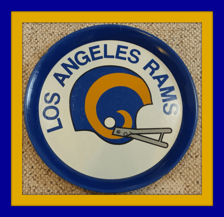
Now that the NFL’s regular season is over, one of the things on the league’s agenda is resolving which team going to move to L.A. Will it be the Chargers (who started out there)? The Ray-duhz (who used to live there)? The Rams (who also used to live there)? If it turns out to be the Rams, the clean retro simplicity of this 1970s L.A Rams serving tray will once again be in vogue.
Here’s the rest of our first Collector’s Corner of 2016:
• Keep your skates razor sharp with this Bobby Hull Skate Sharpener!
• Snazzy-looking coaching staff and nice sweaters in this 1990 Bengals team picture poster, sponsored by 55KRC and others.
• Here’s a 1970s Soapy Slider” Soap on a Rope from the Seattle Mariners Baseball Club. Only thing is, I don’t see the rope. Good luck grabbing onto this in the shower!
• Sorry, no Chiquita NFL stickers included, with this 1970s Chiquita Nerf football.
• Dodgers fans, have you ever seen these? Here’s a pair of 1970s Dodgers “Cheer Bears.”
• Keeping with the Dodgers, take this 1970s-1980s inflatable seat cushion to your next game.
• Nice condition for this 1967 Philadelphia Eagles pennant, notable for two reasons; the Olde English font, and the fact the pennant says “The” at the front of the team name.
“Jordache” designer sneakers for Earl (The Pearl) Monroe? These really existed? (Looks that way!) He didn’t wear these on the court, did he?
• Got to be 1960 or so for this Punt Pass & Kick Cowboys helmet from MacGregor.
• Terrific graphics on this 1979 Mattel “Intellivision” MLB game. Intelligent Television, folks. Is that Joe Torre on the left? And I’d swear I’ve seen the photo of that infielder over the baserunner before.
Follow Brinke on Twitter: @brinkeguthrie
The Ticker
By Mike Chamernik

Baseball News: New Yankee Starlin Castro still has his old Cubs helmet in tow (from Zack Pearson). … A Double-A ballpark in Little Rock, Ark., is being ravaged by sinkholes. I really think sinkholes are among the most underrated scariest things on earth.

NFL News: Yesterday Paul mentioned that Giants QB Eli Manning was wearing a jersey with the new Nike cut without the Flywire collar. Turns out Bears RB Matt Forte was also Flywire-free on Sunday. This is a new style of jersey that will be used as a template for the Pro Bowl jerseys (Forte part from Kevin C., Pro Bowl part from Rob Carabelli). … The Giants retired No. 14 for Y.A. Tittle, but here’s a photo of him wearing No. 18 (from David Feigenbaum). … NFL teams wore some great home uniforms in 1967 (from Todd Radom).
College Football News: Amazon appears to be selling an Alabama cap with the Braves’ “A” logo. Scroll down on the link for a logo comparison. ”¦ North Dakota State will wear its “Harvest Helmet” in this weekends FCS championship game (from Chris Mycoskie). Further info on that helmet design here.

Hockey News: Good-looking game at the World Junior Championships, as Sweden and Finland went color-vs.-color (from Eric Griffin). … Oilers G Anders Nilsson’s mask is a tribute to former Edmonton goaltender Grant Fuhr (from Chris Bisbee). … The Waterloo Black Hawks of the USHL will wear John Deere jerseys later this month. … The SPHL’s Columbus Cottonmouths will wear snake-themed jerseys, including a “snake font” for the uniform numbers, this weekend. .. A team comprised of air traffic controllers from around the world has some bizarre hot pepper-themed uniforms (from Gil Neumann).

Basketball News: Due to a spat between the 76ers and their arena sponsor, the arena’s name was nearly invisible on the court earlier this season. The wordmark is darker now (from Dan Ulrich). … Tennessee will wear grey jerseys on Wednesday (from Jason Yellin). ”¦ Rockets C Dwight Howard had trouble with a contact lens during last night’s game against the Jazz.

Soccer News: Perennial powerhouse Manchester United is struggling a little this year, and Adidas, which has a 10-year, $812 million sponsorship with the club, isn’t pleased (from Zac Neubauer). … Tottenham midfielder Dele Alli had an unusual visual pattern printed onto his kinesiology tape (from Gulliver Hughes). … The Missouri Comets of the MASL will wear retro jerseys on Saturday (from @ZedMinor).

Grab Bag: Bring back the 1990s! The Pro Player sportswear line will be relaunched in 2017 (from Tommy Turner). … Several people have sent this in recently: There’s a great site called Things Fitting Perfectly Into Other Things. When I look at the examples, everything just feels right in my world. … Maybe watch this on mute, but here’s a glimpse of a self-ventilating body sportswear suit (from Brett Clark). … The state of North Carolina’s new logo has been regarded as a flop. … New logo for BBC’s teen channel, BBC Three. … Cumberland University will now be known as the Phoenix. … In English rugby, the Worcester Warriors apparently changed jerseys at halftime of their game on Sunday (from @Stumpy7780). … New logo for Formula One’s Red Bull Racing. ”¦ “We have some more looks at the 2016 NHRA Pro Stocks that have had their hood scoops removed,” says David Firestone. “Here is the 2015 version with the hood scoop, for comparison.” ”¦ Brent Musberger apparently travels light.
Proofreading: “A comprised of air traffic controllers”
Fixed.
The Panthers mock-ups are using the Winnipeg Jets number/letter don’t, which would seem unlikely – if a team isn’t going to wear a basic block number, they’d probably make their own proprietary don’t, right? I love the horizontal stripe, and other teams should wear it besides the Habs. Other MLB teams besides the Yankees wear pinstripes, right?
Agree about the numbers. Just an approximation of the description (or just a placeholder–didn’t read the tweets), I’d guess.
I also think it would look nice to outline the numbers on the white jersey in white instead of gold. Would be a nice crisp contrast over the horizontal stripe and nice, simple blue-on-white sleeve numbers.
That insignia was okay with me until I heard the backstory. I wish I didn’t know the truth; it’s an improvement on the one they have.
What about “the truth” bothers you?
The speculation that the crest was merely cribbed from the 101st Airborne. If he likes it, great; but he has to be a little better at disguising his origins. Otherwise, he’s just a bad copier.
I’m in favor of the horizontal stripe too, it’s a classic and under-utilized look and a damn sight better than the weird asymmetrical, diagonal, broken/bisected and wavy stripe designs of the 90’s. The logo has got to go. Definitely take the wordmark out. Enlarge the head and maybe put it inside a shape different from the crest.
This wordmark + logo design in hockey has gotta go (think Vancouver Canucks). It’s okay if a wordmark is incorporated inside or as part of a logo (Toronto Maple Leafs), but I hate it when they jam them onto a jersey as two separate elements. Even though they’re connected, this Panthers jersey still has the look of two separate elements.
-Jet
Full concurrence! See your offered Vancouver Canucks, and raise you the Tampa Bay Lightning in white jerseys.
Holy Green Army Men,
How can you do a salute to the army when you are ripping off the logo to start? I have great respect (still) for our military institutions but I fail to see how this design is a tip o’the hat to them…
I concur with PL on this one… a self indulgent dick move by a self absorbed owner.
Could it just be that he likes the look of the crest/word mark and wanted to incorporate it for aesthetic reasons?
Could be… and it could be alot worse…
see Chicago Blackhawks…
link
or this from WW II,
link
or mebbe this..
link
maybe not.
The MLB IntelliVision game says “For color TV viewing only”.
I wonder what it looked like on B&W TV.
Was it even viewable at all??
Probably looked like the Jets/Bills color rash game did to colorblind people.
I’m pretty sure that the Intellivision was never designed to be compatible with black-and-white TVs.
i had that intellivision game, and i distinctly remember recognizing the lower right image, most likely from sports illustrated or a baseball card…my first thought was larry bowa, but it didn’t seem right somehow. aha! bill russell!
link
Pretty sure the hurler is Jim Palmer, too:
link
whoa, jim palmer! i have to say, i didn’t remember his leg kick being that high…
Not Joe Torre. He batted right handed.
RE: Things fitting perfectly into other things…..
“It was a million to one shot, doc, million to one!”
So you’re the Assman!
The Sweden/Finland WJC semi-final game was not a case of teams deciding to go color-on-color.
Every game Sweden plays as the “home” team is color-on-color. Sweden’s “home” jersey is yellow and they do not have a white jersey.
In addition, Sweden rarely even wears their blue jersey, which is actually quite nice, and unlike other nations, has seen next to no changes in the look of their uni in the last 40 years (In contrast to say Canada, who changes its uni every few years)
I honestly don’t know if the Swedish national hockey team has ever worn a white jersey. The Tre Kronor have worn gold home jerseys for as far back as I can recall.
I cant think of a time that I have seen them in white either. The only other colour I remember is the Blue that they wear from time to time.
In regard to the Panthers design, I like it. It’s traditional without being boring. Although would prefer they find some room for the current leaping panther logo,which I think is one of the best in the NHL, maybe as a shoulder emblem.
Black Jesus never played in those Jordache sneaks… but he coached in them!
link
re: the 1967 NFL unis. Along with being a great looking set of unis*, I’ve always loved the division names, particularly “Capitol” and “Century.” I have no idea to what either name refers, but I don’t care. It’s much more interesting than “AFC South” or “NFC East.” I’d always loved how the NHL had division and conference names that referenced their history. Was sad to see them replaced with geographic references making them generic and dull.
What’s the deal with the Saints not having a stripe on the helmet? Was that ever a thing or just a printing snafu?
* Yeah, I know… same number font, no alts, blah blah blah. They look infinitely better than the majority of today’s crap. There are actual sleeves, loads of stripes and no BFBS.
link
That’s EXACTLY why I need to read UW on the weekends more often. :) Thanks for the history lesson!
It would have been interesting had they followed the NHL’s lead instead and used some of the NFL’s pioneers as inspiration. It’d be cool to have conference and division names like Thorpe, Halas, Pollard, Nevers, or Brown. Granted a name like “Halas Division” might ruffle some feathers in Green Bay or Minneapolis, but it’d be a nice tip of the cap to the important historic figures of the game that would transcend regional rivalries.
The order of the Saints sleeve stripes is reversed too.
What about them wearing WHITE at home?
Was that their thing also?
Ironically, nine of the 16 NFL teams wore white at home in 1967, including the Giants, Browns, Cowboys, Rams, and Saints for all seven home games. The Steelers wore white at home for six games, the Cardinals for three games, Falcons two games, and the Eagles one game. This is listed in the “White at Home in the NFL” Uni Watch research project
Cumberland University will now be known as the Phoenix.
This is an identity change I can get behind. The best reason to alter your mascot is because ninety other schools have the same frickin’ mascot, AFAIC.
Yeah, that “if it’s racist” reason is way down there on the list of reasons to change identities.
What does racism have to do with this identity change? Cumberland was previously known as the “Bulldogs,” even though they’d used the phoenix as their logo for years.
link
It doesn’t. But I was responding to this general statement:
I think there are better or more important reasons to alter your mascot besides the fact that 90 other schools have the same mascot. All things being equal however, and if the change from one mascot to another is not needed due to the racist nature of a current (or former) mascot…then, yes, changing to something that is unique (or at least less common) isn’t a bad reason to change. I don’t think it’s the “best reason” to change tho.
As a Manchester United supporter, I really could not care any less what Herr Rainer, the Adidas CEO, thinks of the club’s style of play. Frankly, he can take a number and stand in line behind all the worldwide supporters of the Red Devils who feel as he does.
I did find it amusing and a bit disingenuous that he criticized the club’s playing style in one breath and, in the VERY NEXT sentence, he stated that the kit sales have far exceeded what Adidas expected.
That is what he cares about more: sales.
What’s his next possible move? “If this team doesn’t win a few games, our insignia is coming right off”?
More frighteningly, “If this team doesn’t win more games in the uniforms we supplied, we’re going to come in, fire the coach, and take over ourselves.” Based on Adidas’ public comments, it doesn’t sound that far-fetched.
Except that they don’t have an ownership stake in Manchester United. However, they do have one in the holding company that operates Bayern München’s soccer club.
Regarding the NFL jersey and flywire – I think Eli’s jersey is the current style QB cut without the Flywire but Forte is wearing the newer jersey template.
Forte has been wearing that style – link
I am a Habs fan. We do not have exclusive dibs over the torso stripe. Indeed, the Blackhawks’ old Winter Classic alt had one and looked great, and I even dug the sublimated Penguins jersey from the late 90’s, despite how busy it was. That being said, if this Panthers jersey mockup turns out to be accurate, I don’t like it.
When I first saw the shield, my immediate reaction was “New York Rangers.” That, combined with the Habs stripe, just screamed out “We’re gonna pander to all the snowbirds at once, because we don’t have any fans of our own.” Might as well use the Chicago Cubs number font to complete the pandering hat trick.
Everything depends on context. We’ve seen owners’ preferences in action before. Bud Adams picked the Houston Oilers blue to match his personal ring. Looked great. Bob Johnson named his Charlotte NBA team the Bobcats. THUD. To me, Vincent Viola giving a shout-out to his division isn’t a Uni Watching nail in the coffin per se, but it surely doesn’t save the look.
Late-breaking thought: now I’m getting a current Jacksonville Jaguars vibe. That’s really not a flattering comparison.
The Panthers jersey reminded me more of the Carolina Monarchs than the Montreal Canadiens, even if the striping is similar.
When I first saw the shield, my immediate reaction was “New York Rangers.”
Yeah, I thought that was a bit lazy, myself. If they made the shield home-plate shaped, though, that would infringe on the Kings’ crest. Better crack open the Heraldry textbook, and see what other decorative borders they could use.
A Double-A ballpark in Little Rock, Ark., is being ravaged by sinkholes. I really think sinkholes are among the most underrated scariest things on earth.
Certainly since that poor guy in Florida got swallowed while sitting in his bedroom. The house followed him into the ground like a scene from “Carrie”. I couldn’t fathom living in a place where occurrences like that are common.
We had a sinkhole show up in the alley behind our house last new years’s day…started out about the diameter of a basketball and by mid-February it was big enough to swallow a car. City fixed it up, as it was caused by old, leaky pipes eroding the soil underneath, but not before it reached a depth of about 12 feet. Nowhere near as terrifying as that situation in Florida a few years back, but still crazy.
Watched a PBS show about sinkholes recently that was utterly fascinating. It would have been terrifying, but I learned sink holes are not/should never be a concern where I live.
Regarding those 1967 NFL “home” jerseys, they definitely got the Browns wrong — they wore white at home all through the 60s and early 70s.
One other minor point on the Panthers potential jersey. It’s interesting to note they have “Panthers” written on the home jersey, and “Florida” on the away jersey, following what I think is both the baseball and basketball standard approach.
Hey! That “serving tray” from the Rams’ LA days actually looks exactly like the trash can lids that came with the Baltimore Colts and San Diego Chargers trash cans my parents bought my brother and me in the 1980s. Still have my lid in the garage, long after the Colts trash can died in dented infamy.
Dele Alli’s tape is also worn by other Spurs players, including Ryan Mason. Earlier in this season when Mason went down with a knee injury the tape was visible, leading the Men in Blazers commentary to remark on his “elaborate leg tattoo, hashtag #DaddyWants.”
I have to disagree with the comment regarding the perceived self-indulgence of the Panthers owner, this is not new. Doing a quick search, not as thorough as I would like but 5 of the 6 Original Six teams did the same thing in on way or another:
Toronto Maple Leafs — Conne Smythe named the team after a WWI Regiment
Chicago Black Hawks — Frederic McClaughlin named the team after the WWI Infantry Division he was commander of.
Boston Bruins — original colors of brown and yellow were the same as Charles Adams’ (founder) grocery chain
New York Rangers — nicknamed Rangers, as in Tex’s (Rickard, the teams founder) Rangers
Detroit Red Wings — James Norris named the team after a cycling club he was a member of in Montreal, The Winged Wheelers.
Not that I’m saying he should have but its interesting how in today’s day and age it is perceived as self-indulgence, I wonder what was thought of it back in the 20’s and 30’s
Self – Indulgent.
It is neither good or bad… it just is.
Personally, I don’t like to compare sport with war. I don’t care much for the military spending ad money on made for TV spectacles of pseudo patriotism either. That’s just me, I do not speak for the Uni-verse on that.
I’d say that the very act of owning a U.S. pro sports franchise by itself qualifies as “self-indulgence” these days. After all, you can count the number of team owners for whom it’s their principal business on my late father-in-law’s 3.5 finger hand, and still probably have a digit or two left over. Any self-indulgent behavior from the point-of-sale is merely lagniappe. methinks.
At least those owners were the teams’ founders. This guy just bought himself a toy and decided to recast it in his own image. That is the very definition of self-indulgence.
fair enough, splitting hairs, but agreed.
It’s not “splitting hairs”; it’s a legitimate distinction between the two circumstances.
that’s your opinion, and I don’t see any difference between Vincent Viola and the owners of the Leafs or Red Wings for example. They all bought teams from others. The Leafs were purchased by Conn Smythe from Charlie Querrie and were known as the St.Pats at the time. James Norris purchased the Red Wings who were known as the Falcons and changed the name. How is that different from Viola?
Forte also wore that style 3 weeks ago, as did a couple of other Bears. Not sure if they wore them since then but it’s not news.
The state of North Carolina’s new logo has been regarded as a flop.
One does not merely rub a lamp and have, say, a palmetto & crescent, a Colorado “C” or a Zia sun emerge. These icons came to represent their states from humble origins, through repeated use and the passage of time.
Grommet – to that LA Rams Serving tray!
Vomit…to those John Deere jerseys. WTF?
Grommet…for that picture of the 1967 NFL unis and major Grommets to Todd Radom for that find!
Vomit- ALL OVER THOSE VOL HOOP UNIS 5-STAR UPCHUCK ALL OVER THOSE BADBOYS
Grommet for that “thingsFittingPerfectly” website but it seems like there is potential for Vomit if one of you phillistines gets carried away.
Vomit for Musberger to have to wear the same tie more than once. Either wear a blazer with the network logo or get that man a UNI-WATCH T-shirt!
Grommet to those pimpin’ Jordache sneakers. GROMMET THOSE EYELETS, STAT!
As a Panthers fan since the team was founded (I was a teenager in Miami at the time), I like the simplification of the uniform and the stripe, but I am not a fan of the new chest logo. I actually really like the leaping Panther, and at almost 25 years old, it has a decent amount of historical currency at this point for the NHL. Same holds true for the alternate logo with the sun behind the crossed hockey stick and palm tree. Those two logos have been with the Panthers since day one, and I wish they would stay. If the new 101st logo was deemed necessary, I’d almost prefer it to be an alternate logo on the shoulder in lieu of the state flag. There is another hockey team in Florida so it is odd to claim the state.
Bama actually used that logo for the baseball team before switching to the “script A.”
To me, it’s just like any other crest that they use in football. It will be interesting to see if the crest thing catches on in the other sports.
They don’t use crests in football
LSU/Kentucky is color on color
How is that Florida Panthers logo any better than what they currently have? And why base a new sports logo on an old (and not all that great) of a military logo? Smh.
The fellow sliding on the Intellivision cover, Bernie Carbo, World Series, 1970 … a controversial play at the play with an umpire out of position.
link