Click to enlarge
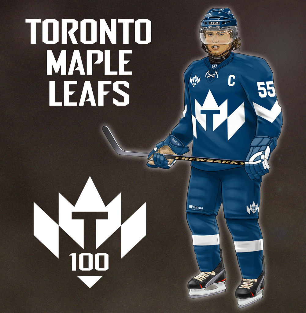
My thanks to everyone who entered my recent “Redesign the Maple Leafs” contest. The results are up now on ESPN ”” enjoy. One of the more interesting submissions, from Jim Brewster, is shown above.
Collector’s Corner
By Brinke Guthrie
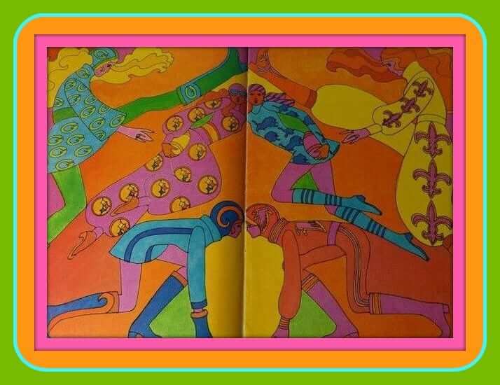
I believe this one has run before, but the advertisements in here are just too good not to bring it up again: This is an NFL 50th-anniversary insert from Life Magazine in 1969. (Kids, ask your parents.) Age of Aquarius, baby.
Okay, now let’s ring out 2015 with our final picks of the year:
• A 1970s ashtray featuring Bruins goalie Gerry Cheevers? Sure, why not.
• Look at the great detail in this Sears ad. You have a Johnny U. football, an “All-Sports Shoe,” and a Rawlings ball for the NFL and Franklin for the AFL. They also snuck in a baseball glove for Bud Harrelson, “The Backhander.” The eBay listing says it’s from 1969, yet it features the two teams from Super Bowl I, so maybe the date is off.
• Great artwork on this 1960s L.A. Dodgers pennant.
• More nice artwork to be found on the cover of this 1976-77 Philadelphia Flyers calendar.
• There’s How-ard Coh-sell enjoying a cold Bud in this 1970s Monday Night Football/Budweiser promo T-shirt.
• Nice vintage graphics on this 1970s Tudor NFL electric football game, with the Juice on the loose on the front.
Landry’s Seafood House in New Orleans says “Go Saints!” on this 1970s bumper sticker. (Shouldn’t that be “Geaux Saints?”)
• This one has Sears written all over it: a vintage 1970s Vikes pom ski hat with the classic “Official Licensed Product” tag. The eBay seller has several other teams available, if you’re interested.
• There was a big leaguer way back when named Owen Friend. He had a baseball camp at one time, and this is the T-shirt from that camp.. Read the interesting story on the auction!
• The 1970s Swingin’ A’s want to Make It Happen — says so on this button.
Follow Brinke on Twitter: @brinkeguthrie
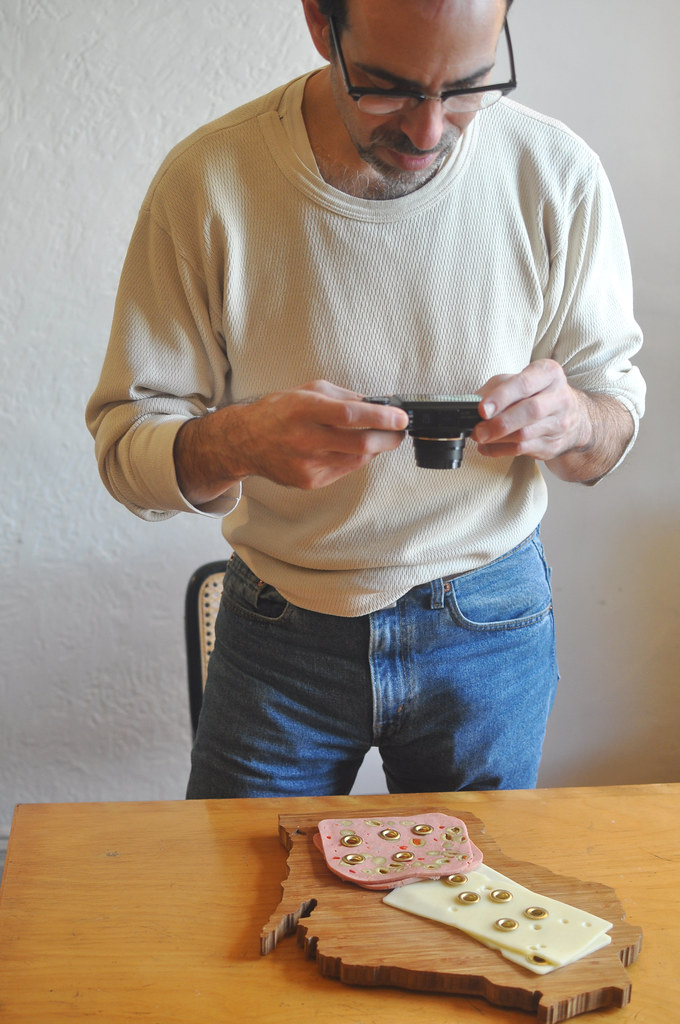
Photo by the Tugboat Captain
Behind the scenes at Gromm•It: A reader who I won’t embarrass by naming him here sent me a note the other day, as follows:
I’ve had it with all this grommet shit. I get that it’s your website and you can do what you want with it, but stick to uniforms and stop shoving this crap down our throats. The whole thing is stupid and I’m sick of it! I’m don’t know what’s worse — that you waste your time on this crap or that you waste our time by posting it! Cut the crap!
I’ve received a few other anti-Gomm•It notes that have expressed similar sentiments. The interesting thing about these notes is that their general tone of anger and disdain is precisely — precisely — the same type of reaction that many people used to have when they encountered Uni Watch for the first time. And the underlying impulse is obviously the same as well: Some people get very uncomfortable when their hierarchy of priorities is challenged, and they lash out as a result. A guy who spends his time putting grommets in food is apparently as upsetting to some people as a guy who spends his time writing about uniforms, because it represents a world where the normal rules of what is and isn’t important don’t apply.
Uni Watch wasn’t the first project of mine to have prompted this type of reaction, and Gromm•It probably won’t be the last. For better or worse (probably a bit of both), my sensibility has always been a bit off-center, so my work — dating back to the 1990s, when I wrote about excruciatingly small details of consumer culture ”” has often resulted in a sizable number of people who Don’t Get Itâ„¢. Most of those people just scratch their heads for a few minutes and then resume going about their business, but there are always a few who get angry, because for some reason they think my work represents a fissure in the Way Things Ought to Be.
I’m used to this by now. But I’m a little surprised — and, okay, a little disappointed — to hear this type of response coming from Uni Watch readers, who really should know better. Many of you, or maybe even most of you, know all about what it’s like to pursue a niche interest that can result in mockery or scorn from others. I realize that most of you don’t care about Gromm•It (just like most of you don’t care about Permanent Record, or Show & Tell, or the Candela Structures, or most of my other side projects), and that’s fine — like I said, I realize my sensibility isn’t for everyone. But for a Uni Watch reader of all people to lash out against something just because you don’t understand it, especially when you’re free to just scroll past it? Come on, people — look in the mirror.
Anyway: Possibly the best Gromm•It entry yet went up yesterday afternoon, whoo-hoo! And I’m continuing to add more each day. Check it out here — unless, you know, you don’t want to. Thanks.
The Ticker
By Mike Chamernik

Baseball News: Here’s a great article about Bonnie Erickson, a designer who created many notable mascots (and Muppets). In addition to the Phillie Phanatic, Youppi!, and the White Sox’s Ribbie and Roobarb, Erickson created a mascot for the Yankees in the late 1970s. Dandy was scrapped a week before it was set to debut in 1979 (from Gordon Blau). … The baseball mascot in the kids’ book Goodnight Baseball wears stirrups (from Chris Flinn).

NFL News: NBC Nightly News flashed a hybrid NFL logo during a segment on Peyton Manning last night. It looks to be a combo of the current logo and the pre-2007 logo. I think I know how it happened: The first result on Google for a search of “NFL logo” takes you to this page. Whoever selected the logo couldn’t tell any differences (from Jack Spirit). … The Packers sell player-used laundry bags. Sweet! I love the old logo. I need to find one of those bags.
College Football News: Florida State will go all-garnet for the Peach Bowl on Thursday (from Phil). … A fan at the Navy-Pitt bowl game yesterday wore jersey with F. Paterno as the NOB (from Adam Fasullo). … Baylor is adding a gold chrome BU decal for its bowl game today. Baylor’s opponent, UNC, will wear all-white (from Phil). … Matt Busch was at California Lutheran’s hall of fame and saw this photo. “I’ve never seen a Northwestern stripe used on the shoulders and on the sleeves at the same time,” he says. ”¦ Minnesota’s bowl game media guide includes a uniform tracker (thanks, Phil).

Hockey News: At the hockey World Juniors, Sweden wore CCM jerseys for pregame warm-ups and Nike jerseys for the actual games. Here’s a possible explanation. … Whoever prepared this graphic really got his team logos mixed up (from Tony Tengwall).

Basketball News: The Lakers and Hornets each wore dark colors during their game last night ”” purple vs. black. As you can see, Charlotte wore its Buzz City sleeved alts (from @LBoogie5). … The Clippers wore their black alternate uniforms last night. … One of Meadowlark Lemon’s 1980s traveling teams had a fantastic warm-up suit theme. … An Alabama high school has some great striped warm-up pants. ”¦ The Mavs wore their green throwbacks at home last night, leading the Bucks to wear white on the road.

Grab Bag: Check it out: Not one, but two compilations of the best logo changes of 2015. … Will Scheibler sends along two 1940s roller derby photos — and they’re both really good. … Rapper Soulja Boy is getting his Gucci logo tattoo removed from his forehead. … The mascot for the 2018 Asian Games has been unveiled.

What Paul did last night two days ago: On Sunday afternoon I went to see the new Quentin Tarantino movie, an ensemble Western called The Hateful Eight. As you may have heard, it was shot in 70mm Panavision, and the studio actually bought up a bunch of old 70mm projectors on the collector’s market and supplied them to theaters for movie’s initial run in select cities. (When it moves to full nationwide release, it’ll be screened more conventionally.) The initial run also includes an intermission — helpful, because the film is more than three hours long.
And it feels even longer. I’m a Tarantino fan (my top three: Basterds, Pulp Fiction, and Django), but this movie is a stinker. The plot, such as it is, is tedious, the characters are uninteresting, and wit is in desperately short supply. I’m not opposed to splatter per se, but I feel like Tarantino used it here mainly to distract from the film’s other shortcomings. Similarly, I’m certainly not opposed to Samuel L. Jackson, but the film leans waaaaaay too heavily on him. (He’s deployed much more effectively in Spike Lee’s Chi-Raq, which is also a much better picture.) There’s an intriguing subtext about the Civil War, but it’s not enough to sustain the film.
The main character is played by Kurt Russell, who, by coincidence, recently starred in another ensemble Western that I absolutely loved: Bone Tomahawk. It’s available on demand and is much, much better than The Hateful Eight — see it. Here’s the trailer:
Am I the only one who sees Admiral Ackbar from Star Wars in this picture?
link
How about the Atari logo?
link
Right on both.
Is that NFL ad Peter Max?
I don’t see the signature “Max” signature on this one. So I think it is only Max-like.
Gromm-It does nothing for me but it’s not worth bilious rage or anything, so whatevs.
Dandy the Yankee mascot would have been awful – and yet those awful Yankee teams of the ’80s somehow deserved that fate. It’s like that era never happened in Yankee history.
I wish the Mavs did their green throwbacks with the round numbers. It looks wrong otherwise.
Before we run out of link, might you grom on to one?
I think the gromm-it idea could be interesting if expanded beyond foodstuffs to manikins or anatomical models.
Love Mr. Brewster’s new Leafs logo. Uniform itself could use more contrast, perhaps different breezers?
Yeah, I don’t really get the Gromm-It thing, but being angry about it is downright silly. No one’s going to arrest you if you don’t read it. Just skip that section, man! I think that if someone’s harmless project pisses you off that much, there’s something else going on in your life that needs fixing.
Possibly it is their mouse scroll wheel that needs fixing.
don’t mind the grommet pics, but I am glad that you made a separate site for it. I can look at the picture and keep scrolling. It ain’t no thang
Many of the readers may not share my opinion on gromâ—it-gate… it it sad to me that you aren’t judging the room. Obviously you are entitled to your niche, but it’s not like I’ll be reading your grommet articles on Joann Fabric’s website anytime soon. Embrace what is making you part of our daily lives, though I do appreciate the link minimizes scrolling fatigue.
Loved the mascots/Bonnie Erickson article. I remember seeing “Dandy” at a couple of Yankees games back then, wish I’d taken a picture of him!
Don’t you love how people get all torqued up about things you put on YOUR website? I don’t know, maybe in other parts of the country It’s harder to scroll past something?
Was at the Mavs game and it was great. You could really see the uni numbers from the upper deck. Block font always, always rules. Our uni forefathers knew what was up.
Sears ad….
Why does the Chiefs uni have blue stripes on the sleeves?
“The first result on Google for a search of “NFL logo” takes you to this page. ”
At the bottom of the page are several team logo montages. Each with thirty-FIVE logos. I’ll leave to you to figure out the duplicates and/or the missing ones!
These days I am enjoying the non-jersey stuff on Uni Watch (including Gromm-It) more than the normal sports stuff. I believe my personal jersey arc is such that I’m still interested in jerseys, but the frequency of change, plus the uninspiring designs, leaves me to scroll past the jersey stuff a lot of times, and pay more attention to anything more interesting or unusual.
I’m curious as to know the cost of all the grommets purchased. I guess like any hobby there’s a cost involved but the grommets are going into perishable goods – mostly – do you recycle the grommets after taking the pics or just toss it? Preserve the items?
The entire project so far has been done with (a) one grommet kit purchased for $11.99 and (b) one mini-grommet kit received as a Christmas gift. I recycle the grommets whenever possible, and I eat the non-grommeted parts of the food. (The food, actually, has been the biggest expense so far.)
Some preliminary research indicates that I can purchase an approximately lifetime supply of grommets for less than $100. I’ll be doing that soon.
Very cool. Thank you for replying!!
“lifetime supply of grommets” – I believe that I’ve found my new band name
LSG! LSG! LSG!
Gromm-It: Not for people who Don’t Gromm-Itâ„¢
Paging down past something I’m not interested in is fewer keystrokes than writing hate-E-mail.
I’ve only got a few strokes left (maybe). I need to conserve ’em!!
I’m with Andy. Interested in the economies and durability of the Grommit project, but especially on the Cheerios…man, how long did it take to stage that? Worth it though. I think it’s the best so far.
I’ve had my share of disagreements with Paul, but as for the Gromm-It, and other contents I’m not interested in, I just scroll on past. No need for unnecessary nastiness.
All: its funny how many of you think asking people to scroll past your content is acceptable. It’s a slippery slope… folks are fickle, they may not know when to stop. Maybe Paul should realize he has a good thing going… he seems like a creative guy, I’m sure he can find a way to express his creativity without ostracizing so many. If this were “will it squatchee” or “put a stirrup on it” there may be more acceptance in the universe.
Oh, please. I’m not “ostracizing” anyone.
I don’t mean that critically… obviously many people enjoy it, I did too the first few times. But you obviously hit a sensative area, ’twas just commenting on that. I’m sure you know you can do whatever you want, I just used to use your blog as a reason to STOP scrolling. Just trying to help, will look forward to seeing what other creative outlets you explore in the future.
I really hope that “put a stirrup on it” becomes the newest project. I’m just picturing leaving my stirrups laying on top of everything in my house now… television, my beagle, my child… hours of fun. Does nothing in your house remind you of the best look for baseball socks? Put a stirrup on it!
I don’t go out of my way to read Gromm-It, but I do find it to be a quirky and enjoyable hobby. If anything, it kind of piques my curiosity as to how you can grommet something like an egg and not have it break.
Anyone who has read this site for any length of time knows the best way to make Paul do a thing more is to complain that he does that thing too much.
Actually, I do things because they interest me, the end.
Oh, no doubt. You aren’t going to do something if it bores you. But if people complain about a thing, you typically don’t shrug your shoulders and hide it.
Grommit is UniWatch’s XFL.
Then again this is a guy who lets his blog readers know when he eats a sandwich at a bowling alley, so I’m not sure why everyone is surprised…
When did I eat a sandwich at a bowling alley?
On August 20, 2010, April 7, 2012 and September 14, 2013.
Lee
It’s probably just a tongue-in-cheek reference to your travelogues where you sometimes post some of the things you eat while on those trips.
Weirdest. Phone. Ever.
link
^^ FTW
Can confirm the existence of Dandy at Yankee games (1981 IIRC). My dad lost it for Dandy’s mustache curling in and out like a party favor.
Not a big fan of Gromm*It either but your service to my intellectual/frivolous interests by hosting and posting more than make up for the inconvenience of odd foodstuffs.
Maybe a compromise would be to post these non-related items (Perm Record, Gromm*it) below the Ticker, like What Paul Did…
As always, thanks for your site, obsession, and efforts!!!
+1
As someone who has used grommets in several projects, including jersey collars and puck bags, I can attest to their unique qualities and the enjoyability of handling and installing them.
The Gromm-It project is interesting as it isolates this experience from the expected application. Like a lot of art, having things out of context makes me consider it more, and makes me aware of things I may not have realized previously.
Love the Gromm-It, Meat-Ups (my name for your various meat outings), Travelogues and other side projects.
Keep up the great work!
Sad to hear you poo-poo the Hateful Eight. Being a big Tarantino fan (although I have not seen Deathproof), had high hopes for this one. I do find that Jackie Brown often gets overlooked as one of his better films.
I love “Death Proof” – Especially the extended stand alone version. That being said, it’s not everyone’s cup-o-tea and probably his least acclaimed film. Some just don’t get that the bad editing, cliche’d dialogue and cheesy effects were all 100% intentional.
Paul, no idea why someone would complain about you sharing one of your passions. I consider your Gromm*it a form of artistic expression. You don’t make people view the photos, you don’t tell people to read it. You simply present it as a window into your world, just as you do your travel escapades.
I’m glad you share alternate content, sometimes I actually get to expand my universe beyond Uni Watching. I know many others feel the same.
Collector’s Corner: The “Cosell” Budweiser Light t-shirt must be from the early 1980’s, as the beer didn’t exist until 1982. Picking nits, I know…
I saw the Hateful Eight yesterday in what was advertised as the Roadshow version. The “film” stopped just before the Intermission, and when it did, the screen pixelated which indicates to me that the theatre in question (Edwards at the Irvine CA Spectrum) wasn’t showing it using an actual film projector.
I don’t disagree with your revue of the film. I now know what a John Wayne movie (thanks to Russell’s impersonation of The Duke) directed by Sam Peckenpah would look like. Why for that matter would the Bruce Dern character be dressed up in a full CSA dress uniform no less (and probably a lot longer) than 3 years (Wyoming became a territory in 1868) the end of the Civil War?
Hey Paul,
Looking at the other comments, I can see I’m not the only one for whom Gromm-It isn’t their cup of tea. I, too, have just scrolled on by.
I’ve actually found it rather unpleasant, but one of the things I’ve found in life is where I am willing to think about and outline why why I do or don’t like something, others tend to simply say, “That sucks, FU.” So I’ll explain two reasons why I can easily see Gromm-It being disliked – one I could see for others, and one for me personally.
1. For others: Those of us who have been daily blog readers for years have grown to know and like you, Paul, and know your personality. We know you’re kind of a Bohemian Brooklyn hipster and largely embrace that, including your love for obscure film, music and Americana obscura. Gromm-It certainly seems like one of the most Bohemian hipstery things you’ve done, but it fits your personality, so we Get Itâ„¢.
But there’s very little more mainstream, i.e. the opposite of Bohemian and hipster, than sports and ESPN, which is where a lot of folks know you from. The same way a lot of folks love the new “costume” trend, and think you’re crazy for calling it out, those same folks probably aren’t the type who take time for obscure art projects, and there are clearly a lot of those folks out there because Nike, Under Armor and other companies continue producing costumes.
Like it or not, your blog is the best, one-stop shop for those folks to find out what’s new, so they probably see Gromm-It as a really weird and kind of frustrating obstacle to getting to what they want. And I don’t think these folks are the types to be tremendously thoughtful about how they tell you so.
I hesitate to even say all of this because I’m partially afraid that it will push you further towards just ending Uni-Watch, which would be a disaster for those of us who share your sensibilities. I’m not defending these folks, moreso just trying to explain them. But that takes me to why Gromm-It has been unpleasant …
2. … for me: I’ll admit, this might be obscure, but I’ll lay it out, anyhow.
I think this blog normally has great appeal to those who are more strongly affected by sensory input than most. Uniforms appeal to those senses – visually, of course, but also in terms of touch and feel.
I’m highly sensitive to textures. Certain textures feel great to me, while others are like nails on a chalkboard in terms of driving me mad. For instance, types of velvet with certain pile or plushness feel awful to the touch for me, which frustrates my wife because she knows I won’t touch her when she’s wearing certain outfits. It’s such a strong sensitivity that I can mentally, virtually, “feel” some textures just by seeing them. The way elastic ribbing hugs my skin feels really good to me; so socks with horizontal stripes that emphasize those subtle ribs conjure that feeling and look better to me. When Under Armor came out with its faux flannel, it bothered me because I knew, even though it was essentially just a pattern printed on polyester, just the sight of it in person would have made me itch, though I had a certain awe for the fact they could create a pattern that evocative and realistic.
As such, Uni-Watch is normally a place where I can embrace such feelings and even kind of have something in common with you, Paul, and other readers, many of whom also seem to have strong sensory reactions. And, usually, such reactions are pleasant and I find myself in agreement with most of the rest of the group.
The sensitivity to texture also applies to food. Show me a Hershey bar and I can mentally “feel” the force needed to bite through the bar and the crisp snap as a piece breaks off into my mouth and starts to melt. Show me cheese and I’ll mentally “feel” its smoothness and chewiness. Show me an egg and I’ll mentally “feel” its smooth surface and imagine it hard-boiled with its smooth white.
Hopefully you know where this is going now, but I’ll fill in the gap: With such feelings, Gromm-It creates an unpleasant, jarring cognitive dissonance for me. Here’s this Hershey bar, which I’d usually bite into with force and enjoy. But if I bite into a grommet with that kind of force, my teeth will shatter, I’ll experience the pain of a root canal without the anesthesia and what was pleasant will become decidedly not. I get that feeling just from seeing a grommeted Hershey bar. It’s a decidedly unpleasant thought.
The most jarring of the Gromm-It pieces, to me, were the cheese and the egg. The cheese because the grommets hid so well in the Swiss cheese that, to me, it was like, “Yeah, those could be in there and I wouldn’t know until pain was shooting through my face.” The egg because it was one, single, ominous grommet, big and in-your-face like, “Yeah, I’m going to haunt your dreams, hide in your food and surprise you and there’s nothing you can do about it.” That’s not pleasant art; that’s the stuff of nightmares.
So yeah, a place where I usually go for enjoyment now has a feature that gives me the heebie-jeebies.
Is it art? Yes! By all means. As such, if it interests you, you should make it. But a person’s reaction to art is subjective and personal, and my reaction is somewhere between avoidance and cringing because of how that art affects my senses negatively, especially on a site where I’m usually comfortable letting my senses run free.
So yeah, you have every right to post it, as it is your site, as you have the right to do whatever you want. But on top of the sensory cognitive dissonance created by the art, it creates a further cognitive dissonance for me when I go to a site I usually enjoy a lot and, in admittedly small bits, see something that creates those unpleasant feelings.
So yeah, if I could get you off the Gromm-It kick, I would. But I also haven’t stopped reading because of it, and I can see how those who are less thoughtful and willing to type than I am would distill their thoughts down to, “That sucks, FU.” As for me, I just scroll. Fast.
I’m with you on scrolling too. And while it doesn’t affect me anywhere near as much as it does my girlfriend, I can’t see anything related to these posts and not think of Trypophobia. For some people this might be their biggest fear broadcasted with great frequency and even the single pictures might be enough to upset them before they get to the link. I’m not saying Paul should stop posting the pictures, I’m just saying some people really don’t like seeing holes where they don’t belong and that’s exactly what these posts highlight. I don’t think similar fears exist for report cards and hosiery which might explain not hearing as much complaining.
I just Googled trypophobia. And now I think I have it. Gah.
That’s not a pleasant Google image search. At all. Granted, people probably post the most extreme examples. But gah.
Though yeah, it’s something along those lines that happens with me and the Gromm-It posts. Perhaps I overstated the strength of the feelings some — don’t get me wrong, it’s not like it ruins my day. But it’s not what I would call pleasant viewing.
I used the phrase “cognitive dissonance” a number of times in my post above, to the point of discomfort. I think trypophobia plays into that, too. It’s just a matter of seeing something someplace it doesn’t belong in a place that seems to be all about seeing things where they do belong, especially when the sensation one gets from one thing is good, but having a similar experience with the other thing is disconcerting. It’s why horror movies work — Prom is supposed to be one of the most awesome nights of your life, but Carrie slamming basketball hoops on people, electrocuting authority figures and burning everyone alive isn’t.
So yeah. Gromm-It, not pleasant for me in a place where finding harmony between colors, patterns and materials is often the goal. And I can see that inspiring angry reactions from some.
Sorry I did that to you Dan. I know people feel those feelings with varying degrees. I also know if Paul decided his latest artistic expression/side project was “spiders in ice cubes, eggs, and fruit” I would have been one of the vocal protesters right away of Arachno-corner.
No need to apologize — awareness is power. And the psychology behind it on the Wiki page is fascinating, especially how it speaks to our core instincts. I’m glad you brought it up. It piqued my curiosity, even while I was repulsed. Which may be part of Paul’s goal with Gromm-It.
Paul’s time is valuable, but I hope he sees these conversations. I think it’s part of why his art has impact, which, even if it’s unpleasant, is “better” than art that’s just wall dressing, even if it’s art that plays a part in making your skin crawl. Related but very separate conversation I had last night: “Schindler’s List” is spectacular art. That doesn’t mean it’s pleasant or I want to see it more than once, however.
To be clear: The people who’ve been angry about Gromm-It have been angry because they think it’s stupid, not because it skeeves them out.
Typophobia: I’ve been made aware of it, and those who suffer from it have my sympathies.
Cognitive dissonance: That’s one of the points of the project.
Fair enough, Paul, though sometimes people hide their skeeved nature, if you will, behind putting down others (calling you or the project stupid) rather than admitting their own insecurities. But, maybe there are folks who think it’s stupid. I don’t find it stupid, but I still find it unpleasant.
With cognitive dissonance, you’ve achieved your point, I’ll give you that, so it works. It’s just a point that kinda, as you put it, skeeves me out. But hey, your site, your thing, your choice, and like I said, it doesn’t stop me from reading. I was a little more put off by the column about the guy obsessed with anchorwomens’ boots than this, honestly. With this, I know it involves a mix of art in function (the grommets), food (a huge passion of yours) and doesn’t hurt anyone, other than maybe being a tad wasteful of food (but aren’t we all). The boots guy struck me as kinda creepy, any way you slice it. But this is ultimately harmless. It’s just not my (grommeted) bag, man. But I do enjoy your random trips through Wisconsin, bike stories and occasional trips to bowling alleys, so … it’s just preference.
So it goes. Good talk, onto other things.
The anger is unnecessary. Some could argue the project is as well, but then one could argue that about anything they don’t find pleasant or don’t understand. I don’t get why people get upset over something so insignificant but I also don’t get the interest in the project. That’s why up until today I’ve just been a silent scroller. It does nothing for me so I ignore it. I figured you don’t need to know I don’t read it and wouldn’t care as you’re a grown man and my lack of interest will have no impact on what you decide to do, so ultimately who cares, right? It will exist until you don’t feel like doing it anymore and then it will fade away. Until then, just keep scrolling and don’t let my girlfriend see the pictures.
I agree the anger is unnecessary. In most occurrences of anger in life, it’s unnecessary. Not to turn into Psychology-It, but I grew up with an often-angry Mom and my wife’s father also had a temper. Anger is often a reaction to a threat that seems credible due to an insecurity. It’s something I’ve been thinking about with our current political climate.
Paul does not deserve any anger for Gromm-It. Folks should be bigger than that. They often aren’t, but they should be.
Also, the Wikipedia article on trypophobia may be a great resource for Paul as to why it makes some folks feel ooked out. Reading the second paragraph was revealing for me.
link
“ominous grommet”
Actually, maybe THAT’S my new band name.
The Maple Leafs design contest results are up:
link
I notice that one of Tom Bierbaum’s redesigns contains a player in white pants. For years, I’ve wondered why hockey players never wear white pants. Since the issue has come up again, I’ll ask, why?
Primary reason: white pants are just so damn hard to keep clean, especially with black rubber pucks leaving marks. Much better to have pretty much any other darker color.
Secondary reason: tradition just makes it so that looks weird.
Will the new Leafs togs be permanent or just for the 2016/17 season?
Regarding Sweden hockey. CCM jerseys were for pre-tournament GAMES, not pre game warm ups. But it’s not uncommon for teams these days to warm up in different jerseys than the game due to sponsors or other events.
With Tarantino, quirky details such as wearing a full CSA dress uniform long after the war often have their sources in older films. In this case I think he was inspired by a 1967 spaghetti western called The Hellbenders (directed by Sergio Corbucci, who also directed the original Django). In that film, Joseph Cotten wears a full CSA uniform because he’s a nutjob who wants to revive the Confederacy. Given that The Hellbenders was selected by Tarantino for the First Quentin Tarantino Film Fest in Austin, TX, 1996 (per imdb), I don’t think this is a coincidence. (Haven’t seen Hateful 8, so I can’t say what the Kurt Russell character’s motivations are).
The Hellbenders: added to my ‘movies to watch’ playlist.
Thanks!
Lee
I meant Bruce Dern character, not Russell.
Kane Saunders Maple Leaf logos seem to be using Seattle’s Space Needle and not Toronto’s CN Tower.
This TV stations messing up logo graphics shit is getting ridiculous. I could see how someone not so keen could look over the hybrid NFL logo, so that gets a pass (it is a nice look, though). But the team logos constantly getting mixed up on TV? Come on now! Does anyone else get pissed off and think that they should be doing this job? Instead of some jabroni who knows nothing about sports and literally Googles logos only to select the wrong ones anyway, television stations should give these assignments to passionate fans such as ourselves, and alleviate viewers of all the unnecessary stress and suffering.
Tom Bierbaum’s helmeted maple leaf mascot with arms raised in the classic goal-scoring celebration position is absolutely brilliant.
I disagree with dark colored NFL uniform pants. I feel white is always the best, cleanest look. Silver, Gold & Yellow are “okay” but can’t stand darker hues like Blue, Red, Navy Purple, & Black. That being said, I still come to uni-watch even though I’m in the minority with this viewpoint.
I’m in agreement with you on that one. My other football pants “pet peeve” is those lacking a vertical stripe down the side of each leg (preferably not truncated by the team name). A couple of examples:
Saints… can’t stand their mono-black look. Their white-over-black option is better, but could be improved still by adding some gold and white stripes on the sides. Otherwise, they just look like the latest trend in women’s fashion, yoga pants.
As a Rams fan more or less by default, I really miss the yellow and blue they wore when they first moved here 20 years ago (and for a pretty decent chunk of their prior history). The gold pants they wore thereafter were good-looking, but would have been improved upon by adding some stripes. The white and navy elements they trot out every week now are comparatively dull, since gold is supposed to be one of their colors. And royal > navy.
I like the winner in the Leafs contest. Way too much tradition in the Leafs to alter it too substantially. They’re Original Six. In many ways, for many people, the heart of the looks for those teams are sacrosanct. Heck, I didn’t even like it when the Sabres and Blues changed theirs, and they’re just older expansion teams.
Doolin, I believe you are in the overwhelming majority here with your stance on NFL pants. Agreed.
I think I may have some type of medical condition that should be treated…but watching last night’s game was annoying. I was for some reason really disturbed about seeing the 2 different shades of orange on the unis. That’s all I could focus on during the game. How different the shades were and how weird they looked when players stood next to each other. I know its weird…. I’m weird…I wonder if there is a medical term for being annoyed by different shades of orange….
Probably bears noting for the next edition of “‘Skins Watch” that shortly before Christmas, the D.C. Court of Appeals, in a 9-3 decision, held that the provision of the federal trademark law on which the US Patent & Trademark Office based its decision to rescind trademark protection for the Redskins name was held unconstitutional. Link is below, but fortunately for those w/out the time or inclination to read a 110-page legal opinion (by which I mean, sentient beings), the money quote appears early on in it (p. 4):
The government cannot refuse to register disparaging
marks because it disapproves of the expressive messages
conveyed by the marks. It cannot refuse to register marks
because it concludes that such marks will be disparaging
to others. The government regulation at issue amounts to
viewpoint discrimination, and under the strict scrutiny
review appropriate for government regulation of message
or viewpoint, we conclude that the disparagement proscription
of § 2(a) is unconstitutional. Because the government
has offered no legitimate interests justifying
§ 2(a), we conclude that it would also be unconstitutional
under the intermediate scrutiny traditionally applied to
regulation of the commercial aspects of speech.
link
That was already listed/linked in last week’s edition of ’Skins Watch.
Hi Paul,
I’ve read and loved your site for a long time but I’m commenting for the first time here. One reason I think you might have gotten some nasty blowback about GrommIt that I don’t think anyone’s mentioned yet is because you often do the same thing. Somebody who doesn’t appreciate GrommIt may figure, “Hey, if Paul can call Nike people douchebags for putting annoying logos on jerseys, I can attack him personally for putting annoying grommets on foods.” Just something to consider.
If Paul was doing this with the intent of selling “alternate lemons” you might have a point. Nike does it to push the uniform merchandise, that’s all.
This argument/comparison would have merit if all I ever said about Nike and their ilk was “douchebags.” But “douchebags” is actually shorthand for many years’ worth of substantive critiques that I’ve leveled at Nike and their ilk.
If someone can come up with a substantive critique of Gromm-It, I’m all for it. But simply being angry at its existence doesn’t cut it.
Apologies, Gromm-It haters, if Paul’s link added a microsecond to your scrolling. As long as you’re voicing your displeasure, let Paul know the exact teams/sports you’d like him feature, so as not to waste any more of your precious free time.
Paul, thank you for continuing to expand the horizons of us knucklehead sports fans. Gromm-It is an intriguing form of art and I simply like it. A request, if possible: grommet a can of Comet!
Great job by everyone on the Maple Leafs uni design. I do agree, the most simple one was the best one.
This will make me sound like a total fanboy, but I really enjoy Gromm-It. Just as UniWatch is a diversion from my daily activity, but one that I pay very close attention to, Gromm-It is a diversion from UniWatch that doesn’t require a lot of attention (sorry, Paul). It is, however, a world of fun. Seriously – grommets in eggs, potatoes, meat, CHEERIOS?!?!? How can you not look?
Paul is basically living out the George Bernard Shaw quote: “Some men see things as they are and say why.
I dream things that never were and say why not.”
Grommets in food? Discarded report cards and other documents? A forgotten World’s Fair structure? Bring them on!
a diversion from UniWatch that doesn’t require a lot of attention (sorry, Paul).
No apology needed. Most of the entries have little or no text. They’re not intended to be big time-sucks; just intended to be interesting (and, ideally, to develop cumulative oomph as the number of entries increases).
The Leafs redesign contest was good fun, Paul…
It’s great to see the different takes.
I don’t think that the Leafs should tweak their existing unis too much.
It’s an iconic brand. Change (if any) should evolve slowly IMO.
However…that’s what 3rd unis are for… throwing something different out there and see how it looks in flight. Do up a third 100th anniversary uni for the season. If the fan base grows to like it, then keep it.
If not, move on and try something different.
There’s nothing wrong with keeping tradition for the most part, but throwing some pizzaz out there once in a while…It’s a long season!
Thanks for the contest Paul…well done.
Oh yeah…re: white pants- They look pretty good for the odd game, but light coloured pants get looking real grungy, real fast when used on a regular basis.
Oh yeah…re: white pants- They look pretty good for the odd game, but light coloured pants get looking real grungy, real fast when used on a regular basis.
In fact, I think that’s the reason the Washington Capitals abandoned their white pants fairly early in their inaugural season.
On top of the grungy factor, there is also that the white pants became see through when wet.
Hey Paul and all… a LOT of great stuff today, both as an entry as well as the comments. Love it. Always makes my days better, day after day.
Thanks!
Lee
Re Gromm-it. I don’t follow the hostility, even if you do think it’s “stupid”. OK, it’s stupid; so what? Lots of shit we spend time on can easily be called stupid (or in some cases, almost everyone would say so). Not sure why that’s relevant. One might make a very nice argument that spending time thinking about and reviewing, commenting, etc. about sports uniforms is equally stupid. Not your thing? Move on. Taking the time to actually write Paul to bitch about it is what strikes me as most stupid.
As an aside, I love the pics with the grommited (sp?) nuts. Hysterical.
why bother with creating another site when you still post it on uni-watch?
More traffic here, I suppose.
Folks, it’s not as if Paul did an MTV and completely abandoned his original format. Uni Watch is still about the unis, with some other stuff thrown in for fun. Enjoy what you like, skip what you don’t. Easy.
I find it odd that anyone would be so upset over the grommet coverage that they would feel compelled to write a complaint email. Maybe “odd” isn’t the right word. “Funny” is probably the right one.
I love this site specifically because of things like the grommet project. Paul creates (and investigates) things that I wouldn’t normally think much about, and it’s always fun to see what’s coming next.
So, to the person that took the time to submit a complaint email…I guess just go ahead and fuck off.
Paul, I enjoy your websites and non uniform related content. Keep it up!
That said, seeing grommets in lunch meat is like seeing needles shoved into Halloween candy. It just makes alarms go off in my brain as if someone is maliciously trying to make food dangerous. I imagine my teeth clanging off of those chunks of metal, and my spine tingles. I can’t look…
But that’s just my unique reaction to those photos. Keep doing your thing!
For what it’s worth: I am in no way trying to make the food look malicious (although I’m definitely trying to make it look different than it normally looks). Needles in Halloween candy are hidden; the grommets are right out there in the open.
Grommets are fine, but what I really like are all those pencil sharpeners around the door frame.
When is GrommItCon gonna happen?
The grommets aren’t my thing after the first 3 days. Cool for the first few items but to me all that remains to be done is some grommets over a shark body.
But I can scroll past grommet stuff as easily as I scroll by the camouflage pics.
I’m pretty sure that Yankee mascot, or at least one similar to it, did make it into Yankee Stadium at some point in the 80’s. Under a different name maybe?
As far as he Gromm*It stuff, I personally find it really interesting (I’m not the Brian above). It’s not something I would ever do myself, but personally I have a lot of weird interests, be they sports uniforms or vinyl records or action figures. Heck, I make my living as a freelance writer and the main site I write for is dedicated to comic books.
It takes a special kind of arrogance to come to someone else’s website and tell them to “cut the crap”.
It’s Paul’s site, if he wants to post a series on the history of breakfast cereals, that’s his choice.