For all photos, click to enlarge
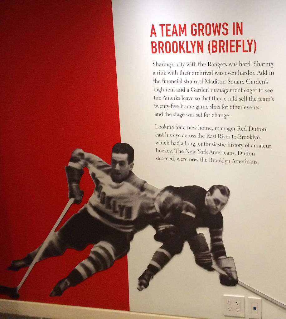
The Brooklyn Historical Society currently has an exhibit devoted to the Brooklyn Americans, the NHL team that was known for most of its existence as the New York Americans and was then rechristened as a Brooklyn team (even though it continued to play at Madison Square Garden in Manhattan) for what turned out to be the franchise’s final season, 1941-42.
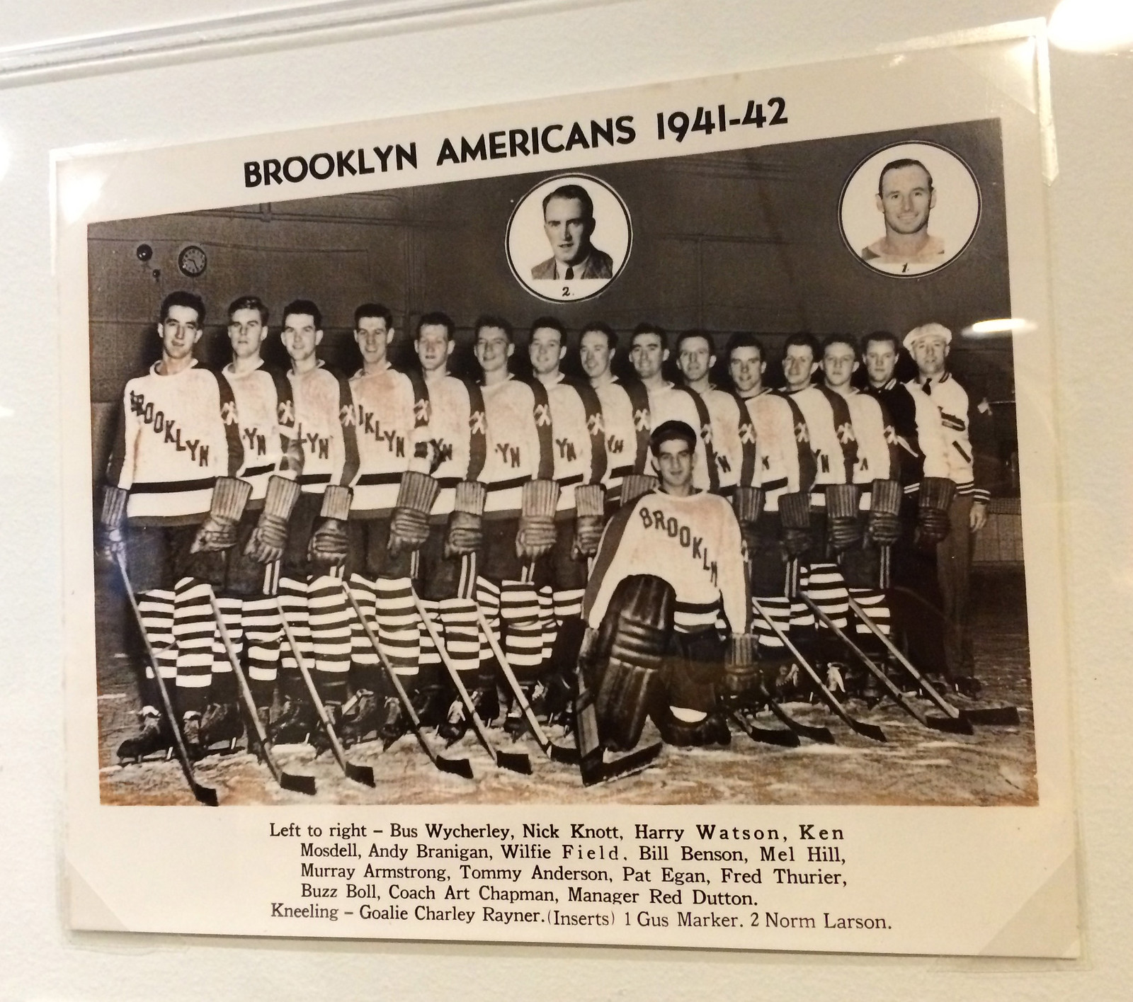
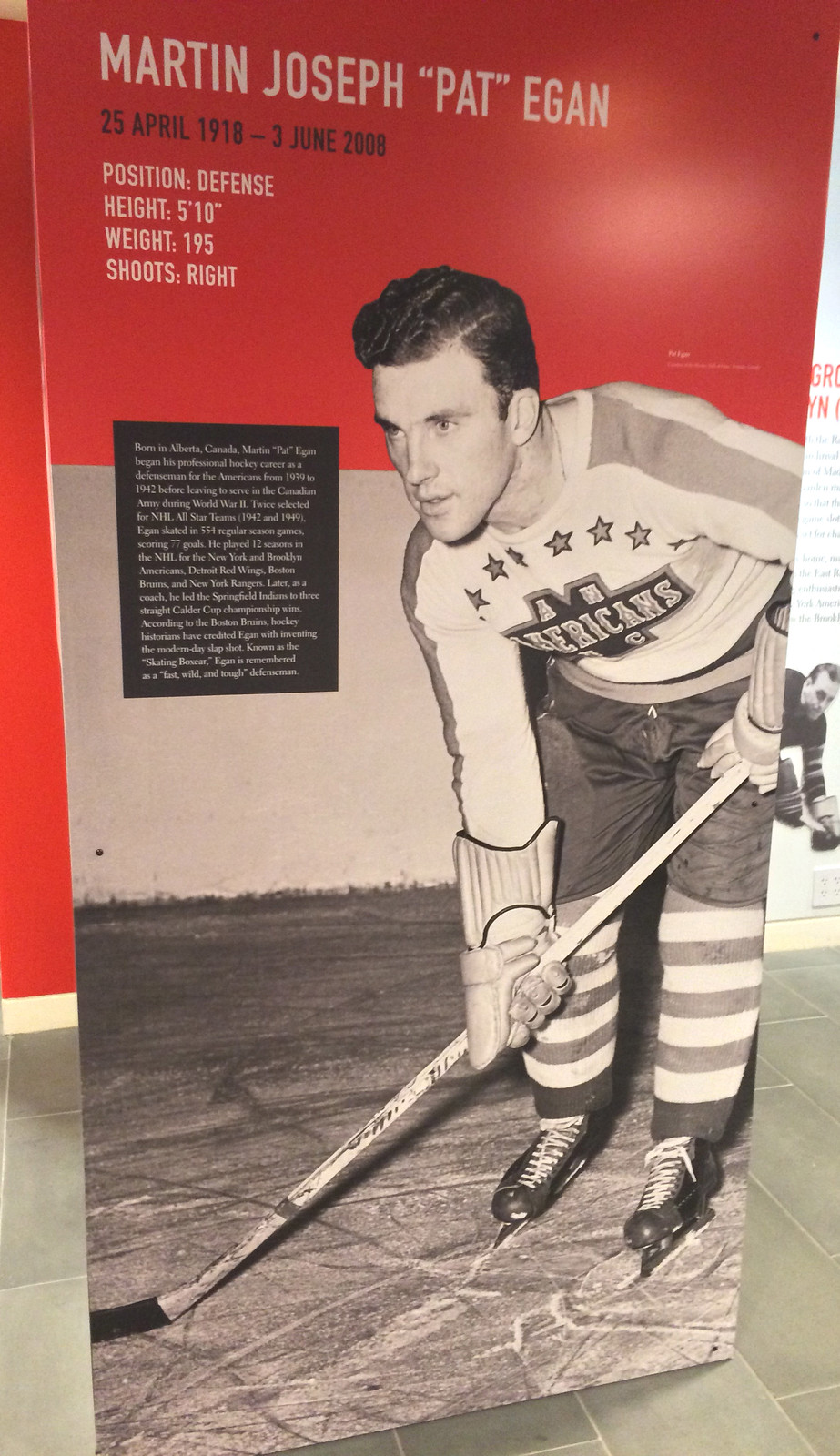
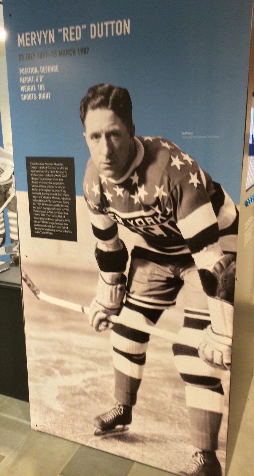
I’d been meaning to check out the exhibit since reader Marc Rivlin told me about it back in September, and I finally got around to it last week. It’s full of interesting photos, videos, and artifacts (many of which are from the team’s pre-Brooklyn years but are still great to see). Here are some of the highlights, beginning with a team portrait:
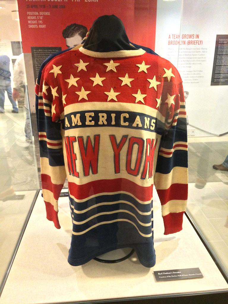
From a uniform perspective, the low-hanging fruit is this spectacular Amerks jersey:
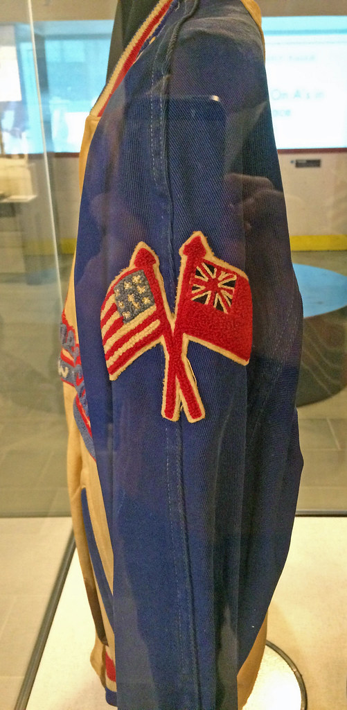
There’s also a really nice Amerks jacket:

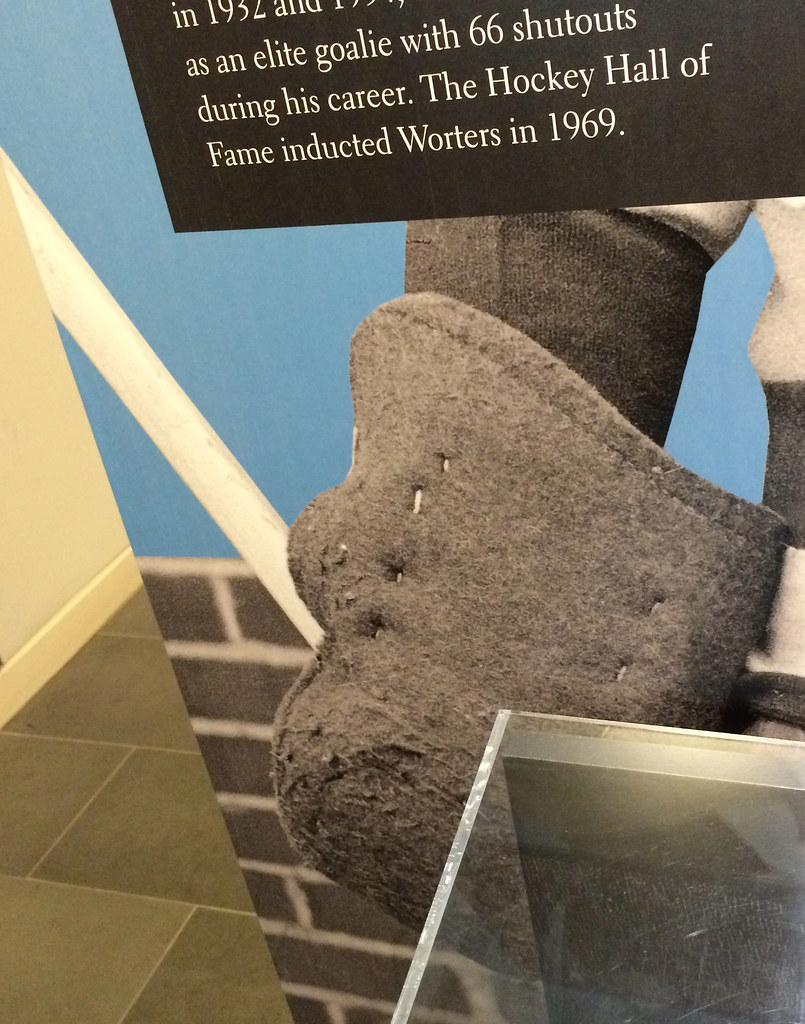
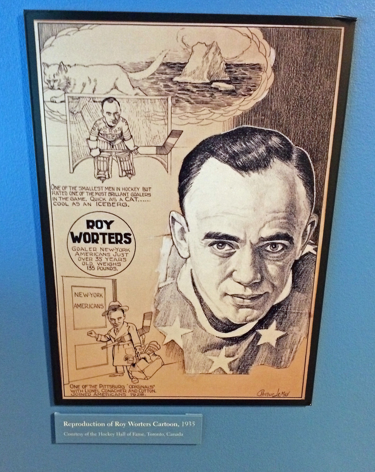
I was amused by a photo of goalie Roy Worters that shows him wearing a blocker that appears to have been little more than an oven mitt:
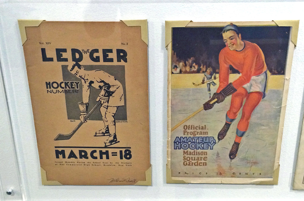
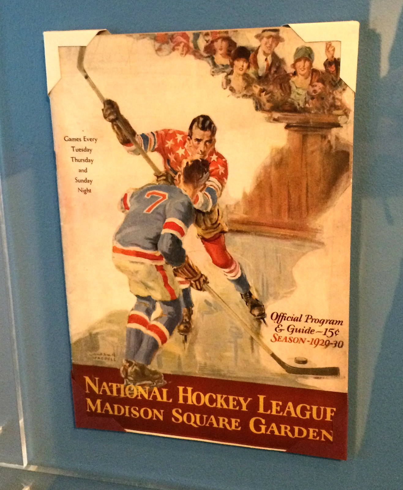
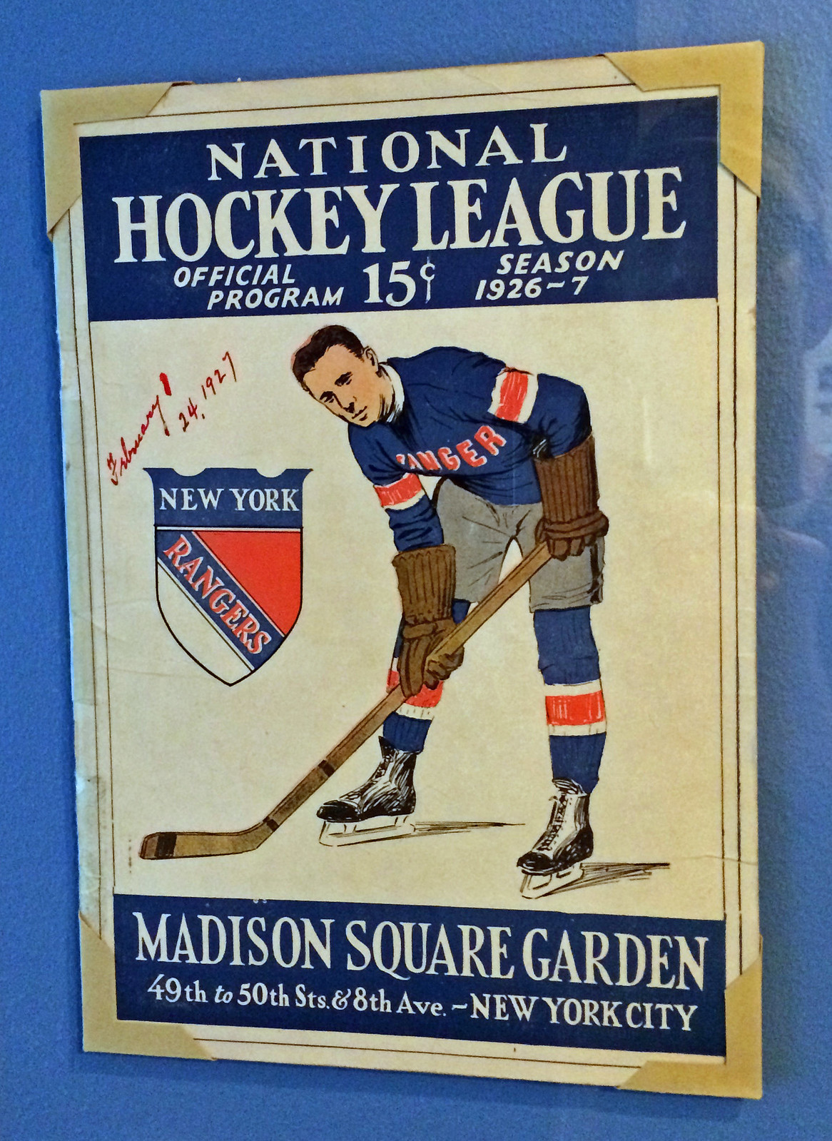
There are several old game programs, a few of which are real beauties:
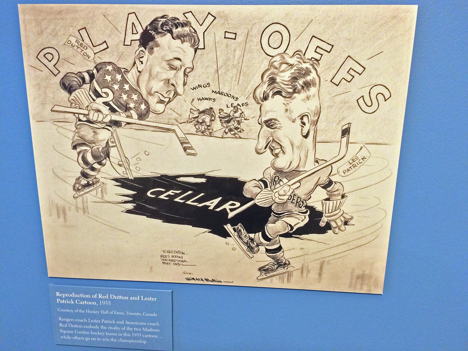
There are also several cartoons and caricatures, including one by the great Willard Mullin:
I was particularly intrigued, and also frustrated, by these two scrapbooks. Naturally, they were under glass, so there was no way to flip through them, grrrrr:
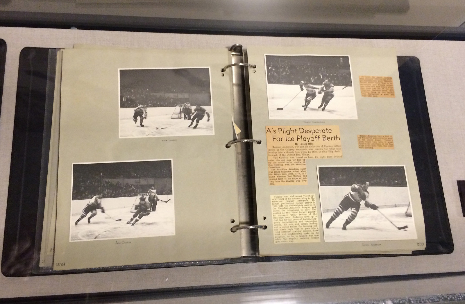
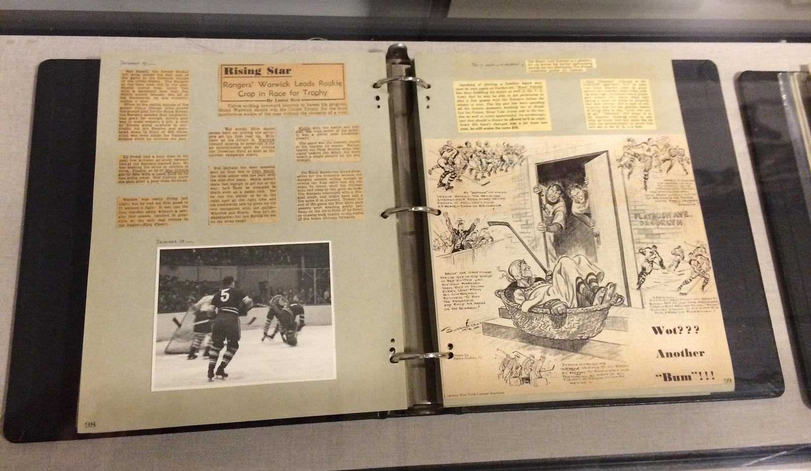
If you’re a serious fan of hockey history, you might recognize some of these players. Even if you don’t, the photos are really nice:

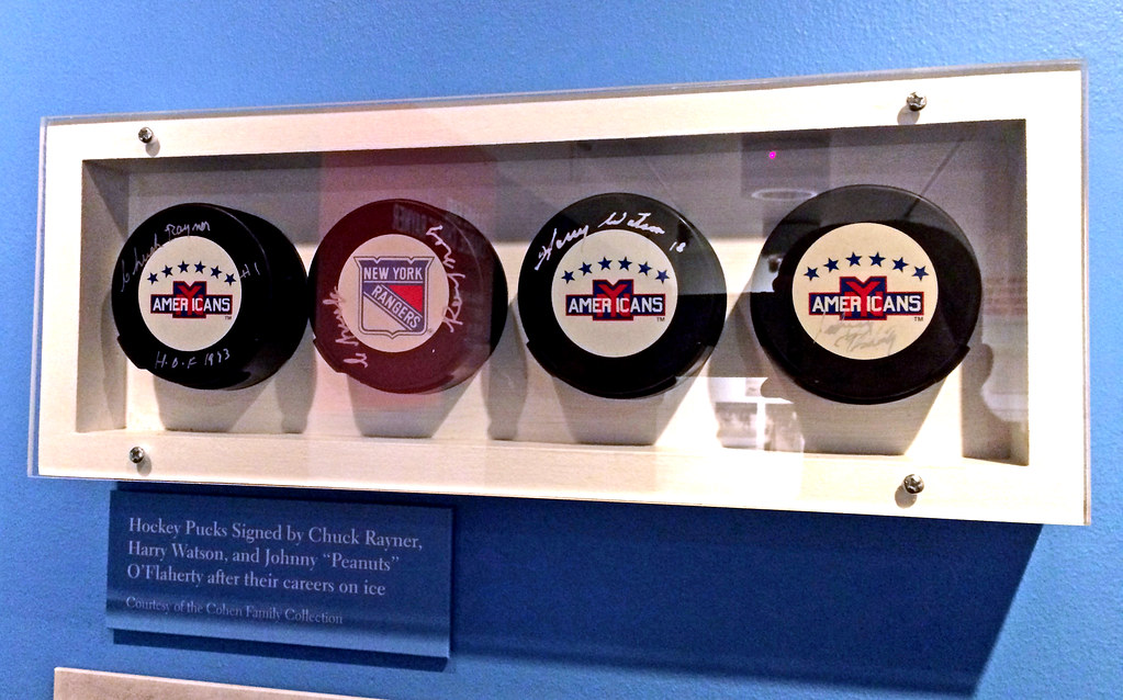
There’s a nice little puck display, and also a large puck-shaped chair/bench thingie, which felt like it was actually made of (or at least covered with) rubber:

Finally, there’s a long timeline Brooklyn hockey history. I tried to capture most of it in a panoramic shot, although it’s a little choppy:

“The Brooklyn Americans: Hockey’s Forgotten Promise” remains on display at the Brooklyn Historical Society in Brooklyn Heights through March 27, 2016.

Click to enlarge
My new favorite piece of hardware: Had to do a little home-improvement project yesterday that involved buying a grommet kit at my local hardware store and then installing a few grommets onto something. It made me realize — and not for the first time — that grommets are totally cool. They make everything seem nicely light-industrial, and I like the way their edges form a tight seal.
That got me thinking: What else can I install a grommet into? What would make the most interesting juxtaposition of grommet and object? It was tempting to hammer one into my palm, but I resisted that urge and instead raided the pantry to come up with the results you see above. Of course, a true grommet goes through something, not just into something, but it’s a decent start — kinda gives new resonance to the terms “factory farming” and “processed foods,” no? (I had baked a batch of chocolate chip cookies the day before, so I tried putting a grommet through one of those, but the cookies kept shattering. Might have to put do it right when they come out of the oven next time.)
As some of you are probably aware, the food writer Daniel Shumski has created a bit of a cottage industry around the notion of reheating things in a waffle iron, a project he calls Will It Waffle? With that in mind, maybe I’ll call this new project Will It Grommet?
More to come, I’m sure.
The Ticker
By Mike Chamernik

Baseball News: An empanadas shop a few blocks from Wrigley Field has a mural of Mexican painter Frida Kahlo in a Cubs road jersey. … What if the Montreal Expos came back and became a basketball team? A gamer created an Expos court and uniforms in NBA 2K16. … Mookie Wilson wore big reflective cop sunglasses at the plate (from @MM4039). … People who signed up for the Wayne Gretzky fan club in the late 1980s received a photo of the Great One in a Dodgers jersey. Scroll down on that link for a few more classic Gretzky pics. … The Reading Fightin Phils released a gold emblem celebrating 50 years in Reading.

NFL News: The Pro Bowl uniforms were officially unveiled, although it’s not much of a surprise because the designs had first surfaced nearly nine months ago. … Here’s a good history of the Bears’ uniforms (from Phil). … WRs DeSean Jackson and Dez Bryant exchanged signed jerseys after Monday night’s Washington/Dallas game. … My buddy Jeff Bertheau took a trip to Arizona last week and found an Obama ’Skins jersey at a resale shop, which is odd on multiple levels. He also attended an Arizona Coyotes game and got a kick out of a P.F. Chang’s junior hockey jersey. The program is affiliated with the Coyotes.
College Football News: Looks like Michigan State will wear this against Alabama in the Cotton Bowl. “Not sure they’ll be in dark, as Alabama is higher seed, but with swooshie, who knows,” says Phil. … Oregon revealed what the Ducks will wear in the Alamo Bowl. … Washington State has new laundry facilities (from Phil).

Hockey News: John Lennon received a Canadiens jersey in 1969. Yesterday was the 35th anniversary of his murder. … A few people sent this in: The Spokane Chiefs will wear very nice Spokane Canaries throwbacks on Dec. 19 (more photos can be seen here). The Canaries were a Pacific Coast Hockey Association team during the 1916-17 season. … Two items from Nicholas Maibroda: PK Subban and Ray Bourque are each wearing altered jerseys in this photo, as Subban has his Reebok logo blocked out and Bourque has his Bruins logo taped over. Second, “this one is from Patrick Roy’s last game in Montreal back in 1995, big old cheater pad showing on his hip.”

Basketball News: The Cavs wore sleeves and went color-vs.-color against the Blazers last night. … The Warriors wore their cable car throwbacks in Indiana yesterday evening (from @RNs_Funhouse). … An artist has combined all the teams’ logos into one comprehensive artistic logo for each NBA conference. Very neat! … Also, an artist created NBA-themed state flags for every team. … Kobe Bryant broke Jonas Valanciunas’s hand when trying to block a shot a few weeks ago, so Kobe signed Jonas’s cast when the Lakers played the Raptors again on Monday. … Speaking of Kobe, someone made a large snow portrait of him on a basketball court at a university in China. … On Instagram yesterday, Mitchell & Ness posted a photo of a Bobcats hat in its new cap line. Must have been a mistake, because the hat isn’t included in the online shop. … The Bucks will play on their alternate court tonight. … A young Bucks fan got the team’s logo shaved into his head. I’m surprised by how good it looks. … Last Bucks item: Bango, the team’s mascot, got a yearbook portrait in the Bucks’ media guide. … This month’s issue of Slam had a whopping 16 pages dedicated to Stance NBA socks. Jeez, Stance, we get it, you make NBA socks now. … Watertown (Wis.) High has illegible jersey type (from J Goede).

Soccer News: DC United finally unveiled its new crest (from @alcamp15). … The USA women’s team has been fighting against having to play on artificial turf, most of which is dangerous and ill-suited for soccer. The players even called off this weekend’s game against Trinidad and Tobago because of the shoddy turf at Aloha Stadium in Hawaii. … Two items from Patrick Thomas: The Chilean club Colo Colo unveiled these jerseys and AC Milan showed its 2016 home shirt. … An official in the Wolfsburg-Manchester United match wore teal socks.

Grab Bag: Boxer Rafael Rivera wears the Green Lantern’s logo on his trunks. Why? Because Rivera’s nickname is “The Big Bang,” and the Green Lantern’s logo is also worn by Sheldon from The Big Bang Theory (from Gabe Oppenheim). … North Carolina is creating a new state logo. … Wegmans, an East Coast grocery store chain, has unveiled a 100th-anniversary logo. ”¦ Krispy Kreme rigged up a scannable stream of glaze in the shape of a bar code, which is redeemable for a free donut. Now they just have to figure out how to glaze a bar code onto a donut (from Scott Davis). ”¦ Here’s an article on rugby numbers from an announcer’s perspective. “It makes more sense if you know going in that rugby numbers denote specific positions, and can change for a player from game to game,” explains Kevin Mueller.
Proofreading: “The Canaries were a Pacific Coast Hockey Association during the 1916-17 season.”
“Boxer Rafael Rivera wears the Green Lantern’s logo on his trunks. Why? Because Rivera’s nickname is “The Big Bang,” and the Green Lantern’s logo is also worn by Sheldon from The Big Bang Theory”
Jeez!… a couple more degrees and he could put bacon on his trunks.
It wasn’t just an official (in soccer they are referee and his assistants), all 5 of them (in UEFA Champions League you have 2 extra assistants behind the goals) have the same uniform.
Anyway, it was really odd to see them dresdef like that
The oddest part in the article about the US National Women’s Soccer fighting against playing on artificial turf was that the Men’s team does not play on turf, and that grass is installed in artificial turf stadiums for the Men’s team but not the Women’s. Based on the article it seems like they have a valid complaint.
You have to thank FeeFah (FIFA) and the former President of “Everybody” – Sepp Bladder and his ilk for the current situation in women’s international soccer.
On the bright side Loretta Lynch et al seem to finally be bringing the croniest and corrupt of sports organizations to heel ( the NFL Cartel notwithstanding ). So one fine day, just maybe, the womens national teams might be able to finally earn the right to play on the same kind of field as the men.
Mr. Bladder also said he wanted the women to wear tight short shorts… and I am totally conflicted about that one.
Agreed on FIFA’s role in this.
But they do have a point when it comes to the efficacy of turf for the purposes of weather. Two major world tournaments have had to be moved or interrupted because of weather; last year’s Club World Cup in Morocco and this year’s CONCACAF U-20 women in Honduras.
An artificial grass pitch would have drained in an hour or two. Not so much a natural grass surface in tropical conditions where there are rainy seasons.
And unlike what the rhetoric says, men do play on artificial grass — even MLS’s Revolution and Sounders do it. Also, the Russian Premier League and others in northern Europe.
And I don’t see what Our Women are complaining about — we WON the World Damn Cup on artificial grass!
Totally apples and oranges.
Abby Wambach was one of the main voices in the complaint that the World Cup should be on grass. She would always say (paraphrasing here), “Clubs can play on turf, but the World Cup is supposed to measure the best in the world, and soccer is at its best on grass, so please put it on grass.” Not to mention that turf gives greater risk for errant bounces, knee ligament tears, and epic carpet burn, plus the general principle of FIFA’s unequal gender treatment.
(The Jeff’s point below: It might be expensive, but in 1994, when the men’s World Cup was in the USA, they brought grass in for one game at the Pontiac Silverdome. Meanwhile, the Canadian stadia for the women’s World Cup [turf default for home clubs, not disputing that] were open air. You could have laid down some grass, and with normal sunlight, water, and photosynthesis, you could have stretched that dollar for a lot more value than the Silverdome, and for more high stakes soccer. Next to FIFA’s money burning in 1994, the women’s request is super reasonable. Remember, this isn’t a rinky dink club game or even a qualifier or a friendly. This was THE WORLD CUP.)
As for “they won on turf, they should stop complaining,” HAHAHAHA get out of here. If the hot pepper eating championship went from jalapeños to ghost chilis, if you won in the year of ghost chilis, I guarantee you you would campaign to revert to jalapeños. Fine, you win once in the face of a hugely undesirable condition of play, but you’re thankful it didn’t tank your chances and you don’t want to leave that to chance ever again.
Seriously? They ‘complained’ for an entire year leading up to the W.C. and during it. There was even an lawsuit filed against FIFA to get natural grass fields installed. It doesn’t matter that we won the tournament. FIFA would never have a men’s W.C. on field turf, but they certainly didn’t care that the women’s tourney was on it, second class citizens ya know..
Exactly, Julie.
There’s also the terribly minor issue of artificial turf link in players.
Four World Cup games were played at the Silverdome, not one. They were played on grass grown at Michigan State, and laid in aluminum trays assembled like a jigsaw puzzle on the floor.
The pitch held up fairly well. The problem was that there was no air conditioning, which made the place a sauna.
“Mr. Bladder also said he wanted the women to wear tight short shorts… and I am totally conflicted about that one.”
~~~
Really?
Please. Imagine the discussion between the devil on your left shoulder and the angel on your right.
Wouldn’t be a long discussion.
and that grass is installed in artificial turf stadiums for the Men’s team
That sounds like it might be sorta expensive. Maybe the women’s team just doesn’t draw a big enough audience to justify the cost?
There is a lot to this sentiment, The Jeff.
While some are saying, “unequal treatment,” there’s some things that just aren’t financially possible. The USMNT does install temporary grass surfaces on-top of turf facilities. I imagine that’s not that safe either. But…anyone can go look at USSF and its financial reports — more money is spent for the USMNT, but they also bring in MUCH more than the USWNT.
The other thing that FIFA has always done is “experiment.” There’s always changes to rules, regulations, or any way to do sport. FIFA allows for experiments in controlled environments around the world. This is done with a variety of rules. This is done with a variety of refereeing operations — 3 man system, 3-man and 3-whistle system, disappearing foam, etc. I imagine this “soccer on turf” is another experiment FIFA is allowing and doing to see how legitimate or concerning turf v. grass actually is.
more money is spent for the USMNT, but they also bring in MUCH more than the USWNT
Which is interesting and all, but US Soccer’s mission is not to make money. It is a nonprofit, with the mission to grow the game at all levels in the United States. They make money only to advance that agenda.
Shortchanging the women’s team certainly seems to run counter to their mission. Shortchanging the women’s team because of money would pervert it.
A “nonprofit” doesn’t have a goal to “not to make money.” A nonprofit simply doesn’t have a single owner raking in all the money that the organization may produce.
It’s hard to say their mission isn’t actually doing what they claim to do. They allocate resources directly to where the supply/demand is. More network revenue, ticket sales, merchandise sales, etc. come from the USMNT…why shouldn’t they have more expenditures too?
How is playing on turf actually hindering the game, or women’s soccer in the United States? FIFA permits turf for international competitions, regardless of gender. Regardless of common ideology, there is basically little-to-no evidence that even says turf has an increase on injuries — either minor or career-altering. Where are women being shortchanged then?
If shortchanging the women’s team because of money is perverting it, then overspending actually isn’t smart to the mission either.
Interesting that the Amerks program from the 1929-30 season (beautiful, btw) features five and-a-half fans on the cover, four of which are women.
That program looks like it works for both the Rangers and Americans. (At least as a cover.) And it enabled the Garden to block out three nights of the week for hockey.
It’s disgusting what FIFA and international soccer has done to woman’s soccer. Making the woman play on artificial turf is dangerous, unprofessional and misogyny at its highest level. FIFA would NEVER ask the men’s teams to play games on turf. Trust me, I’m very far from a “social justice” or “equal rights”‘ crusader. That said asking for the rules to be the same for both genders isn’t social justice or an equal right it’s just the right thing to do.
It demonstrates people working on behalf of the Men’s team are better at twisting arms than the Women’s.
I’m surprised that the WNT agreed to play in a victory tour where 7 of 10 venues are artificial grass. Also surprised that a turf company isn’t ready with the hexagonal trays of sod ready to form a soccer pitch, much like roadies for a rock band.
They didn’t really “agree” to play 7 of 10 games on artificial turf. They are obligated to play in the tour based on their contracts with the USSF. They have been playing for a few years without a new contract after the old one expired. Supposedly, it is being negotiated but…
The players had to agree to go by the terms of the old one in order to play in the world cup.
“FIFA would NEVER ask the men’s teams to play games on turf.”
But if the next World Cup got moved to a tropical climate where inches of rain can fall in 30 minutes (Colombia, India, Cameroon) guess what? They’re playing on NexTurf, or SafePlay, or PoliGrass. Full stop.
Hence the next World Cup won’t be moved to a place that cannot sustain using real grass (or would be moved to a different time of year).
But if the next World Cup got moved to a tropical climate
Even if this were true – and I think the weight of simple logic tells us it’s not true – what does that have to do with either the Women’s World Cup in Canada or the victory-tour games in American states? None of these games are in places and dates prone to monsoon rains.
In Hawaii, the issue wasn’t turf as such, it was badly installed and maintained turf. Open seams, misaligned sections, that sort of thing. When the US men play, even the least important of friendlies, US Soccer inspects the venue several times over months before the match in order to ensure proper and safe playing conditions. When the US women play, it seems that US Soccer does no advance on-site inspections. Which is shocking.
(As to the hypothetical World Cup in Bangladesh or wherever, FIFA could just schedule the tournament so it doesn’t take place during a rainy season that typically lasts two months. Get the World Cup done by October and you’re golden. That, or play in covered stadia.)
Fortunately FIFA would never put the World Cup in such an unsuitable location. Ahem.
Faanatics well done Chicago Bears uniform timeline misses the 1972 Bears jersey with the block numerals… a low real point in Bears brand history — until they wore the orange reverse “Monstrosities of the Midway”… Barf.
link
MSU jersey’s appear to be a “one-off” mix between their standard home and home alternate. The alternate jersey has bronze shoulder stripes with black shoulders. Having said that, I think these are a nice touch and much better looking than those god awful alternates. Looks like they’re going with the standard helmet too. Should look great with white pants (assuming they’ll wear them). Michigan State’s 2015 helmet continue to be one of my favorites right now. Love the matte finish and how its kind of chameleon green/dark grey…
Some people put grommets in their earlobes. They call them gauges, but it’s the same thing.
I call them “rigatoni earrings.”
DC United doesn’t have that new logo on their website or anywhere. Was it leaked? That image has a button for shopping, but they’re not selling anything with that logo.
It’s a leak. According to link, they’re supposed to unveil it officially on the 18th.
I have to say that the new DCU logo isn’t half-bad. I like how it incorporates the DC flag rather than having a standalone star that didn’t seem to have any meaning. The star clearly wasn’t a representation of how many MLS Cups the team had won as they’ve already won four.
I like the attempt, but I’m hugely disappointed in the actual new crest. The black-on-black (black eagle on a black shield) is a waste; if it’s all going to be black, just give us the bird without the shield to frame it. And the red DC stars & stripes on black is all kinds of wrong. It’s hard to see, and will be effectively invisible on the uniforms and in any use at any distance. It’s not like they had to keep the stars & stripes red, since that symbol has a white background, not black, so they’re already messing with the iconography in fundamental ways. So it would have been fine to make the stars & stripes, say, white, to make them visible.
Switch to a red eagle with white stars & stripes on a black shield and I’d love it. Or a black eagle with white stars & stripes on a red shield. Or a black eagle with no shield and, I don’t know, red stars & stripes with some kind of thin white outlining. Almost any change in how the colors are used would be an improvement here.
On the plus side: Big improvement on the lettering.
I like the new crest. It’s obviously a huge improvement on the previous version, which had lots of pieces that never worked well together.
Don’t like the eagle itself – too curved and lookse. There was link featuring a redrawn, sharper eagle.
Aside from the lettering, last month’s leak was superior in every way to the supposedly real new crest. I’m not so swift to call the new crest “obviously better” than the old. Conceptually and in terms of general shape of the main elements, absolutely. But the use of color throughout is just plain bad. Both crests are deeply flawed bits of design, and personally I find the flaws of the old one less offputting than the flaws of the new one. The old one is sort of not drawn well, but in most other regards it’s more competently executed from a basic, “would I pay someone who delivered this level of work on a design project?” level. The new one starts from a point of better draftsmanship, but is then executed at a level I regard as sub-amateurish.
Though, again, the type is a huge improvement, and good type counts for a lot to me, so maybe that will tip the balance for me to preferring the new crest.
Paul,
In the Nike press release for the Pro Bowl Unis, the “Nike Vapor Untouchable Uniform” has “strategic design elements to remove moisture marks on the stomach and back.”
Sounds like Nike’s calling a mulligan on your cherished “sweat box,” eh?
Well, I’d say it’s an excuse to check out the Pro Bowl to see if it’s true, but do players exert themselves enough during that game to even sweat? XD
Perhaps not, but it will be mid-afternoon in Hawai’i.
Splendid two days for hockey sweaters; first Seattle, now the Americans! I’m geeked by the utter craft of arranging the tiny block letters inside the red “S”, and the migraine the seamstress must have had choosing between legibility and neatness. Can’t wait for the Isles to host their first “Americans” game; assuming, that is, the NHL owns all the nicknames.
Frankly, I’ve been saying that the Rangers should do an Amerks throwback, using the jersey as a template with “Rangers” instead of “Americans”. That would be much sweeter than the lame Winter Classic jersey or the current “heritage” jersey they have.
I would be ashamed to have been a part of North Carolina’s 2-year project to come up with a state logo and end up with something so lame and amateurish.
I wonder how much taxpayer money was wasted on that project?
Horrible!
The Frida Kahlo mural previously wore a home Blackhawks jersey. link
I remember watching Patrick Roy’s final game for Montreal, and I just couldn’t believe that he’d been left in long enough to give up nine goals. But I didn’t know at the time that there had been that much tension between him and Mario Tremblay.
I definitely prefer the numbers the Habs had back then to the thicker style they’ve used since 1997.
You can put grommets on a jersey.
In fact, it’s been done. Check out the 4th photo on this page:
link
Anyone else find those Gretzky photos disturbing?
Yes, I didn’t know Gretzky was a member of Def Leppard!!
link
-Jet
A gamer created an Expos court and uniforms in NBA 2K16.
Not crazy about the court design, but I’d wear those unis!
Seeing that much detail in the create-a-team options makes me really wish that they still made a football game.
a thought: have you considered adding the ‘jump’ links on top of your content for days the content may have no interest to the reader? like today, i am in the mood just to skip to the ticker… just wondering if it’s a hassle or not. have a wonderful holiday!
Thanks for the heads up on that Amerks display, gotta take a ride in from Long Island to see that. Yeah, I know many of those old names from playing tabletop hockey games!
-Jet
So many of my favorite uniforms – I’m not saying they’re the best, just that they’re my favorites – are from teams that no longer exist. The Americans, Whalers, North Stars, Golden Seals, racing-stripe Expos, Nordiques, Seattle Pilots. Is it a thing that doomed teams have, I don’t know, a lack of pressure and attention that permits interesting design, or is it just that knowing that a team later ceased to be flavors appreciation of their uniforms with a certain romance or nostalgia?
Likely both.
Most of my favourites are from defunct teams and leagues. Likely some of it’s a nostalgia for teams from my youth (1970s), but much of it is from an era from long before I was born. “The past is a foreign country: they do things differently there.” —L.P. Hartley.
Likely true of most eras, but there seems to be a certain look in many of the logos of today. Not to pick on one design company but there seems a lot of what I could call the ‘Brandiose’ look out there. While they have designed many good looking logos, after a while there seems to be too much similarity in their own look and in others who use a similar digital arts style.
Defunct teams and leagues since they are no longer around have a sort of scarcity and I don’t just mean in what merchandise there is around for them. They are of a time and only of that time; they won’t be adding a player you despise, an atrocious 3rd jersey, or a flavour of the year logo. Add to this mix a little of “you don’t know what you’ve got until it’s gone” and add in some love for the underdog and that’s what I’m trying to convey, poorly and in too many words.
Love those old outfits lol, almost no protection, if you get a hit you end up in a hospital for 99%, the fights must have been something quite different back in those days. Just look at those ridiculous Montreal ‘battle armors’ (live right now on link for example) its so funny :D
Real interesting to see the artifacts. The story behind the team is also really interesting. I’ve published about four days ago a podcast on this topic for the Hockey History Podcast.