The college basketball season tips off this Friday, which means it’s time for my annual college hoops season preview, which is a bit of a monster — so many conferences and teams! Check it out here.
No major trends this year, although it’s worth noting that several Nike-outfitted teams are using outlined lettering (see above), which is bound to create some legibility problems. Seems like everyone would’ve learned that lesson by now, but apparently not. Interesting.
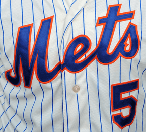
Rut-roh: A reader who prefers to remain anonymous sent me the following note last night:
I was at the Mets store on 42nd St. on Sunday, and one of the sales guys told me they are likely to have new uniforms in “two or three years” since the pinstripes haven’t really taken off and sold well. Not sure if that lines up with anything you’ve heard, but just passing it along.
A few quick takes:
1. This is all news to me. I know what that Mets’ uniform plans are for 2016, but I’m not privy to anything beyond that, nor have I heard anything through the grapevine. That doesn’t mean the store clerk was wrong, of course. Just means I can’t corroborate what he said.
2. Have I mentioned how one of the many problems with making jerseys available for sale is that the retail program ends up driving the on-field program, which is total fucking idiocy?
3. In two or three years, the Mets’ young starting rotation should just be hitting its prime, plus hopefully they’ll have traded Matt Fratboy for a big bopper by then. In other words, it will be exactly the wrong time to change from their gorgeous pinstripes (not that there could ever be a good time, but still”¦).
Let’s hope the sales clerk was wrong. Meanwhile, if anyone else has any info on this, please let me know. I’ll protect your identity, of course.

Click to enlarge
Collector’s Corner
By Brinke Guthrie
Ever seen a Tudor NFL game this old? Not me. This Tru-Action game dates back to the 1950s. Features include: “Runner actually carries ball” and “Nylon ‘legs’ insure fast, smooth action.” Who are they kidding? We all know that the players always ended up in the corner of one end zone in a massive pile of helmeted humanity (and humility). Still, great packaging!
On to the rest of this week’s finds:
• Maybe guys will show you more respect if you show up for your next pickup hoops game wearing these 1970s Pistol Pete Maravich socks with purple/yellow striping.
• Here’s a nice set of 26 (out of 28) 1970s NFL helmet push pins.
• You’re always an L.A. Rams fan with this Arco bumper sticker (with the Big A scoreboard done in blue and yellow).
• I had these, believe it or not: NFL shield decals, “c/o NFL Properties, Inc.”
• This 1970s Cleveland Barons NHL puck bank is still in the package!
• Felco was the maker for this 1970s Cleveland Indians jacket.
• Learned something today: The artist behind a well-known 1960s NFL poster look was Don Salmela. Here’s his handiwork on display for the Boston Patriots. Never knew his name until now.
• More of a generic look — no team or league branding — on this pair of 1970s 49ers socks. (That auction concludes tonight, so move fast if you want these.)
• Nice graphics on this 1973-1974 World Football League poster.
Follow Brinke on Twitter: @brinkeguthrie
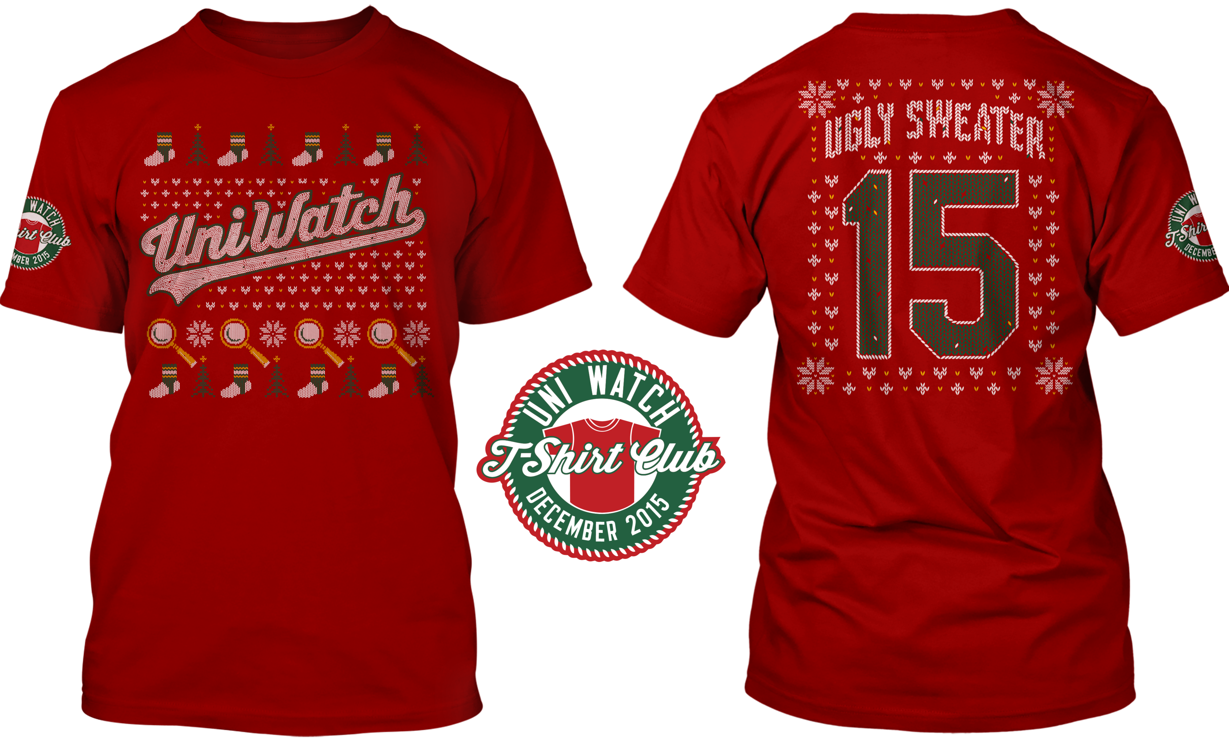
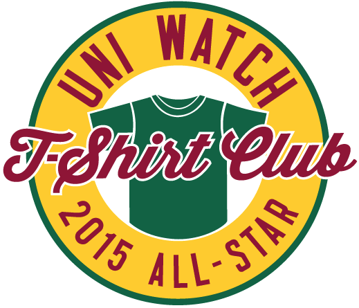
T-Shirt Club update: Okay, we’ve made a few more adjustments to the front of the December shirt, and I’m also able to show you the back of the shirt for the first time. The design is now final.
I know I keep saying this, but my Teespring partner, Bryan Molloy, has really kicked some serious ass on this one. Check it out (click to enlarge):
Meanwhile, in case you missed it yesterday, I made a bunch of other Club-related announcements. Here they are again (with apologies for the redundancy for those of you who already saw all of this yesterday):
1. As a result of all the problems with the November tequila sunrise shirts, the entire run is going to be reprinted. If you were told by Teespring’s customer service people that a replacement shirt wasn’t possible, forget that — it’s possible, and it’s happening. Everyone will get a new shirt. If you were sent the wrong size, you’ll get the right one. If you weren’t happy with your shirt’s print quality, you’ll get a new one. And if you loved your shirt and had no complaints, well, now you’ll have two of them. Congrats!
If you requested and received a refund, I’m pretty sure you’ll still get a new shirt anyway (I’m trying to confirm that). If you were thinking of asking for a refund but hadn’t yet done so, please wait and let’s see how the new print run turns out. If you’re still not satisfied with the replacement shirt, you’ll still be able to request a refund.
To everyone who’s had a complaint: Please accept my apologies. I know how frustrating it is to order something you’re excited about and then have it turn out to be a letdown. As the creative force behind this project, I’ve shared in both the excitement and the letdown — it’s a drag. We’re doing our best to make it right. Thanks for your patience.
2. We’re going to offer some additional Uni Watch shirts for the holidays. Strictly speaking, these will not be part of the T-Shirt Club — there will be no sleeve patches, and you won’t have to buy any of these to qualify for the “Collect ’Em All” bonus prize. Still, these shirts will be very much in keeping with the spirit of the Club, and I think you’ll like them. More details later this week, I hope.
3. Many of you have asked if the 2015 T-Shirt Club shirts, all of which have been limited-edition, would be offered for sale again. After thinking about it, I’ve decided to go ahead and make all of the 2015 designs available, but with some provisos: (a) The 2015 designs will not be revived until 2016, probably around February or so. Only the people who bought the designs this year will get to enjoy them this year. (b) When the 2015 designs are revived, they will not have the T-Shirt Club sleeve patch. Only the people who bought the shirts the first time around will get to wear the patches. (c) The revived versions of the designs will not count toward the “Collect ’Em All” bonus prize. The only way to earn that prize is to have ordered all 12 of the 2015 designs when they were first offered.
4. Speaking of the prize, it’s finally time to announce what it is. Everyone who’s ordered all 12 shirts (and who can prove it, either by sending a photo of the 12 shirts or by sending copies of “Your order has been received” emails from Teespring) will receive an embroidered patch with this design:
5. Finally, many of you have asked if the T-Shirt Club will continue in 2016. Answer: Probably, but not necessarily in the same format we used this year. I’m fairly certain we’ll have some new shirt designs, but I’m not sure we’ll come up with a new one every month, or on any specific schedule. Right now, I have several ideas that are still in flux. More details soon.
By Mike Chamernik

Baseball News: A bunch of people sent this in: A 2016 calendar misidentifies a photo of Fenway Park as Nationals Park. … New hats for UNC. … Marc Aune found a clip of an acoustic guitarist wearing a Twins cap during a church service. … Mexican pro wrestler Pentagon Junior wears MLB logo batting gloves. The logo forms when he puts his palms together (from Jared Patz). ”¦ Looks like Majestic’s “new” logo, which isn’t all that new anymore, may finally be appearing on MLB jerseys.

NFL News: Fascinating 1975 Chicago Tribune article on NFL uniform fashion, including a tidbit discussing the early-1960s Broncos vertically striped socks. I was also just as interested in the old newspaper ads and box score agate (thanks, Bob Gassel). … Chargers QB Philip Rivers apparently wears very old gloves.
College Football News: Boise State’s equipment manager oversees 600 sets of uniforms, 500 helmets and 2,000 gloves (from Phil). … Speaking of Boise State, the woman who helped select the school’s blue and orange color scheme just turned 100. The colors were chosen to differentiate from Boise High School’s red and white, and “Broncos” was picked in reference to the wild horses of nearby Owyhee County (from Brad Iverson-Long). … Keith Joseph Jr., a Mississippi State LB, and his father, a Bulldog from 1989-92, died in a car accident over the weekend. The team will wear this helmet decal as a memorial. … Unclear what team this is, but this is a pretty ugly football uniform. … A Thundering Herd message board kicked around Marshall’s new black jerseys (from Jay Abbott). ”¦ Bowling Green’s equipment truck shows a player wearing an Adidas jacket — you can tell from the triple-striped zipper pull tab — but the Adidas logo on the chest has been changed to a Nike logo. ”¦ David Sikula was watching Hold ’Em Jail, a 1932 movie that features, among other things, a football game between two prison teams. “I think you’ll like the uniforms,” says David. “In addition to the stripes, note that the jerseys include uniform numbers and — instead of NOBs — PNOBs, or prison numbers on back.

Hockey News: This is great: nothing says late-1960s hockey like Tijuana Brass (from Nick Maibroda). … Kenn Tomasch wants to know when, and why, a season ticket holder became a season ticket “member,” as exemplified in this Arizona Coyotes pin. Paul got some really good responses when he put the question to Twitter. … The Saskatoon Blades will wear Star Wars jerseys on November 28 (from Phil).

NBA News: The Heat are wearing their olive military alternates this week. … The Grizzlies are teasing their Memphis Sounds throwbacks. … The Nuggets are listing all of their season ticket holders’ members’ names on an on-court decal. … Former NBA G-F (and 2001 Slam Dunk Contest winner) Desmond Mason is now an artist.

Soccer News: Several national teams unveiled their kits yesterday, including Austria, Belgium, Northern Ireland, Slovakia, Germany, Italy, Bolivia, and the Czech Republic and Switzerland (all from Patrick Thomas). … And, Bosnia and Herzegovina revealed its new jersey, too. … A Dortmund player got a yellow card for revealing his Batman undershirt when celebrating a goal (from @holycalamity). … Northern Ireland fans are campaigning to get the country’s Euro 2016 kits changed (from Andrew Shannon). ”¦ “Last week I spent four days at Disney theme parks and kept track of every English Premier League jersey I saw,” says David Brand. In the end, I spotted 15 out of 20 clubs. No surprise: Manchester United won, followed by Arsenal. But I did see more Leicester City supporters than Manchester City. I created a table and article here.”

Grab Bag: Racing enthusiast David Firestone has broken down the Mopar logo.
So long as the numbers have sufficient contrast, I don’t see any problem with rendering the school/team name in outline. In fact, it might even help draw more attention to the numbers.
You apparently don’t recall how much trouble everyone had with the NBA “Big Color” Xmas unis.
We’ve been down this road often enough to know that this is not a functional look. There will definitely be legibility issues.
I think Rob’s point is that the numbers actually contrast just fine. It’s the team names that don’t, and that’s less important.
Let me get this straight: The team name on a jersey is not important?
OK, if you say say so.
As long as the opposing teams have sufficient contrast, and the numbers are clearly visible, that’s all that’s really required as far as running and officiating a game.
Aesthetically speaking, yes, I’d prefer the school/team name to be a bit more visible, and there’s certainly the intangible factor of school pride, but from a practical (read: on-court) standpoint, the name on the front isn’t strictly necessary.
I had no trouble watching football Sunday despite the tiny (or nonexistent) team names on the jerseys. I’ll see how readable the Browns’ orange numbers are Sunday, but the “CLEVELAND” on the front of the jersey won’t help me at all.
Poor analogy, since many NFL jerseys have NO team name on the front.
But for basketball jerseys, the team name is an important part of the design.
I still fail to see where outline-only names on front would be a problem on the court, because that was what you seemed to be implying, Paul.
Anything else I could say at this point would just be rehashing my 8:56 comment, so I’ll just leave it at that.
Hard to fathom who the so-called “legibility issues” will affect. The refs? No, the numerals aren’t in outline, which from their standpoint is the only thing that matters. The fans in attendance? Guessing they’d have no difficulty differentiating between the teams they came to see. Radio/TV commentators? Same. The TV audience? I guess maybe, for all of the 2-3 seconds before their eyes drift to the scoreline imposed on the TV screen.
From a design perspective the outline team name may or may not be attractive, but it hardly poses a functionality issue.
From a design perspective the outline team name may or may not be attractive…
Which is sort of the whole point of Uni Watch. I think the point has been made. Let’s please move on. Thanks.
The NBA jerseys had outline-only numbers, and yes, that’s an issue. However, the photos you’ve got up at the top of the page today do not have outline-only numbers. They’re in full contrast to the jersey, and look quite legible to me.
As a sports broadcaster, that style of number can be incredibly difficult to see. One thing you don’t see in these pictures is movement, which adds to the situation. Certainly the wider the border/outline is, the better it is, and I’ve seen all different thicknesses.
Was that a problem on the ABA Spurs’ jerseys? That was my favorite part of the black San Antonio uniform.
The thick outlines and very high contrast (white/silver on black) alleviated the issue somewhat.
The Spurs did it right, as Rob said. You could still read it.
Part of the problem now is the smaller lettering/numbering on most jerseys. You can’t afford to do *any* outlining these days.
The “TC” on that church singer’s cap is reference to “Totally Christian”. An organization for young people to seek out those with similar faith an belie…..
.
OK, I’m just making stuff up.
As a lifelong Mets hater, I do like the pinstripes as is and now that the black drop shadow is gone, this is what the Mets should look like. Moreover, I hate that focus groups and sales might be driving a move away from an established look that has been fairly consistent for 50 years. Pinstripes don’t look good off the field (why I bought a gray Phillies road jersey) but they look right on the field.
Mets have never been consistent in their entire 53 year existence. But the most consistent period seemed to be that 14 years the Mets wore black (’97-’11).
But today the Mets will wear what will sell. Let’s not forget the Wil-ponzis are in business to make money anyway they can.
I don’t think it is also a coincidence a large number uniform changes have come since the Mets moved into Citi Field and the Wilpons gained a bigger mortgage payment. They have been cash strapped since 2009 and must be hard up. Keeping the merchandise fresh in the team store and licensing is one way to keep the scharole coming in.
I am a lifelong Mets’ fan, and I never liked the pinstripes, too much of an association with the evil Yankees. I have a feeling they are going to go back to the snow white unis for home games. A lot of the fans loved those, and I for one do miss them.
I personally preferred the snow whites, but I would have thought that a minority opinion – if they were so popular why did the Mets phase them out?
I think what they might do is re-introduce the pinstripeless home alternates in off-white, effectively swapping the fabric colors of the 2012-14 home uniforms. If true, I would like it better (or, hate it less) if they’d drop the blue home alts; I never thought having two alternate home jerseys was necessary, let alone good. And while they’re at it, drop both of the alt caps.
My single biggest gripe in baseball uniformery: Teams with both pinstriped and non-pinstriped home whites. A team is either a pinstripe-wearing team or it is not. If you’re a pinstripe kind of team, then by gum you wear pinstripes. And if you’re not a pinstripe kind of team, then for heaven’s sake don’t wear pinstripes.
For this Twins fan, for example, the only thing worse than the fact that the Twinkies have abandoned a century of franchise tradition to wear plain, un-pinstriped uniforms is that they also still wear pinstripes at home from time to time. The same would be true of the Mets. If they want to ditch the pins to stake out a look more distinct from the Yankees, fine. But stake out that look, don’t half-ass it by sometimes wearing pinstripes, sometimes not.
Really? They haven’t? Their home uniforms have had the same basic look since ’62. True, the roads have undergone more changes, but not very many. Overall, apart from peripheral tweaks like racing stripes, black alternates and drop-shadows, the look has never been substantially revised (like, say, the Astros, Brewers and Diamondbacks have).
What about the Mets players? They seemed to wear the blue softball tops a lot in the postseason. Does that mean they prefer the softball tops over the pinstripes? Could that also be a factor why the Mets might consider ditching them?
They seemed to wear the blue softball tops a lot in the postseason.
Only when Matt Fratboy pitched.
“Matt Fratbro” seems to work better.
“Frat Harvey” is RIGHT THERE.
As a Mets fan, I would be appalled if they ever did away with the pinstripes.
…and Game 2 of the NLCS, which Syndergaard started.
I felt like that was just stopping the Cubs from wearing their favored Blue Alts.
Proofreading: “a photo Fenway Park as Nationals Park.”
The MLS third kits link gets me a “Sorry, that page doesn’t exist!”
Typo fixed, link removed.
Also, I am really loving the Ugly Sweater t-shirt design
Thanks for helping me out at this year’s ugly sweater party!
I’m offended by the Christmas sweater design. I prefer my Christmas designs to be solid red.
You are a terrible person. Taking all of the doodads and gewgaws off of the red shirt is part of the war on Christmas. I will never frequent this establishment again and will use Twitter to tell everyone of my outrage.
I am outraged at YOUR outrage and will tell the world via Yelp!
T shirt club: Why not number 25 on the back? That would keep in line with the other holiday themed shirts.
Didn’t want non-Christians to feel excluded.
Yes, I know, there are Xmas trees on the front. Compromise.
Thanks, Paul! You’ve chosen the compromise route over full-on exclusion. Much appreciated.
Also, not all Christians celebrate Christmas on December 25. Most Orthodox Christians celebrate Christmas on January 7.
That is correct. The Eastern Church celebrates Christmas usually 12 days after the Western Churches. The Catholic Church also celebrates the 12th day after the “Western” Christmas, commemorating the visit of the three kings or wise men, which is meant to signifying the extension of salvation to all mankind. It is called the Feast of the Epiphany.
There will be a test at the end of the week.
The jersey with the new Majestic logo is definitely one of those new cool-base replicas. Whenever they do in fact switch the authentics to the new logo, it almost definitely won’t have the word underneath the mountains, it’ll mirror what the current BP jerseys have. But what makes me so confident that the jersey shown is not an authentic is the light shining off the NOB. Those are definitely plastic numbers like they put on the replicas. Not to mention that it looks like a Mets jersey and there’s no sleeve patch.
I was watching this AP video from the 1972 AFC Championship game and noticed one of the gold end zones at Three Rivers had Dolphins in black lettering. I’ve seen other videos from that game but never saw that.
Anyone else ever seen that?
link
Used to be common — or at least not UNcommon — to have the visiting team’s name in one end zone.
The AFC did that well into the 80s for its championship games. Not every year, but they did it a lot.
The Saints used to do it every week back at Tulane Stadium, and the Chiefs would have the opposing team’s helmet at midfield every week before Arrowhead got turf.
The Chiefs did have the opposing team’s helmet at midfield, but that was at Municipal Stadium. They did not do this at Arrowhead Stadium, which was originally artificial turf. Instead they would have the logo for Alitalia airlines at midfield for some reason. And don’t forget that this was the place where directional arrows at the numbers first appeared; even though a different standard design has come into use, I still call them “arrowheads”.
I just have a hard time fathoming the idea of having goal posts mounted inside the end zone, within the field of play, rather than out-of-bounds at the back of the end zone. I have an even harder time fathoming the old H-style posts being mounted on the goal line.
The one area in which I think having the (new) goal posts on the goal line rather than the back of the end zone can be seen in Canadian Football, where teams are required to return a punt or missed field goal out of the end zone or concede a single point. In the NFL and college, most missed field goals go wide left or right, but in the CFL (where the end zones are also 20 yards deep), a missed field goal that is long enough but wide will still usually be in the end zone, meaning a lot of them get returned, some of them for touchdowns. (The longest return ever is 131 yards.) Say you required teams to return a missed field goal (unless out of the end zone) or else down it and bring it out to the 20, rather than the point at which the kick was attempted. Could be interesting.
Re: the 1975 Chicago Tribune article – Foreshadowing of the fashion show the NFL has become! I wonder what the (God-willing still alive) author thinks of today’s Uni-Shenanigans?
Couldn’t help noticing below the story the “Electronic Calculator” on sale for $249! Something we take for granted today as an expected feature in our phones, computers, etc. or look down upon as a cheap-o bank giveaway item was a major purchase back in the day. Great Magnavox Odyssey-style logo too for Monarch Office Supply!
In 1981, my grandpa bought a VCR from Montgomery Ward. Even back then, it cost more than $1,000!
I got a kick out of the ads also.
The article about Bud Grant (“Not Ice in Grant’s Veins”) also has some uni-related information such as:
Wearing coats and ties on road trips – no psychedelic jumpsuits.
Shunning white football shoes.
Not pulling up the white oversocks to cover the purple stockings on their calves.
Not putting 25 on the back of the t shirt? So are we not supposed to call it a “Christmas” sweater? Is it the “Seasons Greetings” sweater?
I’m a Jew and I would rather buy it if it had 25 on the back which would make more sense. I hate how PC this world has gotten. I’d rather hear people say Merry Xmas to me than Happy Holidays. Or some people now say Happy Hanukkah to me and I reply back Merry Xmas. I’d rather see people celebrate their religions than to make people feel they should exclude it.
It’s true, the number is part of the War on Christmas®. I did it mainly to annoy you — just you. Well, and also Bill O’Reilly, to whom I’ll be sending one of the shirts.
If you don’t like the number, don’t buy the shirt. The end. Let’s move on. Thanks.
Thanks for posting the beautiful Cleveland Indians dugout jacket. Say what you will about Ol’ Wahoo; the Tribe had some of my favorite uniforms of that period. It’s a pity their play didn’t rise to the level of what they wore. The more their detractors chided them as loud and garish, the more I dug in my heels.
I learn something new every day (today it was another defintion for AGATE)
Full Definition of AGATE
1
: a fine-grained variegated chalcedony having its colors arranged in stripes, blended in clouds, or showing mosslike forms
2
: something made of or fitted with agate: as
a : a drawplate used by gold-wire drawers
b : a playing marble of agate
3
a : a size of type approximately 51â„2 point
b : condensed information (as advertisements or box scores) set especially in agate type
The phrase “Season Ticket Member” just seems kludgy to me. You wouldn’t say “I’m a member of season ticket”, would you? Now, “Season Ticket Club Member” sounds a whole lot better to me.
As for the whole “member” thing, I just think it’s following the whole “inclusion” trend we’ve seen in recent years; referring to employees as “team members” or “associates”, for example.
On that note, anyone want to offer over/under on when the first pro team will describe its mini-season plans as “curated”? As in, “The new Rivalry Pack offers [subscribers/members] nine carefully curated games featuring the hottest divisional and interleague opponents”? It’s bound to happen soon.
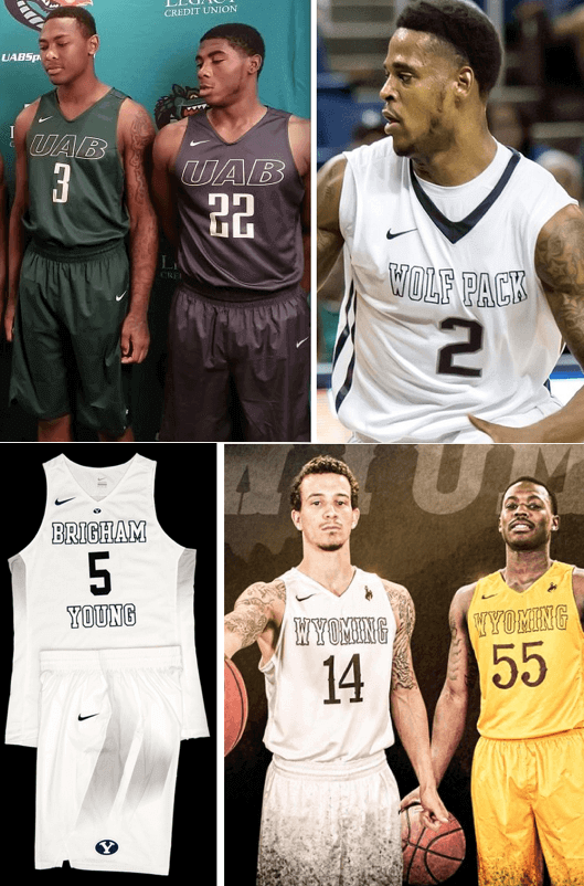
The college hoops season preview is up:
link
The more I look at UAB’s uniforms, the more I dislike them. And one of those uniforms looks like it will have some number visibility issues (is that camo I see? Ugh).
I know Tulane is the Green Wave, but green-on-green isn’t so hot. There’s at least a little bit of contrast between the lighter green name and numbers and the darker green base, but they could do better.
Hartford, if you’re going to emulate the Bulls’ color style (black outlined in white on red), you should probably go with more bolder numbers. That thin font doesn’t look that great like that; it’d probably look better in white outlined in black. The home uni colors look fine.
Duquesne makes me feel sad, because they’re doing a Brooklyn Nets uniform better than the Nets! What a difference color makes. Plus, the Dukes get some bonus points for their funky 70s throwbacks.
Michigan’s shorts look like ass. August can’t get here fast enough.
And finally, if you’re talking about name-on-front legibility, St. Mary’s miniscule, wispy-looking font is a lot harder to read from any significant distance than the larger, boldly-outlined NOFs for BYU, Wyoming, and Nevada. And that’s my last word on that, I promise.
Does any team need to have six different uniforms? Probably not, but Duquesne is doing it
One for each win…
I love all of them, though. I was expecting Duquesne to be a poor man’s Dayton, but they look a lot better than the Flyers. The distinctive D (and color, as Rob said) helps a lot.
Brigham Young’s home shorts look as if they wiped their dirty hands on them.
You need a Uni Watch magnifying glass (you oughta sell those, Paul) to see the writing and numbers on Toledo’s jerseys. Terrible. Just terrible.
As an Akron alum, I am ashamed at how well Kent State looks. School colors, man…even on the gray alts, the Flashes know how to incorporate them. Meanwhile, with no news about the Zips, that must mean year number…four? without any gold at all. Another year of blue and
goldsilver?link
PFFFFFFFT.
Gonna close on a high note by listing all the stuff I love:
* N7 turquoise
*
Dang it… my finger hit submit before I was done…
* Syracuse’s shorts
* Duquesne’s whole set
* LaSalle’s shorts
* Rhode Island – my vote for Most Improved Unis
* Weber State maximizing jersey space
* Badgers throwback alts
* Jayhawks throwback alts
* Western Kentucky
* “Blacktop” and green courts
* Fresno State
* Eastern Illinois
* Utah grays
* South Carolina – my runner up for Most Improved
“…it’s worth noting that several Nike-outfitted teams are using outlined lettering (see above), which is bound to create some legibility problems.”
The swoosh is clearly visible though, yes?
I’m not sure it’s big enough, actually. Stupid size rules…
With the University of Cincinnati changing to Under Armour that will be the third different apparel deal for the Bearcats – Nike (plus they also had Nike offshoot Jordan doing basketball for a time), Adidas and now UA. How many schools have had three different apparel deals (and I’m sure there’s some because of Reebok’s foray into it a while back)? Just wondering.
Sometimes sales numbers can improve a uniform. I bet that one of the reasons that the Orioles switched back to the cartoon bird is that the throwback hats were selling a lot better than their ornithologically correct bird hats.
“Sometimes sales numbers can improve a uniform.”
~~~
What?
I think he means that every now and then, popularity coincides with good design and teams that follow the money can stumble into a better look.
I can’t stand the Brewers’ current duds. But fortunately for me, enough people like the old royal blue and gold to keep those around. Now if we can just get enough people to like them to make them the primaries….
I think he’s saying, “sometimes, the popularity of retro merchandise can lead a team to adopt retro-inspired designs that are better than their current designs.” Which is true, and does happen, but rarely. Usually, either the public has bad taste and should not be trusted (see the results of pretty much every name-the-team poll ever conducted or, in my book, the Orioles, who looked much better with a more realistic bird on the cap), or team owners stand by their terrible choices no matter how much retro merch fans buy (see the Phillies and Eagles). Or, possibly worse, teams adopt some retro elements as alternate uniforms alongside their current unis, making the team an incoherent mess of clashing iconography (see the Brewers, Twins, Indians, and pretty much every team with a “retro” alternate).
Perhaps means the cartoon bird uniform is a great improvement on the one with the ornithologically correct oriole, meaning an inadvertent consequence of the rise in sales was the decision to return to that uniform full-time.
“the cartoon bird uniform is a great improvement on the one with the ornithologically correct oriole”
~~~
But it’s not.
The white front panel is the great improvement. Logos are a push.
Re: the 1975 Chicago Tribune sports agate. Note that the NFL standings show the Bengals record as 6-0, one of two other times in history (besides 2015) when the team started the year with at least six straight wins. Who-Dey!
I feel like Matt Harvey has diminished the value/tradition of the home/road whites/grays because of the blue tops he always wore this season. I can’t really remember any significant games with the road grays this season since the blinding blue alts with the terrible gray lettering were worn so much.
They clinched both the NLDS and the pennant wearing the road grays.
I played trivia last night at a local brewpub and one question was “What NHL team is wearing a 90th anniversary patch on their jerseys (sweaters) in 2016?” I was kind of pissed that I got it wrong, but I figured I had a 1 in 6 shot at it if I picked an Original 6 team.
Unfortunately it wasn’t the Maple Leafs.
Actually, at the moment, the correct answer should be “none”. The Rangers, Blackhawks, and Red Wings haven’t released any 90th anniversary logos that I’m aware of, much less patches.
Wiki says the Red Wings are wearing a patch and another site says the Bruins are wearing a patch (link).
I can’t find anything else.
Actually, that article was posted during last season, and was inaccurate anyway as the Bruins wore their 90th anniversary patch during the 2013-14 season.
As for the Red Wings, I have them on my TV right now, and they’re not wearing any patches.
On the “Blades and Brass” video, note the Expo 67 logo at center ice at The Forum!
David Sikula
I always look for old football movies on TCM. I had seen Hold Em Jail before but dvrd it anyhow.
Did you see the awesome miniature football figures and field in the very beginning.
Duquesne has six uniforms, okay.
But (by my count) they include four number fonts and five workmarks. Boy, that’s a bit of overkill.
Hey, I recognized Wheeler and Woolsey in those stills from “Hold ‘Em Jail”. Now I must see it to figure out how it ranks with “Pigskin Parade” or (and this would be a reach) “The Freshman”.
Duquesne is celebrating the 100th anniversary of its basketball program this year. That doesn’t mean that “overkill” is an inaccurate description, but that’s the reason.
Re: Ever seen a Tudor NFL game this old?
Why, yes… I have one – it was my dad’s. Although I did not think my packaging was that plain in color.
The retro-themed Adidas uniforms are easily the best thing they’ve done in years. And no sleeves! However, that atrocious template Miami and Michigan are stuck with ranks among the worst.
That old hockey video link was amazing. After viewing a couple of the related videos, if you don’t view the beginning of this one, your day will be nothing but shit:
link
Speaking of Tudor/Electric football, I love the way the Browns and Eagles helmets are facing on this stadium. I guess they are trying to show the uniqueness of the decal placement. ???
link
Also the Dolphins helmet is wrong.
Lastly, the Browns and Eagles helmets seem to be fitted with the “cow catcher” type facemasks (as opposed to all other having the single bar).
Are tattoos a required part of the Wyoming uniform kit?
DId you see the link for the Slovak men’s national soccer team? They’re halfway to Chris Birdman Andersen.
Teespring won’t change my address to send the November reprint to where I moved to right after the first run was shipped, even though I asked multiple times. It wouldn’t be an issue, except my shirt was printed incorrectly, so I would actually like the reprint to, you know, arrive to where I live.
Kenny, instead of posting this in the comments, please email me. Thanks.
Sorry about that.
The Mets should definitely get rid of those yankee wannabe pinstripes. They should bring back the snow whites preferably with the black drop shadow. And for the road unis I would bring back the 1987 road script.