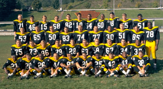

My Friday Flashback piece on ESPN today takes a look at one of my favorite overlooked uniform designs: the Steelers’ “Batman” uni, which was originally worn in 1966 and ’67 and is ripe for a comeback. If you don’t know the story behind this underrated design, you’ll learn it today — check it out here.
Click to enlarge
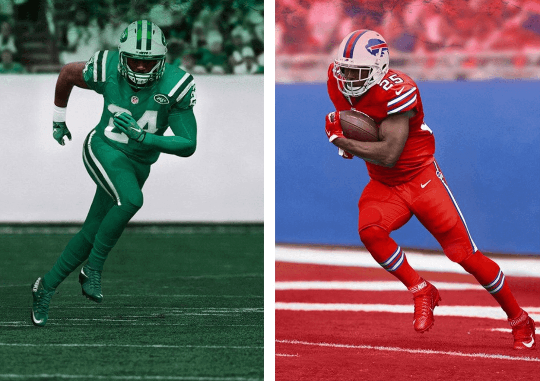
Christmas in November: Last night the NFL revealed the first two of its monochromatic Thursday-night uniforms, which will be worn next Thursday, and they’re pretty much what we expected.
It’s hard to express how much I hate the Bills design. Red is not their primary color; it’s a trim color. Never liked them with red helmets and really don’t like them doing the blood-clot thing. Piece o’. (It’s funny to see how Nike and/or the NFL even showed the field in red, just to accentuate the effect. Nice try, guys.)
As for the Jets, it’s not as though we’ve never seen them in mono-green before. Let’s compare their this new uniform to their existing mono-green look (click to enlarge):
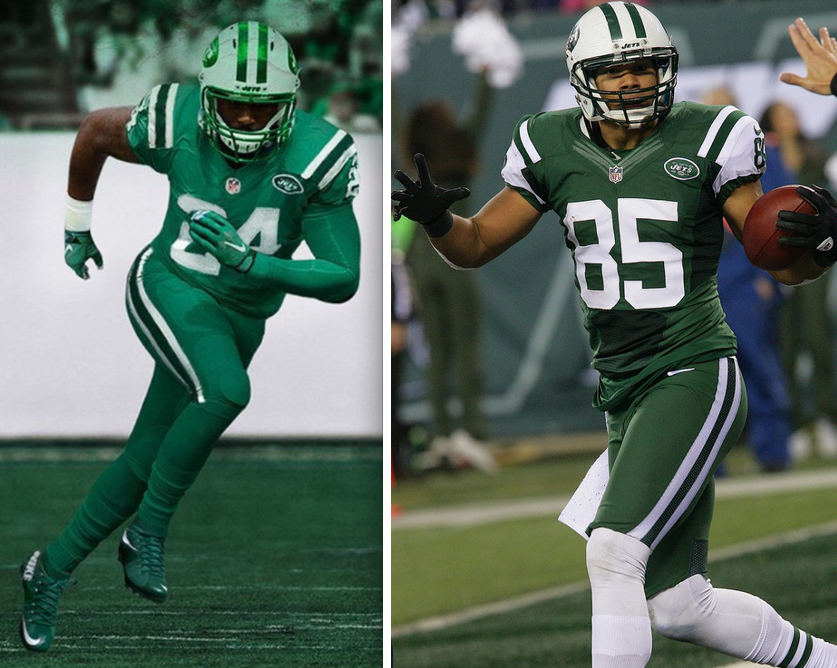
Okay, so they lightened up the shade of green, gave the helmet some reflective striping and a chrome facemask, and changed the contrasting sleeves and socks to green. Big deal. (Meanwhile, it’s worth noting that Nike still can’t get the green tones to match.)
Both uniforms look like bodysuits or full-body costumes, which is obviously what Nike has wanted football to look like for years now, whee! I never watch the Thursday-night games anyway, so I don’t really care. Now I have even less reason to watch those games.
As for what we’re going to call this program — because there’s no fucking way I’m gonna use the term Color Rush week after week — you folks had some very good suggestions yesterday, including Hue Spew (from Mike Cole), Cluster Rush (R. Scott Rogers), Technicolor Yawn (Jeff Hannaford), and CFCS (many people).
But my favorite suggestion came from Greg Mays, who said everything that needed to be said simply by changing one letter from the original: Color Rash. That’s what I’ll be calling these uniforms from now on. Greg wins himself a free Uni Watch membership card — congrats!
Silly season, continued: This is the final weekend before Veterans Day, so football teams are in high pandering mode. Here’s a roundup — far from complete, I’m sure, but sadly representative — of the cheapening of our flag and what it stands for:
App State's S&S helmet stickers for tonight's game vs Ark State (h/t @BearlyDoug) pic.twitter.com/58ZmUcZW6P
— Phil Hecken (@PhilHecken) November 5, 2015
YSU's helmets for this Saturday ðŸ§ðŸˆ pic.twitter.com/9yP06s2TqM
— Youngstown Social (@YtownSocial) November 5, 2015
We're honored to wear special uniforms in celebration of the U.S. Military & its members Saturday. #GoEags pic.twitter.com/kHWVBQGpR6
— EWU Football (@EWUFootball) November 5, 2015
Welp. UCLA has joined the S&S decal helmet parade too. Will wear Saturday pic.twitter.com/LABR87PZb6
— Phil Hecken (@PhilHecken) November 5, 2015
SMU adding patriotic pony to helmets for Friday's game -> https://t.co/HnTTnBF0iq pic.twitter.com/hyZ4Vuwb9K
— Phil Hecken (@PhilHecken) November 4, 2015
@Keith247Sports @Uniformswag @UniWatch pic.twitter.com/ph7Y9JYU9L
— Chad Grier (@ChadGrier_) November 5, 2015
Some of these are worse than others, but those are differences of degree, not of kind. The whole thing is in poor taste and needs to stop.
And hey, why should silly season be limited to football? It isn’t:
New stars & stripes "Hoops for Troops" NBA team shooting shirts ($44) pic.twitter.com/iNvey1x3BG
— Darren Rovell (@darrenrovell) November 4, 2015
@PhilHecken @UniWatch Mike Moustakas and Drew Butera wore their July 4th jerseys on Jimmy Kimmel last night. pic.twitter.com/4yZSk3lEI1
— Kevin (@Jarferama) November 5, 2015
To all you veterans out there: I’m sorry that this is how the sports world chooses to “honor” you. You deserve better. We all do.
T-Shirt Club update: We have one design left to go for the 2015 Uni Watch T-Shirt Club collection — the December shirt. We hope to launch it next Tuesday, although there’s a chance it’ll be bumped back to the following Tuesday. Either way, I want to give you a peek at the direction we’re taking. I think you’ll agree that my Teespring designer, Bryan Molloy, has really outdown himself with this one (click to enlarge):
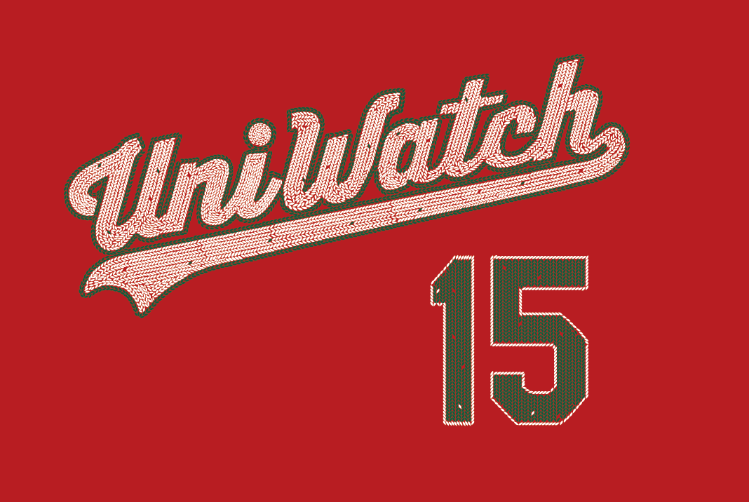
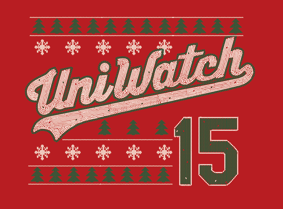
Pretty great, right? I especially love the little “flaws” and “mistakes” that Bryan built into the knitting pattern. So good!
This is still a work in progress — we’re not sure if we’ll go with just the script or if we’ll include the little tree/snowflake trim (I’m leaning toward the latter), and Bryan has some other ideas that he wants to incorporate. Still thinking about the NOB (which was originally going to be “Ugly Sweater,” but there’s nothing ugly about this so we’ll have to come up with something else).
Feedback is welcome. Like I said, maybe we’ll have all of this worked out by next Tuesday. If not, then by the Tuesday after that. Stay tuned.
Meanwhile, we’re working on getting everything fixed regarding the tequila sunrise shirts. If you have any problems with the way your shirt turned out, let me know. We’ll take care of you.
Membership update: Two more cards have been added to the membership card gallery (including Samuel Selker’s 1970s Cavs motif, shown at right). I have two more slots open on the current sheet, which I plan to send to the printer on Monday. So if you sign up today, you’ll likely have your card in your hands by the end of next week.
As always, you can sign up for your own custom-designed membership card here, you can see all the cards we’ve designed so far here, and you can see how we produce the cards here.
The Ticker
By Paul

’Skins Watch: Good for Adidas, which has created a new initiative to provide financial assistance and design resources for schools that want to change from their Native American mascots. Further info here. Now let’s see Nike and Under Armour do likewise. ”¦ Unsurprisingly, one critic of the Adidas initiative emerged right away: the ’Skins. Rather tellingly, their critique took the form of accusing Adidas of hypocrisy — in other words, they tried to indict the messenger but didn’t refute the message. Weak (from Rob S.). … Some students and faculty members at Amherst College in Massachusetts want to change the school’s mascot. The current one, Lord Jeff, is based on Lord Jeffery Amherst, the 18th-century British military commander who endorsed giving smallpox-ridden blankets to Native Americans. ”¦ The ’Skins legal team’s latest brilliant tactic in fighting to retain trademark protection is to claim, “Hey, we’re no worse than porn companies!” Classy (from Tommy Turner). ”¦ A DC-area parent thinks kids should not be permitted to wear clothing with the ’Skins team name or logo in local public schools (from Tommy Turner). ”¦ Remember this Blackhawks concept that was floating around a few years ago? Quebec’s top First Nations chief has endorsed it as a replacement logo for the Blackhawks.

Baseball News: Faaaaascinating juxtaposition between two new MLB sleeve patches that were released yesterday: The Braves will celebrate Atlanta’s unbelievably poor urban planning, while the Cubs will celebrate urban preservation. ”¦ Longtime Uni Watch pal Tyler Kepner sent along this step-by-step guide to wearing stirrups, from a 1972 book by former MLBer Bob Shaw. ”¦ Majestic says the Royals are good for business (thanks, Phil). ”¦ Ladies and gents, your new Atlantic League team: the New Britain Bees.

NFL News: Jim Cramer, an entertainer who plays a financial analyst on TV, has a personalized Eagles jersey on his set. ”¦ Here’s a gallery showing all 32 NFL locker rooms (thanks, Mike). ”¦ The Bills will play dress-up soldier on Sunday by wearing helmet decals representing the military branches (from John Falardeau). ”¦ The Bucs, who’ve been wearing a lot of white at home, will wear red at home this Sunday. ”¦ Giants DL Jason Pierre-Paul, who blew off one of his fingers in a July 4th fireworks accident, may return to action this Sunday, so he’s experimenting with four-fingered gloves (thanks, Mike).
College Football News: In what I gather is more the exception than the rule, the success of Alabama’s football program has had positive effects rippling throughout the university, including at the academic level. ”¦ Next year’s game between Navy and Notre Dame has its own logo (from Leigh Torbin). ”¦ Here are this weekend’s uni combos for UNC, Duke (those two teams will be facing each other), Arizona State, USF, and Washington State. ”¦ Speaking of Washington State, their non-traditional uni combos are becoming more traditional (thanks, Phil).

Hockey News: Dreadful G.I. Joke unis this Saturday for the Des Moines Buccaneers. ”¦ Oooh, look at the jersey once worn by the Waverly Gold Diggers, an old Nova Scotia team (from Will Scheibler). ”¦ This is pretty cool: Did you know NHL goalies have bags to transport their masks? I didn’t — but they do! (Good one from J. Walker.) ”¦ Here’s the logo for this season’s AHL All-Star Game (from Chris Cruz).

NBA News: The Mavericks’ fan-designed alternate uni, which was first unveiled more than a year ago, is nearing its on-court debut. ”¦ You already know that the Pacers will be wearing Hoosiers-inspired uniforms for a handful of games this season. What you might not know is that the uniforms used in the movie disappeared after the film wrapped and weren’t rediscovered for another 25 years (from Todd Usher). ”¦ Inside the NBA’s Kenny Smith imitated LeBron James by ripping his sleeves last night (thanks, Mike). ”¦ As you can see from that last video clip, the Bulls and Thunder went color-on-color for last night’s game. ”¦ LeBron’s sleeve-ripping move also inspired the Canadian network TSN to present its top 10 uniform moments (from Mike Styczen).

College and High School Hoops News: Oh man, there is sooooo much to love about this old high school basketball photo, which I’m assuming is from the 1970s or maybe early ’80s. Only thing missing is striped tube sox. ”¦ Fortunately, there are striped sox aplenty in this shot. Tasty! (From David Stephens.) ”¦ Pitt is going G.I. Joke for the Armed Forces Classic.

Grab Bag: One soccer item: New Euro 2016 kit for Spain. … Interesting article on the signage on all-gender restrooms (from Tommy Turner).
Party reminder: Uni Watch party tomorrow, 2pm, in the back room of Sheep Station in Brooklyn. Hope to see lots of you there. Everyone have a great weekend!
Since so many minor league baseball teams run XMAS in July uniforms I would go with the tongue-in-check XMAS in December NOB.
Last link in college football section is messed up.
Thanks. Fixed.
Given how briefly it lasted (and the conversion from olympic to baseball use), shouldn’t it be “Turn-&-Burn Field” instead of “Turner Field”?
I was upset when I saw the first Expos game after Olympic Stadium was converted for them. It’s too bad there was no stadium technology at the time that would bury the track and bring it back as the occasion arose. Also, no Impact-level soccer team to take up residency.
Take away the chrome effect on the helmet, and use the darker shade of green for the socks, and the Jets would look pretty good I think. I like the idea of them intentionally using two shades of green.
Buffalo just looks dumb though. Why not just let them wear their normal blue uniforms against the mono-green? Dammit NFL, I want to see color vs color, but this really isn’t the best way to do it.
Dammit NFL, I want to see color vs color, but this really isn’t the best way to do it.
What he said.
I can’t stand the mono look under any circumstance (other than all-white, of course). Makes the teams look like a high school squad.
Congratulations to Greg Mays, whose winning entry parallels my general feeling of uniform changes in general: Sometimes all it takes is a minor tweak to come up with a winning formula.
Proofreading:
“fromJ. Walker.”
“TSN to present its to 10 uniform moments”
Fixed.
Piece o’. (It’s funny to see how Nike and/or the NFL even showed the field in red, just to accentuate the effect. Nice try, guys.)
Piece o’ what?
And…since I can still remember Marty Glickman’s guiide to broadcasting a quarter century later, this grammar violation is one of his pet peeves:
Like I said, maybe we’ll have all of this worked out by next Tuesday.
As I said.
“Piece o’ what?”
~~~
We don’t need the “S—” word on here Jimmer.
Like you were.
Isn’t red/green colorblindness relatively common? link. That little detail makes next week’s Jets/Bills debacle just that much more stupid. Perhaps some colorblind folks could protest the NFL. Raises a question: are there colorblind uni-watch fans?
The NBA has had red vs green on Xmas a few times and I don’t recall there ever really being any outrage over it. The shades in question are too bright and vibrant to be a problem for all but the most severely affected. The Jets wearing mono-green on a green field is probably a bigger issue for viewers with bad eyesight.
“are there colorblind uni-watch fans?”
~~~
Judging from several of the comments the past few days, I’d say there are many…
As I was scrolling down this morning I first thought the UW shirt was faux chain-stitched (an idea to ponder), then realized with the 2nd pic that it was “fnitted”.
Name suggestions:
Spirit
Festivus
Butterball
Commercialized
Just because we might actually like the Christmas design on the t-shirt doesn’t mean we can’t call it Ugly Sweater. I think it’s better with the trees and snowflakes.
Another vote for the design with the added tree and snowflake design! I also think NOB should be ‘Ugly Sweater’
As a t-shirt design, I too prefer the full-sweater treatment. But only if there will be nothing on the back. If there will be number and name on back, then the version with the full ugly-sweater treatment doesn’t make sense. With name and number on back, the t-shirt is really a jersey, and so the version without the decorative filigree is more in keeping with the nature of the thing.
So, is this an ugly holiday sweater, with a plain back, or is it a jersey, with a less filigreed front?
The faux-knitted execution, BTW, is fan-freakin-tastic. Brilliant idea, beautiful execution.
How about “Sweater”?
It would be subtle for the adjective “Ugly” simply to be understood, but not too subtle..
I thought it was chain-stitched at first too!
Jim Cramer’s jersey customization seems more appropriate for an XFL jersey!
I know James Madison (JMU) has a flag decal helmet too. Not sure if it is on-tap for this weekend or not.
link
I was actually excited when I thought my Bills would wear red jerseys for a game. Thought it would be a nice change up, maybe once a season on the road. Then Nike pairs the red jersey with red pants? Way to ruin it Nike!
Blue pants would have made it awesome. But I don’t expect awesome from the NFL.
STOP.
What if the different shades of green on the Jets uniform is intentional? I actually think it’s better with the darker stripes. Or are we talking about how that mesh insert is a little darker?
I agree. While the light green represents 1963-2001, the dark stripes on the shoulders and pants perhaps were kept on purpose to represent 2002-current. Who knows? Maybe the ‘chromed’ green on the helmet represents the third part of the trifecta – past, present, and future.
(Hey I’m trying to rationalize NIKE here. Cut me some slack.)
Seems pretty clearly intentional, since it matches the green in the logo.
Maybe it’s because I grew up in the 80s, but I prefer the Bills with the red helmet. But that’s just me.
I don’t really agree with the way you critique the new uniforms for any level. You are all about the classic look. Nike, Under Armour, and Adidas are changing because the generation of players being recruited, and playing in college, want to look good. My generation loves seeing what Oregon comes out in every week. Loves seeing a team bring out a black, or grey jersey, and we wish teams like Alabama, and Texas would change it up every now and then. The brands are tailoring the way the make uniforms for the current generation of football players. When colleges bring recruits in they have a locker set up, or a table set up to show off all the “gear” the athlete will get. The more there is, and the better looking it is in their eyes, the better chance they have at signing that recruit. That’s why the uniform game is changing the way it is.
You don’t have to agree with my tastes, of course — we can agree to disagree — but it’s sad that you view design as a generational wedge issue. Good design and bad design are not generational. Good design is good design; bad design is bad design. We may not agree on what constitutes good or bad, but good aesthetic values transcend generational appeal (or at least they should).
Did we forget to mention how sad it is that colleges are recruiting players on how they look versus which school is right for the student?
And what the hell does that have to do with the mockery that’s becoming the NFL?
The further removed from a time where functionality was a factor, the worse uniform designs will become.
Maybe we just have to better educate people on what makes something “better looking.” There are fantastic ways to advance classic looks into something more flashy, interesting, engaging, etc., but that’s not what’s happening in sports right now. Rather, it’s just, “How much chrome and how many patterns can we fit into this design?”
Or maybe we could get people to stop claiming to speak for their entire generation.
You mean Nate or Paul?
I speak for nobody but myself. And, on occasion, I’ll speak for the Uni Watch community when I feel there’s something on which we’ve achieved a fairly broad consensus.
I *never* speak generationally, in part because I don’t feel — and have never felt — a particularly strong generational identification.
I’m not aware of Paul ever using “my generation” and “we” to justify his own aesthetic preferences…
Agreeable to that.
However, how can you say “good design is good design and bad design is bad design”, and then say that people may not agree on what good design is?
I mean, a shirt obviously has certain fundamental characteristics it needs to possess to be considered a shirt, however, any designs on top of that would have to be an opinion of whether it’s good or bad design.
And I think that is where this comes back to Nate’s assessment. Although he speaks for his generation, it seems “they” might seem more open to alternate uniforms and changing things up, where in my opinion it seems folks in my generation generally seem to like the uniform atmosphere of +/-25 years ago. Personally I’ve seen uniforms of today that I like as well as some from 25 years ago.
Honestly though I enjoyed Nate’s post, I don’t agree with all of it but it is interesting to see that other folks do like seeing the black and grays from time to time. Personally, I don’t care for most of them, although in a vacuum many work well. I wouldn’t mind hearing more from Nate and his generation on how they like what’s happening today in the uni-verse.
On the Locker Rooms , that was not the Raiders normal Locker Room, that was a picture from their training camp in Napa, CA .
It said it wasn’t the real thing under the photo. But thanks for the info. Any idea wtf is going on with the Lions???
This was a joke post on Reddit yesterday, poking fun at the Lions.
For the name on the back of December’s shirt, what about the following:
Claus
S. Claus
Kringle
K. Kringle
Because then only Christians would buy it, silly.
Disagree. “S. Claus” is actually quite clever. Speaking as a secular Jew, I think Santa long ago transcended the bounds of Christianity. He belongs to all of us.
What other Clauses would have initials? F. Claus? M. Claus?
I personally want S. Clause from A Night at the Opera.
If you go with the design without the trees, I like S Claus.
The one with the trees is most definitely an ugly sweater design, and the NOB should be Ugly Sweater.
As someone’s who will buy it and is collecting them all, I am leaning towards the sans-trees design.
“S. Claus”, as opposed to “Claus”, delights me. But let’s kick it up a notch and go “San. Claus”
As a half-and-half McCatholic/Jew, I agree that Santa Claus transcends religion. “S. Claus” would be an awesome NOB. I also vote for adding the tree/snowflake trim… makes the shirt an acceptable alternative for the nauseating trend of ugly sweater parties.
Seconding Lou on all points. If you go for the full ugly-sweater front, it should be plain on the back, but if it must have number & name on the back, then it absolutely has to be UGLY SWEATER. I mean, when teams do holiday jerseys in this style, they actually refer to them as “ugly sweater” jerseys. It’s a uni term of art, so it should be used here.
R. Udolph ???
You forgot the “JR.” or “III”.
How ’bout M. Hankey?
Nfl locker rooms
That cant be the Lions locker room!!
I had that same thought! is the creator of that album a frustrated Lions fan?
TSN UNI MOMENTS TOP 10 now says it’s not available “in my region”. Another link perhaps?
link
The only relevant results go right back to TSN’s site, and the video that apparently won’t play outside of Canada (though they’ll still let you see the ad that plays before it).
Same issue for me. I guess Florida is definitely not their “region”.
(what does the first W in WWW stand for again??)
Sorry guys – I had no way of testing the link when I submitted it.
Now you all know how I feel when I try to watch MLB or NFL highlights.
December shirt looks great, but I’m surprised there wasn’t a throwback tee this year. Obviously some of the designs like the TS were technically throwbacks, but I’m thinking fancy font, interlocking letters logo, etc.
Maybe next year if you do it each month could be a different flannel-era design. Block letters, fancy, vertical placket lettering, etc. Having said that, I haven’t bought any of the shirts as I don’t wear crew-neck tees and the cost in CDN dollars is high, but there is a lot of entertainment value in just seeing the designs. Would love a Henley, though.
Second the call for a henley!
Maybe a split placket and a Unii Watch! ;)
Paul, I’m a little surprised that the link on the Adidas initiative didn’t get a mention in ‘Skins Watch.
Hadn’t seen that — wasn’t aware of it. Will take a look and add it to ’Skins Watch if it seems add-worthy.
basically they say “how can you like apples, but not like oranges!?”
I’m kind of used to weak arguments from SnyderCo, out of necessity if for no other reason, but this one was particularly anemic.
More specifically, the team’s statement boils down to,
1. It’s hypocritical of Adidas to take this step with regard to high school teams while profiting from similarly named professional teams; and
2. Adidas will inevitably try to apply pressure on pro teams too and that would be a bad thing.
As arguments go, those are mutually contradictory; they literally cannot both be true and valid. But they represent a near-perfect translation of the rhetorical style of the NRA’s lobbying arm. Snyder and his inner circle are very involved in the NRA’s political activity, so this may just reflect the way they think logic and political persuasion work.
I’ve always thought that the Steelers’ “Batman” jerseys were poorly designed.
On a perfect weather day the jerseys look great. But on a dark and muddy day the yellow gets muted into the color of light skin.
Check out this old NFL Films clip of Bill Saul. If you’re not paying that much attention it looks as if the players’ shoulders are exposed. Or maybe that’s just my perception?
link
There are no more muddy days in the NFL.
A lot less light skin, too.
You’re absolutely right on all of those points. Plus the majority of people now watch football on high definition displays.
The jerseys would look fine now.
But how would they do NOB on those jerseys? Slap on the letters In the usual place, where black (or white) and yellow come together? Or Use a separate nameplate for the letters?
Jets going full Gumby. That’s what it looks like, “I’m Gumby dammit”.
The Blackhawks logo proposed I think is quite the reasonable compromise. Maintains main elements of the current logo and looks really good. Hopefully the Blackhawks execs will give this serious consideration. Have to hand it to the Native Americans who came up with this concept that they didn’t totally trash the traditions of the NHL team and came up with a very reasonable compromise look.
“Full Bumby” for the win. Hysterical!
Sorry, *Gumby”, not “Bumby”.
While I think the execution of the December shirt is nice, it’s not realistic, and any Uni Watcher worth his salt knows this. When you knit something, it’s done in rows. You can’t knit shapes that follow the curves of letters like chain stitching or mosaic tile work does. This graphic looks more like those techniques rather than knitting.
This is a good example of how knitting would be done:
link
There was a guy wearing a white with blue pins version of that sweater at one of the WS games. Got some good TV time.
That’s some major-league fact-checking by the NY Times in that article about Amherst College. So Amherst College was “named for the town, not Lord Jeffrey”? The TOWN was named for Lord Jeffrey, fer chrissakes. That said, changing the mascot to a moose would certainly be keeping with the NESCAC spirit of having a quirky mascot, so color me in favor of it.
Wasn’t aware that they were thinking to change it, but it seems a good idea. And they might get Paul on board if it involves ditching the dreaded purple for something else.
Tangentially, I’ll add Amherst to my list of Lady Man-Name colleges (Lady Knights, Lady Bulls, Lady Stags…). I’m not sure what’s funnier, the womens’ hoops team as the Lady Lord Jeffs or the Lady Jeffs.
If a new mascot was based on an actual moose that wandered onto the campus, I would have no problem with Amherst having that as a new mascot. But that over-sized, store-bought moose costume is hard to take seriously (Don’t ruin the magic, Ben!). Here’s a better idea for Amherst: NO MASCOT!
I’m pretty sure you’re supposed to take it seriously. Which is why I love it.
I disagree that Adidas’s announcement is “good”. Even if you are happy with the end result, this is another example of the tail wagging the dog. And it’s clear from the press release that they are doing this, at least in part, to promote themselves.
It’s hard to imagine how any organization could launch such an initiative WITHOUT promoting itself.
How, precisely, is it “the tail wagging the dog”? Explain, please.
This is just another case of a maker instigating change, to promote the maker. Read the press release. Adidas is already comparing themselves to Jackie Robinson, Jesse Owens, and Billie Jean King.
The fact that they have some self-serving motives doesn’t mean they have ONLY self-serving motives.
And even if they did have only self-serving motives, that wouldn’t change the fact that they’re doing something good.
Nike’s N7 program, which promotes Native American youth participation in sports, is also a good thing. Does Nike use it to promote Nike? Sure. But it’s still a good thing.
I sure prefer these types of programs over Nike and Adidas promoting themselves via, say, Color Rash NFL unis and sleeved basketball jerseys.
You’d be hard-pressed to find a bigger critic of corporate behavior than me. But just because corporations tend to be douchebags doesn’t mean they’re incapable of doing something good, nor does it mean we shouldn’t acknowledge those good things when they occur. And it sure doesn’t mean we should immediately discount or even disparage those good things simply because we don’t like who’s behind them.
Give the devil his due.
Color Rush jerseys look like the stock electric football players. link
How about Tudor Thursdays?
This. Is. Awesome.
My card looks fantastic in the picture – exactly how I hoped it would. Paul you are the man! Thanks so much!
I think academic success following football success is a pretty common theme. We know it boosts applications when the football program is successful. I think what follows is that the wider pool brings more high level students. I know it is a discussion in Nebraska, where we have chosen to stop playing top=level football, that it will eventually hurt NU applications and academics.
We know it boosts applications when the football program is successful. I think what follows is that the wider pool brings more high level students.
You are assuming that the kinds of students who base their applications on a football team’s status tend to be “high level” students (or at least higher-level than students who don’t base their applications on football performance). I find that assumption highly suspect.
No, the logic doesn’t rely on that assumption. Any increase in the overall number of freshman applications will permit a school to raise the overall quality of its incoming class, provided that even a single one of the students among the marginal increase is above average. The school can then select that applicant, deny the least-good applicant it would otherwise have accepted, and also deny literally every other football-influenced applicant, and its incoming freshman class will have a higher caliber. Are most “high level” students influenced by a school’s athletics? Almost certainly not. But all it takes is a tiny minority of above-average students to be so motivated for the arithmetic to permit a school to translate athletic notoriety into increased academic standards and admissions selectivity.
And remember, for state schools, “average” is actually pretty low. The practical effect is that if a single student with a B-minus high-school GPA applies to a state school who would not otherwise have done so, the school will raise the average quality of its freshman class by accepting that applicant. Is it really so hard to imagine that a few B-minus students might base their application and/or acceptance decisions in part on a school’s athletics? I mean, I personally know people of high school age in both Iowa and Virginia whose college preferences are highly influenced by their rooting allegiances between Iowa and Iowa State or Virginia and Virginia Tech.
If I were a top-level HS student today, any college that had a successful football program would make me EXTREMELY mistrustful of going there. I prefer my academic institutions to be, well, academic institutions.
So … Duke, Northwestern, Missouri, Stanford, Auburn, Virginia, Virginia Tech, and a host of others whose names don’t immediately come to mind … you would be distrustful of all of them?
I’m not armed with any screen shots but I’m pretty sure the Browns also had the military branch decals on their helmets last night. (Apologies if this was already mentioned previously)
Looking through the NFL locker room gallery, and we get to the Lions… and it looks like we’ve got a link. Hell, that’s not even what’s left of the link. (A commenter on the locker room gallery posted a shot of the link.)
On a side note, I’m always baffled by the idea of people getting upset over walking on the team logo on the floor of the locker room. If you don’t want people to walk on it, why put it on the floor in the first place?!?
Putting the logo in the carpet and then preventing players from walking on it forces a respect and instills a mindset.
Respect is not something that can be forced.
Doesn’t mean they don’t try…
I agree with the second part (“instills a mindset”), and I also agree with Paul that respect can’t be “forced.”
We had something similar when I was in military school; the company logo/letter was painted on the floor just inside the entrance to the barracks. “Don’t step on the B” (or the A, or the C, or the G, or whatever) was a ubiquitous, hard rule. It’s really a psychological ploy, playing on humans’ peculiar attachment to symbols; indeed, a lot of military training is a form of mind control. And football is a lot more militaristic than the other sports.
And I just realized something – what makes a locker room floor logo any more special than a team logo in the middle on the field (or on the court or ice)?
what makes a locker room floor logo any more special than a team logo in the middle on the field
Sometimes, it appears the players don’t see much difference at all.
link
the great thing about that image gallery of the 32 NFL locker rooms is that it’s just a joke to bag on the Lions.
I swear. This is what their locker room actually looks like: link
And as a commenter pointed out, the Raiders photo was wrong. Here is their locker room in the Coliseum link
Hey, random question: Do Canadians care about NCAA football and basketball? Do those sports get covered on TSN?
Well, TSN.ca does have an link…
If the way the TSN.ca page is set up is any indication (and I’m not saying it is), right now they have 12 sports listed under sports and then a more sports category. NCAA is under more sports.
Just a guess and only my opinion.
I suspect the average casual Canadian sports fan doesn’t have NCAA too much on their radar – some big NCAA tournaments are very popular for fans of that sport; the average games I don’t think so. I’d guess that only those with some sort of connection to a U.S. college or hardcore fans of that NCAA sport in Canada care about the NCAA.
They have a good amount of NFL coverage as well.
NCAA: not the same level of obsessiveness, but the major games get covered. And there’s definitely not the same level of coverage of non-game stuff (recruiting scandals, coaching moves, conference membership shenanigans)
NBA: The Raptors get a lot of airtime, Canadian players get a lot of airtime (Wiggins, Nash, etc), and the top teams/players. Otherwise no.
Re. Browns helmets. You can see the difference in these two shots (lower left of back). I couldn’t find anything closer.
link
link
Here’s a link that shows the back of Duke Johnson’s helmet – you can see his GI Joke ribbon and US Army logo sticker.
Awesome. Thank you!
Today’s Friday Flashback is up:
link
A great summary of the history there. A terrific uni design in my book; it’s a shame the Steelers weren’t more successful while wearing them. Also interesting that player derision was so open and seemingly so influential.
It’s worth mentioning that the ‘golden triangle’ motif has been part of the Penguins’ logo since 1968, through about 19 different sets of uniforms.
You know, I never realized that’s what the triangle was for on the Pens uni. Thanks for that info!
Changes coming to the Arizona Diamondback’s look next year.
link
Details will not be revealed until the new uniforms are officially unveiled on Dec. 3, but there is not expected to be a change in colors or logo.
“This is an exciting time for our franchise, as we have a unique opportunity to continue to evolve our uniforms,” said Hall. “We have worked closely with our players for a year and a half to get their input, as well as feedback from fans and some of the top uniform experts in the world.”
The process of designing the new uniforms began midway through the 2014 season, and the team took the extra step of involving its players in the process.
I personally would love to see a vest come back into play, one of the 90’s trends that I really liked. Hopefully they’ll get rid of the horrible font and “D-backs” wording they’ve been using lately.
Not that I’m supporting the look, but I thought AZ had one of the best link (along with Colorado) during that unfortunate incident.
Being that they’re a young franchise, and they have a couple of fantastic design elements (snake, dback pattern) this could be an opportunity to try something very forward-thinking.
MLB uniform design hasn’t moved too far forward since the throwback regression of the early 90s. Could be time for AZ to blaze a trail.
I’ve seen the new set, and one of the few things I’m at liberty to say about it is that there is no vest. (As an aside, don’t expect to see *any* MLB team add a vest anytime soon. Why? Because vests don’t sell. Tail, dog, etc.)
The article mentioned “feedback from… some of the top uniform experts in the world.” and I immediately wondered if they consulted you, Paul. Sounds like they did if you say you’ve seen the set and aren’t at liberty to say much. What can you say?
I’m a Diamondbacks fan and have actually been asking Derrick Hall a couple times a year to consider a uniform update so this is great news to me. The article also mentioned baseball history… does that mean we’ll get some more traditional elements? As long as they burn that “D” hat and never wear it again I’ll be happy. I hoped back in ’95-’98 when the expansion team was announced that they would have just taken over the old Phoenix Firebirds name, logo, and uniform as they started the franchise.
They most assuredly did *not* consult with me (and if they had asked to, I would have turned them down, since that would present a conflict of interest).
I’ve seen the new set via other channels.
Odd that I hadn’t thought of that as a reason why MLB teams don’t wear vests anymore. Maybe the one positive development to come from the uni/merch confluence.
Too bad. While there were definitely some clunkers in the immediate past – Twins, Rockies, Rangers, Angels – I thought Seattle had a great look, and the Reds/Pirates should keep them in regular rotation.
“vests don’t sell.”
~~~
Neither do sleeveless shirts, which is essentially what MLB has done to the once venerable vest. This is one time when (perhaps on purpose?) MLB dug its own retail grave with poor design that also doesn’t sell to the public.
I don’t think vests tailored the old way would sell, either.
Of course, none of that should be driving what we see on-field.
Are vests actually better for players from a performance standpoint? Maybe, but I doubt it, given how modern “vests” are constructed. Basically, modern MLB “vests” are just jerseys with contrast sleeves, only they sell them to consumers without the sleeve. Of course that doesn’t sell well! It’s like, any outdoor store sells pants where you can unzip and remove the bottom of each leg, so they convert into shorts. Imagine if you went to the store to buy a pair of convertible pants, and found that they don’t actually include the bottom of each leg? You wouldn’t buy that.
If MLB would just be honest about what it’s doing – in this case, making jerseys with contrast-color sleeves, not making vests – I suspect it wouldn’t have any problem moving the merchandise it wants to move. I mean, the Toledo Mud Hens wear “vests,” but in their team store they sell jerseys with contrast sleeves stitched in to look like vests, and they seem to sell a lot of them. Just include the sleeves, and fans will buy them, if fans-buying them is important to the design process.
Besides which, actual link need to return to pro baseball!
I wish the Diamondbacks would get a new shorter, nickname. If they truly want to totally elimnate the Colangelo influence they should go with the Scorpions or Firebirds.
Snakes.
I hate myself for obsessing over this, but even if the NFL locker room photos were all up to date, it still would not be all the NFL locker rooms. There aren’t any pictures of the visitor’s locker rooms. I’d like to see each home and visitor room, just for completeness.
More than completeness, it would be good for comparisons sake. Does the NFL mandate the visitor’s locker room to be identical to the home teams’ or are they just generic, as simples as possible designed?
Well, we all know the Eagles’ visitors locker room had some holes in the wall, but other than that, we know nothing.
Good question – would love to know that too. I have seen photos from college team equipment guys of visiting locker rooms which are definitely less than the home locker room. Curious if there are rules for NFL?
I noticed that the promo photos depict players wearing socks without the usual NFL-mandated white portion at the ankle area. I wonder if the league is allowing the teams to ditch the white lower in these mono-color games?
Since mono color is the whole point, I think we can presume that they’re not only allowing teams to ditch the white socks, they’re requiring them to.
There’s just something wrong about Nike going out of its way to outfit the Jets in a different shade of green before/without getting the regular uniforms’ green right or consistent.
And omitting the contrasting sleeves — a Jets trademark — makes this basically a green Colts’ jersey.
Maybe it’s their way of telling the Jets to switch greens.
Hey, we have problems with the green you use now, but we can totally do this other green here instead… c’mon, you guys have worn the same thing since 1998, it’s time for a change, don’t you think?
No. In fact, the 1998 version (by Starter) was the best of them all, in terms of the shoulder/sleeve treatment and shade of green.
Here’s what I’d like to see: Fix the green, keep the current shoulder/sleeve tailoring, make the TV numbers a wee bit bigger and put the Nike logo below them (or elsewhere), change the shape of the helmet decal from oval to football-shaped (like the 1964-77 logo), wear link with the white pants, and never, ever, ever, ever again go mono-green.
Two things to add to that (one of which is per a comment I made below):
1. Reverse the colors on the shoulder stripes, so that the color separation from the stripes to the sleeves is nice and straight, and not the jagged mess we currently have.
2. Dump the stretch-knit ribbed fabric and just make the stripes out of the base jersey material, eliminating the whole color-matching issue.
I’ve been saying since 1998 that they should reverse the shoulder inserts. That said, it’s currently the only part of the jersey that’s the correct shade of green.
Is it just me, or is the Jets uniform a copy of an old Saskatchewan Roughriders template? link
Jets should go back to the green helmets they wore from 1978-1997.
Never liked those, apart from the color. The 1978 uniform change was a rare example of an NFL team “upgrading” or “modernizing” its uniform to make every element (helmets, jerseys, pants) more plain and more generic.
The helmets in particular were the most severely understated design outside of Cleveland; plain green, white facemasks, no stripes, and worst of all, a wordmark decal. I never thought wordmarks (as opposed to logos) on football helmets looked good; I didn’t like the Giants’ contemporaneous helmet wordmark either. My high school went from a really nice interlocking “NYMA” logo my freshman year (1984), to a baseball-esque cursive “Knights” decal my sophomore year, and I thought it was terrible then. (We had a really nice knight graphic on the jersey sleeves that I always thought would look great as a helmet decal, but alas….)
I agree. I never liked either of the two New York wordmark helmets.
Texas and Alabama don’t need to change it up. That’s their look and it’s pristine. If a millenial is basing his entire future and his college education on what the football team wears……and wants to look good? I just don’t know what to say. That’s asinine.
Totally agree! Perfect link. #NoSwagNecessary
link
dbacks changing uniforms this coming season,, showing them on dec3
on the topic of the Redskins, this (link) happened yesterday, too
Did the Jets just purchase their Colour Rash unis from the Saskatchewan Roughriders?
I am intrigued that the Jets plan to go one-color for this one game when, frankly, they can’t even decide on one shade of green on their regular uniform.
To me, it seems like the pants and most coloring below the shoulder stripes is almost a military olive green, while the stripes themselves are a dark kelly green, and the helmet markings are forest green!
link
It’s not a matter of “not deciding” on one shade of green so much as an abject failure in color-matching across multiple fabric types.
Do they even really need to have that stretch-knit ribbed fabric for those shoulder stripes anyway?
The helmet appliqués and shoulder inserts are the correct color, i.e., hunter green. Everything else is wrong.
The main body of the jersey (and the green pants) looks like military-olive green in sunlight, somewhat greener under non-sunlight conditions. The nameplates, side and abdomen panels, and green numerals are too dark.
Anyone else notice a similarity between the subtle triangles on Spain’s uniforms and the subtle (kind of) triangles on the Hawks’ uniforms? Both made by Adidas…
In collector news, Free People (and URBN in general) are retailing vintage sports items for Christmas. It’s mainly Phillies since their HQ is there. Vintage items will also slowly roll out to key store locations in the future with product specific to that city.
link
Hilarious Cramer line.
I remember Sports Illustrated doing the “colored field” thing on their 2011 NFL preview covers.
link
Like last nights “Halloween” game between the Browns and the Bengals, The Jets vs. Bills game should be played closer to Christmas.
Best t-shirt design of the year. Really either one works well.
I vote for the snowflake trim.
If #17 for St. Pat’s, #5 for Cinco de Mayo, #1 for Canada Day, and #4 for Pandering, why not #25 for Xmas?
Maybe. But while Santa Claus is for everyone (see earlier comment thread), Christmas isn’t necessarily for everyone. Not sure I want to go that route, because I wouldn’t want non-Christians to feel excluded.
Hey, Uni Watch just joined the War on Xmas®, whoo-hoo!
Instead of a number, why not a wreath? Looks like a zero, and is certainly “holiday”.
Well then maybe #12 for December (or The 12 Days, which might as well be a pop culture song), even though it would make a hiccup on your consistency.
As a secular Jew not unlike you (I’m not saying “like you” because religion is subjective and I don’t know you super well), a general “Christmas vacation” or “December holiday party” should cover everybody. Heck, even the mailmen get a day off! So voila, I would think 12 or 25 should be a special number here, not 15. I’d vote 25 over 12, but I’m just one vote that doesn’t count.
The number is going to be 15. Not 12, not 25, not anything else — 15.
Any chance the ugly holiday sweater could go NNOB?
I believe this story is right up Mr Lukas Permanent Record alley.
link
No time to look it up now, but I already covered that story on PermaRec several months ago!
Saw the tweet for the updates Ugly Sweater design. Love it with no number on the front. Should have a blank back as well. Would love that design in a long sleeve tee!
YES YES YES to a long-sleeved tee-shirt.
Yes, we will have long-sleeved and, probably, sweatshirt options.
47 Brand is selling a lot of retro tees. Here’s a logo I thought I’d never see again. Memphis Chicks (former AA affiliate of the Royals. Bo Jackson played for them, ect..)
link
Surprised no one has mentioned the similarities between the Bills red jerseys and the Patriots current unused throwbacks and to a lesser extent actual pre-1993 jerseys.
Probably closer to the 70s Patriots, who had stripes on the sleeves rather than the shoulders.
Funny how this didn’t make the cut at Skins Watch. Probably because it didn’t fit the narrative. Why are SJW types such hypocrites?
link
The reason it didn’t “make the cut,” Ryan, is that I wasn’t aware of it until you just now posted the link. Perhaps if you’d been conscientious enough to send it in, it would have been included. I’ve always posted things on both sides of the debate, but I can’t post something if I don’t know it exists.
Then again, this one might not have been included, since it actually has no bearing on the issue at hand. Maybe the Apache leader is a hypocrite and maybe he isn’t; either way, that has no zero impact on the rights or wrongs of teams using Native American imagery. Even hypocrites are sometimes right (and even sincere people are sometimes wrong).
The message, not the messenger.
Great Friday Flashback. I’d go you one better – the Batman uniforms shouldn’t be the next throwback, they should be the new primaries.
That would solve their link – if sleeves aren’t going to be long enough to carry the weight of team designs, then distinctive yokes are an elegant solution.
To be fair, the Steelers’ Northwestern stripes were getting truncated link link.
True enough, but the problem has only link since then.
Whatever happened to Catch of the Day!?
Paul had mentioned a while back that he decided to discontinue it until further notice, probably because lack of updates to it had made it “Catch of the Last Several Months”.
I have yet to purchase any of the tees in the Shirt Club, but I just might buy December if it’s the 2nd design, with the trees and snowflakes. I like the chain-stitching effect by itself in the 1st image, but the red and green pretty well limits you to wearing during December, so you may as well go all out with the holiday designs.
I know it’s the end of the line for the Club, but noting the chain-stitching (and as a Cardinals fan myself) made me think how cool it would be if UW shirts were available in homage to various pro teams. I imagine it wouldn’t even be remotely worth the cost to do every team from every league, but maybe take your top 3 from the “Big 4” and do one a month… NFL in January, NBA/NHL alternating in February-July, MLB August-October, and NFL again to wrap up the year.
While legally the Redskins may have a point, if they want to demonstrate that their name isn’t offensive, they probably shouldn’t be comparing it to names like “Take Yo Panties Off” or “Dangerous Negro”.
The Bills using a couple of small military helmet stickers is not “dress up soldier.”