The NHL held a conference call yesterday to officially announce that Adidas will be taking over as the league’s uniform outfitter starting with the 2017-18 season and will also be outfitting the 2016 World Cup of Hockey. None of that is news, because the story was broken by TSN a month ago, but the conference call nonetheless produced a lot of interesting information. Here are the highlights:
1. NHL commissioner Gary Bettman was asked if the Adidas deal would lead to advertising on uniforms. This was his response:
We are not currently considering putting advertising on NHL jerseys. There have been no discussions, formally or informally, with anyone about doing that. With respect to the World Cup, we’ve had some discussions about it, but there’s nothing imminent about it.
Later on, Bettman was asked whether NHL owners might be champing at the bit for some of that uni-advertising revenue, especially given the current weakness of the Canadian dollar vs. the American dollar. His response:
Our owners are always interested in new revenue opportunities. [But] I don’t think there are people out there saying that because the Canadian dollar has declined against the U.S. dollar, we should go out and license uniforms [for advertising]. It goes to the respect we have for the history and tradition of our game, the reverence that fans have for our sweaters and our game, and our sweaters, among all the sports, are iconic.
That’s why previously I’ve been quoted as saying we certainly won’t be the first [to do uniform advertising], you’d probably have to drag me kicking and screaming, it would take a lot — a lot, a lot — of money, and it’s something we’re not considering right now.
Whether we choose to experiment with it for the World Cup may be something else, but I think the view that I’ve just articulated is consistent, overwhelmingly, with how most of our owners feel.
Later on, as part of the same discussion, one of the Adidas execs basically said (I’m paraphrasing here), “We didn’t get into this deal to share brand exposure with outside advertisers. We got into it to have exclusive exposure.”
I’m sure some of you are skeptical about this, but believe me when I say that the tone and message on this topic were very different than the ones used by the NBA and Adam “It’s Inevitable” Silver. Silver keeps playing the self-fulfilling prophecy game, insisting that jersey advertising is pretty much a done deal (even though he’s been saying that for years and it hasn’t happened yet), while Bettman is insisting that it’s not a done deal, at least not for him or his league. In a rather revealing development, some of the other journalists asking questions yesterday seemed disappointed that Bettman didn’t give them a juicier storyline (one guy followed up on Bettman’s remarks by asking him, “So what you’re saying is that you’re not ruling it out, right?,” which is technically accurate but badly mischaracterizes the spirit of what Bettman had just said), which I guess shows that maintaining the status quo doesn’t sell newspapers or generate clicks. All of that aside, my takeaway from yesterday’s discussion is that we won’t see advertising on NHL jerseys anytime soon.
2. I asked if the Adidas logo would appear on jerseys in the same spot where the Reebok logo currently appears, and if any other Adidas branding, like three-stripe patterns, would be also appearing on the uniforms. The response was (I’m paraphrasing), “No final decision has been made regarding any of that, but we have plenty of time to figure out the best solution before the deal kicks in.” Now that I’m skeptical of — frankly, it’s just not credible. You can be sure they know exactly what they’ll be doing in this regard. The fact that they don’t want to discuss it yet means it’s probably going to be pretty bad. I’m bracing myself for lots of Adidas striping.
3. An interesting bit of news: Although the deal doesn’t kick in until 2017-18, Bettman said they might actually change the maker’s marks from Reebok to Adidas in 2016 — a year early. (Reebok and Adidas have the same corporate ownership, so this would be fine from their perspective.) He said it would have to do with retail inventory issues and other factors “that I don’t want to bore you with.”
4. When asked about technological innovations that Adidas might bring to NHL uniforms, an Adidas exec made a point of referring to the Techfit fabrications that the company currently uses for football. “That’s probably the first thing we would look at,” he said, because the fabric is lighter. I wanted to ask him if that meant tire-tread patterns might be coming to NHL jerseys but didn’t get the opportunity to do so.
5. My ESPN.com colleague Darren Rovell asked if Adidas might make major changes to the league’s jersey template. In response, one of the Adidas execs responded like so:
If the NHL is going to look at reinventing the jersey, there are all sorts of places it could end up. But that would completely change the look at the hockey player. There are all sorts of things we could explore, but I think that would be led by the NHL, not by us.
And there you have it. These conference calls can sometimes be excruciating exercises in corporate-speak, but this one was actually pretty lively — good stuff.
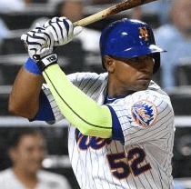
Meanwhile, over on ESPN: I have a new ESPN column slated for today. It uses Mets outfielder Yoenis Cespedes’s neon compression sleeve as the jumping-off point for a look at other recent/current neon-clad athletes and teams. It’s mostly stuff we’ve seen and discussed before, but the cumulative impact of all the neon-centric photos is pretty powerful. Check it out here.
Rocket to Nowhere: Lots of news out of Houston last night, as the Rockets unveiled not one, not two, but three new alternate uniforms, one of which won’t even be worn until the next season (click to enlarge):
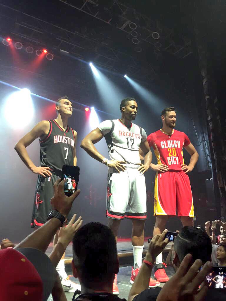
You know things are rough when the BFBS design is the best of the bunch. That’s also the one that won’t make its on-court debut until next season.
The Rockets say the sleeved design in the center is “silver,” but of course that’s bullshit — it’s just GFGS. The checkerboard pattern on the side is meant to mimic the design of the old 1960s Gemini Rockets, which is a textbook example of how so much sports design now emphasizes “story” at the expense of aesthetics. Is it a cool idea to tie the uni design to the Gemini? Yeah, it is — in fact, it’s a really cool idea. The problem is that at the end of the process you’re still stuck with a sleeved GFGS uni that looks like crap. It’ll make its on-court debut on Nov. 25th, and I’m sure the fact that that coincides with the start of the Christmas shopping season is almost completely a coincidence.
And then there’s the sleeved “Clutch City” design, which is just embarrassing. It replaces this design and will make its on-court debut on Nov. 14, and that’s really all the energy I want to waste on it.
Incidentally, if you’re wondering about the “Rocket to Nowhere” header on this section, it was mainly an excuse to embed this classic nugget of proto-punk, which is certainly a better piece of creative work than any of Houston’s newly unveiled uniforms. It would be great if the Rockets adopted it as their theme song, but I’m not holding my breath, so go ahead and play it while reading the next section of today’s entry:

New ESPN project: In a few weeks I’m going to debut a new weekly feature on ESPN. It’s such a no-brainer of a concept, I can’t believe we didn’t come up with it sooner: “Uni Watch Throwback Thursdays” (or maybe “Throwback Thursdays with Uni Watch,” or something like that — we haven’t settled on the final name yet). It’ll be pretty much what it sounds like: Each Thursday I’ll take a look at a uniform that’s no longer being used — sometimes from the recent past, sometimes from the distant past — and discuss its design, its origins, how it fits into its team’s history, and so on.
This should be a lot of fun. As we all know, new uniforms often inspire rancorous debate (hi, Browns fans!), but just about everyone likes looking at old uniforms. The good ones get us feeling nostalgic and the bad ones usually seem like amusing novelties in retrospect.
I’m not sure exactly when Throwback Thursdays will debut, but I plan to start working on it after I get back from a short road-trip vacation that I’m about to embark upon with my friend Aimee (leaving tomorrow morning, returning next Tuesday night; Phil will have the conn while I’m away). It should be a cool project, and I hope you folks enjoy it as much as I expect to. Okay? Okay!
The Ticker
By Paul

’Skins Watch: Running ’Skins Watch early this week, because I’m about to leave town for a bit. ”¦ Faaaascinating article about the 2000+ high schools that still use Native American-related team names and imagery (from @PleatedFront). … Someone has come up with a really good ’Skins T-shirt (thanks, Phil). ”¦ UND’s search for a new team name to replace “Fighting Sioux” has been complicated by the former mayor of Bismarck, who wanted the old name retained and is now trying to mess with the name-selection process by trademarking some of the more likely choices (from Jody Michael).

Baseball News: Ooooh, look at these gorgeous All-American Girls Professional Baseball throwback replicas. Very nice! … Check out this A’s team portrait — players in gold and coaches/staff in white. Not sure I’ve seen that before (from Dan Wohl). ”¦ Great shot of Rogers Hornsby schooling some Des Moines minor leaguers. That’s Ron Santo on the left (from Chris Williams).

NFL News: Reader Bill Kellick took his son to the local Punt, Pass & Kick competition last weekend and was surprised to see that the PP&K signage had the old NFL logo. ”¦ As if the Giants didn’t have enough problems, a bunch of their players are trying to convince people that mandals with socks are a good idea. Further details on that trend (not just in the Giants’ locker room) here (thanks, Brinke). ”¦ Depressing tweet of the day: Someone out there likes the Niners’ BFBS alts in part because the Nike logo really “popped.” Sigh. … Odd logo creep placement on Packers coach Edgar Bennett’s cap (from Evan Kenney). ”¦ The 49ers’ new BFBS alts made The New York Daily News’s list of all-time ugliest uniforms (from David Feigenbaum). ”¦ In a related item, Mets color commentator Keith Hernandez, who’s originally from the Bay Area, described the Niners’ BFBS alts as “hideous” during last night’s broadcast. No word on what he thinks of the Browns. ”¦ Looks like Giants DL Jason Pierre-Paul’s specialized glove will have to be even more specialized than we originally thought.

College Football News: Here’s a good video about how Florida State applies the tomahawk merit decals to players’ helmets each week (from Mike Weston). … There’s been chatter about of the U. of Akron possibly changing its name to Ohio Tech. The football team is apparently preparing for that possibility with some new uniform concepts (from long-lost Vince Grzegorek). ”¦ New whiteout uniforms this weekend for Texas State. ”¦ 3D team-logo thigh pads this weekend for some Penn State players.

Hockey News: The Islanders had originally planned to unveil their new black/white alternate uniform next Monday, but now they’ve moved it up to today. Expect them to appear sometime around 10am Eastern. Here it is. ”¦ A Virginia club hockey goalie was ejected for chugging beer during a game (from Tommy Turner). ”¦ Goaltender Ray Emery wore his Flyers gear for a tryout with the Lightning (from Jason Yeckley). ”¦ New jerseys for the Wilkes-Barre/Scranton Penguins. ”¦ New theme jerseys for the Huntsville Havoc. ”¦ Throwbacks on tap for the Sioux City Musketeers (from @OneTimeStein).

NBA News: The Pelicans have scheduled a “special unveiling event” (as opposed to, you know, all those ordinary unveiling events) for Thursday, 2pm Eastern. I’m assuming they’ll be revealing the “NOLA” design that was first leaked back in July. ”¦ Lots of photos of Moses Malone are currently circulating, including this one showing him with a different “2” than his teammate is wearing.

College Hoops News: New uniforms for Duke. “It appears to have elements from each of the three styles of jerseys they wore last year,” says Jeff Cox. … New uniforms for UNC as well, with the new “Carolina Bold” font (from James Gilbert). … And also for Syracuse.

Soccer News: Interesting story about how L.A.’s new MLS franchise is marketing to millennials (from Andrew Rader). ”¦ “Tottenham Hotspur seemed to be having some trouble with the fabric on their purple third kit during their away game at Sunderland this past Sunday,” says Adam Herges. “In the first few minutes, Kyle Walker had a tear on the side of his shirt, and Harry Kane later had a similar problem with the back of his. Both players were summoned to the touchline and were given a new shirt by the kit man, printed with the correct name and number. Which begs the question: how many backup shirts do they bring to away games for each player?”

Grab Bag: Logo unveiling in the works for a new Pakistani cricket league. ”¦ San Antonio firefighters have been asked not to wear their uniforms while off-duty, even while commuting to/from work, because command worries that first responders in the area are being targeted. ”¦ Here’s an article about Reddit’s alien logo character. ”¦ It’s spreading: The new logo for the chamber of commerce in Fayetteville, N.C., “features four stars in a salute to the military.” ”¦ Adrian Frutiger, one of the greatest typographers you’ve never heard of, even though you’ve seen his work a million times, has passed away. R.I.P.
Mañana: As I mentioned a few hundred words ago, I’m leaving on a short vacation tomorrow, but I’ll put tomorrow’s entry together and post it before I leave. Phil will be in charge while I’m away, and I’ll be back in the saddle next Wednesday. See you then.
Proofreading: “You things are rough when the BFBS design is the best of the bunch.”
Thanks, Jerry. Fixed.
i hate the “aren’t they called the browns” .. such an uninformed comment
this is in regards to the all time ugliest list #2
The fact that they were named for a person (who didn’t want them to be) doesn’t change the fact that the name IS a color, and therefore people are going to expect them to wear it. The St Louis Blues are named for music, but it’d still be really stupid if their primary colors were red & gold.
How do you feel about “Bowling Green” THE?
What colors should they wear?
That’s different and you know it. I mean, if the name of city means they should wear green, then every team in Buffalo should have a buffalo on their… wait… dammit. I guess they should wear green.
Always thought Bowling Green should have green as one of its school colors. That just bugs me.
One of my best friends lives in a town called Hazel Green. Their high school’s colors are red and black. I always shake my head at that.
Green High School in Ohio wears orange and black.
At least Orange High School does, too.
The Eugene Emeralds were an affiliate of the Reds back in the day, so they wore…RED.
No green. Just red.
Basking Ridge (N.J.) High School are the Red Devils. Their color? Green.
also the concepts for Akron say “Ohio Tech” not “Akron Tech” btw
sorry last one:
RE: It’s spreading: The new logo for the chamber of commerce in Fayetteville, N.C., “features four stars in a salute to the military.”
well that make sense since Fayetteville is military town and home of Fort Bragg, the second biggest Army base in the country
1) Fort Bragg is not in Fayetteville. It *borders* Fayetteville.
2) There is no such thing as “a military town,” unless you’re under martial law. Every town is a civilian town. NYC, where I live, is home to Fort Hamilton and what is arguably the nation’s most famous U.S. Army recruiting station, among many other examples of the city’s military culture. But it is not “a military town.”
i lived there for 5 years.. and Fort Bragg is pretty much all there is in Fayetteville. if it wasn’t for Bragg then Fayetteville would be a much smaller town with a smaller economy than it currently has. when i say “military town” i mean the population is comprised mostly of Military people which is the case for Fayetteville.
also it’s more of the center of Fayetteville, the city wraps around the base a bit
Thanks for explaining, Tony. Yes, I figured that’s what you meant. It’s a term that I feel is used far too casually, so sometimes I like to push back against it.
What about college town?
Cow town?
Ghost town?
Paradise city?
All are imprecise terms that have entered casual usage, much like “military town.” But none has the political implications of “military town.”
“A military town is a civilian municipality which is economically dependent upon or receives its greatest economic impetus from a nearby military installation, such as a military base or military academy.”
Source: link
No “political” implications in that definition, which aligns pretty much dead-on with Tony C’s (or, I would wager, most peoples’).
Yes, duh, as I already stated, I’m aware that the term has entered casual usage.That doesn’t make it a GOOD term.
The political implications are twofold:
1) There are *real* military towns in this world — communities under martial law, for example, and communities in countries where the military controls the government (as opposed to our system, in which the government has civilian control of the military). In those places, there’s nothing casual about the term “military town” — the term is frighteningly real. Happily, we don’t have martial law or a military government in America. As such, I would argue that the term “military town” is actually somewhat un-American.
2) When a community is too closely identified with the military, it becomes all too easy for the community and its residents to become rubber stamps in support of military policy, which is always dangerous in a free society. This tends to happen even though the community’s connection to the military is, as Tony indicated upthread, primarily financial. In other words, “military towns” run on artificial economies based primarily on government largesse (just as “college towns” have artificial economies based primarily on wealthy out-of-town parents). So when the Fayetteville Chamber of Commerce designs its logo to “support the military,” that’s not coming from any sense of patriotism or citizenship or respect for service; it’s just about money. And that money, incidentally, comes from your taxes and mine.
No “political” implications in that definition…”
~~~
Not explicitly, no.
But any town that derives most of its employment/economic benefit from one specific industry that in and of itself is dependent upon the whim of the government for its existence (and the government is of course, made up of politicians and their appointees), is, by extension, at the *mercy* of the government. If the government decides to curtail the size of the military or its role, or reduces its war-making capabilities and weaponry (in the case of a town dependent upon the making of killing machines), bye-bye base and bye-bye military town (not overnight, of course, but over time).
A similar (though not exact) parallel could be made for any industry (cars, coal, buggy-whips, widgets, etc.) — if the need for any of those dries up, basically the town dependent upon those goods and services does too (assuming it’s the only game in town, of course). But none of those are dependent upon the government (and politicians) creating a need for their services.
“So when the Fayetteville Chamber of Commerce designs its logo to “support the military,” that’s not coming from any sense of patriotism or citizenship or respect for service; it’s just about money. And that money, incidentally, comes from your taxes and mine.”
it is the chamber of commerce.. which is a federation of buisnesses..so yeah it’s about the money.. and identifying their largest consumer base .. the men and women of the army who are nothing but disposible income in the eyes of 99% of the area’s businesses
ALSO this is the second City of Fayetteville seal that has been talked about being changed. early in the week you had a ticker item about the City seal/logo being changed because of the city market being identified with the slave trade
Let’s not forget Queen City- NYC, Chicago, LA.
Cincinnati NLA.
The phrase “college town” is used to describe many different towns/cities, including (a) a town/city that happens to have a college/university located in or around it, (b) a town/city that has its culture materially impacted by the presence of a local college/university, and (c) an actual town (rather than a city) that is quite small in comparison and perhaps dwarfed by the college/university located there. Without knowing the context, it is difficult to know the meaning of the appellation “college town” in each case. I suppose Paul is right that the use of the term “military town”, without putting it into better context, could be misleading or unhelpful. Now, back to uni stuff….
Holy Adam Smith Pee El & Phil,
Hilarious discussion about the Fayette-Namese sucking up to the Brass hats.
A round of applause for your extra uni-versal poli-sci knowledge.
Ironic that in the very conservative South, The land of gun lovers and bible belters – this kind of Military / Industrial largesse is so ingrained in the local culture / economies that they consider it as almost a right. As demonstrated by the public displays of arse kissing, Kow towing and other demonstrations of boot licking.
They fail to see it for what it is…A SOCIALIST program without the hipsters, minorities, liberals and other ooky types to share with. no wait.
If only the military offered free healthcare and left out the building of things that blow up and kill people they might be on to something.
A round of applause for your extra uni-versal poli-sci knowledge.
Thanks. But I was a poli sci major, after all…
QOTD Larry! (Might be tomorrow’s too…)
All Day I Dream About Stanleycup
Those AAGPBL unis are peachy!!
K&P Weavers does fantastic work for many vintage base ball teams. Their AAGPBL repro unis have been top-notch for some time.
Who was the moron that let the Daily News ‘worst unis’ picture gallery go live? In one post, they trash (deservingly) the new Buccaneers uniforms and state ‘Bring back the Creamsickle’.
Then, near the end, the Creamsickle uniforms make the list.
“Who was the moron that let the Daily News ‘worst unis’ picture gallery go live?”
Scott,
Sir, I think you repeated yourself.
It looks like it might’ve been something that was originally done up a couple of years ago, and they just tacked on the latest stuff to the front of it and called it new.
The fact that Spurs’ kit man can provide players with replacement jerseys posthaste may *invite* the question of how many backups they carry. It doesn’t *beg* it, though.
My assumption is: the kitman possesses the capability of adding name/number to any blank top they have if it is ever needed. They may be able to do it in time for a player to wear it, or they don’t (which is why we can see blank tops at times).
Or…they leave their machine at home and cannot add the name/number.
Soccer jersey tops don’t take up much space. A high dollar club like Tottenham will more than likely bring spare tops printed for its players, especially players who are starting a match.
Also, I would guess that players might want to change into a fresh top at half time, so another reason the kit man would have printed spares available.
Yup. Many top clubs switch kits -at least shirts – at half time.
On the topic of Native American high school mascots, you can subtract one from the “Raiders” column. Loch Raven High School in suburban Baltimore has always used a pirate theme; the school’s rings (I have one) depict a pirate ship on one side. Unusually, the rings also include a wave motif around the school name and gemstone, a nod to the initial debate over “Raiders” vs. “Lakers” as the school nickname. Finally, the school colors are (unfortunately) Lakers purple and gold.
Self promotion alert, I designed these scarves for Indy Eleven’s Oktoberfest event this weekend. Not uni related but I thought everyone here might enjoy:
link
Nice design. Can’t get enough of those lederhosen inspired unis and accessories.
I’m in love with the scarves, but I can’t travel to Indianapolis this weekend; how can I get my hands on one of them or both?
Same scarf just showing front and back. I believe they are being sold exclusively at the Oktoberfest event before the game. So need a game ticket and a ticket for that event which is basically a beer tasting event along with some other German themed festivities.
Gotcha. Hopefully some will show up on eBay at some point. Enjoy the festivities!
Dear adidas,
Keep the 3 stripes to a minimum and you’ll be cool.
I have little faith in them to handle sports beyond soccer, seeing how they have ruined college football. But I am somewhat heartened that they didn’t overreach with the NFL or the NBA. I can’t see them telling a team like the Canadiens that they’re getting the 3 stripe treatment.
Moses Malone invariably had a different “2” with the diagonal stroke than his teammates. I noticed that as a kindergartner, which is how I knew even then that I Got It(TM).
Looks like Syracuse is finally coming back to their senses with their hoops uniforms. Less silver and more sanity is nice. Now, about those football uniforms – I am guessing they maybe the next school Nike tries a UNC or Colorado-style schoolwide restyling where everyone looks the same (fonts, styles etc.).
In my opinion, they’ve ruined a lot of soccer too. I don’t mind the 3-stripes all the time…but I do mind templates.
Most soccer kits adidas has are templates. MLS basically is all the same kit. College soccer kits, adidas makes 1 or 2 that are college legal. Very poor in design, but easy to manufacture.
Unfortunate.
I’m always worried about adding logos to socks like OHL/NCAA. I don’t think it’ll creep anymore on the jersey.
Adidas has let logo creep get in the way in the past. D.C. United, for its first several years, had three stripes across the chest. Boom. Right there. Adidas.
Also, Adidas once supplied uniforms for the U.S. paralympic sled hockey team. I saw a uniform from sometime around 1992 which was pretty much the CCM jersey but with a long three-stripe braid in the middle of the big shoulder/sleeve stripe. Kind of looked like a railroad in the midst of a big field.
I don’t have any pix to back that up, though.
…AND ruined college basketball, AND ruined college baseball. Look at TAMU, UCLA, Louisville, Irvine, etc. before and after the Adidas treatment – it’s sickening how Adidas takes fantastic looks and destroys them. In every sport with multiple uniform makers, Adidas are BY FAR my least favorite. I don’t care about the 3 stripes concept, but forcing their unconventional templates across the board makes me want to vomit with rage.
This is literally the first time I’ve ever heard the term ‘mandals’. Weird.
Best worn at the beach with a mankini.
So, Paul… the Tottenham purple shirt apparently being problematic… does that serve them right for choosing your (ahem) favorite color?
Being a Spurs supporter I was thinking about buying one of the purple shirts but if they’re falling apart I probably won’t.
The sad truth: My brother is a Tottenham fan. He doesn’t realize how much I hate purple. (Yes, this says something about the state of our relationship.)
So the Islanders have officially gone Brooklyn for Brooklyn’s sake.
Zing!
Here’s the full Isles gallery
link|NYI|home
I like the thin sleeve striping, I wish it went around the waist too instead of one bolder white strip at the bottom.
I don’t like the odd modern collar design.
I find the alts to be too simple. Looks like the effort was either rushed or lazy (trying to be similar to the Nets).
Have to admit, I don’t hate it. The sweater isn’t that bad; while I agree that they should have extended the sleeve striping to the body, they need something like the wide white hem to separate the sweater from the pants.
… which are another story. Eliminate the NY logo from the pants, or make it smaller like many other teams wear. At that size, it almost looks like an ad.
Someone burnt the fishsticks! LOL
The “BKLyN” on the helmet is a nice touch. That would have looked good placed on the jersey, or the pants instead of the redundant still-to-big “Ny” on the leg.
link
It seems a bit too simplistic, perhaps, and it’s still BFBS, but it’s far superior to their previous black alternates.
The Islanders alts:
We get that they won four cups in the 80s. But their thing with “four” everywhere: four stripes on the shoulders, four hunks of tape on the logo stick, at some point does the message wear a little thin? “we were great once”
The Oilers did this for a bit with their alts – five gear teeth for five cups – but abandoned that a while ago. I can’t think of another team that spends so much effort reminding people that their best days were 30 years ago.
Great points, Mike, and as an Islander fan, I completely agree with your sentiment.
That’s the problem with fans though — those four cups are ALL Islander fans have. So any reminder of that (to them) is welcome. As a design element, however, it’s shit.
See, I totally disagree with your last point: As a design element, it’s great! Love those four orange stripes (although I agree with Mike’s point that they sort of accentuate how long it’s been since the franchise’s glory days).
I’ve gotta say, this is kind of an upgrade for the Kings. These are for the Kings, right?
If only the alt was in, you know, actual team colors, I’d like it. As it is, I pretty much despise the Islanders, so I’m pleased by the extraordinary crapitude of these jerseys. I like the basic ideas of the NY logo as a standalone element and the four-stripe thing on the edges. But man, that non-team-color thing is brutal. It would still be an ugly uniform if the Islanders switched to a black-and-white color scheme, but at least it would make sense. But at the moment, they’re a blue and orange team that’s wearing black for no good reason whatsoever.
“…they’re a blue and orange team that’s wearing black for no good reason whatsoever.”
~~~
Unless of course, you’re Rbk/adidas, and your goal is not to make the Islanders look good, but to capitalize on merch sales. Wait, that’s redundant.
Think I’ll check out those new Rockets alts…OWW MY EYES!
Paul, back in the day, when the Oakland A’s took their team picture, the coaches wore white, while the players alternated green and gold…
link
Shame they didn’t quite get the checkerboard effect… but that’s still probably the most awesome team photo I’ve seen.
Everyone with their arms folded like a bunch of bad asses. I loved the Swingin’ A’s.
Oakland may never see another period like the mid-70’s when the A’s, Raiders, and Warriors were all relevant.
Yeah, this gold/white one the A’s have been doing since they brought the gold jerseys back a few years ago
Today’s ESPN column is up:
link
This is one time where I’ll applaud Gary Bettman. God it feels so wrong, but here we are. He drew a line in the sand and seems to “get it.” Good on him. Now let’s hope the teams are smart enough to keep their uniforms intact and avoid any “three stripe” overload, which a lot of people seem to be fearing. If it ain’t broke, yadda yadda.
So two things I’ve posted in the comments section here end up in the ticker today, but neither because I said it. I also thought the gold popped on the 49ers jersey, and I mentioned the Duke unis over a week ago. This tells me that Paul is not paying enough attention to my wise musings in the comments section and probably pays more attention to things that are tweeted at him.
I think their primary ticker source is email – but they keep a list of things from twitter that they carry over.
The real reason I replied to your post: there was gold on the 49ers unis???
The Nike swoosh was gold. So, it did “pop” as it was the most visible thing on the uniform.
Hopefully the backlash against these uniforms will be enough for the team to not wear them again… but they won, so we might not be that lucky.
“The Nike swoosh was gold. So, it did “pop” as it was the most visible thing on the uniform.”
~~~
well then, mission accomplished swooshie!
I can’t speak for Paul but even if you post something in the comments section you should ALWAYS e-mail the link account. That way you can be sure it is seen and recorded. Not everything in the comments section (at least when I’m doing the ticker) is necessarily going to be scrutinized for ticker submissions when the best way to do that is via the uniwatching g-mail.
Let’s just get back to the ’90’s when uniforms were intended to enhance the entertainment elements of “sports entertainment”…
link
Gosh, these were fun and never dull nor douchy.
Further to today’s column on neon yellow – the bright shoes are now very common in Track and Field
link
And how about soccer? Carli Lloyd and the United States won the world cup in white, black, and neon green.
Orlando Thunder, anyone?
Or almost every “change strip” FC Barcelona has worn over the last 15 years — traffic cone orange, hot pink, highlighter yellow, rave green, coral.
And the most infamous: Notre Dame men’s hoops under Digger Phelps. The one-off neon jerseys against Syracuse. Looked like a bunch of tall Easter eggs when they played that game.
I should have included the USWNT. Big oversight on my part.
And your other suggestions are also good.
You take a shot at Nate Silver for saying “for years” that ads are “inevitable”, but nothing yet has happened. Ironically, that also pretty much summarizes your stance/prediction on the Redskins name change.
Of course the situations are not identical as Silver is in a position of direct control where you are not. But still, just saying.
I think you’re referring to Adam Silver, not Nate.
You’ve already singled out one big difference between Silver’s situation and my own: He has the power and authority to make his inevitability a reality, or at least to influence it, yet he’s been unable to make it happen.
Here’s another difference: Aside from peanut gallery chatter, there’s nothing — NOTHING — to indicate a shift toward jersey advertising in top-level North American sports. Nobody has dipped their toe in the water, there’s no trend, there’s no preponderance of anything. Just a lot of speculation (much of it initiated by — surprise! — Adam Silver). By contrast, there’s a strong trend toward the elimination of Native American iconography throughout the sports world. Predicting that this will culminate with — or at least include — the changing of the ’Skins name isn’t a willful exercise in self-fulfilling prophesizing; it’s just a reasonable conclusion produced by connecting fairly evident dots.
On the Adidas “We didn’t get into this deal to share brand exposure with outside advertisers. We got into it to have exclusive exposure,” there is precedent for that thought from that company. For a decade or two Adidas did the exact same thing with the All Blacks. Heavy pressure was on the NZ Rugby Union to add a sponsor and their standard reply was, “Adidas won’t let us because they are paying out the nose to be the only logo on the jersey.” Now, that standard eventually fell a couple years back. Even then, AIG was forced to rework the logo and shrink it compared to its size on other jerseys. So it wouldn’t be the first time Adidas blocked sponsorship.
Also, even though every team in NZ has three stripe patterns everywhere, the All Blacks have not added that to either the jersey or shorts all these years. (They do have stripes on the socks, though they have been made black on black most recently.) It was just a non-negotiable with them that the shirt be “all black.” I’d think the NHL would have the same veto power, if they care.
Re: Rockets’ alts
…BFBS alt – well, at least it says HOUSTON. For a long time, they didn’t have any indication of their home city, until the Ronald McDonald alts of the last few years, which I assume have been replaced by the Clutch City alts (I hated that name, even when I lived there, since it seemed such motivational poster pablum…although it was better than “heart of a champion”).
Re: Isles’ alt
…I don’t mind it. At least it’s simple.
I was also glad that Bettman pushed back about going to tight fit sweaters for the NHL.
I dont like it in soccer (how do the Arsenal players move in kits so tight), and it would ruin the look of hockey players (not to mention us fat fans who like wearing hockey sweaters for their ample room). :)
As to the Skins watch. My high school’s rival is Warriors. They have three logos. A big Wisconsin style W is primary, a generic native american head as a secondary, and an anthropomorphic ear of corn as a third (their football field is surrounded by corn fields and they doused my schools courtyard with corn every year). They got blessing from Isabella Reservation group (same one that Central Michigan got approval from) to continue using Warriors.
Why are the Pitates wearing those hideous throwbacks? I threw up a little when I put FSNP on. Yeah I know it’s Root now but that’s stupid. As are those ugly throwbacks. I panicked and thought I slept until Sunday. UGH!!
We had an EMS run so I missed the pregame today. I see now it’s Celemente Day. So I guess that means they have to wear the ugliest uniforms they’ve worn in decades? Blah! Wear the regular uniforms. Poor AJ finally comes back and gets stuck in those.
You’d prefer they wear what? The gorgeous black softball tops?
Meh, the pullovers are more softball tops to me than the colored softball tops are. At least the black has buttons consistent striping and a better yellow. Plus black is my favorite color so I like the black. It is overused but I’d prefer it over the throwbacks. I’d even take the horrible cammo over the throwbacks. But we also all know how much I hate this retro fad.
On the socks with sandals thing; At least in Ohio, this is actually a normal thing. It caught in because guys after football practice would put on sandlas after because it was more comfy. The trend also continued in track season. My friends and I would wear sandals in between event because we didn’t want to put on shoes after wearing our spikes. It was just practical, at least to us
I know I’m fighting a losing battle here, but I think the Isles previous black alternates are way better than the “new” (AKA black and white version of the equally bland Stadium Series design) ones. At least those had the team name and actual team logos. Of course I find those black alternate sweaters generally very underrated.
I for one, like many people, don’t care for logo creep on uniforms. HOWEVER, I do think Adidas’s point about not wanting to share brand exposure is a good sign. I think we can all agree that logo creep is still better than soccer kits with poorly designed betting site logos on the front. Perhaps a reminder to not let perfection be the enemy of the good.