[Editor’s Note: Today we have a guest entry by Jory Fleischauer, who’s going to fill us in on Sunday’s throwback-themed Southern 500 race. ”” PL]
By Jory Fleischauer
Darlington Raceway in northwestern South Carolina is NASCAR’s Wrigley Field. Built in 1950, it is one of the most difficult ovals in the country — egg-shaped (due to a promise not to disturb a neighboring farmer’s minnow pond) and high-banked. It is almost a rite of passage each year for a car to make contact with the outside wall.
Darlington is the site of the Southern 500, NASCAR’s oldest 500-mile race, first run during Labor Day weekend in 1950, and has become a premier event during each NASCAR Sprint Cup season. Starting in 2004, the Southern 500 was moved from its traditional Labor Day date to Mother’s Day weekend in early May, but this year it returns to its rightful spot on Labor Day weekend. As part of the festivities, officials are making the event retro-themed — a first for NASCAR. The initial plan was to have eight or ten teams running throwback paint schemes, but now it has exploded to more than 30 teams running retro-inspired cars. In addition, TV partner NBC and radio partner MRN are bringing back classic announcers, clothing, and graphics packages, and the track is bringing back classic concessions like fried green tomatoes and pimento cheese sandwiches, with Grand Funk Railroad performing pre-race and Tanya Tucker singing the national anthem.
Here’s a driver-by-driver look at the throwback designs (for each of these, you can click to enlarge):
2. Brad Keselowski

Miller has enjoyed decades of success in NASCAR, and this weekend Keselowski will run a scheme based on 1983 Winston Cup champion Bobby Allison. Already this year Keselowski has donned another historic Miller scheme, running the Miller Genuine Draft colors made famous by Rusty Wallace in the early 1990s.
3. Austin Dillon

Prior to being a successful car owner, Richard Childress was a well-known owner/driver in the then-Winston Cup series in the 1970s. Dillon’s scheme is based on one of Childress’s last schemes sponsored by CRC in 1980.
4. Kevin Harvick

Harvick’s car is inspired not by a historic scheme but rather by his sponsor’s historical lineage. Budweiser elected to represent theirfirst can, which was introduced in the 1930s (although some fans have noticed a resemblance to another famous No. 4 car).
5. Kasey Kahne

Prior to becoming the behemoth known as Hendrick Motorsports, Rick Hendrick’s fledgling team was known as All-Star Racing. Kahne will represent Hendrick’s very first paint scheme, run in 1984 by Geoffrey Bodine.
6. Trevor Bayne

In 1998 Roush Racing unveiled one of the most visually dynamic paint schemes the sport had seen at that time for longtime driver Mark Martin. The base possessed a fade utilizing Vs , in reference to the sponsor. For Darlington, Bayne resurrects this scheme, replacing the Vs with As to reflect current sponsor Advocare.
7. Alex Bowman

Team owner Tommy Baldwin’s father, Tom Baldwin, was a well-known and successful modified racer. For Darlington, they decided to honor “Tiger” Tom by running one of his old paint schemes, complete with decals to make the car look like a modified.
9. Sam Hornish Jr.

Roush Racing driver Mark Martin dominated the Busch Grand National Series, a tier below the then Winston Cup Series, in the 1990s with sponsor Winn-Dixie. This sponsor returns to the sport after a more then decade-long absence, emulating the scheme that went to Victory Lane a total of 39 times.
10. Danica Patrick

Darlington is nicknamed “The Lady in Black”, so GoDaddy thought it fitting for Danica’s scheme to be primarily black to represent that moniker.
11. Denny Hamlin

For the second time in his career, Hamlin will run a scheme honoring three-time Winston Cup champion Cale Yarborough’s 1974 car. In 2012, Hamlin ran a scheme representing Cale’s 1978 paint scheme.
14. Tony Stewart

Stewart’s paint scheme represents his sponsor, Bass Pro Shops, whose very first Bass Tracker boat package appeared in 1978. His car is painted in the same style as the original Bass Tracker boats, complete with retro logos.
15. Clint Bowyer

NASCAR recently lost one of the greats of the sport in Buddy Baker, but plans were in motion prior to his death for Bowyer to represent Baker’s 1974 scheme. In true retro fashion, the team elected to hand paint the entire car for this weekend. You can view a clip of the process here.
16. Greg Biffle

Biffle’s scheme for this weekend is a combination of history for both the sponsor and the car number. Ortho’s first company sales cars used this exact shade of red, while the stylized No. 16 is the same as the one run by former Daytona 500 winner Tiny Lund in 1968.
17. Ricky Stenhouse Jr.

Invoking one of the most iconic paint schemes of 105-time winner David Pearson, this scheme has been a fan favorite ever since the announcement that Stenhouse would be using it.
21. Trevor Bayne

The Wood Brothers’ current paint scheme is a direct homage to their look of years past, so instead they have taken one of their modern schemes and emblazoned it with 60 years’ worth of photographs outlining the team’s history across the sport, including their first Darlington start in 1961.
22. Joey Logano

Logano and Penske Racing bring the 24 Hours of Le Mans to the Southern 500, with their paint scheme highlighting the same colors and general design as the one run by Mario Andretti in 1988.
23. Jeb Burton

This scheme honors Jeb’s father, Ward, who was the 2001 Southern 500 winner and 2002 Daytona 500 winner.
25. Chase Elliott

Chase’s father, 1989 Winston Cup champion Bill Elliott, wore this design on his Ford Thunderbird during the peak of his career in the late 1980s.
26. JJ Yeley

Yeley invokes a classic car design trait from the 1950s with this retro-inspired ride.
27. Paul Menard

Menards has a strong tie to motorsports, dating almost to the company’s inception. This scheme was designed in part by Paul and references the design used by the company’s marketing department in the early 1970s, as well as the early schemes carried by a variety of race cars.
31. Ryan Newman

Caterpillar has chosen to utilize the logos and designs from their heavy machinery equipment of the 1970s on Newman’s car.
32. Josh Wise

One of the most famous finishes in NASCAR history occurred at Darlington in 2003 and involved this scheme, then run by Ricky Craven.
33. Mike Bliss

The Skoal bandit graced NASCAR events for nearly 20 years, with this particular scheme representing the final years of the original bandit, Harry Gant.
40. Landon Cassill

For the first race after the attacks on Sept. 11, 2001, virtually every team ran a patriotic paint scheme. This weekend Cassillwill drive a car based off of the Sept. 11 scheme of former driver Sterling Marlin.
41. Kurt Busch

Prior to becoming Stewart-Haas Racing, the team was simply known as Haas CNC Racing. This weekend they’re representing their first Winston Cup scheme from 2003.
42. Kyle Larson

This scheme was first made famous by Tom Cruise in Days of Thunder and then brought to Victory Lane multiple times by Kyle Petty in the early 1990s. The reveal of this scheme has seemingly garnered the largest excitement from the legions of NASCAR fans, and especially from its former driver.
43. Aric Almirola

STP and the famous No. 43 return to Darlington, with Almirola running the same design Richard Petty ran during the 1972 season.
46. Michael Annett

Pilot/Flying J has chosen to highlight their logos and color scheme from the 1970s.
48. Jimmie Johnson

While sponsor Lowe’s has been in the sport since 1995, they chose to delve even deeper into their history by utilizing their logo and colors from the original Lowe’s store in the 1940s.
51. Justin Allgaier

While A.J. Foyt is most often remembered for running the No. 14, it was the No. 51 that he piloted between 1977 and 1984 in his selected Cup series starts.
55. David Ragan

Ragan’s scheme is probably the most personal of all of those running, as it is a replica of the same scheme his father, Ken Ragan, raced in the Cup series in the late 1980s.
88. Dale Earnhardt Jr.

Valvoline has been in the sport long enough to have a plethora of classic schemes. For Darlington, Junior has chosen to honor the schemes run during the early 1980s in the Cup series.
Not every driver is getting in the throwback spirit for the race. Retiring NASCAR champion Jeff Gordon elected to run a throwback to his very first paint scheme two weeks ago in Bristol. Even Dale Earnhardt Jr. has poked a bit of fun at those not participating.
Additional details, like Goodyear decaling their tires as if they were from the 1970s and many contingency sponsors utilizing old school logos, should make the event even more interesting. If you have not watched a NASCAR race in years (or if you’ve never watched one, for that matter), this is a good one to check out. Coverage starts on NBC at 7pm Eastern on Sunday.
T-Shirt Club update: The maroon-based design was the overwhelming winner in our poll to choose a powder blue T-shirt concept the other day. But several of you suggested that the maroon design would be stronger with gold outlining. I liked this idea, because (a) gold is a Uni Watch color and (b) it would make the design less Phillies-like. So here we go (click to enlarge):
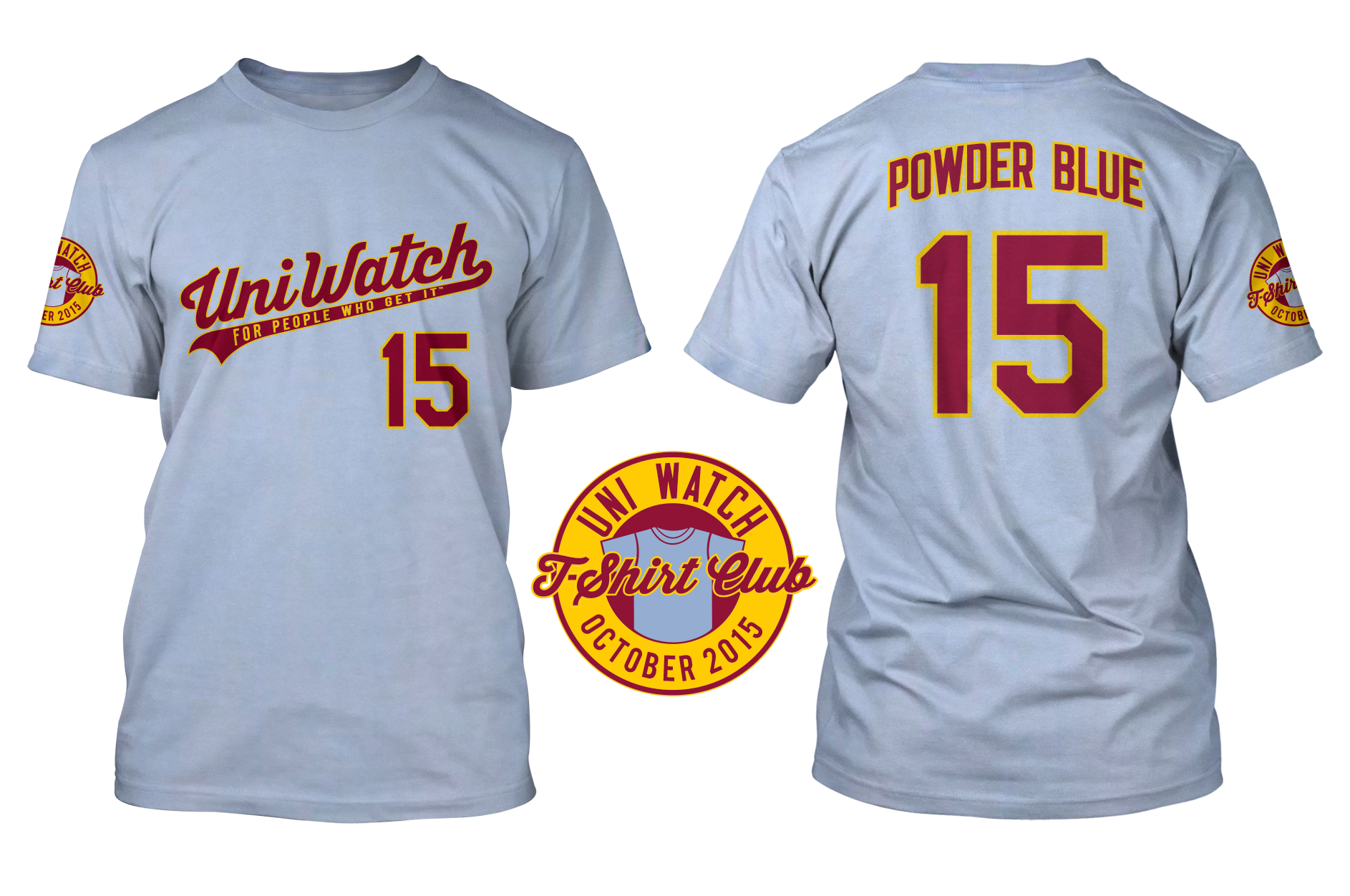
Definitely an improvement over the previous version — my thanks to all who suggested it.
The Ticker
By Paul

’Skins Watch: A Tulsa artist has weighed in on the Native American mascot debate by painting a bunch of famous white people onto football helmets (from Kevin Allen). ”¦ “I had an interesting side conversation with a friend of mine who’s a freelance cameraman for the Kansas City Chiefs in-house video,” says Alan Bloomquist. “He said they will get fired immediately if they show anyone in any sort of ‘war paint’ or Native American imagery. They had one case where they had to get approval to show a kid wearing a Chiefs helmet with half his face painted red. Apparently national broadcasts are only discouraged from showing anything by the league, but in-house video is strictly banned from showing any fans dressed up in that way.”
======

Baseball News: A St. Louis teen has created an amazing Rubik’s Cube mural of Stan Musial (from Jonathan Daniel). ”¦ Bat flipping is considered bad form here in America, but it’s no big deal in Korea. ”¦ Follow-up to yesterday’s entry on infield design: U.S. Cellular field has a rounded corner, instead of a convex cutout, at second base (good one from Andy Bartsch). … In a related item, you can see how every infield looked in 2011 via these cool overhead shots (from Patrick O’Neill). ”¦ Interesting article on uniform numbers in the Korean league (from @MyKBO). ”¦ The York Revolution will wear Little League jerseys (from Bryon Brinson). ”¦ Show Me State land art: a Royals/Cardinals corn maze (thanks, Mike).

NFL News: Tracking sensors will soon be embedded in NFL pads and uniforms. … Packers QB Aaron Rodgers and RB John Kuhn both dressed in military pilots’ uniforms for the team’s welcome-back luncheon the other day (from Dennis McMillan). … A Pats jersey with a “Super Bowl XLIX Champions” patch just showed up in the team’s online pro shop. Not clear if they’ll be wearing that patch for the season opener. ”¦ Lions K Matt Prater put himself in the discussion for the shortest biker shorts ever last night.

College Football News: Last night’s North/South Carolina game was color on color, and it looked great (screen shot by Kade Witten). … Speaking of South Carolina, they have a pretty cool new nose bumper design (from Joel Mathwig). ”¦ And S.Carolina coach Steve Spurrier wear a visor with his own signature sewn into it. ”¦ Meanwhile, UNC sure had a lot of rear-helmet decals (from Dave Garabedian). ”¦ Hmmm, do Syracuse’s season tickets tell us which jerseys the team will be wearing? (From Phil.) … Also from Phil: Michigan’s AD has seen the new Nike/Jordan football unis that will be worn next year. This is pretty much the definition of dog bites man — it would be news (or maybe dereliction of duty) if the AD hadn’t seen what the unis would be before inking a big apparel contract. … Oooh, check out these tickets from a 1971 Tennessee/Vanderbilt game. Very nice (from Wade Harder). … New helmet for North Greenville University (from Andrew Tranum). … Pretty brutal homecoming costumes for Cincinnati (from @giggitygreg). … We already knew Virginia Tech would be wearing a memorial decal for the recently murdered TV journalists, and now it turns out that their opponents on Labor Day, Ohio State, will also wear the decal (from Andrew Cosentino). ”¦ Last night provided our first on-field look at Michigan’s new white-over-white road uni. I like. ”¦ Speaking of Michigan, they appared to be using NFL helmet placards for play-calling signals. Also, if you look at that photo you can see that Jim Harbaugh is wearing a different “M” than everyone else. That’s because he requested a Bo Schembechler-era logo (from @SirPsychoT). ”¦ New helmets for Tulane. ”¦ Utah WR Tyrone Smith somehow ended up with two mouthpieces last night. ”¦ Each Miami player will wear personalized cleats for the Sept. 19 game against Nebraska (from Rich Friedman). ”¦ Hawaii DL Kennedy Tulimasealii had some serious bike shorts for last night’s game against Colorado.

Hockey News: Not exactly a surprise to hear that the Islanders will have an Al Arbour memorial patch. No visuals yet, but maybe they’ll reveal it on Sept. 21, when they’re slated to unveil their new black/white alternates. … Speaking of which, Icethetics has our first look at what the crest on the new alts will look like. … And hey, now the whole jersey may have leaked. Not sure how legit that is. I wish the Isles weren’t going to a black/white jersey (I’ll get into the reasons for this in more detail later on), but if this is the design, it’s better than I expected. I like the sleeve stripes, and the little orange stripes on the “Y” make a surprisingly large difference. ”¦ And the hits keep on coming: A little birdie, who I happen to trust, says he’s seen the helmet decal that will be worn with the Isles’ alt uni. “It’s ‘BKLYN’ in white block letters with the ‘Y’ done in the traditional Islanders logo hockey stick style, including the four orange stripes.” I’m figuring that will probably be the team’s new secondary logo. ”¦ New uniforms for the North Dakota women’s team. ”¦ The four teams of the new National Women’s Hockey League have unveiled their inaugural jerseys. Too bad about the American flag shoulder patches, but the Riveters and Whale designs are pretty good (thanks, Phil).

Soccer News: Here are a bunch of 1990s soccer jerseys reimagined using today’s templates. “They look absolutely incredible!” says Bernd Wilms. ”¦ MLS players will wear “Soccer Kicks Cancer” pregame T-shirts in September (thanks, Phil). ”¦ A rundown of the 13 greatest kits of all time? Sure, why not. … Jacksonville Tea Men throwbacks on tap later this month for Armada FC (from Eric Scott). ”¦ Twelve years’ worth of San Jose Earthquakes jerseys in this GIF (from Tim Cross).

Grab Bag: An additional note about this weekend’s NASCAR event at Darlington: Fans will be able to trade in Confederate flags for American flags. ”¦ New basketball uniforms for Wisconsin (from @max_ethridge). … Cycling item regarding the Tour of Britain: According to a note on this page, “From 1960-1993 the Tour of Britain was known as The Milk Race. The Milk Marketing Board originally agreed to pay for ”˜Drink more milk’ to be embroidered on the riders’ jerseys.” ”¦ New airline uniforms for Ryanair. ”¦ Here’s a look at the Texas Motor Speedway’s pace car designs through the years (from Gabe Flores). ”¦ Hot, humid conditions at the U.S. Open have led the players to pack many changes of clothing for each match (from Tommy Turner). ”¦ Also from Tommy: Cycling caps are making a comeback. ”¦ Jimmy Lonetti notes that PF Flyers recently introduced a new line of sneakers that are made in the USA. ”¦ Interesting look at the old Saab logo. ”¦ Texas Gov. Greg Abbott has called on Texans to wear blue today in support of law enforcement officials (thanks, Phil). ”¦ “In 2017 Canada is celebrating its 150th birthday,” says Charles Fisher.
“The Royal Canadian Mint held a competition for Canadians to submit designs for coins to be issued in 2017. They are now holding an online vote for the finalists.” ”¦ All Tulane teams will wear a “Katrina & Beyond” patch in 2015-16 (from Andrew Lopez). ”¦ Petra Cetkovska was mixing Nike and Fila in her U.S. Open match yesterday — plus she had Asics sneakers (sneaker observation from Alex Melendez). ”¦ Josh Claywell covered a black vs. black high school volleyball match last night.
Holiday schedule: Phil is taking a well-deserved break this weekend, so I’ll be on board for Saturday’s and Sunday’s posts. Content will almost certainly be light on those days (and ditto for Monday), unless a big uni-related story breaks. Sorry, that means no Sunday Morning Uni Watch for the first weekend of college football games, but Phil and his contributors will be on top of that starting next weekend.
If you’re traveling this weekend, travel safe. If you’re working, please accept my thanks for keeping the world spinning while the rest of us get to enjoy a long weekend. And if you’re an NFL player, see if you can get through this holiday with all of your fingers intact.
Anyone else love the irony in corvetteparts.net being a sponsor on a Ford?
Shame about adding the gold to the October t-shirt.
Much agreed about the gold.
The gold just doesn’t work with the powder blue and maroon.
The added gold makes this my favorite UW shirt this year. By far. A real thing of beauty.
“Shame about adding the gold to the October t-shirt.”
~~~~
Au contraire. That’s what sealed the deal. After the road gray, green and gold (and it’s probably tied with all three), this one is a ting of beauty. Tied (IMHO) for best UW tee of all.
Boo, sir. Boo.
I voted for a shirt sans gold. Now there is gold. No bueno.
Don’t buy it then.
I won’t.
I agree. The gold really makes it “pop”! Love it.
In my best Kenny Bania voice; “That’s Gold, Paul! Gold!”
Go drink your Roundtine.
I honestly really liked the green/gold lettering that was the option (though the front number should have also been green and not burgundy), but with the gold outline I really love the maroon.
Agreed, sharp looking shirt
I’m going to say two thing I never in my life thought I would say. I like this powder blue shirt. But it needs green in it to go with the maroon and gold.
I’m going to go shower now after having said both of those things.
I can’t remember where I saw it last night, but the NWHL jerseys will have individual flag patches for each player: ie NY’s Nana Fujimoto would have Japan’s flag on hers.
Ah, interesting! Thanks for that update.
I remember seeing the same thing about the flag on the jersey being the players home country, now I can’t find the darn article where I read that. If I find it will post it.
It’s in the article that’s linked in the ticker. In the haste to brush off the presence of the American flag as jingoism, they failed to read the full content of the article.
“Each uniform has a flag patch on the shoulder, which denotes the nationality of the player whose name is on the back. Flag patches will only appear on game jerseys, not replica jerseys.”
It is a shame that the Islanders have stooped to the Black/White jersey.
So much potential wasted.
I like the sleeve striping.
It is a shame because the classic royal blue/orange Isles is one of my favorite color schemes.
What might make the powder blue look even nicer if if it had white script and looked like the KC Royals away jerseys. But I get why you’d not want it to look like any one team.
Nice choice of graphic for the ‘holiday schedule’ as it seems to be pretty much the same as the new women’s Hartford jersey. At first glance it always looks like she is giving the old f u sign.
New York, not Hartford. I had already chosen the image yesterday afternoon, and then I saw the NWHL jerseys late last night — kismet, or whatever.
Random question for anyone:
What is the Wayne State mascot supposed to be? Is it supposed to be anything?
link
A Warrior.
Yes, but a Warrior what? A gumdrop?
I don’t know, but please tell me Wayne State has varsity jackets with that green/gold W pattern on the body and sleeves.
Michigan looked wrong without their signature yellow pants
Yeah, it was a bit strange. I mean, I didn’t dislike what they wore last night, but without the yellow pants…
Lee
I agree, monochrome looks a bit strange, Michigan looked right without the unnecessary bright vertical piping.
At first, I balked at link homecoming getup, but I really need to see how it looks on the field before I pass judgement. Could look pretty good with those bold triangle shapes.
This being said, these hand painted helmets could start a seriously fucked up trend by way of overly designed hand painted helmets; i.e. current hockey goalie helmets. They look fantastic when you’re up close, yet from the stands and couch it all looks like color vomit.
er, I meant goalie masks.
I think the design on the helmet is meant to follow the exterior of this building, immediately adjacent to Nippert Field, home of the UC Bearcats.
link
That’s exactly what it’s supposed to be, no need to “think” that’s what it is. :)
That’s also their main athletic building with all the offices, Hall of Fame, and whatnot in there. Pretty cool place.
Other than Clint Bowyer and the STP car, where are the so-called, “throwback paint jobs”???
…they really messed up a cool opportunity. ( old Budweiser and Miller high Ligh logos don’t count — the car’s paint scheme has to look like it was from 1971)
I want them to drive CARS from back then too!!
That would be cool — I’d ACTUALLY watch that.
I’m a big fan of the addition of gold to the latest T-shirt club t as it now ties into the colours of my team – West Ham United! Looking forward to sporting it at The Boleyn this season! Good work’
Ran across this article about Boise State’s dominance at home while wearing their blue on blue uniforms, which they will be wearing tonight against Washington.
link
Sorry if this is a double post. Good uni analysis of Boise State’s dominance at home wearing all blue. Maybe there is something to that “unfair advantage” argument about wearing this combo on the blue field.
link
Darlington is not in northwest South Carolina. Northwest South Carolina is Greenville/Spartanburg. Darlington is roughly halfway between Columbia and Myrtle Beach.
Seems the COTD has disappeared.
???
The new Heisman commercial with Eddie George and Marcus Mariotta was my favorite.
Eddie in the classic gray sleeve Ohio State jersey paying Marcus Mariotta in Duck unis.
Since I loved to play table tennis I was watching how good the guys were and missed the joke of the bit. Then watched it again and thought it was very clever.
link
he actually has two different jerseys on in these ads..
Really great work by Jory on the Southern 500. A couple quick comments:
– Danica’s paint job is pretty boring especially with a Mello-Yellow scheme already in the mix.
– Stenhouse’s scheme updates the original 427 C.I. on the hood to the currently used 358 C.I. Almirola’s paint job, however, uses the original 426 C.I. that the King had on his car.
– I’m not really a fan of the cars that simply harken to a paint job from the last 20 years like Kurt Busch’s Haas entry.
– I wish Newman’s Caterpiller used the Ward Burton design rather than having Jeb Burton run a Ward Burton-style fauxback with the Estes sponsor. That said, Newman’s car looks pretty good on its own.
– What’s with Chase Elliott running a standard blue and gold Napa scheme when they are referencing Bill Elliott’s red Coors paint job?
I was at the UNC/USC game last night, and while I usually hate color-on-color, this one really did look great. Reminded me of the classic UCLA/SoCal games with the light blue vs. dark red.
As one that usually hates all things retro/throwback I like the NASCAR thing. Most of those paint schemes look nicer than the regular ones. And speaking of paint I really hope this ugly matte trend is dieing down and will be replaced by the satin finish. The matte looks terrible but the satin finish is much much nicer. Not as nice as the flake finish teams like Jacksonville and Virginia Tech have used but at this point as long as it’s not matte I’m always happy.
And I said it last night and will say it again. Michigan needs to burn those white pants immediately!! Horrible looking!!! But on theodicies side UNC looks fantastic this year. Much improved over what they had been wearing previously.
Shocked that the Islanders are going with black. Bad move. It’s kind of like recognizing yourself as inferior to the Nets.
While you might not like the design (that’s a subjective right) why knock the black and white as inferior just because the Nets (and especially BARCLAYS CENTER) use it? I applaud the Islanders for adapting to their new and exciting surroundings by leaning towards a BKLYN trendy look… remember, it’s just a friggin’ 3rd jersey and is NOT replacing the dynastic blue and orange Isles primary unis. Lighten up people.
What is everyone’s thoughts on National Teams wearing the flag of their opponents and themselves in international matches?
You can kinda see it here froma match yesterday on the Czech Republic’s kit.
link
Is that a Puma-only thing? I recall seeing that in other international competitions. I think it’s OK for an actual tournament (WC, Euros, etc.) but seems unnecessary for qualifying. Do they wear these for simple friendlies?
Back in the late ’60’s the Oakland Seals had a very reminiscent thin striped sleeve and (I presume) socks which reminds me of the Islanders new 3rd jersey.
Also reminds me of the 67 Penguins jersey stripes.
This will help: link
I always thought, and still think, those white stripes are just trim around the blue.
Darlington in northWESTERN south carolina? Err… Relearn east vs. west?
The new powder blue shirt looked kind of odd at first, but then I thought: would it be plausible that a team in the ’70s that was burgundy and gold go with a powder blue like this? I think the answer is yes.
Those new michigan roads prove Adidas at least had the ability to make classy uniforms, it’s just a shame that they have been putting such garbage threads out these days.
I actually like Western Michigan’s matte helmets
That Rubik’s Cube mural of Stan Musial is amazing! That kid has a special talent.
That powder blue shirt looks gray to me.
Darlington is closer to the coast and is nowhere near the northwest of South Carolina. Clemson is in the northwest of SC.
My bad on the location of Darlington, I know better than that. Wrote the majority of that article in between screaming kids and 1am.
FYI – you have Trevor Bayne listed as the driver for both the #6 RFR Ford and #21 Wood Brothers Ford. Ryan Blaney, actually, drives the 21 car this year. Awesome article, though!