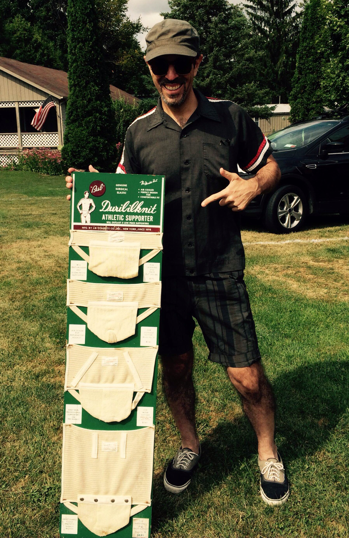
Photo by Karen McBurnie; click to enlarge
I mentioned in yesterday’s entry that I had scored a remarkable flea market find during my August blogcation, and here it is: a spectacular 1940s “Duribilknit” jockstrap display, complete with four sample jocks. It must have looked awesome in an old sporting goods store way back when. I flipped out when I saw it, because it’s precisely the kind of vintage item that I like to display in my apartment, but the seller wanted way too much for it, so I initially thought I’d just take a few photos and then walk away. After a bit of haggling, though, we agreed upon a price that I could live with and the display was mine. Turns out it was an even better find than I initially realized, as I’ll explain in a minute.
The basics: The display is made of wood and is pretty damn big — four feet long by one foot wide. Here’s a better look (for all of these photos, you can click to enlarge):
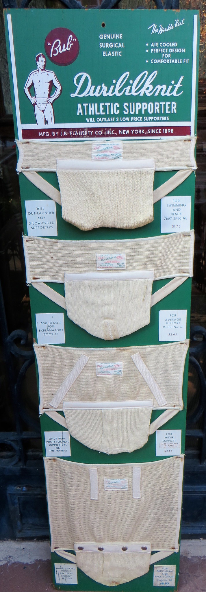
Now let’s take a closer look at the individual elements, beginning with the top graphic:
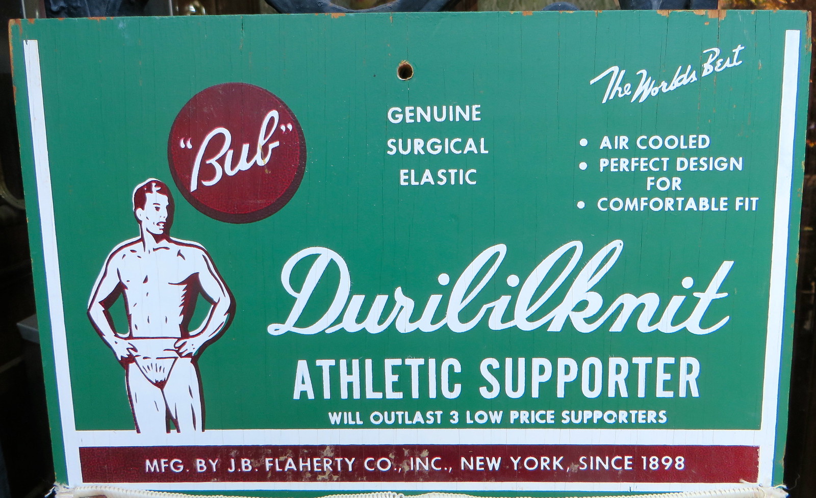
I love the term “Duribilknit” and also love that this design is called the “Bub.”
———
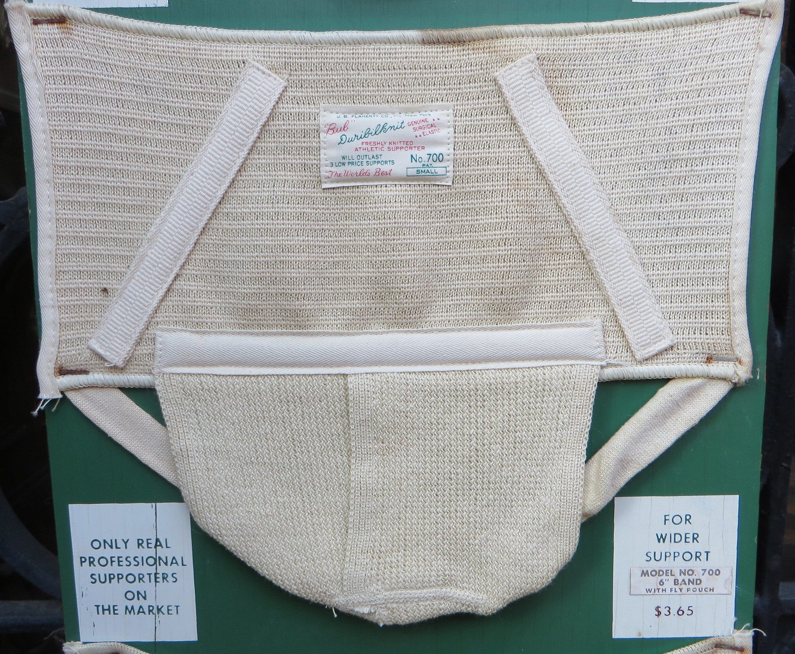
There are four different models shown on the display (running from smallest to largest), each of which is accompanied by two white boxes of text. Here’s the first one:

I didn’t realize swimmers wore jockstraps, but whatever.
———
Here’s the next model, which has a slightly wider waistband:
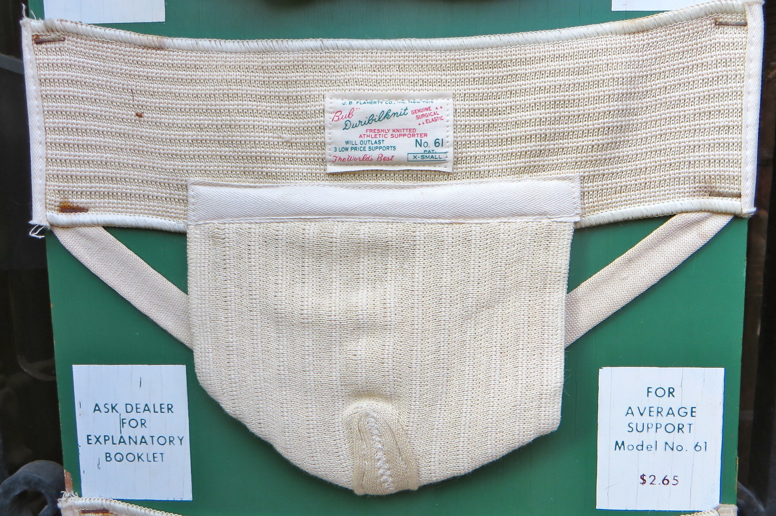
There’s something amusing about the phrase “For average support.” Wouldn’t they have been better off using “standard” or “basic” instead of “average”? Also: It’s incredibly frustrating that there was no “explanatory booklet” included with the display. (More on that in a sec.)
———
Here’s the next one, which has an even larger waistband and two diagonal support bands:
———
And here’s the last one, which looks more like a truss than a jockstrap. The little white box at lower-left is worth the price of admission all by itself:
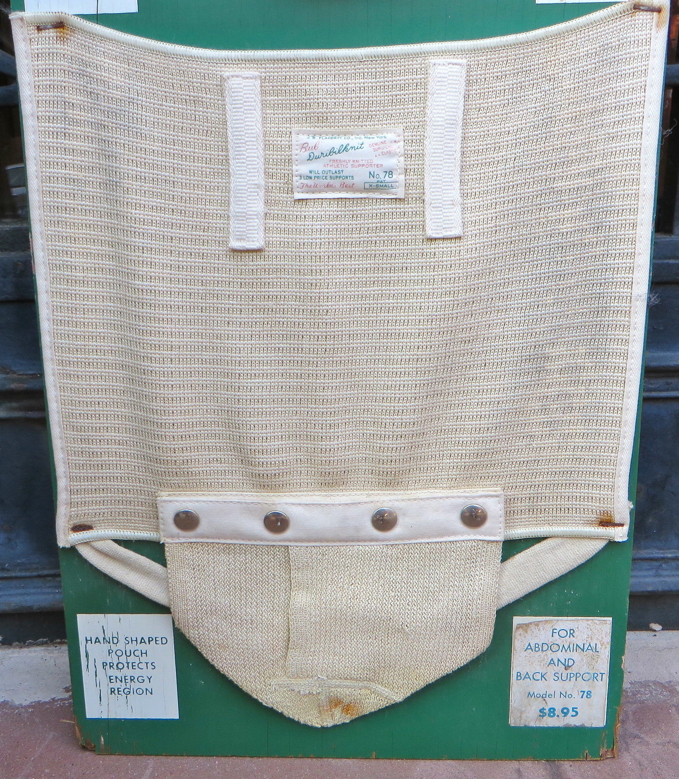

The “Energy Region”! I don’t often have any occasion to talk about my crotch, but I’m definitely going to start using that term from now on.
———
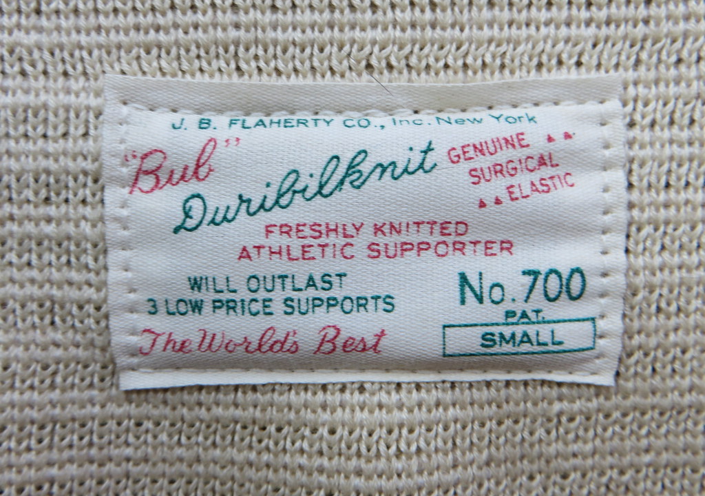
Each of the jocks has a beautifully designed tag that qualifies as a mini-masterpiece. Dig:
———
Finally, there’s a little bonus lurking on the back of the display, which features this weathered label:
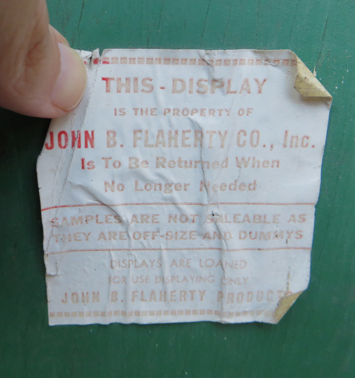
I like how the label says the display has to be “returned when no longer needed.” That’s fine in theory, but come on — who could ever stop needing this?!
———
After I bought the display, I had to carry it nearly a mile back to where my friends and I had parked our car. I passed lots of other flea marketers along the way, many of whom offered me a tight-lipped smile and a small nod — the silent acknowledgment of a nice score. Later that night I had to take the display home with me on two NJ Transit trains and then two subways, where various train conductors and passengers gave me lots of weird looks. At one point I was waiting to transfer at the W. 4th St. subway platform and was standing there with the display (it was too big to fit in a bag and there was really nothing to do with it but stand there with it). A guy walked by, looked at the display for a few beats, and then said, “That’s cool, man. I mean, it’s weird, but it’s still cool.” Indeed.
The display is now hanging on the wall in my bedroom (where I’m sure it’ll be, uh, a big hit with the ladies, eh?). I’m sure some of you think I’m nuts to have such a thing in my home, but check this out: I was curious about the display’s background, so I did a bit of Googling and discovered that a Duribilknit/Bub jockstrap and its box are part of the permanent collection at … wait for it … the Metropolitan Museum of Art!
Now, I didn’t need a fancy-shmancy museum to confer its imprimatur of legitimacy on my display — I already knew it was beautiful. Still, it just goes to show that great design is where you find it (and that I know a great flea market score when I see one).
A few other things I’ve discovered:
• Vintage boxes of Duribilknit/Bub jockstraps can be found on eBay. The box design matches the graphic on my display, and many of the boxes come with a pamphlet (here’s the other side), which is presumably the “explanatory booklet” referred to on the display.
• The Duribilknit/Bub product line also included wrist supports.
• The manufacturer, the J.B. Flaherty Co., was run by one John. B. Flaherty. His son Bryan later founded his own operation, the Bryan J. Flaherty Co. — which, of course, made jockstraps.
• The Duribilknit name lives on in jockstraps made by the Flarico brand. (“Bub,” however, appears to be extinct.)
T-Shirt Club update: There are only three designs left for this year’s Uni Watch T-Shirt Club program. One of them will be a completely amazing shirt that I still can’t show you because we’re still finalizing some of the details. Another one — which we might do for October or possibly for November — will be a powder blue design. And I’d like to get some feedback from you on that one.
One approach to the powder blues would be to keep our usual Uni Watch colors, like so (for all of these, you can click to enlarge):

On the one hand, I kind of like the audacity of sticking with our normal colors, even though they don’t completely mesh with powder blue. On the other hand, there’s no denying that green and powder blue aren’t a natural fit.
Another approach would be to take the one Uni Watch color that does go well with powder blue — maroon — and use that:

Strictly from a design standpoint, I think this one is better. But it’s also less interesting, plus it looks sooooo Phillies-ish.
What do you think? Vote here:
Thanks for your feedback. More T-Shirt Club news soon.
The Ticker
By Paul

Baseball News: Good story about the Danville Braves’ mascot, Blooper (from Tommy Turner). ”¦ Travis Shaw of the Red Sox is using an Ohio State buckeye merit decal on his bat knob (from Jordan Mayblum). ”¦ Virginia Tech is naming its baseball hitting facility in honor of former AD Jim Weaver, who recently died (from Andrew Cosentino). ”¦ Long, spectacular article about the origin of the “Yankees Suck!” T-shirts (thanks, Mike). ”¦ “On Monday night I was out at a bar and had a lengthy chat with a guy named Will Hoover, who is a former Kingsport Met,” says James Cropcho. “I thought you’d enjoy knowing that he is a fan of yours. He seemed very well versed in your canon and became quite animated while discussing some uniform change or other.” Nice to know. ”¦ Reprinted from yesterday’s comments: Here’s a profile of the MiLB design house Brandiose (from R. Scott Rogers). ”¦ Reds P Burke Badenhop was wearing a mouthguard on the mound last night (from Chris Mitchell). ”¦ Great story about a pair of twins who own the URL twins.com despite the MLB’s attempts to purchase it for the Twins. ”¦ After Cubs P Jake Arrieta threw a no-no at Dodger Stadium, the Dodgers gave him the pitching rubber and some dirt from the mound — nice (thanks, Mike).

NFL News: Funny article about Eagles QB Sam Bradford’s sleeves (from Michael Trautman). ”¦ The Texans have posted their home uniform schedule, including pants, for the upcoming season. ”¦ The Titans are selling a Marcus Mariota T-shirt with a Hawaiian lei printed on it (from Andrew Cosentino). ”¦ Oooh, look at these awesome NFL pencils. ”¦ Hacked emails indicate that Sony Pictures altered the upcoming Will Smith movie Concussion to avoid getting on the NFL’s bad side. ”¦ This photo of former Titans scout C.O. Brocato shows a Titans helmet with a grey facemask. “Never seen that before,” says @MaxTE34.

College and High School Football News: Florida is adding a Ray Graves memorial decal. Interesting that it’s grey instead of the usual black — more GFGS, perhaps, or just a play on Graves’s surname? … Nebraska’s top defensive players earned their blackshirts the other day. ”¦ “A week before the season, Nate Ford, a player from Maricopa High in Arizona, was killed when his vehicle struck a cattle hauler on a highway,” says Raymie Humbert. “At their first game, against Agua Fria, all Agua Fria players wore 42 on their helmets, and the Maricopa players had both jersey patches and helmet decals in remembrance.” ”¦ Texas Tech has added a memorial decal for football administrative assistant Jenny Bailey, who passed away in June after working in the program for 28 years (from Justin Barsotta). ”¦ New helmets for Weber State. ”¦ Bowling Green will wear new helmets with metallic orange this weekend. ”¦ Oregon State doing the pandering thing this Friday with their helmet and midfield logo. ”¦ Liberty University is another school adding a memorial decal for the murdered Virginia TV journalists. ”¦ Oregon QB Vernon Adams has FIOB and JrOB — a rare combination. … Texas A&M receiver Speedy Noil was wearing a watch in practice the other day — odd (from Dave Wilson).

Hockey News: New uniforms for Clemson. ”¦ The Ducks have changed the top stripe on their dasher boards from red to black. ”¦ Good article on the Kings’ ice being prepared for the season (from Chris Bisbee). ”¦ New pads for Blackhawks goalie Corey Crawford. ”¦ The Jets apparently have a fifth-anniversary logo, which seems like a bit much. No word yet on how/if they’ll be wearing it.

Basketball News: Michael Jordan’s uniform from Space Jam is going up for auction (from B. Garrity). … Here are one blogger’s picks for the perfect 76ers jersey collection. … New uniforms upcoming for the Harlem Globetrotters. Key quote, from the designer: “My goal for this collection was to reimagine the look of the legendary Globetrotters uniforms by infusing elements of the team’s rich 90-year history with New York City vibes and basketball-inspired swagger.” Uh, great. ”¦ The Hawks will retire Dikembe Mutombo’s No. 55 on Nov. 24 (thanks, Mike). ”¦ Todd Radom and I are both quoted in this article about recent NBA redesigns. … New sweatbacks for Kansas State (from Sean Kautzman).

Soccer News: Here’s a gallery of NBA players wearing soccer jerseys (from Phillip Foose). ”¦ New third kit for Minnesota United (from Clayton Blickenstaff). ”¦ Here’s a good look at the 2018 World Cup qualifying patch.

Grab Bag: Here are the four finalists for the new New Zealand flag design. ”¦ Here’s an article on clothing at Burning Man. ”¦ Faaascinating article/slideshow about attempts to republish an old NASA style guide. Recommended. ”¦ Temple and Under Armour have announced a 10-year extension of their apparel deal. ”¦ New logo for Google (thanks, Brinke). ”¦ A designer has redesigned all 50 U.S. state flags using only red, white, and blue. I don’t really like that premise (certain colors are closely associated with certain states and regions, so why limit that?), but some of the designs are striking, particularly the one for Kentucky (from Andrew Greenwood). ”¦ One day in and the U.S. Open is already unwatchable (thanks, Phil). ”¦ New uniform regulations for the U.S. Navy. ”¦ Auburn and Florida A&M played an orange vs. orange volleyball game last night. ”¦ The Punjab Armed Police apparently have a problem with their uniforms not being sufficiently uniform. ”¦ Residents of Tacoma, Washington, are being encouraged to wear yellow shirts today to show support for wildland firefighters, whose uniforms typically consist of yellow shirts and green pants.
Any thought for putting midnight blue (or white outlined in dark blue) numbers/wordmark on the powder blue shirt (vs. green or burgundy)? Or are those the only choices?
Well, midnight blue isn’t a Uni Watch color. These are the only choices for now. But I agree that midnight blue would look good.
Yes, the burgundy design is the better of the two options. But it would be better still with gold or green (or gold and green) accents.
Midnight Blue=Navy.
Midnight blue is darker than navy.
Midnight blue is darker than navy.
Would someone please tell that to MLB? Most of the teams that “officially” specify navy blue as a team color actually wear caps and tackle-twill with the same color as Yankees’ midnight blue.
“Midnight Blue=Navy.”
~~~
Yeah, um…no…it’s not.
So the Texans have a theme for each regular season game. That’s already pretty dumb. But they have a “homecoming” game. FFS!
Corey Crawford new pads. As does every former Reebok goalie, as CCM has assumed its place. See Marc Andre Fleury, Cam Talbot, Roberto Luongo, and Pekka Rinne. And that’s just what I’ve seen off the top of my head.
Wow, I thought I would never see the day where the Montreal Canadiens jersey, would be done in purple and orange – and yet that’s what Clemson new club team jersey is.
A non uni-watch question, with Arizona St going Division 1 hockey soon, is this an aberration or the start of a major trend?
For now, an aberration. Launching a new NCAA D-1 program is a huge start up cost. Only a handful of new programs have appeared in the past 30 years, most have been conversion of existing D-II programs. Penn State and RIT are the only new programs to appear in the past 10 years. Alabama Huntsville is the only current program in a ‘non-traditional’ hockey market.
Not to mention Title IX. If anything, an NCAA D-I school is more likely to cut a men’s sports team than it is to add one, because it’s easier to achieve gender equality that way than it is by adding new womens’ teams. Especially for a sport like ice hockey that demands its own unique venue as well, unlike, say, lacrosse.
Haha! Great story about the jock strap display. However, I am now going to have ebay suggesting jock straps to me :P
When Gary Anderson finished up his career with Tennessee, he had a gray facemask.
Excellent point! And true:
link
I remember there was talk of having it painted blue, but it never happened.
I’m pretty sure he was the only Titan to wear a gray mask. I do recall seeing a prototype helmet with no stripes and a white mask though.
If we don’t have a Pinktober shirt, I’m not sure what I’m going to do.
If i had been buying all the shirts (disclosure: only bought one so far), i would be very annoyed with a Pinktober shirt. I wouldnt get one and that would ruin the gimmick of buying all of them (and getting whatever Prize Paul offers to those who get the set).
I’d say the same if there was a camo t-shirt.
Pinktober is really more of an NFL thing. It should be a shirt, but it probably won’t be.
I’m a bit surprised that the Kings hand-paint their crown silhouette on the center stripe. As I recall, several teams now use a pre-printed decal strip to create the center stripe; seems like that would be much more convenient.
I like the maroon on the t-shirt. It reminds me of the Phillies uniforms from when I was a kid.
“It reminds me of the Phillies uniforms from when I was a kid.”
~~~~
Which is exactly why it shouldn’t be a UW t-shirt.
Don’t get me wrong, I think the maroon proposal looks much better than doing the shirt in UW colors, but it shouldn’t look like any pro team (especially the Phils); I think midnight blue would be a good compromise (and wouldn’t look like any MLB team specifically);
Just my $.02. YMMV
The rest have basically looked like modified Oakland A’s jerseys.
And the name plate “POWDER BLUE” over the number. Guh. Yeah, the shirt is powder blue.
I have liked the designs all year, but the redundant words over the number have kept me from buying one.
Lots of teams go NNOB. I would have liked to see one of these shirts do so.
My dos centavos.
The April shirt (Jackie) was NNOB.
I have liked the designs all year, but the redundant words over the number have kept me from buying one.
No problem — I completely understand that point of view.
But I love the NOBs. They tie the whole project together, at least from a conceptual standpoint. If the conceptual outweighs the practical, at least for you, so be it.
But would a NNOB shirt have had a “NNOB” nameplate?
Ha! Maybe white ink on white fabric, eh?
I’ll look at it this way, Paul: The NOB’s have saved me money.
:)
“The rest have basically looked like modified Oakland A’s jerseys.”
~~~
Those are Uni Watch colors, though. Powder blue isn’t (but I guess technically burgundy is). I don’t mind the UW shirts looking like A’s tees because those are in UW colors.
It has nothing to do with Philly — I wouldn’t want a UW shirt in Mets colors either.
Again, that’s just my $.02, not saying anyone else should feel that way.
“Ha! Maybe white ink on white fabric, eh?”
If you do that, it should say “BALLARD”.
Just my two cents.
I have to admit that when I heard powder blue I immediately thought of the Royals and Phillies even though it has nothing to do with the Phillies or Royals.
So in a nutshell thats why I picked the maroon one
I think midnight blue would be a good compromise (and wouldn’t look like any MLB team specifically)
Midnight blue’s not a school color, Duck fan. I know, powder blue isn’t either. For the purpose of this exercise, though, it belongs.
This reminds me of some concepts I never got around to…wouldn’t need to see them all on the field, but at least on paper I’d like to do a powder blue uniform for every team that hadn’t previously done them. Some would be bad…some could surprisingly be good.
“I’m sure some of you think I’m nuts to have such a thing in my home,….”
Nuts! I get it!!
The people have spoken – maroon on powder blue it is.
Pffft.
If you’re going that route, might as well print a fake zipper going down the middle like the old Phillies jerseys.
Or racing stripes?
I love the options of the New Zealand flag changes. The 2 with the stars are my Top choices with The Red/White?Blue as #1. It keeps with the current flag. But The other one, if chosen is fine too, cause it changes it up a bit.
Re: the Ducks’ black stripe atop the boards, interesting that the NHL Rulebook (Rule 1.3) specifically mandates that the boards themselves must be white and the kickplate must be yellow, but makes no distinction for the top stripe. Good for Anaheim to use this loophole to add some customization to their home rink.
A number of teams have colored the tops of their boards. Tampa Bay’s (and I think St. Louis’s) are blue, Philadelphia’s are orange. I think Washington’s are red…
I hope this museum-quality artifact is handles with the requisite white gloves. They’re not making store displays like that anymore.
The BUB?
A jockstrap named The Bub – really? Wow.
Did you call it Bub?
link
Am I hallucinating, or have you posted about the jock strap board before?
I posted some photos on Facebook after I bought it, and an embed of that FB post ran on the site a few weeks ago. But not a full description.
Whew. I’m glad that I’m not hallucinating historic jock straps.
Being that my high school’s nickname is Maroons, it was an easy choice.
Paul, I know you can’t broadcast everyplace you go but I wish I knew you were going to be in the Ithaca area, I live close by and would have like to have taken you to some cool places to eat.
Oh well, glad you had a great vacation.
For the powder blues leave the wordmark in uw colors and make the numbers front/back maroon.
A couple things from today’s post. First, I loved those pencils. I used my favorite teams for tests and quizzes. Secondly, who knew Clemson had a hockey team? Not me.
It’s a club team, most major US colleges have club teams, Oklahoma and Iowa St for instance have very good club team, there’s a whole Pac 10 of club teams, however there are only 57 I believe true Division 1 hockey schools.
Powder blue + maroon = gold.
Maroon shirt looks gorgeous, but I’m not sure it fits within the T-Shirt Club parameters. So far, every shirt (save the 42 shirt, which was for a good cause) has represented uniform aspects that apply to multiple sports. Powder blue is pretty specific to baseball and MLB.
And yeah, the Chargers have powder blue alternates. But they’re just that: alternates. They were covered by the August shirt.
Now if you were transform it into a Throwback design (and replace the UniWatch front logo with an Old English UW), it might be the best design yet.
So far, every shirt (save the 42 shirt, which was for a good cause) has represented uniform aspects that apply to multiple sports.
Incorrect. The entire year has been baseball-centric. February was Batting Practice, remember? And the last shirt was road grey. And so on.
Yes, February was BP, but most if not all sports have warm-up/practice jerseys.
link
link
link
Dude, it says “Batting Practice” on the back – -doesn’t get much more baseball than that.
Regarding the color on color volleyball game…
Seems there’s three different levels of color on color games. 1st, where teams are on the field together and can quickly switch between defensive and offensive segments. basketball, hockey, soccer and football. Color matters quite a bit but you could still identify players on your team by their movements (are they trying to block you or are they running with you, etc.) Not good if you’re trying to make a blind pass based on uniform color. Contrast does make a difference in these sports.
Second, baseball. Offense and defense on the field at the same time, but because of the nature of the game, color on color not important to players. You’re not blindly passing a ball or puck to a teammate.
Third, Volleyball and the like. Opposite teams on opposite sides of a net who will never be on the same part of the field together.
It does make a difference to the spectators though, so a red on orange game is ok as long as there is sufficient difference in the colors, enough for spectators to tell them apart at a glance, also in sports (baseball volleyball) where the teams switch sides, this also only needed so when spectators look up they know who’s batting, who’s on the right side of the net, etc.
RE: Redesigned US State flags……
SC: Looks like Spurrier’s visor hanging in the hallway.
Others: Mostly not great. I get what the guy was going for, but they don’t strike my fancy much.
I agree. I was interested to see what he came up with, but I did not like any of the results.
The exercise was mainly interesting to me to the extent that it demonstrated definitively that the basic concept animating the project is a terrible idea. Pretty much case closed on the notion that American state flags ought to share a single visual language. No, they shouldn’t, and I’m surprised to learn that as bad as most U.S. state flags are, they could actually be worse.
However, I thought that a number of his designs were quite good, ignoring the colors and looking only at shapes and space. If someone took his basic ideas for a number of states, and applied some level of knowing and caring about the actual state in question, many of the states currently represented by seals on blue would be vastly improved.
The current set of state flags is amazingly bad, with only 10-15 being tolerable.
I agree that he shouldn’t have limited himself to three colors and certain symbols, and he also shouldn’t have touched some flags (e.g., SC and TX). But overall, I thought his designs were excellent. Almost all of them are dramatic improvements.
As a BGSU Alum, I’m not crazy about the new brown helmet. I think what gets me is the metallic orange in the stripe and logo, but the sold orange in the facemask. Lack of consistency kills it for me. Love their white and orange helmets, the brown helmet just needs some modifications.
The Nebraska blackshirts link ends up going to the Sixers all time jersey collection story.
How about a fauxback/ turn back the clock -or- turn ahead the clock with a giant magnify glass
I did not know other companies made nut sack protection. We had Bike Jock straps in high school.
Don’t forget the fifth option for the NZ flag. The current one and by the sounds of it that will be winning easily
Paul: glad you wound up with that awesome display. The fact it’s in Uni Watch colours is cool.
For the t-shirts, while they do have a bit of an A’s look, the UW colour scheme is actually quite unique. I can’t think of a team that used all three colours like that – maybe the Sonics for a while?
Re: Dodgers’ acknowledgment of Jake Arietta’s no-hitter.
Kudos to the Dodgers; what a classy organization! No wonder Vin Scully never wants to leave (and he shouldn’t.)
The “supporter” display is a fantastic lede! Great work, and great score.
I never new there was a such thing as jock strap collectors.
This line from the pamphlet may be one of the best ever penned by a marketing dept-
“The ‘Bub’ pouch provides firm, hand-like support to the ‘energy region’ at all times.
Just for the record: I do not collect jockstraps. But I do collect retail displays, salesman samples, and the like.
I actually think the green and gold works on the powder blue shirt! But I don’t think it works when you also include the burgundy number on the front.
If you made the front number green outlined in gold like he rest of the design, it’d look pretty dang sweet.
I like the powder blue with the maroon ala Phils (or red?) but instead of “POWDER BLUE’ HOW ABOUT “THROWBACK” or “TBC”
I was guessing you would put the jock strap display in the bathroom.
Here’s an article on clothing at Burning Man
Subtly clever
I prefer the Maroon over the regular Uni Watch Colors but a better look would be white numbers outlined in either Navy or Midnight Blue.
Now I can’t get the words “super-powered, genuine surgical elastic” out of my cranium. And “firm, hand-like support” in my “energy region”? It’s all too much, I tells ya!
Correction: Based on the Texas Tech decal, it’s Jennie Bailey.
I know you guys are anti-native American mascots, but WTF?
link
I, too, LOL’d at “energy region”.
That must be where the 9 volt battery goes.