[Editor’s note: You guys may recall that in previous summers I had Morris Levin pen some guest columns for Uni Watch, but unfortunately, he won’t be able to do so this year; I asked uniform and logo designer Todd Radom if he’d share some of his logo case studies during Paul’s vacation, and he happily obliged. This is the third, and final, in that series, and I’m sure you guys will enjoy it. ”” Phil]

Sports Logo Case Study #3 – Mr. Red
By Todd Radom
The third in an ongoing series of entries about vintage sports identities. Sports fans, as I have often said, are the most ardent brand loyalists on the face of the earth. There are stories to be told here at the intersection of art, commerce, history, and fandom.
The Cincinnati Reds claim the title of “America’s Oldest Baseball Team” and their Mr. Red mascot has been a part of the Cincinnati franchise for 60 years.
The origins of Mr. Red are rooted in the anti-Communist “Red Scare” of the early 1950s. In April 1953 the team announced that they would henceforth be known as the Cincinnati Redlegs. One newspaper account stated that while the team didn’t cite a specific reason for the name change, “there’s been some freestyle guessing that the political meaning of the word ”˜reds’ might have something to do with it.”
Oddly, the club’s traditional wishbone-C logo containing the word “Reds” continued to be used on home jerseys through the 1955 season.
Mr. Red made his first appearance in this March 4, 1953 item in The Sporting News. He also appeared on the cover of the 1953 team yearbook and served as the visual centerpiece of the press pin issued for the All Star Game that summer, played at Cincinnati’s Crosley Field.


Mr. Red was definitely a five-tool player. He appeared throughout the ’50s and ’60 in a variety of poses, fielding, hitting, catching, pitching, and flexing his muscles. He even rode an airplane into outer space.

His first on-field appearance came in the form of a sleeve patch in 1955. He migrated over to a larger role on the team’s road uniforms the following year. An article in the April 25, 1956 Sporting News describes him as “an emblem of a baseball made it into the face of an old-time player, complete with a black mustache, surmounted by an old-style square cap around which are two thin black stripes.” Although it took a little while for him to be commonly known as Mr. Red, he became entrenched almost immediately after being introduced. (He is also referred to as “Cincy Red” in a 1967 yearbook.)


While the team’s popular mustachioed mascot continued to be used as the official logo, club officials made it known that the name of the franchise would revert to “Reds” in February 1959. The new/old name served witness to the National League pennant winners of 1961. The decidedly retro, traditional Mr. Red would represent the team through the 1967 season. The Reds fielded some good, competitive teams during the mid ’60s, but the logo had to have started to seem like a relic from a very different era””even in conservative Cincinnati.


A New Mr. Red
The seeds for a new Mr. Red were planted as early as 1961, when a running version of him appeared in the team yearbook. In 1968, going against all trends of the times, he lost his trademark handlebar mustache (it was also around this time that the Reds instituted what would become a 32-year ban on players wearing facial hair.) This new version of Mr. Red, the “Running Man,” coincided with three World Series championships””the 1975 and 1976 wins for the “Big Red Machine” and the 1990 upset of Oakland.

Running Man was retired after the 1992 season when the Reds dropped him from their primary logo. He was flipped around and brought back as a sleeve patch when the team changed their uniform designs in 1999. Most recently, a refreshed Mr. Red that is very closely based on the 1953 version was introduced in 2007.

Living Mascots, Humanoid and Otherwise
According to a 1982 newspaper article, the first live Mr. Red mascot was introduced in 1973 at the suggestion of the wife of team CEO Dick Wagner. This costumed mascot was supplanted by owner Marge Schott’s St. Bernard dogs in the late 1980s but was reintroduced in 1997.


Split Personality
The Reds now employ two similar mascots who are descended from our 1953 guy. The first, known as “Mr. Redlegs,” was made-over from the original logo art and reintroduced in 2007. He is described as “barrel-chested”¦with (a) well groomed handlebar mustache and bulging muscles” The team’s clean-shaven “Mr. Red” returned in 2012 after a 5-year hiatus.
Let’s wrap things up by celebrating Mr. Red and his six decades with some additional imagery from the glory years of the ’70s””an era in which Mr. Red cooked, listened to a transistor radio, and went nuts over 4 NL pennants.


Phil here — thanks Todd! As previously mentioned, Todd is curating a show in Chelsea (the show itself began this past Saturday, August 22nd, and continues thru September 19th), with a reception on Thursday, September 10th. It will definitely be worth checking out (hopefully Paul and I will both be there on the 10th) if you’re in and around the City towards the end of August/beginning of September. Hope to see some of you there.

Uniform (kit) issue with Manchester City on Sunday – Was Fabian Delph wearing Frank Lampard’s shorts?
Got an e-mail from Andrew Flynn yesterday and it’s pretty in-depth, and for those of you who are soccer/football folks, pretty interesting — even if you’re not into the Beautiful Game, it’s still pretty cool. Dig:
I know the Premier League isn’t in the daily wheelhouse, but thought this was interesting. Soccer is a bit different, in that the visiting team doesn’t always have to wear their “Away” jerseys, only when there’s not enough contrast to the home squad. Because of that most teams wear their second kit maybe one game in three or four. Normally, Everton (royal blue) and Manchester City (sky blue) contrast enough to allow both to wear their primary kits.
However, in Sunday’s match against Everton, Manchester City wore this season’s shirts, and last season’s shorts. Last year, the shorts were sky blue with a navy stripe, while this season’s shorts are white with a sky blue stripe. Both are Nike, but the blue color of this year’s shirts is a slightly different hue than last season’s, as seen in the first photo below.
I’ve searched everywhere and not seen it mentioned in the news, but my guess is that Everton (the home team) also wears (royal) blue and white shorts, so apparently City had to have shorts of a contrasting color (there was no issue last week with Chelsea (also royal blue) as they go monochrome):

This seasons’ kit last week against Chelsea (also the same as worn in Week 1 against West Brom) with 2015-16’s white shorts with blue stripe:

Last Season’s Kit (against Manchester United):

All of this means that when new arrival Fabian Delph (#18) entered the game yesterday in the final minute, he was quite possibly wearing a pair of Frank Lampard’s 2014-15 shorts (#18 last year):


Hopefully interesting to you and the readers. Thanks,
– Andrew Flynn
Chandler, AZ
Good observation, Andrew — sounds plausible too!

Colorize This!
Occasionally, I will be featuring wonderful, high-quality black and white photographs that are just begging to be colorized.
I usually run this feature on the weekends, but since I’m running the show during Paul’s sabbatical this month, I’ll probably (or at least as long as guys submit to me) run these once a week during August. Got several today, from our friends Bruce Menard and Chris from ManCave:
Click any photo to enlarge
Enjoy!
First up is Bruce, who sent three:


Hey Phil
Yeah, I guess there has been a lot of colorizing lately.
The reason why is that I’ve been re-posting (Twitter/Facebook) my edits from years past and I’m trying to make them a bit different so I’m not just repeating myself. Since they’re already edited/cleaned up, adding some color to them isn’t nearly as time consuming.I’ll attach the Jackie Robinson one from today, such a great action shot!
Here’s the text I used in my full post:Rookie Jackie Robinson Steals 2nd Base
âš¾ 68 Year Ago Today – Ebbets Field, Brooklyn – August 21, 1947
~ (Wire Tag) “Robby Steals Again – Jackie Robinson of the Brooklyn Dodgers steals second in the fifth inning of game with the Cincinnati Reds Aug. 21 as catcher Poland’s throw goes into the outfield. Watching the ball is shortstop Eddie Miller of the Reds. Robinson went to third on the error. Umpire is Jocko Conlan. Dodgers rallied for four runs in this frame to beat Ewell Blackwell, 8-1, as he went after his 20th win.”
And the other two from Bruce:


Phil,
Here’s the Eddie Gaedel St. Louis Browns colorization (August 19, 1951) – before/after comparison and the text from my full post:
Eddie Gaedel On The Browns Bench After His MLB Debut
âš¾ 64 Yrs Ago Today – Sportsman’s Park, St. Louis – August 19, 1951
~ (Wire Tag) “Midget On Brownie Bench – Chicago stunt man Ed Gaedel sits between catcher Matt Batts (left) and pitcher Jim McDonald on the bench in the Brownie dugout during the second game of a doubleheader with the Detroit Tigers today, August 1951, in Sportsman’s Park, St. Louis, MO. The three feet seven inch midget had just drawn a walk when he appeared in the Brownie lineup as a pinch-hitter for outfielder Frank Saucier. Umpire questioned his eligibility, so Gaedel trotted back to the dugout and brought forth his signed contract for proof.”


I didn’t send the 1938 Babe Ruth Brooklyn Dodgers colorization, or did I?
Anyways, here’s that one – with before/after. I went for more of a color tint look rather than a photo realistic look here (which is what I generally go for). Here’s the full text too:
Babe Ruth & The Brooklyn Dodgers Bums Belt Out A Tune
âš¾ 77 Years Ago Today – Polo Grounds, NY – August 16, 1938
~ (Wire Tag) “Dodgers Quartet Eludes The Heat With Song – Despite the broiling sun, this Brooklyn Dodgers quartet burst into song and forgot about the heat as they relaxed at the Polo Grounds, August 16th, where the Dodgers beat the Giants, 7-3. Left to right: Tuck Stainback, Buddy Hassett, Kiki Cuyler and Babe Ruth.”–Bruce
And finally, a pair from Chris from ManCave:


Phil,
Today’s colorized portraits are of Hal Chase, when he was with the Federal League Buffalo Buffeds, and Fred Lake, when he was managing the National League Boston Doves, in 1910. This one of Fred was made for his Great Granddaughter, who says that she has a lot more photos of him from a trunk that was fished out of a dumpster just in time.
Chris
That’s it for today. Great job, Bruce & Chris!

LAST CALL ”” T-Shirt Club reminder: Today is the LAST DAY to order the Uni Watch T-Shirt Club’s latest offering — the road grey shirt — which is available here. Obviously, this one is pretty straightforward, but it’s still plenty handsome. In fact, it’s arguably the nicest design we’ve done so far (click to enlarge):
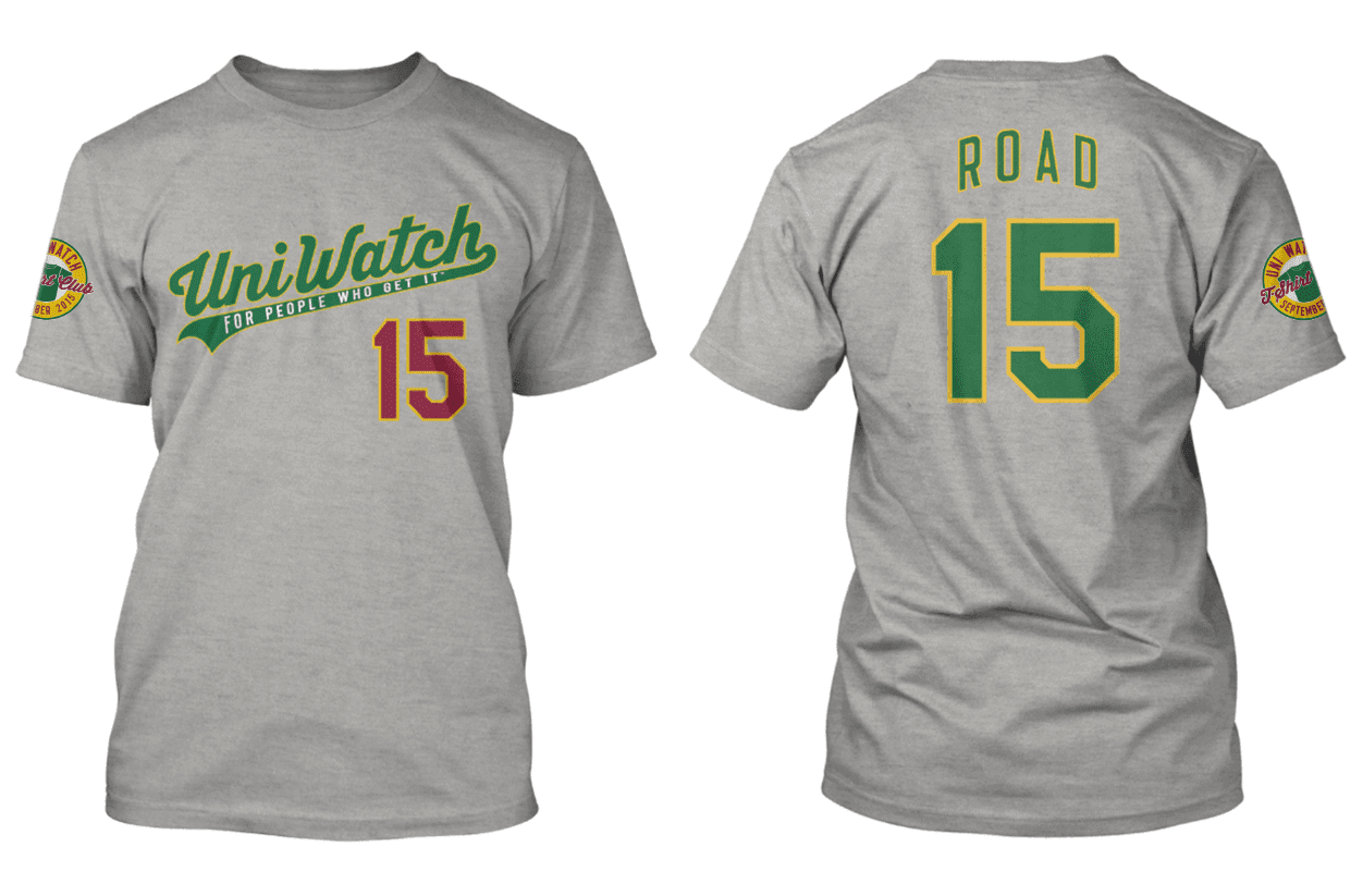
Again, this shirt is available here, but only until 11pm Eastern tonight. There’s additional information about how this shirt fits into the larger T-Shirt Club program here. Thanks.
Uni Watch News Ticker:

Baseball News: CBS evening news did a story on a Maine vintage baseball club’s game (from Paul Dillon). … The Boston Celtics’ Bill Sharman never actually played in the majors, but looks good in a baseball uni (from Phil Lawson). … On Friday night, Andrew Roman was watching a replay of a play in the Tigers/Rangers game, and noticed that Alan Trammell was wearing #3 again. He points out that Ian Kinsler also wears #3 and wonders how long this has been going on. These sets of tweets may help explain things (from Michael Hersch). … The Washington Nationals are giving away nesting dolls on September 3rd. (here’s more on that, with thanks to Andrew Hoenig). … Do you remember the Mets white (“Good Humor”) caps from 1997? Well, if you don’t, here’s a primer. … With all the talk of the White Sox ’76 throwbacks this week (and the fact they won’t be wearing shorts), here’s the 1975 Sacramento Solons, a AAA club who also wore shorts (nice find by RoryJ). … Reader Tony Caliguiri saw this Roberto Clemente batting helmet and asks, “Never noticed my buccos used these, any info on whether this was a one off for Clemente or if the whole team used them?” I know we’ve seen these before (and the Cubs still use them), but that’s a great artifact! … According to this article, the Blue Jays are no longer wearing “road grey uniforms” (I’m assuming the author means the tops, since I think they’re still wearing the gray pants on the road) — Thanks, Paul. … After all the A’s hosiery hijinx over the past few days/weeks, Domenico Delgado points out there is “finally a normal pair of stirrups for the A’s.” … Look at the odd spacing between the “A” and “N” of the Rangers’ Jeff Bannister (screen shot by CJW). … Yesterday was the Andy Pettitte number retirement ceremony at Yankee Stadium and here’s a look at the patch the team wore (via Bruce Menard). On Saturday, the Yanks did the same for Jorge Posada. … The Tulsa Drillers had some interesting uniforms on Saturday night. … Terence Kearns asks, “Rockies’ Castro have an oddly spaced NOB?” — I was watching the game, and noticed it as well. … Tweeter Curtis Galvin is not pleased with these LLWS brims. … Last night, Andrew McCutchen was wearing what appears to be part of a printed stirrup sock on his right arm (via Alex Iniguez).

NFL News: Looks like this could be the new Breast Cancer Awarness sideline cap (shown for the Chiefs), submitted by John Ternest). … The New Packers Hall of Fame comes to life in this video (h/t Mitch Purcell). … Mercedes-Benz already has applied its name to the Superdome, and now it will add their name to the new Atlanta Falcons stadium which is still yet-to-open (thanks, Brinke). … Something called “Musket Fire” (guess it’s a Patriots blog) on FanSided ranked the top 12 NFL unis. … Check out this great custom 8-bit Eagles iPhone background (from Jesse Reis). … Here’s a patch covering a patch — that’s the Patriots’ Chandler Jones in a local furniture ad in official jersey w/NFL shield covered (nice spot by Ted). … Interesting Steelers gold helmet stripe information from Bill Schaefer, “The Steelers helmet stripe began as a match to their less-than-yellow pants and sleeve stripes since the early 70s. Even as recent as last year, the stripe doesn’t match the rest of the team’s yellows.” Bill continues, “However, in photos of both last week’s game in Jacksonville and [yester]day’s game vs Green Bay, the stripe appears to now match everything else.” … Oops — a local Indy station screwed up the Colts helmet (should be, and has always been, a single stripe). Nice spot by RTB. … “Check out #29 Jaquiski Tartt. I’ve never seen a swoosh on a compression sleeve before (certainly not on RG3) and couldn’t find a mention of it anywhere. Is this new?” asks Ron Amadeo. “It’s pretty awful considering it’s 1) bigger than the swoosh on the damn uniform and 2) at a totally wacked-out angle (and the opposite direction from the shoulder swoosh). This is from the 8/23/15 preseason game.” More from Ron: “Another compression sleeve oddity: #11 Quinton Patton has a vertical stripe running down his sleeve. Doesn’t the NFL have rules about what can and can’t be on the sleeves? I thought only solid white or a solid team color was allowed.” … Outline or no outline? Check out the inconsistencies with the Gold 50 yard markers (h/t Interstate 44).

College/High School Football News: According to @MSUHailState, Mississippi State will have new maroon pants this season. … The Miami Hurricanes don’t (at least not yet) have an alternate helmet, but that didn’t stop FanSided from asking if they could win with ‘alternative’ helmets. … Here’s Tim Dunn with more on Wyoming: “Looks like they’re trying to have the Football number font match what the Basketball team has. Haven’t seen Nike announce this one yet: Football.” Tim “Also found an interesting document, publicly filed apparently — the contractual agreement between Univ Of Wyoming and Nike.” … Bowling Green’s QB are sporting USMC patches/ads on their jerseys (h/t Joe MacQuarrie. … Texas A&M’s Ricky Seals-Jones is seen wearing Nike cleats in practice (from Ryan Bernal). … Remember the kerfuffle last week about the High School that wanted to honor fallen soldiers with NOBs, and was denied? Well, they’ve reached a compromise. … The Northern Illinois Huskies are going to wear gorgeous 1965 throwbacks. Here’s more on that. … Penn State is adding “Nittany Lions” to their neck bumper (thanks, Paul). … Illinois finally has their blue jerseys in. Couldn’t get them last year due to reported budget issues (via Clint Richardson). They opted for orange, white and the Gray Ghost over the blue jerseys. … Also from Clint, our first look at the new Tennessee State gray jerseys. … Here’s a look at Louisville’s 2015 unis. Seth Bloom has some nice, hi-def images of the helmet, and the red jersey, with closeups of the shoulder and pants.

NBA News: “As a Celtics fan growing up in the 80s, I always thought it was cool how Dennis Johnson had his name spaced out around the back of his jersey,” says Dave Flynn. “I particularly remember this on his home jersey, but I found a clip here from 1984 that shows it displayed that way on his road uniform as well [Here’s a still from the video — PH]. I recall him wearing it this way, on his home uniform at least, through the 85-86 season, but then changed to the normal alignment that the rest of the players had beginning in 86-87 and kept it that way for the rest of his career.” … The Grizzlies applied for an alternate “blacktop” court but the NBA turned them down (thanks, Mike).

Soccer News: Here’s a look at the new Peru kit, from Patrick Thomas, who notes they’re wearing Umbro. … These are the jerseys VT soccer will wear for 2015. … “Thought this was interesting pic of famous Manchester United players who have worn #7 over the years – can see the changes in fonts and kits,” writes Ted Arnold. … Army women have new soccer unis (from Geoff Holm). … This is cool: the pitch at Leicester City is cut in a plaid design (via Angelo Fico). … During the Man City v Everton match, one of the players got disappearing foam on his shoe (great grab by Chris Sorenson). … Oops — Jeremy Brahm noticed that Chelsea doesn’t sew its patches on. … Life imitating art (or something like that)? Here’s Danny Drinkwater, a midfielder for Leicester City, well, drinking water (nice grab by The Football Bible).

Grab Bag: Friday’s ticker featured a wonderful photo of the Beatles playing Comiskey. “So after playing Chicago the fab 4 headed up to Minnesota to play old Metropolitan Stadium, the then home of the Twins,” notes Jimmy Lonetti. “I came across this photo of George Harrison wearing a Twins cap. What is odd is that the colors of the T and the C on the cap are reversed. The T should be white and the C red. I never have seen this Twin cap variation before.” … Reader Chris Perrenot noticed the sweat ring on Tiger Woods’ cap, and thought it reminded him of the old Angels’ halo caps. … Couple things from David Firestone: As of 2016, NHRA Pro Stocks will lose their iconic hood scoops, Vincent Nobile posted a photo of how they will look. And, this is what they currently look like. … Cool mask for Semyon Varlamov commemorating the Avs 20th anniversary (from Christian Moffett). … Tiger Woods’ caddie Joey Lacava is obviously a Giants fan, notes Chris Perrenot. “Super Bowl logos and all.” … Johnny Dutch at World Champs searching for a shoe deal, uses tape to cover logos until he finds one (thanks Brinke). … And last but certainly not least (and this is awesome), from Gene Sanny: “Here’s a painting I did this weekend for a guy in the electric football hobby. He wanted throwback Buccaneers so I drew and watercolored Ricky Bell. A little homage to Jack Davis. Gotta love those orange unis :)”
And that’s all for today — big thanks to Todd for the Logo Case Study, Andrew for the Man City bit, Bruce and ManCave for the colorizations, and any and all who tweeted or e-mailed for the ticker. Hope everyone had a great weekend. Enjoy your Monday (sorry). Cheers.
Follow me on Twitter @PhilHecken.
Peace.
“Good God. For the next 3 months am I going to be subject to the stylings of sideline tarps in the ticker? Nip this in the bud.”
— Mainspark
Is the “1968” Reds Running Man logo really from ’68? The (human) Reds didn’t wear the polyester unis with the sansabelt and stripes on the sleeve until 1972
Definitely not 1968 for Running Man. I remember noticing when they added the sleeve striping etc in the early 70s. Radom’s own site has the proper Running Man, although I don’t recall red around the collar for him then, either.
link
The non-matching piping on City’s uniforms drove me nuts the entire game yesterday.
It shouldn’t be that hard for teams to figure out all potential uniform conflicts and be prepared with professional looking uniforms.
Oops – Jeremy Brahm noticed that Chelsea doesn’t sew its patches on.
Does any Premier League team? Aren’t they all ironed on with a heat press, just like the player names and numbers?
Every team in the Premier League and the Football League uses a heat press to put on their sleeve patches.
The Reds do not claim the title of “America’s Oldest Baseball Team.” The franchise claims, and is, the first PROFESSIONAL Baseball Club. Quite a difference. link
I get that it’s cool, but I think linking to the Leicester plaid pitch twice is overkill maybe?
Good catch — second mention now removed.
The two NHRA Pro Stock pictures link to the same image.
Yeah — that’s what David sent me — I looked at both and thought maybe one was different somehow (like those spot the difference thingies).
Yahoo Email just fucks everything up, here is the photo
link
Trammel and Kinsler both wearing #3? Could this possibly solve the Yankees problem of running out of numbers?
Seriously, this sort of nonsense shouldn’t be allowed.
Aha – Trammel isn’t a coach. He’s “special assistant to the GM.” So that must be why the double # is OK.
If he’s in the dugout during the regular season, he’s been made a coach.
When the Yankees used to use Phil Rizzuto as a spring-training bunting instructor, I would imagine that he’s wear no. 10, despite the fact that that number was still in circulation before it was retired for him in 1985. But, if the team had made the Scooter a coach during the regular season, then either he or Chris Chambliss would have had to get a different number. So, similarly, either Trammell or the current player should be wearing a different number.
Barry Bonds could not wear his no. 25 when he coached with the Giants; Joe Torre could not wear his no. 9 when he managed the Cardinals; Mel Stottlemyre could not wear his no. 30 when he coached with the Yankees; and so forth. So Trammell should not be wearing no. 3 if a player has it.
I meant to type “Bobby Bonds couldn’t wear his no. 25” when he was a coach. The player wearing it was Barry Bonds.
Technically, MLB has no rules governing the assignment of numbers, duplication or otherwise. Thus, presumably the teams themselves are responsible for governing their uniform assignments.
In Trammell’s case, he was activated as a third-base coach on a strictly temporary basis, as he was filling in for Dave Clark for a few games, with no intention of taking a permanent job on the staff at this time.
Also, most longtime Tigers fans believe the team should have already retired the number 3 for Trammell.
“The Steelers helmet stripe began as a match to their less-than-yellow pants and sleeve stripes since the early 70s. Even as recent as last year, the stripe doesn’t match the rest of the team’s yellows.”
That can be said for most helmet decals, can’t it? They’re almost always darker than the colors on the rest of the uniform, even when it’s not intentional like the Cowboys. Just look at the Packers or Lions helmets compared to their jersey colors. It’s nice to see Pittsburgh actually trying to fix that issue.
Something called “Musket Fire” (guess it’s a Patriots blog) on FanSided ranked the top 12 NFL unis.
On one hand, they put the Raiders in their proper #1 position. On the other, Cleveland is 3. Cleveland may not be the worst in the league (that honor goes to the Jags), but they sure as hell aren’t top 3, or even top 20.
Whoever made that 8-bit Eagles thing should have put the helmet on a black background, like it is in the game it was ripped from. The area around the facemask where the sprite uses transparent pixels kinda ruins an otherwise cool idea.
Both NHRA photos are the same.
See above (response to Adam R.W.)
The 50-yard numbers aren’t any more inconsistent than they would normally be. The only specification the NFL provides is for their placement (the bottom of the number must be 12 yards from the sideline), size (2 yards high), and basic color (white – at least, normally). Teams are given leeway as to whether or not to outline the numbers, and there is no required “standard” font.
The Eagles don’t have them outlined, but that’s always been the case at the Linc for the exhibition…. errr…. pre-season games. The field, and even the end zone, is usually bare-bones for pre-season games. I’d be willing to bet that they’ll be outlined for the home opener. I’d also bet that a lot of other team on natural grass do the same thing.
Any idea why Mr. Red wears #27?
Todd wrote it up on his blog once. One of the Reds’ owners really liked Dal Maxvill. (I was disappointed this didn’t get into today’s article.)
Yeah, the owner’s kid liked St. Louis’s second baseman, #27
Here’s the link to Todd Radom’s previous blog entry on why Mr. Red wears #27.
link
That last three paragraphs of link explain what McCutchen was wearing on his arm. The rest of the post is also interesting.
I love how Louisville’s new uniforms have last years’s ACC logos on the jerseys.
Man City’s shorts bugged me so much yesterday. Thanks, Andrew!
Is Mr. Red a Skyline guy or a Goldstar guy? Or, is he gonna get all hipster on us and claim Camp Washington or Empress?
Skyline is the official chili of the Reds, but if Red really is alluding to commies, he’s probably a Goldstar guy.
Pete Rose is a Goldstar guy.
I thought Trammell’s number would be out of circulation pending retirement. That is a tough team to get your number retired.
Looks like Mr. Met was somehow inspired by the original Mr. Red and the updated running man took the look of Mr. Met.
The handlebar Moustache has kinda become THE thing for the Reds. They have a suite called the handlebar club, the AllStar game was 1000% Moustache based in its imaging and marketing, and they play this song (link) on the billboard during the games.
It’s funny to a kid growing up remembering the Big Red Machine and its compulsory clean-shaven look. How did Cincinnati come to take such a draconian attitude toward moustaches back in the day?
Newly hired General Manager Bob Howsam in 1966 instituted the official “no facial hair” policy. According to the McCabe’s book, Baseball’s Golden Age, no one had facial hair in the majors from 1917 until 1972.
Didn’t Frenchy Bordagaray rock the ‘stache for the Dodgers (I believe) sometime in the ’30’s?
Also, I know of two hockey players who wore hair above the lip in this era: Andy Blair in the 30’s and Garth Boesch in the 40’s, both for the Maple Leafs.
You can thank Greg Vaughn for the lifting of the Reds’ longstanding policy in 1999.
Andrew McCutcheon link (scroll all the way to the bottom) that he was, indeed, wearing a cutoff sock on his arm during yesterday’s game.
Fantastic post today, Todd! With no disrespect intended to the Phillie Phantic (who I’m told is all the rage among the kids), Mr. Met & Mr. Red/Redlegs are baseballs’ greatest mascots, with Mr. Redlegs getting the top nod due to that fine ‘stache.
The sleeve with the vertical stripe are the Nike elite sleeves, it has the same design on it as the elite socks and I’m pretty sure I’ve seen players wearing them before in games. Also I’m pretty sure I’ve seen players wearing sleeves with swooshes, just much smaller and on the wrist
For Hallowe’en in 3rd grade, I dressed as Mr Red (Running Man, no mustache, it was 1984). I am a lifelong Phillies fan but a guy from my hometown (and uncle of a friend of mine) pitched for the Reds and won the Series the year I was born, so they were a strong #2 team to follow.
Anyway, my mom made the head out of papier-mâché from my Spider-Man Hippity Hop. In hindsight, I wish I still had the Hippity shop since I outgrew the jersey a log time ago.
I doubt ANY teams actually sew on the Premier League patch. I’m fairly certain that any of the uni elements that change from competition to competition (tournament patches, numbers and NOBs) are heat applied.
I may be alone on this one but I actually like those white hats the Mets wore in 1997.
Also, never knew that Bill Sharman was on the Dodger bench at the Polo Grounds for the shot heard around the world.
I loved those white hats. Maybe people thought they were a little goofy because the white hat against a dark background looks too big. If the crown were a little smaller they would have been perfect.
This was posted…
More from Ron: “Another compression sleeve oddity: #11 Quinton Patton has a vertical stripe running down his sleeve. Doesn’t the NFL have rules about what can and can’t be on the sleeves? I thought only solid white or a solid team color was allowed.”
Thought…
Similar to the Andrew McCutchen story, take a close look as that actually looks like a cut-off Nike basketball sock with the gradient line down the back that might have been cut at the ankle.
Alternative is correct for uniforms not usually worn.
Alternate means it goes back and forth, like Alternating current.
Everyone gets it wrong. When there’s a detour on your way to work you take “an alternative route”, not an “alternate route”. Unless you go one way today, the other way tomorrow, and back and forth, alternating turns!
Don’t forget about Rosie Red. . . link
RG3 is an Adidas guy so he wouldn’t have a swoosh on his compression sleeve anyways
Re: double numbers
Don Zimmer and Bernie Williams shared #51 for the Yankees one year