
[Editor’s Note: Paul is on his annual August break from the site and will return in September. Daily content is continuing under the direction of deputy editor Phil Hecken, who’s running the site this month.]
By Phil Hecken
You can tell the NCAA Football season is getting ever closer, as three schools released new uniforms yesterday — fortunately, two of them are one-offs, and one is being called an alternate. Two of those schools, Notre Dame and Boston College (both Under Armour schools) will be playing each other. The third, UCLA, dropped a uni that is merely a an all-black version of the beastly uniform the school had introduced earlier this year.
Lets start with the “ugly”* (Notre Dame). Click on any images below to enlarge:


If this were to be Notre Dame’s full time uniform, I’d be a lot more venomous in my disdain, but since it’s simply a one-off (to be worn for what Notre Dame calls its “Shamrock Series”), its just ugly*.
Notre Dame is playing Boston College on November 21st, at Fenway Park in Boston (ironically designated a “home” game for the Irish). As such, UA and Notre Dame are calling these uniforms the “Green Monster” uniforms — an allusion to Fenway’s famous left field wall. (*audible sigh*). OK, it’s a one game thing and Notre Dame has introduced crazy Shamrock Series unis for several years now. One seems to be crazier than the next.
The uniform itself has a few interesting features (even if the uni itself is rather garish): the shoulder stripes, gloves and pants all have stripes with 11 notches — symbolizing Notre Dame’s 11 national championships. If you look at that last image, you’ll also notice the now ubiquitous (it seems) UA knee/thigh striping (in blue and gold). You’ll also notice the helmet has ND’s Leprechaun logo (you can see it a bit better here (also below).
Fans (or non-fans) of the team know the normal (standard) helmet has been solid gold for years, but recently, the team has been putting stuff on it for special games. The helmet also has a blue and green stripe which tapers off with the 11 notches as it goes from front to back. Also, the facemask is half green/half blue, which is a bit tough to look at.


Numbers are blue with a gold outline. Unfortunately, the pants also have “Fighting Irish” down the pant leg.
* It’s not a terrible uniform, by any means. And I probably shouldn’t call it ugly either (but then I couldn’t use the “The Good, The Bad and The Ugly” line). I’ll need to see how it looks on the field to truly determine how it looks, but at least we can see how it will appear on an actual player:

And you can see a short video which shows off the uniform a bit more here:
Great having our model Josh Anderson in this morning to model the #ShamrockSeries Uniform #GoIrish pic.twitter.com/5VVjBJbAtA
— Ryan Grooms (@NDFBEquipment) August 13, 2015
If you haven’t yet seen enough, there is a video here with some of the players discussing the new unis.
Next — The Bad:
Almost at the same time as UA was unveiling the BC and ND unis, UCLA revealed a new black “alternate” uniform. It’s actually worse (because it’s well, BFBS) than the UCLA uniform Paul shredded back in July. See for yourself:


There is literally nothing good about this uniform. And if I can’t say anything nice about it…well, you know the rest — basically, if you read the article Paul wrote (linked in the opening graf above), and replace what Paul said about it (just add “all black” to any references to blue or gold) and well…that’s about all I have to say about that. But one thing is extremely disconcerting — it’s possible the Bruins’ jerseys will actually have “BRUINS” down the side of the jersey — if this fan jersey is any indication. Moving along, there’s nothing more to see here…
Finally — The Good:
OK, Boston College, who are playing Notre Dame in that Shamrock Series game in Fenway, will be playing as visitors (if that makes any sense — but what does in college football anymore). They too have received a “new” uniform, but instead of creating something shiny or black to appeal to the kids, BC is going to have a “throwback” to the Doug Flutie Hail Mary/Miracle in Miami uniforms of 1985 vintage. Nice! Let’s take a look at what’s been released so far:


OK — obviously, no teams today can wear true throwbacks, due to the cut of the uniform and clearly the uni that Doug Flutie wore was of a different material and had actual sleeves (and those sleeves had stripes). The mannequin is not wearing a baselayer, but the last image does show a baselayer with a nice set of stripes that fairly mimic the ’85 sleeves. The pants stripe shown doesn’t appear as thick as the one Flutie et. al. wore, but we’ll need to see that on the field to be sure. But from the little that has been released on this uniform thus far — it should look pretty fine on the field.
So there you have it…just another day of multiple uniform reveals — what do you guys think?

First Look at the Browns New Unis in Action…

Last night, the Cleveland Browns played their first pre-season game in their new uni set — although it was a home game against the Washington football club, the Browns chose to wear white jerseys and pants, and paired it with orange socks. From the waist up, the uni isn’t awful…

And if you look at the uniform from an almost straight on angle, it still looks OK:

The problem, as we all anticipated, is the pants with the “BROWNS” wordmark running down both sides … looks just awful:


I’d show you more, but you get the idea. And this is actually a good looking (in terms of color) set — it might look as good with a brown top and white (or orange) pants, but if they go mono-brown or mono-orange…woof.
If you really want to see more game photos, click here. You’ve been warned.

And now a few items from Paul: In case you missed it earlier this week, the Uni Watch T-Shirt Club’s latest offering will be the road grey shirt — the last of our “core” designs. Obviously, this one is pretty straightforward, but it’s still plenty handsome. In fact, I think this is my favorite design we’ve done so far (click to enlarge):
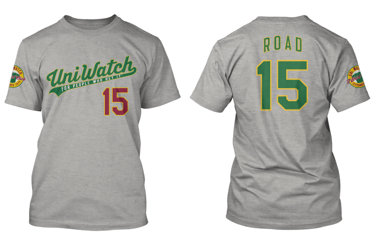
We had originally planned on doing a different design — something much more elaborate — for September. But that design turned out to be so tricky that we’ve decided to have some samples made first, so we can troubleshoot any production issues in advance. That design is now slated for October, and it’s going to be a doozy. I’m pretty sure you’ll be excited about the November and December designs, too. You’ll see.

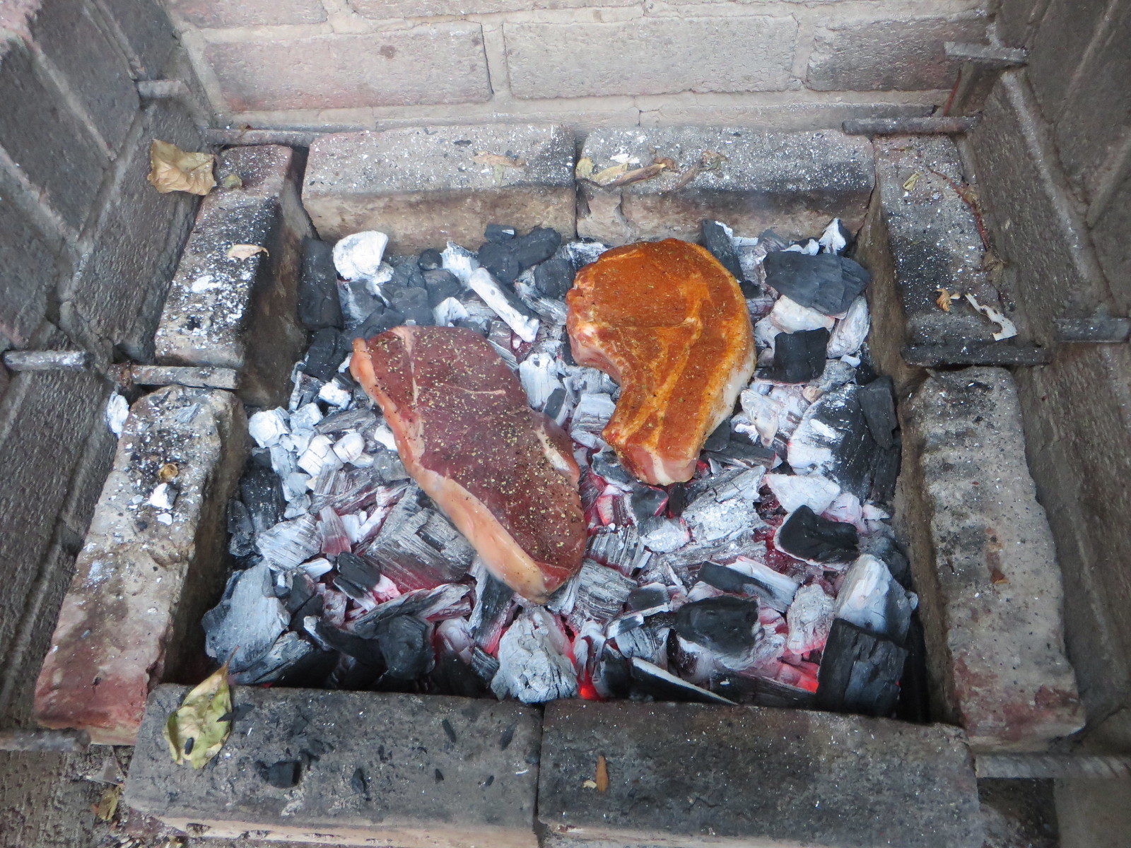
Culinary Corner: Earlier this summer, the Times ran a story about cooking steaks and chops directly on the charcoal, instead of on a grill. I’ve been meaning to try this myself and finally got around to it on Wednesday night. Here’s how it went (for all photos, you can click to enlarge).
1. First I got a nice slab of top sirloin (18 ounces, 1.5″ thick) and a big ol’ pork chop (20 ounces, 2″ thick):

2. I seasoned the beef with salt and pepper, and the pork with a southwestern dry rub (a mix of paprika, chile powder, cayenne, mustard powder, cumin, brown sugar, salt, sage, garlic powder, and maybe one or two other things I’m forgetting):

3. I’m normally fine with Kingsford, but for this method it’s important to use hardwood charcoal, not briquettes. That’s because the meat will be touching the charcoal, and briquettes have chemical binders that you don’t want to be in contact with your food. So I lit two chimneys’ worth of hardwood charcoal, dumped them into my grill, and then put the meat on the coals. (I was supposed to blow on the coals before adding the meat, to remove any loose ash, but I forgot that step.) There was a bit of a sizzle, but it wasn’t as loud or intense as I had expected:

4. I turned the beef after four minutes and the pork after five. In both cases, a few small pieces of charcoal stuck to the side that had been coals-down (probably because I neglected to blow on the coals before adding the meat, so that’s on me). Aside from that, though, everything looked good:
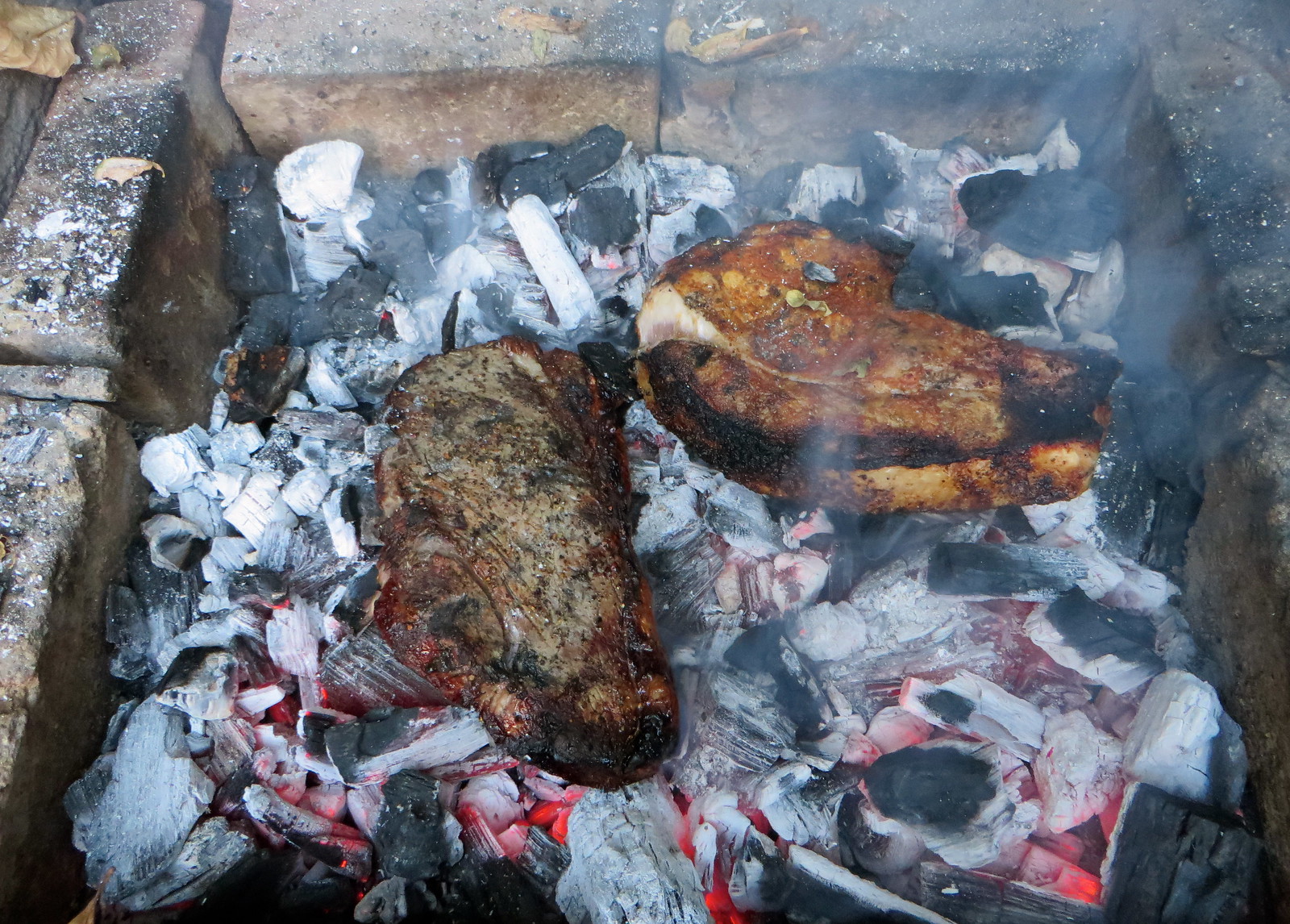
5. After another four and five minutes, respectively, both pieces were done. I let them rest for a few minutes, removed any pieces of ash or charcoal that had stuck to the meat, and then carved. Both pieces turned out beautifully:
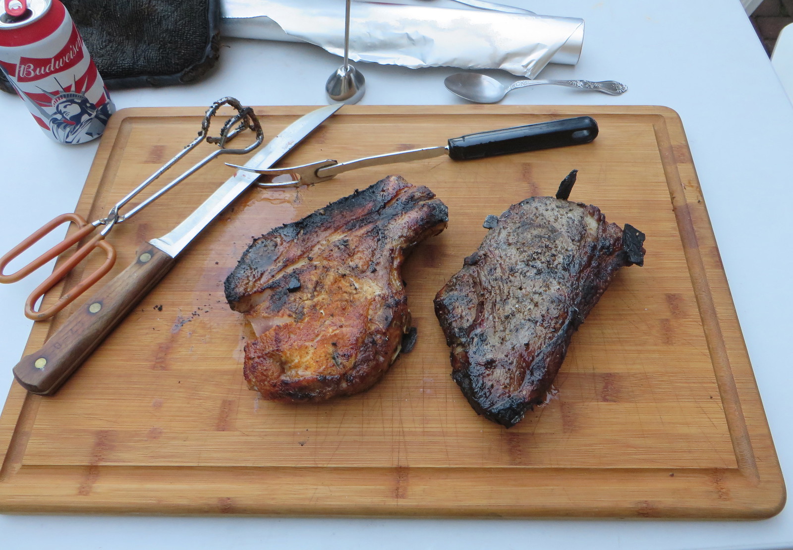
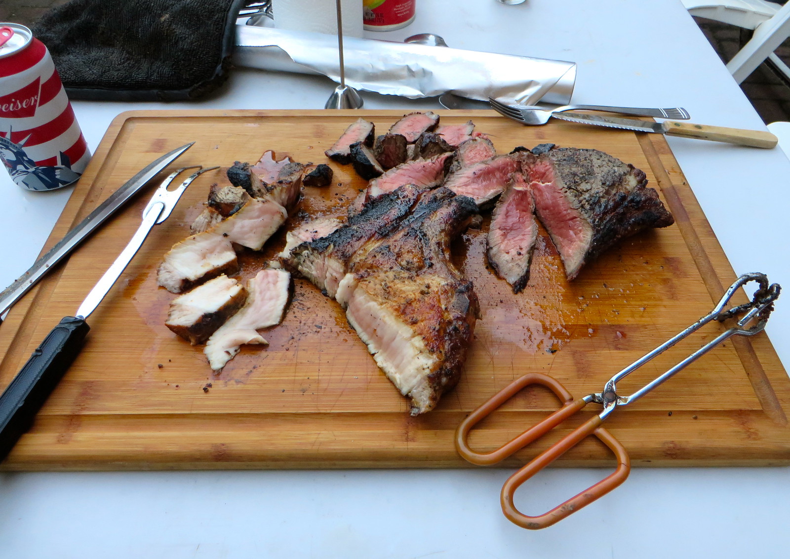
6. So how did it taste? Really, really good. Excellent charred outer crust, succulent within. I did get one bite that included a small piece of ash (again, that’s my fault for not blowing away the loose ash before putting the meat on the coals), but it wasn’t terribly unpleasant.
Did it taste better than conventionally grilled meat? Tough to say — it would be interesting to do a blind taste test. It certainly didn’t taste worse, and there’s something very satisfying about having the food in direct contact with the heat source — it feels more primal, more elemental. I’ll definitely be trying this again.

Uni Tweaks Concepts
We have another new set of tweaks, er…concepts today. After discussion with a number of readers, it’s probably more apropos to call most of the reader submissions “concepts” rather than tweaks. So that’s that.
So if you’ve concept for any sport, or just a tweak or wholesale revision, send them my way.
Please do try to keep your descriptions to ~50 words (give or take) per image — if you have three uniform concepts in one image, then obviously, you can go a little over, but no novels, OK? OK!. You guys have usually been good with keeping the descriptions pretty short, and I thank you for that.
Like the colorizations, I’m going to run these as inline pics — click on each one to enlarge.
And so, lets begin:
First up today is Thomas Juettner who some “Crosstown Series” concepts for the ChiSox & Cubbies (note: these were sent prior to the first series):
Hi Phil,
The Cubs/Sox cross town series is coming up so I thought I’d share this concept I designed for Chicago flag – themed uniforms for both clubs.
Cubs – To reference the flag, I used light blue pinstripes instead of Cubbie blue. The crest is a little different, I took the 50’s era script and put it in circle with another light blue stripe. The sleeve patch uses the classic Cubbie face over a red-six pointed star. I went with Cubbie blue for the road uniform as a way to stand out. The cuff and pants stripes use a pattern reminiscent of the flag and the underline of the C-U-B-S has a Chicago stars under each letter. The caps utilize a “C” in the same color as the jersey.


White Sox – The home cap takes on the aspects of the flag with light blue enclosing white space with red elements. The road cap is essentially what they wore in the early 70’s. The home uniform uses red script to echo the stars with double blue stripes on the placket, cuffs, pants, and stirrups. The sleeve patch has a diagonal flag with S-O-X imposed over the stars. The road uniform takes the script style from the 59 road kit but with the rounded edges of the 83 script. The road jersey could even make a good softball top if worn at home.


Hope everyone enjoys!
Sincerely,
Tom Juettner
And we close today with Daniel Torres who has two helmet concepts, for the Jags & Falcons:


Hi,
My name is Daniel Torres, I’d like to submit a couple of helmet concepts, I guess that others have submitted similar designs but both helmets bug me so much I wanted to send them anyways.
Thanks
Daniel
And that’s it for today. Back with more next time.
Uni Watch News Ticker:

Baseball News: Pretty nice throwback unis and stirrups for this “Blues” team. … Here’s some more “retro-inspired” unis for a summer league team (via David Streeter). … Here’s Telly Savalas in an orange Astros cap from Capricorn 1 (via Dan Epstein). … The Erie SeaWolves’ ”˜Paint the Park Pink’ jersey is featured in minor league competition. … On Wednesday evening Brett Lawrie tucked his pants into his 2-in-1s (a truly awful look). That prompted Kevin J. Chmura to note that Omar Vizquel did the same thing (only with socks and not 2-in-1s) for the Indians. … “The Staten Island Yankees had a ‘Meet George R. R. Martin’ night and re-named themselves ‘The Direwolves’ for the evening, complete with custom Stark-themed jerseys,” says Dixon Muller. “They played the Hudson Valley Renegades, dressed as Lannisters. The game benefited New Mexico’s Wild Spirit Wolf Sanctuary and the game-worn uniforms are on sale for the same cause.” …Check out this fantastic Brewers concept uniform designed by Peter Melling, featuring Owgust! (that’s UW stalwart Chance Michaels‘ blog). … Here’s a look at the Astros alumni jerseys for the 2005 National League Champions reunion this weekend at Minute Maid Park. Not sure if they’ll be worn in a game though. … Somebody at NASA is a Braves fan (h/t Dustin Semore). … “Always a joker, Tiger slugger Norm Cash brought a table leg to the plate to face unhittable Nolan Ryan during one of his 1973 no-hitters,” notes Matt Steinmetz. “Umpire made him use a real bat though.” … “Here are Danny Salazar and Francisco Lindor of the Indians during (Wednesday) night’s game,” says David Feigenbaum. “At least these two know how to dress.”

NFL News: Oops. The NFL was slightly off on their colors for the Chicago Bears in their graphic for last evening’s pre-season games. … “Was cruising around this morning and found this image of Bobby Bell,” says Scott Kneeskern. “I did a double take when I realized he’s wearing boxing shoes! Guys back then trying to figure out how to deal with that ridiculous astro turf.” … USC & Clemson are the latest to announce they’re limiting the number of football jerseys available for purchase. … The Carolina Panthers will wear the greatest uniform in NFL history (or something like that) tonight (h/t Landry Heaton). … “While this isn’t specifically uniform related, the photos that go along with the article highlight the Browns uniforms throughout the decades,” writes Thomas Moore. … The Pittsburgh Steelers’ Joey Porter has Los Angeles Lakers golf cart (from Chris Flinn). … “The Baltimore Ravens have a (new?) logo for the mascot Poe,” says Jake Trout. “I’m not sure if it’s new or not, but I’ve never seen it before at least.” … Ryan Lindemann thinks “Soldier Field’s gold 50 needs an outline or something. Looks dirty and faded.” … Ryan Wetstein‘s dog’s new Seahawks jersey has the NFL 50th gold logo on it. … Not only were the Browns unis awful, it seems as though their mobile site is in pre-season mode (h/t Ty Beatty). … Here’s a first look at No. 79 helmet decal the 49ers will wear in memory of Bob St. Clair.

College Football News: The University of Cincinnati Bearcats have some really cool-looking season tickets (nice spot by Tony Theobold). … Looks like Vanderbilt will be unveiling a new uniform on Sunday. … Possible new unis for Stony Brook? “Saw this pic (click on the link and then go to the 2nd picture, the “Stony Brook Reports for Fall Camp” story) on their website of the team getting fitted for camp,” says Eric Wright. “The numbers and striping pattern on the pants or jersey in the background show a navy or black outline around the numbers, and navy or black as a stripe color. They’re also in the midst of an athletic dept transformation — in June they unveiled their ‘Together We Transform’ five-year, eight-part plan to further develop the athletics department. So maybe new unis are part of that?” … Southern Miss will be unveiling new uniforms this Saturday. … Speaking of new unis, Duke will reveal one today (h/t Will Goldman). … Looks like new tops for the Ragin’ Cajuns (no more black outline — from Cody Junot). … Looks like UMich is going with Jordan (h/t Paul Bruzzese). Here’s more on that (from Andrew Rader). … Some minor changes to the South Carolina jerseys this year (via Paul). This brings them in line with the white and garnet jerseys which were changed last year. … Also from Paul, LSU RB Leonard Fournette is adding “Le.” to his jersey this season now that his brother Lanard has joined the team. And K-State has Nike flywire collars now.

NBA/NCAA/Basketball News: I honestly don’t remember if this was tickered before, but it’s worth another run if so (I know it was in the comments): The Washington Mystics donned special pink uniforms for their annual Breast Cancer Awareness game. Submitter Stewart Small “noticed that their jerseys didn’t have numbers on the back. Can you remember the last time a professional sports team did that? Just struck me as odd.” Think the last time that happened was the Yanks/Red Sox throwback game some years ago. … Here’s a look at LeBron James in a USA uniform (a pre-olympic event, where he remains non-commital for the 2016 Olympic team). … Sad news as the Washington Generals are no more. Jim Vilk adds, “perhaps the Washington football club could use the name now?”

Hockey News: Paul wrote a nice ESPN piece on the recent developments in NHL uni news, including the Avs & Ducks new thirds, plus the Preds’ Saturday gold (yellow) helmets. Check it out! … “In the top Finnish league (Liiga), the top scorer on every team wears a golden helmet,” notes Tim Kavanagh. “You can find some pictures by rooting around on their official league website, as well as on Google images. Also, Mikko Rantanen ”“ drafted this year by the Avs ”“ can be seen wearing one in his profile photo on eliteprospects.com.” … Here’s a “sneak peek” at the Centennial Cougars Hockey jersey. … Superstition be damned! Check out the first #13 in New Jersey Devil uni history (via Sam O). … The Vancouver Canucks are going to wear retro black skate jerseys as they celebrate 20 years of the Rogers Arena.

Soccer News: The North Carolina State University soccer team has a new white kit (h/t NCSU Men’s Soccer). … Looks like a few of the ladies’ Nike schools will have gradient unis this year (from Mark Grainda). Here’s a full look at Arizona’s new kits. … New unis for the ASU ladies’ soccer team (from Joey). … New kits for Clemson soccer. … New Balance just launched the Panamanian National Soccer Team’s third jersey (from Alfredo Clark).

Grab Bag: “For the Win” has ranked the 30 Best Logos in American sports (via Tim Cross). … Here’s a look at the progression of movie studio logos over the years (h/t Austin Shea). … Take a peek at John Daly’s glorious pants (and the socks on the caddie!) at yesterday’s PGA Championship. … Arizona and Nike have extended their partnership for unis and apparel through 2025. … The new British Athletics uniforms for the IAAF World Championships in Beijing are missing the Union Jack and it’s not Nike’s fault. … Designer Vera Bradley has become the latest to enter the collegiate market (via Tommy Turner). … Reader David Firestone “Scored these lottery tickets from the 1858 Maryland Lottery for the Patapsco Female Institute. Man! Even lottery tickets looked better in the 1800’s!” … Rory McElroy was wearing some awesome pants at yesterday’s PGA championship. Not as good as John Daly’s…but pretty good. … Wow, check this shit out: a complete set of 1992 NFL Coke cans. … A former Postman has redesigned USPS uniforms and launched a petition for approval (thanks Paul).
And THAT will do it for this week, kids. *Phew* — Hope everyone has a great weekend — Ek will take you thru till Monday. Thanks to the concepters and all those who submitted for the Ticker via e-mail or tweet. Cheers, everyone.
Follow me on Twitter @PhilHecken.
Peace.
“The one thing on a uniform that has a necessary function to perform during the game (besides protective equipment which is a different category to me) is the uniform number. When you leave decisions on them to kids, they only worry about how cool it looks from a foot or two away.”
— Tim Shea (on the student uni designers for EMU)
1 I hate what Adidas is doing to ucla
2 I think the shamrock jersey from last year was the best one so far and this one would’ve been better if it wasn’t mono green
Navy pants would have been nice.
Navy pants with a green jersey and gold helmet? Are you sure about that?
Did not pay attention to the fact that helmets are still gold. Scratch the navy pants idea.
I don’t really get the above-the-knee stripes that UA keeps wanting to use on teams, but aside from that I think those look pretty good for ND. I could see swapping the blue numbers for gold ones, though.
UCLA is a freakin joke, of course.
…and the Browns need to wear the freakin orange pants. The text is still stupid, but white over orange is going to look SOOOOO much better than the damn all-white thing.
The Lions are still wearing their “WCF” patch from last year. Are they going the route of the Bears and Chiefs making it ‘permanent’ or the way of the Browns and keep the tribute on the jersey for 10 years or so?
I sincerely hope not.
I can understand the Bears and Chiefs having their memorials due to the impact of those respective owners on the NFL (even if I think having a perma-memorial on their jersey is a bit much). Halas was one of the builders of the league, while Hunt was the driving force behind the AFL. And both are revered among their franchises’ fan bases.
The difference here is that William Clay Ford, Sr. is not revered by Lions fans at all – he’s reviled. As Lions owner, he seemed to be more concerned about being friends with the people he employed than with building a consistent contender, and his relatively hands-off approach projected an air of indifference, at least to the fans. People in this town wanted to see Senior gone from the Lions.
New Arizona State soccer kits. The maroon jersey features wide horizontal stripes, and the black jersey includes a maroon pinstripe. A+
link
UCLA would be a prime example of flying to the West Coast for business, let’s stay and extra day and take in a UCLA game and see the Rose Bowl, and have to look at that black garb on the field, instead of seeing the traditional colors. UCLA should be about the blue/gold and that’s it.
That Wisconsin cutting board is awesome!
ND: Meh, for 1 game I can deal with it.
UCLA: JUST STOP IT, ADIDAS.
BC: The number font is wrong. One of the things I loved about ’80s football was the Champion font for letters and their comically-oversized numbers. That was one of the main design elements and they didn’t come close. Is there a proprietary reason for that?
HELMETS: Love ’em both, especially the Falcons.
BROWNS: Tops are too collegiate, pants are just awful, shadowing on the numbers is inconsistent, orange socks aren’t the worst but the all-whites need more brown, especially with the orange numbers.
NCSU soccer kits are phenomenal.
All right, time to go to work.
NCSU Soccer kits: Hoops should go all the way around. Or are you saying you like the way that side panel breaks them up ?
How have I never heard of that Norm Cash incident before? Ninth inning of a no-hitter, two outs, and he brings a table leg to the plate?! That’s bananas. Can you imagine the uproar if a player did that today?
I remember that game well, and am old enough to remember his table leg incident being on the TV news.
There would be a brawl with the bullpens running in….
“Also from Paul, LSU RB Leonard Fournette is adding “Le.” to his jersey this season now that his brother Lanard has joined the team. And K-State has Nike flywire collars now.”
This was put in the basketball section, but it should go in the college football section.
Yikes. Actually there were a couple items at the end that should have been in the football section. Should be fixed now.
Not sure if Bobby Bell is actually wearing boxing shoes. There looks like a lot of tread on those shoes. They are definitely boxing-like. Some crazy hybrid?
In photos I’ve seen of Bell, he appears to have wore high tops through much of his career.
Astroturf-only cleats were introduced in 1969:
link
The pic in the Ticker shows him in a helmet with a white facemask. The Kansas City NFL team switched to those in 1974..Bell’s final season:
link
Yea, I agree don’t think those are boxing shoes, simply high top versions of turf shoes.
the “30 Best Logos in American sports” includes Toronto and Edmunton. I wasn’t aware that they were American.
NORTH American
Yes, they (FTW) are including America’s hat in their definition of “American”
But what about America’s skinny pants?
link
As part of the NJ Devils story, 3 players are changing their numbers, and the team is offering an exchange program for any fans who own jerseys with the old numbers.
link
I’m having trouble understanding why you’d put a corporate logo of basketball player who went to UNC on a U-Mich football jersey.
At least the new coach has done a lot of good things on their aesthetic front so far.
eh, I didn’t mean to post this as a reply. Sorry Dane.
Call me contrarian, but if you can overlook (1) black not being a school color and (2) its glorious uniform history, those UCLA uniforms are pretty cool. The ridiculous compression sleeves and gloves aside, of course.
The thing about the Browns’ uniforms is not that I think the pant wordmark is intrinsically bad. I don’t, actually.
But the real question is – would the uniform look BETTER without it? Clearly yes. Not only better but more in keeping with their traditional look.
I still rather like the Browns’ new uniforms. And I have been a Browns fan since moving as a young lad to the US in the late 1970’s. As with everything, opinions differ, but my sense of most Cleveland fans is that the uniform set is more popular than not.
I’d have been fine with keeping the old look in perpetuity. But as the franchise might literally be the worst one in all of american major sports. And as changes to that status seem anything other than immediately forthcoming, I can see the motivation as far as doing SOMETHING to create some sort of buzz or excitement around the club.
i think it would be better if
a. it was just the word all the down the leg
b. it was encased with stripes and centered more
Word lettering doesn’t really work for a teams whose name and letters are stout like the “BROWNS” or “BEARS”. Yet a team name and letters that have a good length to them, it kind of works: “SEAHAWKS”, “DOLPHINS”.
Word lettering doesn’t really work
for a teams whose name and letters are stout like the “BROWNS” or “BEARS”. Yet a team name and letters that have a good length to them, it kind of works: “SEAHAWKS”, “DOLPHINS”.~~~~
Fixed it for ya.
Can we talk about your grill? Did you build it? I want.
It’s built into the back patio. Was already there when I moved in 15 yrs ago.
You could never do the “gold helmet for the top scorer”,in the NHL, talk about having a target on your head. It works in Finland where passing and a larger ice surface protects the player better, but in my opinion makes for a dull game.
The part about the Browns Uni that really kills it for me is the “Cleveland” on the front – looks like a bad souvenir jersey. Other than that it’s not as bad as I thought it would be.
“…against the Washington football club”
We’ve always been at war with Eastasia.
The attempts to expunge history and facts are so depressing.
It is kind of annoying when people who don’t want to say Redskins make sure they phrase everything so that you they’re doing it intentionally. We can’t just say that Cleveland was at home vs Washington, no… gotta draw attention to it.
Yeah, heaven forbid you should actually have to think about it.
As if we haven’t discussed it to death here already.
I highly doubt anyone is going to change their minds about the name because you go out of your way to awkwardly use “The Washington Football Club” instead of just saying “Washington” in a way that sounds natural.
Whatever floats your boat though.
You’re the one calling more attention to it by complaining about it in the comments. If you don’t like the debate, don’t engage in it.
Have to compliment Daniel on those helmet concepts for the Jaguars and Falcons, those would be instant upgrades. We have too many teams with black helmets in the NFL.
Regarding the Boston College throwbacks, does anyone know the specific name of the jersey sleeve striping? It was mentioned once here, and I should have written it down. This pattern was also used by the Pitt Panthers, St. Louis Cardinals, and New York Giants during the 70s and 80s. It was used by other college teams as well during this era.
Are you talking about “feather edge” striping? (That’s a similar pattern to that on “feather edge” stirrup stripes). Not quite the same, but similar.
Paul, come cook for me!! You can do some meat better than anyone I’ve ever seen. I’ll supply the beverages if you do the cooking! That just looked so damn good.
Those ND unis are just awful. I understand the concept of having a one off uni but that one is just incredibly bad. A school like ND doesn’t need to do the gimmickry like this or at least they shouldn’t have to. UA has entered the fray of which apparel company can produce the ugliest uniforms for their clients.
The UCLA black uni made me throw up a bit in my mouth. Not just BFBS but butt ugly BFBS.
Those new Browns uniforms are absolutely hideous. Remember the first version of Madden on N64 – before they acquired team licenses? These look like they were inspired by that game – except worse. I can’t believe people got paid for “designing” those things.
The WNBA debuted the no-number-on-back unis at the All Star game. check here to see Brittney Griner and Shoni Schimmel sporting the ASG unis:
link
All the Breast Health Awareness pink unis are in the same style. There has been some speculation that it might be a full time, league wide style next season.
You are correct: UCLA and ND are “Bad and Ugly”. Christ!
Loved Paul’s section on the cooking. Every time he posts photos showing his steaks, they are cooked perfectly to my tastes. Instant drooling followed. The man can cook a steak, it seems!
Thanks, Tim!
I’m lucky enough to have a very, very good butcher around the corner from me, so I have access to very high-quality meat. That definitely helps…
Lucky, lucky dog to have a good Brooklyn butcher in the hood…
link
Uni-Watch holiday today?
Forgot to mention that both of those helmet concepts (Jags, Falcons) are great and would be upgrades. Also, the on-the-field photos of the Browns confirms it: I like the orange change, but the “BROWNS” wordmark is just plain stupid looking.
“perhaps the Washington football club could use the name now?”
The Washington Generals would match their more recent on (and off) field performance. They could also change Hail to the Redskins to the Benny Hill theme song.
“Yakety Sax” by Boots Randolph
Golf “cart” or Golf “car”???
link
I would like the new “Shamrock Series” unis if not for the helmet logo and the fact that green isn’t one of Notre Dame’s colors. I also would like UCLA’s new alternates if black was one of their colors.
Notre Dame has been occasionally wearing green for a few decades now. It may not be an official color, but there’s certainly historical precedent for it.
Bottom line…they should immediately stop using that silly-ass leprechaun as a mascot.
Cubs/Sox doing part 2 of the Banks/Miñoso tribute. Add a 60s Cub patch to the sleeve (plus names on back and number on front), and the Cubs throwbacks would be fantastic road uniforms for the present day. Sox in white (not cream), with all players wearing Minnie’s # 9. Several Sox (but not starter Jeff Samardzija) wearing appropriately-striped stirrups.
Sox are wearing cream and the socks have the top part of the stripes cut off. It looks like someone just copied the image on Chris Creamers site without realizing the pants are supposed to be bloused.
Down here in Texas, we call that type of grilling, Eisenhower-style. I guess he was quite fond of that method.
Yes, the Times article that I linked to mentions that.
But don’t call it “grilling,” cuz there’s no grill!
Any guesses to the last 3 t-shirt designs (especially the “doozy” one)?
I’m thinking a throwback, an LGBT, and ????
Perhaps the doozy is the throwback. Maybe even a tequila sunrise LGBT rainbow?
Where did you get the Wisconsin cutting board? I tried the series from Bed Bath and Beyond, but wasn’t happy with the quality and returned it.
It was a gift.
UCLA – Awful
ND – Awful
Steak/Pork Chop – I’m still salivating
Not sold on the rest of it, but I like the asymmetrical navy & green stripe on the ND helmet. I wouldn’t mind a few more teams picking up that idea.
The Brown pants look bad in pictures, and a lot worse on tv. They messed up here IMO. Honest question, is there anyone who looks at Cleveland’s unis from last year and doesn’t recognize them? Really, really casual fans maybe?
Those Chicago concept uniforms by Thomas Juettner are awesome. A huge upgrade over what both teams wear now. As a Cubs fan, I say switch to both of those for next year; the home uniform returns to its timeless classic look and the under-used all-blue road uniform makes a deserved comeback.
That Notre Dame uniform might make sense if it was worn by the North Dakota Fightin’ TBDs.
I know the new Browns look is polarizing, but as a die-hard fan, I’m convincing my brain to like them.
I’ve worked my way past to not hating them. I’m up to kind-of-sort-of-okay with them. My goal is to love them by the time they’ve won their tenth regular season game. – – So I’ve got time. Lots of it.
The best things in my mind about the new look is what is not in it.
1. The “AL” ligature absolutely drove me crazy. Happy to see it go.
2. The various rumors of gray being a third color never saw the light of day. Brown and orange is a tough combination. “Let’s add some gray” will always be a bad idea for the Browns. (Would have been fine with a third color – maybe maroon?)
The worst thing is not the uni – I give them credit for taking some risks. It’s the logo. I still cannot see past the helmet logo as nothing other than clip art that’s been used by every NFL / NCAA / and CFL team at some point. (Pick a team. Any team. and Google images for “[insert team] pennant.” You will see the Browns logo helmet template everywhere.
The team should have tried harder in updating the logo. But I can live with the unis.
All right campers! Rise and shine and don’t forget your booties cause it’s COLD out there………
Wait it actually is tomorrow.
Those Browns uniforms are terrible. Like someone mentioned they are too much like a MAC conference uni. then an NFL look. Hopefully these uniforms maybe are at least a slump buster for the Brownies
By slump buster, you mean they might go 7-9?
I’m not a Notre Dame fan, but the ONLY redeeming thing connected to that new uni is that the student modeling it is a walk-on who was then surprised with a scholarship. link.
You look at the Cubs and White Sox throwbacks and then at the proposed unis for ND and UCLA (and the new Browns unis) and one is left to wonder…what are these new designers after? What is the purpose of these nouveau designs other than to sell something new. And sadly, the public is buying this crap.
I went to the mall the other day and couldn’t believe the clothing offerings. Ugh!!! No wonder we – as a nation – look like slobs.