
For the White Sox section of my recent ESPN column on the best throwback uni for each MLB team, I wrote, “Nope, no throwback of the infamous “Sox in shorts” uniform — at least not yet. But it’s got to happen someday, right?”
That day could now be at hand. Reader Pat Budny pointed out yesterday that the White Sox are selling a 1976 throwback cap that, according to this listing, “will be worn on-field in late July, 2015.” 1976, of course, is when the Sox debuted the shorts. Could they be planning a shorts-clad throwback game? Maybe just using the shorts for BP and then changing to regular throwback pants for the game?
It’s a tantalizing possibility. I sent a note late yesterday afternoon to the Sox and to MLB, asking for details — no response yet.
Even if they don’t wear the shorts, they basically can’t go wrong with 1976 throwbacks, what with the untucked jerseys, the wide collars, and the clam-digger pants. I’m pretty sure this will mark the first time they’ve done a throwback from this era.
And when might this all be happening? Neither the Sox nor any of their scheduled opponents have any retro promotions planned for the next two weeks, so it’s not clear when this game will be played. But hey, “late July” is a pretty short window, so we’ll presumably find out soon.
Update: Word I’m now hearing is that the White Sox throwback game will likely be in August, not late July. Still no word on a final date or whether shorts will be involved.
ESPN reminder: In case you missed it yesterday, my latest ESPN column features the results of my Clippers redesign contest. Some really good stuff — don’t miss.
T-Shirt Club reminder: In case you missed it earlier this week, the Uni Watch T-Shirt Club’s latest design — the green alternate shirt — is now available. And in response to reader requests, we’ve added a women’s V-neck option, which comes in a slightly lighter shade of green. The men’s crew neck and women’s V-neck options are both shown below (click to enlarge):
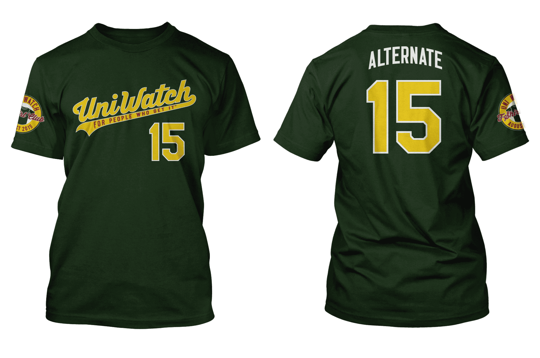
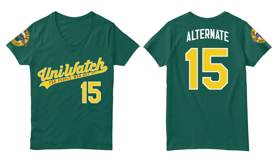
To order, go here, and you can get further info here.

’Skins Watch: Whether you’re pro-Wahoo or anti-Wahoo, you definitely need to read this spectacular article on Wahoo’s secret history. It shows that a version of the Chief appeared in Cleveland newspapers 15 years before the official logo was commissioned by Bill Veeck, and that the Wahoo name may have originated with pitcher Allie Reynolds! Essential reading — don’t miss (big thanks to William Yurasko). ”¦ The ’Skins name controversy was the source of a Jeopardy! answer the other day (from Chris Flinn).

Baseball News: The Astros will wear tequila sunrise throwbacks tomorrow night. Their opponents, the Rangers, will also be going retro. … John Candy’s widow recently uploaded video of a 1982 SCTV softball game, with Candy in a Mellonville Mexicans uniform and lots of other good unis (from Mike Duffy). ”¦ Christmas in July jerseys last night for the Reading Fightins (from Eric Scarcella). ”¦ Cognitive dissonance: A bank robber pulled a heist on Long Island while wearing a Red Sox cap and a Yankees shirt (thanks, Phil). ”¦ More Xmas in July-ness, this time from the Wisconsin Timber Rattlers (from Jon Gausewitz). ”¦ The Reno Aces will wear jerseys saluting wildland firefighters on July 25 (from @NVHoonigan). ”¦ Star Wars jerseys for the Bradenton Marauders (from Matthew Cox). ”¦ Jimmy Buffet jerseys tonight for the Peoria Chiefs (from MrMichael). ”¦ Tequila sunrise jerseys tomorrow for the Fresno Grizzlies (from Luis Gustavo). ”¦ For a while the Astrodome had a mix of Astroturf and real grass. Love the astronaut groundskeeper with the vacuum cleaner (from @synoptico). ”¦ Iowa Hawkeye-themed jerseys tonight for the Iowa Cubs.

NFL/CFL News: The Dolphins have painted over a bunch of murals by a controversial artist at their stadium. ”¦ The Montreal Alouettes wore their alternate “signature” uniforms last night. Lots of additional photos here (from Mike Styczen).

College Football News: Here’s a neat timeline of Minnesota Gophers uni history (thanks, Phil). ”¦ Penn State added NOBs after the Sandusky/Paterno scandal — the stated rationale was to remind the players that they shared individual responsibility for everything connected to the team — but now they’re removing the NOBs, plus they’re going with the Nikelace. ”¦ Here’s a look at Virginia Tech’s new white alternate helmet (from Andrew Cosentino). ”¦ New helmets and white uniforms for Troy.

Hockey News: Penguins goalie Matt Murray spent some time talking about his mask design. ”¦ Way back in the 1920s, there was an NHL team called the Pittsburgh Pirates, and they had a seriously killer uniform (from @penguinshistory).

Basketball News: Dwyane Wade wore No. 5 during his rookie stint in the NBA Summer League. ”¦ Conrad Burry, whose leaks and scoops are usually reliable, says these are next year’s NBA East and West All-Star logos. … Interesting editorial about Kansas’s uniforms in the recent World University Games (from Matt Larsen).

Soccer News: New shirt for Chelsea. ”¦ New white away uniforms for Liverpool. Further info, photos, and video here and here (from JohnMark Fisher).

Grab Bag: Looks like the new Netflix series Wet Hot American Summer: First Day at Camp features some killer striped tube socks. ”¦ Good story about how college apparel deals were often much more contentious back in the day than they are now (from Steve Ceruolo). ”¦ Jon Solomonson notes that the Red Lobter menu includes a logo timeline. ”¦ Here’s a very entertaining interactive map of profanities, cuss words, and the like. ”¦ New rugby home uniforms for the Leicester Tigers (from Eric Bangeman). ”¦ Cricket note from Graham Clayton, who writes: “During the cricket Test Match at Chennai in January 1977 between India and England, England fast bowler John Lever wore Vaseline-impregnated gauze on his eyebrows to stop sweating dripping into his eyes.” ”¦ The U. of Utah is limiting the uni numbers that will be offered on retail jerseys (from Paul Cherrington). ”¦ New logos and uniforms for Howard University athletics. ”¦ Plans to build a “bike helmet”-shaped stadium for the 2020 Tokyo Olympics have been scrapped.
Baseball is a warm weather, summer sport, why shorts are considered out of place is bizarre. If sliding is an issue, make the infield skin portion grass. It doesn’t seem to be that big of a deal. Why is it normal to wear pants when it’s 80°+ outside?
Thinking back to playing baseball as a kid and softball as an adult, I can only say that I think of all of those nasty strawberry burns we got from playing on fields that weren’t all that…. and that was through our pants. With the immaculately manicured fields of MLB, there’s little reason why they couldn’t do it.
Your “stated rationale” as to why PSU added NOBs isn’t even close to correct. O’Brien did it to recognize the players that stuck with the team through the scandal. It was a reward to those players, of sorts.
I don’t have time to find the supporting evidence now, but no, I am not incorrect. It was clearly stated at the time that they wanted to reinforce the notion of shared individual responsibility.
No problem, I’ll do it for you.
link
link
link
“We want our fans to know and recognize these young men,” O’Brien said. “They have stuck together during tough times, and I commend them for the leadership they have shown. Moving forward, I’m deeply committed to honoring Penn State’s traditions, while building a bright future for our football program.”
link
“School officials said adding the names was a way to recognize the “resolve and dedication” of the players, as the team faces a four-year bowl ban and loss of scholarships under the severe penalties handed down by the NCAA last month over the school’s handling of the Sandusky scandal.””
link
See ya and raise ya:
link
“Coach O’Brien says after speaking with some members of the team, they made the decision together to add names to the uniforms. Players indicated the names on their jerseys also mean they will hold each other accountable to uphold the traditions of Penn State football, both on and off the field.”
Sounds to me like a stated rationale of what the players thought it meant for themselves and each other. Not a stated rationale as to why it was decided upon in the first place.
I think we can say that we were both correct here.
Since I cannot respond to Paul’s last statement I’ll do it here. I do not think you can say you are both correct Paul. Paul, you are taking a statement “names on their jerseys also mean they will hold each other accountable to uphold the traditions of Penn State football, both on and off the field” and twisting it to sound like they felt the were personally responsible for a child molester by saying “the stated rationale was to remind the players that they shared individual responsibility for everything connected to the team”. It’s just lazy, and at best bad paraphrasing. Why not use the quote directly?
I also find it a little unsettling that you called the scandal the Sandusky/Paterno scandal. I don’t want to argue whether Paterno did or did not do anything wrong, you are entitled to your opinion. But to call it the Sandusky/Paterno scandal implies equal guilt. Sandusky is a convicted child molester. Paterno at worst didn’t tell enough people what he did or did not know.
I did not “twist” anything, nor did I imply that the players shared individual responsibility for a child molester. (You’re twisting MY words more than I twisted anything.) I simply said that the names were intended to help create a sense of shared responsibility. As it turns out, the word used at the time was “accountability,” not “responsibility” — my bad on that. But the terms and meanings are synonymous.
to call it the Sandusky/Paterno scandal implies equal guilt.
No, it implies that they were the two primary figures in the scandal, which they were. One went to prison and one lost his job.
We are absolutely NOT going to relitigate this scandal here today. Let’s please move on. Thanks.
Overall, what’s most concerning is that they are going to be using Nikelace. That’s disappointing.
As a child of the 70’s, those White Sox throwbacks bring back many great memories, including my first Sox jersey – home white with big, blue collars.
I cannot wait to see them in action again.
I’m not a Sox fan but I always really liked those uniforms. They so fit the Bill Veeck, whimsical era of White Sox baseball. I can’t wait so see them either.
Wet Hot Amerian Summer???
Fixed.
And the slippery slope continues.
link
Lol, you said “slippery slope”.
Lee
More on the Saints logo.
link
I sincerely doubt any insignia handed from culture to culture, such as the swastika, five-pointed star, or fleur-de-lis, can escape misuse and dodgy history. The world is too old and there’s too much history. As a matter of fact, one can make the case the entirety of the earth comprises sacred ground since blood must have been spilled on every square inch of it.
It’s really great how our modern society can’t let anything just stay in the past. I, for one, don’t freaking care what a symbol was used for 300 years ago. Is it used that way NOW? No, it isn’t. Stop being so god damned oversensitive about everything.
I care about history.
Caring about history doesn’t mean dredging up things from 300 years ago to be offended by today though, does it?
^ THIS.
“Melonville Mexicans”?
I was hoping for something from the Lutonians, who kidnapped SCTV president link.
Or “Dr. Tongue’s Evil House of Pancakes.” With the logo rendered in 3-D, natch:
link
I’d rather 3-D House of Stewardesses, if we’re going 3-D.
I love that Red Lobster claims its “iconic lobster image” was born in 2004, after almost 40 years of lobster imagery.
I love that they call it ‘iconic’.
Lee
I remember this topic coming up the other day about the Illinois High School with the nickname “Midgets”. They’ve decided to keep their name.
link
Or “Dr. Tongue’s Evil House of Pancakes.” With the name rendered in 3-D, natch:
link
Wasn’t it reported here a week or so ago that the Sox were going 1976 for a game? So that’s not a surprise.
I just feel the shorts won’t happen, unless one of the silly guys (like Adam Eaton) does so as a joke for BP.
That, and smart money says they will look like baggy shorts, anyway. Might as well wear pants, if that happens.
Wasn’t it reported here a week or so ago that the Sox were going 1976 for a game?
If so, I missed it. (Now let’s hope I wasn’t the one who reported it.)
The 1976 White Sox shorts were such an embarrassment, there’s a reason they were only worn for a single game. I can’t imagine Chicago would make the same mistake again. In addition, the players could refuse to wear these shorts, and that would be a public relations nightmare.
They were actually worn for three games over two seasons, not one game.
If it’s a home game, almost no one would see if the Sox broke out shorts for BP; they take it before the gates to the park open. Even if they did; it wouldn’t be a huge deal. IIRC, the Rangers would take BP in shorts at home as a way of combating the Arlington heat.
I didn’t know Britto was so “controversial”.
I didn’t either. I read a couple articles and besides being a shill, didn’t find anything about him creating controversial art.
Lee
I think being a “shill” (read: successful) is what other *artists* find controversial. As in, “People keep paying him to do things, and they are not paying me to do things. I find that controversial!”
This will, indeed, mark the first time the Sox have thrown back to the South Side Hitmen era. I seem to remember hearing about a ’77 throwback that they were going to wear in a game in Toronto(?), but didn’t for reasons I can’t recall.
Can’t find anything to corroborate that, so it may just be my imagination.
Good memory, Eriq! Confirmed by Bill Henderson’s guide:
link
Those Jimmy Buffett jerseys are nice and all, ….
…but who are are “Chefs”? ;^)
The Kansas USA unis are pretty sweet. I saw the game on ESPN and I had to do a double take when I saw the jayhawk logo on the kits
The Sox wearing 1976 uniforms came out months ago, the same time the 1959 uniforms did (which seemed weird at the time, until they recently announced the thing they were doing with the Cubs). My guess for the 1976 uniforms has been the July 25th game at Cleveland – they’re doing a bunch of Larry Doby stuff that day, and Larry Doby was a coach on the 1976 White Sox. There’s no mention of throwbacks, but its the only thing I can find that makes any sense at all.
Update: Word I’m now hearing is that the White Sox throwback game will likely be in August, not late July. Still no word on a final date or whether shorts will be involved.
The Minnesota Gophers went mono-gold at home for ’72 & ’73, with gold numbers on the road jerseys. Maroon jerseys returned around ’76. Did not realize they had done mono-gold earlier, but makes sense for “Golden Gophers”.
Someone correct me if I’m wrong but I seem to recall UM using a much darker, almost purple-ish maroon in the late ’60s and early ’70s.
A lot of elements of those Sox uniforms are (justifiably) derided, but I’ve always liked the “Chicago” word mark on the jerseys. I’ve always wished their current away uniforms used that word mark instead of the script “Chicago.”
It seems hard to imagine current players would be OK with wearing shorts, but maybe I’m wrong…
Seems highly unlikely. Most likely, they’ll wear regular-length dark pants. Best-case scenario: Dark pants with pink or brown (as appropriate to the individual player) bands at the knee, with high white socks. Faux shorts!
“Regular length” these days would go all the way down to their shoes and conceal one of the great elements of the uniform — actual white socks.
If they do it right, I suspect you’ll hear the players say that — looks aside — it’s the most comfortable uniform they’ve ever worn. Sansabelt pants, plain socks, and a loose-fitting jersey designed to be worn un-tucked-in. Using the modern, lighter materials might make it even more so.
Happy Days softball team…
link
I remember Bill Veck and George Steinbrenner having a war of words, with Veck saying he had the better team, and Big George replying “in softball”. Classic, and this is from a Red Sox fan!
Veeck loved playing David to the Yankees’ Goliath and had the perfect foil in Steinbrenner. It kicked off with the Sox’ first trip to the Bronx, when Steinbrenner/Billy Martin complained about the white undershirts worn with the Sox all-navy road uniforms. The umpires forced the pitcher to cut the sleeve off his throwing arm before allowing him to pitch. Veeck swung into action by getting the American League to issue a press release saying that the uniform — white undershirt and all — had been approved by the League and was perfectly legal. Then Veeck made a show of sending the Yankees a bill for the ruined undershirt.
For Veeck, it was Mission Accomplished — a couple days of headlines and publicity, and a few laughs at Steinbrenner’s expense.
I myself have no use for the White Sox shorts, or for that matter the collars, but that 1976 uniform is still one of my all-time favorites. I agree with Austin that the word mark is gorgeous and the all-navy road uniforms are beautiful and striking while reviving an important part of the MLB uniform scene of the early 20th century. The Sox have had some great uniforms over the years but the 1976 set is my favorite.
I really don’t know why they decided to wear shorts in the first place. While it was a unique look, obviously, it just seems like a good way to scrape the hell out of your legs sliding for a base.
The Clippers redesign contest is one of the best to date. The winner’s depiction of the midnight blue waves is legitimately intimidating.
But I also (surprisingly) love the idea of a one sleeved jersey. It would make it much easier for a casual fan to recognize when a player is attempting shots with their non dominant hand.
Why does the alternate t-shirt not have the maroon number like the home t-shirt did?
Because it’s the alternate, duh.
Jeff: Alternates generally follow the same color scheme as the standard uniforms. That’s the difference between, well, an “alternate” and a randomly colored “fashion” jersey you can buy at Foot Locker.
I thought the maroon number was one of the cooler aspects of the “standard” versions of the Uni-Watch t-shirt.
We tried that but didn’t like the way it looked.
The Astrodome grounds crew must have had some strict rules, wearing the space helmets even in an empty stadium.
Maybe… maybe not. I mean… if you can wear a space helmet, why wouldn’t you wear a space helmet?
COMMENT OF THE DAY!!!
Padres (a) unveil 2016 All Star Game logo, (b) seem to add yellow to team’s color scheme, (c) indicate that brown hasn’t necessarily been eliminated from the team future: link
The SCTV softball game video is great! Thanks for posting! I recall they did a (paraphrasing)”terrorist picnic softball game” skit for their show and I cannot find a trace of it online. I imagine it has been banned.
link
One comment on the Alouette’s third uniform set: Phil and I reviewed them last year when they debuted.
link
There’s links to other reviews of the “signature” uniforms.
I have probably said this on Uni Watch before, yet I’ll say it again – I really dig Montreal’s signature uniform. If you’re going to do a two-tone helmet, that is one way to do it.
Also, I like the new Howard wordmarks and logo. I can see how they are almost “watered down” yet they are straightforward and to the point.
A week or two ago on Twitter someone posted a screenshot of the Alouettes showing they have Stefan Logan in number 0 and someone else wearing 00. The Als haven’t updated the roster on their website, but I noticed it again last night. Anyone know who number 00 is?
Didn’t know the CFL allowed 00, most teams have someone wearing 0.