Click to enlarge
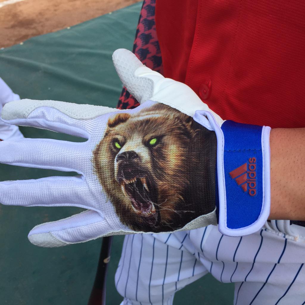
As you know, cubs are ferocious, rabid beasts that snarl like the demon hellspawn they are. They stalk the landscape in zombie-like packs, striking fear into the hearts of all who are unlucky enough to cross their path and laying waste to those foolish enough to oppose them.
They also have neon-green eyes.
So of course that’s what Cubs phenom Kris Bryant wore on his batting gloves for last night’s home run derby. He wore the same depiction on his shoes, but there must have been a manufacturing error on those, because the eyes were red instead of neon. Fail!
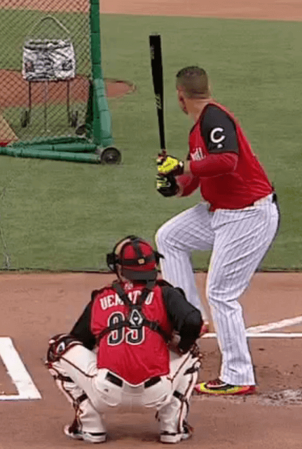
Fortunately, there was plenty of neon to be found in many of the other players’ gloves and shoes, as you can see in this shot of Bryant’s teammate Anthony Rizzo:
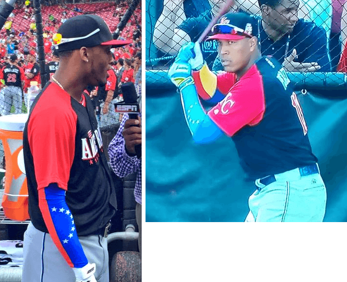
Meanwhile, during yesterday’s all-star batting practice, Royals teammates Alcides Escobar and Salvador Perez were wearing arm sleeves patterned after the flag of their native Venezuela (whose national colors inexplicably do not include neon, what a loser country):
We’ll presumably see lots of additional custom accessories during tonight’s All-Star Game. Full coverage here on Uni Watch tomorrow.
T-Shirt Club launch: It’s time for the launch of the Uni Watch T-Shirt Club’s August design. After all the back and forth over the “Pandering” design last month, this one is much more straightforward. As I showed you last week, it’s the green alternate design (click to enlarge):
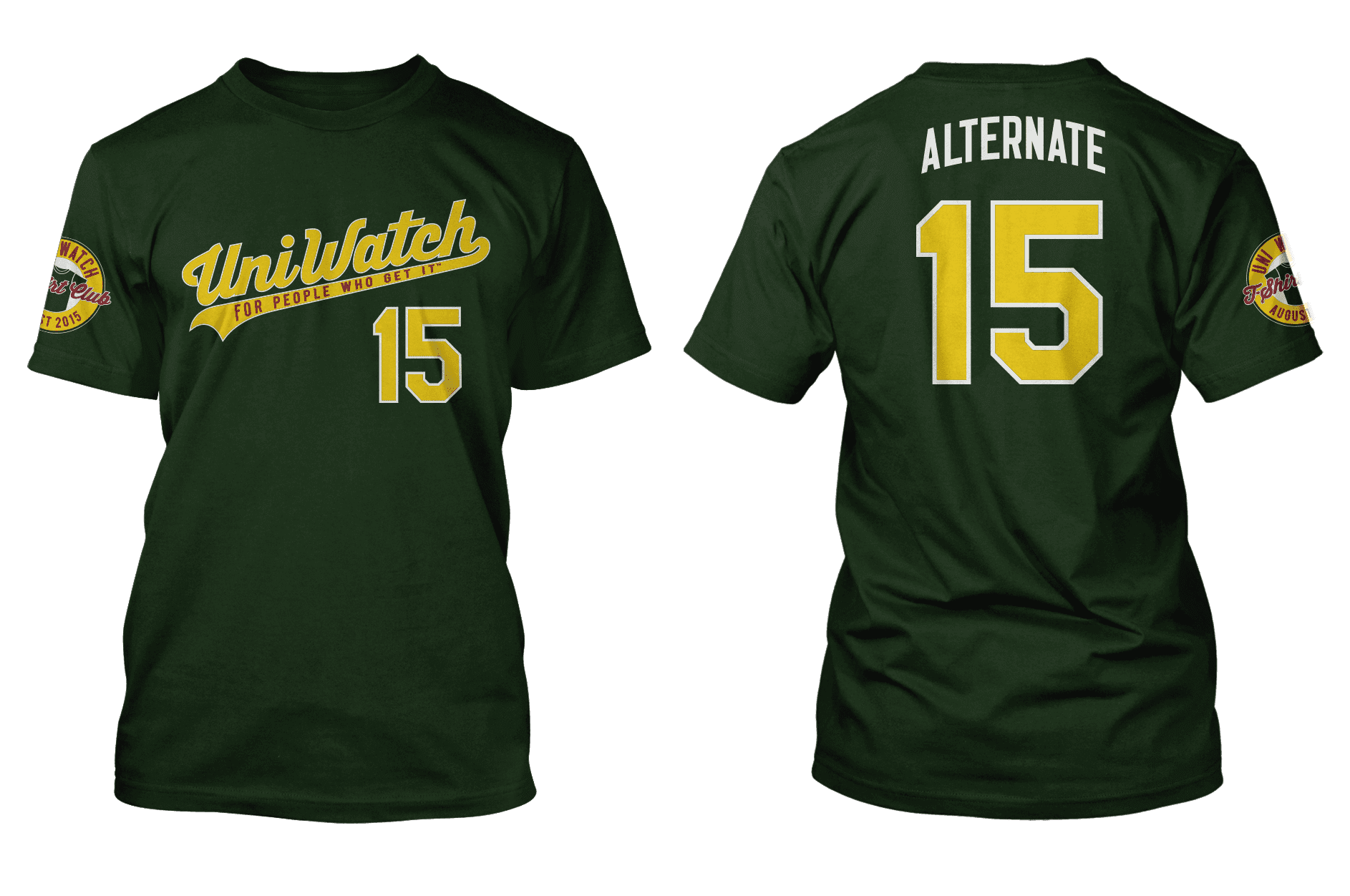
Here’s everything you need to know about the shirt and how to order it:
• You can order the August shirt on this page.
• The shirt will only be available through next Monday, July 20, 11pm Eastern. After that date, the shirt will not be offered for sale. All shirts ordered by then should be delivered by the first week of August.
• There will be four more designs — one for each remaining month of the year. One of those designs will be the grey road shirt, although we haven’t yet decided which month that design will be featured. You can probably guess what some of the other designs will be, although I think a few of them may surprise you. In each case, we’ll update the “sleeve patch” to reflect the appropriate month.
I think that’s it. Again, you can order the August shirt on this page. If you have any questions, give a holler. Thanks.
(Special thanks to Teespring designer Bryan Malloy for all his great work with the T-Shirt Club designs.)
Click to enlarge
Collector’s Corner
By Brinke Guthrie
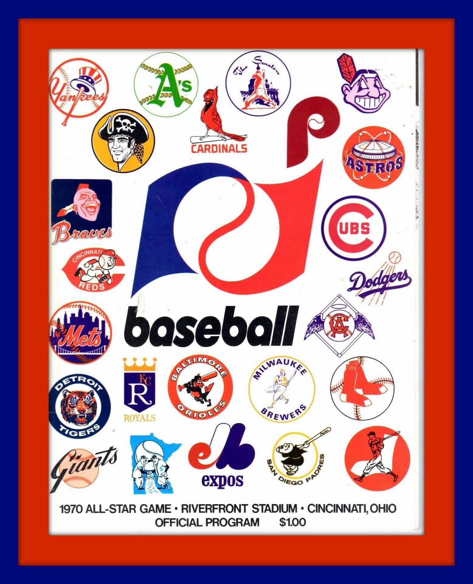
Midsummer classic tonight in Cincinnati. It’s the fifth time for the Queen City, and the third different stadium: Crosley Field in 1938 and 1953, Riverfront in 1970 and 1988 (when I flew directly over the stadium in a hot air balloon), and now Great American Ballpark. Here’s a program from the 1970 game, and another one from 1988.
Here are the rest of this week’s eBay picks:
• Will you check out this early-1970s KC Chiefs sweater. (Says late 1960s, but AFC didn’t begin ’til the 1970 season.) How about that design on the chest — and I remember Varsity House, Inc. on a number of my NFL items from the period!
• Look at this early-1970s (judging from the helmet scheme) Philadelphia Eagles desk set. Looks like they just stuck a helmet bank on there.
• Never seen this one before: a double sided pennant. Astros on one side, Colt .45s on the other.
• This Domino Sugar ad says you can get your official Major League Baseball sweatshirt for just $1.95! (Plus proof of purchase required.) Gotta be 1969 for this one, as it includes a Pilots logo.
• Speaking of Seattle, love this 1970s Mariners tee with three-quarter-length sleeves. Another version here.
• That same seller also has vintage tees for the St. Louis baseball Cardinals and the Phillies.
• Dave Boss alert! A rare poster from my standpoint — don’t see the Detroit Lions design offered very often.
• I’d bet Mike Curtis was the model for this 1969 Baltimore Colts poster. And while you’re at it, cheer on your (Baltimore) Colts with this vintage 1960s megaphone.
• At one point, Joe Willie had his very own electric football game. Did all his teammates end up in one corner of the end zone, too?
• The 1970s NFL Pro Bowl had its very own stationery. Blue for NFC, red for AFC?
Follow Brinke on Twitter: @brinkeguthrie
Podcast appearance: There’s a new-ish podcast called The Seams, which is all about clothing. They recently interviewed me on the subject of baseball uniforms, and the results are available in in this episode. My segment starts at the two-minute mark and runs about seven minutes.
They were very happy with how this segment went, so they may be having me back on a semi-regular basis. Further details when I know more.
Raffle reminder: Today’s the last day to get in on the raffle for this pair of Mizuno MLB All-Star Game cleats, Size 10. To enter, send an email with your name and shipping info to the raffle address by 7pm tonight. One entry per person. I’ll announce the winner tomorrow.
The Ticker
By Mike Chamernik

Baseball News: Both the National League and American League wore great stirrups in the 1969 All-Star Game (from Phil). … Braves OF Ralph Garr wore white spikes in the 1974 All-Star Game (from Phil). … Russ Havens compiled a nice collection of All-Star Game ticket stubs. … Several minor league teams are running Christmas in July promotions (from Phil). … The Binghamton Mets will wear camo jerseys on Aug. 24 (from Phil). … Here’s a good breakdown of what types of gear catchers like to wear (from Nolan Jones). … Here’s a graphic that shows the longest home runs hit at every ballpark this season (from Tom Heppard). … I know we’ve seen this statue on Uni Watch before (because I have a photo of it saved to my computer), but Jonathan Daniel found a great vintage Blatz Beer baseball display. He also found a Reds clock that’s from the 1940s. … MLB Network showed last year’s Futures Game logos in a graphic the other night. This year’s version looked like this. … Weird dark-grey uniforms last night for the Sugar Land Skeeters (from Paul Braverman). ”¦ At the Legends Softball Game, the fence included an old-timey Reds baseball illustration that had obviously been inverted, because the “C” logo on the chest was backwards (from Don Schauf).

College Football News: Miami will unveil its new uniforms at a party on Saturday night (from Phil). … The design of the new Joe Paterno beer has been revealed (from Brinke). … College logo haircuts are gaining popularity. … Here’s a look at Notre Dame’s new shoes and special teams cleats (from Warren Junium). ”¦ Looks like some uni changes for UMass, including a GFGS alternate (from @zachisgod).

Hockey News: New logo and jerseys coming Wednesday for the Milwaukee Admirals. This might be an unpopular opinion, but I like the team’s skeleton logo and black-and-baby-blue color scheme (from Brian Kerhin). … The NHL and the players’ union figure that they can rake in $8 million dollars with uniform advertisements at the World Cup of Hockey (from Chris Bisbee). … Jay Danborn remembers that a team in Saskatchewan, the Assiniboia Southern Rebels, used to have a modified Confederate battle flag logo as recently as 2002. Here’s what the team’s jerseys looked like. ”¦ The LA Kings are sponsoring a high school hockey league. Here are the eight jerseys that will be worn (from @thezambonis).

Soccer News: The MLS all-star jerseys have been officially revealed (from Mark Grainda). ”¦ Here’s a look at Manchester United’s new home kit, and how it differs from the previous set (from Chris Taylor). … Also, in case we haven’t seen it here, new away kit for Aston Villa. The club switched from white to yellow and black (from Randy Williams). … El Salvador didn’t wear a logo on its chest during the 1982 World Cup; instead, the team wore shirts with “ES” on the left breast (from Graham Clayton). … New kits for Real Betis (from James Welham). … New jerseys for FC Rubin Kazan, Shakhtar Donetsk, FK Sarajevo, Ural, Krasnodar, CSKA, and Anzhi (all of those from @espitt). ”¦ New home kit for Napoli (from Yusuke Toyoda).

NBA News: Nike was fined for dressing a French statue of Winston Churchill in a basketball jersey (from Phil). … This gallery contains some rare and interesting NBA photos, including a Kevin Garnett and Randy Moss Minnesota jersey swap.

Grab Bag: I never really noticed, but Jerry Seinfeld wore an extensive amount of athletic footwear in his television show (from Chris LaHaye). … If you scroll through this pro wrestling message board, you’ll find scans from a classic wrestling gear catalog. I dig the old lucha libre mask (from Rick Hodge). … I got a note that Howard University’s athletics dept. will unveil a new logo on Thursday. … An eyeglass company is playfully suggesting that Republican presidential candidate Scott Walker stole their logo. … The Pac 12 has updated its logos (from JB). … Invisibility cloaks are in the early stages of reality (from John Dankosky). … HBO’s John Oliver did a bit during a segment on pro sports stadiums where he gave a pep talk to fans wearing various sports uniforms (from Richard Paloma). … A few NHRA notes from this weekend from David Firestone: JR Todd’s car had a “transparent” paint scheme; dragsters’ tires really change shapes during a race; Cruz Pedregon had a paint scheme for the 95th Anniversary of Snap On Tools.
Sorry, Brinke, but “(when I flew directly over the stadium in a hot air balloon)” is worthless without pics!
Wish I had a camera! It was restricted airspace due to the VP being there. That, and we heard this whirring noise. Kept getting louder. Saw nothing. LOUDER. Still nothing. Looked down- whoops, no more ground. All white. It was the Fuji blimp.
I prefer the Goodrich blimp.
Found some balloon flight shots..doubt these are from the ASG tho.
link
link
Third item in grab bag refers to a “logo logo”.
Really surprised that the Pac-12 seems to be pretending that the 1959 dissolution of the old PCC never happened.
Fixed.
From the Pac-12 style guide:
“Variations of the Pac-12 mark outside of institution-specific color options are not permitted. Any variation will compromise the integrity and unifying function of the Pac-12 brand.”
Oh, please.
Also, “do not use [Pac-12 mark] on distracting background.” Is that why there wasn’t a Pac-12 conference logo on the UCLA Bruins Beastly Bruins jersey? Maybe Adidas will have to change it now since the fabric is pretty disctracting, at least to this UniWatcher.
link
Also, I was not aware that the Pac-10 had used two different fonts for this conference logo. I’m most familiar with the one on the left, but which actually came first?
link
In the soccer section of the ticker, the team’s name is not Shakhtar English, it’s Shakhtar Donetsk. It’s Ukrainian team and the twitter page the link is to is the english version of the team’s twitter account. Hope you all see this!
Big fan by the way =)
Thanks. Fixed.
I believe adidas have used the bear graphic and other animal graphics for their athletes at this years nfl combine this year. None the less it looks stupid.
That MLB logo on the 1970 All-Star Game program. Anyone know whether that was an alternate to the Jerry Dior batter logo? I remember seeing it when I was a kid. I always thought both of them were pretty cool.
That’s the commissioner’s office logo. Was used here and there in the 1970s. A few weeks ago we had something in the Ticker about how it was designed.
I noticed that very few of the batters in the Home Run Derby wore their caps last night while batting. New Era can’t be happy about that.
Best moment was Albert Pujols picking up Joc Pederson’s brother! Albert does great work supporting people with Down syndrome.
Just an FYI, you only mention Escobar wearing the Venezuelan sleeves, but the second picture is Salvador Perez, who is also Venezuelan.
Thanks. Will adjust text accordingly.
That Namath electronic football game is devoid of any NFL references…. except for the NFLPA logo.
I think we’ve discussed the NFLPA logo and its “detachment” from the NFL before. Can anyone recall why it is used without the NFL shield–as if it had zero affiliation?
Because it’s possible to negotiate with them separately? 1988’s NES Tecmo Bowl game has an NFLPA license, but not an NFL one, meaning the game had actual player names, but the teams were only referred to by city and didn’t all use accurate colors. Bo Jackson played for a black & gray Los Angeles team, but Seattle had pink uniforms.
Not true: link.
That’s Tecmo Super Bowl, which came out 2 years later and had an NFL license. Different games. Tecmo Bowl only had 12 teams.
My error.
Based on those pictures, it looks like both Alcides Escobar and Salvador Perez were wearing that Venezuela arm sleeve, which makes sense (they’re teammates).
New logo and jerseys coming Wednesday for the Milwaukee Admirals. This might be an unpopular opinion, but I like the team’s skeleton logo and black-and-baby-blue color scheme
I don’t know, I don’t think it’s very good for a team called the Admirals. For a Pirates/Raiders type of team, it wouldn’t be bad.
Why do the Admirals jerseys sport the Brewers’ ball-in-glove logo?
link
AHL teams have jersey advertisers. In the Admirals’ case, their advertiser is the Brewers, which makes sense, because the team is owned by a bunch of Brewers-affiliated people.
It’s so off-kilter that it works. Anyway, just run with the assumption that he’s a pirate admiral, and it all clicks. The hints about the new look seem kind of promising, except the only reason the blue and the black work together is because the blue is so light and bright. The darker blue they feature in the promo graphic will look terrible if the team is keeping the black.
Is a “Pirate Admiral” even a thing, though? I guess there’s the time when Admiral Kirk basically went rogue and stole the Enterprise… so I guess he’d fit the bill… but other than that, I can’t think of anything. All the major nautical pirates are just captains – Hook, Blackbeard, Sparrow…
Henry Morgan would like a word with you, The:
link
Heh. Well ok then.
Well, technically the commanding officer of a flotilla of pirate ships, each under the command of a captain, would properly be ranked a pirate commodore. But being a pirate, the pirate commodore would not stand humbly on precedent and would undoubtedly declare himself an admiral. Especially if said pirate flotilla commander were also an animated skeleton.
Those Blatz characters (bottle-man, can-man, and keg-man (or barrel-man)) used to appear in a lot of advertising for Blatz.
link
You can find that same Blatz statue at the Minhas Brewery in Monroe, WI. Well worth the visit to see their basement museum of beeriana. Quite the collection! Not so worth visiting for the beer; it’s a large-scale contract brewery pretending to be a craft brewery, and for the most part Minhas manufactures exceptionally terrible beer.
The Milwaukee admirals skeleton logo and color scheme are awesome….. Hope they don’t change much!
Re that Dave Boss/Colts poster: the elbow pads and taped forearms undeniably evoke Mike Curtis, but I think the pose itself may be inspired by this picture of Rex Kern:
link
Yeah, but Kern came into the league (71-74) after this post came out. One of my alltime favorite player names, tho. QUARTERBACK..REX KERN. bet he got ALL the girls in HS.
Fair enough, here it is shown in another e-Bay listing that actually shows the print date:
link
One of my earliest football memories is watching Rex Kern totally fool the TV camera time & time again with his ball fakes while QB’ing OSU. That, and the Sunday morning clip show of Notre Dame highlights that was always playing at my grandparents when we stopped to pick them up to go to church…
Currently in Madrid, went down to the stadium of Rayo Vallecano to buy the rainbow sash kit, found that all they have left is 3XL and child sizes.
The Admirals’ mid 90’s logo was the best one they did. I wish the sweaters would have admiral stripes on the cuffs.
I hope one of the shirts will be a turn ahead the clock jersey motif.
I don’t think teespring is capable of doing the overisized graphics that a TATC shirt would require.
Just write Uni Watch in a goofy print font, turn it sideways, maybe give it #95 instead of 15, and voilà !
Good point… I guess we could also go with the Venus, Mars or Jupiter Uniwatch, seeing how Paul’s a Mets fan and they’re moving to Mercury at some point.
I hope one of the four remaining designs is NN or Message OB.
Aren’t all the jersey Message OB?
Then what we really need is one that has “NNOB” as the number, with no name above it.
That, or one with the name “UNDER” printed below the number.
My guesses:
September: Road Gray
October: Pink-tober
November: Joe-vember Camo (Pandering 2!)
December: Throwback (though how you’d render it I still can’t figure)
I’m thinking a Christmas special for December. Either a snowflake or a $3 Woolworth’s mistletoe can dot the i.
Oh man a throwback would be sweet. Fancy/Tiffany font, or the Pirates type font with just UW on the front like an old flannel jersey…
Aren’t Escobar and Perez’ arm-sleeves “pandering”?
Sigh. No.
After the Cubs-White Sox coverage the other day touched on the two-for-ones, I was going to ask about the origin of stirrups in baseball uniforms. So I’m glad I listened to your NPR podcast, nicely done
“El Salvador didn’t wear a logo on its chest during the 1982 World Cup; instead, the team wore shirts with “ES” on the left breast (from Graham Clayton).”
The El Salvador jerseys are certainly an interesting find, but what fascinates me in its own right is the rudimentary flashing “R” graphic in the upper left-hand corner of the screen after the goal:
link
The finest replay technology that 1982 had to offer!
Seinfeld actually had an episode with an entire storyline about all the sneakers he owned. Kramer took them in to a repair shop to get them fixed, leaving Jerry just a pair of cowboy boots. Then the repair shop owners went out of business and took Jerry’s shoes and were trying to sell them using his name.
You mean Mom and Pop weren’t even a real Mom and Pop???
“Next Stop Pottersville”!!
I noticed that on the graphic images of the jerseys for the LA Kings HS Hockey League, the American Flag is shown on the right sleeve in the front view, with the LA Kings logo on the left sleeve.
They are shown exactly the opposite on the back view of the jerseys. Oooops!.
Love that Washington Senators Logo on the 1970 program. Their only representative at that game? Frank Howard.
UMASS unis.
Third example I’ve seen of the revamped Adidas techfit template ( also UCLA and Louisville). The added seem on the shoulder does give it a cleaner look. Still a dog poop design compared to the Nike templates but its the best I’ve seen since Adidas started the TechFit line. Hopefully this helps eliminate the stripe distortion we’ve seen in previous years. As well as the shoulder pads flying out of the arm holes. Also looks like they are keeping the old template for the road whites.
That is the first time I have see the Chief Wahoo logo face that way. Interesting.
Soccer ticker: Interesting that MLS/adidas chose a design that would definitely clash w/ Spurs’ primary kit. Makes me wonder if we’ll see their blue second or the purple third.
I loved the segment on “The Seams.” So glad to hear there’ll be more episodes coming!
Thanks, Stephanie — appreciated.
Interesting double-sided Astros/45’s pennant. If displayed horizontally, one side would have to be upside-down.
In response to the Venezuelan arm sleeves…what, no “flag desecration” nonsense? No “trotting out”? No ridiculous military bashing tirade? No, that is reserved for that vile, fascist rag, the US flag. At least Venezuela has a stellar record of defending human rights and supporting gays.