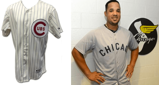
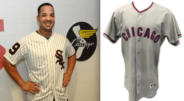
Very interesting storyline yesterday out of the Chicago, where the Cubs and White Sox announced that they’ll be honoring Ernie Banks and Minnie Minoso by wearing late-1950s throwbacks for their game this Sunday at Wrigley, and again for their Aug. 14 game at I Still Call It Comiskey.
Here’s how the uniforms will look, with the pairing for this Sunday’s game on top and the pairing for the August game on the bottom:
That’s all very nice. The two Chi-town legends passed away within a few weeks of each other this past winter, so they’re linked by their connection to Chicago and the timing of their deaths. The two teams arranging to honor both players is a really nice move, and a good example of how interleague play can occasionally have its advantages if the teams coordinate with each other (and if circumstance provides a good opportunity for same, obviously).
But there’s an additional wrinkle. For the game at Wrigley, the Cubs players will all be wearing No. 14 for Ernie. The Sox players will pull a similar move for the August game, with all of their players wearing No. 9 for Minnie.
There are very few instances of all the players on an MLB team wearing the same number. The most obvious example takes place each year on April 15, when everyone wears No. 42 for Jackie Robinson Day. In fact, I thought that was the only example until Chris Creamer reminded me the Red Sox memorialized Johnny Pesky by having everyone wear No. 6 on Aug. 21, 2012. (I was on my annual summer break when that took place, so it didn’t lodge in my memory the way it otherwise would have.)
My initial reaction to the players wearing the same number was “Man, The Jeff is really gonna hate this” mildly negative. That’s because I really like Jackie Day and want it to be its own thing, without any competing promotions to water down its uniqueness. I also fear that this will become a ratchet situation, and that uniform memorials will start to get ever more elaborate and showy — a grief sweepstakes, so to speak.
Then again, that didn’t happen when the Red Sox all wore No. 6. It’s taken three years and a fairly unusual set of circumstances for this type of memorial to be repeated. Viewed in that context, I’m okay with it — although I hope other teams will save this gesture for very, very special players, assuming they use it at all.
Uni Watch intern Mike Chamernik happens to live in Chicago, so I asked him what he thought of this. Here’s his response:
I think it’s a perfect way to honor two of the most legendary Chicago ballplayers. That the teams are doing it during the Crosstown Classic is even better. While the novelty of interleague play has worn off, the two yearly Cubs/Sox series still have an edge to them, at least for the fans. The matchups are highlights of the summer for Chicagoans and they’ll have even more significance attached to them this year.
So there you have it, from the Uni Watch Chicago bureau. What do the rest of you think?
Update: Shortly after this entry was posted, commenter Adam Newman pointed out another example: On Aug. 10, 2007, the Indians all wore No. 14 for Larry Doby. This was the same year that players started wearing No. 42 on Jackie Day and was was almost certainly inspired by that move.
Collector’s Corner
By Brinke Guthrie
Haven’t shown any Technigraph plaques on Collector’s Corner in awhile, so here’s a whole lot of ’em! This seller has 17 NFL helmet plaques up, and five mini-baseball ones that you rarely ever see.
Here are the rest of this week’s picks:
• Check out this lot of 1950s MLB patches from Post cereal.
• Dolphins fans, grab this one now — a switchplate from 1973! (Still have my Bengals one.)
• What did the 49ers like to eat in 1973? You’ll find out with this recipe book.
• Astros fans, here’s a perfect item for your office desk: a 1980 Tequila Sunrise NL West Champs flag.
• Here’s a nice lot of NFL books, including the absolutely terrific NFL Fun Book. If you’ve never seen one of these, check it out ”” a real treat.
• Just bid on it, baby — that’s what Al would say about this 1970s Rayduhz helmet buggy.
• This makes sense: a 1960s/1970s Vikings snowmobile suit, for those chilly Sunday-morning trips to the Met.
• Although the auction has ended, it’s worth checking out the uni on this 1960s Steelers bobblehead — Batman-style template with the team name!
• Vintage 1960s Cowboys tube socks here, never worn. How did I not own something like these back in the day?
• Reader Lamar Bourgeois III sent in the link to this set of 1975 NFL Icee cups.
• And from reader Jim Ransdell, here’s a great-looking USFL gumball helmet set.
Follow Brinke on Twitter: @brinkeguthrie
The Ticker
By Mike Chamernik

Baseball News: The White Sox have worn five different uniforms in their past five games (from Charlie Kranz). ”¦
NPR did a story on the Greek debt crisis and the banner photo shows an old timer wearing a throwback Indians cap, or possibly a Chicago Bears hat (from Rich Rittenour). … Did you know Ted Turner wanted to rename the Braves in the mid-1970s? Turner wanted to call the team the Eagles (from Cort McMurray). … Los Angeles Clippers star Blake Griffin took BP with the Dodgers the other day and wore a personalized Dodgers uniform. Griffin wore his No. 32, which is retired by the Dodgers for Sandy Koufax (from David Feigenbaum). … Ryan Lindemann proposes that the White Sox should bring back the vests to honor the World Series champions of 2005. He’s trying to get the hashtag #bringbackthevests going and he emailed the Sox’s marketing department. … Harrison L. Michelson researched the 1967 MLB All-Stars vs. Celebrities softball game chronicled here yesterday. Although the game was billed as the “first annual,” Harrison determined that ’67 was the only year it was played. He also found a few newspaper clippings about the event. … The Reds placed 20 seven-foot mustaches around Cincinnati and one ended up at the base of an Abraham Lincoln statue near Patrick O’Neill’s office. “What is ironic is that the statue shows Lincoln without whiskers — one of the few such depictions of the former President,” he says. “So the statue shows no facial hair on his face, but now the Reds have placed facial hair at his feet.” … The Iowa Cubs will wear Iowa Hawkeyes-themed jerseys next Friday (from Jullia LaBua).


Pro, College, and High School Football News: Here’s Pats coach Bill Belichick’s record in various types of hoodies (from Brinke and Domenico Delgado). ”¦ The Texas Longhorns are apparently keeping their metallic helmet logo decals (thanks, Phil). ”¦ A Virginia high school will continue to use the Confederate flag on its football helmets and as a school symbol (from Tommy Turner).

Soccer News: Since the USWNT won its third World Cup, the team updated its uniform with three stars over the crest. The stars are stacked like a triangle; JohnMark Fisher says that teams with multiple titles usually curve them around the team crest. And, the jerseys must have been rushed a little for the unveiling because the added star doesn’t match the others (from Michael Kramer). … New away kit for Sheffield Wednesday (from Patrick Barnett).

NBA News: In the Bad Boys 30 for 30 film, a player on the 76ers had a really extreme jersey modification (good spot by Aaron King). … A Summer League promo for the 76ers shows the team’s current updated logo but an old version of the Jazz’s logo (from Chris Jastrzembski). … The Kings continue to perplex the basketball world with everything that they do, so the team’s owner pledging not to shave until the VP of basketball operations stops signing players fits right into all the weirdness.

Grab Bag: Michigan is ditching Adidas and will switch back to Nike. The new deal doesn’t go into effect until August of 2016, so Michigan teams will continue to wear Adidas until then. … Here are some proposed updates to the Virginia Tech logo. Further details are on the bottom of this page (from Andrew Cosentino). … Fox Business’s anchors all wore purple-ish clothing or accessories the other day. “Is there an election coming up?” asks Chris Howell. … Here’s a good interview with Jerry Cohen, the founder of Ebbets Field Flannels (from Neil Macleod). … Here’s something you might not know: Adidas once made hockey skates. … Bowling Green State University is in Ohio, but this shirt maker got it confused with the Kentucky town Bowling Green (from James Gilbert). … Gatorade is reviving classic television ads and producing bottles with throwback labels (from Will Osborne).
I thought I remembered the Indians all once (or more?) wearing 14 for Larry Doby, and I found evidence that I was right: link
Good one! Photos here:
link
I’ll add that to the text.
Back in 2012 the Saitama Seibu Lions wore throwback uniforms and had link.
And the Hiroshima Carp will be putting number 86 on everyone’s back this August 6th to commemorate the anniversary of the atomic bomb being dropped there. Not sure I like this one; it’s a little too political.
The photo says it all. All hail the swoosh!
link
*Rant Alert*
Couple thoughts about the Virginia Tech stuff:
1) LEAVE THE FUCKING LOGO ALONE.
2) Dummy put the wrong bowl logo next to Tech’s record in 2014 (pg. 66 – link)
3) Also – pg 130 and 131 in that same document shows plans to get rid of the rest of the campus golf course. Fuck.
The single stroke is much better than the double, though, and it *is* kinda weird that the V is straight up while the T is italic. I think it could be improved.
I’m still calling it “VPI.”
I still call ’em the Fighting Gobblers.
Re: the USWNT three-star jerseys: it seems obvious to me that they just took the existing two-star stock and tossed the third star on it, which is why the stars are in a triangle pattern instead of the usual line across the top of the shield.
My guess is that they’ll have a proper star design by the time they play Costa Rica in August.
At the same time, the triangle looks kinda cool, and goes well with the pointy bit at the top center of the shield.
All of the merchandise they are selling has the three stars in a triangle, which just looks amateurish and stupid.
Can Nike do anything right?
Nonsense, the triangle pattern looks perfectly fine. What would look amateurish and stupid would be trying to curve three stars around a badge shaped like a shield, as opposed to the circular or curved badges like the German or Brazilian teams sport.
I liked when the women’s team wore their WC stars on their right sleeve.
link
I seem to recall that when Brazil won their 5th World Cup title in 2002, they did something similar right after they won: Brazil put the 5th star in the middle, and a little bit above the other 4 stars.
However, they were all lined up across the shield when the new jersey was released. I imagine they take existing jerseys and add the new star. My guess is we won’t see the triangle design on the next USWNT jersey.
The jersey is also missing something: the FIFA gold championship badge. We’ll likely see those next time the USA takes the pitch.
I own that NFL fun book. Bought it through the school book program 30+ years ago.
I had it too! Read that thing cover to cover and back again at least a billion times (slight exaggeration). Loved the stuff like the evolution of equipment and all those team “cards” you could tear out. Great stuff! That book, the PP&K library of books, my PRO! subscription and my collection of Dave Boss posters fueled my insatiable ‘tween fascination with pro football.
Not true that national teams with multiple WC titles “usually” curve the stars denoting them around the team crest. Italy doesn’t, and nor does Uruguay.
link
link
I guess it depends on your definition of usual. Is it more than 50%, 75%? Either way, it’s pretty obvious that these were just existing jerseys with the two stars already embroidered on them. You’re not going to tear off the two stars so that you can curve three stars around the top of the crest. You’re just going to add a third on to the top.
No, it depends on THE definition of “usual,” which is more often than not. More often than not, in the case of multiple WC winners, the stars are not curved around the badge. Hence, that’s NOT how they’re “usually” aligned.
Only three other teams have three or more World Cup stars: Brazil men, Germany men, Italy men. Germany curves the stars around their round crest. Brazil doesn’t curve its stars, but arranges them across the top of their shield crest. (Note that while Brazil’s stars follow the shape of the top of the crest, each star is straight up and down, not tilted like Germany’s left and right stars.) Italy stacks its stars inside its shield crest. There is no “usual” practice, given how rare the phenomenon of three-plus championships is. I have no doubt that USA women will eventually line up the three stars along the top, like Brazil, but keeping the quickie triangle treatment of the championship merch would not be unusual; it would basically be the Italian approach set on top, rather than within, the crest.
Alternately, USWNT could make the three stars within the national crest gold to differentiate themselves from the men’s team.
Pedant alert: Uruguay has 2 WC titles, but 2 additional stars as part of its badge denoting the pair of FIFA-recognized world championships it won by taking gold in the 1924 and 1928 Olympics. Which appear in a straight line on their jerseys as per the photo linked to above.
Yeah, I don’t count Uruguay’s BS third and fourth stars. Still, if we do pretend that those fantasy “championships” count, then Uruguay gives us a fourth star treatment different from each of the other three: In a line, within rather than outside, the crest.
So the “usual” practice is simply that each country that achieves a third World Cup star develops its own unique way of displaying the stars. Curved above the crest, straight above the crest, stacked within the crest, and straight within the crest. As such, USA would actually be more in line with “usual” practice to keep the triangle than it would be imitating any existing men’s team’s arrangement of stars.
The additional 2 stars hardly represent “fantasy” championships. The 1924 and 1928 Olympics were the first two soccer tournaments in which countries from multiple continents competed. Indeed, apart from the World Cup they’re the only other ones ever even held, and it was their success that proved the impetus for FIFA’s creation of the World Cup competition. In fact, the reason Uruguay hosted the initial WC in 1930 was precisely because it was the defending world champion.
Given the small sample size of national teams, it’s worth looking at club football where a very large majority of teams wear their stars in some sort of linear fashion above the badge.
Juventus, for example: link
Los Angeles Galaxy went link, link.
Thanks for the shoutout! #bringbackthevests
Good football stuff from Brinke today, but what really caught my eye was that 1969 KC Royals Technigraph plaque: the “KC” logo on the cap is orange/gold. Was that the original plan for that logo before they went with white?
I’d buy that New Orleans Saints one in a New York minute, except they TOTALLY SCREWED UP the helmet decal! Sheesh!
“Gatorade is reviving classic television ads and producing bottles with throwback labels”
I wish they would bring back glass bottles and discontinued flavors like iced tea!
Bring back that awful tasting gatorade falvored gum from the 70s.
You’ll see the pic in this newspaper article: the Eau Claire Express of the summer collegiate Northwoods League had Ickey Woods as a promotional guest last night, and the Express all wore orange number-30 jerseys with the Bengals “B” on the left sleeve, a black drop shadow on the number and what looks like “Woods” as the NOB.
link
I was glad when the White Sox dropped the vest, and I hope it never comes back.
That being said, I’d be all for the ’59 throwback moving into the rotation in the same way the ’83 throwback has.
I’d say the vest is unlikely to come back, for the same reason that vests have largely disappeared from other MLB teams’ wardrobes: Fans don’t buy vests.
Another example of the merchandising tail wagging the on-field dog, and of why we’d be better off if jerseys weren’t available for retail sale.
There’s got to be an owner with balls enough to say “The hell with it! We’re gonna have one home uniform and one away. They’re gonna look great and I don’t care how many we sell.” Unfortunately, he’s probably the owner of the Fantasyland Idealists.
Actually, that owner’s name was George Steinbrenner, and his children continue to embrace that philosophy today.
Don’t the Tigers and Yankees do this?
Ah geez, I can’t believe I forgot that. Must’ve taken my moron pills today.
How close do the Cardinals come to doing this as well? I’m not as familiar as you guys with alts and such. There’s no room for improvement with their jerseys IMHO.
The Cardinals have an alternate home jersey. I believe the Tigers and Yankees are currently the only two uni teams (save for Negro League and Latin American promos).
And Memorial Day G.I. Joke, and Independence Day pandering….
Well, those two are MLB-mandated promotions. The Negro Leauges and Latin-American promos are still originating from the teams, as far as I’m aware.
I bought a vest: Therefore, I am not a fan:)
Would fans buy “faux-vests” with contrast colored set-in sleeves?
NASCAR is changing the way it designates its playoff contenders visually for this year.
In 2014, the cars were easily recognized with a yellow front valence, windshield namebar, and roof numbers.
link
For 2015, the valence and namebar remain, but the teams will maintain their normal number color, and instead the rear spoiler will be yellow.
link
That Cincy Lincoln statue is a great reminder. Today, Abraham Lincoln exists in the public mind’s eye with a careworn brow and his “Father Abraham” beard. But when Americans elected him president in 1860, this was the only picture most people had seen of him:
link
Young, fit, a little stern.
While the best known sculpted Lincoln images have him with a beard (thinking Lincoln Memorial, Mt Rushmore), there are plenty of statues of younger, pre-president Abe without the facial hair.
Maybe it’s being in Illinois, but it seems like Abe statues are everywhere.
Yeah, being in Illinois has a lot to do with that. Here in Virginia, we have like one Lincoln statue in the state, it wasn’t installed until 2003, and crowds turned out to protest against it. It’s got the beard, because it depicts Lincoln’s April 1865 visit to just-liberated Richmond:
link
One thing you’ll never see on any statue of Lincoln, a mustache. He never wore one.
“Here in Virginia, we have like one Lincoln statue in the state, it wasn’t installed until 2003, and crowds turned out to protest against it.”
Protesting a Lincoln statute? That is all kinds of messed up. I have always tolerated the Sons of the Confederacy with a bit of an eye roll and wave of the hand, but screw those guys. Seriously.
Those 70s NFL Icee cups were great! Had a handful of ’em and used them till the graphics wore off from repeated washing.
It looks like the White Sox screwed up 1959 pinstriped jersey. The number appears to be the wrong style.
Compare that #9 to the one on the back of the batboy in this photo from the series:
link
It looks like they just took the watered down version they wore in 2009 and made the base jersey cream.
link
Compare these jerseys to the ones they wore in 2005:
link
My initial reaction to the players wearing the same number was “Man, The Jeff is really gonna hate this”
Well, I don’t know if I hate it, but I do think it’s kinda stupid. Jersey numbers were added for a reason, and having everyone wear the same number is dumb, and presumably a pain in the ass for the stat guys. Now, NOBs on the other hand, aren’t really necessary. How about everyone wears their normal number, but with Banks or Minoso on the back? I’d do the same thing for Jackie Robinson day (why does that still need to be an ongoing thing anyway?) Just use Robinson NOBs and wear regular numbers.
Well, I don’t know ifI hate it,but I do thinkit’skindastupid. Jersey numbers were added for a reason, and having everyone wear the same number is dumb, andpresumablya pain in the ass for the stat guys. Now, NOBs on the other hand, aren’t really necessary. How about everyone wears their normal number, but with Banks or Minoso on the back? I’d do the same thing for Jackie Robinson day (why does that still need to be an ongoing thing anyway?) Just use Robinson NOBs and wear regular numbers.How are same jersey numbers a pain in the ass for statisticians? It’s baseball fer chrissakes, not basketball or some other fast-moving sport where there’s an actual NEED to differentiate between players.
Without numbers, a substitute could come onto the field without everyone noticing and stats could be given to the wrong player. Supposedly this happened a few times back in the days of unnumbered jerseys and unmicrophoned public address announcers.
Except the manager comes out to inform the home plate umpire of any change, so that he can write it on his lineup card.
Try scoring an extended rundown, scottrj.
Piece o’ cake. The player tagging the runner gets a putout (PO), all other players handling the ball get an assist (A).
But what if four other fielders handled the ball on the play? Might be kind of hard to keep track of who all gets an assist if they’re all wearing the same number and NNOB.
My point was, keeping statistics and keeping a scorecard are separate endeavors. Remembering *the order* in which different players handled the ball in the course of a rundown for scorecard-keeping purposes? Yeah, that may be a bit challenging in the case of a 4-5 throw (AKA “poorly executed”) rundown. Remembering *who* handled the ball for statistics-keeping (PO/A) purposes? Eh, not so much.
Score this one if everyone’s wearing the same number:
link
Sure, the catcher’s easy, but the rest?
C gets the PO, and P/1B/2B/SS all get assists. Nothing else matters to the statistician. Not to mention instant replay makes it simple enough to sort all that out.
That was shambolic defense, BTW. Give the pitcher a pass b/c, well, pitcher, but 1B/2B/SS should be ashamed. If I was scoring my card would read “2-Clusterfuck-2.”
The only issue might be on MLB.com’s play-by-play feature, where each action is coded to produce the stats and a text description. I suspect their scorers could use video replay to double check things.
This is all just an insidious plot by MLB. Little by little they chip away and people start to think, you know, who needs uniform numbers after all? To which MLB responds by saying, “We agree. So we’re going to slap giant ads on the back of the jerseys instead.” You’ve been warned.
If people thought Jackie Day would be the only instance where a team all wore the same number, they’re as naive as the guy who thought Oregon and only Oregon would be the “mix and match and let’s add non-school colors for even more combinations” school. Folks, it’s human nature to copy stuff like this. Whether or not it’s a good idea (and in this case it most certainly is not), once somebody puts it out there others will follow. Especially when it comes to the sheep herd that is sports marketing and promotions.
If a simple black armband is appropriate for a recently deceased player, how about a simple black number 42 or 14 or 9 on the sleeves of the players? Seriously, what more do you need? You don’t have to make a mockery of the numbering system to show you care about a legendary former player.
Back in 1995, Mickey Mantle’s passing had been announced very early on a Sunday morning – too late for any of the clubhouse people to affix mourning bands on uniform sleeves for a Sunday day game. Many of the Yankee players used chalk to put a 7 on the back of their caps. That must have given Steinbrenner or someone an idea, since they then put 7s on the shirt sleeve, instead of an armband – which has been continued for Yankees who have had their number retired.
And then it was a fine, simple, and uniform memorial regime for the rest of George’s tenure. Retired number if applicable, but an armband for anybody else. It was classy and dignified, the way George might like to think the Yankees look. But then Hank and Hal took over, and once Bob Sheppard and their dad died, they forgot to ask “What Would Daddy Do?”
(Is this a Uni Watch record for the youngest “Get off my lawn” post? I’m only 26.)
The old Greek guy is wearing a Chicago Bears hat, and a fairly recent one. Smart guy. :)
In addition to the revelation about wanting to change the Braves to the Eagles, two other interesting lines from the Ted Turner article:
1. “People don’t want to watch news and documentaries,” insists Turner. [Note to the young’uns: Four years after this article was published, ol’ Ted would launch a small news station called CNN.]
2. “I don’t want to shoot my mouth off a lot,” he says. “I’m going to keep a low profile.”
Also of note with the Braves fleeing the city for the suburbs in 2017
” I want the players going down into the ghetto and working. And if they don’t want to do it,” grins Terrible Ted, “I’ll get some who do”..
Did no one else notice that the Gatorade commercials all happened around this past years NBA All-Star game? So if anyone was excited to see them, I think the ship has sailed on that.
I’m a sucker for the throwback logo trend. I recently went to buy a sports drink and shamelessly bought the Gatorade solely for the old logo. I also grab the retro Doritos bag, and I was all over the old Miller Lite cans. It took me one sip to remember, “Oh I forgot Miller Lite is awful”.
It’s a guilty pleasure of mine, because I’m against the concept of adding alternate brand representation to satisfy my minority consumer subset. It’d be like me being a Oregon football fan so long as they wear a throwback once a year.
Interesting to see yet another school opt to switch to a new company rather than stay with Adidas. Not to mention the NBA making the same call.
But will Gatorade bring back GatorGum?
Wow. I remember that.
Texas should keep the metallic helmet logo. It’s actually the same color as the jerseys.
The Bowling Green (Ohio) State University shirt is printed on a Russll branded shirt.
If I’m not mistaken, Russell is part of Fruit of the Loom and FOTL has a plant in Bowing Green, Kentucky.
I think Western Ky Univ, that is in Bowling Green, Kentucky, is a Russell Athletic school.
Apologies if this has already been shared… Sports Illustrated Kids recently invited their readers to submit concepts for ugly uniforms.
link
link
It’s really too bad the Maryland Frogs weren’t included in this.
Then again, that wasn’t really an ugly uniform design.