Click to enlarge
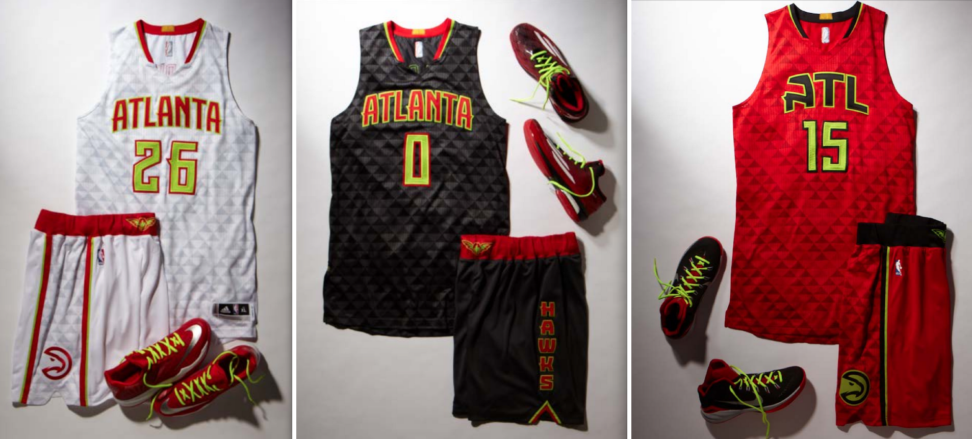
Surprising development in Atlanta, where the Hawks are scheduled to unveil their uniforms today at 11am Eastern. Everything on this one had been on total lockdown, but then Hawks beat writer Chris Vivlamore, who covers the team for The Atlanta Journal-Constitution, posted photos of the new uniforms last night at about 10:45pm, along with photos of assorted merch.
That certainly removes a lot of the suspense from today’s unveiling, eh? Which is fine with me, because I have an 11am doctor’s appointment and will have to miss the unveiling anyway.
As for my take on the designs, I’ll have my say over on ESPN — Link here.
For now, though, I’ll just point out one small detail that I found interesting: On the home and road jerseys, I like how the crossbar on the first “A” extends off to the left and the crossbar on the last “A” extends off to the right, creating a nice bookend effect. But shouldn’t the crossbar on the center “A” have extended to both sides, for the sake of symmetry?

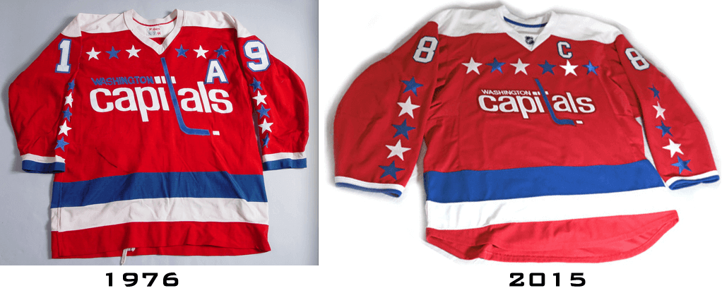
Meanwhile, over in DC…: The Capitals unveiled a new alternate jersey yesterday afternoon. There was almost no advance notice on this one — the word on the unveiling had come down the day before, but that was the first I’d heard of it.
Anyway, as you can see above, it’s basically an Edge-ized throwback to the team’s inaugural road design, except the word “Washington” has changed from blue to white (which seems like an improvement). Here’s a comparison of the new design and the original on which it’s based (click to enlarge):
A few thoughts:
• The good news is that this design is certainly better than the team’s regular red home jersey, which has all the unnecessary stripes and side panels. The bad news is that the Caps say this red throwback alternate will replace the white throwback alternate that the team has been wearing in recent years. The white one was even better than this new red one, so this design, nice as it is, is actually a downgrade.
• The mothballing of the white throwback is particularly surprising because the Caps wore that jersey, instead of their standard white road jersey, for road games in this past season’s playoffs, which had led many observers (myself included) to think that the white alts were poised to become the new road primaries. Turns out the postseason was the last hurrah for that design. Too bad.
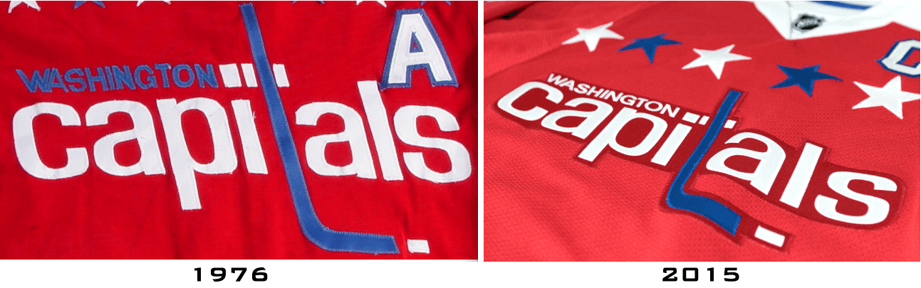
• This isn’t surprising, but it’s still disappointing: They’re applying the lettering as a single patch. It’d look so much better if they sewed each letter on individually, like in the old days (click to enlarge):
• This is the part where I have to say that it’d be cool if they wore the new jersey with white pants for a game or two.
Design contest reminders: In case you missed it yesterday, I’m running an ESPN contest to redesign (or, if you prefer, re-redesign) the Clippers. The deadline is next Thursday, July 3, 7pm Eastern. Full details here.
Also: Phil is running a contest to redesign the Rays. Deadline for that one is next Tuesday, June 30. Full details here.

Baseball News: A Richmond Flying Squirrels fan collects the ice cream mini-helmet dishes that other fans leave behind at their seats, takes them home, cleans them, and then bring them back so the players can autograph them. ”¦ Nats P Stephen Strasburg’s bat knob decals show his uni number in three different fonts. Odd. ”¦ Lindsay Resnick has started a new blog about historic baseball team names. ”¦ Here’s a new one: Pirates OF Andrew McCutchen and 3B Josh Harrison went high-cuffed with striped socks last night. Never seen that particular striping on a Pirates player before. Naturally, I like the striped hose, but it’s a shame that socks have essentially become a non-standardized accessory, not really that different from a wristband, instead of a uniform component (screen shot by Coleman Mullins). ”¦ Here’s a Richmond RiverRats player wearing gold stirrups with black (or maybe navy) sannies. ”¦ Phillies C Cameron Rupp’s catcher’s helmet had a throwback logo last night (from Chris H). ”¦ The Orix Buffaloes have a new jersey that shows a map of the world (from Armin Rosen).


Pro, College, and High School Football News: No, the Jets are not getting a black helmet (nor are they making any other uniform changes this season). But if they did, it might look like this (from @ChiaEstevez). … Baylor has enough uni combos to wear a different one in every game for 10 years. Of course, that doesn’t mean much because they’ll likely get another makeover well before then (thanks, Phil). ”¦ It’s a little hard to see, but the NOB in this shot reads “1 Tim 4:12” — a Bible citation. That’s Trinity Christian High School in California (from Eric Maddy). ”¦ Good news at Iowa State, where it looks like the team’s shoulder stripes are getting longer. Also looks like they’re going with a new number font and new pants striping ”¦ Here are Maryland’s cleats for the upcoming season. ”¦ Very disappointing to see that Penn High School in Indiana is selling the naming rights to its football field (from Scott Held).

NBA News: Reprinted from yesterday’s comments: Here’s more on that Wisconsin high school that has poached the Bucks’ new logo before it could even appear in an NBA game. ”¦ Kevin Durant has a new sneaker.

Soccer News: Here’s a hint about the possible design for the 2015 MLS all-star kits (from Conrad Burry). ”¦ Online searches for Peruvian national team jerseys are spiking. ”¦ Really good article on the little rubber pellets found in the artificial turf used for the Women’s World Cup. ”¦ The rest of these are from Yusuke Toyoda: “Something I noticed at this year’s Women’s World Cup: female players exchanging jerseys after a game. It still doesn’t happen much, partly because many teams can’t afford extra jerseys.” ”¦ Great piece and some nifty animation on the evolution of Portland’s Providence Park. ”¦ Regarding Tuesday’s ticker item about fitness sensors worn under Women’s World Cup jerseys: The monitors for the US federation are supplied by Polar, and Canada has a similar deal with Catapult Sports. ”¦ Here’s an oral history of the United States’ 1990 World Cup team, including anecdotes about how a couple of players exchanged shorts because their Italian counterparts had already swapped jerseys, and how several players lost the battle to wear their Puma gear because the US federation had an exclusive contract with Adidas.

Grab Bag: I really like this necktie diary, based on a guy wearing a bunch of his father’s old ties. … The U.S. Army is adding zippered shoulder pockets to its uniforms (from John Muir). … NASCAR issued a statement supporting the removal of the Confederate battle flag from the grounds of the South Carolina state capitol and reiterated its ban on the use of the flag in any official capacity, although fans are still welcome to wave it during events (thanks, Phil). ”¦ California is bringing back black license plates. “And this one’s still available!” says Brinke. ”¦ In an item that intermixes the themes of the two previous items, Virginia Gov. Terry McAuliffe has announced that the state will no longer issue Confederate flag license plates. North Carolina Gov. Pat McCrory wants to do likewise in his state, as do Tennessee Gov. Bill Haslam and Maryland Gov. Larry Hogan. Georgia Gov. Nathan Deal, however, is hedging. ”¦ Meanwhile, the speaker of the Mississippi House of Representatives says it’s time to remove the Confederate symbol from the state flag, and a growing stream of retailers, including Walmart, Amazon, Sears, and eBay, have said that they will no longer carry Confederate flag-based merchandise. ”¦ Speaking of flags, here’s a not-very-insightful critique of all 50 state flags (from Nathan Gruber). ”¦ Golfer Jordan Spieth ended up with Under Armour through an unusual set of circumstances involving a former Washington football player (from Tommy Turner). ”¦ 7-Eleven has won a trademark infringement suit against a Pennsylvania retailer with a very similar logo. ”¦ “During a fiery South Sydney vs. Eastern Suburbs game in the 1970 Sydney rugby league competition, South Sydney player John O’Neill had his jersey ripped and torn after an altercation with an Eastern Suburbs player,” says Graham Clayton. ”¦ Also from Graham: “The Bendigo Thunder women’s Australian rules football team recently had spare jumpers, team dressing gowns, and other clothing stolen from the club.” ”¦ New hockey uniforms for Illinois State (from Steven McVeigh). ”¦ Kinda creepy but kinda cool: motorcycle helmets that look like shaved human heads.
One pro to the red retros for the Caps is that they can actually wear them at home without any juggling from the visiting team. The Caps have only wore the white alternates on the road for the last few years.
Interesting that none of the uniforms read “Hawks,” given that was the wordmark on the leaked Christmas uniform. Paul — Now that the Bucks and 76ers new uniforms are out, will you pass along the Christmas designs for those teams?
Yikes. It looks like the Hawks will continue to search for a signature look.
Just an FYI: Penn HS is actually in Northern IN, just east of South Bend.
Fixed.
For the last few weeks I’ve been unable to access the site while at work on IE 11. Prior to that it was a slow load and there was a message about stopping a long-running script. Now all I can get there are the green side panels. During June it hasn’t been a big deal as I’ve been on a big project that has occupied basically all of my time, but as that winds down, I’d like to be able to check in during the day..
That was happening to me too! Im on my phone using Chrome, but having the exact same problem.
If I’m on wifi the problem seems to have disappeared.
I get long script running messages too on IE.
Use chrome now at work. no probs.
It works fine on Opera, Chrome and even my kindle on my home setup. I don’t like reading full websites on the phone.
I’ve alerted my webmaster, guys. Thanks for the heads-up.
Thanks for getting this fixed.
Good to know. I thought I was the only one! Uni Watch has had an unsettling knack for crashing my Safari.
I actually somehow REALLY like the new Hawks jersey. At least in these pictures the jersey pattern looks nice, the font is nice and I am no fan of day-glo yellow but here it almost sorta works. (maybe because its a more muted not as bright yellow but a green/yellow color?). I just wish the collar would extend all the way down into a triangle and it would have been nice to see the home jersey say Hawks instead of Atlanta.
All in all and surprisingly so not a total mess and certainly better than the LA Clippers hot mess of a dumpster fire look.
Some will find these suits to be heinous, but I think they’re fun. An admission the dull uniforms of the past few seasons were a mistake. Go big, or go home!
I have a feeling the “Atlanta” wordmark instead of “Hawks” serves a couple of purposes:
* Counter to the Braves’ move to the outer suburbs
* Penance for the racist email controversy that alienated the city
I’d like to see “Hawks” on the home jersey as well, but overall I like these quite a bit. I really like the sublimated pattern. It’s something that we are used to seeing on soccer uniforms and it’s interesting to me that as soccer is gaining traction in North America we seem to be seeing little bits of soccer design pop up in other sports. In his ESPN article Paul quoted social media as saying “any over 30 will hate them, and any under 30 will love them,” I’m 30 so I guess I could’ve gone either way but I like these.
i am with you. i love these new jerseys, though they are not without their flaws (and i am in fact OVER 30). i don’t like that the triangle pattern isn’t applied to the majority of the shorts, only the leg stripe. i would have inverted that application. the font, which i do really like, is, admittedly, derivative of the hornets. and i am generally not a fan of that collar style or shoulders without color trim of some sort. also that ATL “A” is trying way too hard. but though they are not perfect, i think they are a far superior attempt at “the future is now” styling that teams like the seahawks, buccos, and ducks (and so many other NCAA football teams) are going for these days.
what kills it for me, and this is true of all team branding efforts, is the marketing jargon BS. just once i want a team to get out on the podium and say, “hey, our merchandising profits were stagnating, and we thought this new stuff would look cool for a little while.” and you know what? that’s exactly what the hawks have accomplished here. the merchandising will spike for a little while, and they’ve created a look that works well right now, and in a decade, when everyone is calling them the “ugliest jerseys EVER” they will go with something different. and in another decade those same people will be clamoring for those 2016 throwbacks. and in another decade there will be so many sponsorship logos on the jerseys that style and color schemes won’t matter one bit.
i think basketball and football in general are struggling to modernize. baseball remains, plugging along with uniforms that work best when done in a simple and classic fashion, but the NBA and NFL don’t want to go in that direction. yes, the simple classic team designs are the ones that last, look best, and breed the strongest bond with the fanbase (the bears, raiders, packers, celtics, bulls, lakers) but those sports also seem somehow married to modernization, and so poised to do cool new things with jerseys, helmets, shoes, etc, and the logos and branding should follow. a colts horseshoe, for example, looks just fine on a blue polo shirt, or a basic hat, but looks totally out of place on that wicking neoprene fitted warm-up track jacket with the digital camo fade on the sleeves and neon trim pieces. the seahawks logo, on the other hand, has the opposite problem. in the same vein, watching the colts play the seahawks is a visual incongruity that doesn’t necessarily make either team look bad, but makes the NFL’s identity crisis look silly and the game hard to watch.
here the hawks have acted in the spirit of that “future is now” marketing strategy and created something that actually works, if only for a season or two. maybe not deserving of a “good for them” but at least a “good enough for them.”
The black Jets helmet looks just as bad as their lame ’94 TB attempt.
Black and forest green are identical twins, as far as I’m concerned. If the Jets were leaf green, or kelly, you’d have something.
Well… they’re alright at a glance, but there’s a lot of little issues when you start really looking at them. People are gonna complain about the yellow numbers on the white jerseys for sure. Is there really nothing down the sides of the jerseys? The trim from the shorts really should have continued all the way up. I’m also not a big fan of the airport abbreviation thing. ATL is just as stupid as PHX…and does it mean the black jersey is their primary road and the red is only an alt? And why do the shorts only have the sublimated triangles on the one side instead of being covered in it like the jerseys? If that pattern is really as bold as it appears, from a TV broadcast view it’s gonna look like they’re wearing gray jerseys with white shorts.
So…. Does ATL equate to PHILA? Not to me.
I don’t like ATL. No need for an abbreviation in this case in my mind. If it’s just them trying to be hip-ho-and-happening I don’t like it either.
Just my taste.
You realize the “ATL” thing isn’t new for them, right?
link
Yes, i know. but there was such a fervor over the PHILA jerseys the other day, I was just wondering people’s thoughts.
The Suns, Thunder, and Hawks were attempting to own the abbreviations from the ticker. The 76ers were merely coping with trying to fit “Philadelphia” into limited space.
Yeah, but there are people who do refer to Atlanta affectionately as “Ay Tee Ell”. I think this is more organic than PHX.
I can’t speak to how Philadelphians refer to their city, but I did think that “Philly” was more common than “Phila.” Although, it does seam that the city website is phila.gov.
I will say that a good number of Atlantans refer to the city as ATL or the A.
“ATL, Georgia, what do we do for ya”
– Outkast, Rosa Parks
“Started poppin’ bottles cuz its ATL tradition to.”
– Drake, Still Fly
“When you come to ATL boy you better not hide.”
– Outkast, B.O.B.
“ATL – ho, don’t disrespect it.”
– Lil John and the Eastside Boyz, Get Low
“ATL my hood, yeah, understood, yeah”
– 2 Chainz, Used 2
ATL can also stand for Above Tha Law.
I remember letters commonly being addressed “Phila, Penna” in the days before state codes were mandatory. Conversationally we used “Philly.”
Nike shoes in the Hawks’ new Adidas uniform photos???!!
The rubber pellets…I find them everywhere after my rec. league matches too. Not to mention they get into your shoe during play and work their way under my big toes and cause the worst blisters I’ve ever had.
Always been a fan of the sash on soccer kits (Peru, Washington Diplomats) or diagonal jerseys like FC Cologne & AS Monaco
I enjoyed, beyond all reason, the later three-stripe sash and the big “DIPS” nameplate.
They seemed to play the Cosmos on channel 9 twice a month.
I think I like the new HOME Hawks uniforms, not so sure on the ROAD – definitely dont like the ALTERNATE.
And the yellow intrigues me? Is is day-glo? Is it a greenish-yellow, a throwback to their early 70’s colors? If the former, I’m not sure. If the latter, then I like it.
so we are all going to ignore the elephant in the room with the Confederate flag topic, because I’m cool with that.
Eh, not much to talk about really. It’s not a federal banning of the symbol so we aren’t getting to the 1st amendment territory. Personally I’m OK with people who want to advertise their views to the world… it makes it easier for me to avoid them… and why Walmart wouldn’t want to take their money is beyond me… but whatever.
the Walmart thing surprises me, but I am sure they are not all too pleased with the stereotype that these are “their people”
Uh, state governments are constrained by the 1st Amendment as well. But in any case, there’s no talk of banning the flag anywhere for private use.
Not in the context of the Confederate flag it doesn’t:
link
Not to go too far into the legal weeds, but that decision relates to government speech, and to what extent government may (or may not) speak for itself. The Court held that license plates constitute government speech, and thus can decide what it puts on its plates. As that decision reaffirmed, government has broad discretion in what it can/can’t say.
State governments are still constrained by the First Amendment. That’s why they couldn’t (or at least very likely couldn’t) ban the private use of a Confederate flag.
Not sure what you mean by “the elephant in the room,” or why you’d raise an issue to begin with if your point is that you want to ignore it. In any case, news relating to flag design and license plate design is nothing new for the Grab Bag — just standard design-related news.
just that it is a hot topic issue that usually gets a ton of people’s panties in a bunch. Hell I am going to a country concert in VA on Saturday and I am kind of looking forward to seeing the idiots there trying to defend a flag they have no conncction to while so many companies (including NASCAR) are trying to distance themselves from it.
and yea, I guess I was taking a backdoor route to talk about it. It intrigues me.
Judging by the cars I see on I-95, the Confederate flag appears to be the unofficial symbol of Prince William County.
But you know, they’re just showing pride in their heritage (of enslaving people, committing treason and oppressing a minority group).
and it is probably right next to a Redskins sticker.
Funny, but I feel like I don’t see all that many Confederate decals on cars in Prince William County, compared with Fairfax and Alexandria. But hoo boy, I know I’ve crossed the Rappahannock River by the sudden ubiquity of Confederate decals south of Fredericksburg. (Though maybe western Prince William and Manassas are a different story.)
I still remember how jarring it was when I was driving to Minnesota for the first time in several years in 2005 when, just as I got onto the I-94 bridge over the St. Croix, and a big ol’ pickup with Minnesota plates and a Confederate flag decal passed me. I couldn’t remember ever seeing a Confederate flag on a car with Minnesota plates before.
Maybe Prince William County isn’t right (it might have been Stafford County), but I remember driving just south of the Beltway and seeing an increase in rebel flags, Redskins decals and Gasden flag license plates. Complete shock to my Montgomery County sensibilities.
Curious to know what your problem is with naming rights in HS sports? I don’t know the particulars of this school, but I have heard you be similarly “disappointed” by other instances in the past.
I have seen naming rights save districts whose budgets have been drastically slashed. Why wouldn’t a town use this as a means? It’s not like an NFL owner looking for a new revenue stream- I’m sure the HS softball coach is pocketing the money from Teachers Credit Union Field.
The use of corporate naming rights by schools is essentially a step toward, and a small example of, the privatization of public education, and that’s seriously bad public policy.
If you want a certain kind of public education system, tax the public accordingly. That’s part of society’s basic responsibility to its children (and to itself). The selling of corporate naming rights ultimately serves corporate interests, not public interests. It also puts corporate messaging in the face of schoolchildren, which teaches them to be consumers instead of citizens. Bad news all around.
Taxing the public accordingly, and society’s basic responsibility sounds all well and good, until you put the school budget up for a vote.
In many places, you have a greater than 50% society vote for the budget that does not have a child in the school system. In a “what’s in it for me” society in which we live, these people overwhelmingly vote against any increases in funding, whether it be for sports, arts, or really anything involved with increasing their tax bill.
Thus, the gap must be made up in other ways, or gets cut. My daughter, in 9th grade, has no delusions on her talent when playing volleyball or softball. She does, however, reap the benefits of her playing- the leadership qualities she has developed, the self confidence and the scholastic discipline it provides. If it meant the difference betweeen playing or not playing, she would be fine with a “Bob’s Discount Furniture Field” sign as big as Cowboys Stadium. Same thing applies for her band funding, which was cut this past year.
Other districts have used similar means to keep from cutting school programs- we have seen advertising on school buses, on auxilliary buildings, and at fields. Of course it is serving the corporate interests, they wouldn’t do it otherwise. But this is one of the few times it ALSO benefits the public.
The “schoolchildren” you speak of are inundated from corporate interests at every turn. On their phone, TV, at the Mets game, etc. At least in this case, it would provide her with something she feels is important. I can live with that one.
The reality is that softball and volleyball are not part of a school’s educational mission. I’d rather do without them than sell out to corporate interests.
You would rather do without school sports? Wow.
That’s a false choice. There are all sorts of ways to keep school sports without selling out to corporate interests. Let the parents raise funds for their kids to have a team. Let the kids wash cars. Apply for a grant. Etc.
But if all of that failed, then yes, I would prefer not to have school sports than to have corporate-bankrolled school sports.
My son went to a public high school that, due to an obscure provision in the Texas UIL regulations, could not field interscholastic athletics teams (the school was rated 3A; the other schools in the district are all 6A: UIL rules say all the schools in a district have to be within one ranking division of each other). “Homecoming” for his school is a flag football game between the upper and lower classes. He had a great experience in high school. He received a terrific education. And he’s been accepted to his first choice university.
He’d had his heart set on playing high school soccer. He didn’t. He got over it.
High school sports are overrated.
Run all the bake sales and car washes and 50/50 raffles you want, you aren’t making the budget gap needed in many cases.
As for Cort, I am sure that my daughter will be fine too without her music, and would be too without sports. But I am damn glad she has them, and it has nothing to do with her batting average or wins and losses.
Texas 6a is overrated.
From the linked article about the high school that stole the Bucks logo:
“All I know is that if I would have thought any of this was a violation or something, I certainly would not have sent (the tweet) out,” [Principal] Weber said.
Would have still stolen the logo and put it on the new gym floor. Just wouldn’t have publicized it on Twitter.
Nice.
Yeah, I made that same point when that article was posted in yesterday’s comments. The principal sounds like a serious jerk.
Hundreds if not thousands of schools are using pro or major college team logos. Generally no one cares, but somehow this school is an issue?
This is the guy who got pulled over for driving 72 in a 65 after getting passed by a few other cars first.
Generally no one cares, but somehow this school is an issue?
(1) I’ve cared and called out schools for doing this for many years now.
(2) This example is particularly brazen because the new Bucks logo hasn’t even appeared in an NBA game yet but the school already poached it. That’s why it’s particularly notable and discussion-worthy.
Look, even if it didn’t cross legal or ethical lines (and it clearly does), why wouldn’t you want your identity tied to someone else? The whole point of having a logo is to distinguish yourself. Borrowed interest is a good way to signal to the world, “Hey look at how lazy, unimaginative and unethical we are!”
I looked back at yesterday’s comments just now to see what I missed. Eltee asked about the high school design program Paul wanted to launch a couple years ago, to which Paul replied that that idea died.
I want to make everyone aware that there are such programs already in place. I teach at a high school, and we launched a new school brand identity a little over a year ago through one such program. It involves some give and take of course. I think the design work was free, and in return they provide our official school merch (not team uniforms) for a few years. The work included logos, wordmarks, official colors and fonts, all in a stylebook identifying proper use.
Prior to this, our school brand was a mix of a few old (I believe) original logos, and various appropriated logos (Georgia G, USC Trojan logo, Georgia Tech, etc). Of our new set, there are a few things a like, a few I don’t, but at least it is ours, which gives us a leg up on many other high schools across the country.
Interesting quote regarding the HS logo. This from Zach Lowe’s column on the new Bucks floor. link
“By the way: The Bucks are well aware a Wisconsin high school team borrowed” aspects of the Bucks’ new deer logo for its own center-court design. The team hasn’t taken any legal action, and it may leave the issue to the NBA, which owns the intellectual property. The Bucks are drumming up taxpayer support for a new arena, and they understand how it might look for the big, bad NBA to crush a local school in court. “There’s something positive about it being a school all the way on the opposite end of the state,” Godsey says.”
I believe the Hawks’ unis would be improved if they’d used the classic yellow of the 1972-2007 Hawks, rather than the neon green of the 1970-72 period – especially when it comes off looking like regurgitated pea soup.
It just dawned on me – that “volt green” on the Hawks reminds me a lot of the Columbus Blue Jackets’ original logos. Thankfully, the Jackets never expanded their neon green-yellow beyond the stick/”J” in their original monogram crest and Stinger’s head in their secondary logos, and retired the color (save for its use on the Stinger mascot costume itself) in 2007.
“I believe the Hawks’ unis would be improved if they’d used the classic yellow of the 1972-2007 Hawks.”
Hear, hear!
On the Pirates newish stirrups….
I have seen the triple yellow stripe on the black stirrup before, infact, I wrote to the Pirates asking them to consider making them the standard… But there are different, they have white trim on the outside on the yellow stripes.. I’m thinking this is because on the black jerseys, with matching hat, there is white trim around the Pirates ‘P’ as an outline.. The other uniforms (and batting helmets) don’t have these.. I am curious to see if they were these stirrups with anything but the black…
Journalistic commentary: insignificant personal details like saying you have an 11 AM doctor’s appointment are unnecessary. Leave that stuff out.
Always nice to have a new reader.
The key word is “commentary”.
You should give the New York Times a shot.
Paul, would you consider Uni Watch to be a journalistic endeavor? Something I’ve never thought to consider before. If it isn’t journalism, what is it?
Cant be journalism. A journalist wouldn’t publish something without verifying it.
A journalist wouldn’t use caveats like “So let me make this as clear as possible: I don’t know if this cap design is legit” or “So let’s hope this design – whose legitimacy, I’d like to stress, has not been determined one way or the other” in order to get the story first.
A journalist wouldn’t put something out there with those words to protect himself from critique, but still allowing himself to tout the “You saw it here first” the next day when it turned out to be true.
A journalist wouldn’t have been burned a month earlier by a similar report, and if he had, he certainly wouldn’t come back a month later with another unverified report, caveat or not.
Not a journalist.
Not on a blog he wouldn’t.
But in an actual report, he (and I think Paul) likely would/does.
Not a journalist.
How enlightening! This will come as news to the NY Times, the Wall Street Journal, Fortune magazine, and the dozens of other journalistic enterprises for which I’ve written.
Duh, yes, of course I’m a journalist. That’s how I’ve made a living for the past 20 years.
As for this website, it’s a mix of journalism and personal narrative. I do lots of things here that I wouldn’t do on ESPN.com, or in any of those other publications I just rattled off. I curse, I talk about my mom, I talk about what I had for dinner last night, I print things when I’m not sure about them (but usually say, “I’m not sure about them”), and so on. Oh, and I engage in dialogues like this one right here. That’s because this website is my personal media project, which lets me define its parameters. Its content includes journalism but is not limited to journalism.
Uni Watch as a whole (by which I mean the ESPN column and the parts of this website that aren’t about my mom or what I had for dinner last night, etc.) is, by and large, journalism. It’s a sports beat that I created, and features a mix of news and criticism, both of which are standard journalistic formats.
I actually really like the Hawks uniforms. Much better than the nondescript navy/red/white of the past few years. It’s a modern update that incorporates elements of their team’s past (not neon for neon’s sake). The volt yellow is not excessive and I think it works in this case. It’ll be interesting to see how the texture looks when sweated through i.e. darker.
I agree that the state flag critiques were less-than-insightful, but man, there are a lot of really crappy state flags. Most of them are terrible.
The author was intending to be glib/snarky. In her case, she illustrated the point that glib/snarky does not necessarily equal funny or insightful.
Wow! She really went for it! 50 jokes! But like any comic will tell you,…. You write 50 jokes just to get one good one.
And the other 49 never see the light of day. Unfortunately, she likes to share.
Count me as liking the Hawks uniform EXCEPT I wish the away and alt were flipped (I have the same complain about the Hornets set).
I think, like the Seahawks uniforms that I like, this is something I’m going to disagree with people about. I like the classic look, but I think there’s room for a modern look in the uni-landscape as well.
The white Hawks shorts are cool. I should hate the new uniform, but I don’t.
I too like the shorts. The sublimated triangles limited to the stripe is just fine.
Regarding the Capitals, I can’t say I’m surprised by the move to switch their throwback-based third from white to red. What disappoints me is that the Caps haven’t used the third jersey program to experiment with, or refine, their current brand. It suggests to me that the organization might not be entirely enthusiastic about their brand going forward.
It’s plain to see that the team isn’t ready at this point to just scrap its 2007 rebrand altogether and go full-on retro. Still, I see this as a missed opportunity to test out potential updates to their current jerseys, or to just do something different with their current identity.
I agree. I have long wanted them to update the home an road unis to a more traditional style. While I am a fan of the newer wordmark and the secondary logo, the gratuitous striping needs to go. Combining the old jerseys with the new workmark would look sharp in my opinion.
Even sharper: The old jersey style, but with the W-eagle logo instead of the wordmark. Or just adopt the most recent Winter Classic uniform as the basis for new home and road. Maybe brighten the red and blue of that uniform. Otherwise, its use of stars is a near-perfect reference to the classic old unis, and the simplicity of the pattern is vastly superior to their current home and road jerseys.
Who actually thinks that day-glo yellow doesn’t completely clash with the red and black? I could get being these modern, funky uniforms, but where’s the color theory, people? A regular yellow would have been fine.
I like the uniforms way more than I thought I would. Maybe it’s because I’m part of the millennial target demo.
It seems like the Hawks are making a nod to a couple of different eras.
Neon chartreuse harkens back to the early-70’s Pistol Pete unis.
link
The return of red to a prominent role in the uniform, pairing the red with a garishly bright accent color, and the Pac-Man evokes pique Nique-era.
link
The black road uni reminds me of the Mookie Blalock, Dikembe Mutombo teams I grew up rooting for,
link
Lastly, I think I have an explanation for the triangles. If you look closely on the logo the Hawks used before switching to the blue/white/red color scheme, you’ll notice triangles on the breast of the Hawk. Perhaps that was what they were going for?
link
I think you mean “peak Nique-era” – unless you’re irritated by that particular era.
YOU SAY THIS>>>Design contest reminders: In case you missed it yesterday, I’m running an ESPN contest to redesign (or, if you prefer, re-redesign) the Clippers. The deadline is next Thursday, July 3, 7pm Eastern. Full details here.
Also: Phil is running a contest to redesign the Rays. Deadline for that one is next Tuesday, June 30. Full details here.
______________________________________________________
Am I wrong but isn’t there only 1 day between Tuesday and Thursday? If next Tuesday is June 30th then that Thursday can’t be July 3rd, right? That would be the 2nd right?
You’re right. July 3rd is a Friday.
When does the Hawks redesign contest begin?
I am not a pro hoop fan, so this is based solely on aesthetic…I like the new Hawks unis. They aren’t perfect, but as a ‘modern’ design, i think it works and is a nice balance between traditional uni and modern elements. I look at them and think, “Wow, these are a new design without being a joke” They have a nice pop and a clean look. They don’t feel weighed down by any bullshit design novelties. I know some will say the font or the pattern on the jersey are bullshit, but I think that gives them a sleek look and some texture. I think there is a nice balance between modern touches (colors, pattern, font) and traditional looks (layout of name and number etc & pacman logo). I especially like the alt uni. Let’s see how they look on the court.
Paul’s new ESPN column is now live: link
Interesting that he mentioned feather and quilt. I thought the triangles make it look like a quilted down fabric.
Like these:
link
I like how the crossbar on the first “A” extends off to the left and the crossbar on the last “A” extends off to the right, creating a nice bookend effect. But shouldn’t the crossbar on the center “A” have extended to both sides, for the sake of symmetry?
In theory, yes, but in the same sense that in theory, communism works. The middle A comes between the letters L and N. The shape of the L creates room for the crossbar to extend to the left without disrupting the natural kerning of the letters. The vertical side of the A sits tightly against the vertical stem of the N, so extending the crossbar to the right would force unnatural space between the letters. That would be terribly disruptive of the whole thing, both as a logo and as type. So it’s either no extended crossbar on the central A in the name of symmetry, or the crossbar extends to the left on the central A in the name of consistency with the two other As in the word.
You rock, Scott.
I read the comment before seeing the picture, so I didn’t know there wasn’t enough room on the right of the central A, but indeed, I was thinking the same thing: “no extended crossbar on the central A in the name of symmetry.”
Again, because I read it before I saw the picture, I thought Paul was referring to, not something protruding out of the letter A, but rather something making a notch INTO the letter A. Basically, I thought that the A on the left had the notch coming from the left, and on the right the notch coming in from the right. If you had the notch coming in (as opposed to extending out or protruding) on both sides in the central A, then wouldn’t it look this?
link
Good thing I misunderstood the description.
link
The neon green might be laughably dated tomorrow, but the Hawks new look is cool. But as long as we’re talking about which abbreviations are “organic” enough to be acceptable on a basketball jersey, I would support a NOLA jersey for the Pelicans. They used it on the Hornets’ Mardi Gras alternates, we use NOLA in common parlance (you could send a postcard to my childhood address at “NOLA 70124” and it would get there), the Times-Picayune’s web spinoff is nola.com, and let’s face it–NEW ORLEANS looks a little uneven in an arch, unlike NEW YORK.
To me, “NOLA” sounds like someone trying to say a heavily-accented “N’awleans”, but is slurring it so much (for whatever reason) that it ends up coming out that way instead.
At first I thought the new Hawks set was pretty bad, then I remembered the hyper-bland uniforms they’re replacing. Since the second the outgoing Hawks uniforms were unveiled, I thought they were the most boring, least inspired pro uniforms I’d ever seen – especially from a team whose uniform history had been consistently interesting, both on the good and bad ends of the spectrum. The new ones are at least interesting.
I still think they’re executed poorly (especially making black the road color), but there’s a lot to work with here. I think it’s possible they’d even look downright good without that stupid sublimated pattern.
“…I really like this necktie diary, based on a guy wearing a bunch of his father’s old ties. …”
Very cool. I wear my father’s ties, my father’s suits, and there’s still one shirt (he died 1986) that’s more or less presentable. This is, among other things, an illustration of the glacial pace in businessman garb, at least within the finance / law / opinionizing sector over the past 60 years. My dad’s 1955 suit still looks appropriate. Can you imagine an 1850 US respectable gentleman type dressing like John Adams did in 1790?
True story: In the 1820s, President James Monroe still dressed in the style of the 18th century. Wikipedia has a great illustration of Monroe, with his Uni Watch-approved high cuffery, speaking to his cabinet of betrousered secretaries.
link
Within the course of Monroe’s adulthood, men’s dress had changed radically. Whereas there’s not a man alive today who would look out of place dressing as his grandfather did. At least in the civilian spheres of white-collar work, worship, and recreation.
I see a disapproving John Calhoun giving Monroe’s outmoded style of dress his trademark scowl behind the President’s back.
“necktie diary”. Not to be confused with a “necktie party”.
Lots of positive response in the above comments to the Hawks uniforms, and I mostly agree, despite my general disdain for the futuristic look. I like the pattern. The neon is stupid, especially when it’s not in the logo, but I like them except for that and the heavily stylized A on the alt. Just use the same A everywhere, heavily stylized or not.
I also think that the two things Paul gives the unis credit for (the mix-and-match approach and the “HAWKS” down the leg) are, by far, the worst things about the uniform, even worse than the neon. In fact, given that the photos show the left leg for the other unis, I’m guessing the vertical lettering will be on all three uniforms, which is a really lame move.
The point that some people have made on how bland the old Hawks unis were is a great one. Many recent NBA uniforms are too plain, lacking the classic striping and lettering that make the Celtics and Knicks unis crisp instead of boring. The Hawks needed some pizzazz.
Someone above mentioned the Seahawks unis as similarly divisive. I actually think the Seahawks set must have been a huge influence here, with its background patterns and overuse of neon trim.
This just in, the Hawks uniforms are being officially introduced, and a model, Kyle Korver, is in a boot!
link
Feels out of place because obviously, you’d never wear a uniform and a boot at once. But really, they couldn’t find somebody else on the roster?
It looks like Adidas bought a bunch of link at surplus and unloaded it on the Atlanta Hawks.
Time to break down the Hawks’ link as shown on their site, with regard to their “5 Firsts”:
1. Pattern
The “feather” hypothesis has been confirmed, but as pointed out above by BvK, it looks more like Umbro surplus to me, and not particularly feather-like. I’ll still need to see it on the court before I give my final verdict on the pattern. For now, though, it doesn’t really bother me.
2. Asymmetry
“Another first”? Apparently they’ve forgotten that the 1970-72 unis and every set from 1982 to 1999 had asymmetrical shorts. Though, none of them had that “triangulated feather pattern” on only one side, though I fail to see how that’s a “first” on its own, since the pattern is covered by item #1, and asymmetry is nothing new for the Hawks.
3. Bold Color
… I wouldn’t call “Volt Green” bold so much as, say, sickly. “Georgia Granite Gray” doesn’t impress me either.
4 and 5 – Whatever.
An effective feather pattern would emphasize the downward-facing points. On the photos we’ve seen of the unis so far, the shading seems to emphasize the upward-pointing bits.
Another good point, Scott.
1. Agreed. As long as it doesn’t look too shiny, I don’t mind the patterned look.
2. The asymmetry in the shorts don’t bother me like how link bothers me.
It’s not the asymmetry, but calling it a “first” that bothers me.
Will never understand asymmetrical baseball chest logo/number combinations. Just stupid.
I’m surprised Adidas is calling the neon color “Volt Green.” I thought Nike had more or less claimed link whereas Adidas referred to the color as link
Maybe they’re just staying ahead of the curve for when Nike’s NBA deal kicks in in 2017.
Anyone else think of the Outkast Album ATLiens when looking at the hawks jerseys? Maybe that where they were inspired for the neon.
link
Also isn’t this there third redesign this decade?
I’d wear that, Atlanta!
Not going to go into how I would have done these differently…except to say I would have put a smirk on the hawk. Otherwise, consider me pleasantly surprised with the new look. Good job.
The icing on the cake? link
Mix and match is usually bad for basketball uniforms. I’d post the black & gold Wizards example, but I don’t want to blind anyone.
As long as only one team on the court is doing it at one time, it’s fine.
The Japanese soccer team Shimuzu S-Pulse has been using a world map on their jerseys for a long time.
link
Clearly a Lukas fan breaking down the new court design for the Bucks. Best line “It felt a little bit like we were saying, ‘Oh, black is cool. Let’s make it black,’” Godsey says. “We didn’t want to do black just for the sake of black.”
link
From that same article, a note on the high school appropriation of the Bucks logo on their court (FYI, as of typing this comment, still no word that I can find on the NBA’s opinion). Here’s part of the paragraph:
“The Bucks are drumming up taxpayer support for a new arena, and they understand how it might look for the big, bad NBA to crush a local school in court. “There’s something positive about it being a school all the way on the opposite end of the state,” (Dustin) Godsey (Bucks VP of Marketing) says.”
(Of course, this is besides the issue of whether the high school should have asked for permission/been original.)
I don’t see a problem with Penn High School selling the naming rights to their football field. Schools across the country, especially in Republican controlled states, are terribly underfunded. I would rather see the schools get come from a company to care for the field than take money away from education for the same purpose.
Carlos Santana with some extreme pants blousing in the Indians game vs Detroit. Looks like he has his pants bloused above the knees.
I’m late 30’s but you can’t count me as someone that likes new Hawks uniforms. I prefer classic uniforms but there’s room for modern type uniforms. And just like those other Hawks in Seattle, these modern uniforms are appealing and fun but downgraded slightly for their use of neon.
SI has a good article on how the uswnt kit manager was fired for helping a team member find a shoe sponsor. The article insinuates Nike got him fired because the athlete chose adidas.
link
In regards to the Atlanta abbreviation, I always pronounced the ATL, like I would Al Attles’ last name but without the s.
I’m not going to even go into pronouncing PHX.
I’m going to start calling this “Mipples”.
That didn’t go right – I meant the Minneapolis Lakers jerseys with the “MPLS” lettering.
They spelled ALT wrong.
Another example that, ahem, omitting commas really does affect sentence meaning:
link
Whoever wrote that banner really needs to read this book:
link
I looked at the jersey quickly this morning before work and thought, “Awesome!” Then read the write up and thought, “Ugh.” Why? I thought all that neon green, at quick glance, was yellow. If it were I think this would look nice. I’m a sucker for yellow, red, and black in combo, like here: link or link
But the green sucks.
“That’s because this website is my personal media project, which lets me define its parameters. Its content includes journalism but is not limited to journalism. Uni Watch as a whole….is, by and large, journalism. It’s a sports beat that I created, and features a mix of news and criticism, both of which are standard journalistic formats.”
Thanks–makes sense!
Read this quote on SI. “The gray replaces the current blue by telling a story. Using a Georgia-specific stone tells fans that the team is rock solid and isn’t moving.”
Why do all new uni colors have to “tell a story?”
I can’t believe the Hawks went with “ABCABC” on the back of Kent Bazemore’s jersey.
link
When there was a link to an available retro California plate, I assumed it was going to be “BFBS”, which appears to be available too…
Strasburg’s decals are a whole lot of fonts (and bats) for a guy who’s 0-for-13 on the season.
Nice photos and rugby shirts are also same like this.