
What you see above is a 2013 photo of the brachiosaurus skeleton outside the Field Museum in Chicago, which was decked out with a Blackhawks jersey to support the team during the Stanley Cup Finals. Unfortunately, the dinosaur will not be jersey-clad during the team’s current Stanley Cup run. According to a museum spokesperson quoted in this article, “The sweater we used last year took more of a ‘Chicago weather’ beating than we realized. When we took it out this year, we learned we’d have to make a new one and, unfortunately, didn’t have the time to do so.” Bummer.
That late-breaking item didn’t make it into my annual Stanley Cup Finals preview column, which was posted yesterday afternoon on ESPN, but the column includes lots of other good uni-centric items about the Blackhawks and the Lightning. Check it out here.
IMPORTANT T-Shirt Club update: In case you missed it yesterday, the Uni Watch T-Shirt Club’s July designs — one for Independence Day and another for Canada Day — are now available. But we’ve discovered that the longer shipping times to Canada might make timely holiday delivery of the Canada Day shirt a bit iffy for our Canadian friends. We don’t want that to happen (duh), so we’re going to end that campaign a bit early. The Canada Day shirt will be available until 7pm Eastern this Sunday (instead of 11pm on Monday). Please plan accordingly. The USA shirt will still be available through Monday night.
In case you haven’t seen the shirts yet, here they are (click to enlarge):
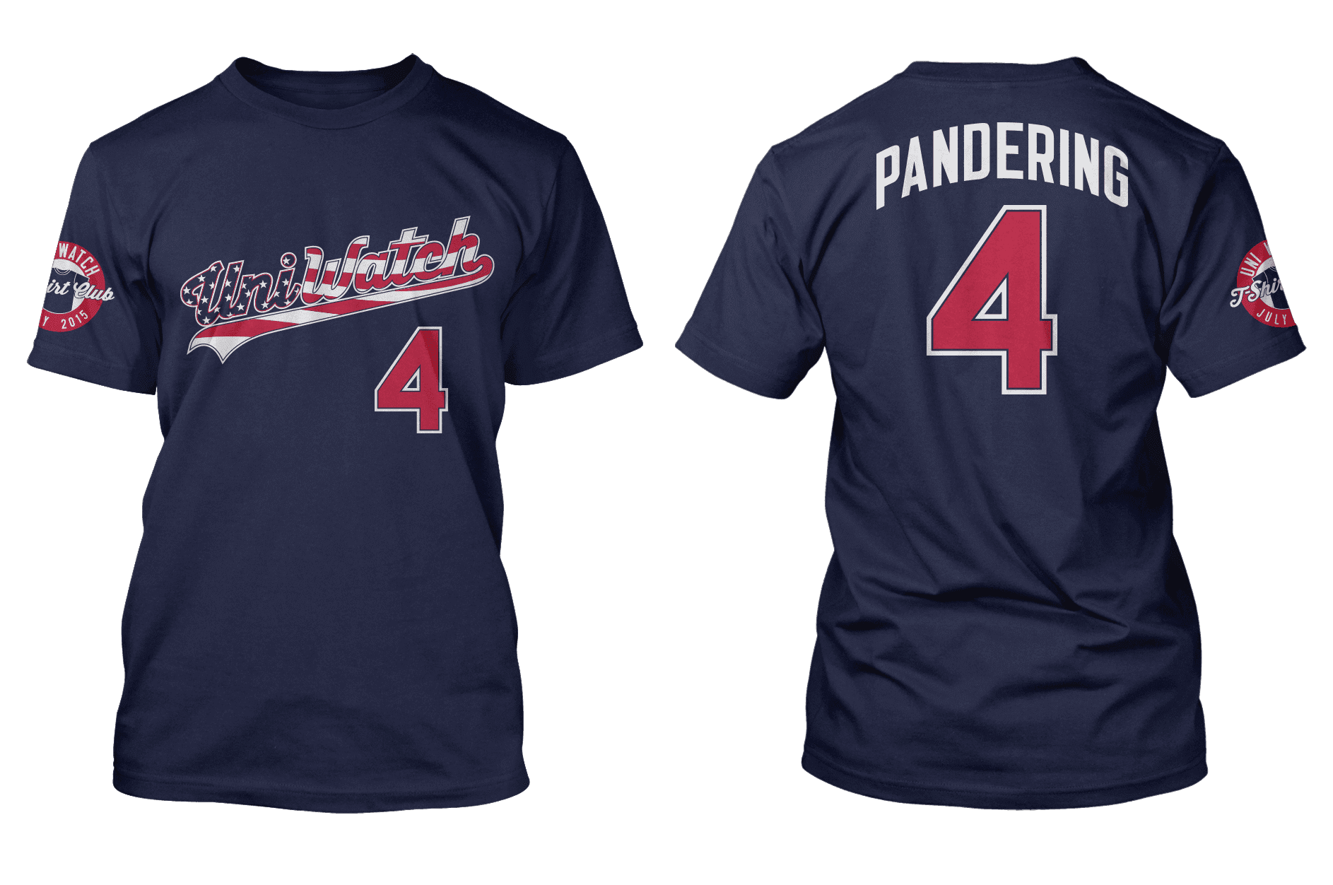
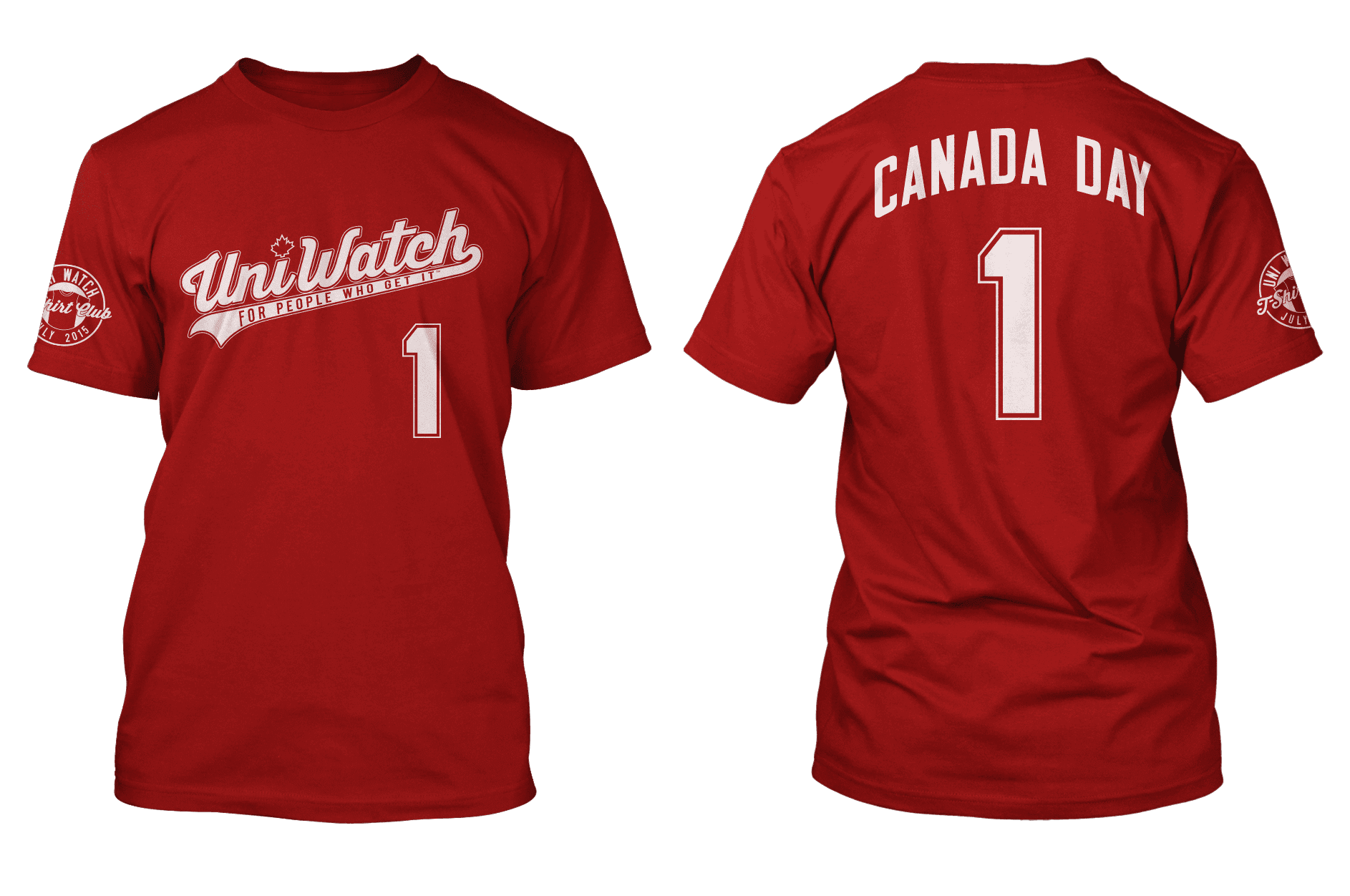
You can order Independence Day here and Canada Day here, and there’s further info here. For those who have issues with the “Pandering” NOB on the Independence Day shirt, that topic is discussed in depth on this page.

Baseball News: Nice to see MLB and New Era continuing to bring class and dignity to the American flag. ”¦ The Mets wore orange shirts — for a photo shoot, not on the field — for Gun Violence Awareness Day, which was yesterday. ”¦ The Padres had three Chargers players throwing out the first pitch(es) tonight, and they’ll be wearing Padres jerseys with Chargers bolts. ”¦ Someone’s running a Kickstarter campaign to raise funds for a new kind of protective headwear for pitchers (from Clinton Dybul). ”¦ James Ryan Bounds’s father has collected a shitload of caps. ”¦ Here are the jerseys for the Norwegian national baseball team, which will be worn this weekend at the 2015 Nordic Open (from Torbjørn Olsen). … According to this story, Carlos Quintana once played in a big league game while wearing a minor league uniform (from Joe Kuras).

Pro Football News: Inconsistent 5s in this 1994 Browns game. When I posted that photo on Twitter yesterday, Scott Johnston provided a good explanation (from Matt Barnett). ”¦ Vikings RB Adrian Peterson, dropped last year by Nike, showed up at OTAs yesterday wearing Adidas — “maybe the new Adizero 5,” says Kawika Asuncion. ”¦ “The Broncos just re-signed Ryan Harris to the team after originally drafting him in 2007,” says Jeff Alexander. The Broncos acknowledged this by posting a photo of Harris holding up his original draft day jersey with an upside-down ‘I’ in his NOB. The serif should be on the upper left corner of the letter, not lower right.” … The state of Florida is offering redesigned license plates for the Bucs, Dolphins, and Jags (thanks, Phil). ”¦ You’ve heard of the San Francisco 49ers, but there’s also a Mexican team called the 49ers, a Mexican women’s team called the 49ers, and a semi-pro team in San Jose called the 49ers — and they all dress like the NFL team! ”¦ The Rams have new practice jerseys. ”¦ This SI article about the WFL includes the following passage: “Rick Eber, a swift wide receiver for the Shreveport Steamer, had four catches for 91 yards ”¦ [while] playing with tacks taped to his fingers. ‘They’re small tacks,’ he said. ‘I can close my hand and the tacks won’t even break the skin. They just drag on the ball. I knew it was illegal, but we needed a win'” (from Tris Wykes).

College Football News: Looks like Kansas State is finally switching to the Nikelace (from Alex Speth). ”¦ You can see the new field turf being applied at Kentucky’s stadium (from @ThePonchat).

Hockey News: In an interesting cross-sport move, Mitchell & Ness is making NBA-style tank tops for the Original Six NHL teams (thanks, Phil). ”¦ There’s been a catalog leak of next season’s Bruins St. Paddy’s Day warm-up jersey.

NBA News: Here’s an interesting piece about the value of an old Steve Kerr jersey. ”¦ David Lee has new sneakers for the NBA Finals (from Diamond Leung). ”¦ Next season’s St. Paddy’s Day jerseys have leaked. So has some of next season’s All-Star merch.

Soccer News: New away jersey for the Orlando Pirates, a South African team (from Alex Cohen). ”¦ “Ecuador’s soccer teams have received new jerseys ahead of the Copa America and the WWC,” says CJ Hague. “The design is way simpler than last year’s, when a number of outlets accused Marathon of using outdated styling to make a too-busy shirt. Most interesting to me, however, is that Marathon is claiming to have created a shirt with more technology, and specifically better ventilation. That is definitely in response to the fact that 2014’s kit couldn’t wick sweat at all, and the shirts clung to players’ bodies, creating a see-through effect.” ”¦ “Chelsea wore their 2015-16 kits against Sydney FC on Tuesday, but with Chelsea FC Foundation on the front of their shirts, rather than Yokohama Tire,” writes Bryan Justman. “They’re also already wearing the gold EPL sleeve patch to reflect this season’s Premier League title.” ”¦ I can never keep track of all these Man U leak stories, but here’s the latest one. ”¦ “Volkswagen has introduced a new typeface,” says Callum Johnston. “What does that have to do with sports uniforms? Well, for the past two seasons Volkswagen-owned VfL Wolfsburg’s shirt numbers and NOBs have been in VW’s (now-outdated) typeface. But next season’s Wolfsburg kits, which debuted during last week’s cup final, feature the new font. Those shirts also featured a memorial patch for Junior Malanda, who passed away whilst playing at Wolfsburg in January. This makes me wonder, how many other times has a soccer team worn a memorial patch for a player?”

Grab Bag: The phenomenon of teams telling paying customers that they can’t wear the opposing team’s jersey appears to be spreading, which is just the latest example of why we’d be better off if jerseys weren’t available for sale to begin with. ”¦ Corsair has scrapped a new logo that had drawn ridicule from the gaming community. ”¦ A recent installment of “What’s the Diff?” included a jersey-based difference (big thanks to Marty Hick). ”¦ Shame on the city of Dallas, which is licensing its logo for use by local businesses. Disgraceful (from Stu Taylor). ”¦ The other day I asked about non-football athletes who wear breathing stripes. Sean Clancy reports that cyclist Alberto Contador has used them for a while now. “Also,” says Sean, “motocross racer Adam Cianciarulo has been testing prototype nasal magnets, but he had some problems with them falling off after a crash at last month’s Hangtown Classic. Details are near the bottom of this page.” ”¦ I just became aware of this company that sells really nice infographic posters. As you can see at the top of that page, they have a baseball design and a football design, each available in two different color treatments, and the non-sports stuff looks pretty awesome as well (big thanks to Roberto Zanzi). ”¦ I haven’t been following the French Open, but @holycalamity informs me that the ballgirls have been wearing some very nifty striped socks. Is that a new thing for this year? ”¦ Pro bowler Kyle Troup has some funny ideas about proper lane attire. ”¦ New uniforms for the USA women’s volleyball team (from Steve Silva). ”¦ New logo for Hewlett Packard Enterprise. ”¦ Authorities in India say that the lion shown in their new “Make in India” logo is a “vibrant and dynamic” lion, while the lion in a very similar logo for a Swiss bank is a “dull and boring” lion.
Uh… the license plate link for the Bucs is going to a wikipedia page about Swashes.
Thanks, Jeff. Now fixed.
At least the San Jose 49ers use an SJ in the logo. The 2 Mexican teams are kinda pathetic. I wonder if there’s any sort of connection or it’s just pure rip-off. For example, there’s a Raiders team in Austria that Oakland considers to be a “sister-team”, but they actually have their own uniforms and logo. (link)
I’ll say one thing about those two Mexican teams…they both have three complete, non-mangled sleeve stripes on their jerseys. Nice.
And I’m just impressed to see a women’s team with proper socks. Usually, they’re a complete mess:
link
link
That Hawkiasaurus couldn’t wear that Blackhawks jersey in Tampa either. Well, not if he had club seats.
link
(note to self: read ALL articles before posting)
RE: The Norwegian national baseball team – it’s sort of weird the that they say “Norway” right? Shouldn’t the uni’s say “Norge” I mean, why are the anglicized?
Exactly what I was thinking. You wouldn’t expect a USA team to wear “Vereinigten Staaten” or “Etats Unis”, so why that?
Though, I’d pay good money for a “Vereinigten Staaten” jersey
Either you’re a big fellow or the lettering would have to be pretty tiny with that many letters.
Japan’s jerseys say Japan on them as well. Maybe they figure it’s an American sport so they’ll use their American name?
*shrugs*
Looking at the 2013 WBC jerseys, Japan, China and Korea had English team names. But they’re countries with non-Western writing systems.
Pretty much every Western country – Brasil, Nederland, Dominicana, Espana, to name four –used their native language.
I suspect there’s something to that.
Though, I always took Japan’s (along with other Asia countries) approach being a by product of having a non-Romanized language to start. So, if they were going to “Westernize” (b/c of all manner or cultural imperialism I don’t want to get into here) there was no local equivalent.
It’s a bit different for Norway, for example Germany goes with Deutschland for it’s national teams
Japan puts “NIPPON” on some of its uniforms; I remember seeing it in Olympic volleyball. I wish they would go back to it for all their teams; it’s not like it isn’t well known everywhere. Sometimes the English names are close enough that we can see the real names and figure it out (Nederland, Dominicana, Türkiye) but there are plenty where the name is not close but we still know it (Deutschland, Hellas).
Contrast that with some countries whose local names are, for whatever reason, not known abroad. You’d be hard-pressed to find too many people who know where Sakartvelo or Hrvatska are; perhaps Georgia and Croatia should advertise their native name a little more.
I had the pleasure of attending a lot of European qualifying and friendly games in Holland ahead of the 2004 Athens Olympics, and most nations used Anglicized graphics. Much as I prefer native-language sports graphics in all settings, the Norway script is just marvelous. Nesting the W into the R across the placket like that justifies the Anglophone treatment for me.
But what would be wrong with an Estados Unidos or Соединённые Штаты
Ðмерики jersey? I’d wear that!
I’ll wear it when you’e through, Scott. Or a shit with “EEUU,” the old-style Spanish abbreviation for United States.
“… Here are the jerseys for the Norwegian national baseball team, which will be worn this weekend at the 2015 Nordic Open (from Torbjørn Olsen). … ”
There’s a Nordic Open for baseball!? How cool. Though I share Scott’s polyglot enthusiasms, English is so darn useful when it comes to international anything.
“… Or a shit with “EEUU”…”
Not that I withdraw this comment, but I meant to say shirt.
This month’s Uni Watch “Pandering” T could make a great present for someone, if you feel like actually giving a shirt.
Even Russia’s Olympic teams (save for ice hockey) go with the English script. How long will that last?
For reasons that I’ve never understood the PGA tour likes to use “ESP” for Spain but I can’t think of any other country they use the native language to create the abbreviation.
What are some other examples of PGA country abbreviations? ESP is the generally accepted international Latin-alphabet abbreviation for Spain, so it’s no surprise to see it used by the PGA. The question is whether the PGA differs in its usage from this ISO list:
link
I believe they differ from that list because while I’m not certain I’m fairly confident they use “RSA” for South Africa and Ernie Els
WFL: Didn’t know Shreveport had a team. NOt crazy about their name, but I think it was best that they went with “Steamer” (singular) than “Steamers”.
(tee hee)
Shreveport was originally the Houston Texans, but moved during the 1974 season…. the starting QB Mike Talliaferro decided to retire rather than play in Shreveport, and the head coach was fired after calling Shreveport “rinky-dink” in the media after learning they were moving there. The name was unfortunate (now more than then i would suspect) but they had a great logo.
link
Fourth link in soccer section is wonky.
Fixed.
OK, this is weird. In the comments view, the title today looks normal. But in the reading view, it looks like this: “Biggest Blackhawks Fan Can’t Wear Jersey This YearBiggest Blackhawks Fan Can’t Wear Jersey This Year.” This is in Chrome. At first, I thought you were making some obscure “Mary Hartman, Mary Hartman” reference!
Forgot to mention–I see the title doubling in Safari also.
Should be fixed now.
I think I’ll go listen to some Duran Duran.
I’ll call my buddy in Walla Walla.
I cooked huli huli chicken on the grill this weekend.
Aaaaaand that’s enough. No more of this, please. Thanks.
I thought that was a big honkin’ adidas logo on the dinosaur’s jersey, but it is just the silhouette of the ribs against the sky coming though the jersey mesh.
Re: the Dallas city seal article. I’ve gotten similar letters advertising for sewer line replacement warranties, with the envelope and letter bearing the city seal here in Northlake, IL (a smallish suburb of Chicago). You get something from the city, and open it right away assuming it is something important, only to be disappointed to find the city has sold out and it’s just an ad. Interesting marketing strategy by this company. Makes you wonder how many cities they’ve gotten to sign up for this.
Licensing public logos can be a good thing, if it’s done to prevent this sort of for-profit scamming. See for example how the government of Canada licenses the RCMP’s name and likenesses. Licensing public intellectual property to enable for-profit scamming ought to be illegal.
Sewer Line Warranties of America.
My brain is shot for the rest of the day.
My phone is dead at the moment or I would’ve taken pictures at Game 1 of the Nationals double-header yesterday.
The Blue Jays haven’t visited Nationals Park since 2009. At the start of Game 1, Nationals Park had the old Blue Jays logos on the jumbotron and the facade scoreboards (I know there is a word for them, but don’t know what it is). In the fifth inning, they changed the alternate stylized T logo to the current blue jay with the maple leaf. Then in the sixth inning, they changed the Jays logo on the jumbotron to the current blue jay logo (blue jay in the circle).
Here are some shots of the old logo. Apparently (whether due to social media or just realizing their own mistake) they corrected the mistake by the fifth inning (if not sooner).
Wow! Someone else took the pictures.
I first noticed the RIBBON BOARDS changed in the 5th. The jumbotron in the 6th.
“Facade scoreboards?” I think they’re called “ribbon boards.”
Thanks. Like I said, I didn’t know the term. They have the score, right? And are they not on the facade?
I think “ribbon boards” is the term the manufacturer uses. “Facade boards” quite adequately describes them.
James Ryan Bounds’s father has collected a shitload of caps.
I have a new idol!
“We don’t *want* that to happen (duh)…”
Thank you. Now fixed.
Don’t you sound a bit hypocritical by having these patriotic T-shirt designs when you bash the major athletic suppliers for doing it? Just saying…
Sigh. You haven’t looked at the back of the shirt, have you….
To be fair, he did say he’s just saying, and not actually looking at things critically.
First time on the website?
Nah, Joseph’s a regular.
Must have missed the past week or so.
Roger that.
I’ve been busy with, well…living real life. So I haven’t chimed in as much lately. As Paul says, “Get Out More.”
While the champions patch and sponsor were different, those were still the 14/15 kits that Chelsea were wearing vs Sydney.
Is it just because I don’t follow hockey, or does it seem like the Blackhawks don’t take nearly as much heat for their logo as Washington or Cleveland?
There’s actually a good article from the Chicago Tribune (from 2013) that talks about this.
link
Wow. Thanks!
For many years, Pawtucket’s uniforms were identical to Boston’s, with the exception of the caps (P for Pawtucket, B for Boston).
And since this was 1989, unless a manufacturer’s mark was visible, it’s doubtful anyone would notice.
re:Chelsea’s sponsorship
I’m guessing they’re not wearing Yokohama Tires yet because the contract doesn’t kick in until July 1, the official start date of the 2015-16 year, and they don’t want to wear Samsung because that relationship is ending.
More interestingly on the uni front, Manchester United may end up wearing both Nike and Adidas on the US tour, which begins before the Adidas contract begins.
“I haven’t been following the French Open, but @holycalamity informs me that the ballgirls have been wearing some very nifty striped socks. Is that a new thing for this year?”
That’s the girl from Saturday’s ticker. But again, I think that the socks themselves are solid black; those “stripes” appear to be makeshift (hair ties, I suspect).
Check out these other pics:
link
link
link
So I’m guessing that a number of ball girls just decided to add some stripes.
And for some reason, the guys are apparently remaining stripe-less:
link
But it looks like *all* the girls are wearing the stripes, and since it’s Adidas, I think the socks are made that way. And the texture on the stripes look the same as the one on the white pleats in the skirts.
Fair points. And you may be right, but the variation in spacing and thickness of the “stripes” still makes me wonder.
If these socks are actually made this way, then we’ve stumbled upon quite a curiosity; the irregular layered texture is a really interesting element here.
Perhaps more information will become available soon.
Okay, so it looks like the ballboys/girls are wearing replicas of link (see Ana Ivanovic).
Ah, mystery solved…well, mostly. Even in that pic, doesn’t it look as if Ivanovic’s stripes are just kinda stuck-on? The bottom row even has some black peeking out in the middle, and it doesn’t appear to be intentional. Weird.
In any case, perhaps there’s a much bigger question to be asked here:
When the heck did some brainiac decide that it might be a great idea to play tennis in black socks?
When the heck did some brainiac decide that it might be a great idea to play tennis in black socks
Blame Yoji Yamamoto – he’s the designer behind Adidas’s Y3 line. I can’t wait to see the Adidas/Kanye West line make its way to the court.
Pretty sure the Chelsea kit is from this (last) season
Yep, link. 2015-16 has link
One thing about the Blackhawks uniforms that people always want to correct is the difference in the sleeve stripes between the home and road uniforms. The home jerseys have sleeve stripes that are truncated versions of the hem and sock stripes: white-black-white instead of white-black-white-black-white. Moreover the three striped home jersey contracts with the five striped road jersey whose stripes are all black-white-red-white-black. The Hawks originally wore five sleeve stripes on the red sweater but suddenly switched to three in 1962.
The secret as to why might lie in the white sweater. According to NHL Uniforms, the Hawks had added black cuffs to the white sweater in the late 50’s. The result was that the long black cuff took over the bottom black stripe, effectively leaving only three stripes on the sleeve (red-white-black), especially when the black cuff moved down the sleeve further away from the stripes.
When the Hawks switched the stripes on their red sweater in 1962 to three stripes, their road sweater still had only three sleeve stripes, making both match. In 1963 when the white sweater changed back to five sleeve stripes, they never remembered to add two stripes back onto the red sweater. So what we see on the red sweater is a remnant of the process that added the black cuffs to the white sweater.
Impressive, sir.
I find it interesting that Paul has such a preference for the white Blackhawks sweater over the red.
I have a strong memory of being 4 years old and going to Saginaw Hawks games, who were the farm team of Chicago and wore the same uniforms with a ‘S’ shoulder patch instead of the ‘C’.
Of course going to home games I only saw the whites, then one day I saw a poster/photo of the team in their road reds and I thought they were so much cooler and colorful. I’ve held a strong preference for the red sweater ever since.
A white keyline around Chief Blackhawk’s portrait would make all the difference in the world.
White would be a bit too jarring. In the recent past, the crest on both red and white sweaters had gold trim around it (matching the gold skin color). That might be better.
Paul, I find it really unfortunate that your “Pondering Pandering” FAQ essentially turned what was a surprisingly articulate, interesting discussion from the day the shirt was announced (a rarity in online comments these days) into a smug takedown of those who criticized or took issue in any way with the “Pandering” NOB. Needlessly sarcastic, and pretty disrespectful to your readership–the people who help put bread on your table by buying things like t-shirts and contributing to your ad revenue.
I know you won’t see it that way, but that’s how it comes off. To offer a bit of constructive criticism after years of reading the site, it’s become more and more apparent that you tend to treat those who disagree with you (even in the most minor of ways) as if they’re complete and utter morons. Whether or not you mean it that way, your tone often comes off as petty and mean. This is no different–and it’s really discouraging, as one of the few whose critiques were reframed into your FAQ, to see those viewpoints whittled down to cartoonish straw men so you can justify selling a few t-shirts.
I strongly disagree with your characterization. I don’t think the FAQ page is smug, sarcastic, or a takedown, and I think most reasonable observers would agree with me on that, even if they disagree with my point of view on the “Pandering” NOB. The page offers detailed responses to issues that have been raised.
Bando, you were the one who (incorrectly) accused me on Friday of having no response to any of this other than, “If you don’t like it, don’t buy it.” Now that I’ve responded in significant detail, you don’t like that either. Ya can’t please some people. Let’s be frank: You just don’t like that I actually have a response to each objection that’s been raised.
The idea that I’m doing this “to justify selling a few T-shirts” is absurd on its face, since I could obviously sell more by going with a more crowd-pleasing design. For the umpteenth time: I honestly don’t care how many T-shirts get sold. If that were my primary concern, the design would have been very, very different.
As for the stuff about “put[ting] bread on my table,” here’s a thought: You come here every single day and get a ton of content for free. I’m not asking you to be grateful, and perhaps you could return that favor. Thanks.
I think he left off a few “to me” qualifiers, such as “that’s how it comes off *to me*.” I, for one, read the FAQ and don’t find its “tone” much different than anything else Paul has posted. As I’ve said to others from time to time, you are only as offended as you allow yourself to be. Whether you agree with Paul’s point of view or not, why are you allowing yourself to get this worked up about it? His position doesn’t affect you or your ability to read and enjoy the site in any way, unless you let it.
I’d also like to add that suggesting Paul doesn’t care about his readers is wrong; anyone who has been a regular on this site can attest to the fact that he cares a great deal about his readership and seems genuinely appreciative. FYI, one evidence of this is the inclusion of a “comments” section that allows us to voice our opinions, and the fact that he often replies to his readers in the forum. Just a thought…
As someone who carved out a differing point of view from Paul in last Friday’s discussion of the “Pandering” t-shirt, I couldn’t disagree more with your characterization of his FAQ for the shirt. I think it’s a succinct yet thoughtful explanation of Paul’s position.
I won’t even ask you to elaborate and provide concrete examples of what you’re complaining about because frankly, I don’t think you can. It’s as if you realized you can’t beat him in an argument based on the content of his ideas, so you’re attempting a flanking maneuver and going after his delivery instead.
RE:
“The phenomenon of teams telling paying customers that they can’t wear the opposing team’s jersey appears to be spreading, which is just the latest example of why we’d be better off if jerseys weren’t available for sale to begin with.”
I think they are also banning any Blackhawks team colors (red predominantly)…That’s a bigger issue than just team apparel.
The whole thing is so friggin’ petty.
That really is sad. For fuck’s sake, sports just aren’t that damn important.
I hate humans.
Yes, this type of thinking is pretty stupid. Same type of over-inflated thinking that results in idiots assaulting people wearing opposing teams’ gear, etc.
Well, the rules are only enforced in the luxury seating.
The real boondoggle here isn’t so much the “no Blackhawks gear in the luxury seating” as the Lightning’s policy of automatically canceling any online ticket order not billed to a Florida address. They’re trying to control who gets in, but at the same time… Lightning fan living in Georgia who wants to drive down to the game? Out of luck. Chicago fan living in Orlando? You’re good.
It’s so funny what the Lightning are doing, because it was the revenue from fans wearing other jerseys at home games which was helping keep the franchise afloat prior to 2004. Tampa Bay had weak attendance, and inflated those numbers as well.
Prior to 2004, many Lightning home games versus Original Six teams, and the two Pennsylvania clubs had huge numbers of visiting jerseys in the crowd. Back then, there was resentment in the Tampa Bay market, but the Lightning were still happy to take the money. Often, it was a 50-50 split at those home games, and the Lightning were frequently rooted down in their home arena.
Re: #8 in the Stanley Cup Preview on ESPN, wasn’t that font just used on their alternate jersey?
Nope:
link
Actually, I think yes.
link
This picture is of a Roman Hamrlik jersey. Compare the 4 digit. One goofy font was used for the homes and road (I think it looks like paintbrush strokes), and another goofy font for the stormy night at sea alternates. At the end of the day, yes, the Lightning eventually moved to much more readable conventional block numerals.
Right, I believe the regular numbers were also a custom font, but not the same as the alternates, which were significantly harder to read.
Here’s the photo from the article for comparison to Mike’s link: link
The next page of the NHL Uniforms site shows it clearly:
link
The “brushstroke” font used on the home and road jerseys were derived from the “Tampa Bay” wordmark on the original logo. The jagged “lightning” font was only ever worn on the original blue third jersey, and was even replaced by the brushstroke font during that jersey’s final season.
Neither were quite as bad as Anaheim’s Mistral numbers and NOBs on their short-lived Wild Wing thirds, though.
Check out the USA cap they are giving away on neweracap.com front page. Holy crikey!
Classy:
link
Remember when this company was just a sportswear outfitter? Now they’re a “lifestyle brand,” with predictably embarrassing results.
Who lives, or wants to live, that lifestyle?
Though honestly if the stars were flush with the cap surface, I’d dig that cap.