Click to enlarge
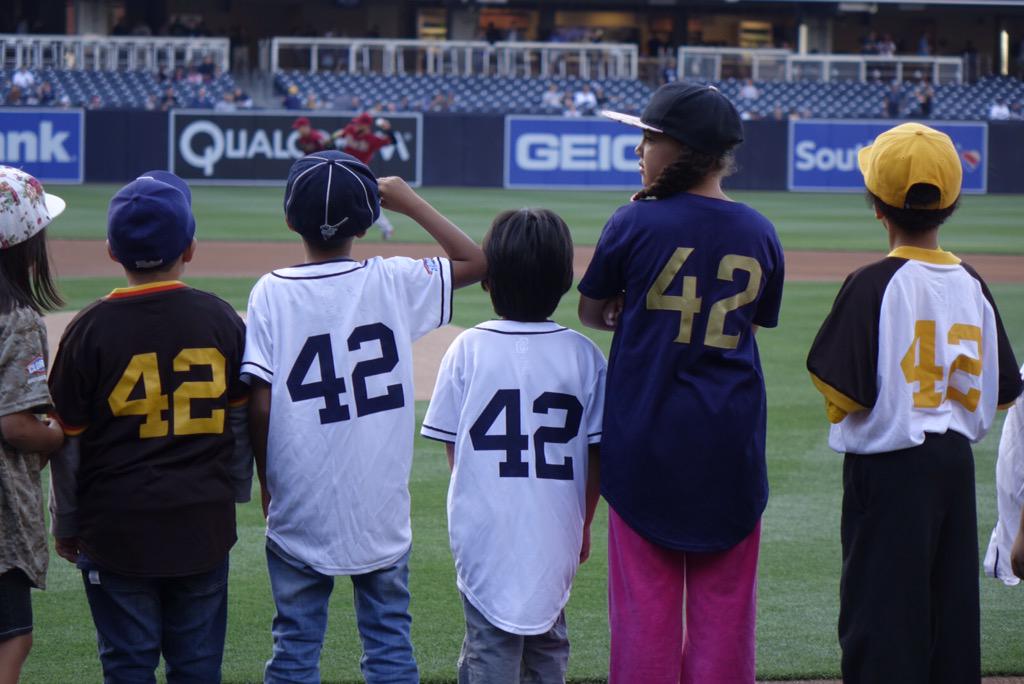
As many of you know, the Padres provide jerseys — Padres jerseys — to San Diego-area Little League teams. They had a bunch of those Little Leaguers, all wearing No. 42, on hand yesterday at Petco Park for Jackie Robinson Day. Very cool move on their part.
As per MLB’s annual custom, all uniformed personnel also wore 42 and went NNOB yesterday. I know some of you think this makes a mockery of the very notion of uniform numbers or some such, but I love it. As I’ve said before (and will keep saying), it strikes me as the one unqualified success from Bud Selig’s tenure as commissioner.
A few Jackie Day notes:
• Several players who usually go with pajama pants went high-cuffed yesterday, including Cubs outfielder Dexter Fowler; Marlins infielder Dee Gordon; Blue Jays outfielder Kevin Pillar; Red Sox outfielder Hanley Ramirez; Astros outfielder George Springer (who as you can see went the extra mile by wearing stirrups); Nats pitcher Drew Storen (great blousing there); and Mariners pitcher Taijuan Walker. I’m sure there were others, but those were the ones I’m aware of.
• Part of the fun of Jackie Day: Teams’ online rosters listed all players wearing No. 42. (They’re back to showing their regular numbers today.)
• In a related item, the Mets recalled utility man Eric Campbell from the minors yesterday (to replace injured David Wright on the roster) and announced that he’d be wearing No. 29. But of course Campbell actually wore 42, just like everyone else. He’ll wear 29 tonight.
• Another fun element: mismatched helmet and jersey numbers.
• Several players wore specialized footwear — not sure how many of them actually wore them), including Pirates third baseman Josh Harrison; Mets outfielder Curtis Granderson; Mariners outfielder Alex Jackson; Orioles outfielder Adam Jones; Nationals outfielder Michael Taylor; and Pirates minor leaguer Cole Tucker.
• The Dodgers and Mariners played the annual Civil Rights Game, so they wore sleeve and cap patches.
• Hmmm, should the Indians have changed their Al Rosen memorial patch from 7 to 42? (Just kidding. Mostly.)
• Astronaut Terry Virts, currently serving on the international space station, wore a Jackie jersey and cap in space! Here’s a video clip.
• The baseball team at Robinson’s alma mater, UCLA, will wear Jackie-era throwbacks for today’s game.
• Finally, I was happy to see that lots of Uni Watch readers wore their Jackie-themed Uni Watch T-Shirt Club tees (if you can’t see the slideshow below, click here):
(My thanks to Andrew Cosentino, Pat Costello, Susan Freeman, and Mike Nessen for their contributions.)
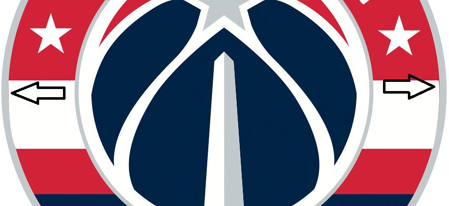
Sloppy work: With no advance fanfare, the Wizards unveiled a new primary logo yesterday (you can click on the image at right to enlarge; further info here) and announced that they’ll be discontinuing this logo. So now the Wizards will have no imagery that shows a wizard.
The new design is okay, although the current trend toward roundel logos is starting to feel clichéd. The bigger problem, though, as pointed out by reader Kris Kolob, is that there are four spots on the logo where thin lines of red are leaking out from the silver border (click to enlarge):
That’s some seriously sloppy execution. It’s like that on the team’s new style sheet, too. For all you folks in the NBA office who are reading this, you might wanna do a little touch-up work on this one. (And you’re welcome.)
Rainbow coalition: Astros pitcher Pat Neshek wore rainbow stirrups during batting practice yesterday, and therein lies a tale. Neshek got those ’rups from Uni Watch reader Al Gruwell, who got them from our own Comrade Robert Marshall. Al explains the backstory like so:
As you might be aware, Neshek is a fan favorite for his accommodating nature with fans (his website, he trades with fans, he has a unique signature). He used to sell T-shirts with his image, with the promise he would toss a ball to you if he spotted you wearing one. I have this huge (really huge) blue glove, and he’s tossed me a few whenever I’ve seen him play over the years.
So I have those rainbow stirrups, which I won as the Stirrup of the Week a couple of years ago. I was attending the game at Minute Maid Park on Sunday, so I waved him over with the Big Glove (it’s pretty famous at the park, has its own Facebook page, I pose for photos all the time) and tossed the stirrups to him as he was heading in from BP. I thought he would wear them for the game that night, but he didn’t. Glad he finally wore them!
Great story. The ’Stros sometimes wear their BP rainbow-side-paneled BP jerseys, so let’s hope Neshek wears the stirrups for one of those games.
Photo by Heather McCabe; click to enlarge
Fiberglass Menagerie: As some of you may recall, last November I wrote a piece for the design website re:form about the Wisconsin company FAST Corp., whose name stands for Fiberglass Animals, Shapes, and Trademarks. That article has now been repurposed in the print and online editions of Wisconsin People & Ideas, the magazine of the Wisconsin Academy of Sciences, Arts, and Letters. Given my longtime crush on Wisconsin, I’m pretty excited to have an article in this magazine — feels like a badge of Badger State legitimacy.
Uni Watch News Ticker
By Mike Chamernik

Baseball News: Marlins OF Giancarlo Stanton is still wearing his facemask attachment against right-handed pitchers but not when facing lefties. … Here’s a good piece about a subculture that continues to update rosters, uniforms and stadiums for the MVP Baseball 2005 video game. … Yesterday we saw the new Cardinals scorecard cover, and today we have a nice feature on its illustrator (from Vernona Elms). … Braves closer Jason Grilli could use a new belt (good spot by Neal Bowers). … The Tigers’ logo has been difficult to draw over the years (from Kary Klismet). … MLB is monitoring irregular ball bounces on Rogers Centre’s turf. … Here’s what it looks like when teams keep moving the fences in. Empty space galore. … The Indians wore their midnight blue alts Tuesday night, but they wore red undershirts with them. In previous years the Indians wore blue undershirts with the blue tops (from Tom Juettner). … The Japanese girl band Gambare Victory (which translates to the fantastic name “Do Your Best Victory”) has a bit of a baseball theme to it. When the members signed their record contract they held a press conference in baseball uniforms and one of their music videos is set on a baseball field (thanks, Jeremy Brahm). ”¦ Two Kentucky high schools — Central Hardin and Elizabethtown — both wore navy jerseys and white headwear when facing each other yesterday (from Josh Claywell).

NFL News: The new Browns jerseys remind Stephen Santangelo of the youth NFL jerseys from a 1984 Montgomery Ward catalog. … Former linebacker Dhani Jones has a modest proposal to improve the sport get rid of the helmets (from Phil).

College Football News: The grounds crew at Auburn’s Jordan-Hare Stadium mowed a series of Northwestern stripes onto the field. I always wondered how groundskeepers put patterns onto grass, so I finally looked it up: It’s a process called lawn striping, and here’s a video that breaks down how it works (from Jonathan Lancaster).


Hockey News: Here’s a short list of the best jerseys of defunct NHL teams. The author missed the California/Oakland Golden Seals/Seals, the Colorado Rockies and, well, the entire World Hockey Association.
Soccer News: Both Paris Saint-Germain and Bastia wore gold numbers in Saturday’s French Cup final. … The USL’s Austin Aztex will wear camo jerseys on May 6. … New unis for the USL’s Arizona United SC (from Marc Altieri). ”¦ The 1972-73 Manchester City change kit had TV numbers on the sleeves (from Graham Clayton).

Basketball News: The Pacers wore their 1990s throwbacks for their season finale last night. … In that same game, the ads on the scorer’s table were turned off. ”¦ Maybe this is well-known already, but Allen Iverson wore No. 6 in the 2002 All-Star Game, in honor of Julius Erving. … People like to wear old basketball jerseys to the Coachella Festival.

Grab Bag: Marco Rubio’s campaign logo has some kerning issues (from Jordan Cutler). … Lindström, Minnesota, a town known as America’s Little Sweden, will be getting back the umlauts on its town signage (from Barry Brite).
I am not a fan of the “Everybody wears No. 42” edict on April 15. To me, it’s just too much, and it feels like baseball acknowledged that it should have recognized Jackie Robinson’s achievement much earlier, so they are doing all they can to make up for lost time. Unfortunately, in this case, too much is more than enough.
When the recognition began in 2007 (I believe), I recall that each team could ask a player to wear No. 42 — or a player could volunteer. I recall reading that the Orioles’ Adam Jones was selected one year to wear the number, and he was moved, awed, and humbled. That makes sense to me — let one player wear the number as a reminder of who Jackie was, and salute his accomplishments.
Now, though … it’s the equivalent of all football players wearing pink cleats in October, or everyone wearing camouflage uniforms. On Steve Jobs’ birthday, or the date Apple was founded, do all Apple employees wear black turtlenecks, khakis, and glasses with no frames? On George Washington’s birthday, should all politicians wear powdered wigs and waistcoats?
My suggestion would be to revert back to the original concept, where one player from each team wears the number on April 15. Or, going a step further, let that player wear a vintage #42 Dodgers uniform for the game. THAT would be pretty special, very moving, and offer a true salute to Jackie Robinson.
Agree about having one player selected to wear the #42, as opposed to the present system, which is too confusing.
But disagree about having that player actually wear a vintage Brooklyn Dodgers #42 jersey. For me, it was almost irrelevant what team Robinson broke in with, his success was more individual in nature. Another person in his situation could have failed, which would have likely pushed back the breaking of the color barrier for years.
Agreed. This feels forced. Now players wear the 42 without any meaning or significance. A player doesn’t even have to know who Jackie was to “honor” him.
Plus, I’ve always maintained that it’s difficult from a player identification perspective. The uniform number is there to provide a function (identifying the player), and now it’s no longer functional. It’s really not that different from the black-on-black numbers that so many college teams use.
Quick note: “ride” in the football ticker should be “rid.”
Thanks. Fixed.
For the Wizards logo, is the idea there to have the Washington Monument appear like a wizard’s magic wand? I see the start on top of it and the lines coming from the star.
If so, that would be kinda sorta a wizard thing in the logo.
Maybe the Wizards prepping to change their name? I know they are the Wizards and the WNBA team plays off it with the Mystics, but if the Wiz are shedding anything tied to being the Wizards, maybe they are going to change to align with the Capitals and Nationals, like they recently did with their color scheme. I’d be alright with that. The Wizards is one of the worst team name I can think of.
In my opinion, I believe Ted Leonsis wanted to change the name back to Bullets, but David Stern blocked the idea. I have absolutely no evidence of this. Ted made a huge list of changes that fans wanted to see a number of years ago. The name was one of the few (if not only) change that wasn’t made. That’s why the colors switched back to red, white, and blue.
Stern was a close friend of Abe Pollin, the previous owner of the Bullets/Wizards who changed the name after the assassination of Yitzhak Rabin (who was a friend of his) and because gun violence was at a high level. (I suppose gun violence is still at a high level.) So because of these reasons, I could see Stern wanting to protect Pollin’s decision to change the name.
Now that Stern is out, perhaps there is a push to change it back. I think some people see this logo change as a sign.
The old wizard logo always looked dumb in red and blue.
Wizards is surely a dorky name, but I kinda like the logo. The design and the dorky name play a little into that Masonic mystery eye-atop-the-pyramid stuff. Come to think of it, the eye-atop-the-pyramid should be the logo.
I think you can thank Agent Zero for the name (probably) never returning to “Bullets” (which is a stupid reason, but that’s life). Wonder if they’ve looked into trademarking “Monuments”…
FWIW, the “Washington Monuments” trademark is owned by Washington Warriors, LLC, which is basically some guy in Alexandria, VA selling burgundy and gold coffee mugs.
“FWIW, the “Washington Monuments” trademark is owned by Washington Warriors, LLC, which is basically some guy in Alexandria, VA selling burgundy and gold coffee mugs.”
~~~
And which, I’m fairly certain, is a shadow company for the Washington Football Team, who may need a new name at some point.
Monuments would be a monumental improvement over Wizards. Though I’ve come to appreciate the nonsensical aspect of the Wizards name. Which, frankly, would also be true of Bullets. “Washington Bullets” makes no more sense as a DC team nickname than “Washington Wizards.” It’s mere sentimentalism and blind nostalgia that leads folks like me to pine for the return of the Bullets. (Same with the Redskins: If they were forming a new NFL team in DC today, nobody would even think about calling it the Redskins. Not on account of it being offensive, but on account of it being nonsensical for this city and region.)
Much as I do like the new logo, putting the Washington Monument front and center seems to come awfully close to a Washington Generals reference. As in, the monument makes me think of George Washington, the man, who was a general.
Imagine a day when Washington’s sports teams are the Nationals, Americans, Capitals, Monuments, and United.
I link and he seems to own (at least claim to own) practically every possible replacement name for the Washington football team (my favorite is the Pandas!).
Trademark submission isn’t cheap (though not super ridiculously expensive), so I’m guessing he’s really wealthy and has a lot of time, or he’s serving as a front for the team.
He trademarked Pandas, but…
RED PANDAS
…should be available!
At the very least, they should add player names when appropriate so that the jerseys are personalized and can be sold for charity. I know they already do this, but as it is, you can’t tell the difference between a Mike Trout 42 and the bullpen catcher.
I think a much better idea than the single day 42 (and they could actually do both) would be to let the previous year’s Rookies of the Year be the only people who can wear 42 all year. That would remind people that the award is named for Robinson.
I agree about the NOB. I understand that they didn’t wear them in Robinson’s day, and that the lack of a name lets the focus be on him…but it does take something away from the enjoyment of the game. The number would be sufficient tribute, IMO. Not sure what the Yankees and other NNOB teams would do, but other teams at least should have the name.
Other than that, I’m in favor of keeping the 42 day tradition. The Rookie idea is interesting, though.
Just to comment on the sloppy work of the Wizards new primary. It was brought to the leagues attention awhile back and they did fix it. Funny that rough one is still floating around.
Interesting!
I went to Wrigley last night and while I always thought the everyone-wears-42 thing was cool and unique, I can now say it creates one of the more confusing sporting events you can possibly see. No NNOB, everyone wearing the same number, the scoreboards use 42 for everyone, too… It was incredibly difficult to follow, particularly at a stadium with such spartan amenities (new video scoreboard and all).
I know, I know, one day a year, but I couldn’t help but be frustrated trying to follow the game–much less try to keep score.
I share your frustration. Even when I’m watching the game on tv.
I like to 42 idea. When Jackie told his wife you can pick me out on his first day in the majors, its was because he was wearing 42. Great story. Great idea.
Never thought about this before, but: Have the Padres worn enough different jerseys so an entire Little League can be outfitted as “The Padres” and no two teams will wear confusingly similar unis?
What other teams can we do this with? (White Sox, I’m looking at you.)
Umlauts are used in German, in Swedish those dots are called prickar.
However, Uni Watch is written in English, and in that language we’ve handily adopted the German word. What that diacritic is called in Swedish is relevant only as interesting color. The idea is to be understood in English, and “umlaut” does that perfectly, and without extraneous explication.
“The new Browns jerseys remind Stephen Santangelo of the youth NFL jerseys from the Sears catalog in the 1970s.”
Actually, the image name suggests that this is from a 1984 Montgomery Ward catalog. I’m not sure that I would really be able to tell the difference, but at the very least, the description lists the Raiders as being in Los Angeles.
Agree. You can also tell by the jersey numbers (being for stars of each team), that it’s from the 80s, not 70s.
You guys are good. In the crunch of time I just went the classic Sears-1970s description.
EDIT: I see the file name is “1984 Montgomery….”. I’ll make the change.
It’s… Nationals outfielder Michael Taylor or Michael A. Taylor.
Haven’t read the whole article about modding MVP Baseball, but back when I had a PC more capable of playing the FIFA series, it was always fun to download adboards, tv graphics, and kits that were closer to the real thing than what came included in the game. It’s understandable that there’s only so much developers can do given multiple world leagues, so it was fun that active users improved on the visual elements.
For the record. The uniform worn by the USMNT soccer lads playing Mexico last night (2-0 EE.UU.) was a piece of junk.
Abso-freakin-lutely!
Not sure what you mean about no Wizard in that logo. There are clearly wizard arms holding that star, just like he used to hold a star in one hand in the hold logo.
You could even argue that the monument doubles as his beard, just like he had a beard in the old logo. That might be a stretch, though. Makes more sense than it being a wand, however.
Dhani Jones’ suggestion to improve the sport of football;
“….But in a sport so resistant to thinking outside of the box, thinking outside of the helmet could ensure that football remains embedded in our cultural fabric without the safety concerns.”
If you want to seriously remove the safety concerns in football, you would have to remove the aspect of tackling, not the helmet. If the element of tackling is still involved in football, while wearing or not wearing a helmet; six of one, half a dozen of the other…..will not get rid of the many serious injuries(concussions, etc..) that still happen when tackling.
From my mouth to God’s ear! I’ve been saying (half seriously) to get rid of helmets for years. By enveloping players in armor, we’ve given them a false sense of security. It should be apparent to all that football has taken the shape of an arms race, with all the collateral damage that term suggests.
Football started without helmets. People died.
Football today has helmets. And people still die. Early twentieth century football quickly and effectively reduced the lethality of the game, and it did so without solid helmets or other body armor.
“Several players wore specialized footwear specialized footwear.”
Did any of them wear specialized footwear? ;)
Oopsie. Will fix.
The Tigers’ logo has been difficult to draw over the years (from Kary Klismet)
Most teams with a feline theme have botched the logo. Detroit Lions, Columbia U., Florida Panthers (especially heinous), Chicago Cougars, Cincinnati Bengals, BYU, I could go on and on. The only teams I found successful were Kansas State and the Michigan Panthers. But feel free to disagree.
Penn State’s isn’t bad.
It’s dignified, I’ll give you that.
Members of the bear family have been a real conundrum, too, apparently:
link
link
link
link
link
link
If I hadn’t read the article, I don’t think I would have noticed the Washington Monument in the new Wizards logo. What really bothered me, though, is the claim that the three stars represent the DMV (District, Maryland and Virginia), when it really just copies from the DC Flag, which itself was based on George Washington’s family Coat of Arms.
link
Yeah, that bothers me too. Wouldn’t be surprised if the writer of the article doesn’t even know the reason for the DC flag.
Washington Wizards’ logo looks like someone is tied down and about to be impaled.
Wiz owner Ted Leonsis was quoted recently as saying he’s sticking with the name, but I believe there’s a plan to change “Wizards” to “Monuments,” which may by why logo has a taped-over feel to it. MONUMENTS would fit better and make much more sense.
Monuments? Really? Not a very agile mascot, is it? Monuments make me think someone died. Granted, it’s easy to remember, and tall. But I vote thumbs down.
Although if you look around Washington, you’ll notice Senators ain’t very agile either . . .who knows about their Ottawa counterparts.
Washington Monuments reminds me of that scene in ‘Big’ when Tom Hanks is critiquing the toy that transforms into a building. “Who wants to play with a building?”
Ha! Nice reference there. Excellent point.
I’m thinking that’s reading too much into the fact that the company that operates Leonsis’s franchises (Wizards, Capitals and Mystics) is Monumental Sports & Entertainment.
I’d love it if they changed the team name to “Monuments”, then the nickname would be the “Mons”.
link
Why not the ‘Ments, or Mints? Think of all the vaguely offensive but fun puns fans and headline writers could use with ‘Mental!
Actually, the Astros wore the rainbow-paneled BP jerseys for Sunday home games all of 2013, but they stopped doing that in the middle of last season. Not sure if they’ll start wearing them again this year, but they’ve been MIA in games for almost a year now.
It’s still listed in the style guide as an alternate jersey option. That doesn’t mean they’ll wear it in a game, of course, but it means it’s still on the menu of options.
good thing i wasn’t standing up, because all i know is i nearly plotzed when i saw the hosiery. way to go al, you made giving away those pairs for the pic of the week totally worth it. too bad i don’t have any more of that one in particular.
That’s too bad, Comrade. I was going to put you in touch with the equipment manager for the ‘Stros, Altuve and Springer like to go high once in a while, would be awesome to see. They definitely would look cool with the rainbows on the shoulders, which are going to be worn this year.
Awesome old varsity jacket alert! Check out the beautiful jacket worn in 1960 by Buffalo (hockey) Bisons coach Frank Eddolls: link
P.S. I would LOVE to see the Sabres wear that Bison’s uniform as a throwback!
Growing up, I never understood the appeal of the old Buffalo Bisons’ logo or uniforms. The sweater is one giant ad for Pepsi. Every year we hear about people wanting to bring it back as an alternate for the Sabres. No one under 50 even remembers it, I just knew it because of a photo my dad had up in his garage. Time to let an ugly cash-in rest quietly.
I never saw The Bisons in action, so I guess the appeal for me is a nostalgic link to my late father. He was a long time Bisons’ season ticket holder.
Do people really call for that uniform to return? (I moved away from Buffalo a long time ago.) I thought I was being clever. ;-)
Paul, can you analyze the good and the bad of Bud Selig’s time as commissioner? He seems like such a polarizing figure, I’d love to hear your opinion. Others can certainly chime in too.
Off the top of my head…
Good:
* Didn’t make the NL use a DH
* Realignment (although Milwaukee and Houston are in the wrong leagues)
* “Retiring” the number 42 for all teams
* The one-game wild card playoff
Bad:
* Unbalanced schedule. Enough Yankees/Red Sox already!
* Too much interleague. The one game every day is fine, but the big blocks of it need to go.
* 1994
* Goodbye, Expos
* Unretiring #42 for everyone
* Replay (there’s a place for it, but they’re not using it right)
Good:
Unbalanced schedule and an emphasis on divisional play. That creates great rivalries and reduced the chance of under.500 teams making it to postseason play.
Bad:
Interleague play.
Canceling the World Series.
Great rivals don’t need to play that many times a season. It waters it down and lessens the anticipation.
Elaborate on this replay thing Jim.
I’m assuming just about every stadium has a high-def video board now, right? Put the replay on there, start a 30-second timer, and see if you can reverse the call. If you can’t decide in that amount of time, screen goes dark, call stands.
Even if they want to see it in the command center, same thing. I might even say 60 seconds, but absolutely no more. If it’s that close you trust the judgment of the ump and move the game along.
That’s more generous than my original proposal: replay for grading purposes only. Grade the umps/refs and post the stats in the box scores.
Funny you mentioned the Grizzlies sideboard was not working. I briefly saw one of those Windows or BIOS messages flash and then it remained off for the rest of the game.
I wish MLB had retired 42 for the NL & 14 for the AL, I find the event to be shameless pandering as it tries to gloss over history with the widest brush that covers up a much bigger and more complicated story. I’m unsure how easier Robinson’s call-up really made it for Doby a few weeks later.
I like this idea.
I think one issue, though, is that the leagues are essentially one entity now. I think there would be confusion as to why one league wears one number and the other league wears the other number… similar to how people don’t understand why the NL doesn’t have the DH.
I don’t think many casual fans (especially outside of Cleveland) know the name Larry Doby very well. However, doing this would certainly highlight him more.
But doing this could certainly be very educational to baseball fans.
The Mariners outfielder mentioned is Austin Jackson, not “Alex”.
Actually, those are Alex Jackson’s cleats.
link
The Mariners have both Austin Jackson and Alex Jackson (a minor league prospect). I say one of them has to change his name to prevent this confusion.
I really like the comment by Neil Collins.Totally agree. Must they do this jersey thing with #42 each year, really? Can’t they just do it on Major Anniversary Years like 75, 100, etc.?
Grew up in DC during the Hayes, Unseld, Bing, etc. days.
Hated the name change.
Hated the color change.
Hated the wizard “W” guy.
Back to R,W,& b. Yay!
Rid of “the wiz”. YAY!
Now we just need a new-new name. YAY!!!!
I will confess I used a gun to murder one complete stranger every week for DECADES. I traveled quite a bit for my job and that enabled me to randomly and widely from a geographic standpoint slay quite a variety of folks. Then one day they changed the name of the Bullets to the Wizards and I thought to myself “what am I doing here? This ain’t right.”. So I stopped killing and now do magic shows 230 nights a year.
True Story
I’m surprised there’s so much criticism on here about celebrating Jackie Robinson with the league-wide wearing of 42. Since it’s actually about baseball celebrating a baseball event, as well as a milestone in American history, setting aside one day each year for 42 to be worn on the field is perfectly appropriate. And the idea that it’s confusing or hard to watch games is baloney; the PA announcers still announce the players and tell you who’s at bat or who’s pitching.
But I rarely attend all 15 MLB games on a given day. I do, however, watch baseball on TV, sometimes flipping between games in the evening, sometimes catching up on highlights. So the PA announcer doesn’t do me any good. I often have games on mute, and anyway TV announcers don’t actually say player names very often except when naming new batters, relief pitchers, or fielders who’ve touched the ball in play. With actual numbers, I often have a fair idea who’s who in any given shot. With everyone wearing 42, I mostly recognize Nats players by personal appearance or field position, and I can name a handful of Twins and other players as well, but the rest of the league becomes John Doe for me on April 15.
That’s my problem with the defense of the everyone-wears-42 thing: If it is a valid argument, it is not actually an argument in favor of the 42 thing. It is an argument in favor of eliminating jersey numbers from baseball. Which, fair enough, is the one sport that would least inconvenience participants, spectators, and officials by eliminating player numbers.
On the other hand, the 42 stunt is one of those things that I strongly oppose in principle, but am happy to live with in actually practice. In theory, it’s a self-evidently terrible idea. In practice, it’s fun and kind of moving.
We should all remember that integration was also annoying, inconvenient, and obnoxious for a lot of people at the time.
I’m fine with eliminating the numbers.
In one of the World Hockey League photos, it appears to be the Aeros vs the Whalers (the Howes are in the photos) and it’s color on color; green vs. green!
Actually, due to the lighting and old photo, that might be green vs. blue. Hard to tell, but still looks strange.
I’m not a fan of the everyone wears 42 either. It was OK the first year but come on. His number is already “retired” by all the teams. Do a ceremony before the game, let the players wear a patch or something but stop the leaguewide wearing of 42. Or at least keep the blasted player names on the uniforms! It’s frustrating as all hell trying to watch a game on 42 day.
Of course I also think player names should be mandatory for ALL pro & college teams including the ones that don’t have them now. They should be forced to wear them.
And my 2 cents on the new Wizards logo? Terrible. Not that the old logo was great but the new one is just a cluttered mess that includes all the current NBA logo cliches. It’s a mess up close so from a distance it’ll look even worse. I guess they didn’t do the extensive testing the Browns did for their uniforms on this. Not good. But at least it’s not a Brandiose design.
“The bigger problem, though, as pointed out by reader Kris Kolob, is that there are four spots on the logo where thin lines of red are leaking out from the silver border (click to enlarge):”
Really, this is the bigger problem, not the unintended phallic/sexual imagery? no one here notices that?
Ummm, “woman on top.”
Yeah, I see it.
No in-game tribute in sports, no matter how deserving the honored individual might be, should interfere with the game itself.
In baseball, there is a valid need to be able to identify individual players quickly and from a distance – for the players themselves, the managers, the umpires, broadcasters, and fans.
Sometimes it seems that MLB is going over-the-top with Jackie Robinson worship to distract us from the fact that there is only one black manager and the number of African-American players have dwindled to about 8% of the league.
Also, while Robinson was the first, there were other black players who joined the majors in 1947 who seem to be mostly forgotten.
The Montgomery Ward NFL jerseys. Adidas sees you and raises you a long-sleeved NBA jersey. Just to mess with us one more time before Nike or UA takes over.