In all the years that I’ve been running uniform design contests over on ESPN, nobody has ever submitted his or her design as a video — until now. When we recently announced the contest to create an expansion NHL franchise for Las Vegas, Jim Brewster sent in his design as a YouTube video (shown above). It’s a fun idea — check it out and see for yourself — although it certainly helps that Jim’s design concept was one of the best that I received. A lesser design might look extra-lesser in the video format.
You can see all of the other submissions I received here, and my ESPN column with my picks for the best entries is now available — look here.
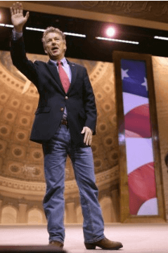
Politics makes for strange bedfellows uniforms: Sen. Rand Paul announced his candidacy for the Republican presidential nomination yesterday, which is of interest because he has an unusual “uniform”: He often wears a jacket and tie with jeans (and also cowboy boots, although that part of is of less interest to me).
I used to favor this style myself, back when I worked a real job at an office. Jeans were prohibited by the company dress code, but I loved jeans and didn’t want to have to stop wearing them, so I got away with it by wearing really nice ties and dress shirts (often with French cuffs) and really nice shoes. And the jeans I wore were clean, not faded, etc. I thought I looked fine — better than fine, even. But when I see other people pairing a jacket/tie with jeans these days, I cringe a little — it usually doesn’t look good. In retrospect, it probably didn’t look good on me either. (But I was in my late 20s, so whatever. Could’ve been a lot worse, right?)
It’ll be interesting to see if Paul maintains this look now that he’s officially running for president. How will voters respond to it? (One influential group that apparently does not care for the jeans: big GOP power brokers.)
As an aside: Paul has no more chance of becoming president than his father had, of course, but I have to admit that it’s mildly intriguing to imagine four or eight years of people referring to “President Paul.” Has a nice ring to it.
Uni Watch Hit Parade: The new album by Australian indie-rocker Courtney Barnett, Sometimes I Sit and Think, and Sometimes I Just Sit, is even better than the two EPs that were compiled on her previous album. I thought she might have peaked with that one song about the asthma attack (which is the kind of not-quite-novelty tune that you can build a career around), but it turns out she was just getting started. The new album is easily the best thing I’ve heard so far this year. Here are some of its best tunes:
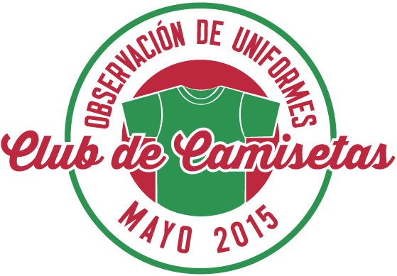
T-Shirt Club reminder: The Uni Watch T-Shirt Club’s latest limited-edition design, jointly inspired by Cinco de Mayo and the Brewers’ “Cerveceros” jerseys, is now available. Full details here, or go directly to the ordering page.

Baseball News: When the Cardinals first came up with their birds/bat insignia in 1922, reviews were mixed at best. ”¦ An Opening Day item that I missed: The Rays retired No. 66 for Don Zimmer. ”¦ Superhero Night jerseys on tap this June for the Lehigh Valley IronPigs (from Jayson Loose). ”¦ G.I. Joe uniforms this weekend for Boston College (from Dan Rubin). ”¦ Good article about the Astrodome turning 50 (from Dave Wilson). ”¦ New uniforms for the Syracuse Chiefs (thanks, Phil). ”¦ The Tigers are the latest MLB team to host an LGBT Pride Night (thanks, Phil). ”¦ Whoa, look at the nicely fitted uniform, complete with high cuffs and stirrups, that Tigers P David Price wore in high school — a far cry from how he usually looks nowadays. The high-cuffery in the old photo is nice, but what really gets me is the trim-fit tailoring — so much better than the baggy look (from Jonathan Daniel). ”¦ Cubs and Cards were rained out yesterday, which allowed the world to learn that the Wrigley Field tarp is now plastered with a big, douchey Reynolds Wrap admade of fucking aluminum foil (thanks, Phil). ”¦ The Columbus Clippers are now selling a Columbus Jets throwback jersey, although it’s not clear to me whether they’ll actually be wearing it. ”¦ Speaking of the Clippers, are they going with mesh jerseys? Sure looks like it. ”¦ Here’s something odd: Marlins slugger Giancarlo Stanton routinely goes pajama-pantsed during games, but Cork Gaines has noticed that Stanton always goes high-cuffed during pregam warm-ups. Bizarre! Do any other players exhibit a similarly split personality? ”¦ The Empire State Building marked Opening Day by being lit in the colors of all 30 MLB teams (from Jeff Fishman). ”¦ Orioles OF Adam Jones is still wearing the striped socks, just like last year. Love the look but I don’t like it when some high-cuffed players wear striped hose and others go stripe-free. ”¦ Speaking of stripe inconsistencies, look what was going on last night with the A’s. That’s pitcher Jesse Hahn on the left, second baseman Eric Sogard on the right. Yes, I realize one wore stirrups and the other wore socks, but can’t we at least get matching stripe patterns? (Screen shot by Richard Paloma). ”¦ Interesting move by Rangers, who are doing a promo that involves a Rangers cap in Baylor colors, and with the Baylor logo on the side. ”¦ Very nice cream throwbacks last night for Arkansas.

NFL News: Hmmm, I can’t remember the NFL’s official soft drink, can you? That’s from a display of helmets in Chicago, promoting the upcoming draft. Douchebags (from Scott Lederer). ”¦ Incidentally, the Browns helmet in that display has a grey facemask. And the Jags helmet is way better than the real thing.

Hockey News: If you combine the Red Wings with Pearl Jam, you get this mash-up jersey. ”¦ Check out this early-1970s shot of a Toronto Toros (WHA) player wearing what appears to have been one of hockey’s first visors (from Tris Wykes).

Basketball News: Here’s something I didn’t know: The Nets still have offices and a gym in New Jersey. … Black court design in the works for Oakland (from Mike Cole). ”¦ Under Armour gave the Notre Dame women’s team a bunch of superhero socks prior to last night’s national championship game against UConn. Guess they didn’t help.

Soccer News: Here’s a cool gallery of Liverpool uniforms through the years (thanks, Phil). ”¦ Here’s the latest Man U leak. ”¦ Reading will play in a fan-designed uniform this Saturday (from Andrew Cairns). ”¦ The Costa Rican men’s and women’s national teams will now be outfitted by New Balance. ”¦ “German Bundesliga team VfB Stuttgart will be wearing special jerseys this coming Saturday,” reports Bernd Wilms. “Instead of advertising, the team will be promoting VfBfairplay, a new brand for the club’s charity initiatives.”

Grab Bag: After a Pennsylvania high school lacrosse coach recently passed away, a bunch of his former players showed up at his funeral mass wearing their old lacrosse jerseys. ”¦ Interesting piece about coffee baristas who have unusual uniforms: bikinis. ”¦ New logo for Play4TheCure, which is the National Foundation for Cancer Research’s sports fundraising program. ”¦ New uniforms for Aegean Airlines. ”¦ New lacrosse gear for Texas (from Stephen Murphy). ”¦ Colgate’s uniforms will now be provided by some company you’ve never heard of (thanks, Phil). ”¦ Nike is looking to grow its business by focusing on women, kids, and runners. ”¦ Tiger Woods has been wearing his 2011 model shoes lately. “I find it interesting because it marks the third top Nike athlete to ditch the current signature shoe in the past two years (Lebron last season and Durant this season),” notes Brendan Hickey. ”¦ New trophy design for the beach volleyball world championships (from Jeremy Brahm). ”¦ Here are the jerseys for the new American Ultimate Disc League, which begins play this weekend (from Marc Viquez). ”¦ “According to the Moredcai ‘Three Finger’ Brown biography I’m reading (Three Finger: The Mordecai Brown Story), the Reds wore the White Sox”s uniforms against the Cubs on April 29, 1913,” says Stephen Hayes).

What Paul did last night: I’ve been a big fan of the illustrator and cartoonist Drew Friedman since the late 1980s, when he was a regular contributor to Spy (more info on him is available here). Last night he gave a presentation of 40 of his favorite old paperback book cover designs at the weekly meeting of the New York Comics and Picture-Story Symposium. I took some (mostly shitty) photos of the (mostly awesome) covers he presented (if you can’t see the slideshow below, click here):
As you can see, several of the books were by or about old Jewish comedians, and Friedman himself kinda had an old Jewish comedy shtick going on as he discussed the cover designs, riffing in the manner of the old greats. It was like he was his own one-man Borscht Belt. Great stuff.
I bumped into several friends there, including my pal Coco, who was wearing an absolutely amazing bowling-themed necklace and matching charm bracelet (click to enlarge):

How cool is that?!
I thought the Cubs’ tarp was supposed to be made out of a zillion gum wrappers!
At least it’s the color of gum wrappers now. They should look into that. Last year it was blue
In one of his books, Bill Veeck said he always tried to get Morton Salt to sponsor the tarp at Comiskey Park. “When it rains, it pours.” They would never go for it.
I guess Morton’s did it in Atlanta. Interesting
Wonder what the Browns helmet looks like in that display?
You know there’s a link directly to the Browns helmet, right?
I wonder if Logan Verrett is pitching for the Rangers on Baylor night.
Aces concepts and video: BRILLIANT!
Yes! Great job, Jim Brewster.
Back in the 1980s I remember seeing a tarp, possibly in Atlanta, in which Morton Salt plastered its logo and slogan “when it rains it pours.” I think the Marlins had the Weather Channel advertisement on their tarp a few years ago.
here is an article about the $5k tarp and teh annual fee Morton’s paid
link
The Las Vegas Aces presentation is a winner to me. Combines the history of Nellis Air Force Base with the Casinos. Great job done on that.
Got my Jackie Robison UniWatch t-shirts. They are nothing short of awesome.
Texas Rangers did the college themed games last season as well… I happened to be there for the Oklahoma State caps. As an Orioles fan it was strange to see Rangers fans wearing my teams’ colors.
The Rangers do the University Days promotion with the hats in university colors with the logo for a few local D1 schools. Looks like this year they have SMU, TAMU, Baylor, UNT, Texas Tech, TCU, and OK State.
link
Today is one of those awesome days on UW with a range of really interesting and varied content. The bowling jewelry is by far my fave piece of the day.
True dat. She had a bowling necklace and a bowling bracelet. But she was missing a bowling…pin.
link
More on the Reds wearing White Sox unis in 1913. Equipment manager pulled a boner: link
Notre Dame Bball Socks link shows mesh jersey….
Fixed. Here’s the proper link:
link
Legitimately jealous about that Drew Friedman program…I love his work so much. I pored over those issues of BLAB he worked on obsessively in high school and college.
Fun fact: This image by Friedman is the unfortunate origin of my nickname “Chappy”.
link
Rob, I was thinking of you last night. I figure it was right up your alley!
That would be the Toronto Toros (you can se “Toros” on the sleeve stripe), not the Birmingham Bulls. Their opponent, the Chicago Cougars, folded in 1975, a year before the Toros moved to Alabama.
Interestingly enough, the Cougars are one of the rare teams to have worn yellow as their “dark” jersey color, something only seen with the Original Six-era Bruins and the present-day Predators.
In the early 70s, the yellow jersey were considered “home” in the NHL and NBA (Kings, Golden Seals, Lakers, Warriors) but dark in the WHA, ABA and WFL (Cougars, Conquistadors, NY Stars). Funny thing, Cougars had yellow roads but Blazers had yellow homes. One team had to switch.
Thanks. Fixed.
Still wondering why the Rays bothered to retire a number for Zim, considering he switched numbers every year. Maybe they were honoring his age.
Pretty sure they are honoring his number of years in baseball.
It was the number of years he had spent in baseball, going back to his Brooklyn Dodgers days.
The Astrodome story mentions 8th Wonder Brewery, which sells a couple of link.
Two things jump out at me on that page…
1) They show their address as:
2202 Dallas St.
HouTex, 77003
“HouTex”? Is that how Houstonians refer to their town? Never heard of that.
2) Do they have license to use the Wonder Woman and Astrodome likenesses? Just wondering.
Also: someone had a jersey made.
link
Pretty sure “HouTex” falls outside of USPS addressing regulations.
Supposedly you can write anything you like for the city and state if you get the ZIP code correct.
(Newman was lying!)
I’ve lived here for 29 years, and for most of that time I’ve work in a place where we get a lot of mail from locals. It is very, very common to see “HouTex” in the return address, especially when the mail is coming from native Houstonians who are over the age of 50.
I don’t think it’s used much anymore, but at one time, “HouTex” was en vogue.
I’m picturing “HouTex” on a Rockets or Astros jersey. Might make for a nice fauxback.
I think what kills the jacket/tie/jeans look is not wearing the right jacket. Rand Paul always wears a suit jacket that looks like it’s meant to have matching pants. I think the look works a lot better with a patterned, tweed, or cordury jacket. Maybe he’s afraid that wearing one would make him look too much like those despised liberal college professors, though.
That’s true, the suit with jeans is often considered the mullet of the sartorial world: half business, half party. But if you pair it with a more casual jacket like the ones you listed it tends to work better. But then it’s not really half a suit any more.
The jeans have to be better too. It’s hard to tell from just one photograph, but it looks really ill-fitting, really bunched at the knees and hanging way too low at the ankle.
If you want to pull off the suit/jeans look, you should really wear tailored jeans with straighter, slimmer legs. But then, you end up looking like some pretty boy northeastern liberal…
Ummm… it’s Southerners who are known for wearing tight jeans:
link
Point taken.
Though I’m talking simply being more fitted (“straight” vs “relaxed”), not necessarily skin-tight.
Most of those jeans marketed as “slim-fit” or something to that effect are pretty bad, TH.
I’m not saying that Rand Paul looked good in that outfit, but things could have been far, far worse…
link
Yeah, I don’t expect a 52-year-old senator from Kentucky to dress like a software engineer in Mountain View, but the jeans just look sloppy in the picture above (though it’s better than link). I mean, you don’t have to drop $500 for a pair of tailored, well-fitting jeans that gets you in that happy median between “renegade” and “professional”.
Still better than this look.
link
I think the look is meant to signal that he’s his own man, which I think he is to a greater degree than anyone else who may be in a position to make a serious run at national office. Of course that’s why his campaign has some quixotic air about it.
The last decade hasn’t been friendly to the country that already has an link, so he’s also got that going against him.
Or it could be the usual populist stuff that usually shows up around election time. Cue up photo op of him having a beer in a bar, “because he’s just a regular guy.”
I agree…the latest person who “is going to change the culture in Washington.”
David Price’s pajamery used to be interrupted by glorious hi-cuffery whilst with the Rays. Haven’t seen him wear stirrups with the Tigers yet.
link
Wears high cuffed with socks showing occasionally (including on Monday): link
Power brokers on both sides of the aisle are fuddy-duddies. Suits are boring.
I have a soft spot for the AstroDome. It was my first MLB stadium I visited. Growing up in Louisiana, we really had only one team in the 70’s-80s to root for. I know it would be expensive, but I wish they could refurbish it and find a use for it. Parks, movie theater, something.
Tomorrow night, Harris County is opening the Dome for a sort of birthday party/wake.
I kinda like Oakland’s black court. But pairing with blue lines? That looks awful. Why not some shade of gold, which would seem to match school colors (if memory serves) much better as well as actually contrasting against the floor?
Also, I feel like there’s a missing word in the Rand Paul parenthetical.
I saw an another article on the court that said the blue is merely painter’s tape; the actual lines will be white, to simulate the look of a blacktop court.
That makes much more sense. :)
…to simulate the look of a blacktop court.
In that case, I like!
there’s a missing word in the Rand Paul parenthetica
Or an extra “of”.
There’s a really simple rule for dressing up jeans: You can wear a tie, or you can wear a jacket, but you can’t wear both. You can only go so far to dress up jeans before you wind up calling attention to the informality of your leggings. Fortunately for Rand Paul, who demonstrates amply what a dweeb one looks like with both jacket and tie above jeans, U.S. senators are not permitted to wear jeans on the floor of the Senate. Though to Senator Paul’s credit, he at least wears jeans that fit him reasonably well, unlike President Mom Jeans at the other end of Pennsylvania Avenue.
Anyway, we now have two serious declared candidates for the 2016 Republican presidential nomination. Both are using “liberty’s torch” as symbols.
Ted Cruz: link
Rand Paul: link
Cruz’s logo has come in for well-earned mockery; is he burning the flag, or stealing Al Jazeera’s logo? But it seems a more memorable icon than Paul’s, and the Texas senator’s typography is much stronger than his Kentucky peer. Still, interesting that both have gone with a flame, rather than straightforward stars and stripes, as symbols. In design terms, much more forward-looking than Hillary Clinton’s not-yet-a-campaign-but-who-are-we-kidding logo, which recycles the same basic building blocks of her husband’s 1996 reelection campaign logo that she used in her 2000 and 2006 Senate campaigns and her 2008 presidential run.
What if you wear solid black jeans?
Solid black jeans means you’re a rebel. All the edgy guys wore solid black jeans in the late 80’s/early 90’s. The blue jeans paired with dress shirts is very Texas frat boy. Almost every businessman in Texas wears that combo, with cowboy boots, at least some of the time. It’s why you can wear jeans and not be thrown out of nice restaurants in Texas, along with most western states.
Now, jeans with ironing creases say alot about the man wearing them. None of it good.
The Royals have also been doing a University Days promotion for the past 4-5 years (at a minimum). This year, there will be caps in K-State, Mizzou, Nebraska, Kansas, and Wichita St. colors.
link
In re: the Aces’ video, it looks very good, and plenty thought out. Of the others, I thought that the Villians’ logo design was great.
As for Rand Paul, I find it interesting that his logos use just his first name. I suppose that’s to separate him from his father, but I also find it funny that it might appeal to the Objectivists in the crowd. Did Hillary do that in 2008, or did she just go with Clinton?
The branding was link. I think it’s partly, as you allude to, to distance herself from a famous family member, but it also softens up to folks who think of her as an ice queen of sorts. But yeah, Paul’s given name is “Randall”, but I’m sure he sees the appeal of “Rand”.
Rand Paul’s name is so discombobulating to those of us who love Paul Rand, arguably history’s greatest graphic designer (who, incidentally, is currently the subject of a big exhibition link).
Heaven help us if someone named “Bass Saul” gets into politics! XD
You know what would be just as bad? If he had a brother named “Lucas”.
Even worse if he spelled it with a K!
Paul, do you know if teams ever look at your design contests? If they decided to use a design that was submitted to one of your contests, would ESPN allow that to happen? If a team wanted to use a design featured in one of your contests, would you insist that they pay the designer?
I have no idea who does or doesn’t read my articles. As for a team using a reader’s design, I’d have no say in that. Up to the team and the designer (who I hope would insist on being paid, but that’s not up to me).
I can tell you from my experience with ad agencies and design firms that companies do NOT like unsolicited work. It potentially undermines existing client-vendor relations, and they don’t even like seeing unsolicited work, lest they be accused of stealing an idea down the road.
But sometimes teams do end up using unsolicited work:
link
Oh cool, did not know.
And to clarify, it’s more the design/marketing firms that dislike unsolicited work because the “work” is their bread and butter and they have a business model to protect.
The fan designer essentially “squatted” on an existing Ottawa jersey/logo, and did not create anything distinctly new for Ottawa to use. I feel the Senators were forced to work with the designer in this case.
If it was a new design from the ground-up that caught Ottawa’s eye, then it would be more noteworthy.
Reading will play in a fan-designed uniform this Saturday
Not just fan-designed, but by a boy with inoperable Duchenne muscular dystrophy.
Kind of want them to be called
Las Vegas Baby.
Cork Gaines has noticed that Stanton always goes high-cuffed during pregam warm-ups. Bizarre!
Franklin Gutierrez used to do this with the Mariners. I can’t speak to why these guys are doing it for sure but as a former high school and college low-cuffer, I used to do this after a wash to help stretch out the cuffs for a more relaxed fit around the ankle/shoe.
As much as I love to see striped hosery its distressing to see patterns used indiscriminately. It just validates the apparent opinion that socks are not part of the uniform in any way beyond their color and therefore, subject to the whim of the individual player. Either everybody wears the same stripes or nobody wears them at all.
You won’t get any argument from me.
The Las Vegas Aces design and presentation is obviously really well done, and it does tie in to both the gambling and military aspect of Las Vegas. Problem is, there’s already a professional team in Nevada named the Aces – the Reno Aces (AAA Baseball). They are a relatively recent franchise (relocated from Tucson, AZ) that Reno has invested a lot of money in. I don’t see any way a LV team could now use the name Aces…
That Toronto Toros photo is nice.
Reminds me of this hockey card I had as a child.
link
I remember I used to see guys in beer leagues wearing the half cages instead of plastic visors back 10-15 years ago. I’m not sure if they just cut a cage in half, or what?
The Toros photo looks like it might be a cut-down Jofa cage based on the bar spacing.
Not positive but I’m pretty sure they manufactured the half cages 10-15 years ago; never a popular item but worn by some. Know one guy that’s regularly worn one of the half cages for the past couple years.
Lots of great designs in the LV contest. My favourite, by far, is that yellow Desert Owls design – fun stuff!
As a boot wearer myself, I’m just glad to see Rand Paul not wearing a black jacket with brown boots (and brown belt). The jacket looks navy to me, so brown boots fit just fine with it.
INARIA is a surprising move for an athletics department. I know they have a small market in soccer, but never expected a department to go that route. My limited knowledge of them is they do a lot of custom work with those who want their gear. So, they’ll cater to the clubs, departments, individuals, etc. pretty nicely instead of total templatey work (which they do offer).
I’ve heard of them too! They outfit my daughter’s youth soccer league (and also make knockoff Pugg pop up goals). Though I didn’t know they made adult gear (the younger kids wear Inaria, middle school and up wear Adidas).
Per the press release, the only Colgate team INARIA is outfitting is men’s soccer. The more interesting (bizarre) thing is just how many different uniform manufacturers Colgate’s athletic teams employ: INARIA is replacing Adidas for the men, but the women wear Nike, whereas men’s basketball wears UA and women’s Nike. But if you think Nike’s struck a deal to outfit just the women’s side, well, UA outfits field hockey and, oh, Nike outfits football. And that’s not to mention the ice hockey players wearing Reebok, and track & field Asics. It’s all very dizzying.
Ah, though I think it only seems weird because we’re used to seeing the big money deals for the biggest schools in the news. The Michigans and the Alabamas represent a relatively small part of the landscape.
The reason those schools have a single supplier is because when the bidders come knocking on their door, they have the leverage to say, “If you want to outfit the football team and the men’s basketball team, you have to outfit the entire athletic program.” Nike has very little interest in supplying tracksuits and running shoes for the North Carolina women’s crew team, but they’ll do it if they can get the Jumpan logo on the basketball jerseys. The Colgates of the world have no such luxury.
Sure they do, obviously not as a “licensed” school a la UNC, Michigan, etc., but rather as a “sponsored” one. Adidas, to name one, is sole source supplier for some 86 schools, only 11 of whom are licensed. The other 75 include such sports juggernauts as Western Oregon, Sacred Heart, and Southern Utah.
link
Hell, my daughter plays at a D-III school that’s a Nike-sponsored one.
I stand corrected. Thanks!
I like the Aces logo and branding, I just think the team name would be unpleasant to pronounce. Las Vegas Aces…too many “S” sounds. Aces is a slip away from A**es too, which opposing fans would use mercilessly.
Sometimes alliteration can be taken too far, so yeah. I’m not particularly warm to the “Aces” name here myself.
Alliteration?
Today’s ESPN column is up:
link
re: Texas lacrosse gear
Just for the record, the Big 12 doesn’t recognize lacrosse so the UT gear is just for a club team.
Always like to see new concepts – even if they are remixes – it’s all uni-goodness.
Just wanted to mention that Stan Freeburg passed away yesterday. For those of you who don’t recognize the name – he was the “Madmen” eras court jester of advertising.
Madison avenue had a love hate relationship with him, he would not work with big tobacco – for obvious reasons now but not so much back in the early 60’s. He thought that most Madison ave. agencies couldn’t do humor if it showed up and danced on their pointy heads.
Then went out and proved his point as his 21 CLIO awards attest. If you don’t know what a CLIO is… ask an ad man or do the google.
link
R.I.P. Stan
Well, that does it. I’m now a fan of a hockey team that doesn’t exist. The merits of hockey in the desert aside, everything about that presentation was spot on perfect. I’ve been a hockey nomad since the Whalers left Hartford for North Carolina, but I think I’d be forced to root for those Aces.
That Aces video is fantastic – and the work featured in the video is top notch. (I’m not a hockey memorabilia collector by any means, but I’d buy an Ace Vegas plush tomorrow if I could.)
And ending today’s post with that fantastic bowling necklace? That’s just tremendous.
Strong starter, excellent middle-innings stuff, and a shut-down closer. Perfect post for the early days of the baseball season!
below is a breakdown by category of Vegas submissions:
Animals-14
People-14
Things/Objects – 4
Predictable/Obvious Vegas Stuff – 34
Wow. I was sure I’d commented on Rob Ullman’s concept at some point when it was previously mentioned, but after searching the Uni Watch archives, I found that I hadn’t.
I really liked the design the first few times I saw it, but looking at it today, I just feel it could use a little additional color to distinguish it from the other red-and-black teams already in the NHL.
If maybe blue and yellow could be incorporated somehow… both colors are often featured on face card designs, while blue is a common card back color. I wouldn’t make them major parts of the uniform; I’d just try to work them into the trim in small quantities, maybe incorporate them into the logo.
As,a longtI’m Orioles fan, I love seeing the striped hose. I just wish the Birds would go to this look:link
Twinkies are wearing their blue shirts today in Game 2 at Detroit. So far, that’s 2 for 3 of teams that went softball-top on Opening Day continuing to wear those tops in their respective opening series. (Yesterday, Toronto went blue while Colorado went gray.)
Toronto didn’t play yesterday. They went Blue for the first game and game 2 is tonight in the Bronx.
I meant Texas. I knew it was one of those T teams. :P
TOROntoS
One of the designs you featured on your ESPN article just copied the UCF logo. Compare this link with this link
Oops, one of those links should be this one: link
The Cleveland Indians are wearing their blue tops tonight and they look much darker than last years version. Did they change the color of the tops along with the road caps?
Daniel Nava wearing the Nike Pox undershirt vs Philly
If Las Vegas was awarded an NHL franchise, recent history shows team nicknames are based on some sort of animal or predator. The clever names that have been sent in are way to weak and hard to sell to the “street toughs”
Great work nonetheless.
About the signature shoe issue, LeBron did actually wear a signature shoe last year, but it was his “takedown” model, the Zoom LeBron Soldier. Each of the big 3 (Kobe, KD, and LeBron) have their named model, and their “takedown” model. Kobe has the Venomenon and KB Mentality, KD has the KD Trey 5, and LeBron has the Soldier.
I’m not sure exactly why but this web site is loading very slow for me.
Is anyone else having this problem or is it a issue on my end?
I’ll check back later and see if the problem still exists.